

WordPress Images Not Displaying So Let’s Fix That
November 29, 2025
The Best Museum Website Design You Can See Today
December 6, 2025Your navigation bar has about 3 seconds to make sense. Fail, and visitors leave.
The best website menu design examples share one thing: they get users where they need to go without making them think.
Sounds simple. It's not.
Menu design affects bounce rates, conversion paths, and how long people actually stay on your site. A confusing dropdown or buried link costs you clicks and customers.
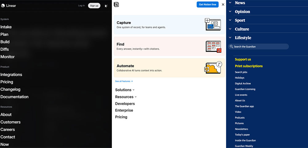
This guide breaks down navigation patterns that work across industries. You'll see real examples from brands like Stripe, Apple, and Shopify, plus the specific choices that make their menus effective.
Horizontal navs, hamburger menus, mega menus, sticky headers. We'll cover when to use each one and the mistakes that kill usability.
What is Website Menu Design
Website menu design is the process of creating navigation elements that guide visitors through your site's content.
It covers visual styling, layout positioning, link hierarchy, and interaction patterns.
A well-structured navigation bar connects users to pages without confusion or extra clicks.
Menu design directly affects bounce rates, time on site, and conversion paths.
Poor navigation sends visitors away. Good navigation keeps them exploring.
The header area typically houses the primary menu, making it the first thing users scan when landing on any page.
Website Menu Design Examples
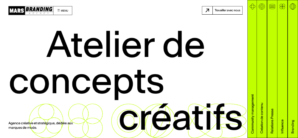
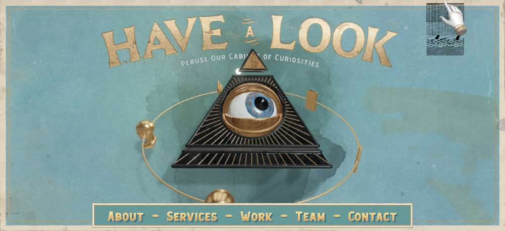
Mars Branding
Silvia Bianchi
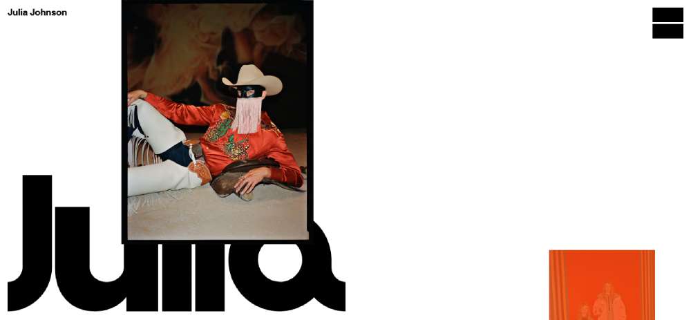
Julia Johnson
Bepolitics3

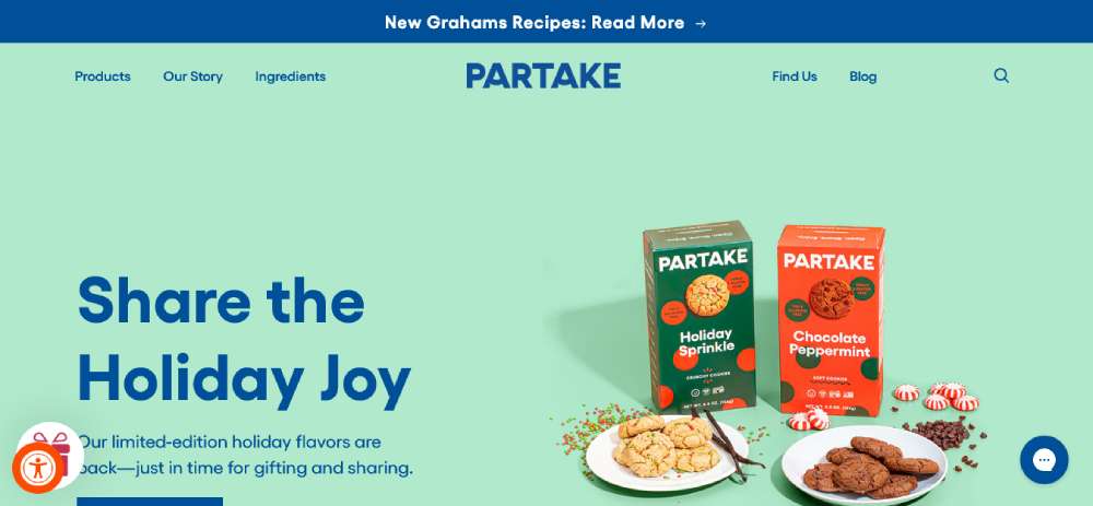
Partake
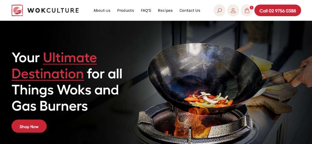
Wok Culture
The Legend of Zelda
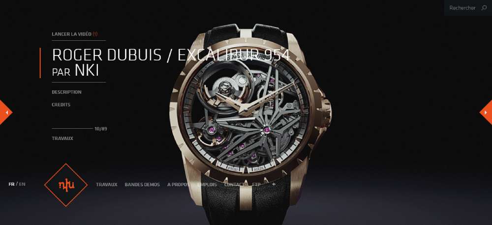
NKI

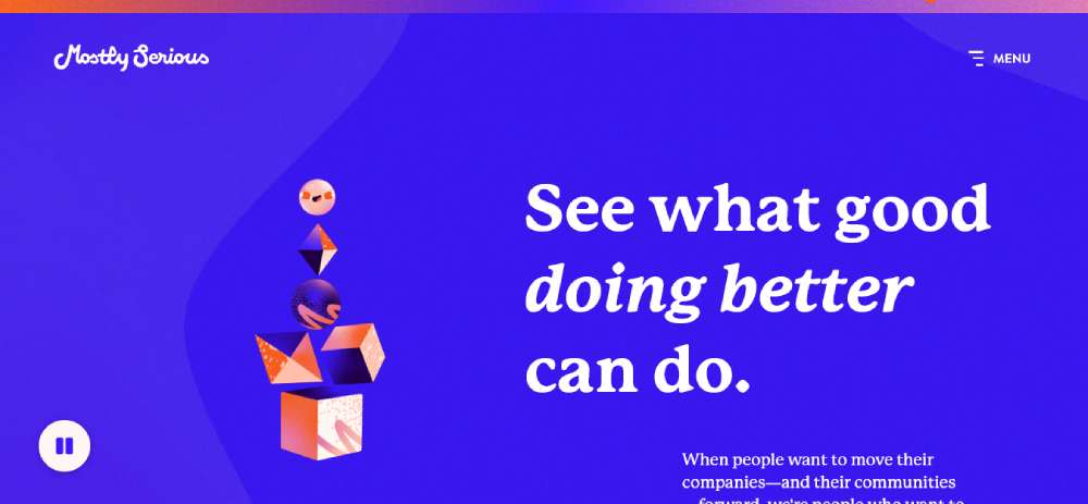
Mostly Serious
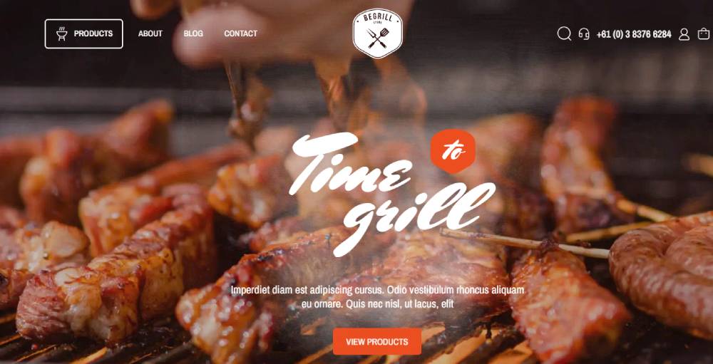
Bebarbeque
REAL ESTATE 3D INTERACTIVE MAP

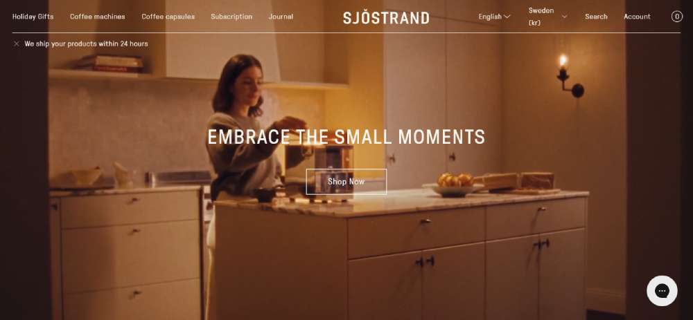
Sjöstrand Coffee
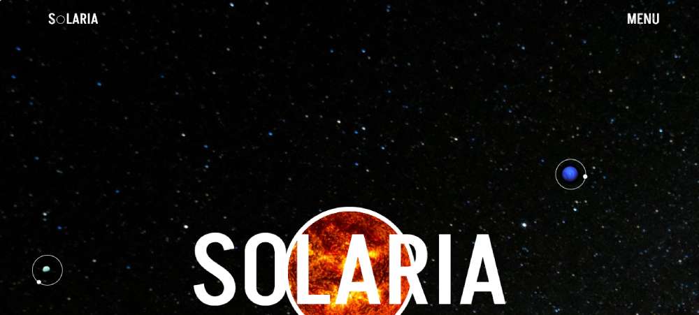
Solaria
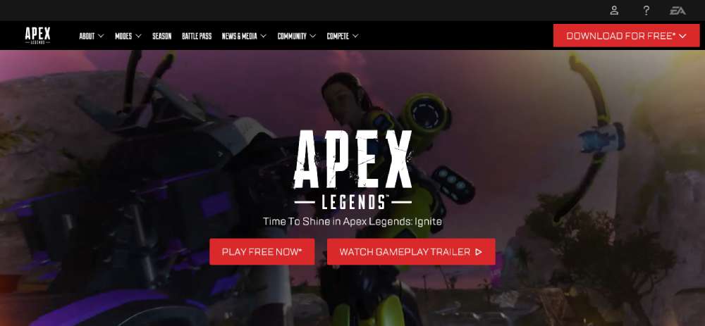
Apex Legends
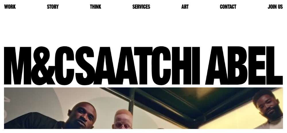
M&Csaatchi Abel
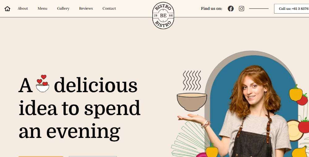
Bebistro5
Beauty Bakerie

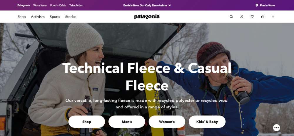
Patagonia
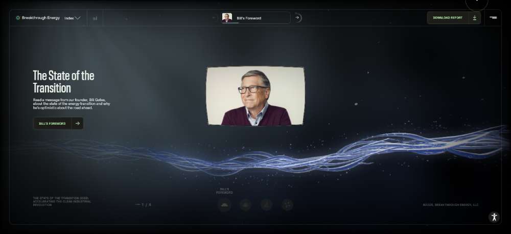
THE STATE OF THE TRANSITION 2023
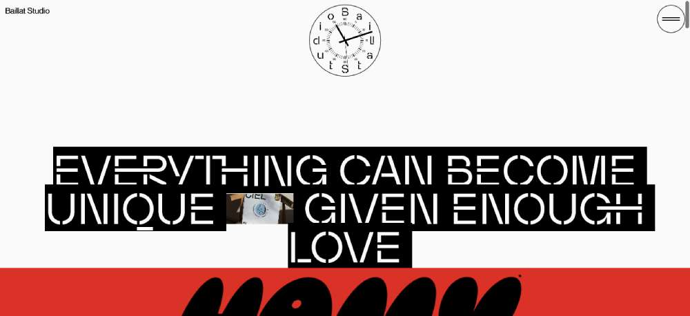
Baillat Studio
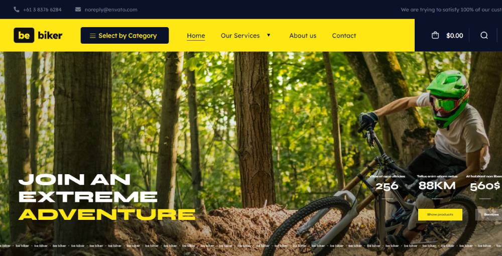
BeBiker4
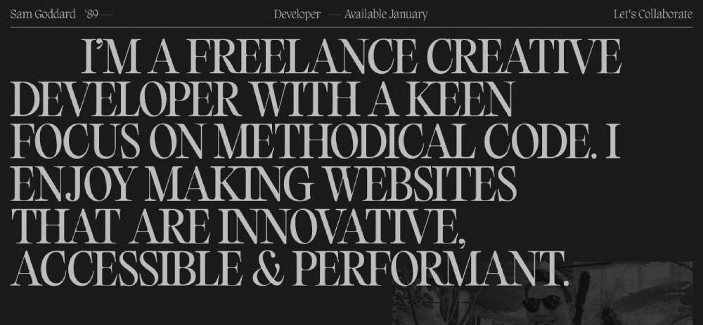
Sam Goddard
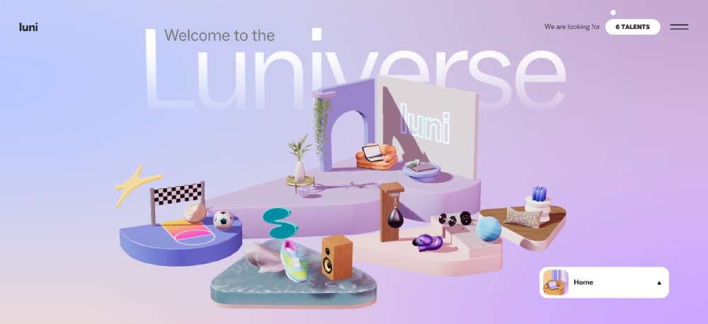
LUNI
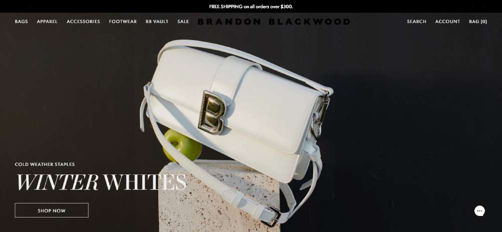
Brandon Blackwood
LVMH Prize

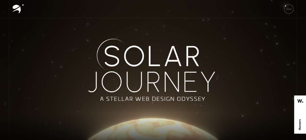
SOLAR JOURNEY
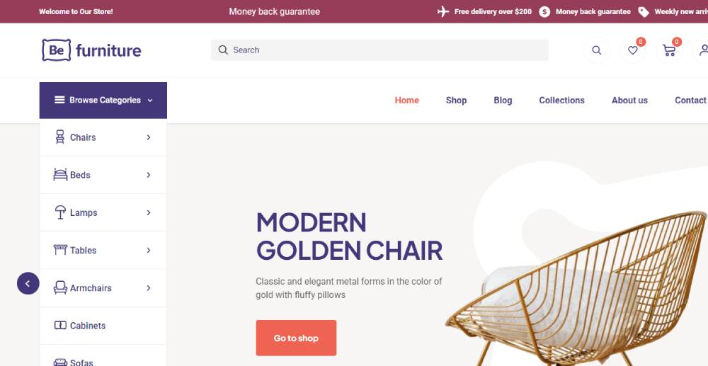
Befurniturestore2
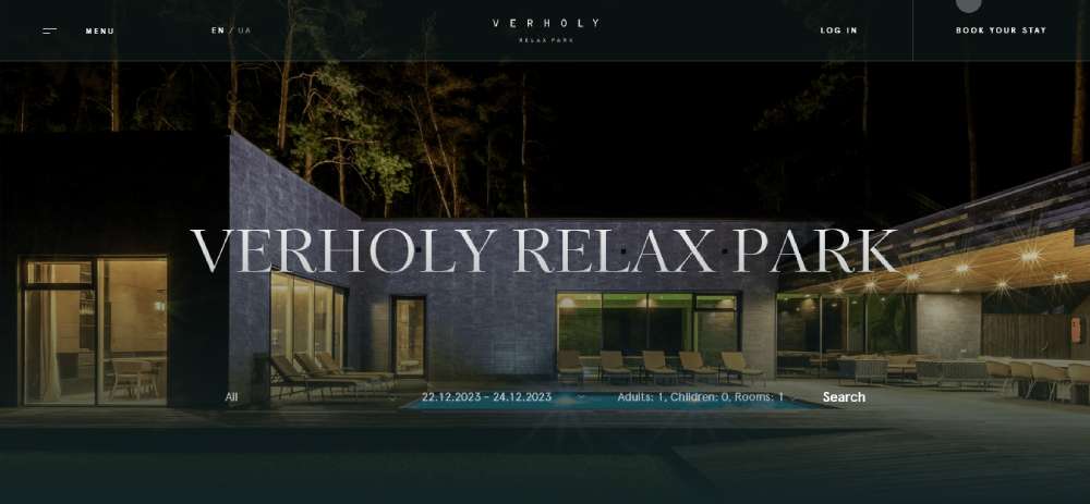
Verholy Relax Park
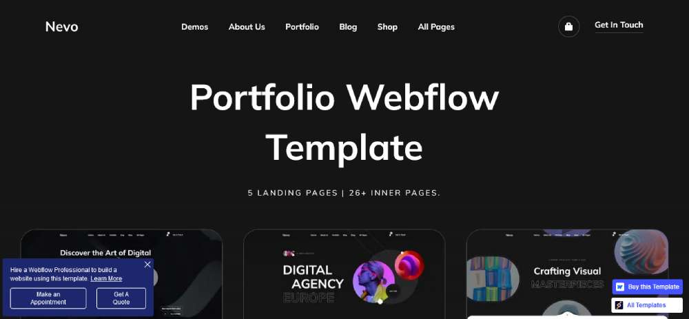
Nevo
BITKRAFT

Pipe

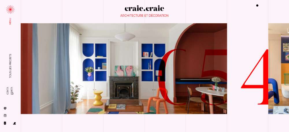
Craie Craie
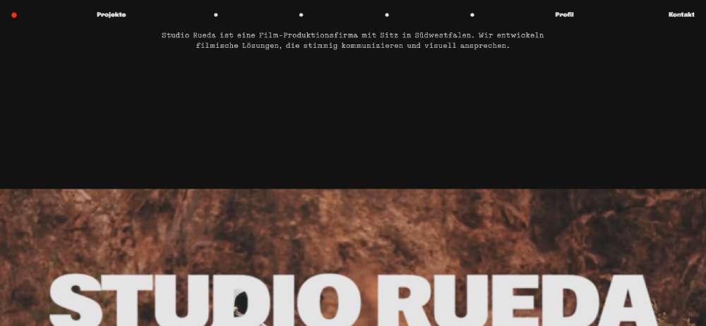
STUDIO RUEDA
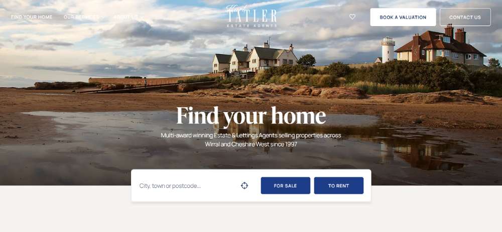
Karl Tatler
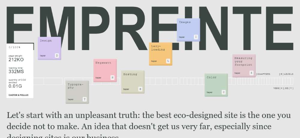
Empreinte
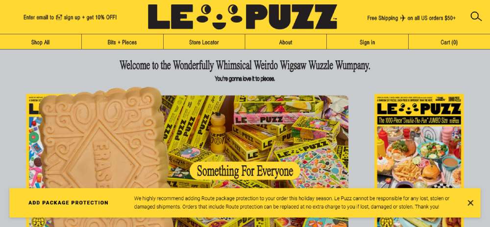
Le Puzz
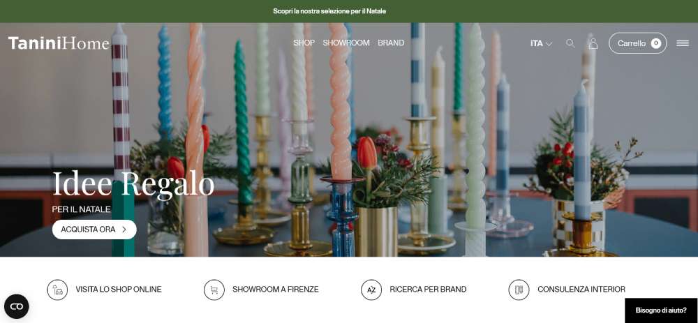
TANINI HOME
SercoPointWeb

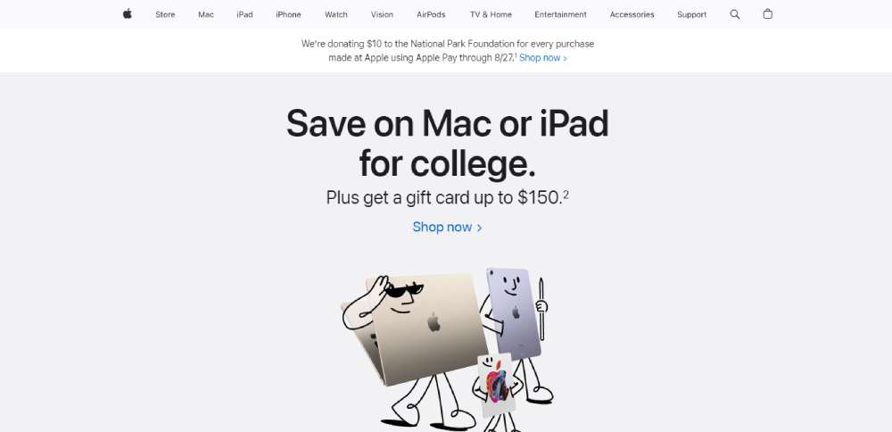
Apple
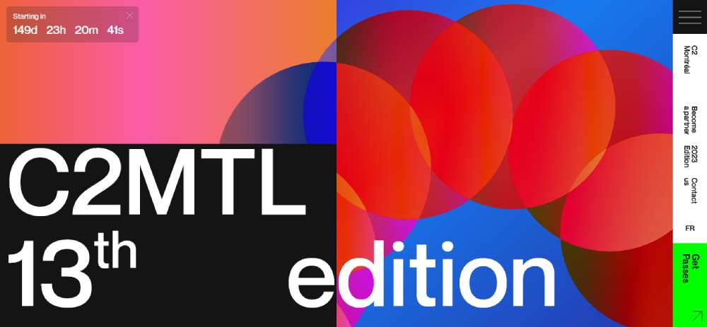
C2 Montréal
UN7

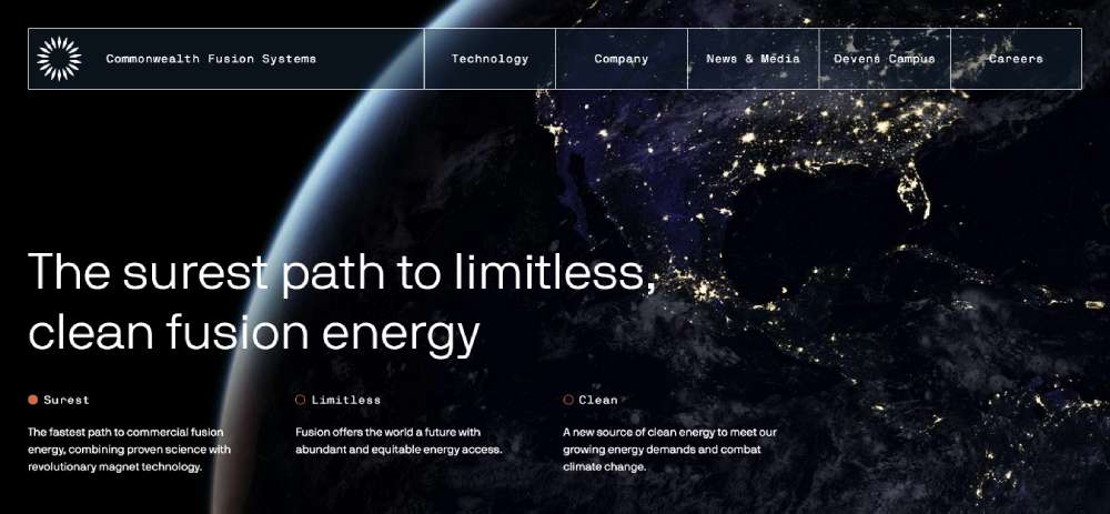
Commonwealth Fusion Systems
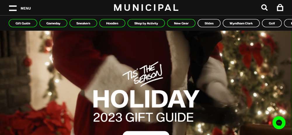
Municipal
LUTZ

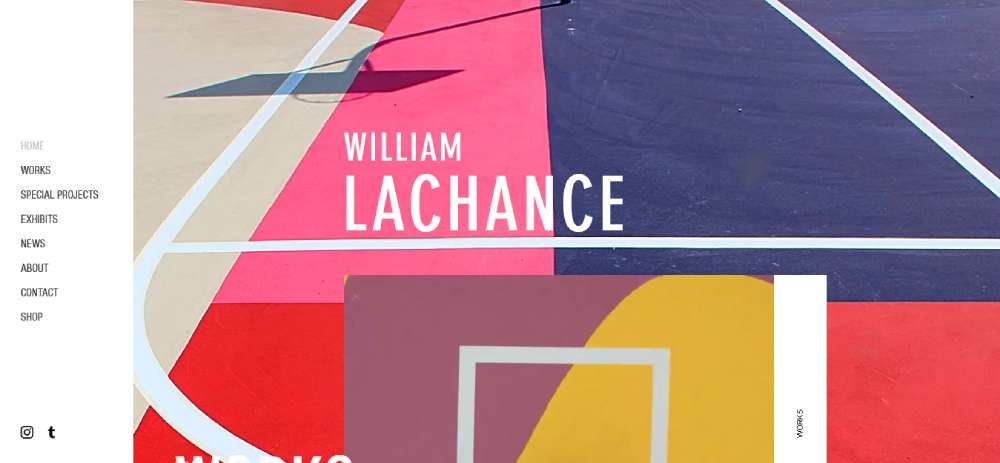
William LaChance
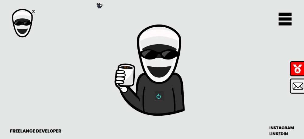
Alannn - Creative Developer
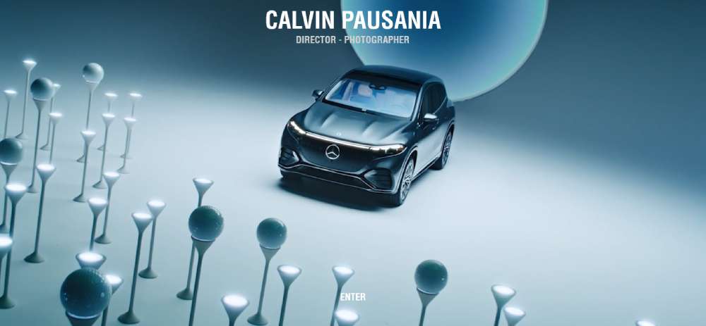
Calvin Pausania
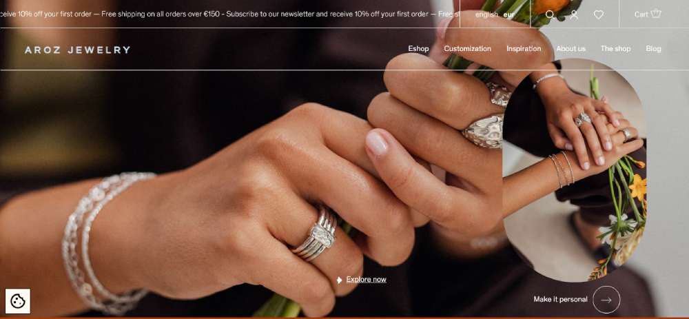
Aroz Jewelry
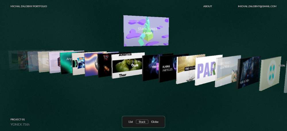
Michal Zalobny - Portfolio
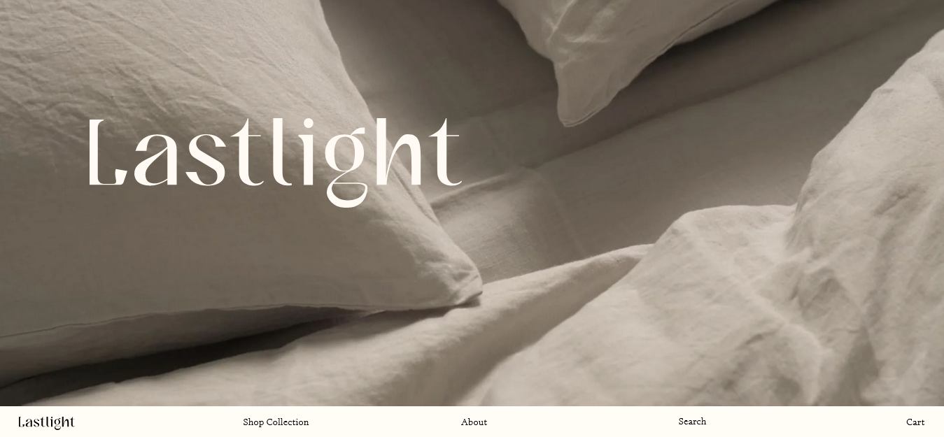
Last Light
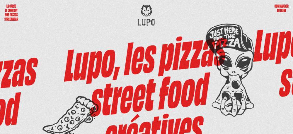
Lupo
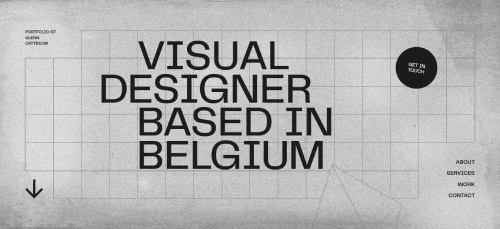
Glenn Catteeuw
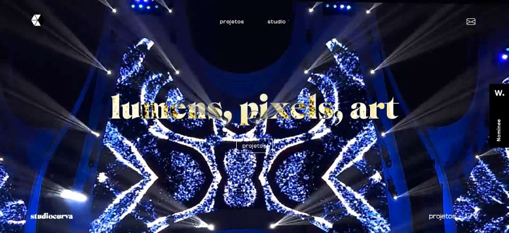
Studio Curva
Curious & Company
Ashland University

Temperley London

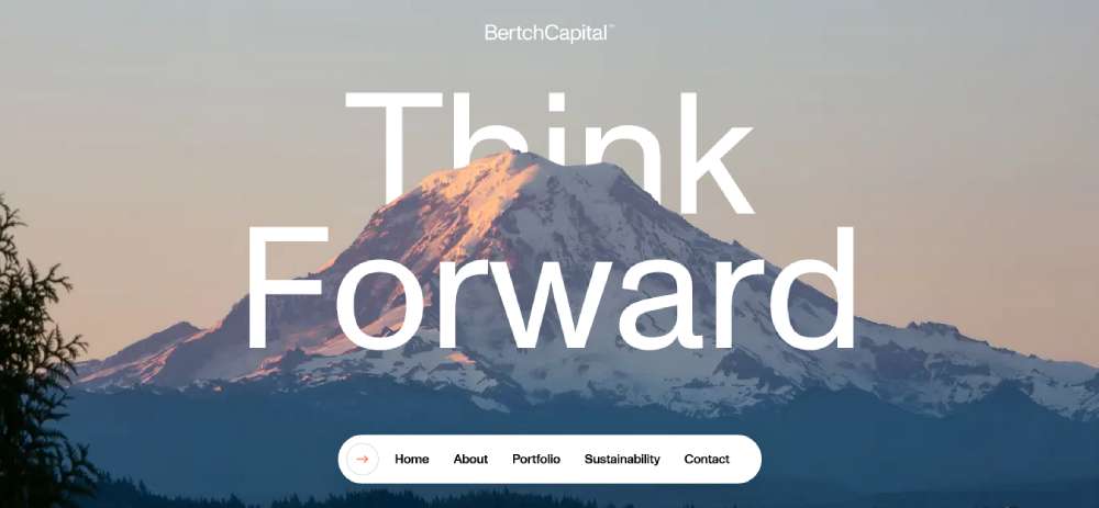
Bertch Capital
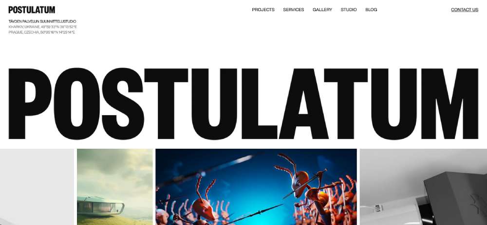
Postulatum Studio
Victor Adeniji
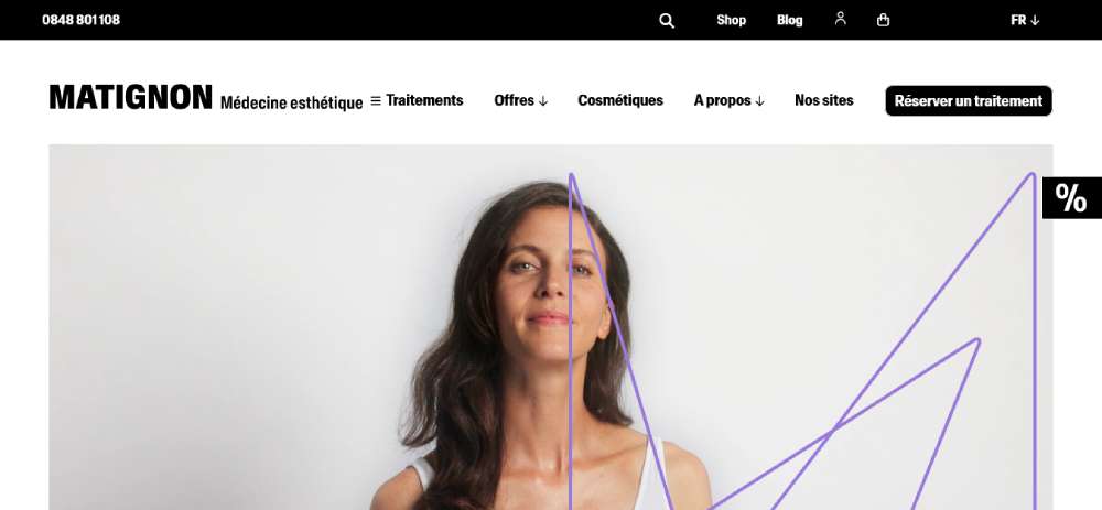
Matignon
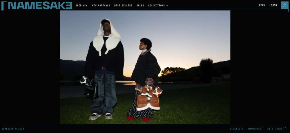
Namesak3
Lacoste

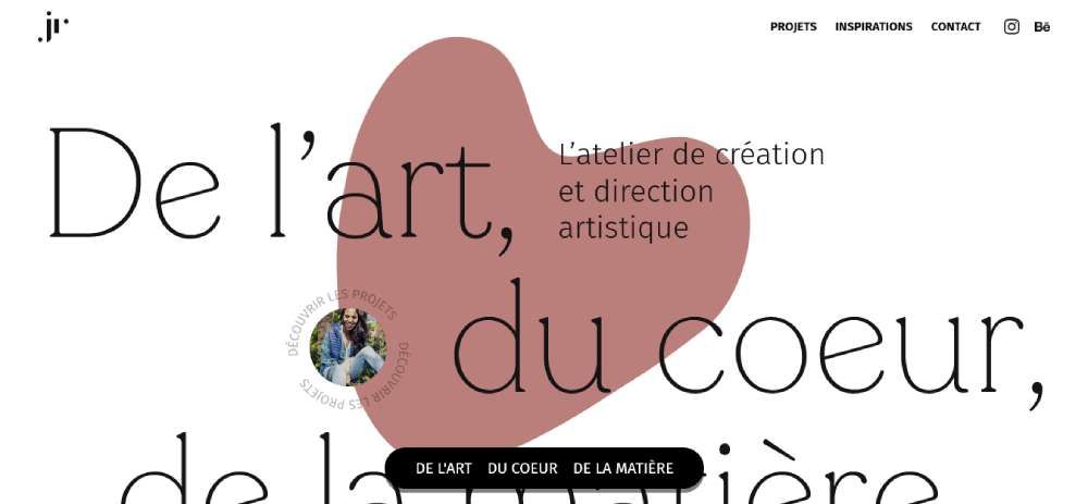
JR Atelier
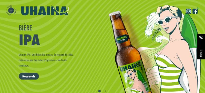
Uhaina
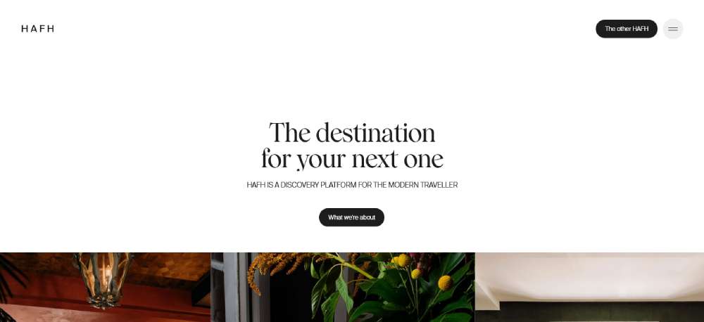
HAFH
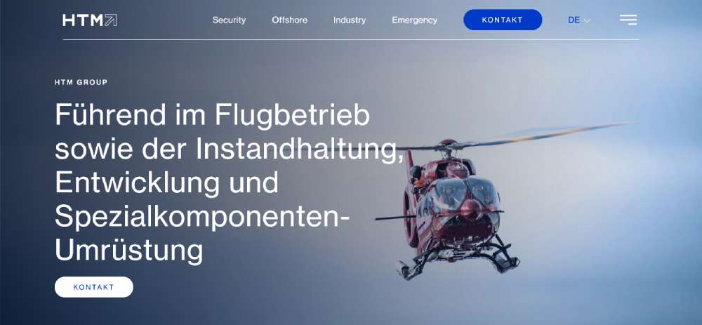
HTM
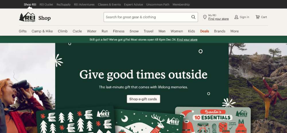
REI
How Website Menu Design Affects User Experience
Navigation patterns determine how easily visitors find what they need.
Every click matters. Every extra step increases drop-off rates.
What Makes a Navigation Menu Effective
Clear labels, logical grouping, and predictable placement.
Users expect main navigation at the top or left side of the screen, and effective website navigation respects these conventions while adding visual clarity.
How Users Interact with Menu Structures
Eye-tracking studies show users scan in F-patterns, hitting the top navigation first.
Mobile users rely on thumb reach zones, making hamburger menu placement a UX decision with real consequences for user friendly website design.
What Role Does Menu Placement Have in Page Layout
Menu position affects content hierarchy and visual flow.
Sticky headers keep navigation accessible during scroll; sidebar menus work better for content-heavy sites with deep category structures.
Types of Website Menu Designs
Different menu types solve different problems.
Your choice depends on content volume, device usage, and industry conventions.
What is a Horizontal Navigation Menu
A horizontal nav bar sits across the top of the page, displaying 5-7 primary links.
Standard for corporate websites, SaaS websites, and business website designs where simplicity beats complexity.
Requires sufficient screen width; breaks down on mobile without responsive adaptation.
What is a Hamburger Menu
Three stacked lines that expand into a full menu on tap or click.
Mobile-first navigation pattern now common on desktop sites pursuing minimalist website aesthetics.
Hides navigation until needed, freeing up screen space for content and imagery.
What is a Sidebar Menu
Vertical navigation positioned on the left or right edge of the viewport.
Fixed sidebars stay visible during scroll; collapsible versions save space on smaller screens.
Common in dashboards, documentation sites, and blog design layouts with extensive category systems.
What is a Mega Menu
Large dropdown panels displaying multiple columns of links, images, and subcategories.
E-commerce standard. Amazon, Target, and major retailers use mega menu structures to expose product categories without forcing users through multiple pages.
Requires careful information architecture to avoid overwhelming visitors.
What is a Sticky Menu
Navigation that remains fixed at the top of the viewport during page scroll.
Uses CSS position: fixed or sticky properties to maintain accessibility on long-form content pages.
Keeps primary actions within reach, reducing scroll fatigue on one page website designs.
What is a Footer Menu
Secondary navigation at the bottom of every page.
Houses legal links, contact information, sitemap access, and overflow items that don't fit the primary nav.
Users who scroll to the website footer are engaged; give them clear next steps.
How to Choose a Menu Design for Your Website
What Industry Affects Menu Design Choices
Retail websites need mega menus for product categories; portfolio sites work better with minimal horizontal navigation.
Finance websites require trust signals in nav; entertainment websites can experiment with unconventional patterns.
How Content Volume Determines Menu Structure
Under 10 pages: horizontal nav. 10-50 pages: dropdowns. 50+ pages: mega menu or sidebar with search integration.
Content-heavy news websites and educational websites need category-based structures with multiple entry points.
What Device Usage Should Influence Menu Selection
Check analytics for mobile vs desktop split before committing to a pattern.
80%+ mobile traffic demands mobile first design approach; hamburger menus become primary, not fallback.
Website Menu Design Best Practices
How to Structure Menu Items Logically
Group by user intent, not internal organization. Limit top-level items to 7 or fewer.
Place highest-traffic pages first; use card sorting research to validate hierarchy.
What Text Labels Work Best for Navigation Links
Action-oriented labels outperform generic ones. "Get Started" beats "Services."
Keep labels under 2-3 words; avoid jargon that only insiders understand. Pair with strong call to action button design for conversion points.
How to Handle Dropdown Menus Properly
Add 300ms hover delay to prevent accidental triggers; include visible arrows indicating expandable items.
Keep dropdown depth to 2 levels maximum. Deeper nesting frustrates users and breaks mobile usability.
What Accessibility Requirements Apply to Menus
WCAG 2.1 compliance requires keyboard navigation, focus indicators, and screen reader compatibility.
Use semantic HTML (nav, ul, li elements), ARIA labels for complex interactions, and 4.5:1 contrast ratios. Study accessible websites for implementation patterns.
Common Website Menu Design Mistakes
What Happens When Menus Have Too Many Items
Cognitive overload kills conversions. Users freeze when facing 15+ options.
Audit menu items quarterly; remove pages with under 1% click rates from primary navigation.
How Poor Mobile Menus Affect Bounce Rates
Tiny tap targets, hidden hamburger icons, and slow-loading dropdowns push mobile users away.
Test on actual devices. Emulators miss touch interaction problems that real fingers find immediately.
What Visual Clutter Does to Navigation Clarity
Competing colors, excessive icons, and animation overload distract from core navigation tasks.
Review bad design examples to identify patterns you're accidentally replicating. Embrace white space between menu elements.
How to Test Website Menu Usability
What Tools Help Analyze Menu Performance
Hotjar and Crazy Egg show click heatmaps on navigation elements; Google Analytics tracks menu item click-through rates.
Lighthouse audits catch accessibility issues; PageSpeed Insights flags menus that slow page loads.
How User Testing Reveals Navigation Problems
5-second tests expose confusing labels; task-based testing shows where users get lost.
Run monthly usability sessions with 5 participants. That catches 85% of navigation issues before they impact good UX goals.
FAQ on Website Menu Design
What is the best type of menu for a website?
Depends on content volume and audience. Horizontal navigation works for sites under 10 pages. Mega menus suit e-commerce with deep categories. Hamburger menus dominate mobile-first designs. Match the pattern to your specific user needs and device analytics.
How many items should be in a website menu?
Keep primary navigation to 5-7 items maximum. Cognitive load increases with each addition. Users scan, not read. Group secondary pages under dropdowns or move them to the footer navigation instead.
What makes a navigation menu accessible?
Keyboard navigation support, proper ARIA labels, screen reader compatibility, and 4.5:1 contrast ratios. Use semantic HTML elements like nav, ul, and li. WCAG 2.1 guidelines outline specific requirements for compliant menu accessibility standards.
Should I use a hamburger menu on desktop?
Only if minimalism serves your brand and users know where to find it. Hamburger menus hide options, reducing discoverability. Test with real users before committing. Most professional websites reserve hamburgers for mobile breakpoints only.
How do I make my menu mobile responsive?
Set CSS breakpoints around 768px to trigger mobile layouts. Replace horizontal bars with hamburger icons or off-canvas panels. Increase tap target sizes to 44x44 pixels minimum. Test on actual devices, not just browser emulators.
What is a sticky navigation menu?
A menu that stays fixed at the viewport top during page scroll. Uses CSS position: fixed or sticky properties. Keeps primary links accessible on long pages without requiring users to scroll back up for navigation access.
How do dropdown menus affect user experience?
Well-designed dropdowns organize content logically. Poorly designed ones frustrate users with tiny targets, accidental triggers, and deep nesting. Add hover delays around 300ms. Keep depth to two levels maximum for optimal usability.
What colors work best for website menus?
High contrast between text and background ensures readability. Dark text on light backgrounds remains the safest choice. Dark themed websites need careful attention to link visibility. Match menu colors to your overall color scheme for brand consistency.
How do I test if my menu design is effective?
Use heatmap tools like Hotjar to track click patterns. Run 5-second tests for label clarity. Monitor Google Analytics for menu click-through rates. Conduct task-based usability testing with 5 participants to catch 85% of navigation issues.
What is the difference between navigation and menu?
Navigation refers to the complete system users follow to move through your site. Menu is one component within that system. Breadcrumbs, search bars, footer links, and internal content links all contribute to overall site navigation architecture.
Conclusion
These website menu design examples prove one thing: navigation patterns should serve users, not impress designers.
The right menu structure reduces click depth, improves engagement metrics, and guides visitors toward conversion points without friction.
Start with your analytics. Know your mobile vs desktop split before choosing between horizontal navs, hamburger icons, or sidebar layouts.
Test everything. Heatmaps reveal what users actually click. Usability sessions expose confusion that analytics miss.
Keep accessibility non-negotiable. Keyboard navigation, proper contrast ratios, and screen reader support aren't optional extras.
Your website navigation shapes every visitor's experience. Build it with intention, measure its performance, and refine based on real user behavior.
Good menu design disappears. Users find what they need and never think about how.


