
How To Fix The WordPress Parse Error Easily
March 13, 2026
Political Campaign Website Design Examples
March 16, 2026Color is the first thing users notice. Before they read a word, before they click anything, the palette has already shaped how they feel about the site.
These colorful website design examples show what bold, structured color choices actually look like in practice, across e-commerce, SaaS, food brands, portfolios, and nonprofits.
Each example covers the specific palette decisions that make the design work, from color hierarchy and contrast ratios to responsive color rendering and accessibility compliance.
You will leave with real references, practical criteria, and a clearer sense of what separates a colorful site that converts from one that just looks loud.
What Is Colorful Website Design?
Colorful website design is a visual approach that uses 3 or more dominant hues in a structured, intentional way to build hierarchy, guide user behavior, and reinforce brand identity. It is not random color use. Every hue has a role.
The difference between a colorful site and a cluttered one comes down to system. A colorful design has a defined palette. A cluttered one just has a lot of colors.
85% of shoppers cite color as the primary reason they buy a particular product, and up to 90% of initial impressions about a website are based on color alone (Colorlib, 2025). Those numbers make palette decisions non-negotiable.
How Colorful Web Design Differs from Generic Multi-Color Use
Most colorful websites follow the 60-30-10 ratio: one dominant hue takes 60% of the visual space, a secondary color holds 30%, and one or two accent colors occupy the remaining 10%.
Without that ratio, you get visual chaos. With it, you get sites like Mailchimp, Duolingo, or Canva, where bold palettes feel controlled rather than overwhelming.
Key distinctions:
- Colorful design uses a defined color token system, not ad-hoc hex values
- Each hue maps to a specific function: navigation, CTA, background, illustration
- Saturation and brightness are balanced so no single color overwhelms the rest
Color Models Used in Colorful Web Palettes
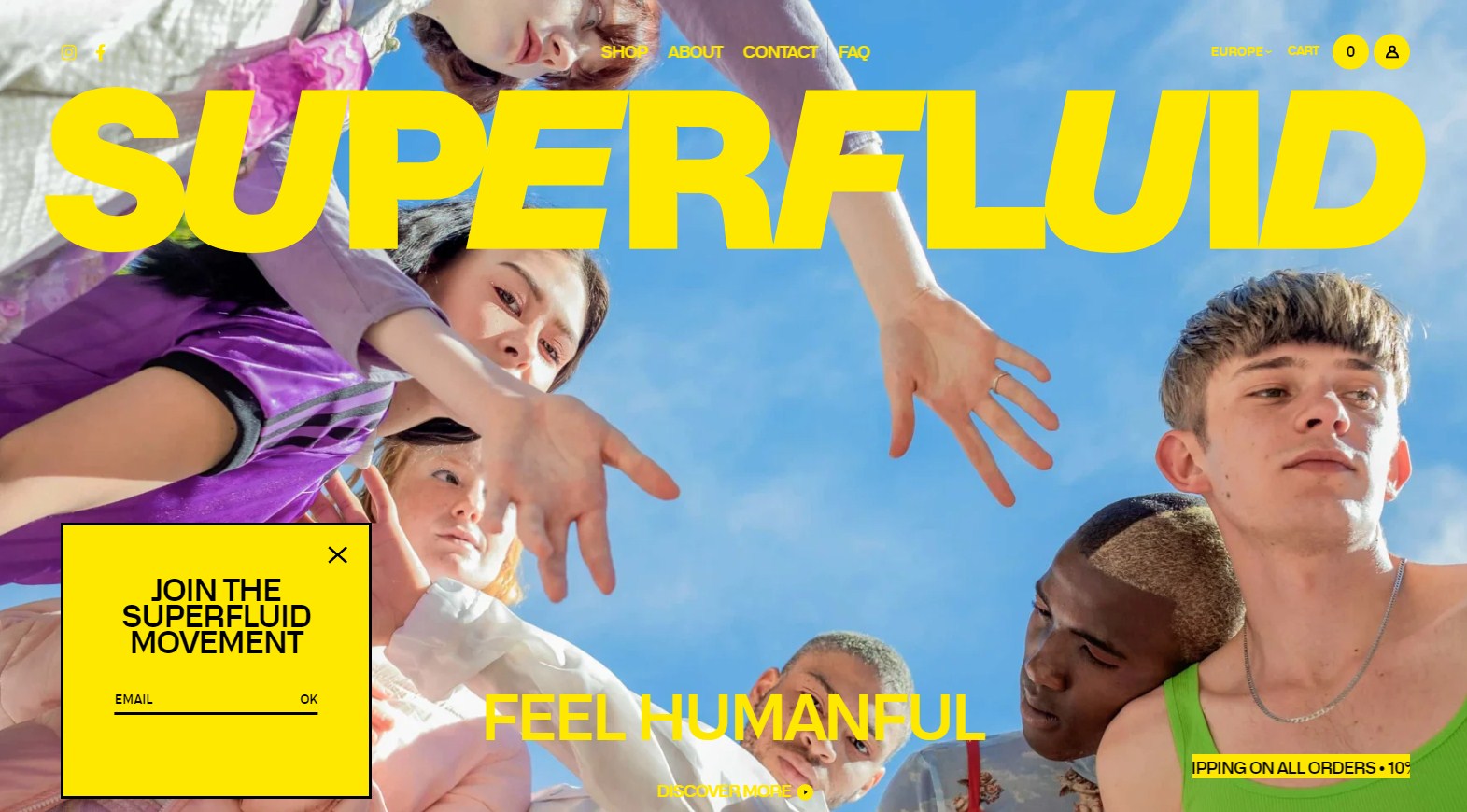
Triadic: Three hues spaced equally on the color wheel. High contrast, energetic. Used by brands targeting younger audiences.
Analogous: Adjacent hues that create a smooth, cohesive palette. Less tension between colors, easier to build hierarchy from.
Split-complementary: One base hue plus two hues adjacent to its complement. More visual interest than analogous, less jarring than full complementary pairs.
Tools like Adobe Color, Coolors, and Paletton all support these models directly, making it easier to build a palette before opening Figma.
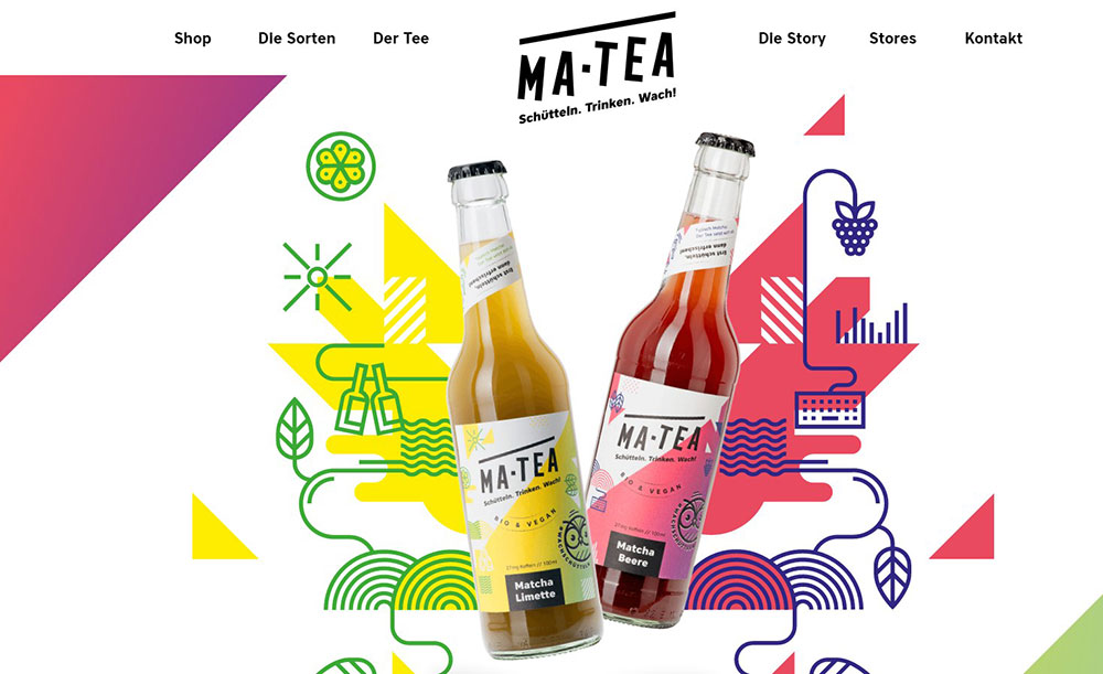
Check out these great colorful websites


What Makes a Colorful Website Design Work?
Colorful web design works when color hierarchy, contrast, and white space are treated as a system. Remove any one of those and the layout breaks down, no matter how appealing the individual hues are.
Contrast ratios and accessibility requirements are what separate a bold design from an unusable one. Low-contrast text appears on 83.6% of all homepages, making it the single most common WCAG failure according to WebAIM's 2024 Million analysis. Colorful sites are especially exposed to this problem.
Color Hierarchy and Visual Weight
Visual weight determines where the eye goes first. In colorful layouts, warm and saturated hues carry more weight than cool or muted ones, which means the placement of high-saturation colors directly controls user attention.
The hero section is where most colorful designs either succeed or fail. A saturated background with a low-contrast CTA button sends users in the wrong direction before they read a single word.
Practical rules for color hierarchy:
- Reserve the highest saturation for CTAs and key conversion elements
- Use muted or desaturated versions of your palette for backgrounds and secondary content
- Never place two high-saturation colors directly adjacent without a neutral separator
- Test your call to action button contrast against every background color in your palette
Accessibility in High-Contrast Color Schemes
WCAG 2.1 AA requires a minimum contrast ratio of 4.5:1 for normal text and 3:1 for large text (18px or larger). These thresholds apply to every color combination in the palette, not just black-on-white.
Checking contrast in Figma with the Stark plugin or running final designs through the WebAIM Contrast Checker catches most failures before launch. Tools like the Colour Contrast Analyser work for final QA directly in the browser.
One thing worth knowing: 300 million people globally have some form of color vision deficiency (Colorlib, 2025). Colorful design that fails accessibility checks excludes a significant share of users.
Typography and Grid in Multi-Color Layouts
Type choices make or break colorful layouts. High-weight sans-serif fonts hold legibility against saturated backgrounds far better than thin or italic cuts. A 400-weight body font on a vibrant background is a readability problem waiting to happen.
Grid systems do the structural work that keeps colorful layouts from looking noisy. Color blocking within defined columns and rows creates visual boundaries that let multiple hues coexist without competing. Good typography and grid discipline are what let sites like Canva use a full rainbow without losing clarity.
What Color Palettes Do Colorful Websites Use Most?
The most effective colorful web palettes fall into 5 recurring types. Each serves a different brand context and user expectation.
| Palette Type | Common Hues | Best Fit |
|---|---|---|
| Triadic | Red, yellow, blue | Bold brand sites, youth-facing products |
| Analogous | Blue, teal, green | Wellness, SaaS, calm-tone brands |
| Gradient-heavy | Purple to blue, pink to orange | App landing pages, tech startups |
| Neon/fluorescent | Electric blue, hot pink, lime | Entertainment, gaming, esports |
| Earthy multi-color | Terracotta, forest green, clay | Food, wellness, lifestyle brands |
Gradient Palettes in SaaS and Tech
Gradient-heavy palettes have dominated SaaS and tech since around 2018, when flat design started feeling sterile. Stripe's homepage is the clearest example: continuously flowing gradients that move through blues, purples, yellows, pinks, and oranges, creating depth without requiring illustration assets.
Gradients work in this context because they imply motion and sophistication, two qualities tech brands want users to associate with their product. They also render beautifully on OLED screens, which now account for a large share of mobile devices.
AI color palette tools like Coolors and Khroma saw 400%+ growth in usage from 2024 to 2025 (Coolors), which reflects how much demand there is for gradient and multi-hue palette generation specifically.
Neon and Fluorescent Combinations
Neon palettes disappeared for a while and came back around 2023, but the way they're used now is smarter. Electric blues, hot pinks, and lime greens show up as micro-accents against dark backgrounds rather than full-bleed loud color.
Entertainment and gaming sectors use these combinations most aggressively. Esports websites and gaming websites rely on neon accents to signal energy and competitiveness without making the layout unreadable.
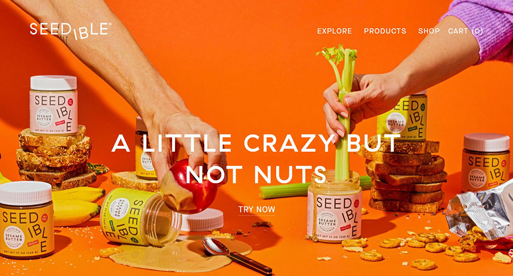
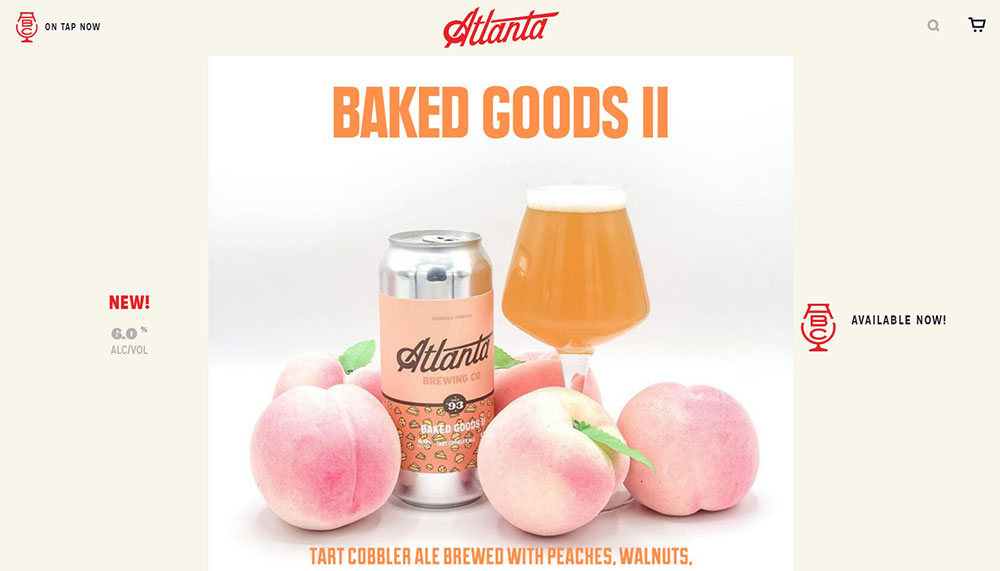
Earthy Multi-Color Palettes in Food and Lifestyle
Terracotta, forest green, deep clay, and warm sand have become the go-to palette family for food, wellness, and organic brands. These palettes communicate authenticity. Websites using green tones report a 20% increase in trust scores among users under 35 (Nielsen, cited by Lounge Lizard, 2025).
Brands like Oatly pushed earthy color blocking into mainstream awareness. Their approach, warm yellows against off-white with hand-drawn typography, showed that food brands could run colorful, illustration-forward layouts without looking like a children's brand.
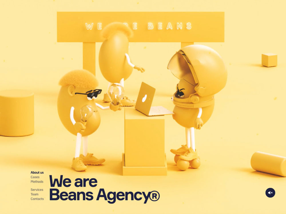
Which Colorful Website Design Examples Stand Out in E-Commerce?
Colorful e-commerce design works when the palette comes from the product itself. The best examples don't impose color on the product. They build the layout around the product's existing visual identity.
Product photography is the most important color element on any e-commerce page. When background hues match or complement the product's dominant color, the result feels considered rather than branded-for-branding's-sake.
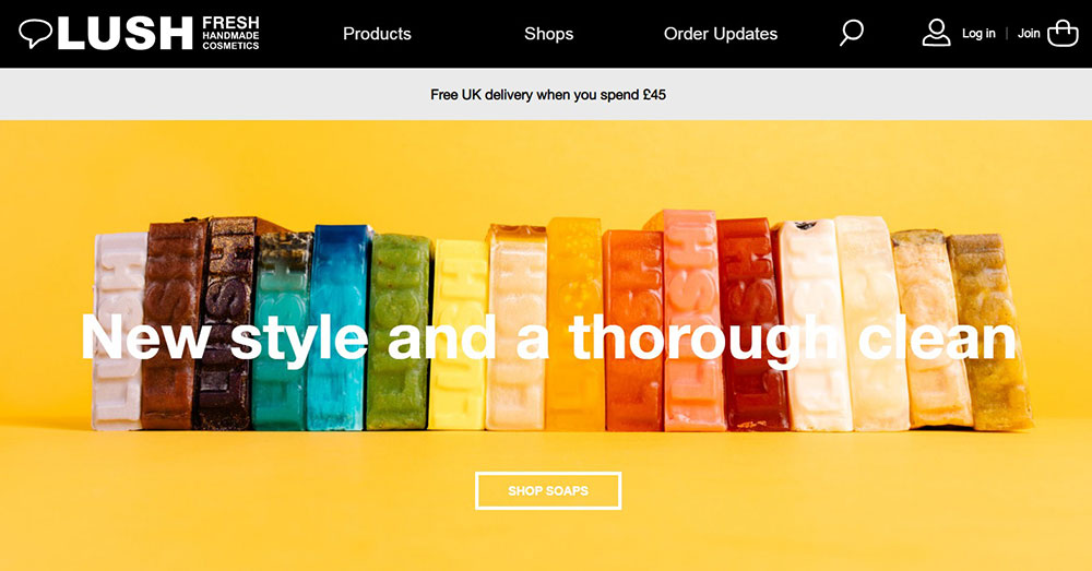
Glossier
Glossier uses pale pinks and muted neutrals throughout their site. The palette delivers a clean, modern feel that matches their minimalist product packaging. Their CTA buttons use a soft pink that contrasts against white backgrounds without demanding attention the way a red or orange button would.
This restraint is deliberate. Glossier's audience expects a calm, editorial feel. A vibrant triadic palette would undercut the brand positioning, even if the contrast ratios were technically fine.
Oatly
Oatly takes the opposite approach. Their website uses bold color blocking, rough hand-drawn typography, and saturated yellows and greens that feel almost chaotic. But it's controlled chaos. Every page section has a clear background color, a clear text color, and a clear hierarchy.
This is a good case study for what's called full-bleed color sections, where each scroll section has its own dominant hue. The approach works on product sites because it lets each item or concept breathe in its own visual space.
Liquid Death
Liquid Death built its entire site around contrast: black and white base with aggressive typography and unexpected color pops. The site treats color like a punk record cover, which matches exactly how they position canned water as an anti-wellness brand.
Their e-commerce homepage design shows how a limited but bold color scheme can feel more distinctive than a full multi-hue palette. Sometimes 2 colors used confidently outperform 6 used timidly.
Which Colorful Website Design Examples Stand Out in SaaS and Tech?
Most SaaS sites defaulted to blue and white for years. Safe, trustworthy, forgettable. The brands that broke from that pattern after 2018 picked up significant brand equity precisely because they looked different. Median conversion rates for SaaS landing pages sit at just 3.8% (Unbounce, 2024). Visual differentiation is one of the levers available to move that number.
Mailchimp
Mailchimp's site is probably the most studied example of bold color in SaaS. Their palette runs warm yellows, cream whites, and black with heavy illustration. The result feels more like a creative agency than an email tool.
What makes it work: consistency. Every illustration uses the same color family. Every section header uses the same typographic weight. The variety comes from content, not from introducing new colors on every page.
Stripe
Stripe uses white as the dominant surface color, then deploys animated gradients across the hero and key sections. Blues, purples, yellows, pinks, and oranges flow together in a way that communicates technical sophistication without screaming "developer tool."
The color system is built around product screenshots, which means every gradient has to work alongside UI elements in gray and white. That constraint actually improves the palette by forcing restraint in saturation levels.
Monday.com
Monday.com uses bold colors, playful animations, and a multi-hue icon system that makes their productivity tool feel approachable rather than corporate. According to Medium's 2025 SaaS design analysis, their site stands out in a category full of boring blue B2B layouts precisely because they committed to personality without sacrificing credibility.
Dark mode colorful variations are becoming increasingly common in this category too. Awwwards data from 2025 shows dark mode-first design now accounts for 30% of new web design projects, up from just 8% in 2021.
Canva
Canva's website shows the full range of what a colorful UI design can do. The site cycles through template previews in dozens of color families, making the homepage itself a live demonstration of the product. Bold color palettes, playful illustrations, and dynamic layouts communicate what the tool does before a user reads any copy.
This is a strong model for any SaaS website where the product has a visual output. Let the output sell the color range.
Which Colorful Website Design Examples Stand Out in Creative and Portfolio Sites?
Portfolio and agency sites are where colorful design gets the most freedom. The product is the designer themselves, which means the color palette is a direct statement about their creative perspective.
These sites regularly win on Awwwards and similar platforms. What separates the ones that actually land clients from those that just look impressive is whether the bold color system supports content clarity or competes with it.
Color Blocking in Portfolio Layouts
Full-bleed color blocking is the dominant technique in award-winning portfolio design. Each project gets its own background color. The designer's name and navigation stay consistent. The result is a site that feels fresh on every scroll without requiring new design work for each case study.
Typographic-heavy layouts pair especially well with this approach. When type is the design, color becomes the breathing room. This is common in graphic designer portfolio websites where the work speaks through letterforms rather than imagery.
Animation and Scroll-Triggered Color Transitions
Scroll-triggered color transitions are a technique where the background hue shifts as the user moves down the page. Done well, it creates a sense of narrative without requiring a single additional image.
This works particularly well on animated websites where motion is already part of the experience. The color shift becomes one layer in a multi-dimensional scroll journey rather than a gimmick.
Tools like Framer and Webflow both support this natively, which means it's no longer a custom-code feature reserved for agencies with large development budgets.
Custom Cursor and Hover Effects
Creative sites often tie color changes to cursor interaction. Hover over a project thumbnail and the entire background shifts to that project's primary color. The technique turns color into an interactive system rather than a static design decision.
This is the kind of detail that gets shared. It's also the kind of detail that becomes a liability if the base layout isn't solid, because motion and color together amplify whatever hierarchy problem already exists in the design. Getting the header and navigation color right first makes these interactive effects land properly.
Which Colorful Website Design Examples Stand Out in Food and Beverage?
Food and beverage brands were among the first to push colorful web design past the limits of what most B2B or SaaS companies would attempt. The product gives them permission. Flavor, energy, and mood are inherently visual, which means the color palette carries direct marketing weight rather than just aesthetic weight.
Illustration-Forward Colorful Design in CPG Brands
Consumer packaged goods brands increasingly use illustration systems rather than product photography as their primary visual language online. This approach gives them full control over the color palette because illustrations don't carry the ambient lighting limitations that photography does.
Oatly pioneered this in the oat milk category. Jeni's Splendid Ice Creams uses hand-lettered typography with bright color blocking that maps directly to their product flavors. Minor Figures, the oat milk brand targeting coffee professionals, built its site around a stark black-and-white base with selective color pops that feel more like a jazz album than a food product.
These brands also treat food website design as a content strategy tool. Seasonal colorway updates signal product launches and keep returning visitors from seeing a static site.
Color as Flavor Communication
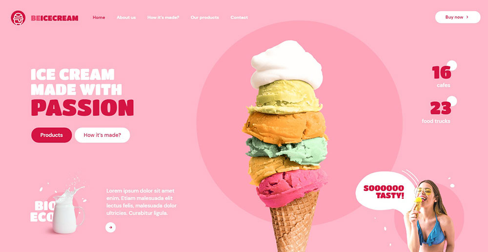
Color communicates flavor before copy can. Orange and yellow read as citrus. Deep red reads as berry or spice. Mint green reads as fresh or cool. Food brands that map their palette to their product's flavor profile create an immediate sensory association.
Ice cream websites are a clear example of this in practice. The best ones use a different pastel for each flavor family, turning the product page grid into a color-coded browsing experience.
Parallax and Animation in Food Brand Layouts
Animation adds energy to food sites in a way that static layouts can't replicate. Parallax scrolling creates depth between illustrated elements and product photography, which works especially well when background colors shift as the user scrolls through a recipe or product story.
Parallax scrolling websites in this category use motion not just for visual polish but to control the pace of information delivery. Slow the scroll, reveal the product, shift the color. The sequence feels like a tasting experience rather than a product page.
Which Colorful Website Design Examples Stand Out in Nonprofits and Education?
Colorful design in the nonprofit and education space does something the corporate world rarely attempts: it uses bold hue combinations to signal inclusivity rather than energy.
71% of users with disabilities will leave a site if they encounter accessibility barriers, according to a 2023 WebAIM report. For nonprofits with broad, diverse audiences, that failure rate is a serious problem. Colorful design and accessibility compliance are not opposites. They just require deliberate work.
Duolingo
Duolingo's site is one of the most studied examples of colorful design in education. The bright green brand color, paired with yellow, purple, and blue accent hues, creates an environment that feels more like a game than a learning tool.
Peak traffic of 106 million visits in December 2023 (Statista) suggests the visual approach is not hurting engagement. The color system maps directly to the product experience, where each language skill has its own color-coded path.
Their illustration characters use the same constrained palette across every touchpoint, which keeps the multi-color layout from feeling scattered. It's a good model for any educational website that wants personality without chaos.
charity: water
charity: water uses a yellow and white primary palette with photography-heavy layouts. The approach is restrained by colorful standards, but the yellow is applied with enough commitment that it becomes instantly recognizable.
Their nonprofit website exemplifies how a single strong accent color, used consistently, outperforms a complex multi-hue palette when the subject matter is emotionally serious. High-saturation background colors would compete with the photography. Instead, color frames it.
Color-Coded Navigation in Education Platforms
Color-coded navigation is one of the most practical applications of colorful design in educational contexts.
Khan Academy uses distinct hues for each subject area: math in teal, science in green, computing in charcoal, humanities in orange. Users locate their subject by color before they read the label. That reduces cognitive load on every return visit.
- Each subject color persists into the lesson interface
- Progress indicators use the same hue, reinforcing the association
- Color never replaces text labels, it supplements them
How Do Colorful Websites Handle Responsive Design?
Responsive colorful design is harder than responsive minimal design. More colors mean more potential contrast failures across different screen sizes, device types, and ambient lighting conditions.
Most developers still build color systems for sRGB screens, but the gap between sRGB and what modern OLED displays actually render is significant. Display P3 covers approximately 26% more colors than sRGB (Wikipedia), and a large share of current flagship smartphones ship with P3-capable OLED panels. A palette that looks balanced on a designer's monitor may appear oversaturated on a user's phone.
Color Rendering Across Screen Technologies
Chrome added CSS Color Level 4 support for Display P3 in March 2023 (version 111). That means designers can now specify P3 color values directly in CSS and have them render correctly on supporting displays.
Three screen types that colorful palettes need to account for:
- sRGB LCD: The baseline. Colors appear as designed in most tools.
- OLED/P3: Higher saturation and deeper blacks. Reds and greens shift visibly from sRGB values.
- HDR displays: Wide dynamic range amplifies contrast between dark backgrounds and bright accent colors.
Testing colorful designs on both an sRGB monitor and an OLED device before launch catches most rendering surprises. BrowserStack and Responsively handle cross-device layout testing, though neither fully replicates gamut differences.
Simplifying Palette Complexity on Mobile
A 5-hue palette that reads well on a 27-inch desktop monitor can feel overwhelming on a 6-inch phone screen. The fix is not a separate mobile palette. It's a hierarchy decision about which hues carry into small screens at full weight.
CSS custom properties and mobile first design workflows handle this by defining base color tokens at the root level and then overriding saturation or brightness values within breakpoint-specific styles. The palette stays unified. The visual weight shifts.
Framer and Webflow both support this through their responsive style panel, which is one reason colorful brand sites increasingly build in those tools rather than coding from scratch.
Design Tokens for Colorful Responsive Systems
Design tokens remove the biggest maintenance problem in colorful responsive design: value drift. Without tokens, a developer hardcodes a hex value, another developer slightly adjusts it, and within a few months the same "brand orange" exists as 4 different hex values across the codebase.
84% of teams had adopted design tokens by 2025, with 69.8% already using Figma variables as their source of truth for those tokens (Enstacked, 2025). For colorful sites with complex palettes, that adoption rate reflects a real pain point being solved.
Tailwind CSS custom color configuration handles the code side. Define the palette once in tailwind.config.js and every utility class in the project references that source. Changing the primary brand color updates every component that uses it.
What Design Tools and Frameworks Are Used to Build Colorful Websites?
The tools shaping colorful web design in 2024 and 2025 fall into 3 categories: palette generation, design and prototyping, and front-end implementation.
| Tool | Category | Best Use |
|---|---|---|
| Adobe Color | Palette generation | Triadic, analogous, split-complementary schemes |
| Coolors | Palette generation | Fast multi-hue palette exploration |
| Figma | Design and prototyping | Color token management via variables |
| Tailwind CSS | Front-end implementation | Custom color configuration at scale |
| Framer / Webflow | No-code build | Gradient animation, responsive color |
Palette Generation Tools
Adobe Color and Coolors both support the major color models: triadic, analogous, split-complementary, and custom. Coolors also has a contrast checker built into the palette view, which catches WCAG failures before the palette leaves the generation stage.
Paletton adds a visual preview of how palette colors interact in actual UI layouts, which is more useful than a row of swatches for predicting how a multi-hue design will actually feel.
AI palette tools like Coolors and Khroma saw 400%+ growth in usage from 2024 to 2025 (Coolors). The speed benefit is real. A 5-hue palette that previously took 20 minutes to assemble takes 2 minutes with generative tools, leaving more time for contrast testing and hierarchy decisions. These count among the most practical web design tools for color-heavy projects.
Building Colorful Sites in Figma
Figma's variable system, introduced in 2023, changed how color systems are built for complex multi-hue designs. Color tokens defined as variables update across every component simultaneously when a single value changes.
This matters practically because colorful designs require more token variants than minimal ones. A 5-hue palette with light, mid, and dark values for each hue generates at least 15 base tokens before semantic tokens (button background, nav active state, section background) are added on top.
Front-End Implementation
CSS gradient generators like CSS Gradient and Mesher by CSS Hero handle the mesh gradient trend that dominates SaaS hero sections.
Mesher generates layered, multi-point gradients that would take hours to build manually. The output is standard CSS, which means it drops directly into any framework without dependencies.
For checking the final result against WCAG requirements, the Colour Contrast Analyser and WebAIM Contrast Checker are the two tools most accessible website projects run before sign-off.
How Does Color Psychology Apply to Colorful Website Design?
Color psychology research gives designers specific, testable claims about how individual hues affect user behavior. Not all of them hold universally, but several are consistent enough to inform palette decisions.
Up to 90% of initial product impressions are driven by color alone, with assessments forming within 90 seconds of first exposure (Colorlib, 2025). For colorful web design, that statistic defines the stakes of every palette choice.
Hue-Specific Behavioral Research
Red: HubSpot's A/B test showed a red CTA button generated 21% more clicks than the same button in green. The effect is context-dependent, not universal, but urgency and action associations are consistent across multiple studies.
Blue: Dominates finance, tech, and healthcare branding globally because of consistent trust associations. Stripe, PayPal, and most banking interfaces default to blue for primary actions for exactly this reason.
Green: Sustainability and health associations drive the earthy palette trend in food and wellness brands. Websites using green tones report a 20% increase in trust scores among users under 35 (Nielsen, cited by Lounge Lizard, 2025).
Yellow: Duolingo's dominant brand color. Attention-capturing in low doses. Fatiguing at high saturation across large surface areas.
Cognitive Load and Multi-Color Use
The Nielsen Norman Group's research on cognitive load directly applies to colorful web design. Every additional color a user must process and categorize adds cognitive overhead.
Well-structured colorful designs reduce that overhead by making color mean something consistent. Navigation colors stay fixed. Section background colors follow a predictable sequence. Accent colors always appear on interactive elements. When color has a grammar, users learn it quickly, and the multi-hue palette stops feeling like noise.
The problem shows up most clearly on sites with bad design: random color application, inconsistent hover states, and background colors that change the perceived weight of text without any contrast adjustment.
Cultural Context in Global Colorful Design
Color associations are not universal. White signals purity in Western contexts and mourning in several Asian cultures. Red carries luck associations in China and danger associations in Western safety signage.
Coca-Cola's global site maintains its core red and white identity while adjusting supporting palette elements to reflect regional cultural preferences. That is a realistic model for colorful designs serving international audiences: hold the brand color firm, treat supporting hues as culturally flexible.
How Do You Audit a Colorful Website Design for Performance and Usability?
A colorful website audit covers 3 distinct areas: accessibility compliance, performance impact, and behavioral evidence. Skipping any one of them leaves real problems undetected.
Accessibility Audit Process
Start with the WebAIM Contrast Checker or Colour Contrast Analyser. Run every text-on-background color combination in the palette, not just the primary text color on the primary background. Colorful sites have 10 to 20 combinations to check.
The WCAG 2.1 AA thresholds:
- 4.5:1 minimum ratio for normal body text
- 3:1 minimum for large text (18px regular or 14px bold)
- 3:1 for interactive UI components and graphical elements
96.3% of the top million homepages had detectable WCAG failures in 2024 (WebAIM Million). For colorful designs, low-contrast text combinations are the most common failure, affecting 83.6% of all homepages analyzed.
Run the audit in grayscale too. A colorful design that loses all hierarchy in grayscale mode is relying on hue alone to communicate structure, which fails for users with color vision deficiency.
Performance Impact of Colorful Hero Sections
Large image files in colorful hero sections are the most common Core Web Vitals problem on brand-heavy sites.
A full-bleed background image with a complex gradient overlay can push LCP (Largest Contentful Paint) past Google's 2.5-second threshold before a single line of body copy loads. CSS-based gradient backgrounds have zero file size overhead. SVG illustrations scale without weight. Both are worth considering before committing to a JPEG hero background in a colorful layout.
Research from Deloitte and Google shows a 0.1-second improvement in page speed produces measurably better buyer journey outcomes. That finding applies directly to colorful sites where the asset load is heavier than average.
Behavioral Analysis with Heatmaps
Hotjar and Microsoft Clarity both generate click maps and scroll maps that reveal whether a colorful layout's hierarchy is actually directing user attention to the right places.
The most common finding: a visually striking background color section gets high scroll depth but low click activity. Users stop to look but don't interact. That is a signal that the color is doing decorative work rather than directing behavior.
A/B testing specific color variations for CTA buttons, section backgrounds, or navigation states gives direct conversion evidence. VWO and Optimizely are the primary tools post-Google Optimize (deprecated in 2023). Both support the kind of single-variable color tests that produce usable data without confounding visual factors. These insights directly inform whether a website redesign is needed or whether targeted color adjustments will solve the issue.
FAQ on Colorful Website Design
What makes a website design "colorful"?
A colorful website uses 3 or more dominant hues in a structured way, with each color assigned a specific role. It follows a clear color hierarchy: one dominant hue, one secondary, and one or two accent colors. Random multi-color use without a system is not colorful design. It is just clutter.
Which industries use colorful website design most effectively?
Food and beverage, SaaS, education, entertainment, and creative portfolios use bold color palettes most effectively. Brands like Duolingo, Mailchimp, Oatly, and Canva demonstrate how vibrant color schemes reinforce brand identity and drive user engagement across very different product categories.
Does colorful web design hurt conversion rates?
No, when applied with proper contrast and hierarchy. A contrasting CTA button color can increase click-through rates by up to 35% (Nielsen Norman Group, 2023). The key is that color must direct attention toward conversion points, not away from them.
What color palettes work best for colorful websites?
Triadic, analogous, and split-complementary palettes are the most reliable structures. Gradient-heavy palettes dominate SaaS and tech. Earthy multi-color combinations suit food and wellness brands. The right palette depends on audience, brand tone, and the color psychology associations each hue carries.
How do you keep a colorful website accessible?
Follow WCAG 2.1 AA standards: 4.5:1 contrast ratio for body text, 3:1 for large text and UI components. Test every color combination in your palette, not just the primary text color. Tools like the WebAIM Contrast Checker and Colour Contrast Analyser handle this efficiently.
What tools do designers use to build colorful websites?
Adobe Color, Coolors, and Paletton generate palettes. Figma manages the color token system. Tailwind CSS handles front-end implementation. Framer and Webflow build animation-heavy colorful layouts. CSS Gradient and Mesher by CSS Hero generate the mesh gradients common in SaaS hero sections.
How does colorful design work on mobile devices?
OLED screens on most flagship phones render colors more saturated than sRGB monitors. A palette that looks balanced on desktop can appear oversaturated on mobile. Test across devices, use CSS custom properties for responsive color adjustments, and apply design tokens to keep values consistent.
Can colorful website design work for B2B brands?
Yes. Monday.com, Asana, and Canva prove that bold color palettes work in B2B without sacrificing credibility. The approach requires tighter palette discipline than B2C, but personality and professionalism are not mutually exclusive. Color-coded navigation and illustration systems are common entry points for B2B brands.
What is the difference between colorful and retro website design?
Colorful design uses saturated, structured palettes built around modern color models and brand identity. Retro website design borrows specific hue families and textures from past decades, often with intentional nostalgia. A colorful site can incorporate retro elements, but the two are distinct approaches with different visual goals.
How do you audit a colorful website's design performance?
Run WCAG contrast checks on every color combination. Test Core Web Vitals since large colorful hero images slow LCP. Use Hotjar or Microsoft Clarity heatmaps to check whether color hierarchy is actually directing user attention. A/B test CTA button colors using VWO or Optimizely for direct conversion evidence.
Conclusion
This conclusion is for an article presenting colorful website design examples across industries where bold palettes, gradient backgrounds, and structured color systems produce measurable results.
The pattern across every example is the same: intentional color hierarchy outperforms visual complexity every time.
Triadic palettes, analogous schemes, and split-complementary combinations all work when paired with proper contrast ratios, accessible typography, and a defined color token system.
Tools like Figma, Tailwind CSS, Adobe Color, and Coolors make the process repeatable.
Whether you are building websites with a good color scheme from scratch or auditing an existing layout, the standard is the same: every hue needs a role, and WCAG compliance is non-negotiable.


