

How To Solve The Failed To Open Stream Error In WordPress
February 13, 2025
26 Clean Website Design Examples
February 15, 2025Dark mode web design examples show us why simplicity combined with elegance can redefine user experience. As designers, understanding how contrast enhances readability and creates mood is essential. Whether you prefer HTML5 or CSS3, each tool helps craft these dynamic interfaces.
Creating a dark-themed website isn't just about aesthetics; it’s about functionality and user comfort. Implementing dark mode not only reduces eye strain but also extends battery life on OLED screens.
Tools like Figma and Sketch make designing for various devices easier, ensuring a consistent experience across platforms.
By the end of this article, you'll know how to incorporate dark mode effectively, using successful examples, while navigating common obstacles like accessibility and maintainability.
You'll explore everything from design guidelines to the tricks that make dark UI elements work. Ready to get inspired and start making impactful dark mode websites? Dive in to see these principles in action.
Dark Mode Web Design Examples
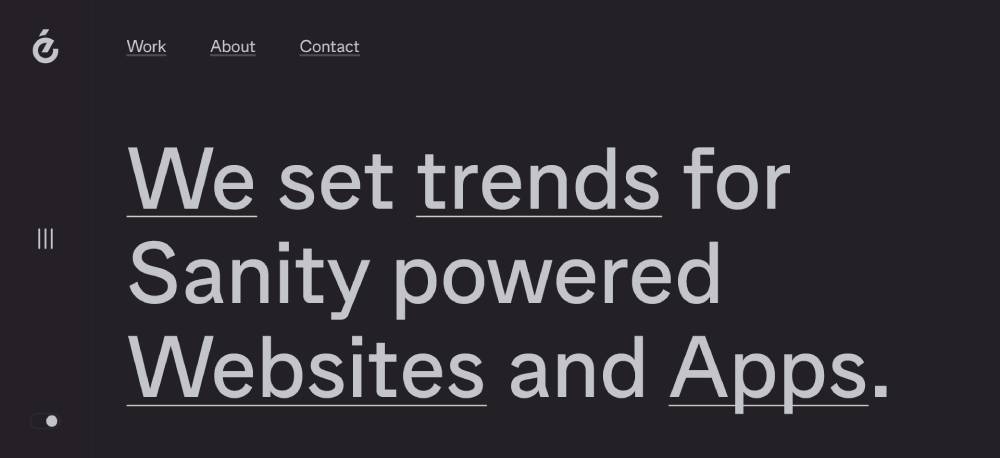
Paxafe Risk Management for Visibility Control Towers
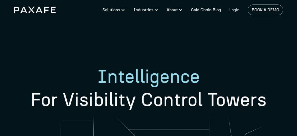
Soft and energetic alignment arises, using a dark backdrop enhanced by light gray text and pastel green and blue accents. This coloring adds vibrancy while improving readability without overwhelming users. Well-detailed content builds confidence in its risk management solutions. Soft accents bring fresh exuberance, emphasizing futuristic design logics.
Angelina Swann The Goddess Collection
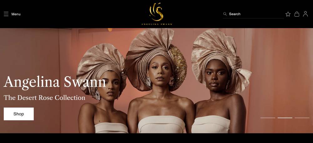
Luxurious high-fashion photography enhanced by a dark background. White and gold text complement the visuals, creating an indulgent feel. Interactive galleries and video clips offer immersive interaction, establishing design excellence. Accessibility Assistant tool supports inclusivity without compromising style. Consistent design coherence enhances the luxury appeal.
Duckbill Cookies And Coffee Shop
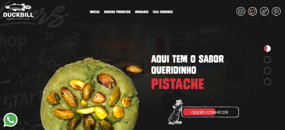
Tantalizes tastebuds with black, red, and white themes. Interactive food elements and parallax effects create a deliciously fun experience. Lazy scrolling aids seamless usability, boosting engagement through rich, creamy transitions. Its enticing theme and design attract and retain interest. Successfully makes browsing both enjoyable and functional.
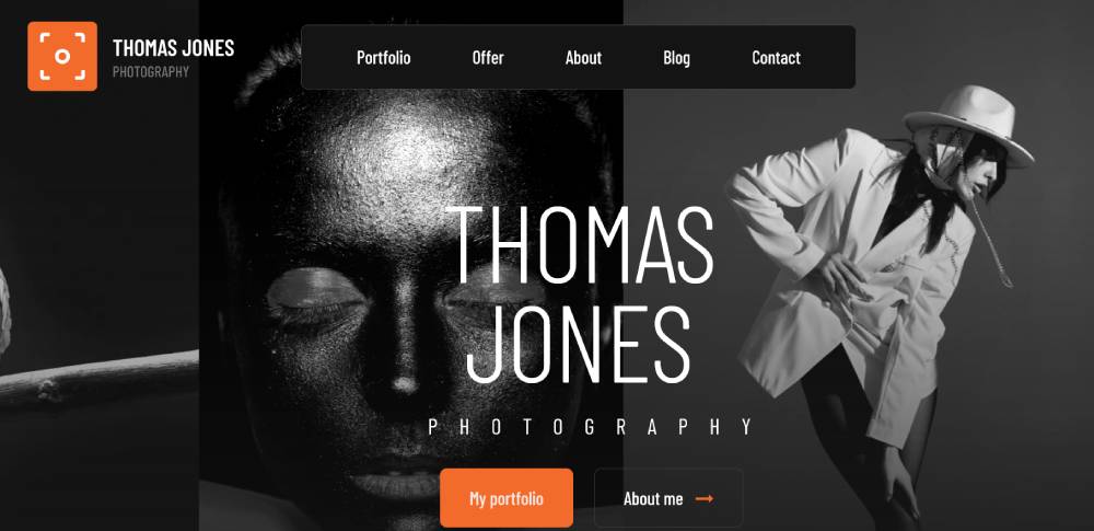
Be Photography 4
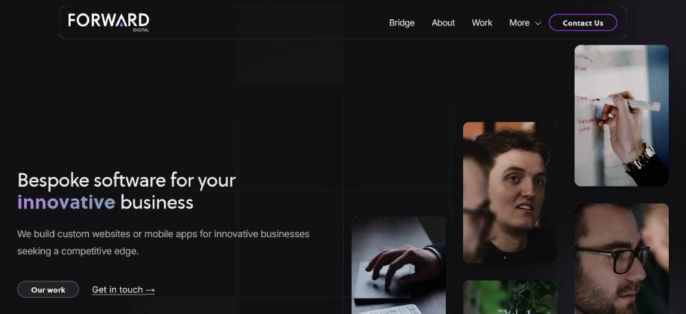
Forward Digital Software Website
Starts with a clean black design, resting on a dynamic grid. Unique split-screen scroll sections enhance user exploration effectively. Typography is thoughtful, with small fonts and plenty of white space ensuring readability. Interactive hover effects drive engagement. The layout is fresh and creative, supporting differentiated browsing experiences.
Tanztheater Wuppertal Terrain Artist Website
Presents a dark yet colorful mix, engaging with scrolling animations and varied layouts. Highlights excellence with high-quality motion effects and large typography. The approach is sleek, weaving captivating narratives into cohesive content. A dark backdrop underpins visual harmony, supporting a detailed exploration of the renowned dance ensemble.
Saint Laurent Revolution Museum
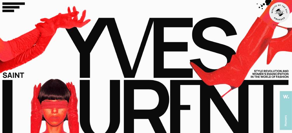
The striking black, red, and white scheme excels on this single-page site. Scrolling animations and complex transitions guide users through engaging narratives effectively. Oversized typography enhances storytelling, positioning the site as a key resource for fashion enthusiasts. Visually aligned with the historical reverence of a fashion icon, it delivers compelling insights efficiently.
InfinityFX Clothing Brand Website
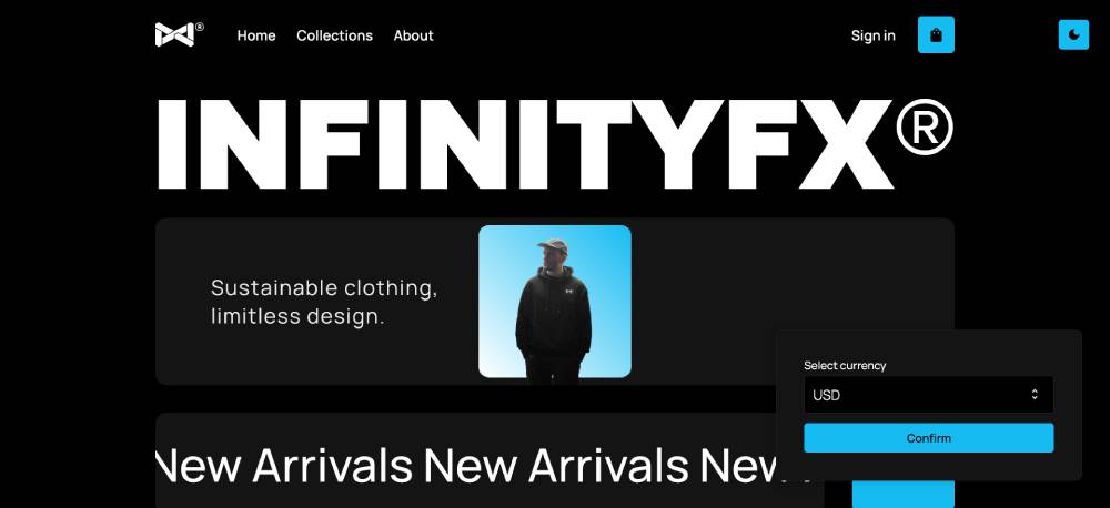
Blends dark aesthetics with eCommerce prowess. Users toggle between light and dark modes, enhancing versatility. Lazy scrolling and big typography aid seamless, efficient browsing. With clean layouts, functionality and engagement go hand in hand. Motion effects further elevate the site, stamping a strong brand mark. Pragmatic design defines a premium shopping experience.
Killer Tennis VR Game Website
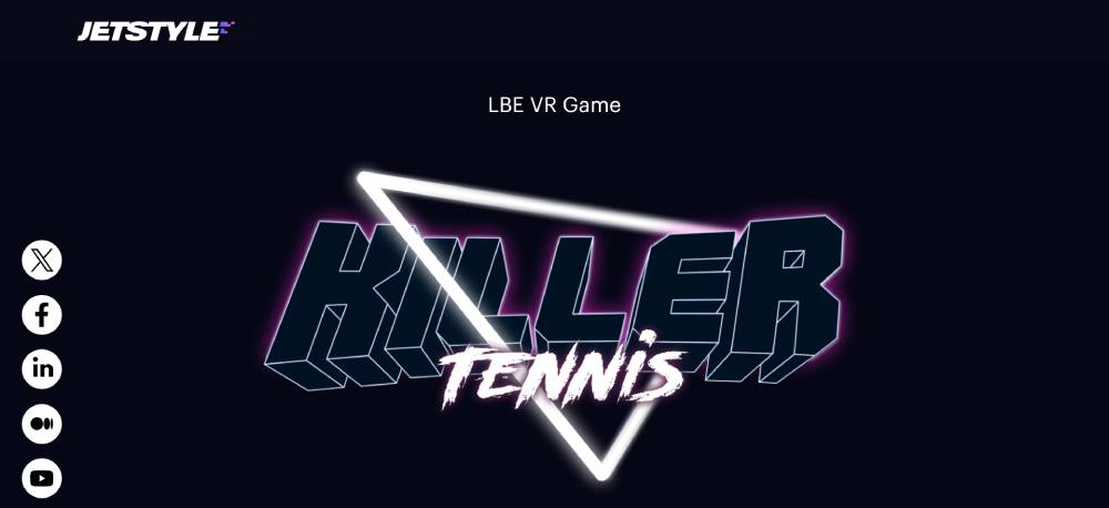
Retro synth-wave aesthetics grab attention, amplified by CGI animations against a dark gradient backdrop. Neon colors create immersive interactivity. A mixed grid design and scrolling animations further enhance user experience, perfectly previewing the non-violent, multiuser VR game. Engagement is consistently sustained by strategic visual elements.
Be AI 3
Raw Lab
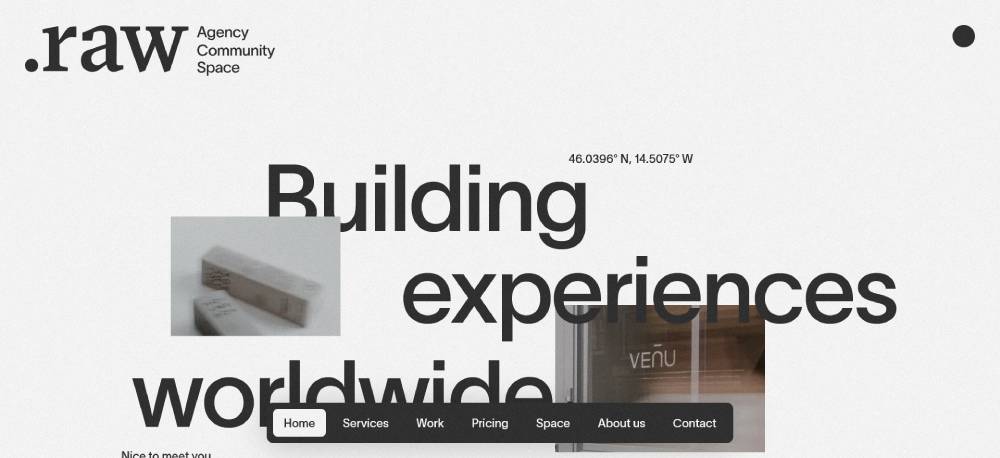
This site blends modern and edgy. Black and white dominate, with sepia adding an old-school twist. Typography? Bold and varied, it grips you. The layout is more than a showcase. It’s a narrative told with gripping images and words. The striking contrast ensures visuals are unforgettable, capturing attention immediately.
Giulia Gartner
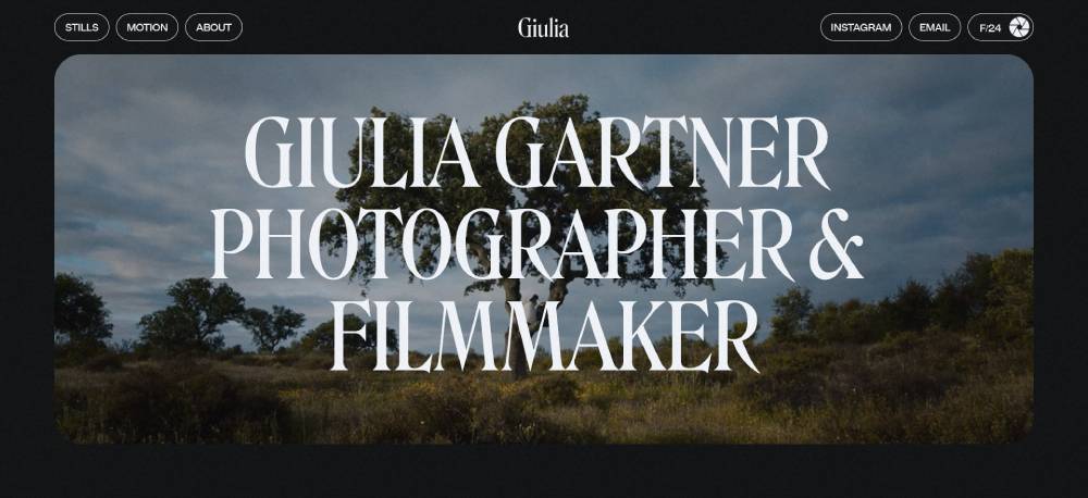
Dark backdrops let stunning photography pop, like stories unfolding on a digital canvas. Full-screen photos command attention, every detail vivid. Simple typography and layout keep the focus on art without distraction. Navigation is seamless, allowing visitors to immerse themselves entirely in visual narratives. It’s a straightforward showcase of photographic brilliance, deeply engaging.
LVNG
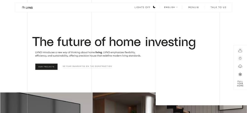
Chic shades of gray and a hint of green. Clean and fresh, aligning modern living and eco-friendly vibes. Layouts are neat, reflecting stylish yet smart interiors. Crisp images deliver clarity, pushing modernity and innovation. Content is open, and descriptive, showing their commitment and trustworthiness in promoting streamlined living spaces.
Yggy Technologies
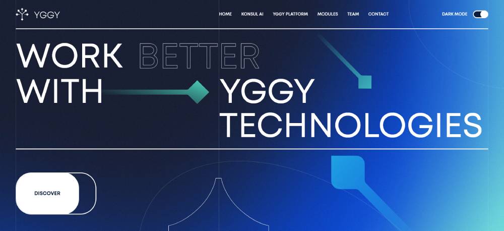
Dark backdrop with bright blue highlights. Cool theme reflects a tech-focused heartbeat. Infographics simplify complex tech talk, making data accessible. Interactive “See How It Works” makes exploration fun. A glimpse into team dynamics creates bonds with site visitors, adding a layer of authenticity. Focused on technological advancements, it aligns with modern professional journeys.
Evensix
Balance of boldness and warmth. Punchy typography contrasts cozy backgrounds. Interactive elements invite engagement. Digital creativity is front and center, not just pretty visuals. Strong typefaces and soft hues coexist, creating a standout design. A virtual chat assistant makes the experience welcoming. It’s about connection and innovative services in the digital sphere.
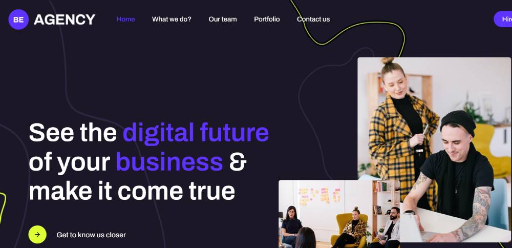
Be Agency 6
Perpetuum
Minimalist yet art-gallery striking. White space breathes clarity into content. Line drawings and unique text layouts evoke creativity. Pastel gradient whispers elegance, setting a serene vibe. Unconventional layout keeps the design fresh and captivating. It's a digital space where sophistication meets simplicity, perfectly aligning with modern visual aesthetics.
Humana Studio
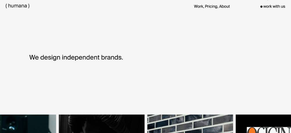
Modern art meets digital design. Black, white, and yellow palette makes a bold statement. Their site reflects a socially conscious outlook with strong design ethos. Mission and impact are clear, supported by stats. Services are upfront, ensuring transparency. It’s about making a difference, injects meaning into visual and digital interactions.
WebTalk
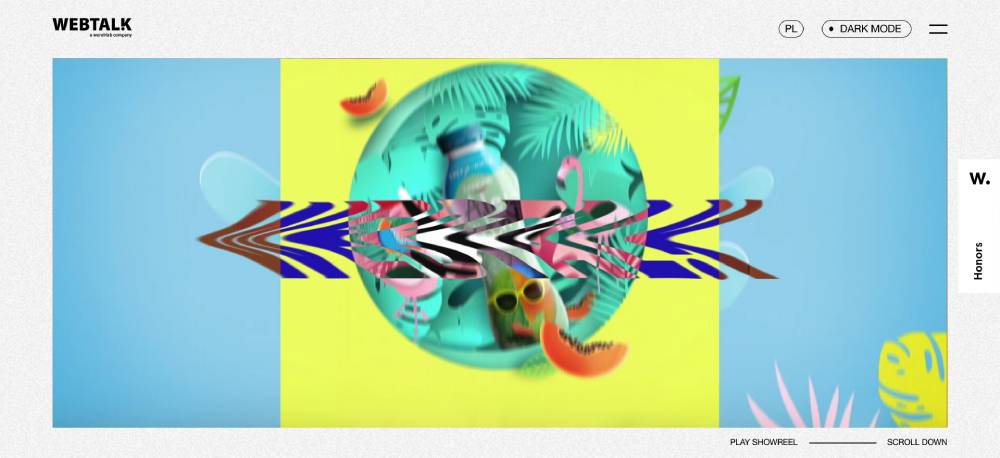
Bold and trendy digital experience. Vibrant animations and images create a dynamic interface, energized by unique flair. Client showcase reads like a success story of collaborations. Crisp messages reinforce digital savvy, projecting forward-thinking strategies. Its trendy style amplifies engagement while maintaining a focus on innovation.
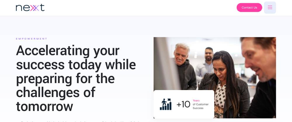
Nexxt Group

Pinks and purples blend into professional vibrancy. Geometric shapes and blocks of color establish order. Text is direct, with bold call-to-action guiding journeys. Partner logos and testimonials upfront build trust instantly. There’s an evident sense of structure and excitement in their digital representation, reinforcing a modern business's organizational dynamism.
Re-scripted
Clear focus in minimalist form. Smart color pops guide attention. Layout breathes simplicity, ease of use is undeniable. Partner showcases spotlight teamwork and achievement. A professional yet welcoming design, it balances clarity with visual appeal. The layout communicates their consulting prowess without clutter, contributing to a highly effective digital interface.
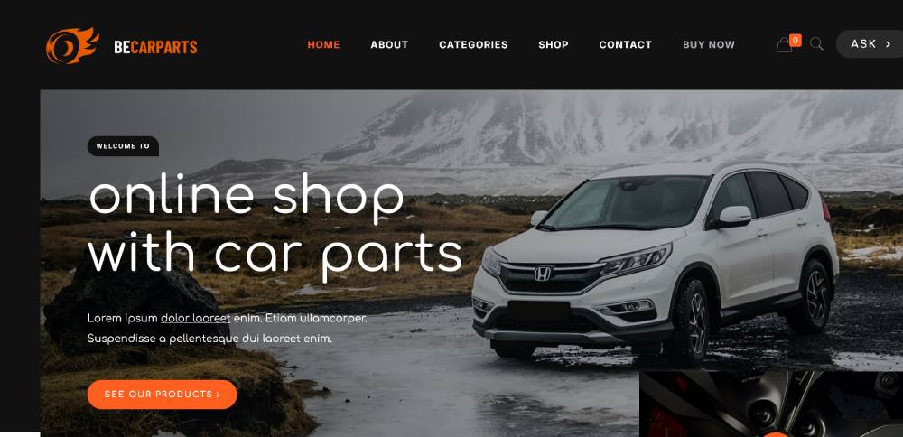
Be Car Parts
Lusion
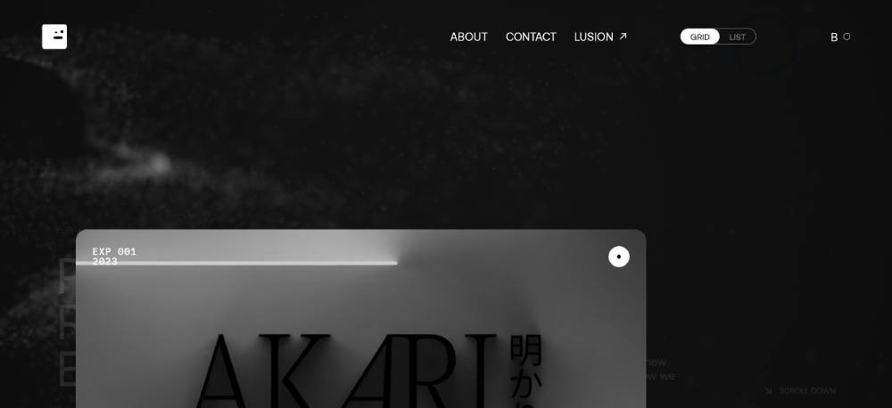
Monochrome palette adds sophistication. Minimalist but not plain, it shines in tech wizardry. Interactive previews open windows to innovation. Each click invites deeper exploration. Design is clean, a mindful browsing experience emphasizing focus. Visual consistency and technological homage weave together beautifully in a disciplined, creatively focused approach.
Stink Studios
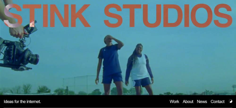
Creativity explodes on this digital canvas. It’s vibrant storytelling through colors and shapes. Portfolio is dynamic, rich visuals unfold like stories. Multimedia elements push creativity from static to alive. Mission and values resound in bold manifestations. It’s a proud declaration of their role in creative digital craftsmanship.
Overseas
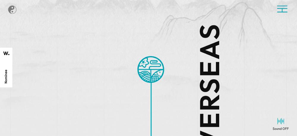
Asian art meets contemporary design. Clean layout supports cultural richness, vibrant ink imagery. Easy exploration complements the cultural journey. Real-time Instagram adds vitality, linking past and present. It’s a tribute to tradition and advanced design, providing an enriching user experience through its seamless visual harmony.
SEIZON
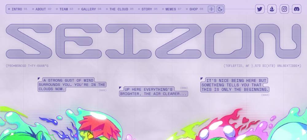
Purple-tinted serenity for digital consulting. Clean and organized, like a favorite book, with content taking center stage. Icons and typography blend in personality, simplifying comprehension. Accordion sections keep everything tidy, allowing detailed immersion when curiosity strikes. Perfectly complements their user-focused design philosophy with its straightforward execution.
FAQ on Dark Mode Web Design
What is dark mode web design?
Dark mode web design focuses on using darker color palettes for website interfaces. It primarily features black or dark backgrounds combined with light text.
This approach can reduce eye strain and save device battery life. Many design tools, like Figma and Sketch, support this popular trend with useful features.
Why is dark mode popular?
Dark mode has become popular because it provides a modern and sleek aesthetic while enhancing readability.
It helps reduce eye fatigue in low-light environments, making it easier for users to interact with digital content for longer periods. This mode is especially a hit in mobile applications and OLED screen-powered devices.
How do I implement dark mode in web design?
Start with HTML5 and CSS3 to design a dark-themed website. Tools like JavaScript can dynamically change color schemes, ensuring smooth transitions between light and dark modes.
Consider front-end frameworks like Material Design or Bootstrap, which provide built-in dark mode options to make the process seamless.
What are the design guidelines for dark mode?
Keep contrast in mind for text readability. Use high-quality, legible fonts and avoid pure black backgrounds; opt for dark greys instead.
Incorporate minimalist UI elements and pay attention to accessibility standards and visual hierarchy. Test your designs for adaptability across different devices and screen sizes too.
How does dark mode affect user experience?
Dark mode can enhance user experience by reducing eye strain and extending battery life on OLED screens. It offers a sleek and modern vibe, improving engagement.
However, some users may find it harder to read, especially in bright light. Provide an easy switch option between both modes for the best results.
Can dark mode impact website accessibility?
Yes, it can. While dark mode provides comfort for many users, it may present challenges for some with vision impairments.
Ensure proper contrast ratios and consider accessibility guidelines to accommodate a wider audience. Incorporating responsive design and testing across multiple devices helps maintain accessibility and usability.
Are there any tools to help with dark mode design?
Certainly. Tools like Adobe XD, Figma, and Sketch offer features to simplify dark mode design. They allow designers to switch color schemes and prototype changes effortlessly.
Google’s Material Design also provides pre-made dark mode components, helping streamline the design process with ready-to-use UI templates.
What examples highlight successful dark mode designs?
Successful dark mode designs often showcase clean, minimal interfaces with clear contrast and intuitive navigation. Examples include Spotify with its sleek look, or Twitter’s ease of use.
These sites maximize readability and comfort while maintaining a modern aesthetic. Studying these examples can be a great learning resource.
How can dark mode enhance user engagement?
Dark mode can enhance user engagement by providing a visually appealing experience that feels cozy and comfortable for extended periods. Its modern aesthetic draws users in, encouraging interactions.
With reduced eye strain, users are more likely to stay and enjoy the content longer, boosting overall user retention.
What challenges might arise with dark mode web design?
Challenges include maintaining readability and ensuring accessibility for all users, as dark mode's aesthetic may not be suitable for every situation. Balancing contrast without sacrificing style is key.
Testing across various devices and making sure the design doesn't interfere with brand messaging are additional hurdles to consider.
Conclusion
Dark mode web design examples underscore the need for thoughtful design strategies. The mix of contrast, readability, and modern aesthetics offers a key benefit for user experience. With responsive design principles, you're equipped to create intuitive interfaces that are both attractive and functional.
The tools at our disposal, like CSS3, JavaScript, and web frameworks such as Bootstrap, allow us to implement these designs effectively. Eye-catching results don't just happen; they are crafted with precision and care. Address challenges, like accessibility issues, while maintaining the necessary elegance that dark mode inherently brings.
Now, equipped with insights from successful web examples and practical guidelines, you can start creating designs that work well across diverse devices and platforms. Your focus should be on user engagement and satisfaction, encouraging interaction that is both enjoyable and lasting.
Ready to take your web design to the next level? Make it happen.
If you enjoyed reading this article on Dark mode web design, you should check out this one about accessible websites examples.
We also wrote about a few related subjects like the best looking tourism websites, hotel website design, product landing page, great looking spa websites, cool looking personal trainer websites, top notch musician websites, the most impressive luxury websites and impressive animated websites.


