


Custom website design vs. template: which is best for your business in 2026?
April 21, 2026
Using Lottie animation on WordPress without plugins
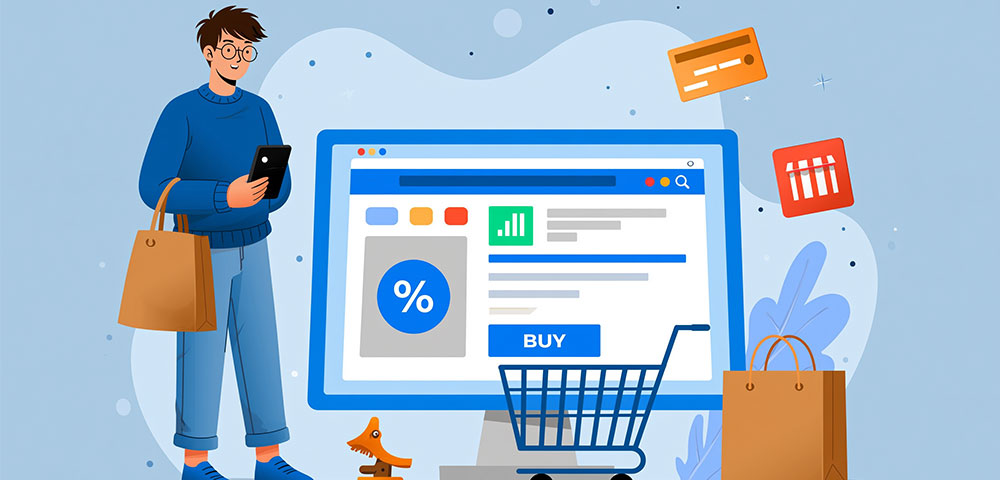
April 23, 2026The median ecommerce landing page converts at just 4.2%, according to Unbounce's 2024 analysis of 41,000 pages. Top performers hit 11.4% or higher. The difference almost always comes down to design.
This collection of ecommerce landing page design examples breaks down what actually works across DTC brands, large retailers, seasonal campaigns, and platform-specific builds on Shopify, Webflow, and BigCommerce.
You'll see real pages with specific takeaways on hero sections, CTA placement, mobile optimization, trust signals, and page speed. Plus the common mistakes that quietly kill conversion rates across online stores every day.
No theory. Just pages that convert, and why they convert.
What Is an Ecommerce Landing Page?
An ecommerce landing page is a standalone web page built around one conversion goal. That goal might be a product purchase, an email signup, or getting someone into a specific collection during a seasonal push.
It's not your homepage. And it's not a product detail page, either.
A homepage serves as a general entry point with navigation to dozens of categories. A product page focuses on specs, reviews, and add-to-cart for one SKU. An ecommerce landing page sits between the two. It tells a story about a product, a campaign, or a brand angle, then pushes the visitor toward a single action.
Brands typically build these pages for paid ad campaigns on Google Ads or Meta Ads, email blasts tied to product launches, influencer collaborations, and seasonal promotions like Black Friday or holiday gifting guides.
Think about how Allbirds runs a landing page for each shoe line during a sustainability campaign. Or how Glossier builds dedicated pages for new product drops shared across Instagram Stories. These aren't just product pages with a fresh coat of paint. They're purpose-built for a specific traffic source and a specific audience segment.
Unbounce's 2024 Conversion Benchmark Report (analyzing 41,000 landing pages and 464 million visitors) found the median conversion rate for ecommerce landing pages is 4.2%. That's the middle of the pack. Top performers in the 75th percentile hit 11.4% or higher.
The gap between average and top-tier is massive. And it almost always comes down to design decisions.
What Makes an Ecommerce Landing Page Convert?
Conversion doesn't happen because of one element. It's the result of multiple design choices working together under a single, clear message. But some patterns show up again and again across high-performing pages.
Visual Hierarchy and CTA Clarity
Every ecommerce landing page that converts well has one thing in common: you know exactly what to do within the first three seconds.
That means one primary call to action button, not five competing ones. The CTA sits above the fold, uses contrasting color, and the copy matches the ad or email that brought the visitor in.
Hostinger research shows that pages with a single clear CTA outperform longer, multi-CTA pages by 13.5% in conversion rate.
Product Photography That Sells
Lifestyle context beats white-background product shots on landing pages. Product pages need clean, zoomable images for detail. But landing pages need images that show the product in use, at scale, in someone's hands or home.
SellersCommerce data confirms product images appear on 100% of top-performing ecommerce pages, with pricing information on 96% and customer reviews on 90%.
The brands that convert best pair hero photography with smaller supporting images scattered throughout the page. And they're always optimized for fast loading (more on that below).
Trust Signals Near the Money
Baymard Institute research shows 19% of shoppers abandon carts because they don't trust the site with their credit card information.
That's almost one in five potential customers gone because of a trust problem, not a product problem.
Placing security badges, payment logos, and return policy details near your add-to-cart or checkout area addresses this directly. Trust badges placed near checkout buttons can reduce cart abandonment by up to 32%, according to Hashmeta research across 1,000+ brands.
A clean testimonial page or embedded review block also helps, especially for newer DTC brands that lack the built-in recognition of a Nike or Amazon.
Layout Patterns That Appear in High-Performing Pages
After reviewing dozens of top-converting ecommerce landing pages, a few structural patterns keep showing up.
|
Section |
Purpose |
Typical Position |
|
Hero with product focus |
Grabs attention, states value prop |
Top of page |
|
Benefit strip (icon row) |
Quick-scan feature highlights |
Below hero |
|
Social proof block |
Reviews, UGC, press logos |
Mid-page |
|
Sticky CTA bar |
Keeps purchase action visible |
Fixed bottom or header |
Businesses with 10 to 15 landing pages generate 55% more leads than those with fewer than 10, according to HubSpot data. The takeaway: don't run one generic landing page for everything. Build targeted pages for each campaign, each audience segment, each product category.
Ecommerce Landing Page Examples from DTC Brands
Direct-to-consumer brands live and die by their landing pages. They don't have retail shelf space doing the selling for them. The page is the store.
And because DTC brands control every pixel of the experience, their landing pages tend to be the most instructive examples in ecommerce.
Ridge Wallet
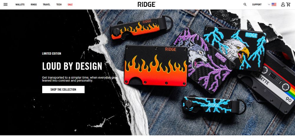
Ridge does something most DTC brands skip: they lead with social proof in the hero itself. Aggregate review counts and star ratings sit right next to the product image. Before you even scroll, you see that 100,000+ people already bought this thing.
The rest of the page layers comparison charts (Ridge vs. traditional wallets), GIF demos showing how the wallet works, and a sticky add-to-cart bar on mobile.
It's aggressive. But it works for a product category (wallets) where the visitor needs convincing that a metal wallet is even a good idea.
Gymshark
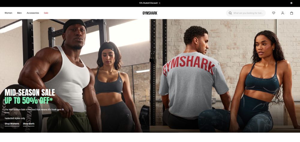
Gymshark uses landing pages heavily for new collection drops. Their approach is image-first. Big, full-bleed photos of athletes wearing the gear. Minimal text.
What stands out is how differently their desktop and mobile layouts behave. On desktop, you get a two-column grid with product shots and copy side by side. On mobile, it collapses into a vertical scroll with large tap targets and a bottom-sticky "Shop Now" bar. Given that mobile accounts for roughly 75% of ecommerce website traffic (Dynamic Yield data), this mobile-first thinking matters.
What DTC Brands Get Right About Hero Sections
Three patterns across the strongest DTC landing pages:
- The headline matches the ad copy word-for-word (message match reduces bounce)
- The hero image shows the product being used, not just sitting on a table
- There's exactly one CTA in the hero, and it uses first-person language ("Get Mine" instead of "Buy Now")
These aren't revolutionary ideas. But most brands still get them wrong. I've seen websites with bad design where the hero section has three buttons, a navigation bar, a popup, and an auto-playing video all fighting for attention. That's how you get a bounce rate above 80%.
Ecommerce Landing Page Examples from Large Retailers
Large retailers play a different game than DTC brands. They have thousands of SKUs, established trust, and traffic from every channel imaginable. Their landing pages reflect those constraints.
Nike
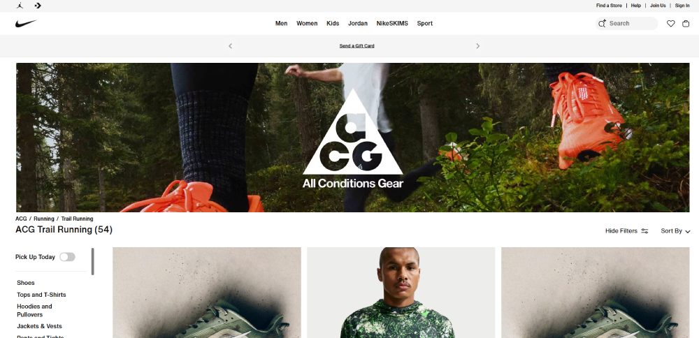
Nike's campaign pages are landing pages disguised as editorial content. When they launch a new Air Max colorway, the page reads like a mini-magazine feature. Full-screen video hero, scrolling parallax sections with athlete stories, and product cards woven throughout.
Nike doesn't need trust badges. The brand itself is the trust signal. So they invest that page real estate in storytelling and lifestyle imagery instead.
What's worth copying here (even if you're not Nike): the way they structure the page as a narrative with product touchpoints rather than a product grid with marketing copy bolted on.
Amazon
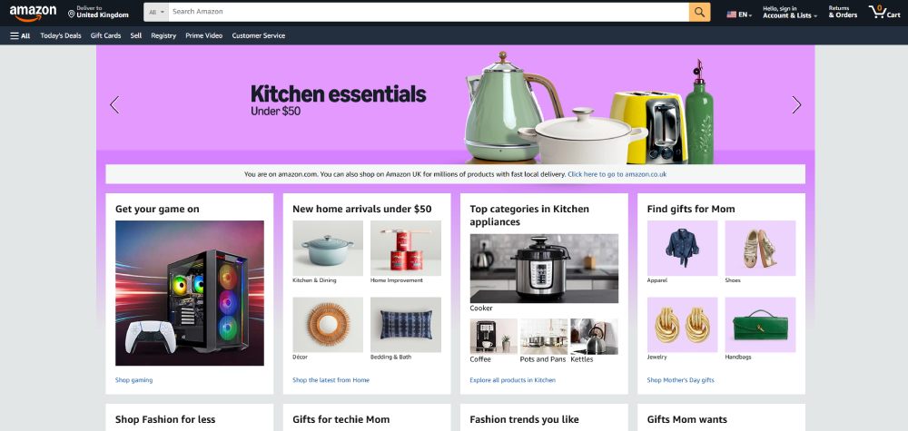
Amazon landing pages are the opposite of pretty. And that's kind of the point.
Their category landing pages (like "Best Sellers in Kitchen") rely on personalized product grids, recommendation blocks, and dynamic pricing. The design is dense, data-heavy, and optimized for information over aesthetics.
Amazon's "Today's Deals" landing pages convert well because they leverage urgency (countdown timers, limited-time pricing) alongside the trust that comes from being, well, Amazon. Profitero research found that the Amazon's Choice badge alone drives 17% more traffic and a 25% higher conversion rate for sellers.
Target
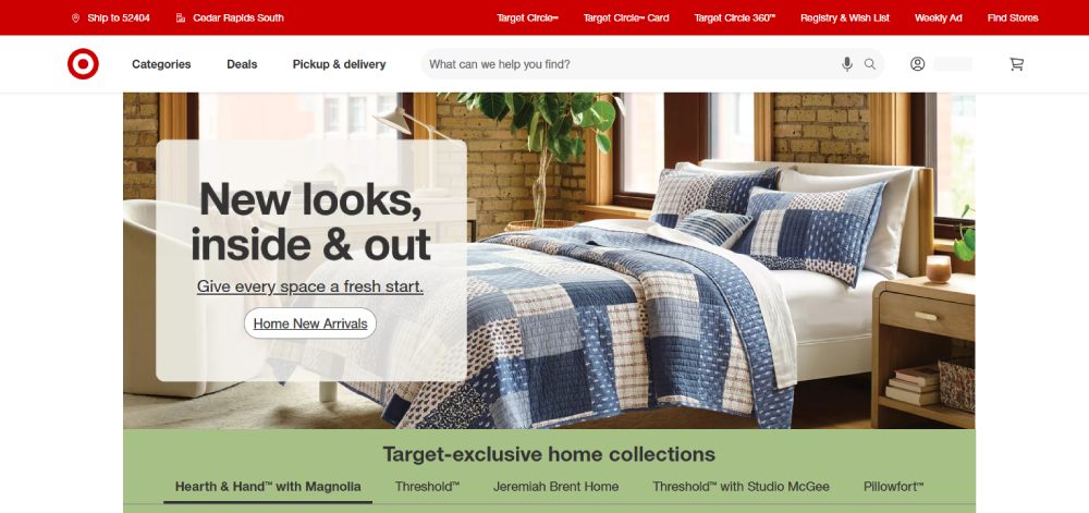
Target sits somewhere between Nike's editorial approach and Amazon's data-driven grids. Their seasonal landing pages (back-to-school, holiday gifting) mix curated product picks with lifestyle photography and clear category links.
They use color schemes that shift with each campaign. A holiday page gets red and green. Back-to-school is bright yellows and blues. It's simple, but it creates visual distinction between campaigns, which matters when you're running dozens of them per year.
How Enterprise Retailers Handle Navigation
One tricky thing about large retailer landing pages: they can't fully remove navigation the way a DTC brand can. A Shopify store running a Facebook ad can strip the nav bar and force the visitor into a conversion funnel. Target or Nike has to keep the main menu accessible because visitors expect it.
The best enterprise pages compromise by using a minimized sticky header with just a logo, search bar, and cart icon. The full website navigation is still there but collapsed. It keeps the focus on the campaign content without trapping the visitor.
Ecommerce Landing Page Examples for Seasonal and Sale Campaigns
Seasonal pages are temporary by nature. They go live, run hard for a few days or weeks, and then disappear. But the design decisions that make them work are some of the most instructive in ecommerce.
Black Friday and Flash Sale Pages
Black Friday landing pages share a few universal traits: dark backgrounds, bold typography, countdown timers, and red or yellow accent colors. Gymshark, Fashion Nova, and Dollar Shave Club all follow this playbook.
What separates the good ones from the generic: specificity. The best Black Friday pages don't just say "Up to 50% off everything." They break deals into categories, show original vs. sale prices, and highlight limited-stock items with low-inventory indicators.
Hostinger data shows that embedding video on landing pages can boost conversions by up to 86%. For flash sales, short product demo clips or "unboxing" style videos play well because they create urgency and excitement without requiring the visitor to read anything.
Holiday Gifting Pages
Gift guide landing pages work differently than standard sale pages. The visitor isn't buying for themselves. They're usually uncertain about what to pick, and they want the page to filter options for them.
The strongest holiday landing pages use segmentation right on the page: "Gifts for Her," "Under $50," "For the Person Who Has Everything." Each segment links to a curated mini-collection rather than a full category page.
A well-structured form design also helps here. Some brands add a short quiz ("Who are you shopping for?" / "What's your budget?") that filters the product selection dynamically.
Urgency and Scarcity in Design
Countdown timers, stock indicators, and limited-edition badges all tap into scarcity psychology. But there's a line between effective urgency and manipulative design.
|
Urgency Element |
Works When... |
Backfires When... |
|
Countdown timer |
Tied to a real deadline (sale ends Sunday) |
Resets every time the page loads |
|
Low stock alert |
Shows real inventory data |
Says "Only 2 left!" on every product |
|
Limited edition badge |
Genuinely limited run |
Applied to standard products |
Visitors catch on fast. If every product says "Almost gone!" and the timer resets on refresh, you're damaging trust, not building it. Forter's 2024 research confirms consumers spend 51% more with retailers they trust.
Post-Campaign Handling
Something a lot of brands forget: what happens to the page after the sale ends?
The smart play is a 301 redirect to the next active campaign or the main store page. Dead landing pages returning 404 errors waste link equity and frustrate visitors who bookmarked the URL. If you're running seasonal campaigns regularly, set up a redirect plan before the page goes live.
Ecommerce Landing Page Examples Built with Shopify, Webflow, and Other Platforms
The platform you use shapes what's possible. And for most ecommerce brands, that platform is Shopify.
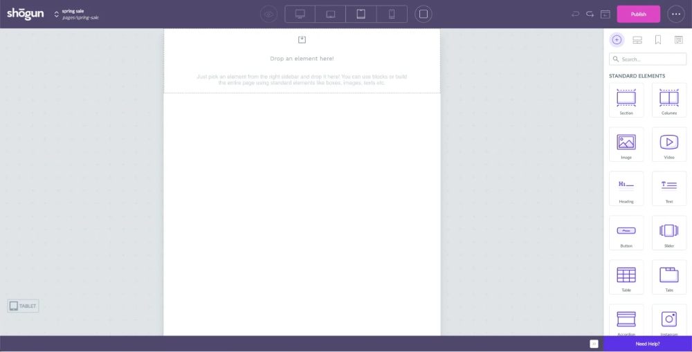
Shopify Landing Pages
Shopify's native theme editor isn't built for custom landing pages. It's designed for standard ecommerce layouts: homepage, collection page, product page. So most Shopify stores use page builders like GemPages, Shogun, or PageFly to create dedicated landing pages.
GemPages gives you drag-and-drop control with pre-built ecommerce sections (hero, product grid, countdown timer, FAQ accordion). It's fast to build with, but pages can look templated if you don't customize the styles heavily.
Shogun offers more design flexibility and A/B testing built in. It's pricier, but if you're running multiple landing pages for paid campaigns, the testing alone justifies the cost. Remember, only 1 out of 8 A/B tests on landing pages produces statistically significant results (Hostinger data). You need volume to find winners.
At least in my experience, the biggest limitation with Shopify page builders isn't design flexibility. It's page speed. Every builder adds JavaScript overhead. And speed matters more than most people realize.
Shopify Landing Pages vs. Custom-Built Pages
Google's collaborative research showed that a 0.1-second improvement in mobile site speed increases retail conversions by 8.4% and average order value by 9.2%. A 0.1-second difference. That's the margin.
|
Factor |
Shopify Page Builder |
Custom-Built (HTML/Liquid) |
|
Build speed |
Hours |
Days to weeks |
|
Design ceiling |
Medium-high |
Unlimited |
|
Page load speed |
Slower (extra JS) |
Faster (lean code) |
|
A/B testing |
Built-in (e.g., Shogun) |
Requires external tools |
|
Maintenance |
Easy, no-code |
Needs a developer |
For brands spending over $10,000/month on paid ads, custom-built landing pages typically pay for themselves through better conversion rates. For everyone else, a well-optimized Shopify page builder gets you 80% of the way there.
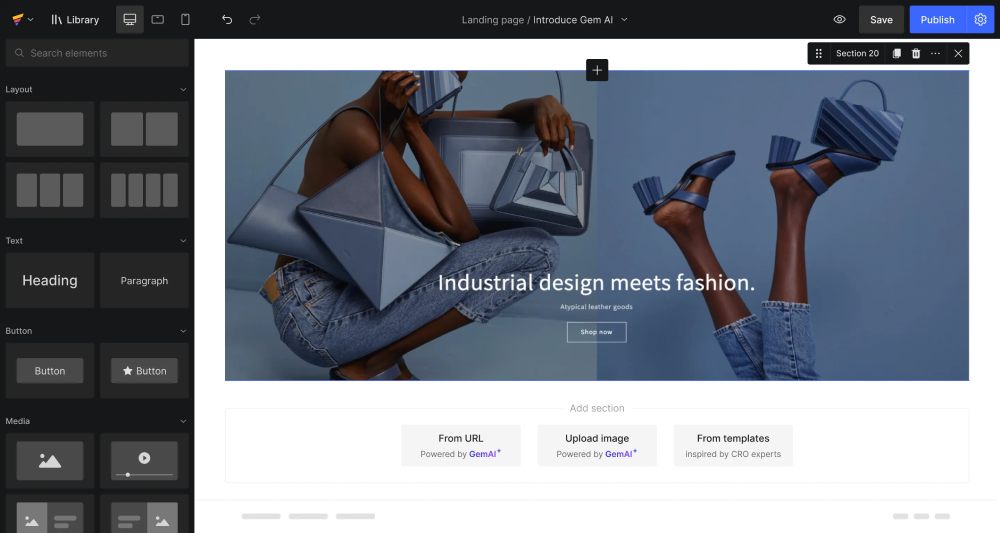
Webflow Ecommerce Pages
 Webflow gives designers full CSS control without writing code. The ecommerce landing pages built on Webflow tend to look more like modern landing pages from design agencies than traditional online stores.
The trade-off: Webflow's ecommerce features are still more limited than Shopify's. Inventory management, multi-variant products, and checkout customization don't match what Shopify offers out of the box. But if your primary goal is a visually stunning campaign page that converts paid traffic, Webflow is hard to beat.
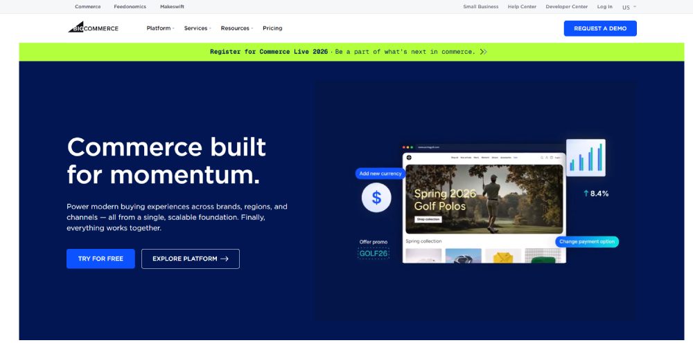
BigCommerce, Wix, and Squarespace
BigCommerce targets mid-market and enterprise stores. Its landing page capabilities depend heavily on the theme and any third-party integrations. Less design flexibility than Webflow, more built-in ecommerce muscle than Shopify in some areas (like multi-storefront support).
 Wix and Squarespace are simpler. They work fine for small stores or single-product brands where you need a product landing page up fast. But they hit walls with advanced ecommerce functionality, page speed optimization, and conversion rate testing at scale.
Platform choice matters. But it matters less than most people think. A well-designed landing page on Squarespace will outperform a poorly designed one on Shopify every time. The platform gives you tools. What you do with them determines results.
Ecommerce Landing Page Examples for Mobile
Mobile accounts for roughly 76% of all ecommerce site traffic, according to Dynamic Yield's 2024-2025 analysis. But mobile conversion rates still trail desktop by a wide margin.
That gap isn't a traffic problem. It's a design problem.
The landing pages that close the mobile conversion gap share specific design decisions you can identify and copy.
Thumb-Zone CTA Placement
The bottom third of the screen is where thumbs naturally rest. The best mobile ecommerce pages place their primary CTA button in this zone, either as a fixed bottom bar or a large button anchored to the lower portion of the viewport.
Uber's mobile landing page is a textbook example. The "See prices" button sits exactly where a thumb naturally lands, with input fields spaced wide enough to prevent tap errors.
Canva does something similar with "Start designing" placed prominently in the thumb zone while secondary options like "Log in" stay visible but smaller.
Single-Column Layouts and Content Stacking
Involve.me data shows 82.9% of landing page traffic now comes from mobile devices. Desktop-first layouts with side-by-side columns simply don't work for the majority of visitors.
- Single-column layouts eliminate horizontal scrolling entirely
- Accordion sections let users expand only what they care about
- Vertical product cards stack cleanly without breaking the scroll flow
Mindful Chef's mobile page demonstrates this well. A full-bleed food hero image sits at the top, followed by a single "Find Your Match" CTA, then stacked social proof. No columns, no clutter.
Image Sizing and Load Strategy on Mobile
Google research confirms a 0.1-second mobile speed improvement lifts ecommerce conversions by 8.4%. On mobile networks (especially 4G), uncompressed hero images are the biggest conversion killer.
What fast-loading mobile landing pages do differently:
- Serve WEBP or AVIF formats instead of JPEG or PNG
- Lazy-load all images below the fold
- Use responsive images that match the device's actual display size
Sticky Elements on Smaller Screens
|
Sticky Element |
Best Practice |
Common Mistake |
|
Bottom CTA bar |
One button, contrasting color |
Adding multiple links to the bar |
|
Mini cart icon |
Top-right, shows item count |
Covering content with oversized overlays |
|
Promo banner |
Thin, dismissible strip |
Auto-playing video that eats bandwidth |
About 88% of online consumers say they're less likely to return to a site after a poor experience, according to Involve.me research. On mobile, sticky elements that block content or cause layout shifts are the fastest way to create that poor experience.
Common Design Mistakes in Ecommerce Landing Pages
Most ecommerce landing pages don't fail because of bad products. They fail because of fixable design decisions that create friction between the visitor and the purchase.
Too Many CTAs Competing for Attention
A page with "Buy Now," "Learn More," "Subscribe," "Watch Video," and "Share" buttons all visible at once gives the visitor decision paralysis. Hostinger research found that shorter landing pages with a single clear CTA outperform multi-CTA pages by 13.5%.
Pick one action per page. Everything else is a distraction.
Slow-Loading Hero Images and Autoplay Video
53% of mobile users abandon a site if it takes more than 3 seconds to load (GemPages data). Unoptimized hero images and autoplay video without a fallback are the two most common culprits.
Portent's analysis of 5.6 million sessions found that ecommerce sites loading in 1 second convert at 2.5x the rate of those loading in 5 seconds. A beautiful hero video means nothing if 53% of visitors never see it.
Generic Stock Photography
Visitors can spot stock photos instantly. And stock photos signal "this brand doesn't have real products to show you," which kills trust before the page even loads properly.
SellersCommerce data shows product images appear on 100% of top-performing ecommerce pages. Not stock photos. Actual product images, ideally in lifestyle context.
Brands like Warby Parker and Glossier invest heavily in original photography for a reason. Your mileage may vary, but I've never seen a high-converting ecommerce landing page that relied on generic stock imagery.
Ignoring Message Match
Message match: the alignment between your ad creative (headline, image, offer) and what the visitor sees when they land on the page.
If your Facebook ad says "50% Off Summer Collection" and the landing page leads with a generic brand statement about sustainability, you've broken the promise. The visitor bounces because they can't find what they clicked for.
OptiMonk highlights this as one of the most common conversion killers. Using the same generic landing page for different ad campaigns guarantees a mismatch for most traffic segments.
How to Test and Improve an Ecommerce Landing Page
Building a landing page is the easy part. Knowing what to fix after launch is where most brands get stuck.
Only 1 out of 8 A/B tests on landing pages produces statistically significant results, according to Hostinger data. That means you need volume and the right tools to find winners.
A/B Testing What Actually Moves the Needle
High-impact test elements (in order of typical effect size):
- Headline copy and value proposition
- Hero image (lifestyle vs. product-only)
- CTA button text and color
- Page length (short vs. long-form)
Personalized CTAs convert 42% more visitors than generic ones, according to Hostinger. Testing "Get Mine" against "Buy Now" against "Add to Cart" is one of the fastest wins available.
Heatmap and Session Recording Tools
|
Tool |
Cost |
Best For |
|
Microsoft Clarity |
Free (unlimited) |
High-traffic stores needing unlimited session recordings and heatmaps. |
|
Hotjar |
Free tier, then $39/mo+ |
Direct user feedback, automated surveys, and AI-driven funnel analysis. |
|
Google Analytics 4 |
Free |
Detailed conversion tracking, ad spend forecasting, and multi-channel attribution. |
Microsoft Clarity includes built-in ecommerce metrics for Shopify users (checkout abandonment, most-viewed products, purchase data). If you're on Shopify and not running Clarity, you're flying blind on user behavior.
Hotjar adds rage-click detection and user feedback surveys that Clarity doesn't offer. For stores spending real money on paid traffic, running both tools together gives the fullest picture.
When to Redesign vs. When to Tweak
Tweak when your conversion rate is within range of your industry benchmark but not hitting top-performer territory. Change one element at a time. Measure for at least two weeks.
Redesign when your bounce rate sits above 80%, your page loads slower than 4 seconds, or you're running a layout that hasn't been updated in over a year. A website redesign makes sense when incremental changes can't fix structural problems.
Baymard Institute research shows ecommerce sites can gain a 35.26% conversion lift through better checkout design and trust elements alone. Sometimes the biggest wins aren't on the landing page itself but on the next step in the funnel.
How to Build an Ecommerce Landing Page from Scratch
You've seen the examples. You know the mistakes. Now you need to actually build the thing.
The process is simpler than most guides make it sound. But the order you do things in matters a lot.
Choosing a Page Builder or Coding Approach
Your choice depends on two factors: your budget and your technical skill level.
|
Approach |
Time to Launch |
Best When... |
|
Shopify + GemPages/Shogun |
Same day |
Running multiple campaigns, need speed |
|
Webflow |
2–5 days |
Design quality is the priority |
|
Custom HTML/Liquid |
1–3 weeks |
High ad spend, every 0.1s of speed matters |
|
Unbounce / Instapage |
Same day |
Testing landing page concepts fast |
Tools like Unbounce and Instapage are purpose-built for landing pages with A/B testing baked in. They're not full ecommerce platforms, but for dedicated campaign pages driving paid traffic, they work well.
Wireframing the Layout Before Design
Skip straight to design and you'll waste hours rearranging sections later. Wireframe first in Figma, on paper, or even in a basic text document.
Recommended section order for most ecommerce landing pages:
- Hero (product image + headline + CTA)
- Benefit strip or icon row
- Social proof (reviews, UGC, press)
- Product details or comparison
- Secondary CTA
- FAQ or objection handling
This isn't the only way to structure it. But it reflects the pattern that shows up across most high-converting creative landing pages in ecommerce.
Writing Copy That Matches Campaign Intent
Backlinko research shows landing page copy written at a 5th to 7th grade reading level converts at 11.1%, compared to just 5.3% for college-level copy. Simpler wins.
Match your headline to the ad that brought the visitor in. If the ad promised "Free shipping on your first order," the landing page headline should repeat that exact offer, not a clever variation of it.
And keep the body copy short. Most visitors scan, not read. Bold the key benefit. Use short paragraphs. Remove anything that doesn't directly support the CTA.
Pre-Launch Checklist
Before sending any traffic to your new page, walk through this list. I've seen pages go live with broken CTAs, missing tracking, and images that load in 12 seconds. All of it is preventable.
- Run Google PageSpeed Insights (aim for a score above 80 on mobile)
- Test on at least 3 real devices (not just Chrome's mobile preview)
- Verify your Google Analytics 4 tracking fires correctly
- Check that the CTA links to the right product or checkout
- Preview the page from your actual ad or email link
A solid website checklist prevents the kind of launch-day mistakes that burn through ad budget before you've collected any real data. Get the fundamentals right, then optimize from there.
FAQ on Ecommerce Landing Page Design
What is an ecommerce landing page?
A standalone page built around one conversion goal, like a product purchase or email signup. It differs from a homepage or product page by focusing entirely on a single campaign, traffic source, or audience segment.
What makes a good ecommerce landing page design?
Clear visual hierarchy, one primary CTA, fast load speed, and trust signals near the purchase action. The best pages match their headline to the ad that drove the click. Message match reduces bounce rates significantly.
What is a good conversion rate for an ecommerce landing page?
The median sits around 4.2% according to Unbounce's 2024 data. Top performers in the 75th percentile hit 11.4% or higher. Anything below 2% signals a design or targeting problem worth investigating.
Which platforms work best for building ecommerce landing pages?
Shopify with page builders like GemPages or Shogun is the most common setup. Webflow offers more design control. Unbounce and Instapage work well for dedicated campaign pages with built-in A/B testing.
How do I optimize an ecommerce landing page for mobile?
Use single-column layouts, place CTAs in the thumb zone, and compress images to WEBP format. Mobile accounts for over 76% of ecommerce traffic, so mobile optimization directly affects your revenue.
Should I remove navigation from my ecommerce landing page?
For paid ad campaigns, yes. Removing navigation keeps visitors focused on the conversion goal. For organic traffic or brand pages, use a minimized sticky header with just a logo, search, and cart icon.
How many CTAs should an ecommerce landing page have?
One primary CTA repeated at logical scroll points. Pages with a single clear call to action outperform multi-CTA layouts by 13.5%. Multiple buttons competing for attention create decision paralysis.
Do product videos improve landing page conversions?
Yes. Embedding video on landing pages can boost conversions by up to 86%, according to Hostinger data. Short product demos and customer testimonials perform best. Always include a fallback image for slow connections.
How important is page speed for ecommerce landing pages?
A 0.1-second improvement in mobile load time increases retail conversions by 8.4%. Sites loading in 1 second convert at 2.5x the rate of those loading in 5 seconds. Speed is not optional.
How often should I update my ecommerce landing pages?
Test continuously. Run A/B tests on headlines, images, and CTA copy at least monthly. Redesign fully when bounce rates exceed 80% or the page hasn't been updated in over a year.
Conclusion
Every ecommerce landing page design example in this breakdown points to the same truth: conversion rate optimization starts with design decisions, not ad spend. The brands winning on Shopify, Webflow, and BigCommerce build pages around one goal, one audience, and one clear action.
Mobile-first layouts, fast page load speed, and strategic social proof placement separate high-converting pages from the ones bleeding ad budget. Tools like Hotjar, Microsoft Clarity, and Google Analytics 4 give you the data to stop guessing.
Test your headlines. Compress your images. Place trust badges where purchase anxiety peaks.
The gap between a 4% and an 11% conversion rate isn't luck. It's responsive ecommerce design, sharp landing page copywriting, and relentless A/B testing. Start with one page, measure everything, and iterate from there.


