


Manufacturing Website Design Examples You Shouldn’t Miss
January 7, 2026
Top Carpet Cleaning Website Design Examples
January 7, 2026Your gym's website has about three seconds to convince someone to book a class instead of scrolling to the next option.
That's the reality for fitness businesses nowadays.
The best fitness website design examples share common patterns: fast load times, clear booking systems, and visuals that motivate action.
This guide breaks down real fitness websites from brands like Equinox, Orangetheory Fitness, and SoulCycle.
You'll see what works for gym landing pages, personal trainer sites, and boutique studio designs.
Each section covers specific elements: color choices, typography, class schedule displays, mobile optimization, and booking integration with platforms like MindBody and Zen Planner.
What is Fitness Website Design
Fitness website design is the process of creating websites for gyms, personal trainers, yoga studios, CrossFit boxes, and wellness businesses that convert visitors into members.
These sites handle specific tasks: class schedule displays, membership signups, online booking systems, and trainer portfolio pages.
The design approach differs from standard business sites because fitness brands sell transformation, energy, and lifestyle.
Gyms like Equinox, Orangetheory Fitness, and F45 Training use their websites to communicate brand identity before a visitor ever walks through the door.
Boutique fitness studios, supplement stores, and online fitness platforms all fall under this category.
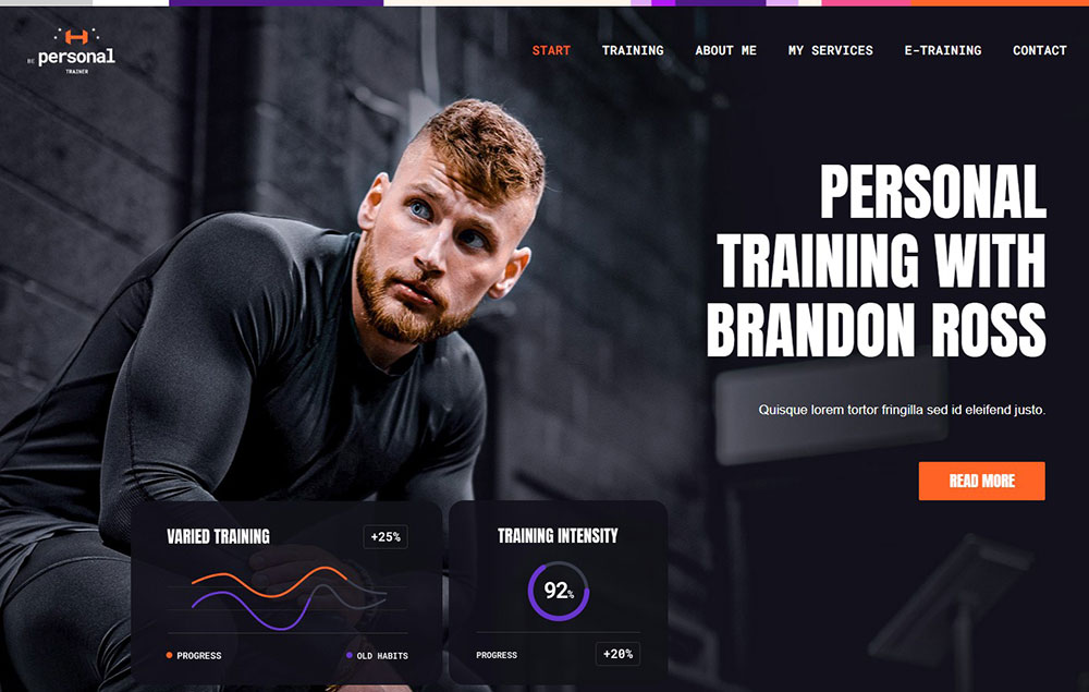
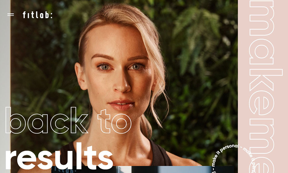
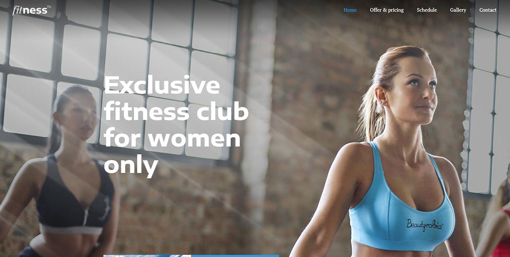
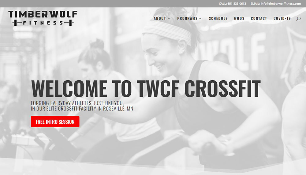
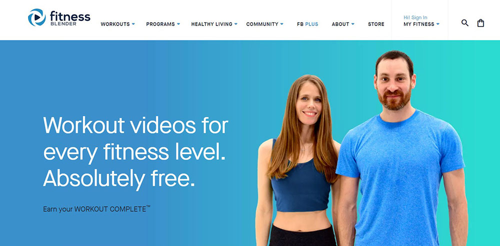
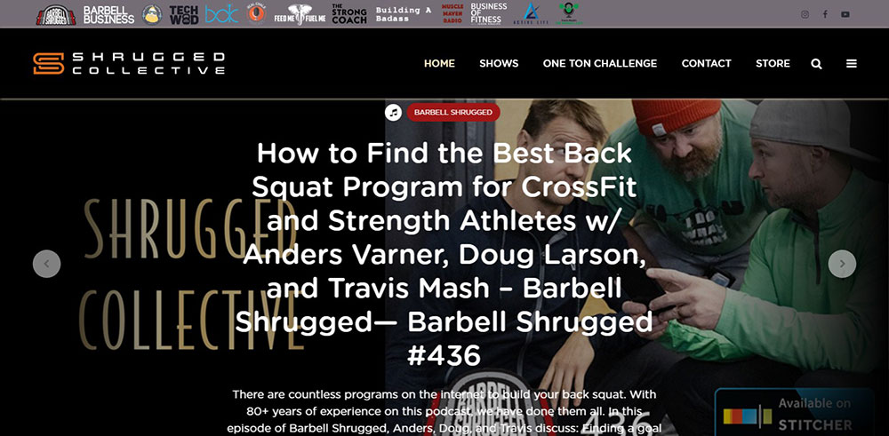
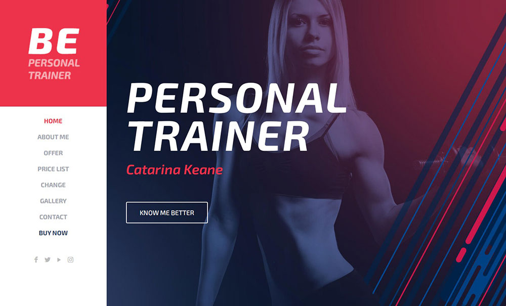
Fitness Website Design Examples
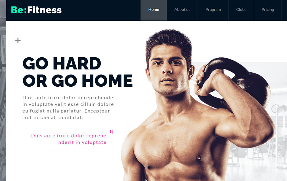
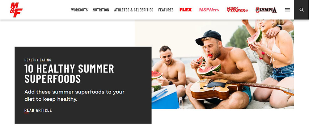
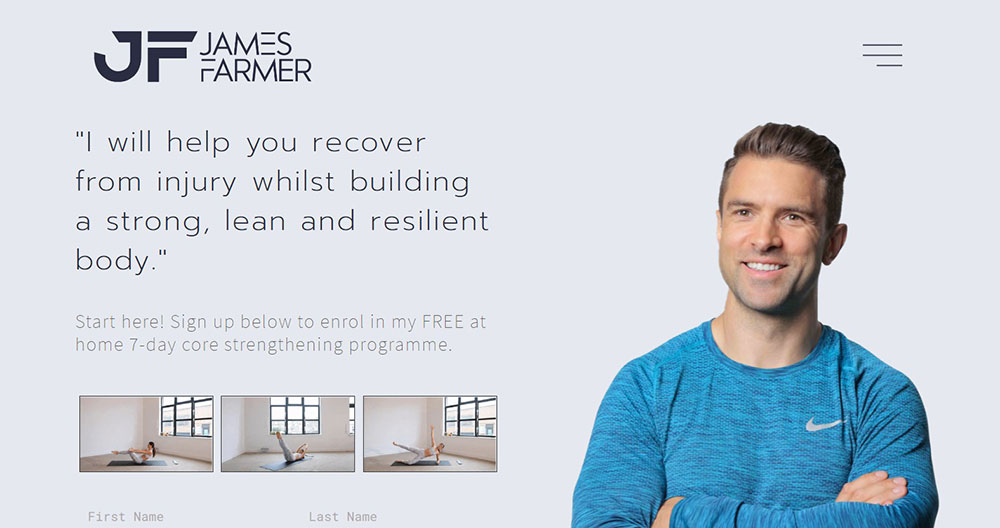
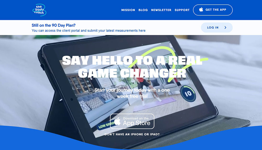
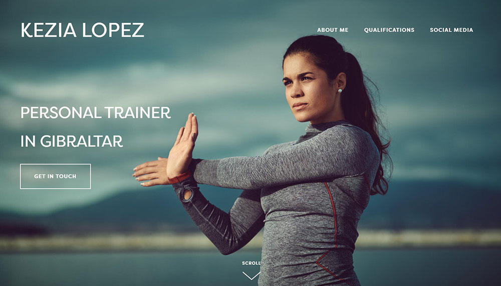
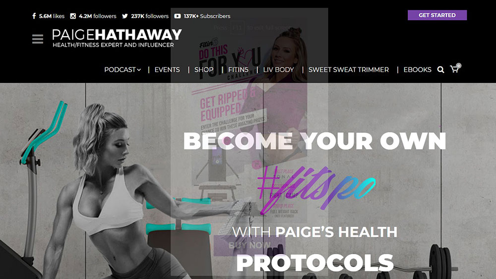
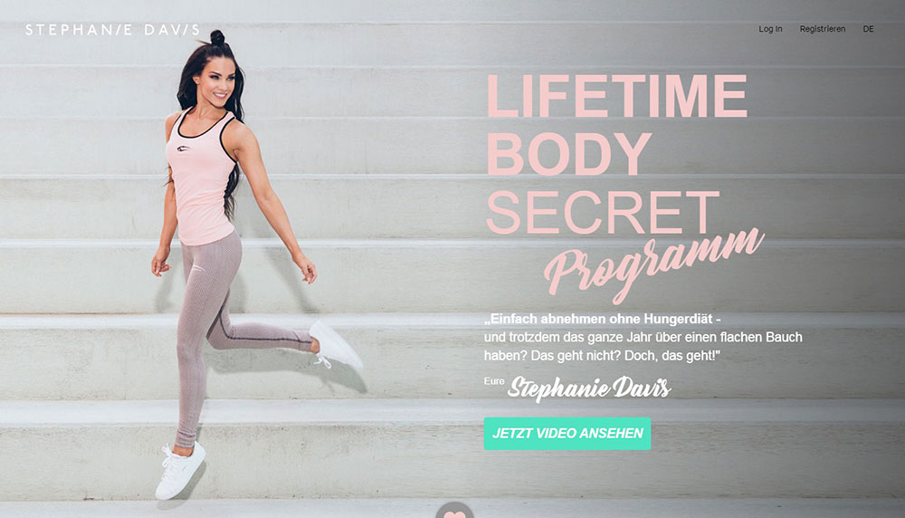
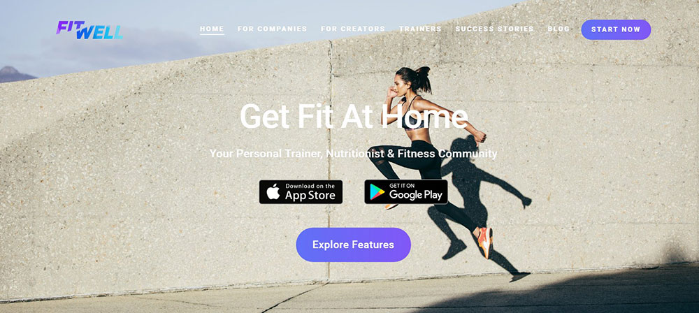
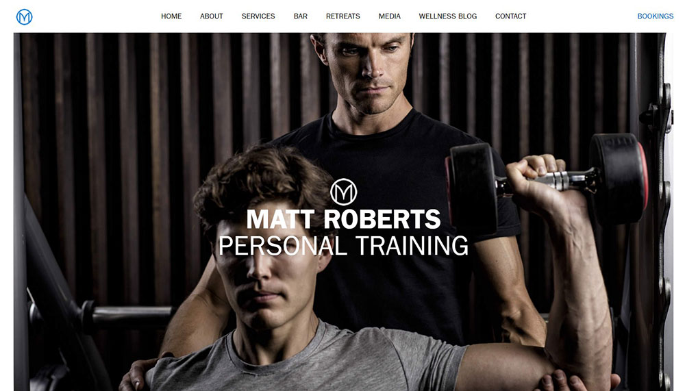
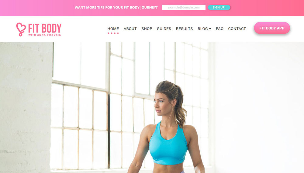
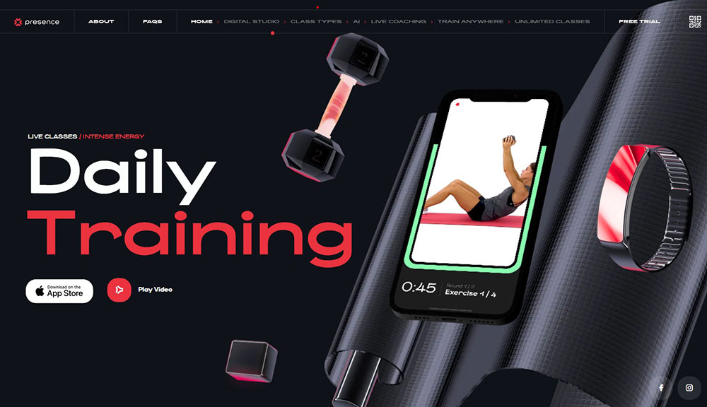
Fitlab


How Fitness Websites Differ from Standard Business Websites
Standard business websites focus on information delivery.
Fitness websites focus on motivation and action.
The visual hierarchy pushes visitors toward booking a class or starting a free trial, not just reading about services.
Most gym website templates include MindBody or Acuity Scheduling integration right in the hero section.
Class schedule widgets need to load fast on mobile since 70% of fitness searches happen on phones.
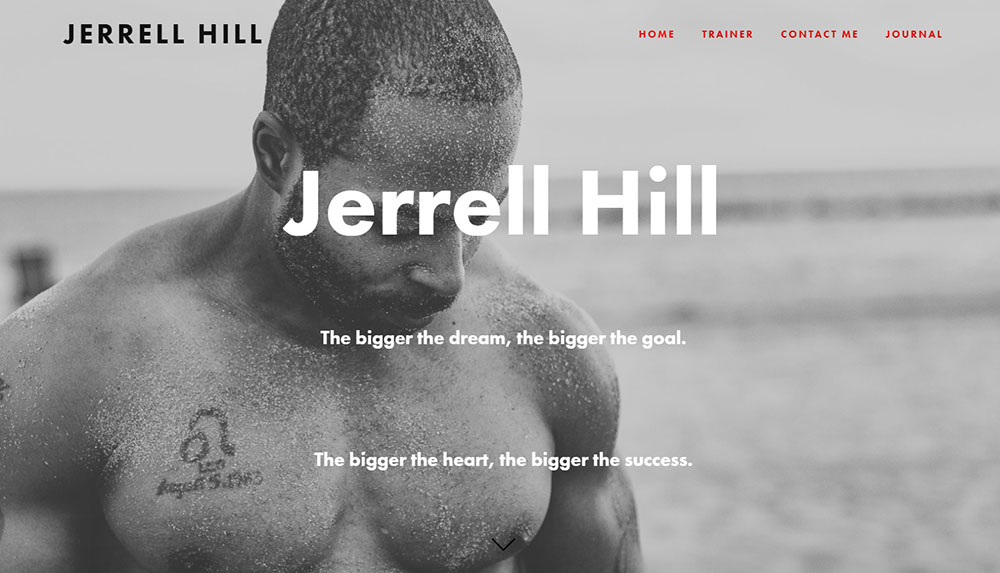
Before-and-after client transformation photos appear constantly, something you rarely see on B2B websites or corporate pages.
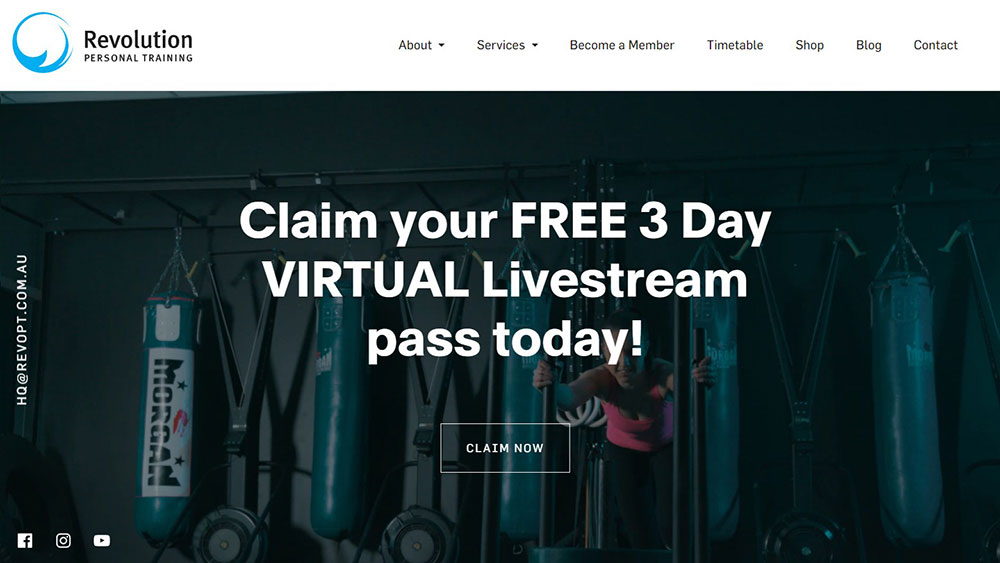
Video backgrounds showing workouts in action create emotional connection immediately.
The call to action buttons are aggressive: "Start Your Free Week" beats "Learn More" every time.
What Makes a Good Fitness Website Design
Good fitness web design balances aesthetics with conversion-focused functionality.
Here are the criteria that separate average from excellent:
Page Load Speed
Google PageSpeed scores above 90 on mobile; Core Web Vitals in green across all metrics.
Compress those workout videos or lose visitors.
Mobile Responsiveness
Thumb-zone navigation for booking buttons; mobile first design is not optional for fitness.
Click-to-call functionality for quick inquiries.
Navigation Structure
Maximum 5-7 main menu items; class schedules and pricing visible within two clicks.
Clean website navigation prevents bounce.
Trust Signals
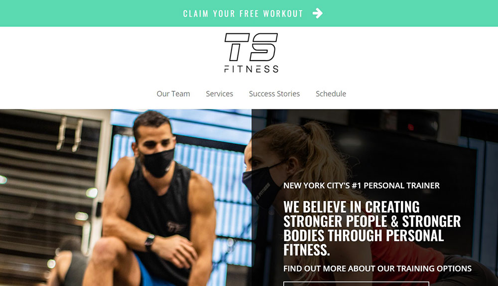
Trainer certifications (ACE, NASM, ISSA) displayed prominently; Google reviews embedded; testimonial pages with real member photos.
Booking Integration
Zen Planner, Vagaro, or ClassPass integration that works without page redirects.
Stripe and PayPal for payment processing.
Pricing Transparency
Clear pricing page with membership tiers; hidden pricing kills conversions for fitness businesses.
What Design Elements Do Top Fitness Websites Share
After analyzing these examples, clear patterns emerge.
Color Choices
Energy colors dominate: oranges, reds, electric blues.
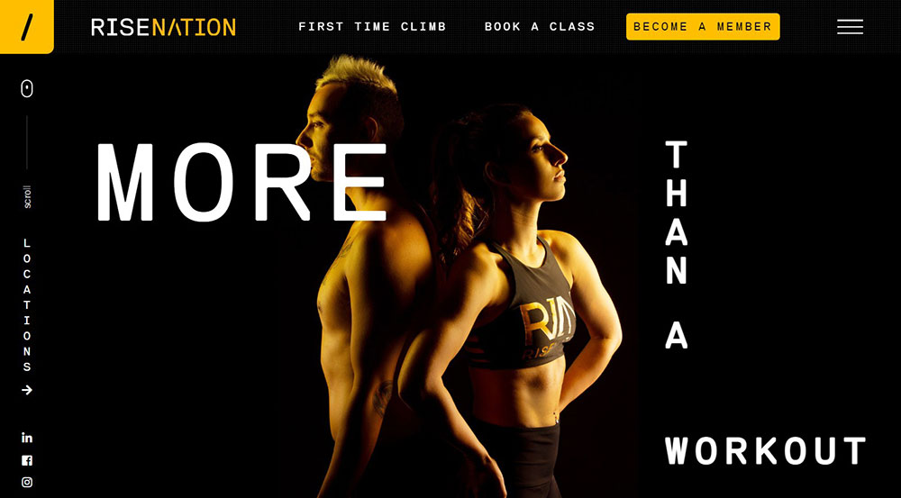
Luxury fitness brands go dark with black backgrounds and minimal accent colors.
Budget gyms use friendlier, approachable palettes.
Typography Patterns
Bold sans-serif fonts for headlines; clean body text for readability.
Google Fonts like Montserrat and Oswald appear frequently in gym websites.
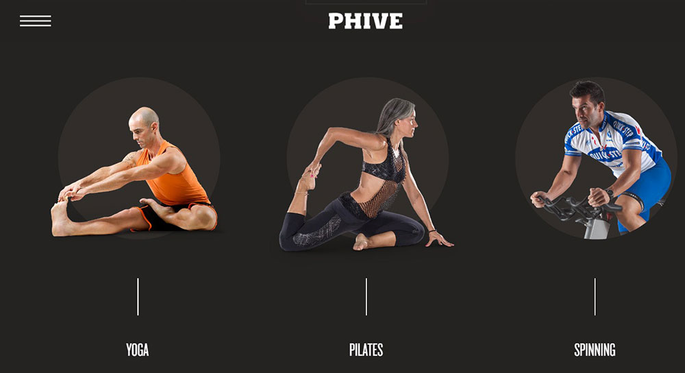
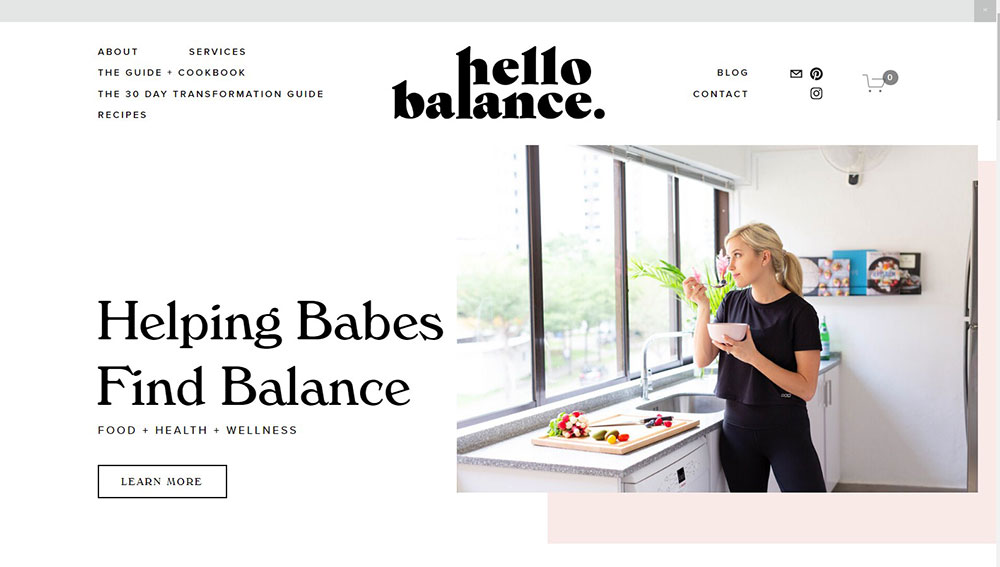
Image Styles
Action shots over posed photos; real members over stock imagery; facility photos that show equipment and space.
Websites with video backgrounds perform better for engagement.
Social Proof Placement
Testimonials near pricing; transformation galleries on dedicated pages; Instagram feeds embedded in footers.
Conversion Elements
Free trial offers above the fold; sticky headers with booking buttons; exit-intent popups with discount codes.
Every successful fitness website prioritizes the path from visitor to member.
How to Choose Colors for a Fitness Website
Color psychology drives fitness website decisions more than aesthetics alone.
Energy-focused gyms use oranges and reds; they trigger excitement and urgency.
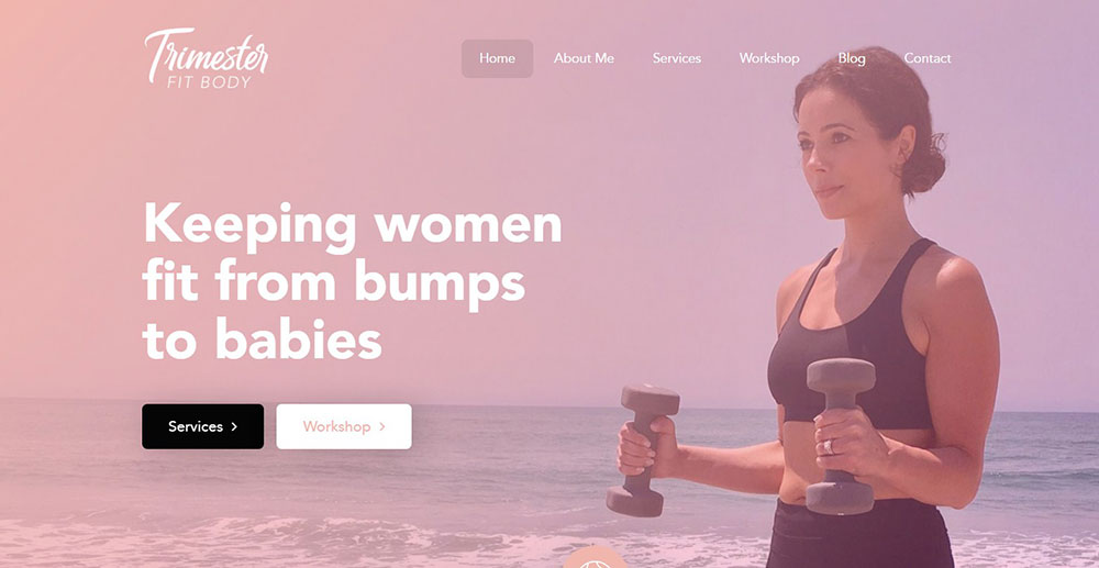
Yoga studios and wellness brands lean toward greens and earth tones for calm.
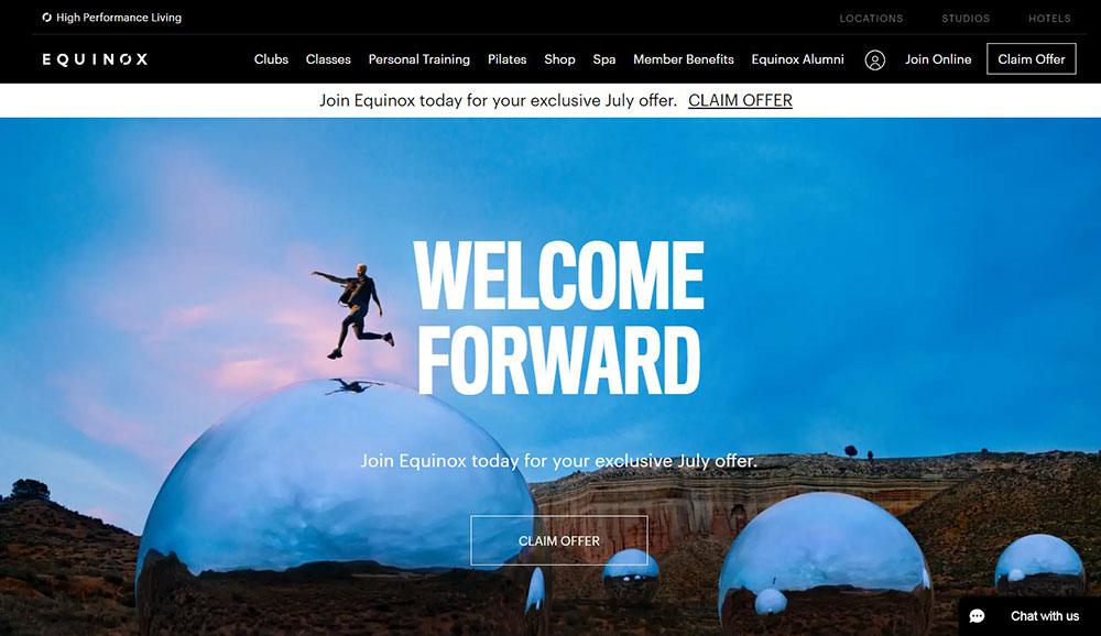
Premium fitness clubs like Equinox choose black backgrounds with minimal accents, following black website trends that signal exclusivity.
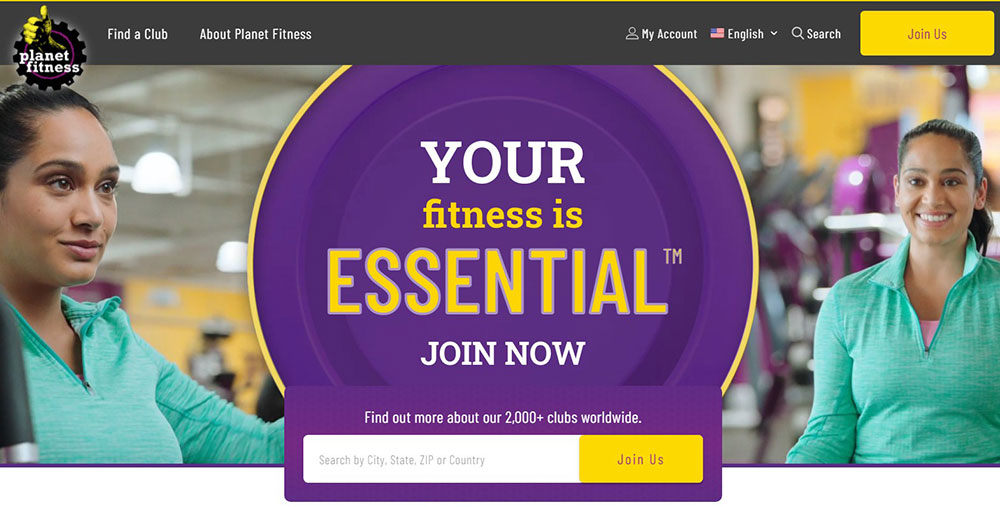
Budget gyms pick approachable colors: Planet Fitness uses purple and yellow to feel welcoming rather than intimidating.
Understanding color theory helps match your brand positioning to visitor expectations.
High contrast between text and background is non-negotiable for readability on mobile screens.
What Typography Works Best for Fitness Websites
Bold sans-serif fonts dominate fitness web design.
Montserrat, Oswald, and Bebas Neue appear across gym website templates because they convey strength and energy.
Body text needs to stay clean: Open Sans, Lato, or Roboto at 16px minimum for mobile readability.
Pair one display font for headlines with one readable font for content; never more than two font families per site.
Check websites with good typography for pairing inspiration.
All-caps headlines work for fitness; they feel powerful and direct.
How Fitness Websites Handle Class Schedules
Class schedule integration separates amateur gym sites from professional website design.
Three common formats exist:
- Calendar view - weekly grid showing all classes; best for studios with 20+ weekly sessions
- List view - chronological display filtered by day; works for smaller schedules
- Filter-based - sort by class type, instructor, or difficulty level
MindBody, Zen Planner, and Vagaro provide embeddable schedule widgets.
The schedule must update in real-time; outdated class info destroys trust instantly.
Mobile schedule viewing requires horizontal scroll or collapsible sections to prevent endless vertical scrolling.
How Fitness Websites Display Pricing and Membership Options
Transparent pricing converts better than "contact us for rates" on fitness sites.
Three-tier pricing tables work best: basic, popular (highlighted), and premium.
Show monthly and annual options with savings percentages displayed for longer commitments.
Free trial or first-class-free offers belong at the top, not buried in fine print.
Include what each tier covers: class access, guest passes, amenities, personal training sessions.
Avoid overwhelming visitors; five membership options maximum.
Payment plan mentions reduce friction for higher-priced PT packages.
What Booking Systems Do Fitness Websites Use
The booking system makes or breaks the user experience on fitness websites.
Top platforms by gym type:
- MindBody - industry standard for boutique studios; handles scheduling, payments, and retail
- Zen Planner - CrossFit boxes and martial arts gyms prefer it
- Acuity Scheduling - personal trainers and solo practitioners
- Vagaro - salons-turned-wellness-centers and hybrid businesses
- ClassPass integration - studios wanting marketplace exposure
Stripe and PayPal handle payment processing behind these systems.
Confirmation emails and calendar sync must work automatically.
Cancellation policies need clear display during the booking flow, not after payment.
How to Add Testimonials to a Fitness Website
Client testimonials build trust faster than any marketing copy.
Placement matters: put testimonials near pricing pages and booking buttons where hesitation happens.
Video testimonials outperform text by 3x for engagement; real members sharing transformation stories.
Before-and-after photos need consent documentation and authentic results, not stock imagery.
Google review integration adds third-party credibility; embed your Google Business Profile reviews directly.
Instagram feed widgets showing tagged member posts create social proof without extra effort.
Include member names, photos, and specific results: "Lost 30 lbs in 12 weeks" beats "Great gym!"
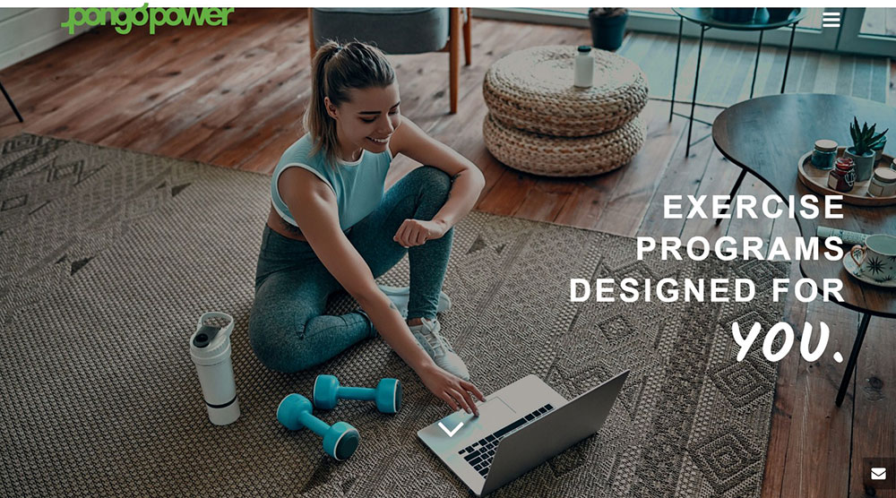
What Images Work Best on Fitness Websites
Original photography outperforms stock images on fitness sites every time.
Action shots of real workouts beat posed fitness model photos; authenticity converts.
Facility photos should show equipment, space, and cleanliness, what members actually care about seeing.
Trainer and staff photos with friendly expressions reduce intimidation for beginners.
Diversity in imagery matters; visitors want to see people who look like them.
Image optimization keeps pages fast: WebP format, lazy loading, compressed files under 200KB.
Hero images need to work on mobile; vertical crops often fail.
How to Design a Fitness Website for Mobile Users
Over 70% of fitness website traffic comes from mobile devices.
Responsive website layouts are baseline; true mobile-first thinking goes further.
Thumb-zone placement for booking buttons: bottom center of screen, not top corners.
Touch targets need 44x44 pixel minimum; small buttons frustrate mobile users.
Click-to-call functionality for phone numbers, one tap to contact.
Simplified booking on mobile: three steps maximum from landing to confirmation.
Speed optimization matters most here; compress images, minimize scripts, use caching.
Test on actual devices, not just browser simulators.
What Mistakes to Avoid in Fitness Website Design
Common fitness website failures kill conversions:
- Slow loading - videos and large images without optimization; visitors leave after 3 seconds
- Cluttered navigation - too many menu items; stick to 5-7 maximum
- Hidden contact info - phone number and address buried in footer only
- Stock photo overuse - generic fitness models instead of real members and trainers
- No clear CTA - visitors don't know what action to take next
- Missing trust signals - no certifications, reviews, or testimonials visible
- Outdated schedules - class times that haven't been updated in months
- Price hiding - "call for pricing" creates friction and suspicion
Studying bad design examples teaches what not to do.
Run through your site as a first-time visitor; every friction point costs members.
How to Measure Fitness Website Performance
Track these metrics in Google Analytics to understand what works:
- Conversion rate - percentage of visitors who book a class or sign up
- Bounce rate - visitors who leave without taking action; above 60% signals problems
- Time on page - longer times on pricing and schedule pages indicate interest
- Traffic sources - which channels drive the most signups, not just visits
Set up goal tracking for form submissions, booking completions, and phone clicks.
Heatmap tools like Hotjar show where visitors click and scroll; reveals dead zones and missed CTAs.
A/B test headlines, button colors, and hero images; small changes often produce big results.
Monthly review of Core Web Vitals through Google Search Console catches speed issues before they hurt rankings.
Compare your metrics against industry benchmarks: 2-5% booking conversion is typical for fitness websites.
FAQ on Fitness Website Design
What platform is best for building a fitness website?
WordPress with Elementor offers the most flexibility for gym websites.
Squarespace and Wix work for smaller studios needing quick setup.
Webflow suits designers wanting custom control without coding.
How much does a fitness website cost to build?
DIY templates cost $100-500 annually.
Custom fitness website design ranges from $2,000-15,000 depending on features like MindBody integration, member portals, and e-commerce for merchandise.
What booking system works best for gyms?
MindBody dominates boutique fitness studios.
Zen Planner suits CrossFit boxes and martial arts gyms.
Acuity Scheduling works well for personal trainer websites and solo practitioners needing simple appointment booking.
Should fitness websites show pricing publicly?
Yes. Hidden pricing creates friction and suspicion.
Display membership tiers clearly with monthly and annual options.
Transparent pricing builds trust and filters serious prospects from casual browsers.
What colors work best for gym websites?
Energy colors like orange and red suit high-intensity brands.
Black backgrounds signal premium positioning.
Wellness websites and yoga studios use calming greens and earth tones instead.
How important is mobile optimization for fitness sites?
Critical. Over 70% of fitness searches happen on mobile devices.
Booking buttons need thumb-zone placement.
Class schedules must load fast and display cleanly on small screens.
What images convert best on fitness websites?
Original photography of real members and trainers outperforms stock images.
Action shots during workouts beat posed photos.
Facility images showing equipment and cleanliness matter to prospects.
Do fitness websites need video backgrounds?
Video backgrounds increase engagement when optimized properly.
Keep files compressed, autoplay muted, and provide fallback images for slow connections.
Workout footage creates emotional connection faster than static images.
What pages does every gym website need?
Homepage, class schedule, pricing, about/trainers, contact, and location pages are mandatory.
Add a testimonials section and blog for credibility.
Spa websites and hybrid facilities need service menus too.
How do I make my fitness website rank on Google?
Optimize for local search with Google Business Profile.
Create location-specific pages, earn Google reviews, and ensure fast Core Web Vitals scores.
Consistent NAP (name, address, phone) across all listings matters.
Conclusion
These fitness website design examples prove that successful gym sites balance visual impact with conversion-focused functionality.
Brands like Peloton, Gold's Gym, and F45 Training win because they prioritize fast booking flows over flashy animations.
Your fitness website needs three things working together: a booking system (Vagaro, ClassPass, or similar), mobile-optimized class schedules, and authentic member imagery.
Skip the stock photos. Show real transformations.
Build on WordPress with Elementor or Squarespace if budget is tight.
Test everything on mobile first since that's where your members browse.
Use this collection as website inspiration, but adapt each element to your specific fitness brand and local audience.
Start with one improvement today: faster load times, clearer pricing, or a stronger CTA.


