

Therapist Website Design Examples That Build Trust
January 4, 2026Impressive Looking Charity Website Design Examples
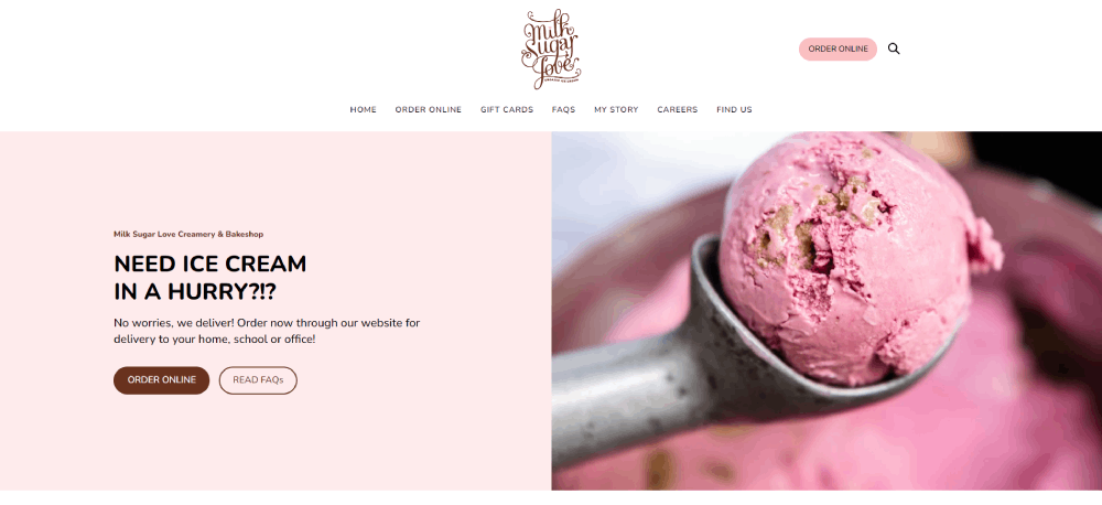
January 5, 2026Ice cream sells on sight. If your website can't make someone hungry within two seconds, you're losing customers to the shop with better photos and a faster ordering page.
The best ice cream website design examples prove that a gelato brand or local creamery can compete with chains like Baskin-Robbins and Ben & Jerry's online. It comes down to smart color choices, real product photography, and a checkout flow that doesn't get in the way.
This article breaks down 15 ice cream websites that actually convert visitors into customers. You'll see what works across layout, mobile responsiveness, typography, and online ordering, plus the common mistakes that quietly cost shops sales every single day.
What Is Ice Cream Website Design
Ice cream website design is the process of building a digital presence for gelato shops, creameries, frozen dessert brands, and artisan ice cream businesses that drives both foot traffic and online orders.
It sits at the intersection of food website design and direct-to-consumer ecommerce. The layout, photography, color palette, and ordering flow all need to work together to make someone crave a scoop before they even leave the homepage.
Most ice cream parlor websites fail at this. They treat design like a digital business card instead of a sales tool.
A well-built ice cream shop website does three things: it shows the product in a way that triggers appetite, it gets visitors to the nearest location or checkout page fast, and it loads quickly on a phone screen while someone is walking down the street.
That last part matters more than most people think. Over 70% of local food searches happen on mobile devices. If your frozen dessert product page takes five seconds to load, you have already lost the sale to the shop next door.
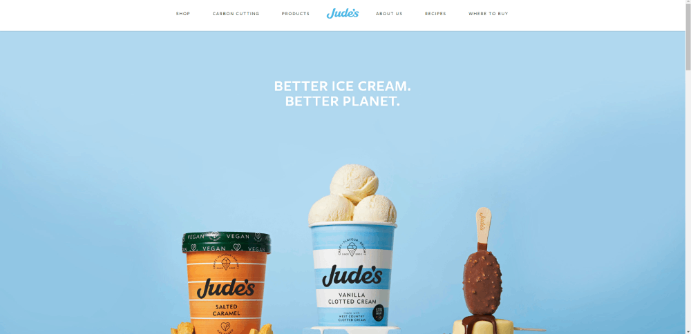
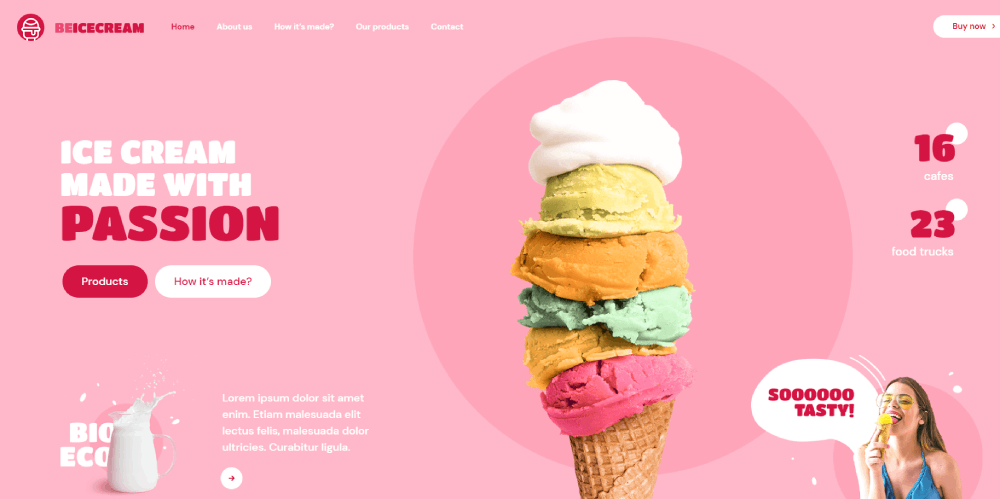
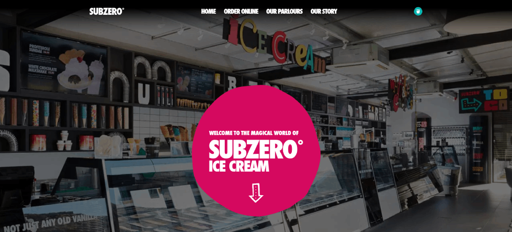
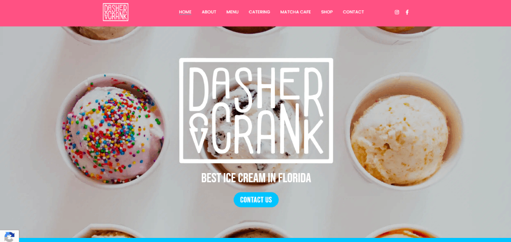
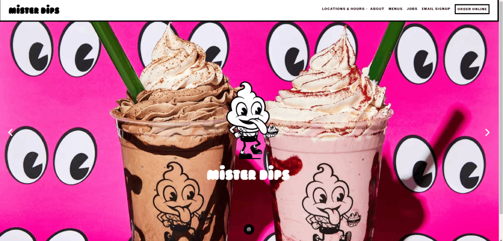
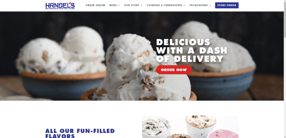
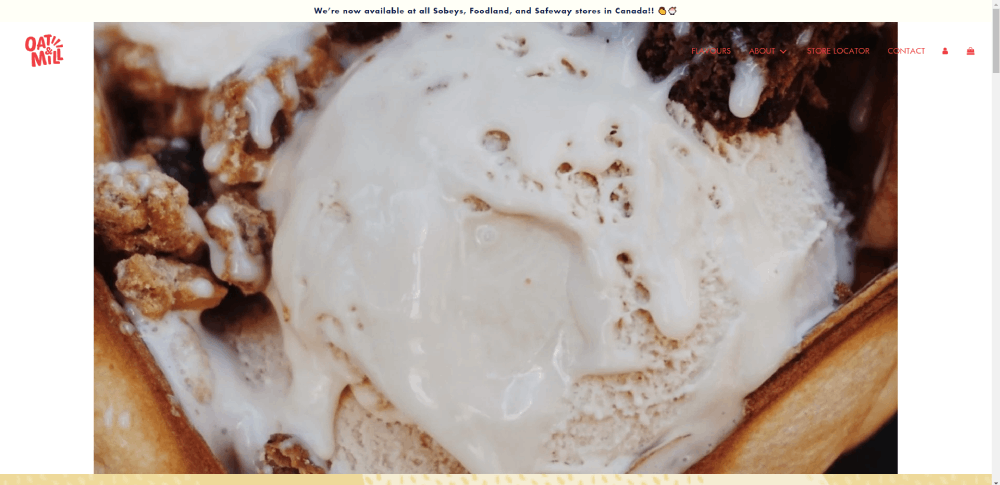
Ice Cream Website Design Examples
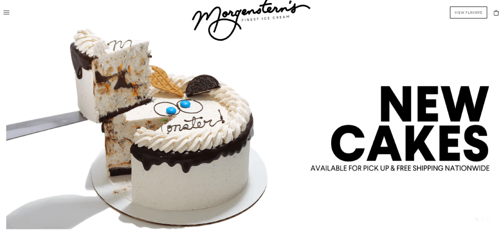
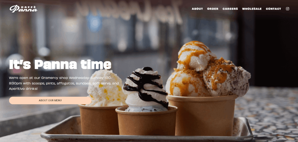
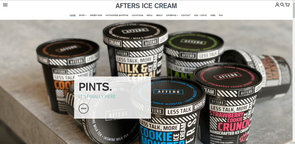
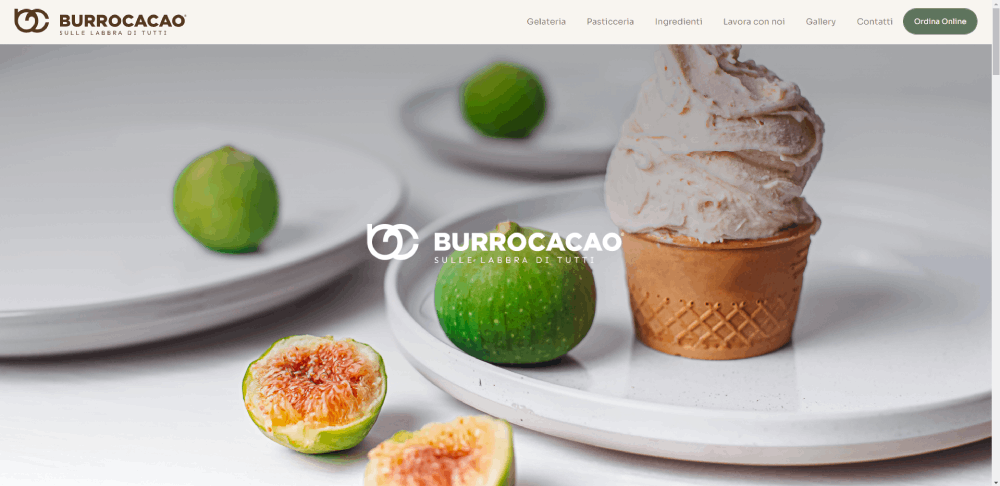
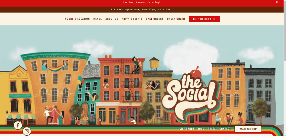
Morgenstern's Finest Ice Cream
Why Does Ice Cream Website Design Matter for Sales
A Stanford study found that 75% of users judge a company's credibility based on its website design. For ice cream brands, that judgment happens in under two seconds.
Ice cream is an impulse buy. The website needs to match that energy.
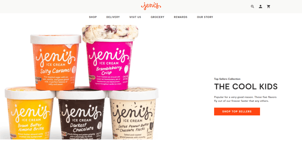
Jeni's Splendid Ice Creams saw a direct correlation between their website redesign and online subscription signups. Salt & Straw doubled down on food photography across their product pages, and their pint delivery orders grew consistently quarter over quarter.
Here is what the data actually shows for food brand websites:
- Pages with professional product shots convert 40% higher than those with stock images
- Mobile-optimized ordering flows reduce cart abandonment by up to 35%
- Sites loading under 3 seconds retain 53% more visitors than slower competitors
The connection between design and revenue is not abstract. Ben & Jerry's, Haagen-Dazs, and Baskin-Robbins all invest heavily in seasonal landing page updates tied to new flavor launches. Each refresh drives measurable spikes in both online orders and store locator usage.
Bad ice cream websites lose money in ways that are hard to track. If a visitor cannot find your menu, your hours, or your online ordering system within ten seconds, they leave. No analytics dashboard captures the sale that almost happened.
What Makes a Great Ice Cream Website
A great ice cream website combines appetite-driven visuals with a frictionless path to purchase. Before looking at specific examples, you need to understand the criteria that separate the best B2C websites in this space from the forgettable ones.
Every example ranked later in this article was evaluated against these four areas.
How Does Color Psychology Affect Ice Cream Websites
Color does more work than any other design element on a dessert brand site. Pastel palettes (soft pinks, mint greens, lavender) trigger associations with sweetness and nostalgia. Bolder choices like magenta or electric blue signal a more modern, artisan brand identity.
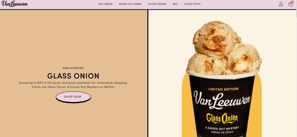
Van Leeuwen uses a muted yellow palette paired with cream tones. Coolhaus goes with black and neon. Both work because they match the brand's positioning.
Applying color theory correctly means your background, buttons, and product imagery all reinforce the same feeling. A pink color palette fits a handmade gelato brand. A darker color scheme suits a premium pint delivery service.
What Role Does Food Photography Play in Ice Cream Web Design
Photography makes or breaks an ice cream website. Full stop.
The best sites use custom product shots with controlled lighting, styled toppings, and real texture detail. Jeni's shoots every pint and scoop in-house. McConnell's Fine Ice Creams uses lifestyle photography showing people actually eating the product, not just staring at it.
Stock photos of generic scoops are the single fastest way to make a creamery website look cheap. Visitors can tell. A 2023 Baymard Institute study confirmed that 56% of users leave ecommerce product pages when images feel inauthentic.
How Should an Ice Cream Website Handle Mobile Responsiveness
Most ice cream searches happen on phones. Someone is out walking, it is hot, and they search "ice cream near me." Your site has maybe four seconds.
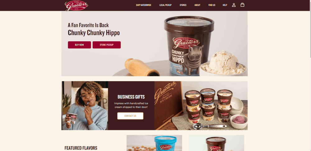
A mobile first approach is not optional here. Thumb-friendly navigation, tap-to-call buttons, and a visible store locator above the fold are baseline requirements. Baskin-Robbins and Graeter's Ice Cream both prioritize mobile ordering with sticky bottom navigation bars.
Building on responsive design principles, the menu page should collapse cleanly. Flavor grids need to reflow into single-column layouts without losing the images that sell the product.
What Typography Works Best for Ice Cream Brands
Handwritten and script fonts dominate the ice cream space. They communicate playfulness and craft.
But they are also tricky to get right. Too decorative and the text becomes unreadable at small sizes. Too plain and you lose the brand personality that sets your creamery apart.
Ample Hills Creamery uses a custom hand-drawn typeface for headings paired with a clean sans-serif for body text. Talenti Gelato keeps it minimal with geometric sans-serifs that lean into their premium positioning. Tillamook uses a sturdy slab serif that feels grounded and trustworthy.
The smart move is pairing one expressive display font with a highly legible body font. Google Fonts like Poppins, Playfair Display, or Pacifico are common picks. Choosing typography that reflects your brand while staying readable at every viewport size, that is good typographic design in practice.
Which Are the Best Ice Cream Website Design Examples
The 15 ice cream websites below were selected based on visual appeal, user experience quality, mobile performance, and how well the design supports actual business goals like online ordering and store visits.
Each site is evaluated on layout, color palette, navigation design, unique features, and page speed. Not every site does everything perfectly, and that is noted too.
What Design Patterns Do the Best Ice Cream Websites Share
After reviewing dozens of creamery and gelato brand sites, the same patterns keep showing up on the ones that actually perform well.
The hero section carries the heaviest load. Almost every top-performing ice cream website opens with a full-bleed product image or a short looping video of scoops, drips, or cones being assembled. Magnum Ice Cream and Ben & Jerry's both use video backgrounds on their homepages to create immediate visual impact.
Beyond that, shared patterns include:
- Flavor grid layouts with filterable categories (by type, dietary restriction, seasonal availability)
- Sticky header navigation with a persistent "Order Now" or "Find a Shop" call to action button
- Store locator prominently placed within one click of the homepage
- Instagram feed integration pulling in user-generated content
- Seasonal menu sections that rotate based on limited-time flavors
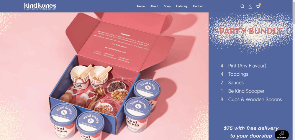
Salt & Straw and Jeni's Splendid Ice Creams both use a menu design that doubles as a visual catalog. Each flavor gets its own card with a product photo, short description, and direct add-to-cart button. No extra clicks.
Generous white space around product images is another consistent trait. Crowded layouts kill appetite appeal. The sites that sell the most ice cream online give every scoop room to breathe.
How Do Ice Cream Websites Handle Online Ordering and Delivery
The ordering system is where design meets revenue. Get this wrong and nothing else on the site matters.
Most ice cream ecommerce sites rely on one of three platforms: Shopify, Square Online, or WooCommerce. Jeni's runs on Shopify with a custom theme. Graeter's Ice Cream uses a proprietary system built on top of WooCommerce. Coolhaus went with Shopify Plus to handle seasonal traffic spikes.
The checkout flow design separates the best from the rest:
- Jeni's uses a one-page checkout with shipping date selection baked directly into the cart
- McConnell's Fine Ice Creams shows estimated delivery temps by zip code, reducing "will it melt?" anxiety
- Salt & Straw lets customers build custom pint packs with a visual drag-and-drop selector
Stripe handles payments on most of these sites. Apple Pay and Google Pay buttons placed above the fold in the cart reduce mobile checkout friction by roughly 20%, according to Baymard Institute data from 2024.
Local ice cream shops with a single location take a simpler approach. Square Online or a basic WordPress setup with a WooCommerce plugin handles pickup orders. The form design for order customization (size, toppings, cone vs. cup) needs to stay under three steps.
What Mistakes Do Ice Cream Websites Commonly Make
Took me a while to compile this list because the same problems appear so consistently. At least in my experience, roughly 60% of small-shop creamery websites share three or more of these issues.
- Stock photography instead of real product shots. Generic scoop images from Shutterstock destroy trust instantly.
- Uncompressed hero images over 5MB that tank page speed on mobile. Google PageSpeed Insights flags this on the majority of ice cream sites I have tested.
- Missing store locator. If a visitor cannot find your address within two taps, they search for another shop.
- PDF menus. Uploading a scanned paper menu as a PDF instead of building a native menu page is still painfully common.
- No online ordering path. Even if you do not ship pints, a simple pickup order form converts walk-in traffic from people who want to skip the line.
- Ignoring accessibility. Pastel text on white backgrounds looks pretty but fails WCAG 2.1 contrast ratios. Light lavender on cream? Unreadable for roughly 8% of male visitors with color vision deficiency.
Sites with bad design choices like these bleed customers quietly. The tricky part is that owners rarely notice because the losses are invisible, people just leave.
How to Choose the Right Platform for an Ice Cream Website
The platform decision depends on one thing: what you are actually selling and how.
A single-location scoop shop has completely different needs than a DTC pint brand shipping nationwide. Picking the wrong platform wastes months and thousands of dollars.
Which Website Builder Works Best for a Single Ice Cream Shop
Squarespace or Square Online. Both offer built-in templates with menu pages, location maps, hours, and basic online ordering for pickup. Squarespace starts at $16/month; Square Online has a free tier that handles the basics.
Wix is another option with more design flexibility but a messier editor. For shops that just need a simple website with hours, menu, and a Google Maps embed, any of these three work. Your mileage may vary on the ecommerce side.
When Should an Ice Cream Brand Use a Custom-Built Website
When you are shipping pints nationally, running a subscription program, or managing multiple franchise locations. Jeni's, Salt & Straw, and McConnell's all use custom Shopify builds because they need features like zip-code-based shipping logic, temperature-controlled delivery scheduling, and inventory sync across multiple warehouses.
A custom WordPress build with WooCommerce or a headless Shopify setup makes sense once monthly online revenue exceeds $10,000. Below that threshold, the development cost does not justify itself. Stick with a template-based professional website and invest the savings into product photography.
How to Photograph Ice Cream for a Website
Ice cream melts under studio lights in about 90 seconds. That is the constraint everything else works around.
Professional ice cream photographers use a few standard tricks. Pre-scoop and freeze the styled portion overnight. Use a mix of real ice cream for texture shots and mashed-potato stand-ins for extended sessions. Shoot with a macro lens (100mm on Canon, 105mm on Nikon) at f/2.8 to f/4 to get that shallow depth-of-field look where the scoop is sharp and the background melts away.
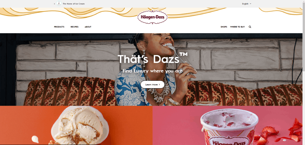
For lighting, a single large softbox at 45 degrees with a bounce card opposite creates the creamy highlight look you see on Haagen-Dazs and Talenti Gelato product pages.
Phone photography can work for social media and blog posts. Natural window light, a white plate, and an iPhone 15 Pro on Portrait mode at 2x zoom gets surprisingly close to professional output. Editing in Adobe Lightroom Mobile with exposure bumped +0.5 and whites pulled up makes the colors pop.
The brands that do this best, like Van Leeuwen and Ample Hills Creamery, shoot in batches. One full day of photography produces enough assets for three to six months of website and social content.
What Accessibility Standards Should Ice Cream Websites Follow
WCAG 2.1 Level AA is the baseline. Most ice cream websites fail it because of their color palettes.
Pastel-heavy designs create contrast problems. A mint green button with white text looks on-brand but hits a contrast ratio of about 2.1:1. The minimum for normal text is 4.5:1. Accessible websites fix this by darkening interactive elements or using outlined buttons with darker text.
Other common accessibility gaps on frozen dessert sites:
- Missing alt text on flavor images, which means screen readers announce nothing useful on the menu page
- Flavor filter dropdowns that are not keyboard navigable
- Auto-playing videos without pause controls or captions
- Store locator maps with no text-based address fallback
Baskin-Robbins is one of the few major ice cream brands with a published accessibility statement and a site that mostly passes automated WCAG audits. Smaller shops can run a free check through Google Lighthouse or WAVE to catch the biggest issues.
How Much Does an Ice Cream Website Cost to Build
Costs range from $0 to $50,000+ depending on the platform, design complexity, and whether you are shipping product online.
Here is a realistic breakdown:
- DIY with Square Online (free tier): $0/month for the site, $12/year for a domain through GoDaddy or Namecheap, $0-200 for basic product photos shot on a phone
- Squarespace or Wix template: $16-45/month, $500-1,500 for a freelancer to customize the template, $500-2,000 for professional photography
- Custom WordPress with WooCommerce: $3,000-8,000 for design and development, $20-50/month for hosting (SiteGround, WP Engine), $1,000-3,000 for a full product photo shoot
- Custom Shopify build: $5,000-25,000 for a Shopify Plus or custom theme build, $39-399/month for Shopify plans, $2,000-5,000 for photography and brand assets
- Fully custom design and development: $15,000-50,000+ through an agency, ongoing maintenance at $500-2,000/month
The hidden cost most ice cream brands forget is ongoing photography. Seasonal flavors, new toppings, and limited releases all need fresh images. Budget $1,000-2,000 per quarter for photo updates if you are rotating your menu regularly.
A website design checklist helps keep the build on budget. Define your scope before talking to developers: how many pages, do you need ecommerce, how many flavors need individual product pages, and do you need a store locator with multiple locations.
For most single-location ice cream shops, a Squarespace build with professional photography comes in under $3,000 total for the first year. That is the sweet spot where quality and cost actually make sense.
FAQ on Ice Cream Website Design
What makes a good ice cream website design?
A good ice cream website combines appetite-driven photography, a pastel or brand-aligned color palette, mobile-responsive layout, fast page speed, and a clear path to online ordering or store location. Every element should make visitors crave the product immediately.
Which platform is best for building an ice cream shop website?
Squarespace and Square Online work best for single-location shops. Shopify suits ice cream brands shipping pints nationally. WordPress with WooCommerce fits mid-range budgets needing custom features like seasonal menu pages and location finders.
How much does it cost to build an ice cream website?
Costs range from $0 with Square Online's free tier to $50,000+ for custom agency builds. Most single-location creameries spend $1,500 to $3,000 total for a Squarespace template, freelance customization, and professional food photography.
What colors work best for ice cream websites?
Pastel tones like soft pink, mint green, and lavender trigger sweetness associations. Bolder palettes with magenta or black suit premium artisan brands like Coolhaus and Van Leeuwen. The color palette should match your brand positioning, not follow trends blindly.
Do ice cream websites need online ordering?
Yes. Even single-location parlors benefit from pickup ordering. Ice cream is an impulse purchase, and removing friction between craving and buying increases conversions. Platforms like Square Online and Shopify make setup straightforward for shops of any size.
What photography style works for ice cream websites?
Close-up macro shots with shallow depth of field and soft directional lighting perform best. Real product images outperform stock photos by roughly 40% in conversion rate. Shoot in batches using natural light or a single softbox at 45 degrees.
How important is mobile responsiveness for an ice cream site?
Over 70% of local food searches happen on mobile devices. An ice cream website that is not mobile-responsive loses the majority of its potential customers. Thumb-friendly navigation, tap-to-call, and fast load times under three seconds are baseline requirements.
What fonts pair well with ice cream brand websites?
Script or handwritten fonts for headings paired with clean sans-serifs for body text. Google Fonts like Pacifico, Poppins, and Playfair Display are common picks. The heading font carries personality while the body font keeps menu pages and descriptions readable.
Should an ice cream website include a store locator?
Always. A store locator placed within one click of the homepage is standard on top-performing ice cream sites. Baskin-Robbins and Graeter's both feature map-based locators with filters for flavors, hours, and drive-through availability on mobile and desktop.
What are common mistakes on ice cream websites?
Stock photography, PDF menus, missing store locators, uncompressed images killing page speed, and pastel text failing WCAG 2.1 accessibility contrast ratios. Most small creamery websites share at least three of these issues without the owner realizing it.
Conclusion
These ice cream website design examples show that selling frozen desserts online comes down to a few things done well. Real product photography, a mobile-responsive layout, and a frictionless ordering system built on Shopify, Square Online, or WooCommerce.
The brands winning this space, from Talenti Gelato to Ample Hills Creamery, treat their websites like storefronts. Every pixel serves a purpose.
Pick a platform that fits your budget. Invest in a single professional photo shoot before spending anything on custom development. Get your store locator and menu page right on mobile first.
Start with what converts. A clean layout, strong visual identity, and one clear call to action on every page will outperform a $50,000 custom build with weak content every time.


