


BeTheme 2026 Review: Beginner-Friendly or Agency Powerhouse
April 16, 2026
Custom website design vs. template: which is best for your business in 2026?
April 21, 2026Pink is one of the most misunderstood colors in web design. Used well, it builds instant brand recognition, signals warmth, and drives real conversions. Used carelessly, it creates visual noise that pushes visitors away.
Websites with a pink color palette span a wide range, from Glossier's trademarked millennial pink to Kylie Cosmetics' high-contrast hot pink. Each approach serves a different brand goal.
This guide covers everything that matters: psychology, color palette combinations, typography choices, UI component decisions, accessibility requirements, and the design mistakes that make pink sites look generic.
By the end, you will know exactly how to build a pink website that works.
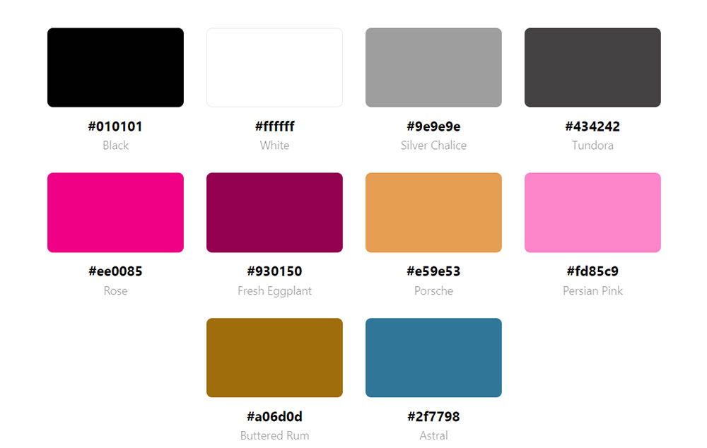
What Is a Pink Color Palette for Websites?
A pink color palette for websites is a defined set of pink-based hues applied consistently across backgrounds, UI elements, typography, and accents to build a coherent visual identity. The palette is not limited to a single shade. It includes a primary pink, one or two supporting tones, and paired neutrals that control how the pink reads on screen.
Pink spans a wide tonal range. The most common shades used in web design break down like this:
| Shade | Hex Example | Visual Weight |
|---|---|---|
| Blush pink | #FFC0CB | Soft, low contrast |
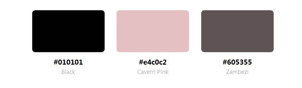
| Dusty rose | #E8B4B8 | Muted, editorial |
| Millennial pink | #F4A7B9 | Warm, neutral-leaning |
| Hot pink | #FF007F | Bold, high energy |
| Magenta | #FF00FF | Intense, digital-forward |
Paired colors determine whether the palette reads as luxury, playful, minimal, or editorial. Blush with white and gold signals premium beauty. Hot pink with black signals fashion and attitude. Dusty rose with sage green and cream reads as organic and wellness-oriented.
Pink is not a single-audience color. Color theory in web design treats pink as a warm hue derived from red, carrying emotional associations tied to care, energy, and approachability. Those associations shift with saturation, pairing choices, and the brand context around them.
Using tools like Design Your Way's color palette generator, designers can find the perfect HEX codes (#FF69B4, #FFC0CB) to complement their brand identity with pink.
How Is a Pink Color Palette Different From a Single Pink Brand Color?
A palette is a structured system of 3 to 6 colors that work together. A single brand color is one hex value used as an identifier. The difference is practical, not just technical.
A pink palette defines which shade of pink covers the background, which sits on buttons, which appears in hover states, and which shows up in typography. Without that structure, inconsistent pinks stack on the same page and create visual noise.
Glossier trademarked their specific millennial pink shade and applied it to packaging, product pages, and campaign assets simultaneously. That consistency is what turned a color into a recognizable brand asset, not just a stylistic choice.
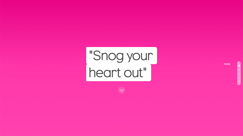
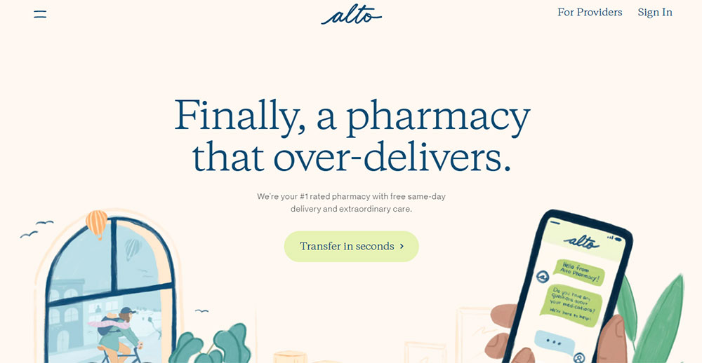
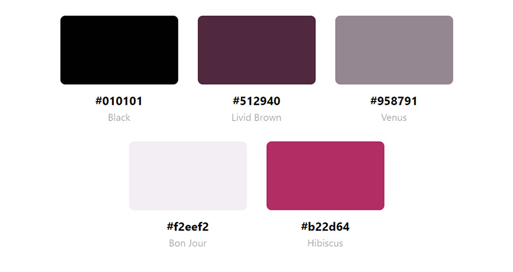
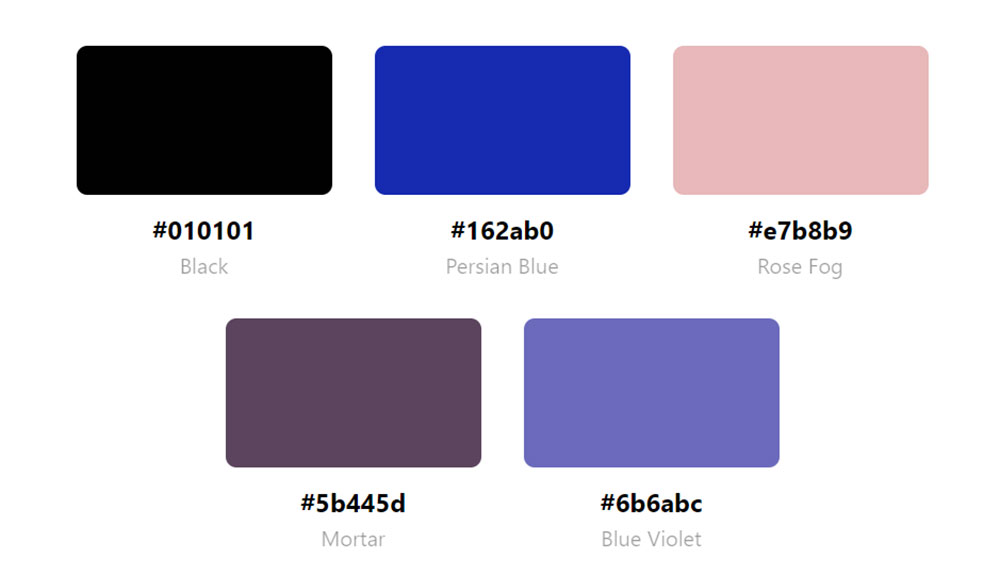
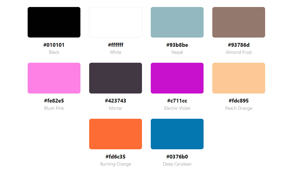
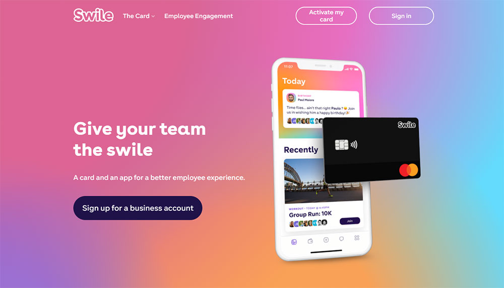
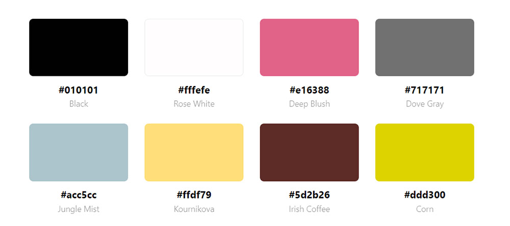
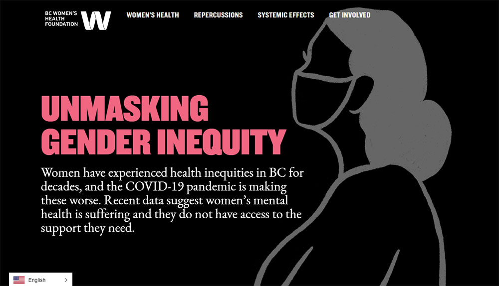
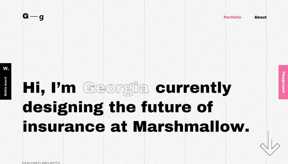
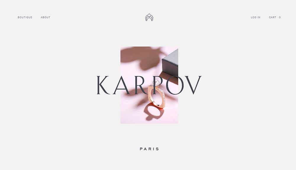
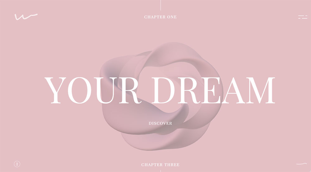
Websites With Pink Color Schemes
Alto


What Psychological Effects Does Pink Have on Website Visitors?
Pink triggers 3 distinct emotional responses depending on its saturation level: warmth and care (pastel pink), confidence and energy (hot pink), and luxury and refinement (muted rose). The response shifts with intensity, which means the same hue family can serve very different brand goals.
According to Striven's color psychology research, companies that maintain consistent color schemes across platforms see 23% higher customer retention compared to brands with variable branding. For pink-dominant sites, that consistency is the mechanism behind the emotional response.
How Does Pink Affect Trust on Websites?
Trust signals in pink-dominant designs depend heavily on saturation and context. Light pink backgrounds reduce urgency, which works in favor of wellness, skincare, and self-care brands where the visitor needs to feel at ease before purchasing.
Hot pink is a different situation. It reads as confident rather than soft, which makes it effective for fashion brands and entertainment sites where high energy matches user expectations. The Build Grow Scale color psychology data shows pink produces 8% higher engagement among women, but that figure is context-dependent and not statistically significant for conversions in all scenarios.
Pink used on call to action buttons can increase click-through rates when the button color contrasts clearly against the surrounding pink background. The issue is that a pink CTA on a pink page disappears. That is the most common error in pink web design.
What Does Pink Signal in Different Cultural Contexts?
Color associations are not universal. Shakuro's research on website color psychology notes that while pink signals femininity in North American markets, in Japan it represents sakura blossoms and carries associations with renewal, nature, and spring rather than gender.
3 cultural distinctions matter when designing pink websites for international audiences:
- North America and Europe: pink reads as feminine, playful, or luxurious depending on saturation
- Japan and South Korea: pink ties to seasonal beauty, softness, and natural aesthetics
- Latin America: deeper pinks like magenta are associated with celebration and vibrancy
Well, the thing is, ignoring this context creates real problems in global campaigns. A beauty brand expanding to Japanese markets can lean into pink more broadly without the gender-association risk that exists in Western contexts.
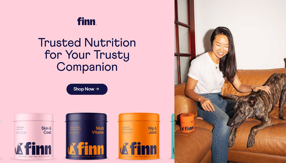
Which Industries Use Pink Websites Most Effectively?
5 industries use pink color palettes with consistent results: beauty and skincare, food and dessert brands, fashion and lifestyle, health and wellness, and consumer tech brands differentiating from blue-dominant competitors.
39% of website users say color schemes are the visual element they notice first on a business website, more than any other design element (WebFX, 2024). For industries where brand recognition is a purchase driver, pink works as a differentiator specifically because it is less common in categories dominated by blue, black, and neutral palettes.
Beauty and Skincare Websites
Glossier reached a $1.8 billion peak valuation and generates $200 to $250 million annually. Their millennial pink branding, trademarked and applied to packaging and digital touchpoints, is central to that identity. Their Shopify store records a 3.5 to 4.0% conversion rate (Getrivalert, 2025).
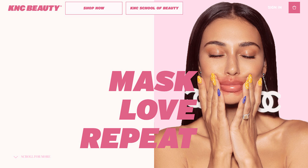
Kylie Cosmetics takes a different approach with high-contrast hot pink. The site opens with a bold hero image, uses image-driven navigation, and maintains a clean interface that fits the brand's target demographic of young women. Coty's acquisition of 51% of Kylie Cosmetics valued the brand at $1.2 billion.
Charlotte Tilbury uses pink in a more editorial register, pairing deep rose tones with gold and black for a luxury feel. The most popular beauty websites consistently use pink not as decoration but as a primary identity layer baked into every page template.
Food, Bakery, and Dessert Websites
Sprinkles Cupcakes, Ladybug Patisserie, and similar dessert brands use blush and hot pink because the color aligns with product expectations. Pink reads as sweet before the product is even visible.
For bakery websites, pink backgrounds combined with white space and product-forward photography perform better than neutral palettes because the color reinforces what the brand is selling emotionally, not just visually.
One thing worth noting: dessert brands that use pink too aggressively end up looking like everyone else in the niche. The differentiator is usually one unexpected accent, a typographic choice, or a texture that breaks the predictability of the standard pink and white bakery template.
Wellness and Self-Care Websites
Pastel pink in the wellness space reduces perceived urgency, which is exactly right for meditation apps, therapy platforms, and spa websites. The color communicates that the brand is not trying to sell hard.
For mental health websites, pink is increasingly used to signal warmth and approachability in a category that has historically used clinical blue and white. The shift works because visitors to these sites are often looking for a calm, low-pressure entry point.
Technology and SaaS Brands Using Pink
Pink in tech is less common, which makes it memorable. A SaaS product using pink immediately stands out from the default blue-and-white landscape of SaaS websites.
T-Mobile's ownership of magenta (RAL 4010) is the clearest example of a tech-adjacent brand using pink as a competitive moat. Striven's research notes this specific shade represents billions in brand equity. The color does the recognition work before any copy is read.
What Are the Best Pink Color Palette Combinations for Web Design?
The best pink combinations for web design are those where pink holds a defined role in the hierarchy: either as the dominant background, the accent color, or the CTA layer. Pink trying to do all 3 at once collapses into visual noise.
| Combination | Primary Use Case | Hex Range |
|---|---|---|
| Blush + white + gold | Luxury, beauty, bridal | #FFC0CB / #FFFFFF / #D4AF37 |
| Hot pink + black + white | Fashion, editorial, bold retail | #FF007F / #000000 / #FFFFFF |
| Dusty rose + sage + cream | Wellness, organic, lifestyle | #E8B4B8 / #B2C4B2 / #F5F0E8 |
| Millennial pink + deep navy | Modern, gender-neutral, editorial | #F4A7B9 / #1B2A4A |
| Neon pink + dark grey + electric blue | Tech, gaming, digital products | #FF1493 / #2D2D2D / #00BFFF |
Blush and Neutral Combinations
Best for: luxury beauty, bridal, fine stationery brands.
Blush (#FFC0CB) on white keeps contrast accessible while signaling softness. Gold accents add perceived premium value without requiring dark backgrounds. Papier.com uses this approach, pairing blush with off-white and minimal typography to build a stationery brand identity that reads as upscale without being heavy.
The risk with this combination is blandness. Too many shades of light on light creates a page that reads as washed out on most monitors. Fix it with a single deep-toned heading color, dark charcoal (#333333) works, and the palette recovers its structure.
Bold Pink and High-Contrast Pairings
Hot pink plus black is the most assertive version of a pink palette. It reads as fashion-forward and confident, which is why it works for clothing websites and editorial fashion brands.
Contrast is not optional here. A hot pink background with white text produces a 2.8:1 contrast ratio on lighter pink variants, which fails WCAG 2.1 standards. Use black or very dark navy on hot pink to hit the 4.5:1 minimum.
Jacquemus uses unexpected pink-adjacent combinations in their digital presence, breaking the predictable hot pink formula by pairing saturated tones with natural imagery and editorial whitespace. The result is a pink site that does not look like other pink sites.
Muted Pink and Earthy Tones
Dusty rose (#E8B4B8) combined with sage green and cream is the go-to palette for organic wellness brands, yoga websites, and natural beauty brands. The combination works because none of the colors compete. Each one is desaturated enough to sit alongside the others without visual tension.
This palette also photographs well. Product shots taken against dusty rose backgrounds integrate cleanly into the site without post-processing adjustments, which is a practical advantage for small beauty and food brands with limited photo budgets.
Which Design Tools Help Build a Pink Color Palette for a Website?
6 tools cover the full workflow of generating, testing, and applying pink palettes in professional web design: Coolors, Adobe Color, Figma, Canva, WebAIM Contrast Checker, and Stark.
Palette Generation Tools
Coolors.co: start from a pink hex value and generate complementary, analogous, or triadic options instantly. Lock the pink shade and let the tool fill in the supporting colors.
Adobe Color: better for designers who already have a brand pink and need a complete system. The harmony rules (analogous, split-complementary, monochromatic) produce palette options that feel intentional rather than random.
Took me a while to switch from Coolors to Adobe Color for client work. Adobe Color's integration with the Creative Cloud means the palette goes directly into Figma or Illustrator without manual hex entry, which saves real time on larger projects.
Design and Application Tools
Figma handles palette application through its color styles system. Define the pink palette as local styles, apply them across components, and update the entire site when the palette changes. This is the correct workflow for pink web design at scale.
Canva's brand kit handles this for non-designers. Upload the hex values, define the typography, and Canva enforces the palette across templates. It is less precise than Figma but good enough for small business brands where the site is built in Canva or a similar tool.
Web design tools like Figma and Adobe XD also support component-level theming, which matters when a pink palette spans multiple page types. A pricing page, a testimonial page, and a product detail page all need to pull from the same pink system without manual adjustment on each.
Accessibility Testing Tools
WebAIM Contrast Checker: input the foreground and background hex codes and get the contrast ratio instantly. Essential for any pink palette because light pink backgrounds frequently fail with white or light grey text.
Stark (Figma plugin): runs contrast checks directly inside the design file. The 2025 version adds auto-detection of low-contrast regions and suggests compliant color adjustments. For pink palettes specifically, Stark flags the most common failure: pink text on pink backgrounds that appear subtle in the design tool but fail WCAG AA on screen.
How Does Pink Affect Readability and Accessibility on Websites?
Pink backgrounds create 3 consistent accessibility problems: insufficient contrast with white or light text, failed WCAG ratios on pastel variants, and reduced legibility for users with color vision deficiencies. Each is solvable, but each requires a deliberate design decision rather than a default choice.
WCAG 2.1 sets the standard at 4.5:1 contrast ratio for normal text and 3:1 for large text (18pt or 14pt bold and above). Level AAA raises those requirements to 7:1 and 4.5:1. Most pastel pink backgrounds fail the first standard with white text, which is the most common pairing in pink web design (WebAIM, 2024).
Why Pink Backgrounds Fail Accessibility Checks
Blush pink (#FFC0CB) on white produces a contrast ratio of approximately 1.4:1. That fails every WCAG level. Hot pink (#FF007F) on white produces around 3.1:1, which passes for large text only. Black (#000000) on any pink background typically hits 7:1 or above, which passes both AA and AAA.
The practical fix is straightforward:
- Use deep charcoal (#333333) or black for body text on pink backgrounds
- Never use white or light grey text on pastel pink
- Test pink CTA buttons with white text before finalizing, most fail
- For form fields on pink backgrounds, use dark navy borders to hit the 3:1 UI component threshold
Building accessible websites with pink palettes is not complicated, but it requires checking the palette before a single component is built. Most accessibility failures in pink web design come from defaults, not decisions.
Safe Text Colors on Pink Backgrounds
3 text colors reliably pass WCAG AA on the most common pink shades:
Deep charcoal (#333333): produces 12:1 contrast on most blush and pastel backgrounds. This is the safest default for body text on pink.
Black (#000000): 21:1 on white, 7:1 or above on most pink shades. Always passes, but can feel harsh on lighter blush palettes. Works better on hot pink and magenta.
Deep navy (#1B2A4A): sits between charcoal and black tonally, produces warm contrast on pink, and avoids the starkness of pure black. Particularly effective on dusty rose and millennial pink backgrounds.
Pink as Accent vs. Pink as Background
The accessibility calculation changes depending on pink's role. Pink as an accent (button border, icon color, underline) needs to contrast against the page background, not against text. The 3:1 UI component standard applies.
Pink as a full background shifts the calculation to every text element on that section. That is a more demanding requirement and the reason many pink websites use pink in bands and sections rather than as the full page background.
For form design on pink websites, input borders need 3:1 contrast against the pink background to meet WCAG 2.1. A light pink border on a pink background fails. A dark charcoal or navy border passes and adds clarity to the form structure at the same time.
What Typography Works Best on Pink Website Backgrounds?
Typography on a pink background has one non-negotiable requirement: the font must hold legibility when the background is doing most of the visual work.
Pink backgrounds reduce the perceived contrast of text more than white or dark backgrounds do. Font weight, size, and family choice all compensate for that.
Serif Fonts on Pink Backgrounds
Best for: luxury beauty, bridal, editorial lifestyle, and fine stationery brands.
Playfair Display and Cormorant Garamond are the two most consistent performers on blush and dusty rose backgrounds. Both carry editorial weight at display sizes without losing legibility at body copy scale.
Cormorant Garamond works particularly well on blush pink because its thin strokes and high contrast between thick and thin letterforms create visual distinction against a soft background. Pair it with a heavier sans-serif for body text to build hierarchy.
Papier uses a serif-dominant system with clean sans-serif accents. Their stationery site reads as premium because the typography is doing the heavy lifting on pages where pink appears in blocks rather than as a full background.
Sans-Serif Fonts on Pink Backgrounds
Neue Haas Grotesk and Futura are the go-to choices for bold pink palettes, particularly hot pink and magenta. Their geometric structure contrasts cleanly against saturated backgrounds.
Futura on hot pink: the combination is high energy, works for fashion editorial and beauty launches, used frequently by Kylie Cosmetics in campaign assets.
Neue Haas Grotesk on millennial pink: modern and clean, ideal for minimalistic websites where the pink serves as a section accent rather than a full-page background.
Script and Display Fonts on Pink
Script fonts on blush pink work for bakery brands, bridal studios, and florist websites. The combination reads as soft and personal.
The risk is readability at body size. Script fonts fail WCAG contrast checks faster than serifed or geometric fonts because their strokes vary so dramatically. Keep scripts at display size only, never body copy.
For wedding planner websites, pairing a script headline font with a clean neutral-weight sans-serif body font is the standard approach. It balances personality with readability across all viewport sizes.
Font Weight on Pink: The Practical Rule
Heavy weights (700 or above) on light pink. Light weights (300 or below) on deep or hot pink.
This is not a stylistic preference. It is a contrast management decision. Light backgrounds need heavier type to maintain the 4.5:1 WCAG ratio. Dark or saturated pink backgrounds provide more contrast, allowing lighter type weights to pass accessibility checks while keeping the design feeling airy.
Typography in web design applied to pink palettes follows the same hierarchy rules as any other color system. The difference is that pink backgrounds demand more deliberate weight decisions than white or neutral backgrounds do.
How Do Pink Websites Handle UI Components Like Buttons, Forms, and Navigation?
Pink websites fail most often at the component level, not the palette level. A well-chosen blush or hot pink color scheme can collapse the moment a low-contrast button, invisible form border, or hard-to-read nav gets layered on top of it.
77% of firms globally run A/B tests on their websites (Mediacharge, 2024), and for pink-dominant sites, button color and contrast are among the highest-impact variables to test.
Button Color Decisions on Pink Backgrounds
3 CTA options work reliably on pink backgrounds:
- Black button with white text: works on any pink shade, always passes contrast
- White button with dark text: works on hot pink and magenta, not on blush
- Deep navy or charcoal button: creates warm contrast on pastel pink, reads as premium
IPSY, the makeup subscription brand, uses black CTAs against their pink and cream background. The black button stands out immediately because of high contrast, while a matching pink button would disappear (OptinMonster research, 2024).
Pink CTAs on pink backgrounds fail almost universally. CXL data shows that contrast between button and background is the primary driver of CTA visibility, not the emotional association of the button color itself.
Form Design Within Pink Palettes
Form fields on pink-dominant pages are among the most common accessibility failures in pink web design.
Input border color: needs 3:1 contrast against the pink background per WCAG 2.1. Light pink borders on a pink background fail. Use dark charcoal (#333333) or deep navy (#1B2A4A).
Placeholder text: grey placeholder text on a pink background almost always fails contrast. Use a color closer to the border value or darken it significantly.
Focus states: add a 2px dark outline on focus to make keyboard navigation visible. Pink focus rings on pink backgrounds are invisible to low-vision users.
Navigation on Pink Sites
Navigation on pink-dominant sites works best in 2 configurations:
Solid white or light neutral nav bar over a pink hero section. This creates a clean break between branding and navigation, keeps links readable, and avoids the contrast collapse that happens when pink nav text sits on a pink hero image.
Dark transparent nav on scroll with a white or very light pink background at rest. Glossier uses this approach effectively, transitioning the nav from transparent at top of page to a solid state as the user scrolls, keeping text consistently readable regardless of the background behind it.
For website navigation examples that use color well, the consistent pattern is that navigation sits in its own visual layer rather than being absorbed into the brand color. Pink brand identity belongs in the content areas, not competing with the wayfinding layer.
What Are Common Mistakes in Pink Website Design?
Most pink website design problems are not color problems. They are hierarchy, contrast, and palette discipline problems that pink makes more visible than neutral color schemes do.
Consistent use of color can boost brand recognition by up to 80%, according to research from the University of Loyola, Maryland. The inverse is also true: inconsistent pink usage across a site actively erodes the clarity and trust that a strong pink palette would otherwise build.
Too Many Pink Shades Without Hierarchy
Using 4 or 5 different pink tones across the same page with no defined role for each creates visual confusion. Blush backgrounds, hot pink CTAs, dusty rose cards, millennial pink headers, and rose gold icons all competing on one screen is not a palette. It is a collision.
Define roles first. Primary pink (backgrounds or hero sections), secondary pink (accents, borders, icons), and neutral (typography, large text areas). Everything else gets replaced with white, black, or a single neutral companion color.
Pairing Pink With Red
Pink and red together read as a color clash in most UI contexts. Both share red's base hue, so the combination creates visual tension without the payoff of a true complementary contrast.
The exception is intentional brand decisions, where a specific shade of raspberry or deep red is part of the defined palette. Even then, both colors need to be tested together at the component level, not just in a static mockup.
Ignoring Dark Mode for Pink-Dominant Designs
Pink palettes that work in light mode often fail completely in dark mode. Blush pink (#FFC0CB) on a dark background produces contrast ratios below 1.5:1, which is unreadable by any standard.
Most dark mode web design approaches replace light pink backgrounds with deep plum or charcoal and use pink as an accent color only. That requires building 2 color systems from the start, not retrofitting dark mode after the fact.
Losing CTA Priority in a Pink-Heavy Design
Pink everywhere means nothing stands out. When the background is pink, the cards are pink, the headers use pink type, and the CTA button is also pink, the page has no visual hierarchy.
CTA buttons on pink-dominant sites need to be the highest-contrast element on the page. Black on pink achieves 7:1 or above contrast ratio on most pink shades. That contrast is what tells the visitor where to click. Nothing else does that job in a pink color scheme.
Sites with bad design in the beauty and fashion categories almost always have this problem: pink overload where the conversion path disappears into the brand color.
How Do Pink Color Palettes Perform in Website Conversion Optimization?
Pink palette performance in conversion optimization depends almost entirely on 2 variables: whether the CTA contrasts clearly against the surrounding pink, and whether the pink palette is consistent enough to build brand trust before the user reaches the conversion point.
Brands that maintained consistent color theming across digital touchpoints saw 23% higher customer retention year-over-year compared to inconsistent brands (Lucidpress, 2024). For pink-dominant brands, that consistency gap is especially visible because pink is more distinctive in the browser than standard blue or neutral palettes.
How Pink CTAs Perform Against Other Colors
CXL research on CTA color performance shows that contrast is the dominant conversion variable, not color choice. A high-contrast pink CTA on a white page can outperform a low-contrast red button on a red-heavy background.
T-Mobile uses magenta CTAs across their site and app. Their magenta buttons on white and dark backgrounds produce high contrast ratios and benefit from the brand's established color identity. The CTA color and the brand color are the same, which reinforces recognition while maintaining conversion performance.
For beauty and cosmetics websites, high-contrast experiments with sticky CTAs show an average 18 to 32% conversion lift when contrast is increased (ConversionXL CTA Research, 2024). The specific color matters less than its contrast against the surrounding pink palette.
Pink and Trust Signals
Pink builds trust in wellness, beauty, and lifestyle contexts. It works against trust in financial, legal, and B2B contexts because it signals softness rather than authority in those categories.
| Context | Pink Trust Effect | Better Alternative |
|---|---|---|
| Beauty / skincare | Positive, reinforces brand warmth | Stay with pink |
| Wellness / therapy | Positive, reduces perceived urgency | Blush or dusty rose |
| Finance / legal | Reduces authority perception | Use pink as accent only |
| B2B SaaS | Neutral to slightly negative | Pink as differentiator, not dominant |
Bounce Rate and Pink Design
Glossier's pink-dominant site achieves 3.5 to 4.0% conversion rates in the beauty category (Getrivalert, 2025). Their bounce rate is held down not by the pink color but by clear navigation, a well-structured product hierarchy, and a recognizable brand identity that creates immediate recognition on page load.
A pink site with no brand recognition to support it will not see the same results. The color is not the conversion driver. The brand consistency behind the color is.
How Do You Create a Pink Website Without It Looking Generic?
Generic pink websites share 3 characteristics: millennial pink (#F4A7B9) used as the primary background, thin sans-serif typography with no visual weight variation, and product photography shot on white rather than on the brand palette.
Consistent brand colors can increase recognition by 80% (University of Loyola, Maryland). But recognition requires a distinctive combination, not just any pink. Differentiation comes from the choices layered on top of the color, not from the color itself.
Use One Unexpected Accent Color
Breaking predictability with a single off-palette accent is the most reliable way to make a pink site feel considered rather than templated.
- Deep forest green against blush pink: organic, unexpected, editorial
- Electric blue against hot pink: fashion-forward, high-energy, digital
- Warm terracotta against dusty rose: earthy, grounded, tactile
Jacquemus uses unexpected color relationships in their digital campaigns, pairing intense pink tones with natural textures and landscape imagery. The result breaks the predictable "pink beauty brand" visual language because the context around the color is non-standard.
Art Direction Over Color Selection
Photography style makes more difference than any specific hex value. A blush pink site with photography shot on location, in natural light, with subjects wearing warm-toned clothing looks nothing like a blush pink site using studio shots on white seamless.
Glossier's early branding succeeded not because of the color but because the art direction was consistent and distinctive. Freckled skin, close-crop product shots, and real textures made their baby pink read as authentic rather than generic.
For aesthetic websites using pink as a primary identity color, art direction investment returns more differentiation per dollar than switching pink shades does.
Typography as the Differentiator
Most generic pink sites use the same sans-serif defaults because they are built on templates where the font is as generic as the color.
Using a distinctive display font for headings (something with real character, not just another geometric sans) immediately separates a pink site from the template baseline. The font does not need to be unusual. It needs to be deliberate and consistent across all headings, from the homepage hero down to product category titles.
A well-chosen heading typeface paired with a neutral body font and a disciplined pink palette is the combination that makes a site feel like a brand rather than a color choice. That is what websites with good typography in the beauty and lifestyle category consistently get right.
Texture and Gradient Within Pink Palettes
Flat pink backgrounds have been the standard since roughly 2016. Adding texture changes the tactile quality of the design entirely.
Grain overlays: a subtle noise texture on a blush background makes the color feel warm and analog rather than digital and flat. Used widely in premium food and beauty branding since 2022.
Blush-to-cream gradients: softer than flat pink, avoids the dated look of millennial pink backgrounds, and photographs better when used as a backdrop for product imagery. Charlotte Tilbury uses soft gradient backgrounds in campaign sections to add depth without changing the core rose palette.
FAQ on Websites With a Pink Color Palette
What industries use pink websites most effectively?
Beauty, skincare, food and dessert brands, wellness, and fashion. Pink works in any category where warmth and approachability drive purchasing decisions. Tech and SaaS brands also use it to differentiate from blue-dominant competitors.
What hex codes are used most in pink web design?
Blush pink (#FFC0CB), dusty rose (#E8B4B8), millennial pink (#F4A7B9), and hot pink (#FF007F) are the most common. Each carries different visual weight and suits different brand contexts, from soft lifestyle to bold fashion.
Does pink affect website conversion rates?
Contrast matters more than color. A high-contrast pink CTA on a white background converts well. A pink button on a pink background fails. CTA visibility drives conversions, not the emotional association of the color alone.
What text colors work on a pink background?
Deep charcoal (#333333), black (#000000), and deep navy (#1B2A4A) all pass WCAG 2.1 contrast requirements on most pink shades. Never use white or light grey text on pastel or blush pink backgrounds. They fail accessibility standards.
Is pink accessible for web design?
It depends on the shade and pairing. Light pink backgrounds fail WCAG AA with white text. Use dark text on light pink, and check every combination with a contrast checker like WebAIM before finalizing the palette.
What fonts pair best with pink color palettes?
Playfair Display and Cormorant Garamond work well on blush and dusty rose. Futura and Neue Haas Grotesk suit hot pink and magenta. Script fonts work at display size only, never for body copy on pink backgrounds.
What colors pair well with pink on a website?
White, black, gold, deep navy, sage green, and cream are the most reliable. Hot pink pairs well with black and white. Dusty rose works with sage green and cream. Millennial pink pairs cleanly with deep navy for a modern look.
How do I make a pink website look unique, not generic?
Add one unexpected accent color, invest in distinctive art direction, and use a deliberate heading typeface rather than a default sans-serif. Consistent, intentional choices across photography and typography differentiate pink sites more than shade selection does.
What tools help build a pink color palette for a website?
Coolors and Adobe Color generate palette options from a base pink hex. Figma applies palettes through color styles. Stark and WebAIM Contrast Checker test accessibility. Use all four stages: generate, apply, test, and adjust before building.
Which real websites use pink color palettes well?
Glossier uses trademarked millennial pink across packaging and UI. Kylie Cosmetics uses bold hot pink with high contrast. Papier uses blush in an editorial register. Each brand applies pink with a defined role, never as decoration.
Conclusion
This conclusion is for an article presenting websites with a pink color palette as a design system that requires real decisions, not just a color picker choice.
From blush and dusty rose to hot pink and magenta, every shade carries different visual weight, different contrast requirements, and different brand implications.
The brands that get it right, from Glossier's trademarked millennial pink to T-Mobile's magenta brand identity, treat pink as a structured palette with defined roles across backgrounds, typography, UI components, and CTAs.
WCAG 2.1 compliance, font weight decisions, and color harmony are not optional extras. They are what separates a pink site that converts from one that just looks pink.
Build the system first. The aesthetic follows.


