Top Wellness Website Design Examples To Check Out
January 5, 2026
Wedding Photographer Website Design Examples That Are Awesome
January 6, 2026Your website is your best salesperson. It works 24/7, never takes breaks, and handles hundreds of potential patients before they ever call your office.
But most plastic surgery website design examples you find online look dated, load slowly, or bury contact information three clicks deep. Patients leave. Consultations never happen.
Board certified plastic surgeons need websites that build trust instantly through before and after galleries, clear credential displays, and frictionless booking systems.
This guide breaks down what actually works. You'll see real cosmetic surgery websites, learn which design elements drive consultation requests, and understand the technical requirements for HIPAA compliance and page performance.
No fluff. Just proven patterns from practices that convert.
What is Plastic Surgery Website Design
Plastic surgery website design is the process of creating digital platforms specifically for cosmetic surgery practices, aesthetic clinics, and board certified plastic surgeons.
These sites serve one primary purpose: converting visitors into booked consultations.
Unlike generic medical websites, a plastic surgeon's online presence requires specialized elements. Before and after galleries. Procedure-specific pages for rhinoplasty, breast augmentation, facelift, and liposuction. Surgeon credential displays featuring American Board of Plastic Surgery certifications.
The design must balance clinical professionalism with approachable aesthetics. Patients researching cosmetic procedures want to feel confident and comfortable before they ever pick up the phone.
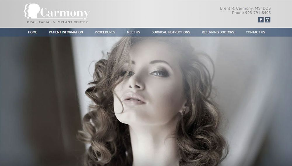
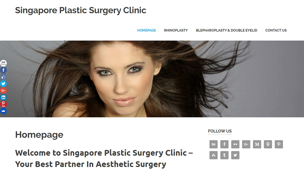
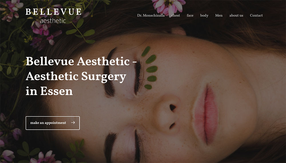
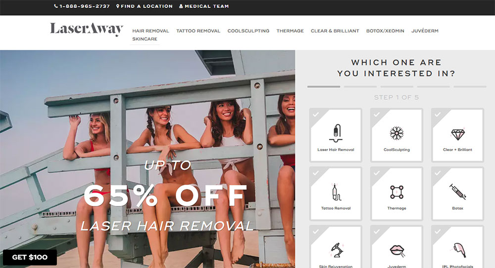
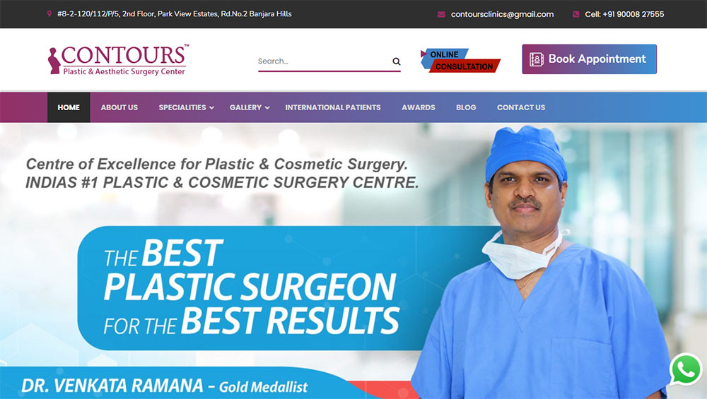
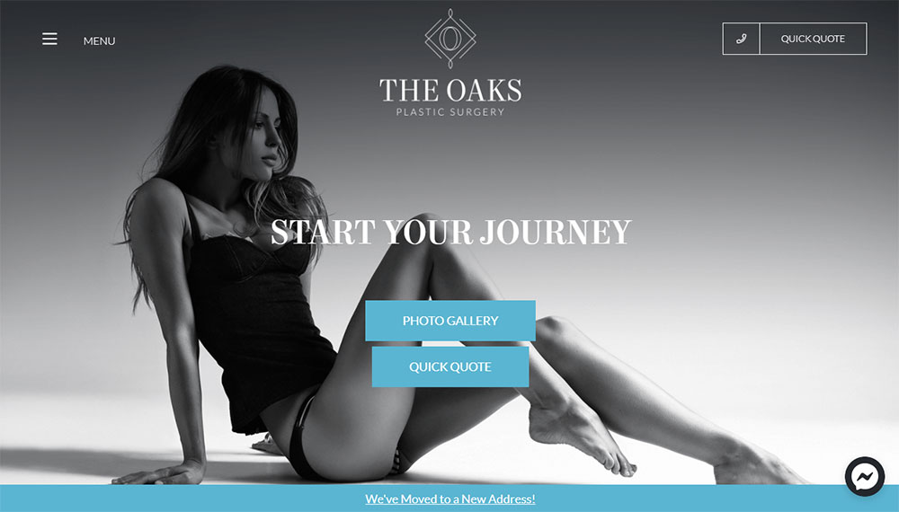
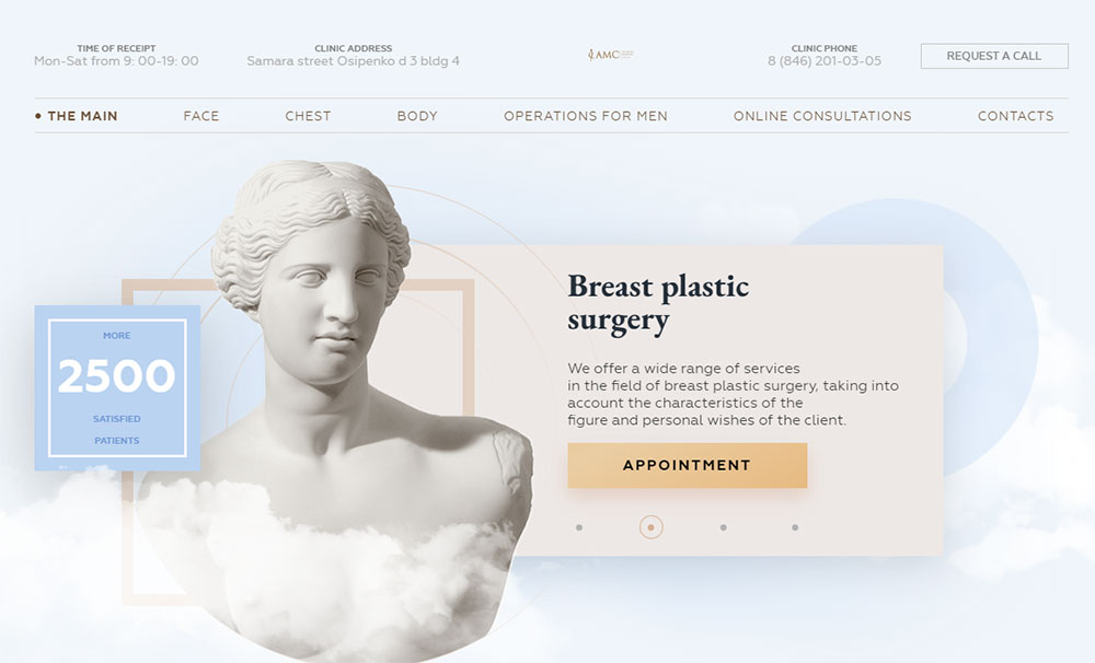
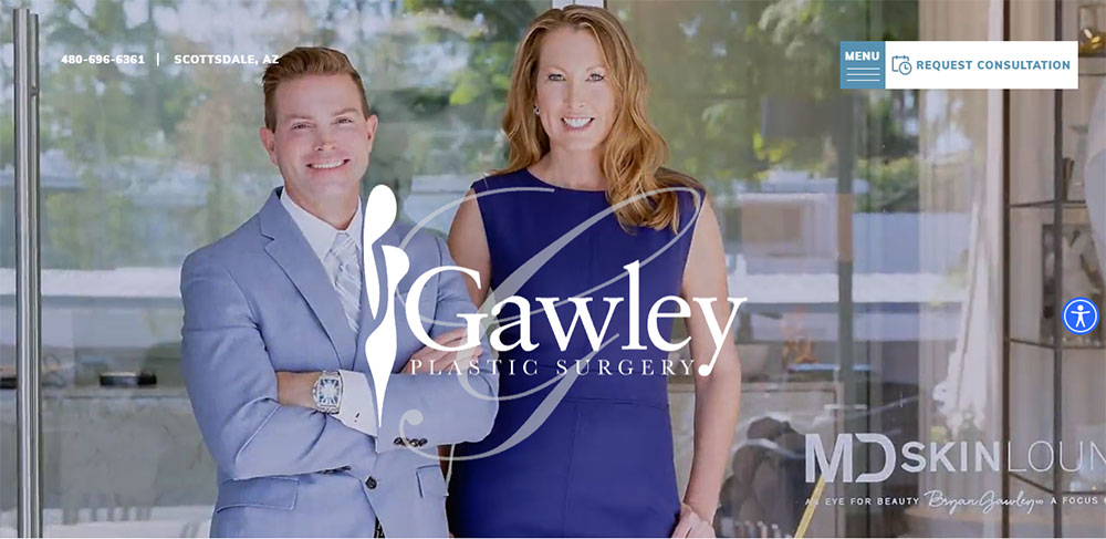
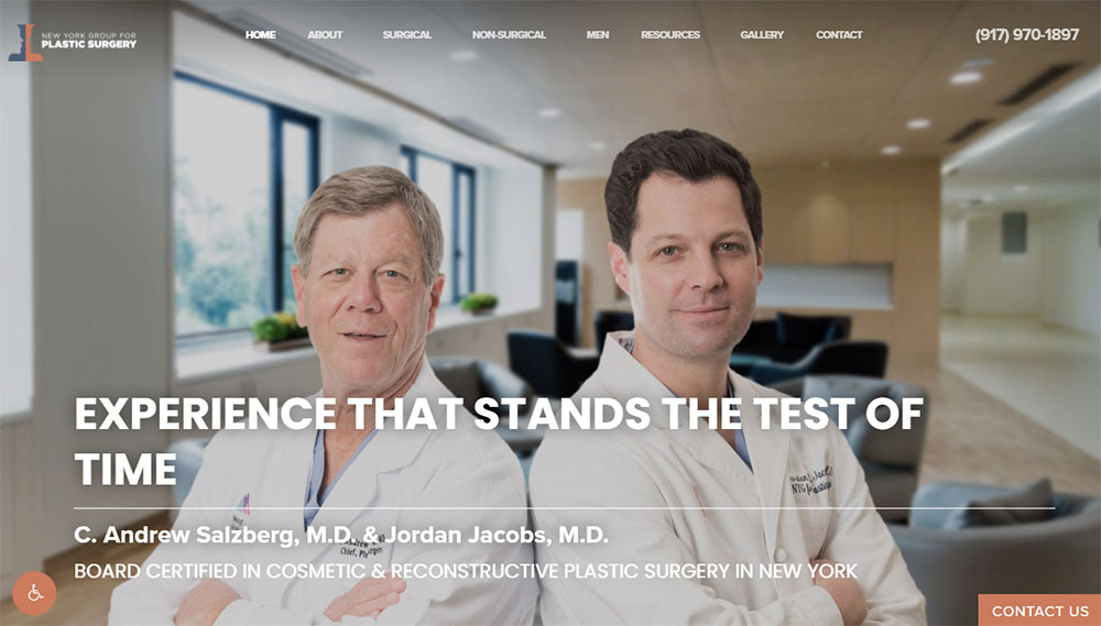
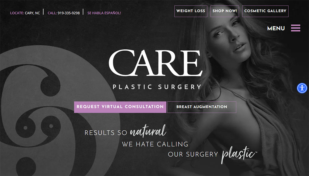
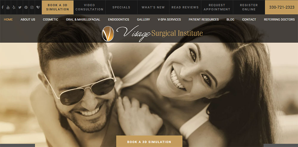
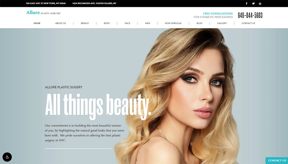
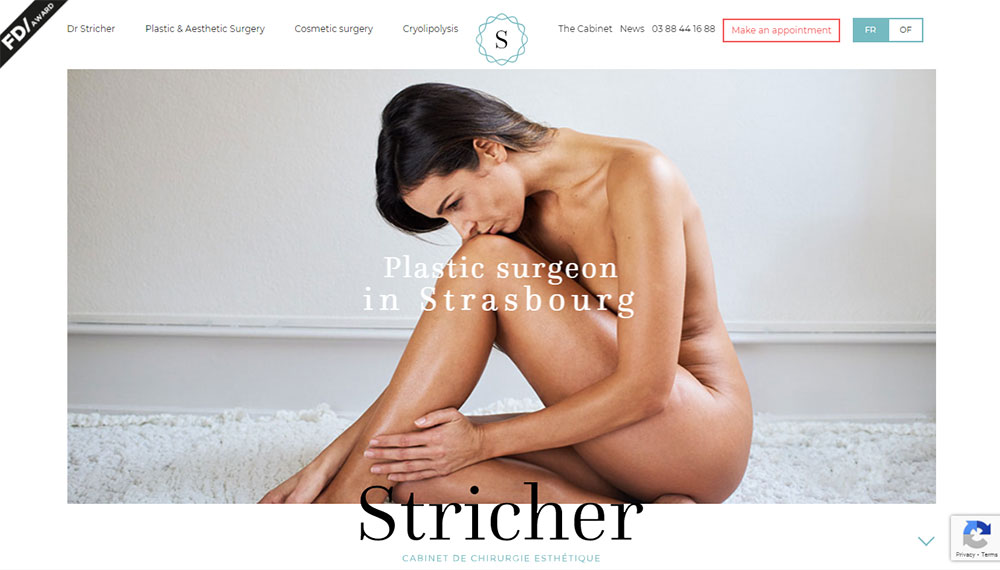
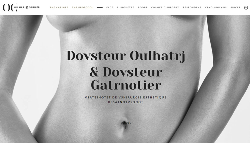
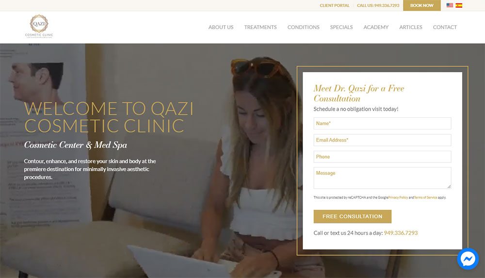
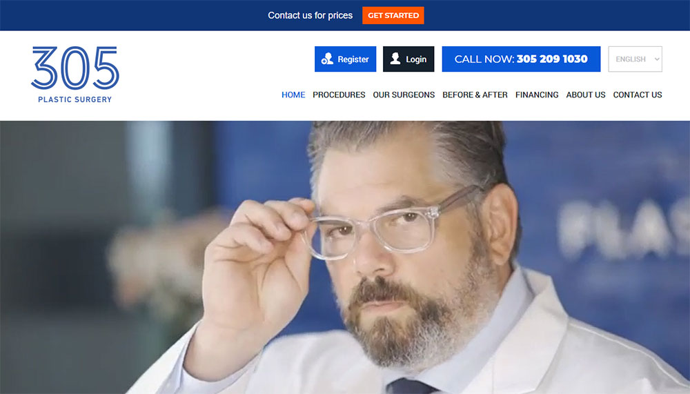
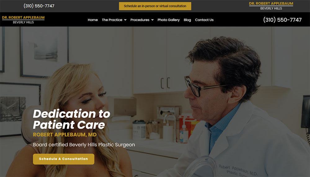
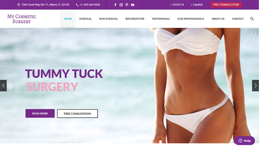
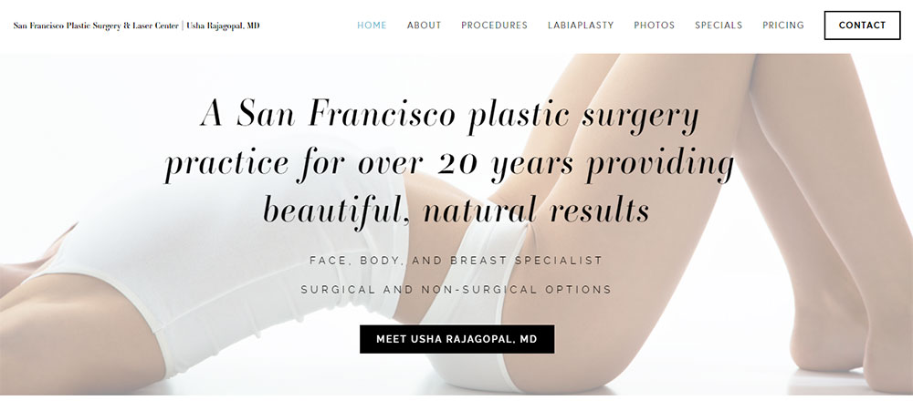
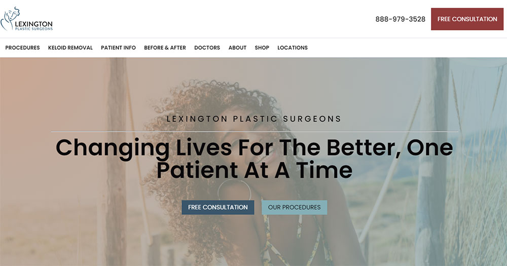
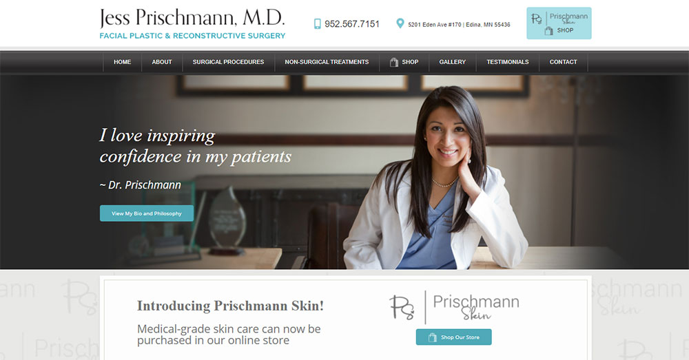
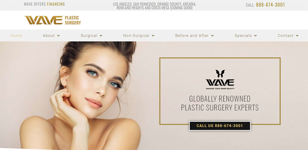
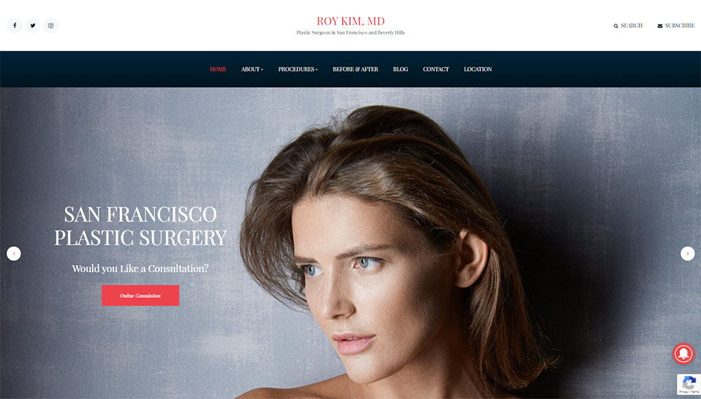
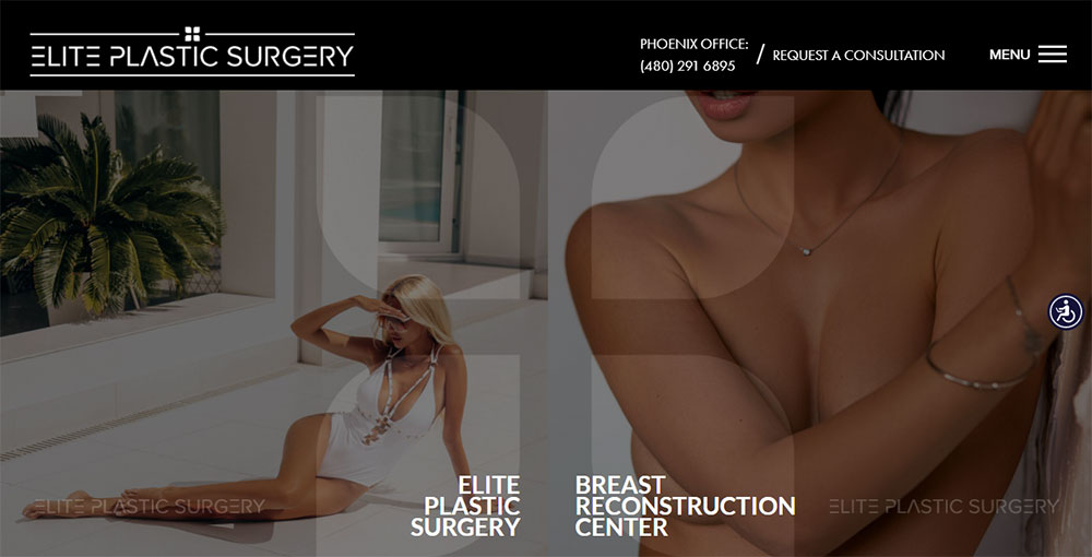
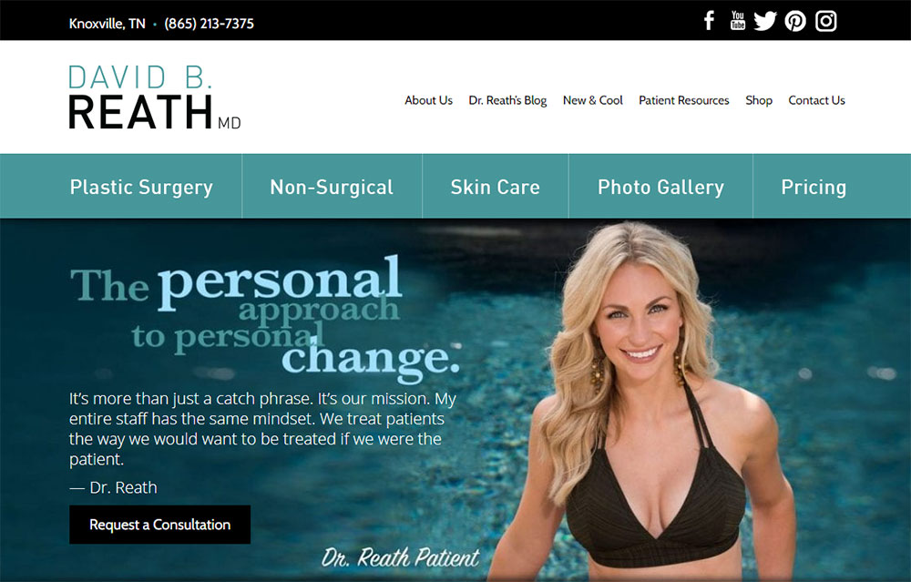
Best Examples of Plastic Surgery Websites
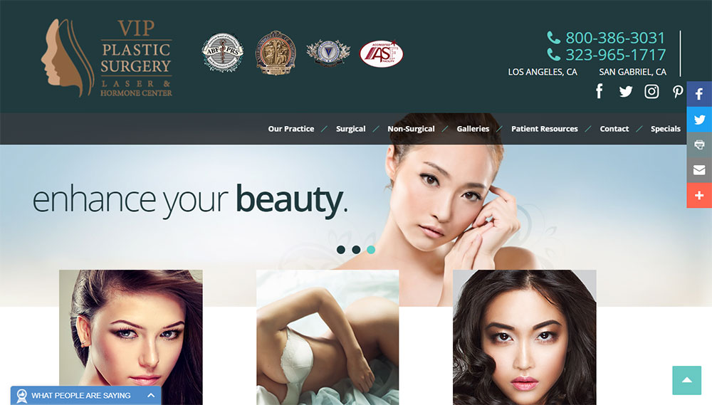
VIP Plastic Surgery
Why Does Website Design Matter for Plastic Surgeons
First impressions happen in seconds. A potential patient lands on your site and immediately decides whether to stay or leave.
Poor design kills trust instantly. Outdated layouts, slow-loading image galleries, broken consultation forms. These problems send patients straight to your competitors.
Strong healthcare websites do the opposite. They build confidence through clean layouts, fast performance, and clear paths to booking.
The American Society of Plastic Surgeons reports that most patients visit multiple surgeon websites before choosing. Your site competes directly against every other cosmetic surgery practice in your area.
How Patients Evaluate Plastic Surgery Websites Before Booking
Patients look for three things immediately: surgical results (before after photos), surgeon qualifications, and easy contact options.
They scan your testimonial page for social proof from real patients. They check if you're board certified. They want to see actual work, not stock photography.
What Makes Plastic Surgery Websites Different from General Medical Websites
Visual proof matters more here than almost any other medical specialty. A patient photo gallery showing real rhinoplasty or tummy tuck results carries more weight than paragraphs of text.
HIPAA compliance adds complexity; every patient image requires documented consent. The booking system needs virtual consultation options since many patients research procedures months before committing.
What Design Elements Do Top Plastic Surgery Websites Share
The best aesthetic clinic websites share common patterns. Not because designers copy each other, but because certain elements consistently convert visitors into consultations.
Understanding color theory matters here. So does strategic white space usage and clean typography.
How Do Before and After Galleries Affect Patient Trust
Galleries are the single most important trust signal on any cosmetic surgery website. Patients spend more time here than anywhere else on your site.
Organize by procedure type: rhinoplasty results separate from breast augmentation, facelift photos grouped with blepharoplasty. Consistent lighting, angles, and backgrounds across all images signal professionalism.
Where Should Contact Forms Appear on a Plastic Surgery Website
Place consultation request forms above the fold on procedure pages, not just the contact page. Effective form design keeps fields minimal: name, phone, procedure interest, preferred contact method.
Add a sticky call to action button on mobile for instant access to booking.
What Color Schemes Work Best for Cosmetic Surgery Sites
Most successful plastic surgery practices use neutral palettes: whites, soft grays, muted blues or greens. A calm color palette builds trust without overwhelming surgical imagery.
Avoid trendy or bold colors. Clean, clinical, approachable works best for this industry.
How Should Surgeon Credentials Be Displayed
Board certifications from the American Board of Plastic Surgery belong prominently on every page, typically in the header or footer. Link to your American Society of Plastic Surgeons profile.
Include medical school, residency, fellowship details, and hospital affiliations. Professional photography of the surgeon builds personal connection.
How to Structure Procedure Pages on Plastic Surgery Websites
Each cosmetic procedure deserves its own dedicated page. Generic "services" pages that list everything together perform poorly in search and convert worse.
Structure matters for both patients and search engines. Follow a consistent template across all procedure pages.
What Information Belongs on a Rhinoplasty Page
Cover procedure description, ideal candidate criteria, recovery timeline (typically 1-2 weeks visible swelling), and realistic outcome expectations. Include your rhinoplasty before and after gallery directly on this page.
Address common concerns: pain levels, anesthesia type, revision rates.
What Information Belongs on a Breast Augmentation Page
Explain implant options (saline vs silicone, sizes, profiles), incision locations, and placement choices. Recovery timeline runs 4-6 weeks for most patients.
FDA recommendations and safety data belong here. So do your breast augmentation results gallery and financing information through CareCredit or Prosper Healthcare Lending.
What Information Belongs on a Facelift Page
Detail the different facelift types: full, mini, mid-face, neck lift combinations. Age ranges and skin laxity indicators help patients self-qualify.
Recovery extends 2-3 weeks for most patients. Include information about combining procedures like blepharoplasty for comprehensive facial rejuvenation.
What Technical Requirements Apply to Plastic Surgery Websites
Technical performance directly impacts patient acquisition. Slow sites lose visitors. Unsecure sites lose trust.
These requirements aren't optional for medical practices handling patient inquiries.
How Fast Should a Plastic Surgery Website Load
Target under 3 seconds on mobile connections. Google PageSpeed Insights scores above 80 for both mobile and desktop.
Image-heavy galleries create the biggest performance challenges. Compress aggressively while maintaining quality for surgical result photos.
What Security Standards Apply to Cosmetic Surgery Sites
SSL certificates are mandatory; no exceptions. HIPAA compliance governs any page collecting patient health information through consultation forms.
Secure your patient booking system and virtual consultation tools with encrypted connections and proper data handling protocols.
How Should Plastic Surgery Websites Handle Image Optimization
Use lazy loading for gallery pages containing dozens of before after photos. Serve WebP format with JPEG fallbacks.
Implement a CDN for faster image delivery across geographic regions. Thumbnail previews that expand to full resolution reduce initial page weight.
What Makes a Plastic Surgery Website Convert Visitors to Patients
Traffic means nothing without conversions. A user friendly website guides visitors naturally toward consultation requests.
Conversion optimization for cosmetic surgery differs from other industries. The decision timeline stretches months, not minutes.
How Do Virtual Consultation Tools Improve Booking Rates
Virtual consultations remove geographic barriers and reduce commitment anxiety. Patients can discuss procedures from home before visiting the clinic.
Integration with your patient booking system streamlines the process. Popular platforms include Symplast and custom WordPress solutions.
What Trust Signals Increase Consultation Requests
Patient testimonials with names and photos outperform anonymous reviews. RealSelf ratings and Healthgrades profiles add third-party credibility.
Media features, published research, and speaking engagements signal expertise. Display these prominently but don't overwhelm the website UI.
How Should Financing Information Be Presented
Cost transparency reduces friction. List price ranges for common procedures even if final quotes require consultation.
Feature financing partners like CareCredit and Prosper Healthcare Lending with clear monthly payment examples. Place this information on procedure pages, not buried in a FAQ.
Common Mistakes in Plastic Surgery Website Design
Certain errors appear repeatedly across cosmetic surgery practices. Most stem from treating the website like a brochure instead of a patient acquisition tool.
Avoiding bad design practices protects your practice reputation and conversion rates.
What Gallery Errors Drive Patients Away
Inconsistent photo quality destroys credibility instantly. Mixed lighting, different backgrounds, varying angles between before and after shots all signal amateur work.
Missing procedure labels confuse visitors. Disorganized galleries without clear categorization waste patient time.
What Navigation Issues Hurt Conversion
Burying contact information kills consultations. Your phone number and booking link belong in the header on every page.
Complex website menu structures frustrate visitors. Keep primary website navigation to 5-7 items maximum.
What Mobile Design Failures Affect Plastic Surgery Sites
Over 60% of plastic surgery searches happen on mobile devices. Galleries that don't pinch-to-zoom, forms that are impossible to complete on phones, tiny tap targets.
Test every page on actual devices, not just browser simulators. Responsive websites adapt to any screen size automatically.
How to Choose a Plastic Surgery Website Design Agency
Not every web design agency understands medical marketing. Cosmetic surgery websites require specific expertise in HIPAA compliance, patient acquisition funnels, and visual portfolio presentation.
The wrong choice wastes months and thousands of dollars.
What Questions Should Surgeons Ask Web Designers
Request their portfolio of doctor websites and specifically cosmetic surgery projects. Ask about HIPAA-compliant form handling and patient image consent workflows.
Verify they understand healthcare lead generation, not just pretty design. Check references from other plastic surgeons.
What Does Professional Plastic Surgery Website Design Cost
Custom designs from experienced medical marketing agencies range $8,000-$25,000+. Template-based solutions using WordPress or Squarespace start around $3,000-$6,000.
Ongoing maintenance, hosting, and updates add $200-$500 monthly. Factor in photography costs for surgeon portraits and before after galleries separately.
FAQ on Plastic Surgery Website Design
What makes a plastic surgery website effective?
An effective plastic surgery website combines high-quality before and after galleries, clear surgeon credentials from the American Board of Plastic Surgery, fast page speed, mobile responsiveness, and prominent consultation booking options that convert visitors into patients.
How much does plastic surgery website design cost?
Custom designs from specialized medical marketing agencies cost $8,000-$25,000. Template-based solutions on WordPress or Squarespace range $3,000-$6,000. Add monthly maintenance fees of $200-$500 plus professional photography costs separately.
What pages should a plastic surgeon website include?
Include dedicated procedure pages for rhinoplasty, breast augmentation, facelift, and liposuction. Add a surgeon bio page, before after gallery, patient testimonials, financing information featuring CareCredit, contact page, and virtual consultation booking system.
How important are before and after photos on cosmetic surgery websites?
Before and after galleries are the most viewed section on any cosmetic surgery website. Patients use surgical results to evaluate surgeon skill. Consistent lighting, angles, and HIPAA-compliant consent documentation are required for every image.
What platform works best for plastic surgery websites?
WordPress powers most successful plastic surgery practices due to flexibility and plugin options. Squarespace and Webflow offer simpler alternatives. Choose platforms supporting HIPAA-compliant forms, image galleries, and integration with patient booking systems like Symplast.
How can I improve my plastic surgery website conversion rate?
Place consultation forms on every procedure page, not just the contact page. Add sticky mobile booking buttons, display trust signals like RealSelf reviews, include financing calculators, and reduce form fields to name, phone, and procedure interest only.
What colors work best for aesthetic clinic websites?
Neutral palettes perform best: whites, soft grays, muted blues, and subtle greens. These colors project clinical professionalism without competing with surgical result photos. Avoid trendy or bold colors that distract from your before after galleries.
How fast should a plastic surgery website load?
Target under 3 seconds on mobile connections. Use Google PageSpeed Insights to measure performance; aim for scores above 80. Compress gallery images, implement lazy loading, and use CDN hosting to improve load times across regions.
Do plastic surgery websites need HIPAA compliance?
HIPAA compliance is mandatory for any website collecting patient health information through consultation forms. This includes SSL certificates, encrypted data transmission, secure storage, and proper consent documentation for all patient photographs displayed.
How often should a cosmetic surgery website be updated?
Add new before and after photos monthly. Update procedure information when techniques change. Refresh surgeon credentials and media features quarterly. Review site performance and conversion rates regularly. Redesign completely every 3-4 years to stay current.
Conclusion
These plastic surgery website design examples prove one thing: patient acquisition starts online.
Your aesthetic practice marketing depends on a website that loads fast, displays surgical results professionally, and makes consultation booking effortless.
Focus on what matters. A strong surgeon bio page with American Society of Plastic Surgeons credentials. Clean medical website navigation. Patient testimonial sections featuring RealSelf reviews. Transparent financing options through CareCredit.
Skip the fancy animations and trendy layouts. Patients want proof of your work, not design awards.
Build your site around the patient journey. Answer their questions on dedicated procedure pages. Show your results in organized galleries. Make contact information impossible to miss.
The best cosmetic surgery websites convert because they remove friction, not because they impress designers.

