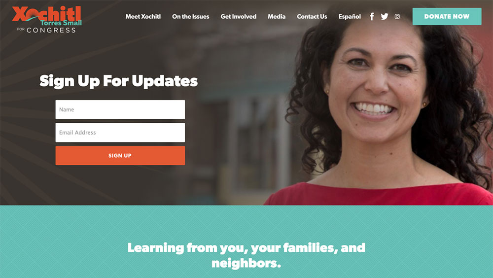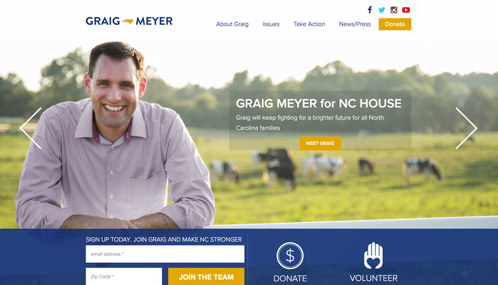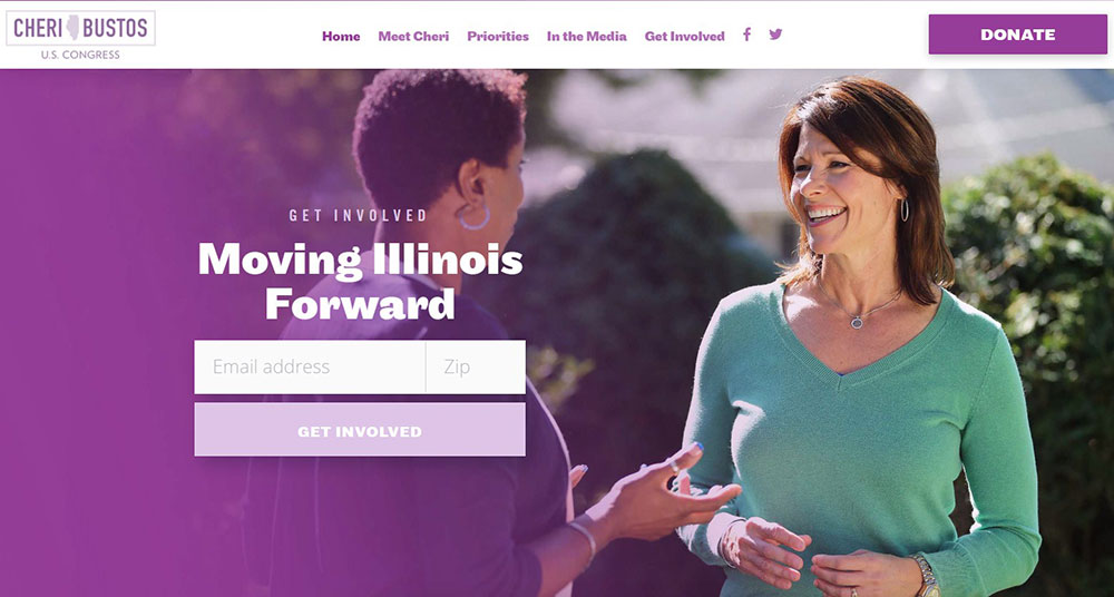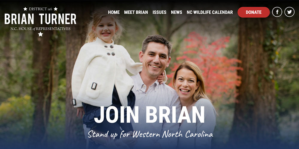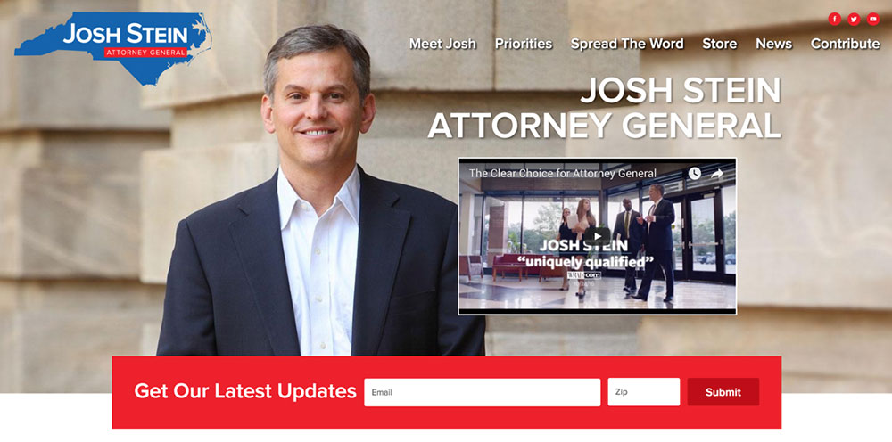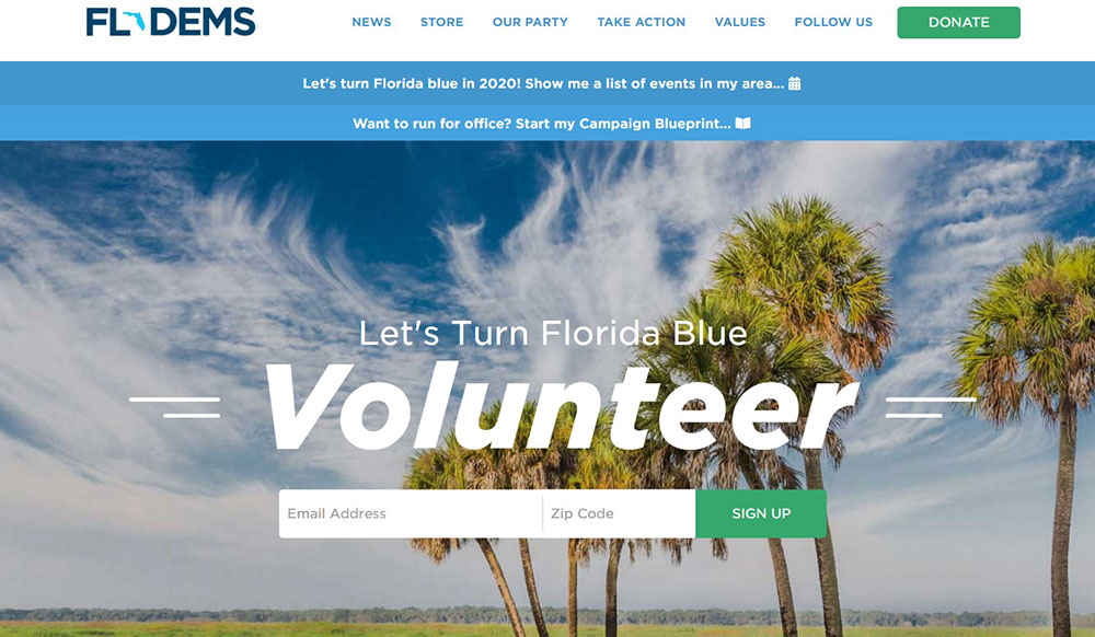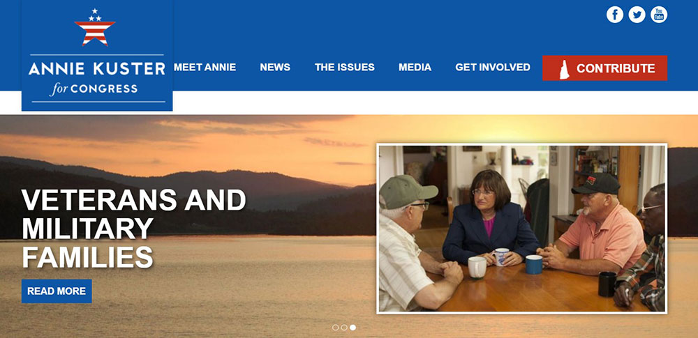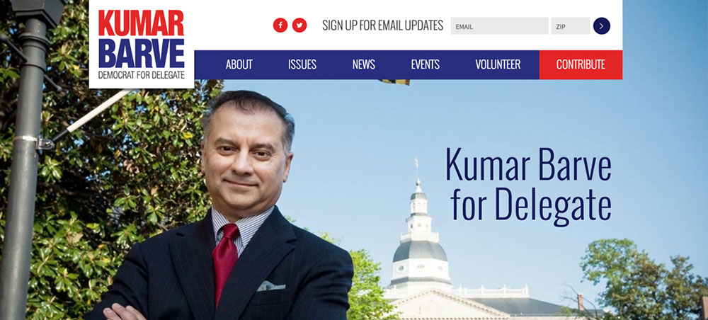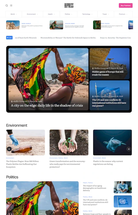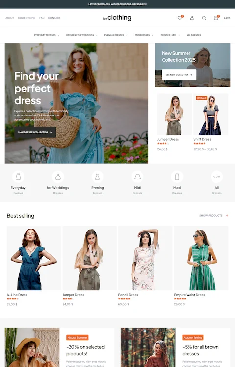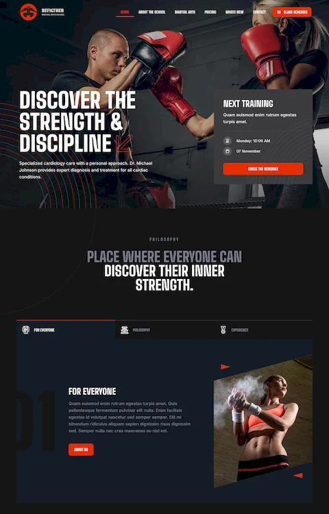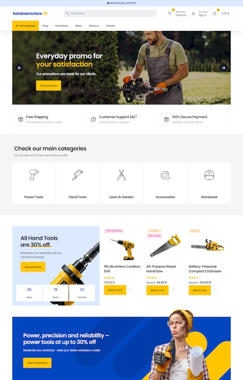
Amazing Colorful Websites With Vibrant Color Schemes
March 14, 2026
Great Looking Websites With A Calm Color Palette
March 17, 2026Voters decide in seconds whether a candidate is worth their time. That judgment often happens on a screen, not at a rally.
Political campaign websites are now the operational core of modern elections. They collect donations, build email lists, recruit volunteers, and establish candidate credibility, all before a single door gets knocked.
But most campaign sites fail at the basics. Wrong platform, missing FEC disclaimers, donation pages that break on mobile, volunteer forms nobody completes.
This guide covers everything: page structure, platform selection, online fundraising, voter data collection, security, compliance, and the metrics that actually matter, from local races to presidential campaigns.
What Is a Political Campaign Website?
A political campaign website is a dedicated digital platform built to support a candidate, ballot measure, or political committee through voter outreach, online fundraising, and message distribution.
It is not the same as a politician's official government site. Government sites serve constituents in an official capacity. Campaign sites exist to win elections.
The distinction matters legally, too. Content on a campaign site triggers FEC disclaimer and disclosure requirements that do not apply to official government pages.
The 3 Core Types of Campaign Sites
| Type | Primary Purpose | Examples |
|---|---|---|
| Candidate site | Voter persuasion, fundraising, volunteer recruitment | Congressional, gubernatorial, mayoral campaigns |
| Ballot measure site | Public education, petition gathering, donor acquisition | Proposition campaigns, referendum committees |
| Party committee site | Candidate support, party fundraising, voter registration | DNC, RNC, state party committees |
Why the Campaign Site Is the Hub
Every other channel points back to it. Social media ads, direct mail QR codes, email campaigns, and paid search all funnel traffic to the campaign website.
Owned data collected on the site (email addresses, donor records, volunteer sign-ups) belongs to the campaign. Social media followers do not.
The Center for Campaign Innovation's 2024 post-election survey found that only about 25% of voters opt in to receive direct communication from campaigns. The campaign website is where that opt-in happens.
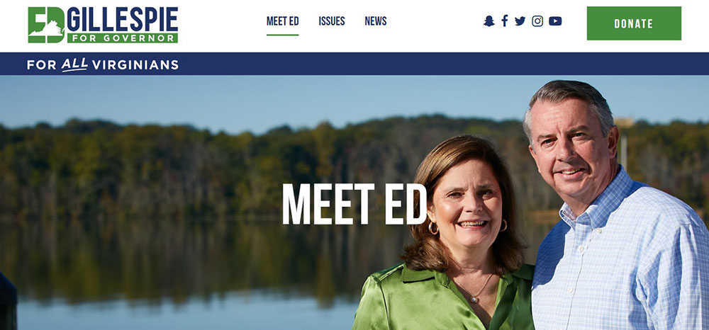
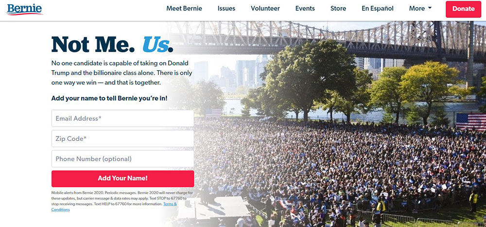
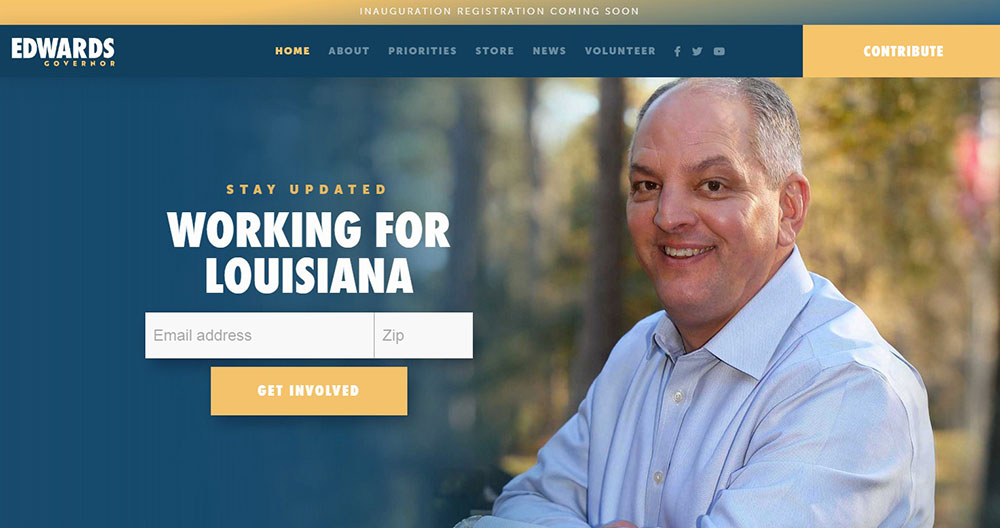
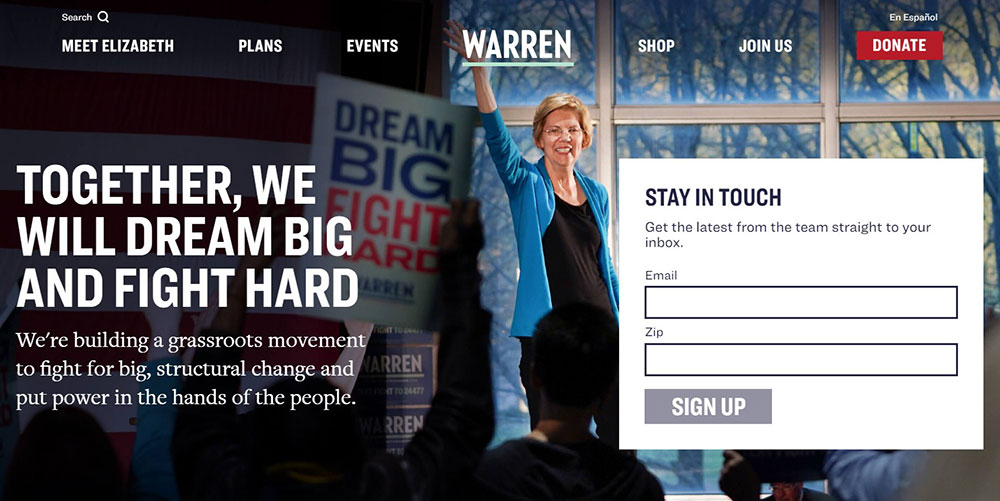
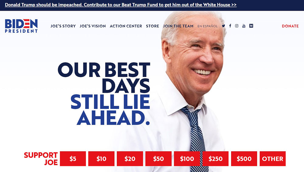
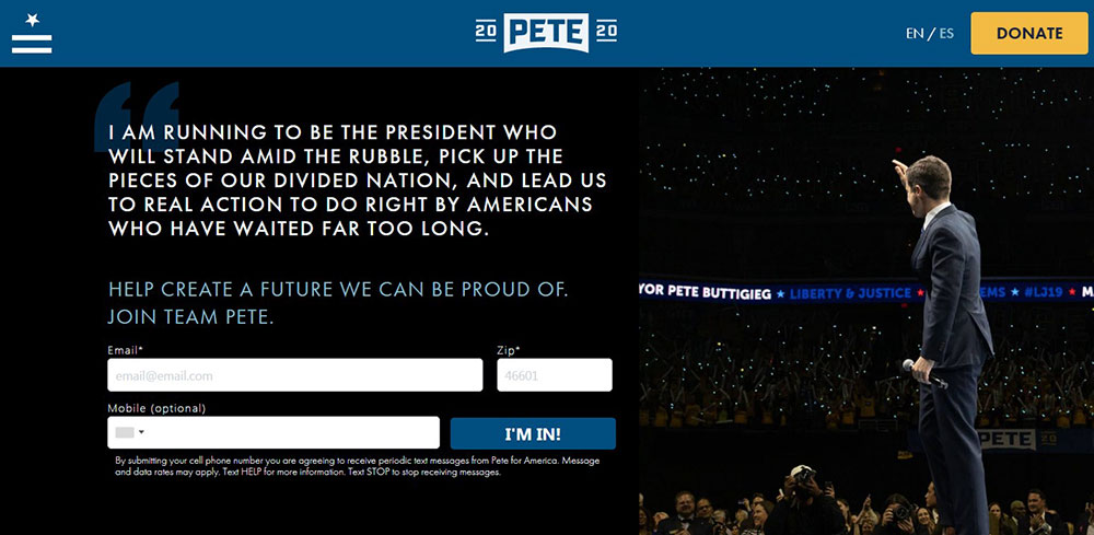
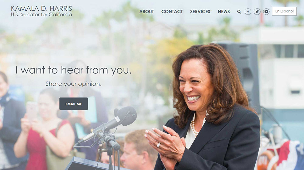
Political Campaign Website Design Examples
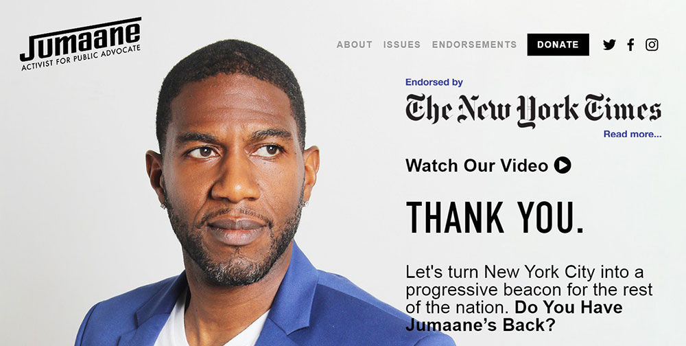
Jumaane Williams for New York
What Pages Does a Political Campaign Website Need?
A campaign site needs 5 core pages. Everything else is optional depending on race size and budget.
Each page has a distinct job. Merging them or skipping them creates gaps in the voter conversion funnel, from first visit to donation or volunteer sign-up.
Homepage Structure and Above-the-Fold Priority
The homepage has one job: get the visitor to take an action before they scroll.
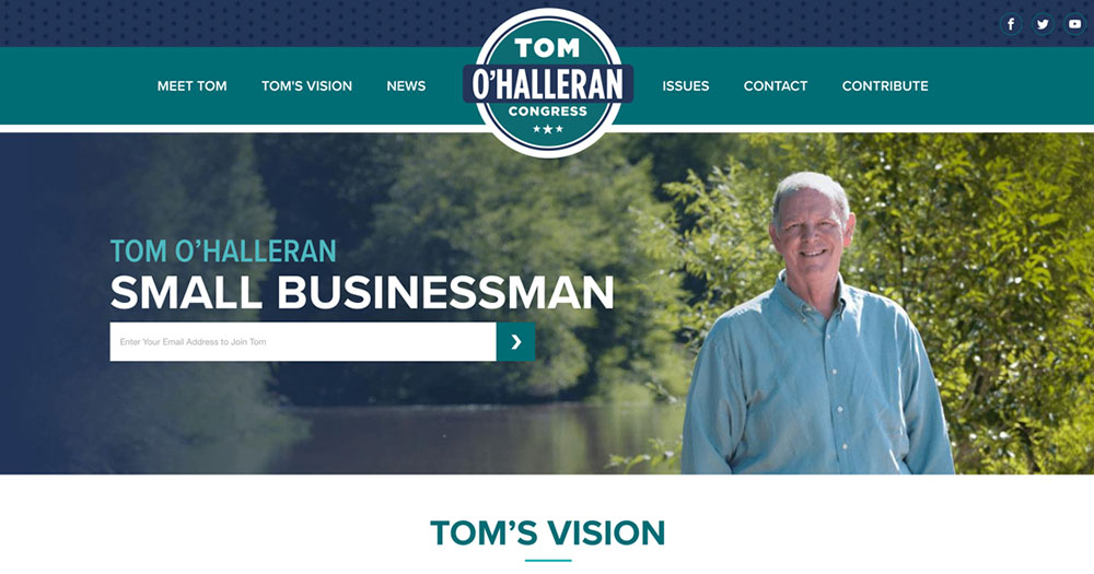
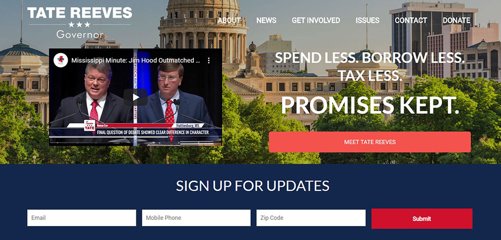
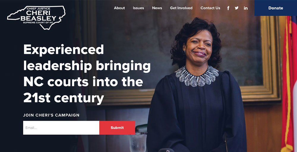
- Candidate name and photo above the fold
- Single primary CTA (donate or sign up, not both)
- Email capture integrated with the hero section
- Clear statement of office sought and district or jurisdiction
Splitting attention between "Donate" and "Volunteer" above the fold reduces both conversion rates. Pick one as the primary CTA based on campaign stage. Early in the cycle, email capture usually wins. Closer to election day, donations take priority.
Issues Page vs. Biography Page: Different Persuasion Jobs
Issues page: Targets undecided voters who are evaluating candidates on policy. Specific positions with concrete language outperform vague statements in voter persuasion research.
Biography page: Targets donors and media. It builds credibility and personal narrative that converts passive supporters into financial contributors.
Both pages need separate, direct URLs. Merging them into a single "About" page buries both purposes and weakens each one.
The 2 Pages Most Campaigns Underinvest In
Press page: Journalists and opposition researchers will look for it. A missing or thin press page signals an amateur operation. Include headshots, biography PDFs, and a contact for media inquiries.
Volunteer page: Form fields should ask for 3 things only: name, email, and zip code. More fields kill sign-up completion rates. MobilizeAmerica integration routes volunteers to local events automatically based on zip code data.
How Does Campaign Website Design Affect Voter Perception?
Stanford Web Credibility Project research found that 75% of users judge a site's credibility based on design alone, before reading a single word of content.
For campaign sites, credibility is the entire product. A candidate asking for trust and a vote cannot afford a site that looks unfinished.
Color, Typography, and Political Signaling
Design choices communicate political positioning without a single word.
- Red and blue remain dominant in US political web design, but contrast ratios and font weight signal party energy and demographic targeting
- Bold sans-serif typography reads as populist or progressive; serif fonts read as institutional or conservative
- Photo selection (crowd shots vs. intimate portraits) affects perceived accessibility
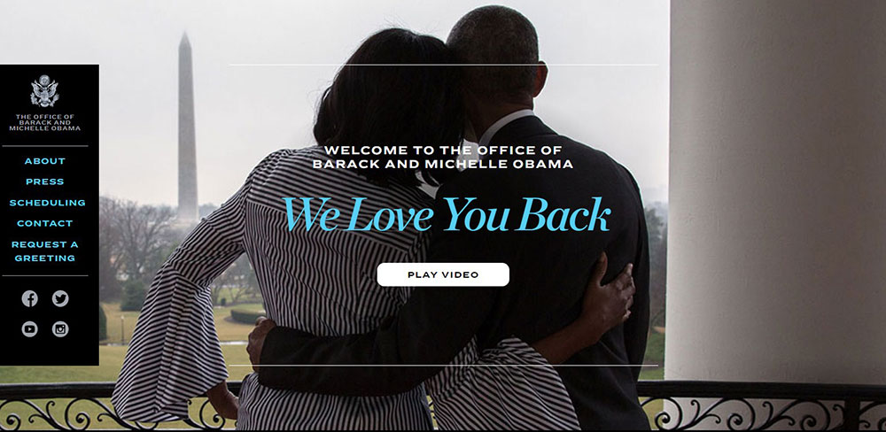
Obama for America's 2008 site set the template for modern campaign website design still referenced today: clean layout, single dominant CTA, high-contrast action button, and a hero section built around the candidate's face.
Mobile Load Speed Is Not Optional
Tech for Campaigns 2024 data shows Americans spend over 7 hours daily online versus just 2.5 hours on TV. The majority of that online time is mobile.
A campaign donation page that takes more than 3 seconds to load on mobile loses a significant portion of visitors before they even see the form. Every second of load delay reduces conversion.
Adobe research confirms that 38% of users stop engaging with a site when the layout or content is visually unattractive. For campaign sites, an unattractive or slow site does not just lose a user. It loses a potential donor or volunteer.
What Good UX Looks Like on a Campaign Site
Good UX on a campaign site is not decorative. It is functional.
| UX Element | What It Does | Common Mistake |
|---|---|---|
| Single primary CTA | Focuses visitor action | Competing buttons above fold |
| Short form fields | Reduces friction on sign-ups | Asking for phone + address upfront |
| Readable typography | Keeps users on page longer | Low contrast text on colored backgrounds |
| Mobile-first layout | Serves majority of traffic | Desktop design scaled down |
What Are the Best Platforms for Building a Political Campaign Website?
The right platform depends on 3 factors: race size, budget, and whether the campaign needs built-in CRM and voter file access or is fine connecting third-party tools.
There is no universal answer. A city council candidate and a Senate campaign have completely different needs.
NationBuilder vs. NGP VAN: Feature Comparison for Mid-Size Campaigns
These are the 2 platforms most discussed among campaign professionals for races above the local level.
| Feature | BeTheme | NationBuilder | NGP VAN (Bonterra) |
|---|---|---|---|
| Website builder | Full drag-and-drop via BeBuilder; politics prebuilt template included | Built-in, no developer needed | Limited; typically requires outside build |
| Voter file access | None (WordPress theme only) | Available on request | Deep integration via VAN |
| FEC compliance tools | None (requires third-party plugins) | Basic | Comprehensive, jurisdiction-specific |
| Pricing start | $60 one-time + hosting (~$3–10/month) | $34/month | $45/month (custom, contact sales) |
| Best for | Campaigns wanting full design control on WordPress with a low one-time cost | Progressive and nonpartisan campaigns globally | Democratic campaigns in the US |
Jacinda Ardern's campaign used NationBuilder to break fundraising goals and win. Randall Woodfin used it to become the youngest mayor in Birmingham, Alabama in over a century. NGP VAN is the default for most Democratic House and Senate campaigns.
When a Custom-Built Site Makes Sense
Presidential and major statewide campaigns build custom platforms. The Biden 2020 campaign had 40+ engineers working on web infrastructure at peak.
For everyone below that level, custom builds are rarely worth the cost or maintenance burden. The exception: campaigns with complex data needs, deep API integrations, or a high volume of concurrent users during fundraising spikes.
Down-Ballot Platforms Worth Knowing
Squarespace: Works for city council and school board races. Clean templates, easy setup, no CRM integration. Fine if ActBlue or WinRed is embedded directly.
WordPress + GiveWP: More flexible, steeper setup, but scales well. Total cost can stay under $500 for a basic local race site with an embedded donation form.
How Do Political Campaign Websites Raise Money Online?
ActBlue has raised $16 billion for Democratic candidates and causes since its founding in 2004 (ActBlue, 2025). WinRed is the Republican equivalent, launched in 2019. Together they process the majority of small-dollar online political donations in the US.
Campaign websites do not process donations directly. They embed or link to these platforms, which handle payment processing and FEC reporting.
Donation Page UX: What the Highest-Converting Pages Have in Common
M+R Benchmarks data puts the average donation page conversion rate at 12% in 2023. The campaigns at the top of that range share 4 consistent UX patterns.
- Minimal form fields: name, email, amount, card number only
- Recurring donation defaulted to monthly, not one-time
- Suggested amounts anchored around one realistic number, not 5 equal options
- Urgency framing: deadline-based copy tied to FEC reporting periods or matching gift windows
Kamala Harris's 2024 campaign raised $81 million through ActBlue in the first 24 hours after launching, the biggest single-day total in the platform's history. That volume is only possible with a frictionless, mobile-optimized donation flow.
Recurring Donor Programs Change the Math
Monthly giving accounted for 28% of all online giving in recent nonprofit benchmarking data (Double the Donation). Campaigns that default donation forms to monthly instead of one-time see substantially higher donor lifetime value.
Most campaigns under-invest in this. The recurring donation checkbox gets added as an afterthought. The highest-performing campaign donation pages make monthly the default selection, not the secondary option.
FEC Compliance Requirements for Online Fundraising
ActBlue fee: 3.95% credit card processing fee on all transactions.
Disclosure: ActBlue reports donor names and amounts to the FEC for all contributions to federal campaigns, regardless of amount. This applies even to small donors who would not otherwise trigger FEC reporting thresholds.
Foreign nationals: Federal law prohibits contributions from foreign nationals. Campaigns collecting donations online need either geographic blocking or a citizenship attestation step in the donation flow.
How Do Campaign Websites Collect and Manage Voter Data?
The primary data goal of most campaign homepage CTAs is email capture, not donations. An email address is worth more than a one-time visitor because it opens the door to repeat asks, event invitations, and volunteer recruitment.
Data collected on the website feeds directly into the campaign's CRM: NationBuilder, NGP VAN, or Action Network. From there it gets matched against the voter file.
Voter File Matching and Why It Matters
Voter file matching connects the names and emails collected on a campaign website to actual registered voters in state databases.
A contact in the CRM who matches a voter file record gets a support level score, a precinct assignment, and becomes part of the field operation's targeting universe. Without matching, web-collected contacts are just names with no geographic or electoral context.
NationBuilder allows campaigns to request a free voter file on account creation. NGP VAN's voter file access runs through the VAN system, which is more granular but requires Democratic party affiliation for full access.
Data Compliance: TCPA, CCPA, and FEC Rules
TCPA compliance: Any phone number collected through a web form that will be used for text message outreach requires explicit opt-in consent at the point of collection. Pre-checked SMS consent boxes do not meet the TCPA standard.
CCPA: California residents have specific data rights. Campaign sites collecting data from California visitors need a compliant privacy policy and must honor data deletion requests.
Cookie consent: Campaign sites using tracking pixels for ad retargeting (Facebook Pixel, Google Ads tags) need cookie consent mechanisms in states with applicable privacy laws.
What Role Does SEO Play in Political Campaign Websites?
Voters search candidate names, office races, and ballot measure information directly in Google. A campaign site that does not appear in those results misses organic traffic that costs nothing to acquire.
SEO for campaign sites is not about ranking for competitive generic terms. It is about owning the search results for the candidate's name and the specific race.
Google's Knowledge Panel and Structured Data
Google pulls candidate information into its Knowledge Panel and candidate carousel from structured data on campaign sites and third-party sources like Ballotpedia.
Schema.org markup for Person and Organization entities helps Google accurately display candidate name, office sought, party affiliation, and website URL in search results without relying on scraped content.
Campaigns that skip Schema markup lose control of how their candidate appears in the carousel. Google fills the gap with whatever it can find, which is often incomplete or pulled from less favorable sources.
Local SEO Signals for Campaign Offices
For campaigns with physical offices, a Google Business Profile tied to the office address creates a local search presence that supports both volunteer recruitment and voter contact.
NAP consistency (Name, Address, Phone) across the campaign site, Google Business Profile, and Ballotpedia listing reduces Google's uncertainty about the entity and improves local pack visibility in geographic searches.
Content Targeting Informational Queries
Voters searching "who is [candidate name]" or "[ballot measure] explained" are in the research phase of their decision. Campaign sites that publish clear, factual content targeting these queries capture undecided voters at the exact moment they are forming opinions.
This works at every level. A school board candidate's site that ranks for "[candidate name] education policy [city]" captures local searchers that no paid ad strategy can reach as cheaply.
For design inspiration that fits a government-adjacent context, the same principles of clarity, accessibility, and trust-signaling apply to both public sector and campaign-focused builds. Similarly, the structured credibility patterns seen in non-profit websites transfer well to candidate sites where trust is the primary conversion driver.
How Do Political Campaign Websites Handle Volunteer Recruitment?
Mobilize (part of NGP VAN) has powered over 22 million volunteer actions since 2018 and maintains a network of more than 6 million volunteers across campaigns and organizations (NGP VAN, 2024).
The volunteer page is where that network connects to individual campaigns. Without a functional volunteer sign-up page, that traffic has nowhere to go.
What the Volunteer Sign-Up Form Needs
Three fields. That is it.
- Name
- Email address
- Zip code
Zip code is the most important field. It allows the CRM to route the volunteer to the local field organizer automatically, without any manual staff intervention.
Asking for phone number, availability, and skills on the initial form reduces completion rates without adding meaningful data. Collect those details in the onboarding email sequence after sign-up.
MobilizeAmerica Integration and Event Routing
Automatic routing: Mobilize integration connects the website sign-up directly to phone banks, canvassing shifts, and events based on the volunteer's zip code.
NGP VAN's own data shows Mobilize's automated follow-up features can increase event sign-ups by up to 40% compared to manual outreach alone.
Congressional campaigns using MobilizeAmerica report significantly better volunteer coordination for door-knocking shifts, with automatic reminders reducing no-shows without requiring staff involvement.
Onboarding Sequences After Sign-Up
The first 24 hours after a volunteer signs up are the highest-engagement window.
Best practice: An automated 3-email sequence: welcome and first action ask, local event invitation, and a direct ask to bring a friend. Campaigns that skip onboarding automation lose a large portion of new volunteers before they complete a single shift.
What Security Requirements Apply to Political Campaign Websites?
Cloudflare automatically mitigated over 6 billion HTTP DDoS requests targeting US election-related websites in the 24-hour period from October 31 to November 1, 2024 alone (Cloudflare, 2024).
Campaign sites are active targets. The attacks are not theoretical.
Free DDoS Protection Available to Campaigns
2 services offer free DDoS protection specifically for political campaigns:
- Cloudflare for Campaigns: Launched in partnership with Defending Digital Campaigns; protects campaign and party sites from volumetric attacks
- Google Project Shield: Defended against more than 25,000 attacks in the first half of 2022 alone, maintaining 99.99% uptime for protected sites (Google Cloud, 2022)
Campaigns that do not use either service are exposed to attacks that a 24,000 requests-per-second spike can take offline entirely, even though that volume is considered modest by Cloudflare's standards.
Email Authentication: DMARC, DKIM, and SPF
Staff credential breaches remain the top attack vector for campaigns. The 2016 DNC hack came through a phishing email, not a direct site compromise.
DMARC + DKIM + SPF records on the campaign domain block spoofed emails impersonating the campaign and protect both staff and donors from phishing attempts.
Setting these up takes under an hour. Most campaigns skip it. That is the entire problem.
Domain and CMS Security Basics
| Security Layer | Requirement | Why It Matters |
|---|---|---|
| HTTPS / SSL | Required for donation pages | PCI DSS compliance; donor trust |
| Domain registrar 2FA | Enable on all accounts | Prevents domain hijacking |
| CMS access control | Remove departed staff immediately | Dormant accounts are a top attack vector |
| Domain renewal | Auto-renew enabled | Expired domains can be registered by bad actors |
How Are Political Campaign Websites Regulated?
The FEC expanded its digital disclaimer rules in March 2023, explicitly applying them to communications placed for a fee on websites, digital devices, applications, and advertising platforms. Not just traditional websites.
Every campaign site, at every level, operates under a specific legal framework. Skipping compliance is not a minor oversight. It is a reportable violation.
FEC Disclaimer Requirements for Campaign Sites
Any public communication by a political committee, including the campaign website itself, must carry a disclaimer (FEC.gov).
Authorized committee format: "Paid for by [Committee Name] and authorized by [Candidate Name]"
Disclaimers must be "clear and conspicuous." The FEC standard is explicit: a disclaimer that is difficult to read or easily overlooked does not comply, regardless of whether it technically appears on the page.
Placement is required on the homepage and on any page that solicits contributions.
State-Level Rules Go Further
State campaign finance laws frequently exceed FEC minimums. Some states require disclaimers on content the FEC does not regulate at all.
Key point: A campaign running in a state with stricter rules cannot simply default to FEC standards. Candidates for state legislative office are governed primarily by state law, not federal rules.
Nonprofit Tech for Good reports that 27% of nonprofits have experienced a cyberattack and only 68% have a website security plan. For campaign sites, which face far more targeted threats, those numbers should be considered a floor, not a ceiling.
Foreign National Contribution Rules Online
Federal law prohibits political contributions from foreign nationals. Campaign donation pages that collect funds without any citizenship verification mechanism are exposed to both legal liability and FEC enforcement.
2 common solutions: geographic IP blocking on donation forms, or a citizenship attestation checkbox required before the payment form loads. Neither is foolproof, but both demonstrate compliance effort, which matters in enforcement proceedings.
What Metrics Determine a Political Campaign Website's Performance?
Campaign website performance is not measured the same way as a commercial site. Revenue per visitor and session duration matter less than the 4 metrics that directly predict electoral and financial outcomes.
Donation Conversion Rate
M+R Benchmarks data puts the average donation page conversion rate at 12% in 2023 for organizations with optimized pages. Most campaign donation pages fall well below that.
Well-optimized campaign pages typically see 1-3% of unique site visitors complete a donation. The gap between site visitors and donors is the primary opportunity.
Bounce rate on the donation page is the leading indicator. High bounce before form interaction means the page is not matching visitor expectations, usually a mismatch between the ad or email that drove the click and what the landing page delivers.
Email Capture Rate
Email capture is the homepage's primary data goal for most campaigns, especially early in the election cycle.
What to track:
- Email sign-ups as a percentage of unique homepage visitors
- Source breakdown (paid traffic vs. organic vs. direct)
- List growth rate week over week during the campaign period
An email address captured early in the cycle can be monetized 3 to 5 times over through repeated donation asks, volunteer recruitment, and event promotion before election day.
Volunteer Sign-Up Completions
Volunteer page conversion is measured as completed form submissions divided by page visitors.
The benchmark is straightforward: a well-designed volunteer form with 3 fields should convert at a higher rate than a donation page. If volunteer conversion is lower, the form has too many fields or the page does not clearly communicate what volunteers will actually do.
Cost Per Donor Acquired
For campaigns running paid traffic to donation landing pages, cost per donor acquired is the metric that determines whether digital advertising is sustainable as a fundraising channel.
Tech for Campaigns 2024 analysis found that political campaigns allocate only 36% of media spend to digital compared to 78% in commercial marketing. Cost per donor acquired improves as that allocation shifts and targeting improves over the cycle.
How Do Down-Ballot Campaign Websites Differ from Presidential Campaign Sites?
The total cost of all federal elections in 2024 was $15.9 billion (Tech for Campaigns, 2024). Congressional candidates alone raised $3.8 billion (FEC, 2024). Down-ballot races operate in an entirely different financial universe.
The difference is not just budget. It is scope, traffic patterns, and what the site actually needs to do.
Presidential Scale: Custom Infrastructure
Presidential campaigns build fully custom platforms with dedicated engineering teams.
Scale differences vs. local races:
- Custom-built CMS and donation infrastructure
- Dedicated A/B testing programs across donation pages and CTAs
- Personalization layers based on voter file matching
- CDN architecture to handle massive simultaneous traffic spikes
The Harris campaign raised $81 million in 24 hours through ActBlue on launch day. That volume requires infrastructure no off-the-shelf platform handles without custom configuration.
Down-Ballot Reality: What Actually Matters
A city council or state legislative candidate needs 3 things working:
- A functional donation page connected to ActBlue or WinRed
- A volunteer sign-up form that feeds into a CRM
- An FEC-compliant disclaimer on every page
Advanced features like A/B testing, personalization, and animated landing pages are cost-justified at the congressional level. Below that, they consume budget and staff time that should go toward voter contact.
Brennan Center analysis shows that total online political ad spending on Google and Meta reached $1.35 billion in the 2023-2024 cycle. The majority of that spending came from a small number of top-tier races. Most down-ballot campaigns drive traffic through direct mail QR codes, local Facebook posts, and earned media coverage, not paid search.
Platform Choice by Race Level
| Race Level | Typical Platform | Approx. Web Budget |
|---|---|---|
| Presidential / Senate | Custom-built | $500K+ |
| Congressional / Gubernatorial | NationBuilder or NGP VAN | $5K - $50K |
| State legislative | NationBuilder or WordPress | $500 - $5K |
| Local / down-ballot | WordPress + BeTheme | Under $500 |
What Are the Most Common Political Campaign Website Mistakes?
Most campaign website failures come from the same 5 repeatable errors. None of them require significant budget or technical skill to fix.
Split CTAs Above the Fold
Placing "Donate" and "Volunteer" as equal-weight CTAs above the fold reduces both conversion rates.
Visitors read a split CTA as a signal that the campaign is not sure what it wants. Pick one primary action based on campaign stage. Relegate the secondary CTA to the navigation or a lower position on the page.
Donation Page Hosted on a Mismatched Domain
The problem: Campaigns that embed a donation form at a subdomain like secure.actblue.com/[campaignname] without matching branding create a visible trust break. The URL changes, the design shifts, and donors who were already hesitant abandon before completing payment.
The fix is a branded ActBlue or WinRed page with matching colors, candidate photo, and consistent copy. Takes under an hour to set up correctly. Seen far too rarely.
Missing or Misplaced FEC Disclaimers
The FEC requires disclaimers on the homepage and every solicitation page. Campaigns that bury the disclaimer in the footer in 8-point gray text are not complying with the "clear and conspicuous" standard.
This creates direct legal exposure. It also creates opposition research material. Neither is worth it.
No Mobile Optimization on Key Conversion Pages
M+R Benchmarks data shows desktop devices still account for 55% of donation transactions and 70% of donation revenue. But mobile traffic volume is higher. A donation or sign-up page that breaks on mobile is losing a large share of the top of the funnel.
The most common failure is a donation form with tiny tap targets and a keyboard that obscures the submit button on small screens. Test every conversion page on an actual phone, not a browser emulator.
Leaving the Site Live After Election Day Without Updating It
Outdated content on a campaign domain after the election does real long-term damage to the domain's credibility if the campaign plans to run again in a future cycle.
At minimum, update the homepage to reflect the election outcome. Remove all donation CTAs once the FEC compliance period closes. Defending Digital Campaigns explicitly recommends that campaigns conduct periodic monitoring for content changes and ensure security certificates remain current between cycles.
For design principles that apply across all of these scenarios, the fundamentals covered in resources on web design principles and web design elements apply directly. A well-structured website footer is also where FEC disclaimers often live, making footer design a compliance consideration, not just an aesthetic one. And the broader patterns seen in high-performing lead generation landing pages map closely to what works on campaign donation and volunteer sign-up pages.
FAQ on Political Campaign Websites
What is the purpose of a political campaign website?
A political campaign website is the central hub for voter outreach, online fundraising, and volunteer recruitment. It collects donor data, builds email lists, and directs all digital traffic from social media, paid ads, and direct mail back to one owned platform.
What pages does a campaign website need?
Every campaign site needs 5 core pages: homepage, issues, biography, volunteer sign-up, and donation page. The homepage needs a single primary call to action. Everything else supports those conversion goals.
What is the best platform for a political campaign website?
NationBuilder works well for most campaigns, starting at $34/month with built-in CRM and voter file access. NGP VAN suits Democratic campaigns needing deep compliance tools. Squarespace and WordPress cover local races under $500.
How do campaign websites collect donations?
Most US campaigns embed ActBlue (Democratic) or WinRed (Republican) donation forms directly on their site. These platforms handle payment processing, FEC reporting, and donor data. ActBlue charges a 3.95% credit card processing fee per transaction.
What FEC disclaimer is required on a campaign website?
The FEC requires a "Paid for by [Committee Name]" disclaimer on the homepage and every solicitation page. It must be clear and conspicuous. Small or low-contrast text does not meet the legal standard and creates compliance risk.
How do campaign websites handle voter data?
Email addresses and names collected on the site feed into a CRM like NationBuilder or NGP VAN, then get matched against the state voter file. TCPA compliance governs SMS opt-ins. CCPA applies to California visitor data collection.
How do you protect a campaign website from cyberattacks?
Use Cloudflare for Campaigns or Google Project Shield for free DDoS protection. Enable HTTPS on all pages, set DMARC and DKIM email authentication, and remove CMS access for any departed staff immediately after they leave.
What metrics matter most for a campaign website?
Track 4 metrics: donation conversion rate, email capture rate, volunteer sign-up completions, and cost per donor acquired from paid traffic. Bounce rate on the donation page is the leading indicator of form friction and lost revenue.
How is a down-ballot campaign website different from a presidential one?
Presidential campaigns build custom platforms with dedicated engineering teams. Local and state legislative campaigns typically use NationBuilder or Squarespace for under $500. Down-ballot sites need a working donation page, volunteer form, and FEC disclaimer. Nothing more.
What are the most common campaign website mistakes?
The top 5 mistakes: split CTAs above the fold, donation pages on mismatched domains, missing FEC disclaimers, no mobile optimization on conversion pages, and leaving outdated content live after election day without updating or archiving the site.
Conclusion
This conclusion is for an article presenting political campaign websites as more than a digital brochure. They are the operational backbone of modern candidate outreach, donor acquisition, and field organizing.
Platform choice, FEC compliance, mobile optimization, and DDoS protection are not optional considerations. They are the difference between a site that converts and one that creates legal exposure.
Whether you are running a school board race on Squarespace or a Senate campaign on NationBuilder, the fundamentals stay the same: one clear CTA, a friction-free donation page, and a volunteer form that feeds directly into your CRM.
Get those right, and your campaign website does real work between now and election day.
