Conference Website Design Examples That Impress
September 6, 2025
Modern Healthcare Website Design Examples to Inspire You
September 11, 2025Your bespoke suits deserve a website that sells as well as you do.
Most tailor website design examples online look dated, clunky, or fail to convert browsers into fitting appointments.
That's a problem when clients expect Savile Row craftsmanship from the first click.
This guide breaks down 15 tailoring business websites that actually work.
You'll learn what separates a forgettable homepage from one that books consultations on autopilot.
We cover visual design principles, appointment booking systems, portfolio presentation, color schemes, and platform costs.
Whether you're launching a new custom suit website or redesigning an existing alteration service page, these examples provide a blueprint worth stealing.
What is Tailor Website Design
Tailor website design is the visual and functional structure of websites built specifically for bespoke tailoring businesses, alteration services, and custom suit makers.
These websites serve a single purpose: convert visitors into fitting appointments.
A well-designed tailor website combines fabric selection galleries, measurement submission forms, and appointment booking systems into one cohesive experience.
Think of it as a digital storefront for Savile Row-level craftsmanship.
The best examples showcase portfolio photography of completed garments while making consultation booking effortless.
Unlike generic clothing websites, tailor sites emphasize personalization and craftsmanship over mass-market appeal.
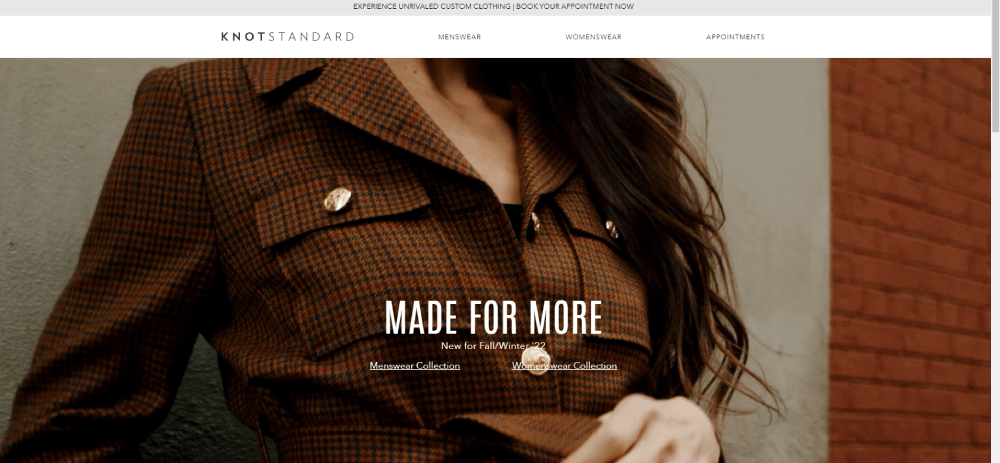
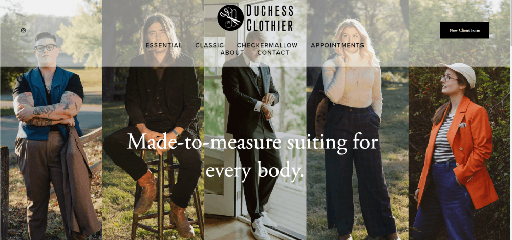
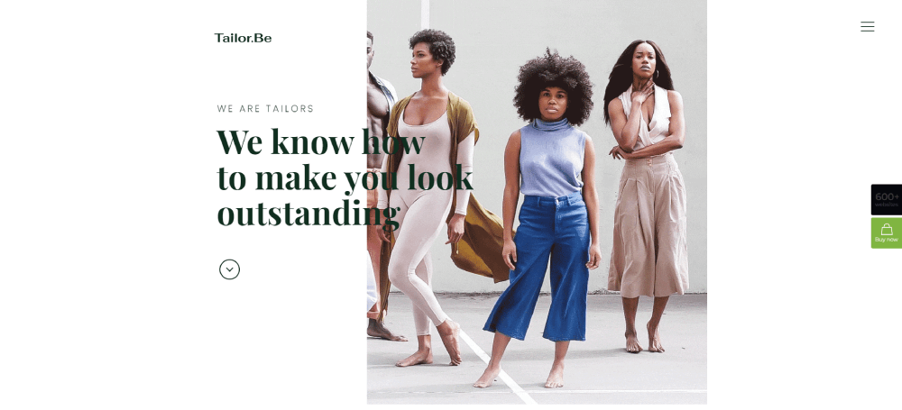
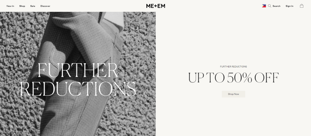
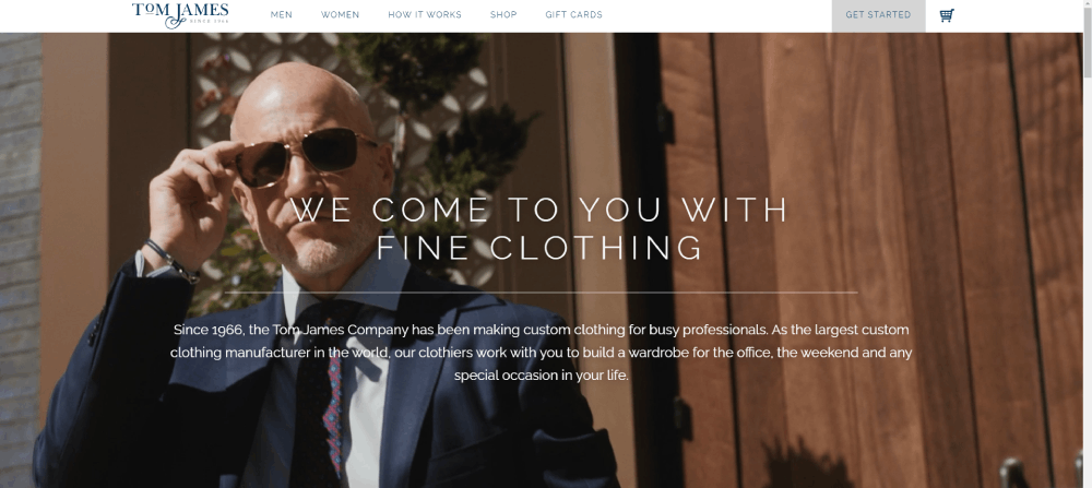
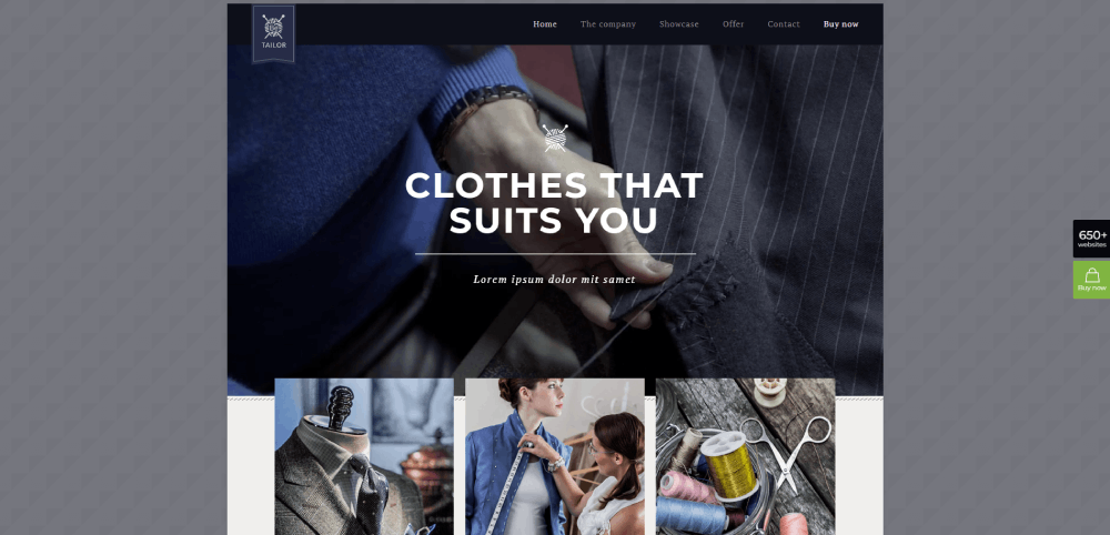
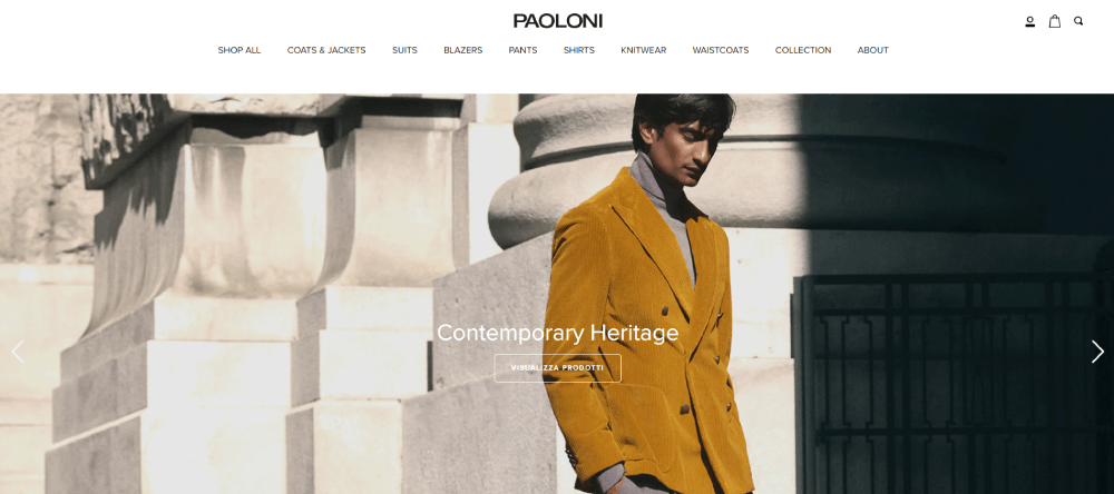
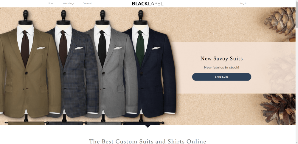
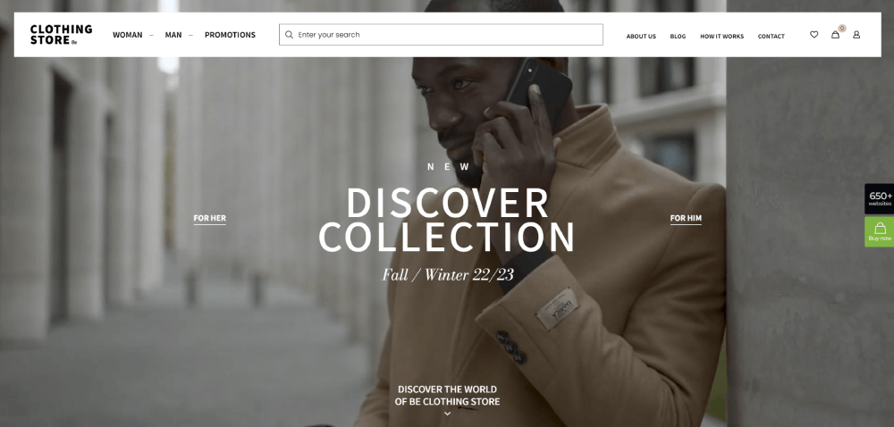
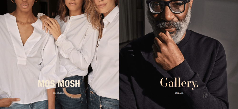
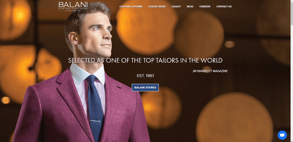
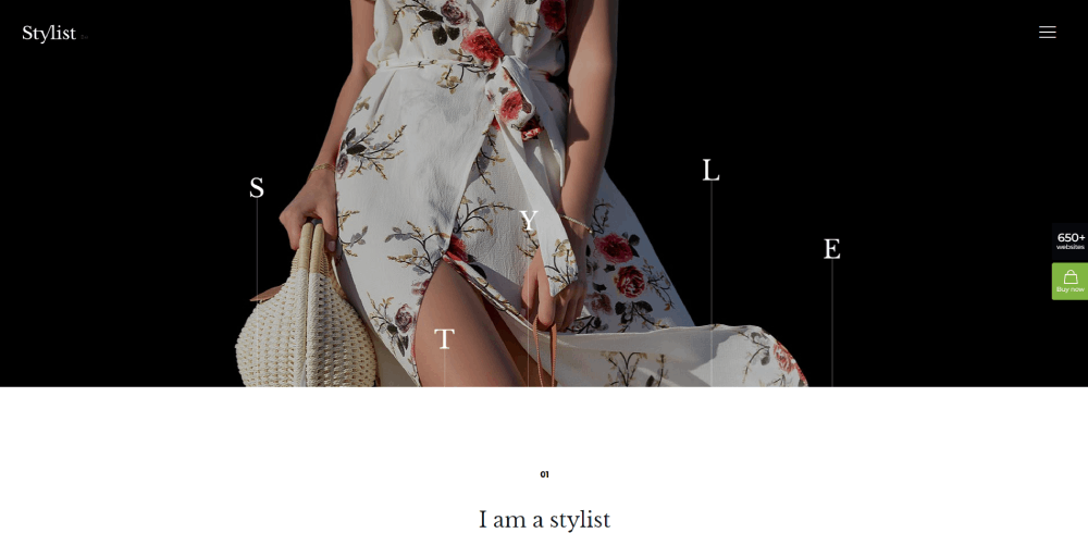
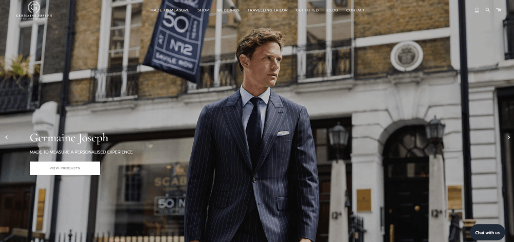
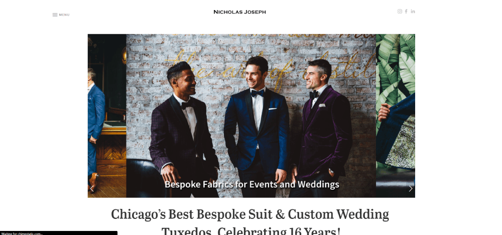
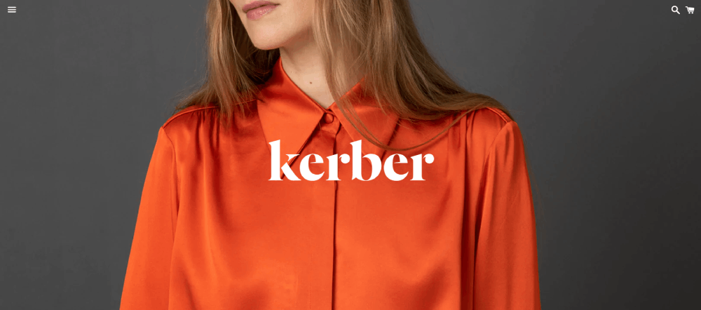
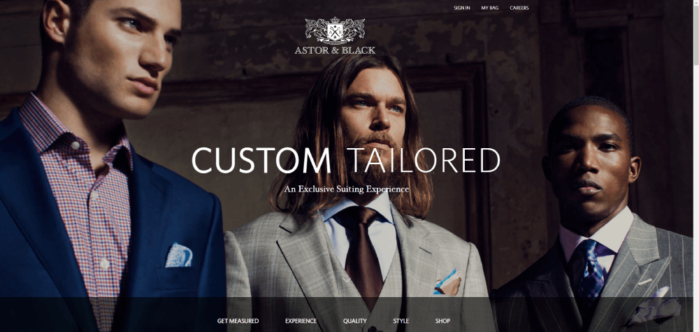
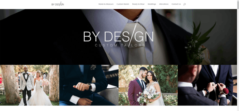
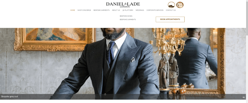
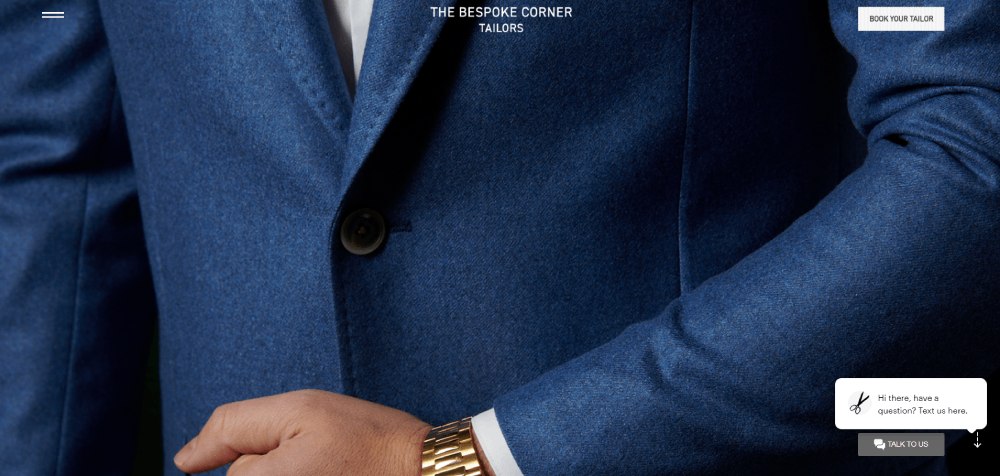
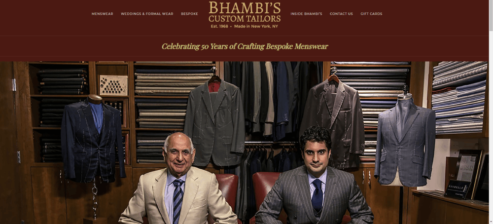
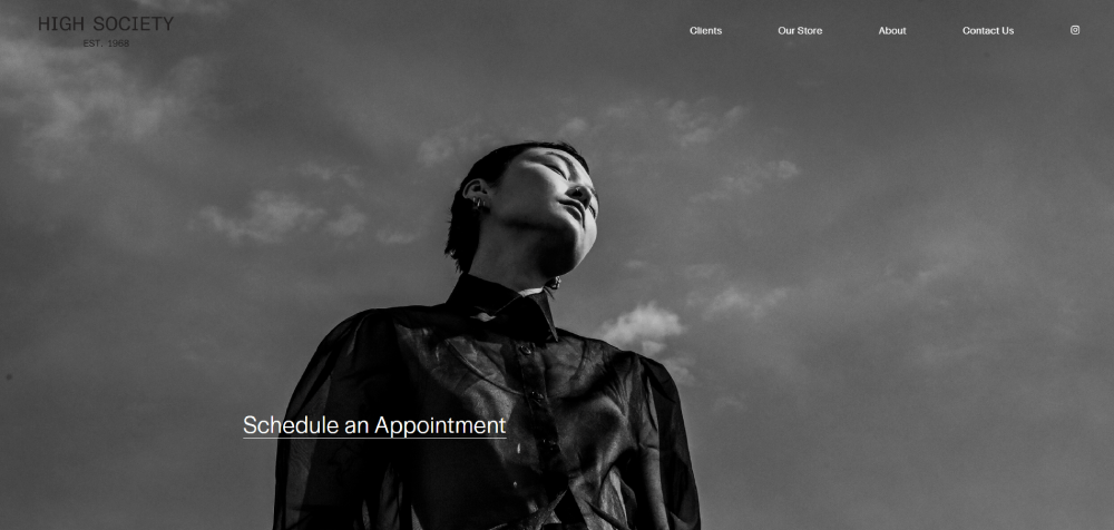
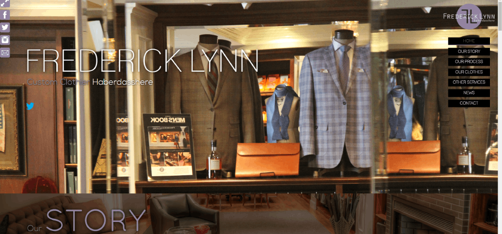
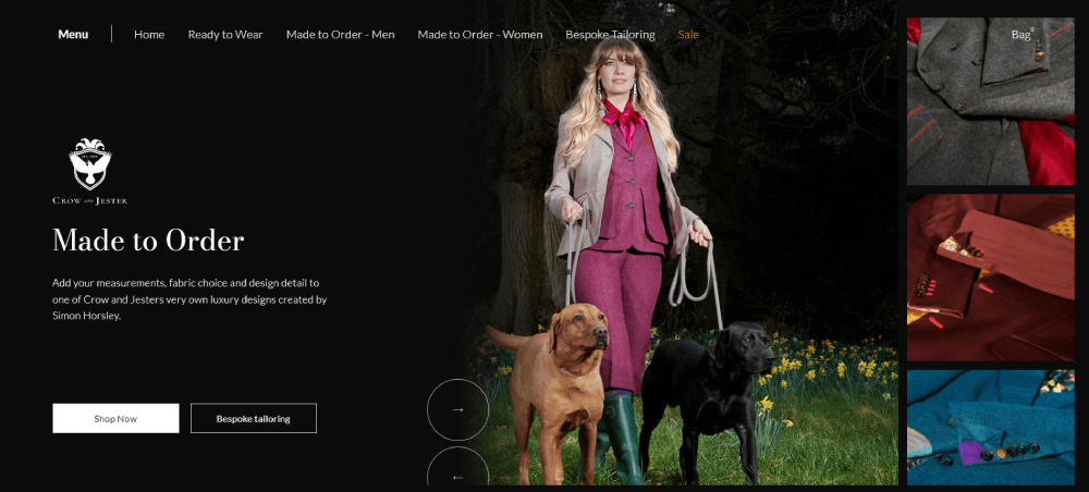
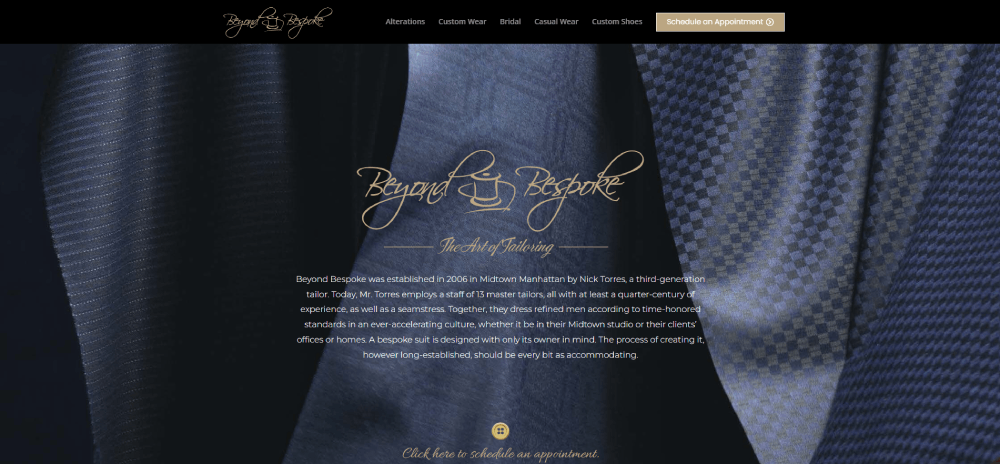
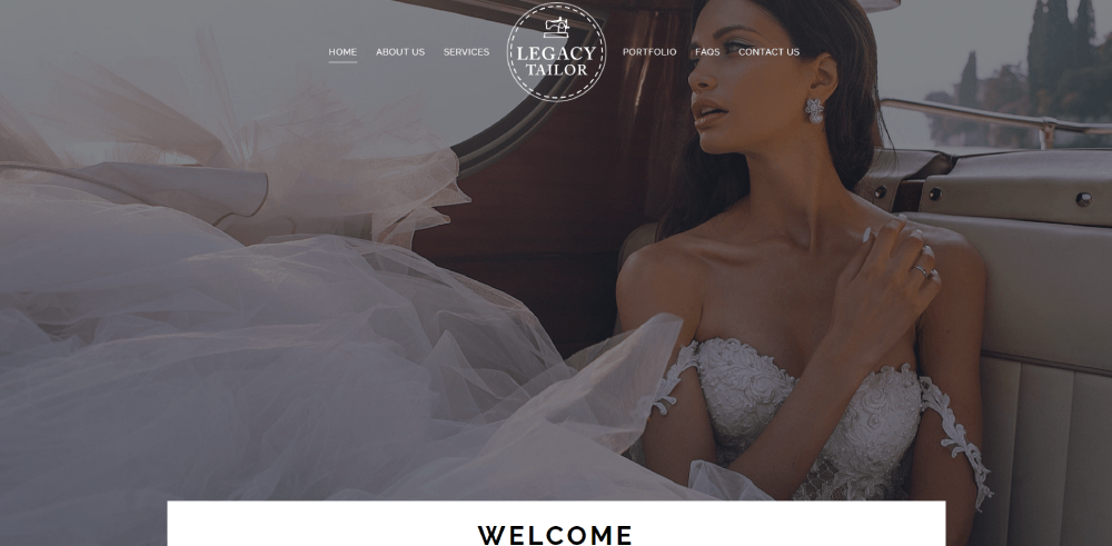
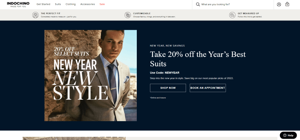
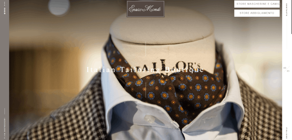
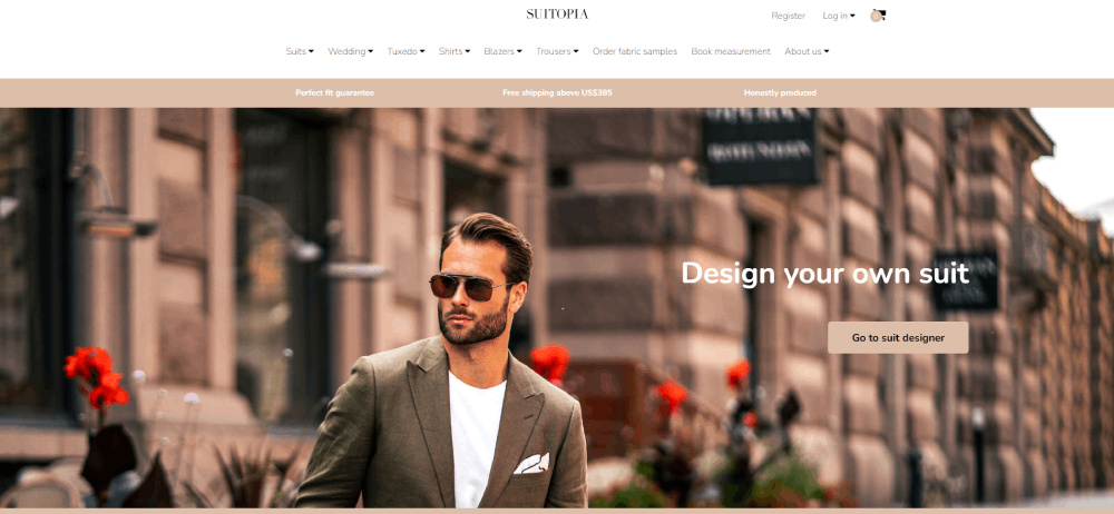
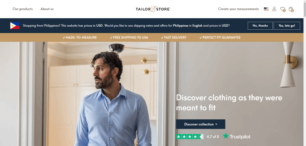
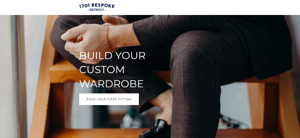
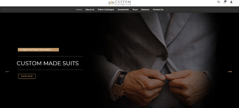
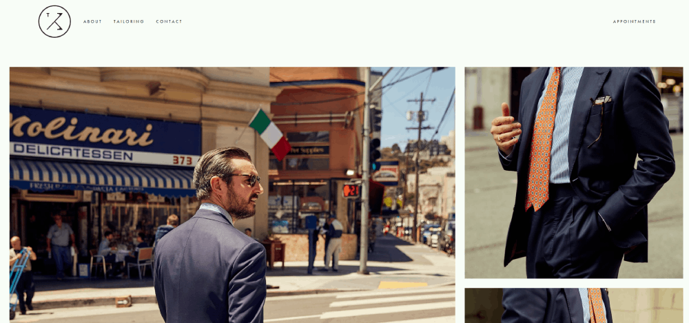
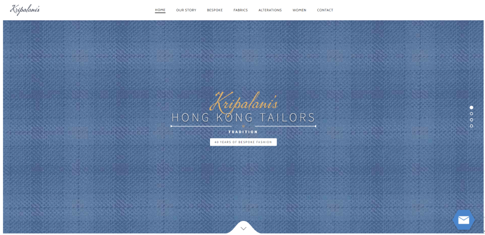
Tailor Website Design Examples
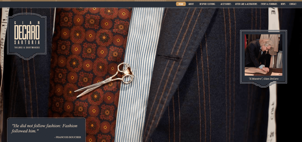
Gian Decaro
How Does a Tailor Website Work
A tailor website functions as an appointment generation machine with visual proof of expertise.
Visitors land on the homepage, browse the suit maker portfolio, and book a style consultation through integrated scheduling tools like Calendly or Acuity Scheduling.
Core User Flow
Homepage with hero section imagery → Service pages for bespoke suits, alterations, wedding attire → Portfolio gallery with completed work → Booking widget for fitting appointments.
Technical Components
- Appointment booking system integrated with calendar sync
- Fabric swatch display with zoom functionality
- Online measurement forms for remote consultations
- Client testimonial sections with before/after photos
- Google My Business integration for local visibility
The measurement submission process varies by tailor.
Some use detailed form design with guided instructions, others prefer video call consultations.
Made-to-measure ordering systems connect fabric selection directly to production workflows.
What Makes a Good Tailor Website Design
Three factors separate exceptional tailor websites from forgettable ones: visual sophistication, booking simplicity, and trust signals.
Visual Sophistication
High-quality portfolio photography is non-negotiable.
Clients paying for custom suits expect to see your craftsmanship before booking.
Effective typography choices signal luxury without trying too hard.
Most successful tailor sites use generous white space to let garment images breathe.
Booking Simplicity
Every page should funnel toward one action: scheduling a consultation.
Effective call to action buttons appear above the fold and after portfolio sections.
Complex multi-step booking processes kill conversions.
Trust Signals
- Client testimonials with specific details about fit and service
- Fabric partner logos (Holland & Sherry, Loro Piana, Vitale Barberis Canonico)
- Years in business, garments completed, or clients served
- Clear tailor shop location maps with contact information
A testimonial page with detailed client stories outperforms generic star ratings.
What Features Should a Tailor Website Include
Five feature categories separate professional tailoring business websites from amateur attempts.
Appointment Scheduling
- Calendar integration (Calendly, Acuity Scheduling, or custom solutions)
- Multiple appointment types: initial consultation, fitting, final pickup
- Automated confirmation and reminder emails
Portfolio Display
Grid-based gallery layouts work best for showcasing completed garments.
Categories should include wedding suits, business attire, casual tailoring, and alterations.
Similar to how photographer websites organize their work, tailor portfolios need clear visual hierarchy.
Service Information
- Clear website menu structure separating bespoke, made-to-measure, and alterations
- Process explanations without jargon overload
- Timeline expectations for each service type
Fabric Resources
Swatch galleries organized by mill: Ermenegildo Zegna, Holland & Sherry, Vitale Barberis Canonico.
Filter options for weight, pattern, and price tier.
Trust Elements
Client testimonials, fabric partner credentials, and years of experience displayed prominently.
Contact information visible on every page, including tailor shop location maps.
How to Design a Website for a Tailoring Business
Start with appointment booking as the core function, then build everything else around it.
Step 1: Define Your Service Focus
Bespoke suits, alterations, or wedding tailoring each require different site structures.
Pick one primary service for your homepage messaging.
Step 2: Build Your Portfolio First
Photograph your 10-15 best completed garments before touching any design software.
No portfolio, no credibility.
Invest in professional shots showing fabric texture, lapel construction, and fit details.
Step 3: Choose Your Platform
- Squarespace: Best for visual portfolios, built-in scheduling
- WordPress: Maximum flexibility, requires more setup
- Wix: Fastest launch, limited customization
- Shopify: Only if selling ready-made items alongside bespoke services
Step 4: Structure Your Pages
Homepage → Services (separate pages for bespoke, alterations, wedding) → Portfolio → About → Contact/Book.
Keep the website navigation under six main items.
Step 5: Integrate Booking
Calendly or Acuity Scheduling embed directly into WordPress and Squarespace.
Test the booking flow on mobile before launching.
Step 6: Optimize for Local Search
Claim your Google My Business listing, add tailor shop location maps, include city name in page titles.
Local schema markup helps search engines connect your site to geographic queries.
What Colors Work Best for Tailor Website Design
Color psychology matters more for tailoring sites than most service businesses.
Your palette signals luxury, trust, and craftsmanship before visitors read a single word.
Classic Combinations
- Navy + gold accents: Traditional authority, works for Savile Row-style positioning
- Black + white + burgundy: Modern sophistication, strong contrast
- Charcoal + cream: Understated elegance, lets portfolio images dominate
A luxury color palette typically uses 60% neutral base, 30% secondary tone, 10% accent.
Colors to Avoid
Bright oranges, neon greens, and saturated blues scream discount retail.
These undermine the premium positioning that bespoke tailoring requires.
Dark Mode Considerations
Dark themed websites showcase fabric textures exceptionally well.
Deep backgrounds make garment photography pop.
Brioni and Tom Ford both use this approach.
Applying Color Theory
Understanding color theory helps you create intentional palettes rather than random choices.
Complementary colors create energy; analogous schemes feel harmonious and refined.
How Much Does a Tailor Website Cost
Budget ranges depend on platform choice, custom functionality, and whether you DIY or hire professionals.
DIY Options
- Squarespace: $16-49/month, includes hosting and templates
- Wix: $17-35/month, drag-and-drop builder
- WordPress.com: $4-45/month, more flexibility than Wix
Total first-year cost: $200-600 plus domain registration.
Professional Design
- Freelance designer: $1,500-5,000 for custom WordPress or Squarespace build
- Design agency: $5,000-15,000+ for full branding and development
- Premium templates: $50-200 one-time, customize yourself
Ongoing Costs
Hosting ($10-30/month), domain renewal ($12-20/year), booking software ($0-25/month), email marketing via Mailchimp ($0-20/month).
Budget $500-1,000 annually for maintenance and updates.
Where to Invest
Portfolio photography delivers the highest ROI.
A $500 photo shoot outperforms a $5,000 website with poor images.
What is the Difference Between Tailor Websites and Fashion Designer Websites
Both showcase garments, but the business models and user expectations differ completely.
Tailor Websites
- Primary goal: book consultations and fitting appointments
- Focus on service process, craftsmanship, and personalization
- Local SEO critical for geographic targeting
- Portfolio shows client work, not runway collections
- Pricing often discussed in-person, not displayed
Fashion Designer Websites
- Primary goal: sell ready-to-wear collections or build brand awareness
- Focus on seasonal lookbooks, editorial content, brand storytelling
- Global audience, less geographic dependency
- E-commerce functionality usually required
- Pricing displayed with add-to-cart functionality
Fashion websites prioritize brand image and direct sales.
Tailor sites prioritize relationship building and appointment conversion.
Hybrid Approaches
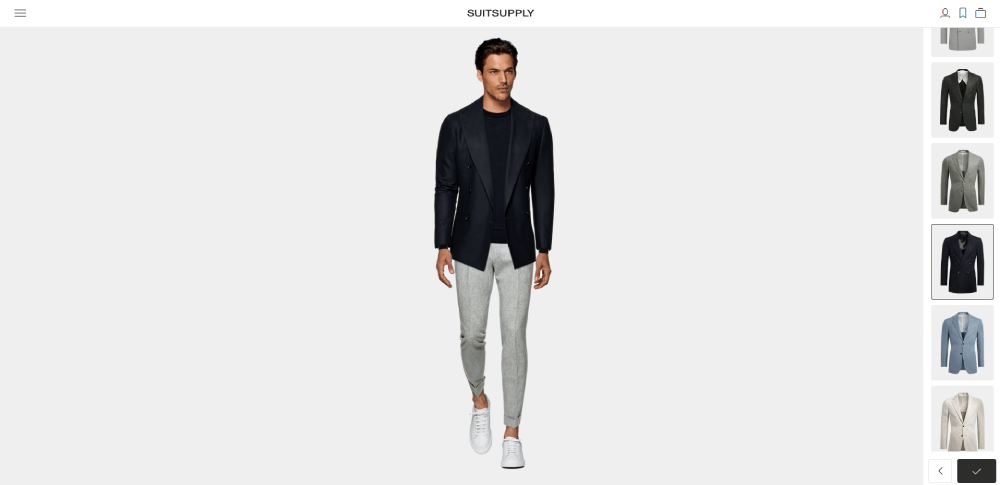
Some tailors like Indochino and Suitsupply blend both models.
They offer online made-to-measure ordering alongside showroom booking.
This requires more complex site architecture and e-commerce integration through platforms like Shopify or custom solutions.
Review B2C website patterns if pursuing this hybrid model.
FAQ on Tailor Website Design
What platform is best for a tailor website?
Squarespace works best for most tailoring businesses due to built-in scheduling, elegant templates, and portfolio layouts.
WordPress offers more customization for larger operations.
Shopify suits tailors selling ready-made items alongside bespoke services.
How much does a professional tailor website cost?
DIY builds run $200-600 annually using Squarespace or Wix.
Professional design costs $1,500-5,000 for freelancers, $5,000-15,000+ for agencies.
Budget extra for portfolio photography, which delivers the highest ROI.
What pages should a tailor website include?
Six core pages: Homepage, Services (bespoke, alterations, wedding), Portfolio gallery, About/Story, Contact with location map, and Booking page.
Keep navigation simple with no more than six main menu items.
How do I add online booking to my tailor website?
Integrate Calendly or Acuity Scheduling directly into your site.
Both platforms embed into WordPress and Squarespace with minimal setup.
Enable calendar sync and automated email reminders for fitting appointments.
What colors work best for tailoring websites?
Navy with gold accents, black with burgundy, or charcoal with cream communicate luxury and craftsmanship.
Avoid bright neons that signal discount retail.
Dark backgrounds make fabric photography stand out.
How important is portfolio photography for tailor websites?
Critical. Clients paying for custom suits need visual proof of your work before booking.
Invest in professional shots showing fabric texture, lapel construction, and fit details.
Poor images kill conversions regardless of site design.
Should my tailor website have e-commerce functionality?
Only if selling ready-made items or accessories alongside bespoke services.
Most traditional tailors benefit more from consultation booking than online purchasing.
Made-to-measure businesses like Indochino use hybrid models with custom configurators.
How do I optimize my tailor website for local search?
Claim your Google My Business listing, add location schema markup, include city names in page titles.
Embed tailor shop location maps on your contact page.
Collect Google reviews from satisfied clients.
What booking features do tailor websites need?
Calendar integration, multiple appointment types (consultation, fitting, pickup), automated confirmations, and mobile-friendly scheduling.
Measurement submission forms help prepare for consultations.
Reminder emails reduce no-shows significantly.
How is a tailor website different from a fashion designer website?
Tailor sites focus on booking consultations and showcasing client work with local SEO priority.
Fashion designer sites prioritize brand storytelling, seasonal lookbooks, and e-commerce sales to global audiences.
Conclusion
The best tailor website design examples share one trait: they make booking a consultation effortless.
Visual sophistication matters, but conversion-focused design wins clients.
Start with professional portfolio photography showcasing your bespoke craftsmanship.
Build on platforms like Squarespace or WordPress with integrated scheduling through Calendly.
Choose a luxury color palette that signals quality, whether navy and gold or sophisticated dark themes.
Optimize for local search with Google My Business and location-specific content.
Your menswear clients browse sites from Henry Poole to Indochino before choosing a tailor.
Give them a digital experience that matches the garments you create.
The fabric gallery, measurement forms, and client testimonials build trust before the first fitting appointment.
Now pick a template and start building.

