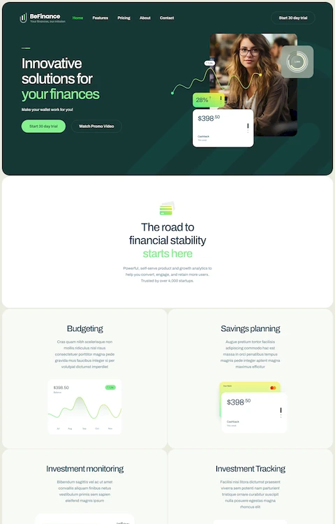
Website Designs With A Luxury Color Palette
November 30, 2024
Fixed: this page is trying to load scripts from unauthenticated sources
December 18, 2024White space, or negative space, is a powerful tool in web design that can dramatically improve user experience. Understanding effective use of white space can elevate your design, influencing everything from visual hierarchy and usability to responsive design.
For instance, employing it correctly in CSS Grid or HTML5 layouts can enhance readability and focus user attention on essential interactive elements.
White space isn't just about creating empty areas; it's about balance, alignment, and the subtle art of letting your content breathe.
When designs include sufficient margins and padding, they inherently guide the user's eye through the page, fostering a sense of ease and simplicity. This technique is crucial for responsive web design, enriching both user engagement and mobile optimization.
We'll also explore tips to ensure your own web projects maintain a clean, functional, and aesthetically pleasing layout.
Examples Of White Space In Web Design
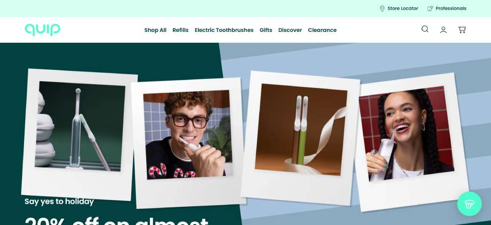
Quip
Minimalist design meets oral wellness through sleek product photography and muted pastels. The interface flows like water, guiding visitors through a narrative of dental care reimagined. Large, airy typography breathes life into clinical concepts, while subtle animations reveal product features. The subscription model integration feels seamless, nestled within clean, structured layouts that echo the product's refined engineering.
Apple
Vast white spaces punctuated by stunning product imagery define this digital masterpiece. Edge-to-edge visuals command attention, while dynamic parallax scrolling creates depth. Typography remains deliberately understated, letting the hardware's elegance speak volumes. Interactive elements emerge naturally, disappearing when unnecessary. Product pages unfold like chapters, each telling its own story through cinematic transitions.
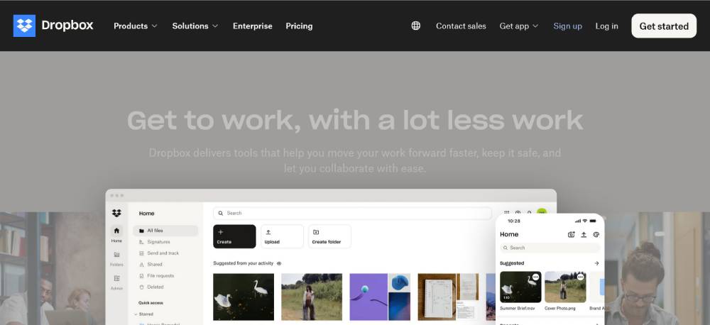
Dropbox
Abstract illustrations dance with purposeful whitespace, creating a visual language that simplifies complex cloud storage concepts. The design breathes collaboration, with subtle hover states and micro-interactions that feel deliberately crafted. Navy blue anchors the experience while playful geometric patterns add personality without overwhelming the serious business functionality.
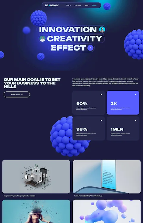
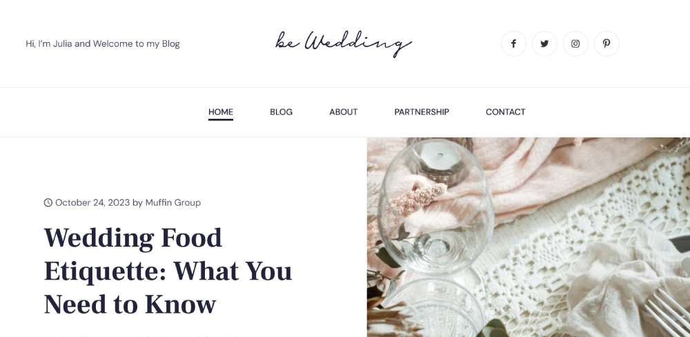
BeBlogger5
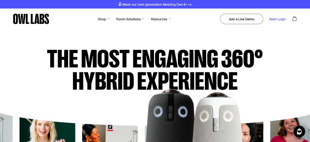
Owl Labs
Bold hero sections showcase hybrid workplace technology through immersive imagery. The layout emphasizes visual storytelling, with meeting room scenes that feel alive and dynamic. Interactive product demonstrations float naturally within the content flow. Warm colors and rounded elements soften the technical edge, making advanced meeting technology feel approachable.
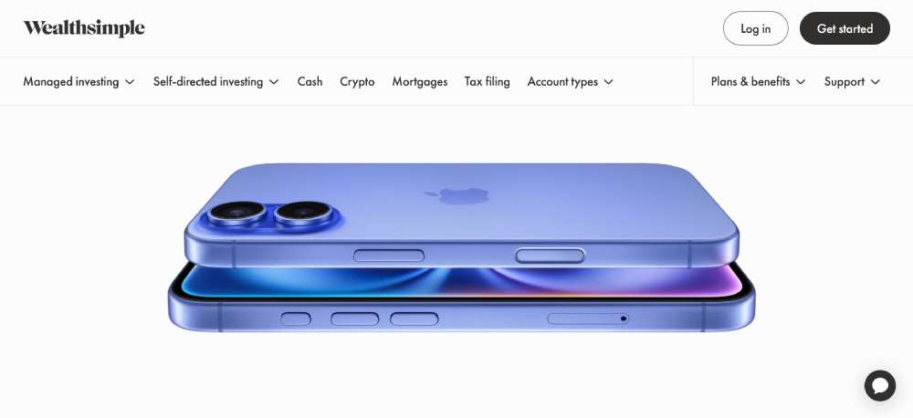
Wealthsimple
Financial complexity transforms into visual simplicity through bold typography and clean data visualization. Dark mode aesthetics convey digital sophistication, while splashes of electric green energize the experience. Scroll-triggered animations reveal features methodically. The interface strips away traditional finance imagery in favor of modern, tech-forward design language.
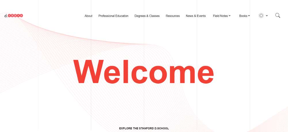
Stanford d.school
Academic innovation bursts through conventional education design tropes. Experimental layouts challenge visitors while remaining surprisingly intuitive. Typography plays with scale dramatically, while candid photography captures genuine learning moments. Interactive elements encourage exploration, reflecting the school's hands-on teaching philosophy.
Asana
Productivity software visualization through masterful use of white space and color psychology. Task management concepts come alive through subtle animations and thoughtful interaction design. The interface demonstrates its own efficiency through rapid loading states and smooth transitions. Illustrations add warmth without sacrificing professional polish.
Slack
Communication platform design that balances playful brand personality with serious business utility. Dynamic diagonal elements create movement, while the color palette pops with confident vibrancy. Interface previews seamlessly integrate with marketing content. Micro-interactions reward exploration while keeping the focus on clarity and function.
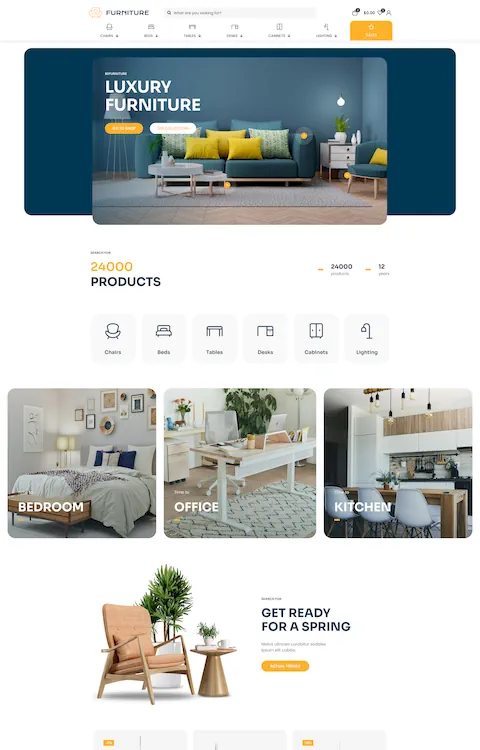
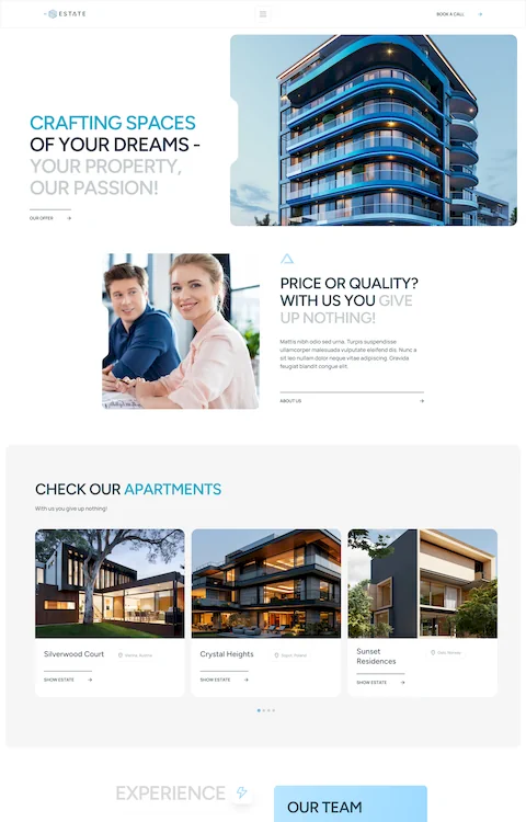
BeRenovate5

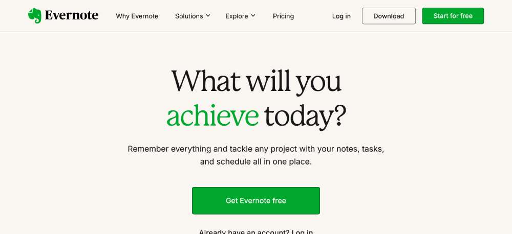
Evernote
Digital note-taking translated into serene visual design. The elephant logo's wisdom influences a layout that feels both organized and organic. Subtle paper textures add tactile familiarity to digital tools. Feature demonstrations unfold through elegant animations that mirror the fluidity of natural thought processes.
Gusto
Human-centric payroll design that radiates warmth through soft, rounded elements. Illustrations capture workplace diversity with thoughtful representation. The interface breaks down complex HR processes into digestible visual stories. Micro-animations guide users through features while maintaining a light, approachable atmosphere that makes payroll feel less daunting.
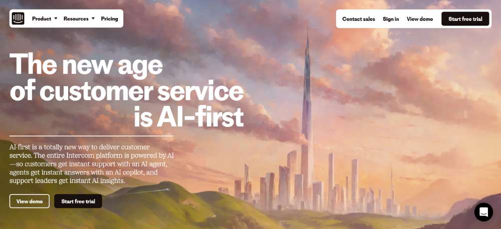
Intercom
Conversational interface design that practices what it preaches. Message bubbles and chat elements weave naturally through the layout. Bold typography commands attention while maintaining readability. The color palette balances professional blues with energetic accents. Interactive demonstrations feel like real customer conversations, showcasing the platform's capability.
Figma
Design tool interface that celebrates collaborative creativity. Interactive elements demonstrate real-time co-creation capabilities. The layout structure hints at infinite canvas possibilities. Cursor animations show multiple users working simultaneously. Bold gradients and geometric patterns add energy while maintaining professional sophistication.
Mailchimp
Playful brand personality meets serious marketing muscle. The iconic chimp mascot influences quirky design touches without overwhelming. Data visualization feels approachable through friendly illustrations. The interface balances whimsy with powerful functionality, using animation to explain complex marketing concepts.
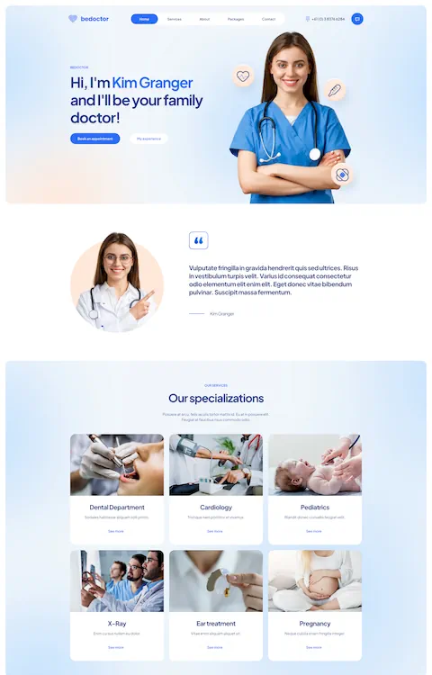
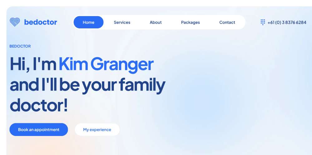
BeDoctor
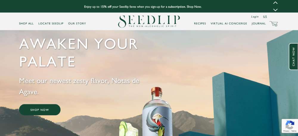
Seedlip
Non-alcoholic spirits brand that transforms botanical elements into sophisticated design. Nature-inspired patterns create subtle textures. Product photography emphasizes glass clarity and botanical ingredients. The interface flows like a carefully crafted cocktail recipe. Color choices reflect garden-fresh ingredients through earth tones.
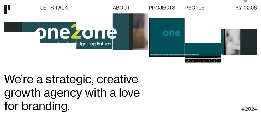
Heights
Digital agency portfolio that pushes creative boundaries. Experimental layouts challenge conventional scrolling. Project showcases blend video and still imagery seamlessly. Interactive elements reward exploration through unexpected animations. Typography scale creates dramatic hierarchy while maintaining perfect balance.
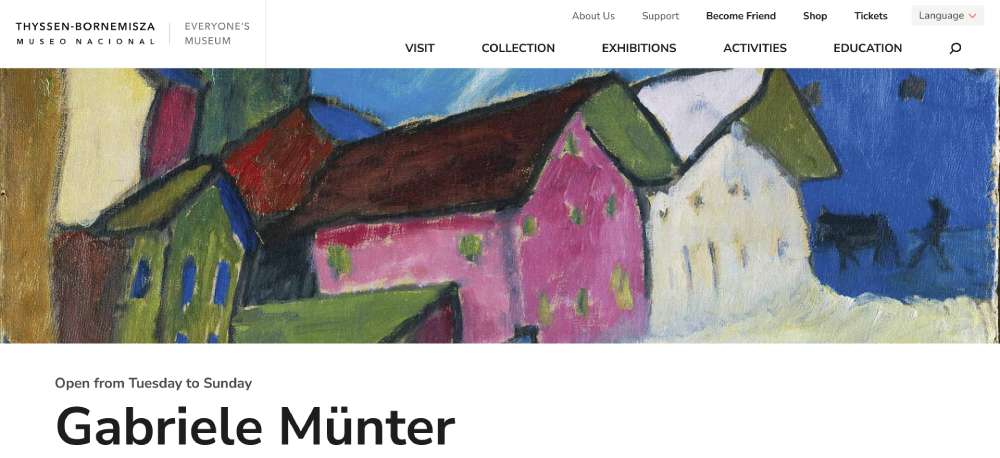
Thyssen-Bornemisza National Museum
Cultural heritage presented through contemporary digital design. Artwork imagery receives gallery-worthy display treatment. The interface balances accessibility with artistic sophistication. Collection navigation feels like walking through curated exhibitions. Typography choices honor classical art while feeling thoroughly modern.
FAQ on White Space In Web Design
What is white space in web design?
White space, often called negative space, refers to the empty areas between elements in a design. It isn't just the background; it encompasses spaces between graphics, margins, and gutters.
Proper use enhances readability, guiding users' attention and improving their overall experience with the site.
Why is white space important in web design?
Effective use of white space significantly improves user experience (UX). It helps create a visual hierarchy, making content more digestible and less cluttered.
By strategically incorporating negative space, you can make your design feel balanced and professional. Well-placed white space also aligns with principles from Google Material Design and Apple Human Interface Guidelines.
Can white space be used in minimalist web design?
Absolutely. Minimalist web design thrives on the use of white space. It emphasizes simplicity by reducing unnecessary elements, thus allowing the essential content to shine.
This approach is fundamental for clean web layouts and improving the overall aesthetic design of the site.
How does white space improve readability?
White space increases readability by reducing cognitive load for the visitor. Properly spacing text and separating sections allow users to navigate content effortlessly.
This layout technique ensures important information stands out, aligning your design with typographic hierarchy principles and content readability best practices.
Is white space only about the color white?
No, white space isn't confined to the color white. It refers to empty spaces regardless of color. The focus is on the empty areas that provide breathing room between elements.
This can be any color, as long as it enhances the visibility and comprehension of your content.
How do I use white space to create a visual hierarchy?
White space helps establish a visual hierarchy by separating elements such as headings, subheadings, and sections.
This makes it easier for users to follow the flow of information. Techniques include margins and padding, aligning content to guide the user's eye logically through the page.
Can too much white space make a design look empty?
Yes, overusing white space can make a design feel incomplete or sparse. It's about finding the right balance to ensure that elements are well-spaced without losing content richness.
Effective web design principles involve optimizing white space to achieve a harmoniously balanced layout.
What are some common mistakes with white space in web design?
Common mistakes include using too little white space, cramming elements together, or, conversely, overusing it and creating a barren layout.
Avoid these pitfalls by maintaining consistent spacing, considering visual balance, and ensuring that white space enhances the overall user-centered design.
How does white space affect page load speed?
White space itself doesn't directly influence page load speed. However, simpler designs with less clutter generally mean fewer elements to load, possibly improving speed.
Effective use of white space can lead to more efficient designs with better performance, especially when optimized for mobile devices.
Are there tools to help implement white space in design?
Yes, several tools can help. Adobe XD, Figma, and Sketch offer robust features for experimenting with white space.
They allow for wireframing and prototyping, enabling you to visualize and perfect the balance in your designs. CSS Grid and Bootstrap also provide frameworks for implementing white space effectively.
Conclusion
Examples of white space in web design illustrate how strategic spacing can elevate both usability and visual appeal. Properly using negative space enhances user experience, guiding viewers naturally through the content. This isn't just about aesthetics; it is integral to effective information architecture.
Key Takeaways:
- User Engagement: Well-implemented white space boosts readability and user engagement.
- Visual Hierarchy: It establishes a clear visual hierarchy and emphasizes crucial elements.
- Clean Layouts: Incorporating white space leads to neat, responsive designs that catch and retain user attention.
By examining various sources like Google Material Design, CSS Grid, and Apple Human Interface Guidelines, you'll understand the balance between content density and breathing room. Apply these insights to ensure your designs are not only visually appealing but also functionally robust.
White space is more than just empty areas; it's a vital design element that can significantly impact the effectiveness of your web pages. Aim for a harmonious balance to make your content more accessible and engaging.
If you enjoyed reading this article on white space in web design, you should check out this one about accessible websites examples.
We also wrote about a few related subjects like the best looking tourism websites, hotel website design, product landing page, great looking spa websites, cool looking personal trainer websites, top notch musician websites, the most impressive luxury websites and impressive animated websites.

