
Great Lead Generation WordPress Themes
May 11, 2025
Top-Notch Education WordPress Theme Examples for You
May 20, 2025Parents spend just 15 seconds deciding whether to trust your childcare center based on your website alone. Professional daycare website design examples showcase how successful centers attract families through thoughtful digital presentation.
Your online presence directly impacts enrollment rates and parent confidence. Well-designed childcare websites communicate safety, professionalism, and educational quality while making enrollment simple for busy families.
This guide examines proven daycare website design examples from leading centers. You'll discover essential layout strategies, content approaches, and visual elements that convert visitors into enrolled families.
We'll explore homepage designs that build immediate trust, photo galleries that showcase your facility, and enrollment processes that reduce friction. Each example demonstrates how educational websites balance parent needs with professional presentation.
From user friendly website navigation to compelling testimonials, these examples provide actionable insights for your center's digital transformation.
Daycare Website Design Examples
Genius Childcare
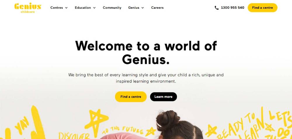
What's the vibe? Think: every learning style meeting in a cool, unique space. They aim to make learning feel special.
Bright Horizons
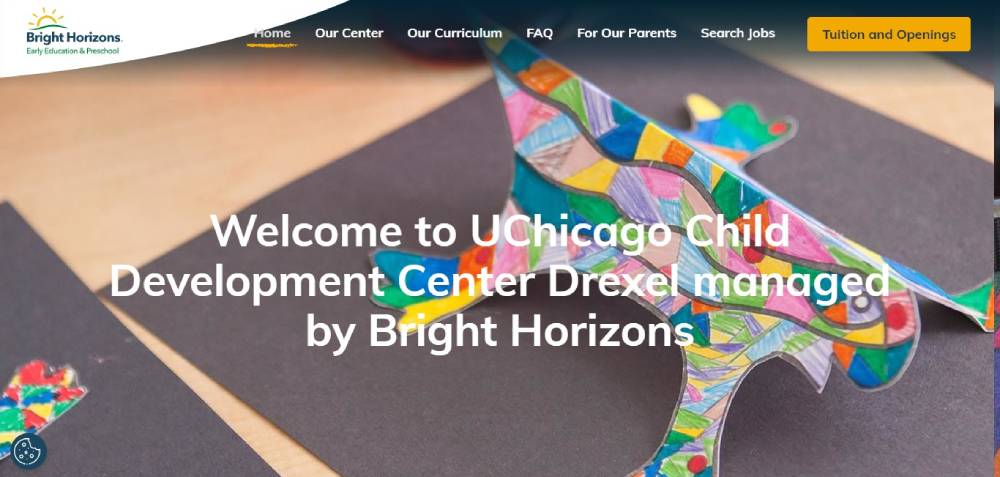
Lots to read? Yup. But oh boy, the visuals! Hover over those cute icons, and bam! Little nuggets of info about how they roll with the kiddos.
Mother’s Pride
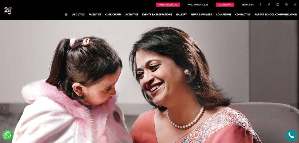
Sleek, modern, and super clean. Their slider? 100% eye-candy, showing stuff that'll make parents nod in approval. Plus, there's this rad success indicator that’s subtle but snazzy.
Briarcliff Child Care Centers
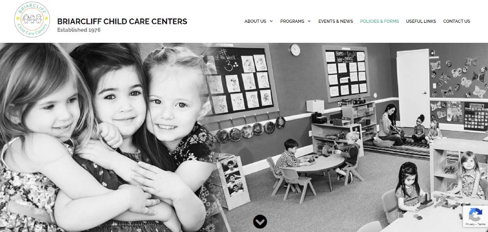
Love minimalism? This site's your jam. Black and white, no fuzz. But the cool bit? Text that slides over pics. Also, breezy to get around.
MEplace
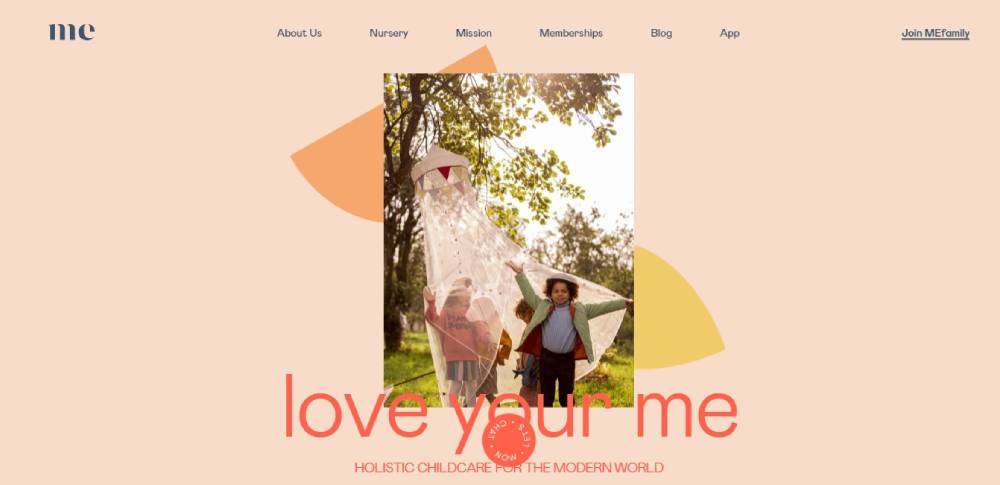
Alright, they've got that holistic vibe. Super cool for the now-gen. Their mantra? Helping the parentals bring up some joyful little beans.
Ebenezer Child Care
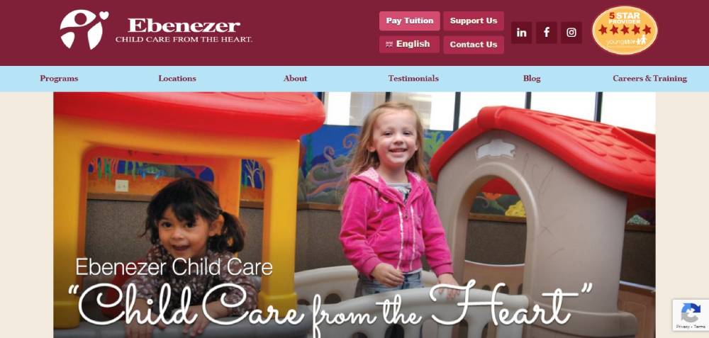
Straight from the heart, this one. Ebenezer's site? Smooth sailing! You wanna know the drill on admissions or what they teach? It's right there, dude.
Children’s Lighthouse
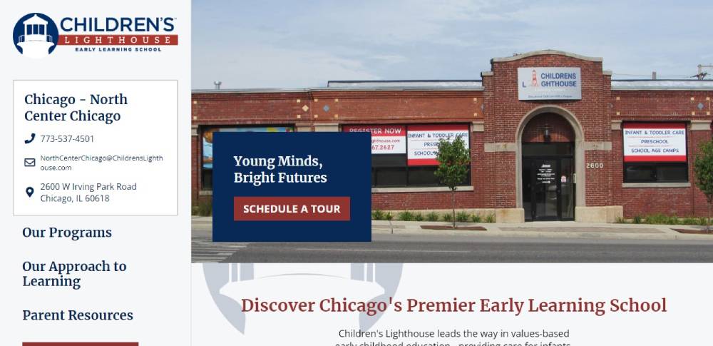
Yo, that red though! Pops right out. And kudos to them for laying out the deets straight – what they offer, pricing, and the works.
The Goddard School
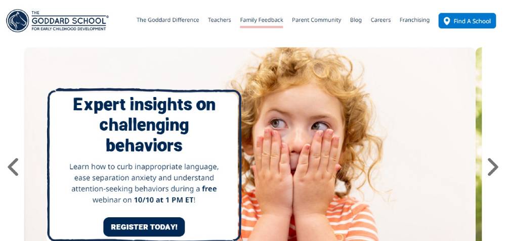
Talk about being everywhere! Goddard’s big league with spots all over the US. Their site's slick, neat, and straight-up handy for folks to get the lowdown.
Moorlands
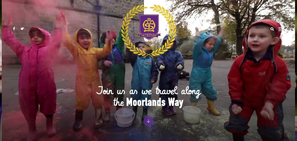
They're in the game of molding young minds. The web digs? Fresh to death. It's neat, and that video backdrop? Fire!
Goodstart Early Learning
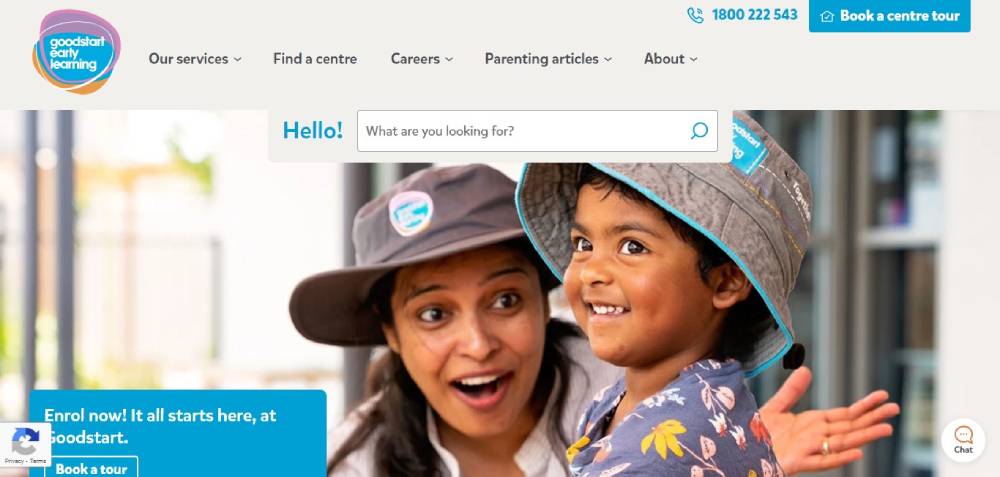
I'm vibing with their layout. Sections are snappy, and the pastels? Gives off those chill, happy feels.
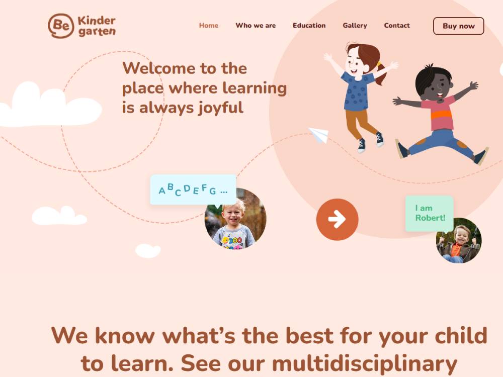
Be Kinder garten 4
Le Petit Bebe Daycare
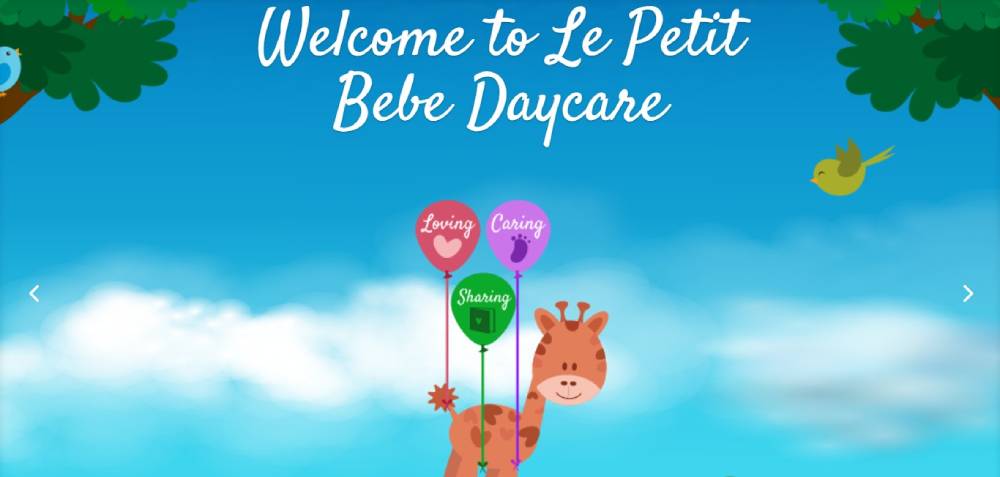
Picture this: It's like your kiddo's second home. The site's mix of artsy pics and real snaps? It’s got layers, man.
KIDS XAP
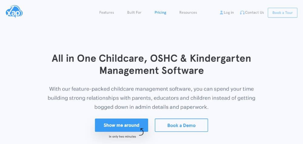
Tech in daycare? You bet! For the childcare centers Down Under, KIDS XAP is changing the game. They're bringing tech and ease into the mix, and it's rad.
Wise Owl
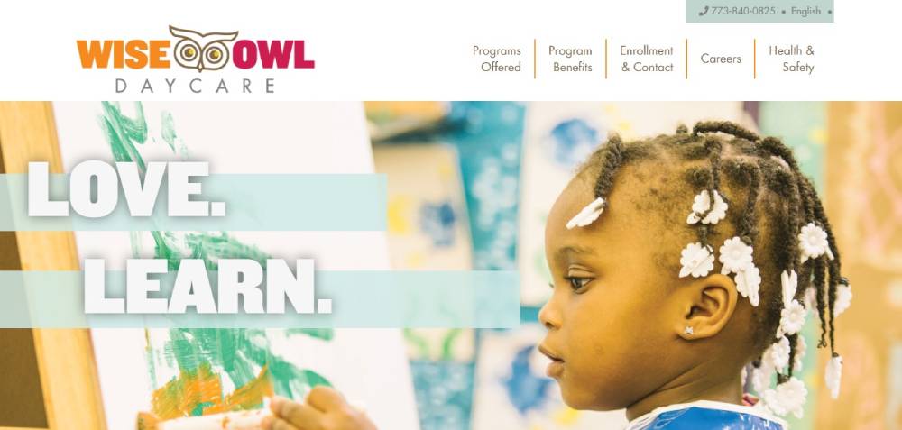
Imagine a canvas - just clean and sleek. This site's got a neat back and forth thing going: snap a pic, read a bit, snap a pic. Bright shades? Totes makes the space feel like sunshine and rainbows.
The Learning Experience
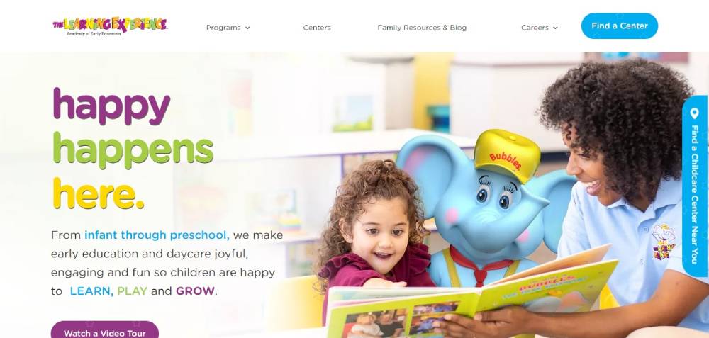
You know that friend who's got it all figured out? That's this site. Super chill to browse, it's got that clear 'we're here for the tiny humans' kinda feel. They're spreading the love and learning all across the states.
Red Lynch Daycare Centre
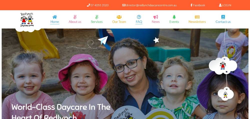
They took unique to the next level. Ditching those usual crisp lines, they've got this cloudy, dreamy edge. Kinda like blending into a daydream. Super cool, huh?
International Grammar School Sydney
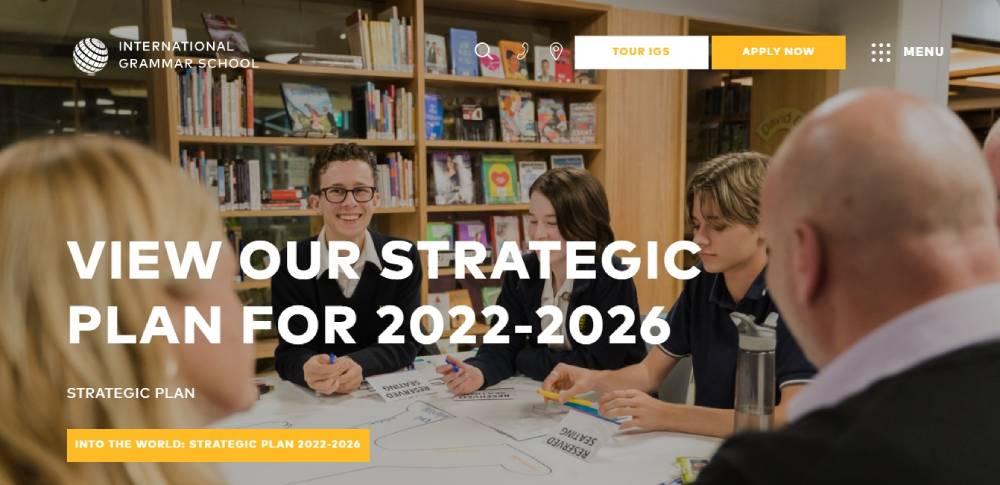
These peeps are serving up some global vibes. Not just sticking to one thing, they're all about holistic learning. Their web digs? It's like a swanky cafe - sophisticated but super inviting. Plus, that side menu? Super handy for quick jumps.
Kindergarten 128
So, if you're thinking of a starter pack for daycare websites, this template’s the deal. It’s like the jeans and white tee combo. Timeless, fits all occasions, and always in trend.
Be Kinder Garten 3
Kinder Care
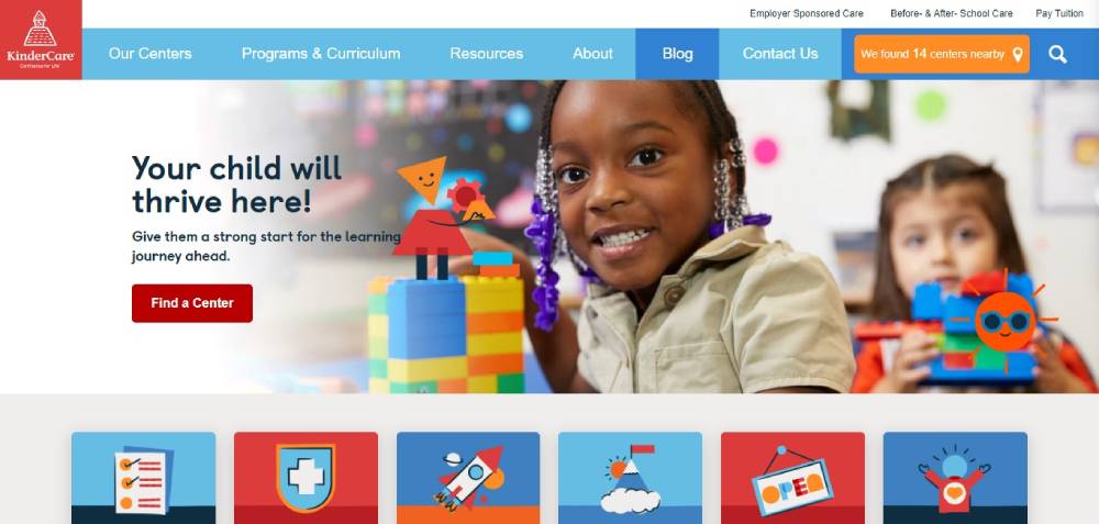
First glance? It's like, "Whoa, they know their stuff!" Might not pinpoint what makes it pop, but it's got that mysterious, sophisticated vibe.
Sunshine House
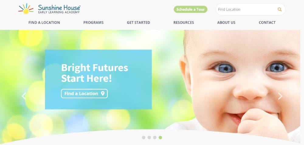
They're like that fave auntie - reliable and filled with love. Whether you're rolling in dough or just getting by, they're here for you. Their site? Like a handy guidebook, with all you need to know, from programs to that extra care they offer.
NY Kids Club
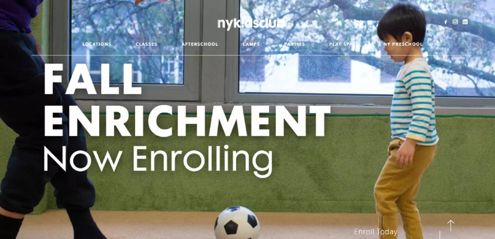
Ever wandered the streets of NYC and stumbled upon a surprise mural? This site's a bit like that. Full-screen pics sliding smooth, like flipping through a fam photo album. They tossed in a snazzy search too – rapid-fire find-your-fact style. And those pics? All over the place, but like, in a super artsy way.
Kid’s Work
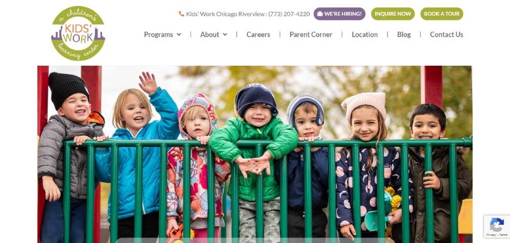
It’s like walking into a toy store. Pow! Color everywhere! But hold up, it's not all just about the dazzle. Text, pics – they balance it out. And it's super neat. Like LEGO neat. Blocks of stuff everywhere, but it all fits just right.
Ebenezer Child Care
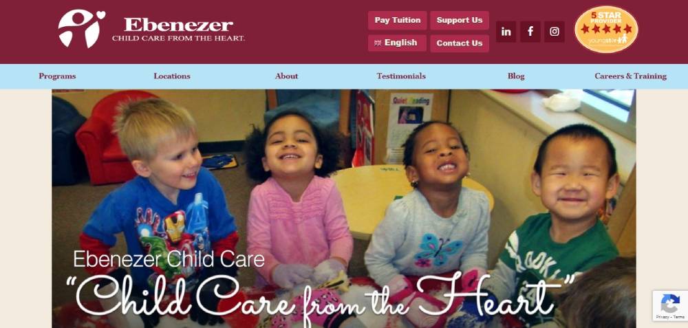
Swiping through, it feels like you’re at the daycare. Little kiddos everywhere! Slide after slide, those faces tell the story. And they’ve got this video – kinda like a cozy chat, spilling all the deets. The whole burgundy vibe? It's like a warm hug.
My Little School NYC
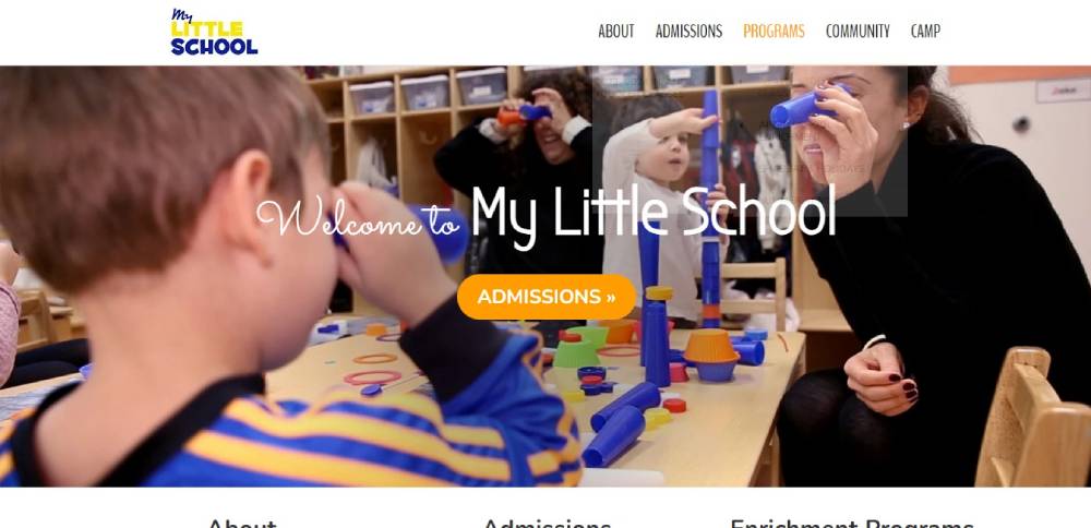
Alright, picture a sleek magazine spread. That’s this. They’re flexing with some next-level animations – GSAP style! You land on their page, and it's like, "Bam! We got this." Pic here, cool call-to-action there, and a crisp headline. Photos are kinda like an art gallery, very... “organized chaos.”
Discovery Point
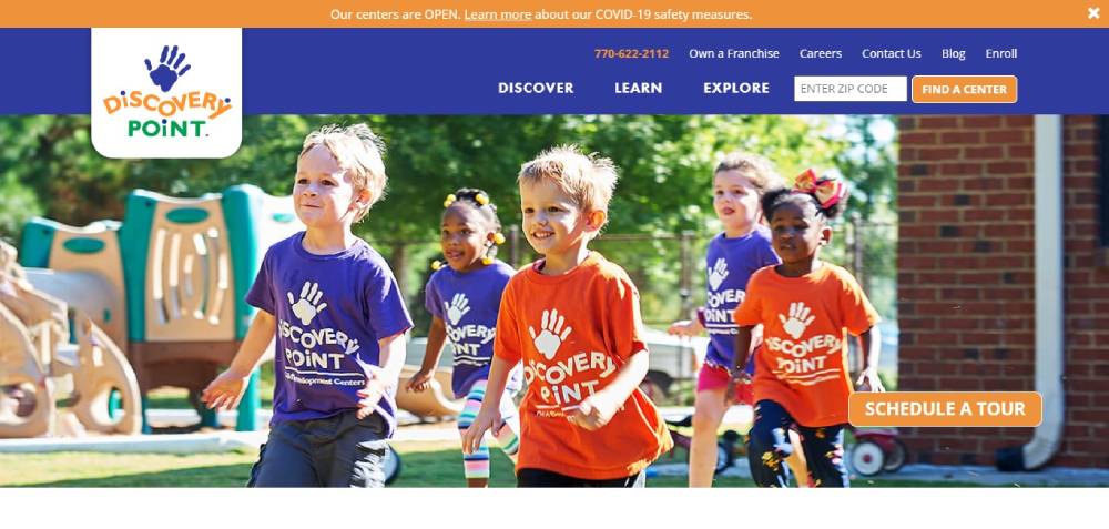
Imagine walking into a room filled with soft, plush pillows. That’s the vibe. Soothing colors, pics that just scream “we care about the kiddos.” Hunting for info on prices or programs? It's like a breeze – smooth sailing all the way.
Be Sitter 2
Monkton
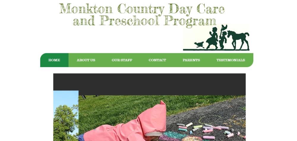
It’s like a TED talk for daycare websites. Super focused on the learn-and-grow deal. Clicking around? It's like gliding on ice – super smooth. And they’re not playing hide and seek with their contact info – it's right there.
Apple-A-Day
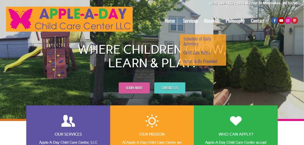
Whirlwind of colors! But they got this trick – every color tells a tale. So, it's not just a rainbow mess; it's like chapters in a book. Landing on the main page, it's pretty chill – the basics, no fuss. But dive deeper? It's like unearthing treasure – all about their mission, services, and the moolah deets.
Grandma’s House
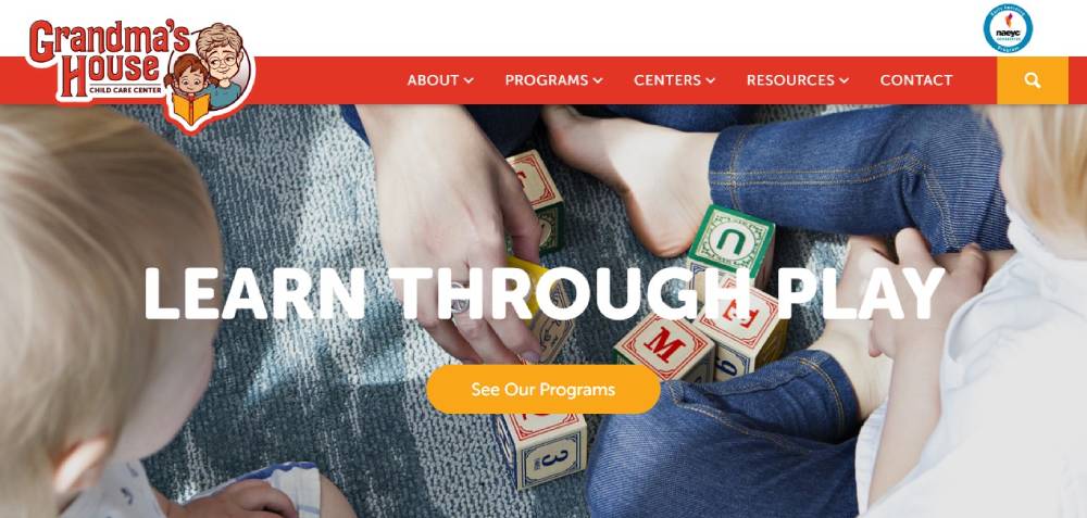
Okay, so first up, picture a book's front page. Massive, shouty letters up top. Now imagine a pop quiz asking, "Why us?" Yeah, that's what they did. This spot's got visuals like confetti at a party, helping you piece their story together. And the cherry on top? Fun, animated kiddo pics spilling the beans on their cool programs.
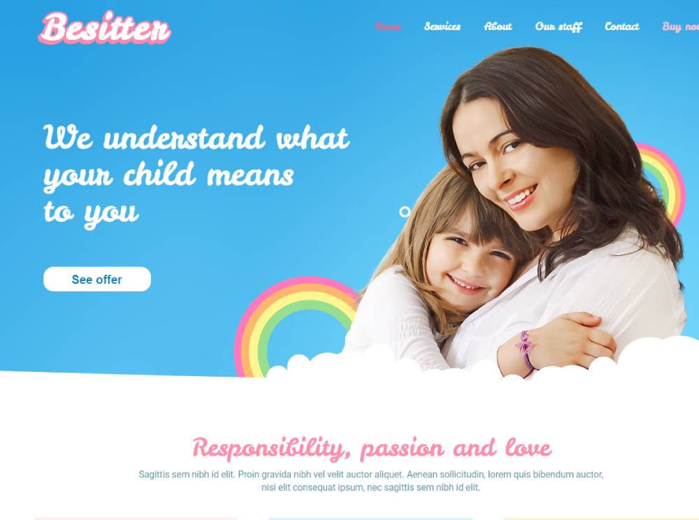
Be Sitter
Little Sprouts
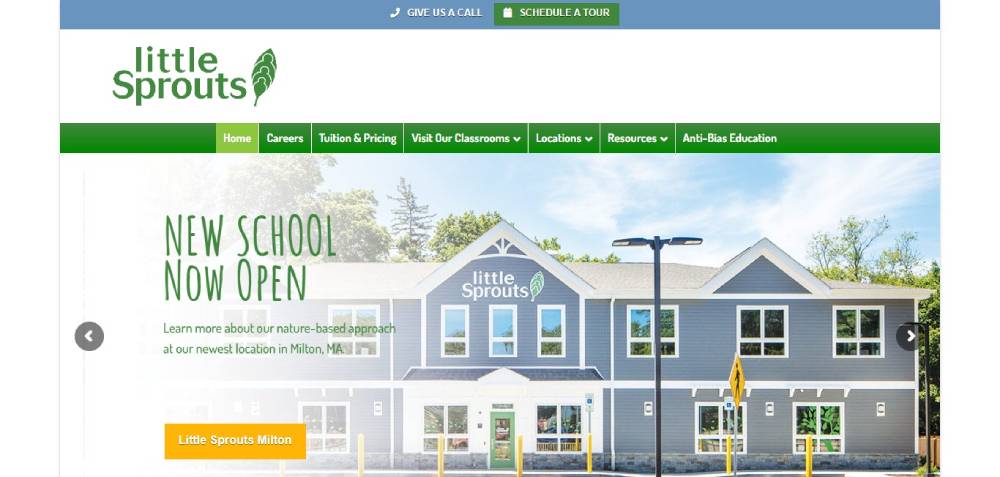
Heard of them? If not, you've been living under a rock. They've got this daycare game on lock. Dive into their digital space, and it's like walking through a magic door. Everything's where it should be, like magic. Feels like stepping into a room full of fairy lights and snug blankets.
Euro Kids India
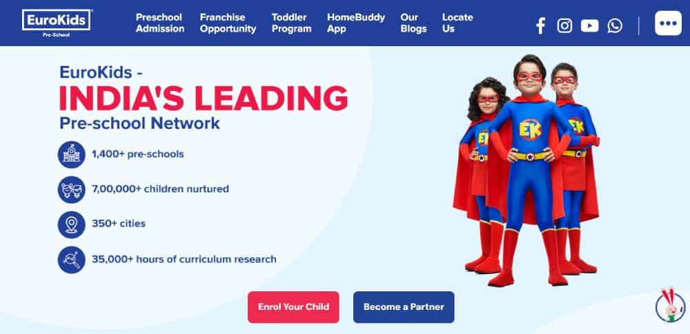
Hold onto your hats! We're at a carnival, and every corner's bursting with fun. Bright colors, flashy designs, and they're screaming, "Learning’s a blast!" Top it off with a grand ol' hero scene showing off their shiny medals and top-notch services. Think of it as their way of saying, "Check out our trophy wall!"
Be School 2
Starfall
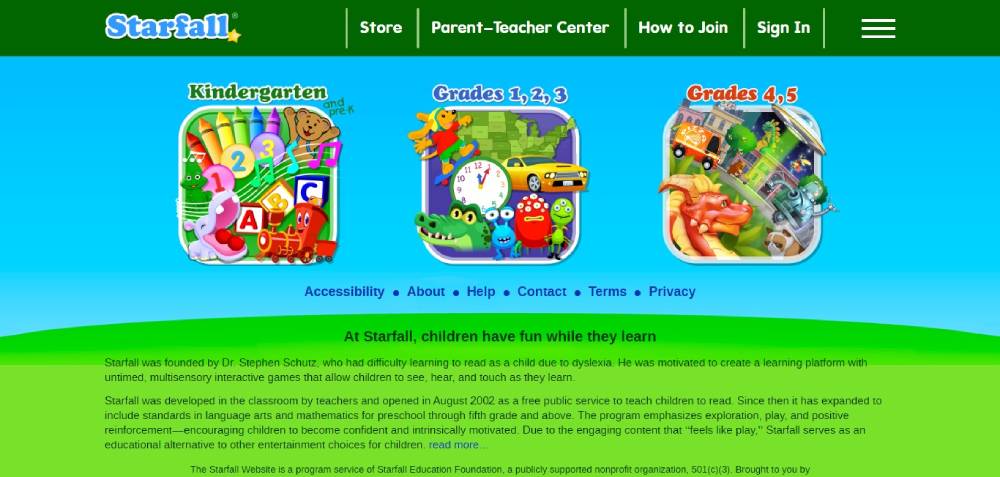
This ain't your ordinary website. This is like... if toys came to life digitally. It's a kiddo’s wonderland. They’ve got tunes, technicolor graphics, and stuff that’ll get those tiny neurons firing. Most sites? Meh. This? A candy store for the brain!
FAQ On Daycare Website Design
What essential pages should every childcare website include?
Homepage, about us, programs, staff profiles, enrollment forms, contact information, photo galleries, and testimonials. Include virtual tours and safety protocols. Parent resources and daily schedules build trust. Professional websites require clear navigation between all sections.
How important is mobile optimization for daycare websites?
Critical. Parents search on smartphones constantly. Responsive websites adapt to all screen sizes seamlessly. Mobile-first design ensures enrollment forms work perfectly on phones. Google prioritizes mobile-friendly sites in search results.
What photos work best on childcare center websites?
Happy children engaged in activities, clean facilities, certified staff interactions, outdoor playgrounds, and learning environments. Avoid overcrowded shots. Professional photography builds credibility. Always obtain proper photo releases from parents before publishing any child images online.
How can daycare websites build parent trust immediately?
Display licensing information prominently, showcase staff certifications, include detailed safety protocols, and feature authentic parent testimonials. Testimonial page designs highlight positive experiences effectively. Clear contact information and transparent policies establish credibility.
What colors work best for preschool website design?
Warm, welcoming colors like soft blues, greens, and yellows. Avoid overly bright or aggressive tones. Color scheme choices should reflect safety and nurturing environments. Maintain consistency across all pages for professional appearance.
How should enrollment forms be designed for maximum conversions?
Keep forms simple with essential fields only. Multi-step processes reduce abandonment. Include clear pricing information upfront. Form design best practices emphasize user-friendly layouts. Provide multiple contact options for questions during enrollment.
What content helps daycare websites rank better in search results?
Local keywords, program descriptions, staff qualifications, educational philosophy, and community involvement. Regular blog posts about child development topics. Parent resources and educational content demonstrate expertise. Local business listings improve visibility significantly.
How can childcare websites showcase their educational programs effectively?
Detailed program descriptions by age group, curriculum highlights, daily schedules, and learning objectives. Include educational philosophy and teaching methods. Age-appropriate activity photos demonstrate hands-on learning. Clear progression paths between infant, toddler, and preschool programs.
What navigation structure works best for daycare websites?
Simple, intuitive website navigation examples with clear labels. Group related content logically. Sticky navigation keeps important links accessible. Search functionality helps parents find specific information quickly. Breadcrumbs improve user experience.
How do successful daycare websites handle pricing information?
Transparent pricing builds trust. Display base rates clearly with additional fee explanations. Compare different program options in tables. Some centers use pricing page layouts effectively. Always include contact options for detailed quotes.
Conclusion
Effective daycare website design examples demonstrate how childcare centers transform digital presence into enrollment success. These designs prioritize parent needs while showcasing facility strengths through strategic content placement and visual storytelling.
Modern preschool websites succeed by balancing functionality with emotional appeal. Clean websites create trust through organized layouts and clear messaging. Smart hero section designs immediately communicate your center's value proposition to visiting families.
Key elements include:
- Mobile-optimized enrollment processes
- Professional photo galleries showcasing learning environments
- Clear staff certification displays
- Streamlined contact information
Your website redesign should focus on parent journey optimization. From initial discovery through enrollment completion, every interaction point matters. Simple websites often outperform complex alternatives by reducing decision friction.
Successful centers understand their website serves as the first classroom parents experience. Invest in user experience design that reflects your commitment to child development and family partnerships.
If you enjoyed reading this article about daycare websites, you should read these as well:


