


Branding Agency Website Design Examples
May 27, 2026
How to Change Fonts in WordPress: Easy to Follow Guide
June 1, 2026Your finance website has about 0.05 seconds to convince a visitor it's worth trusting with their money.
The best finance website design examples share one thing: they turn complex financial information into clear, conversion-ready experiences that build trust before a single word is read.
This guide covers 14 categories of financial services web design, from banking and investment platforms to fintech, insurance, crypto, and B2B tools.
Each section includes real examples, design patterns that actually work, and the data behind why they perform.
What Is Finance Website Design?
Finance website design is the structured planning of layout, visual hierarchy, typography, and interaction patterns for financial service platforms. It differs from general web design in 3 specific ways: compliance visibility, data-heavy UI, and trust signal placement.
A finance site is not just a branding tool. It is a transactional environment where design decisions directly affect whether users hand over money, personal data, or both.
The core functional requirements on any financial website include account access, interactive calculators, data dashboards, and regulatory disclosures. Each of these elements demands a design approach that balances information density with visual clarity.
Finance touches people's lives at a level few other industries do. A clunky layout on a banking homepage is not just an aesthetic problem. It signals risk to a user who is already anxious about their money. That's why financial website visual hierarchy and user trust design are not optional extras.
| Finance Site Type | Primary Design Goal | Key UI Element |
|---|---|---|
| Banking | Account access and trust | Persistent login CTA, security badges |
| Investment platform | Data clarity and onboarding | Dashboard previews, progressive disclosure |
| Fintech / payments | Speed and conversion | Fee calculators, single-action landing pages |
| Insurance | Quote flow completion | Step indicators, minimal form fields |
Visitors form a first impression in 0.05 seconds, and 94% of that impression is driven by design alone (TechKV, 2024). In financial services, that fraction of a second determines whether someone reads your product page or closes the tab.
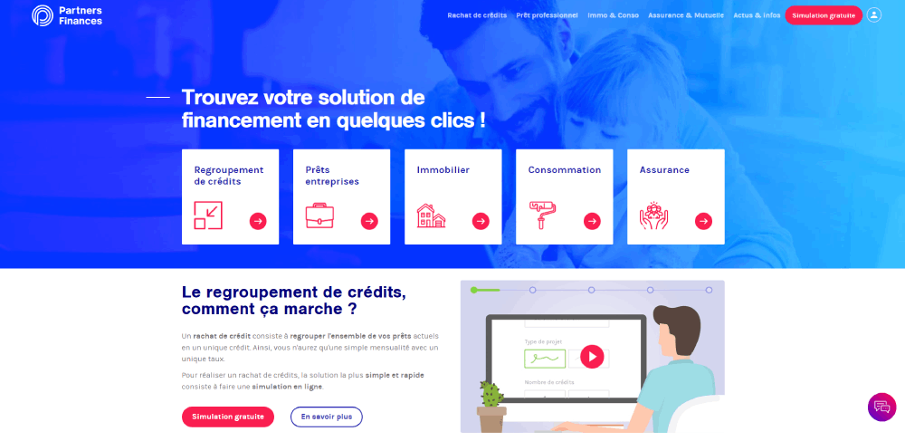
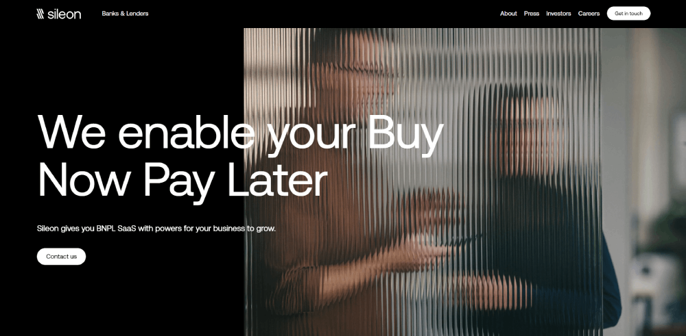
Finance Website Design Examples
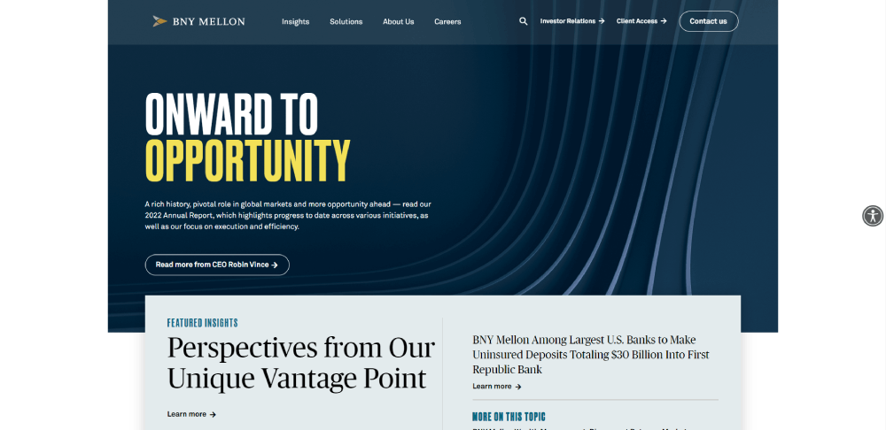
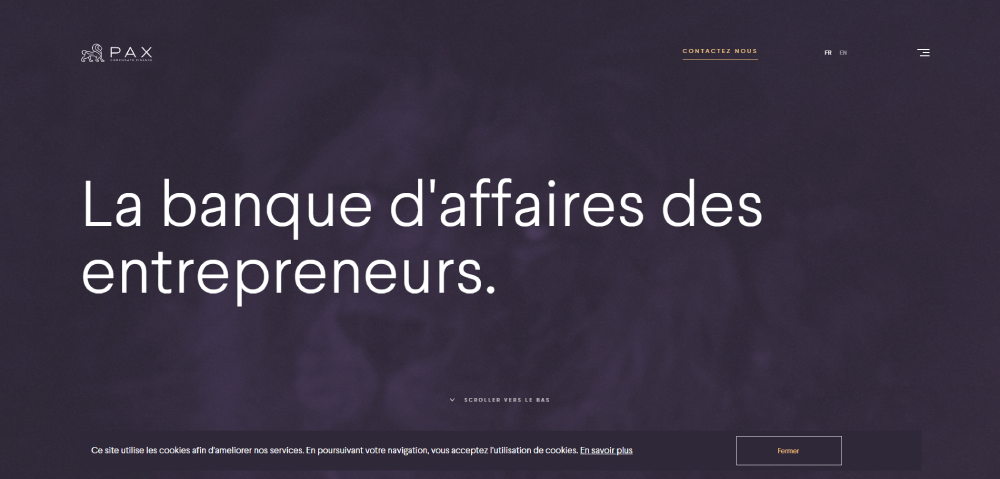
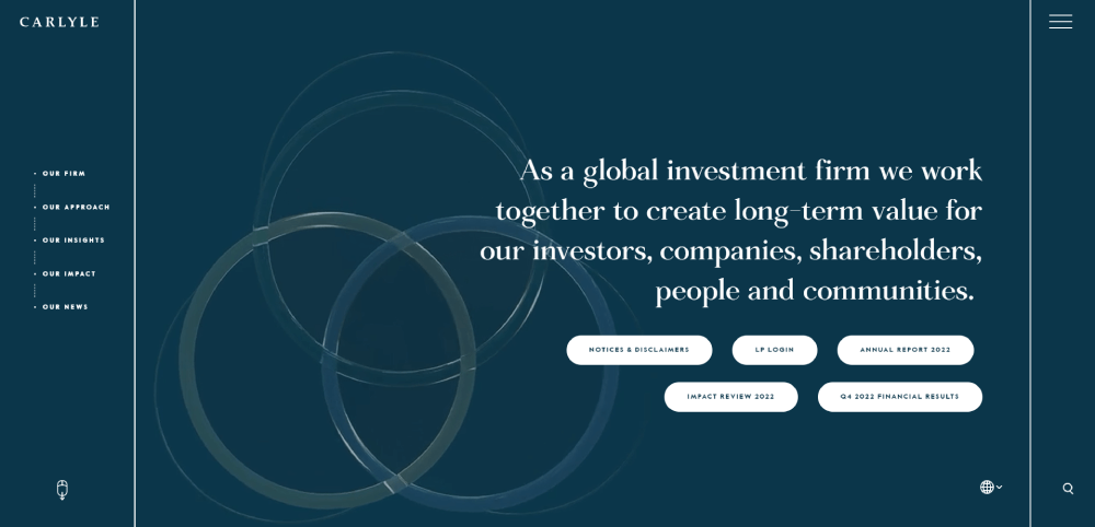
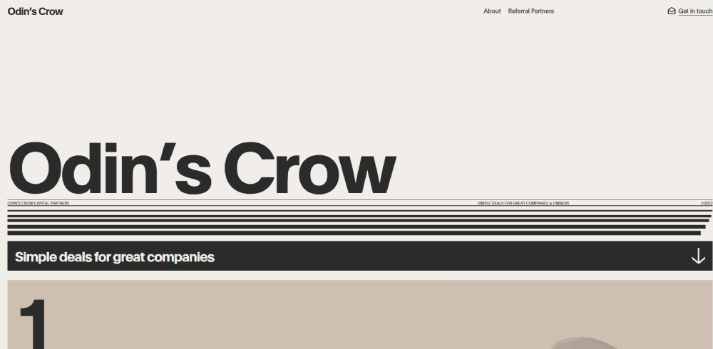
Asset Management
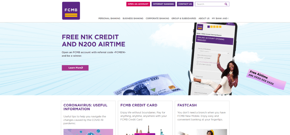
BNY Mellon


What Makes a Finance Website Design Effective?
Effective financial services web design comes down to 3 factors working together: trust architecture, data readability, and conversion structure. Miss any one of them and the other two won't save the page.
Financial services median conversion rates hit 8.4% in Q4 2024, the highest of any tracked industry, according to Unbounce's benchmark report covering 57 million conversions across 41,000 pages. That number is only achievable when trust and UX work together.
Trust and Compliance Design Signals
Trust signals in finance web design are structural, not decorative. They include 3 categories that users actually scan for before taking action.
- Security indicators: SSL badges, padlock icons in forms, and regulatory body logos placed near CTAs
- Social proof: client testimonials with full names and job titles, not anonymous quotes
- Regulatory disclosures: license numbers, FINRA/FCA references, and legal language visible without scrolling
Adding a single trust badge increased conversions by 42% in a documented case study (Nestify, 2024). That is not a minor UX tweak.
Data Readability and Visual Hierarchy
Financial dashboard UI handles more data per page than almost any other content type. The design challenge is not adding information. It is removing everything that competes with the signal a user needs.
4 readability standards show up consistently across high-performing finance site designs:
- WCAG 2.1 AA contrast ratios on all body text and table data
- Sans-serif typefaces (Inter, Helvetica Neue) at minimum 16px for financial copy
- Color used only as a secondary signal, never as the sole data indicator
- White space used to separate data groups, not to fill empty space
Mobile and Performance Standards
Over 70% of fintech traffic comes from mobile devices in 2025 (Lazarev Agency). Financial website mobile optimization is not a "nice to have" category anymore.
Every 500ms delay in load time cuts conversion by up to 7% in financial services (Lazarev Agency, 2025). On a site generating thousands of daily sign-ups, that is a measurable revenue number.
Key mobile performance benchmarks for finance websites: sub-2 second load time, 44px minimum touch targets on CTAs and form inputs, and biometric authentication UI support for returning users.
What Color Schemes and Typography Work Best for Finance Websites?
Color decisions in financial website design are not aesthetic. They are functional. The wrong color on a data table row can make a user misread a portfolio gain as a loss. These choices carry real consequences.
Blue increases perceptions of trustworthiness by 42% in professional service contexts, according to research published in the Journal of Business Research. That is why Bank of America, Chase, American Express, and Merrill Lynch all use blue as their primary brand color.
Color Palette Patterns by Finance Sector
Color choices follow sector logic, not personal preference. Each financial category uses a palette that signals the right emotional register for its audience.
Traditional banking: Navy blue with white. Stability, longevity, institutional authority.
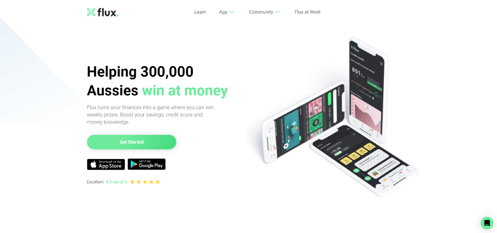
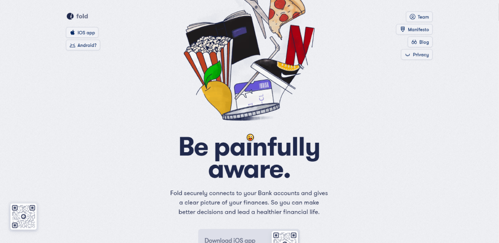
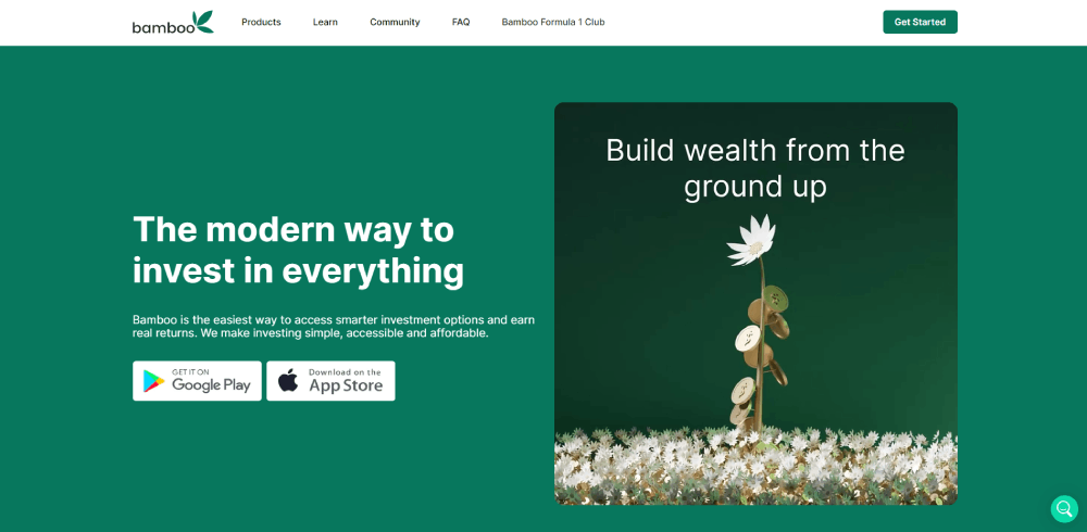
Robo-advisors and personal finance: Pastels, soft greens, and light backgrounds. Reduces financial anxiety for first-time investors.
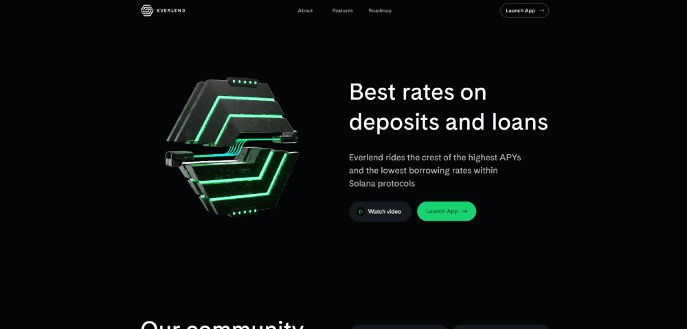
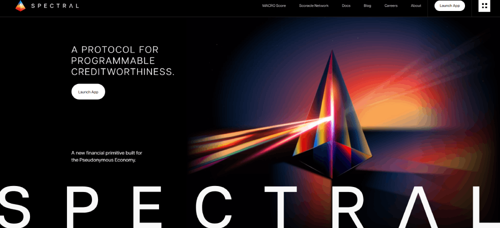
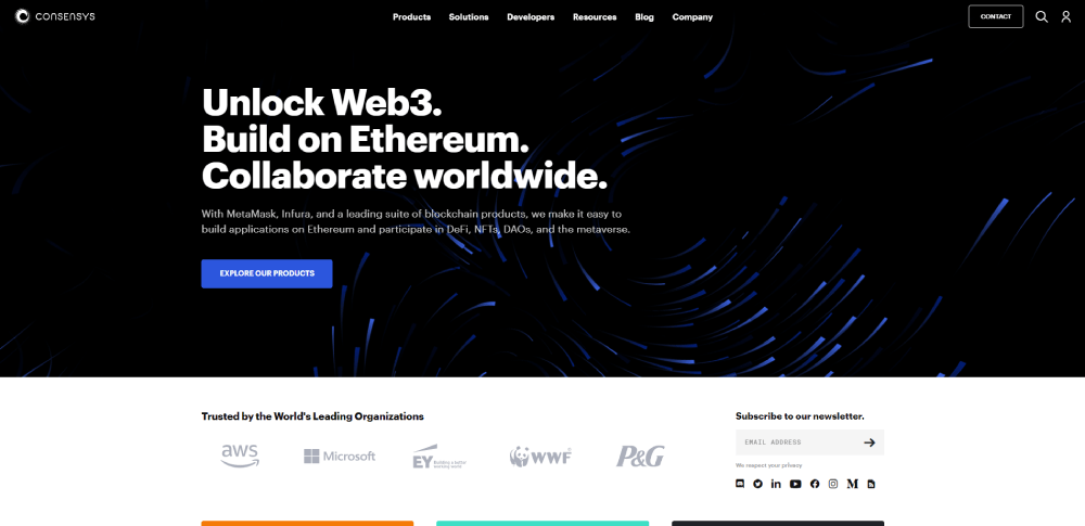
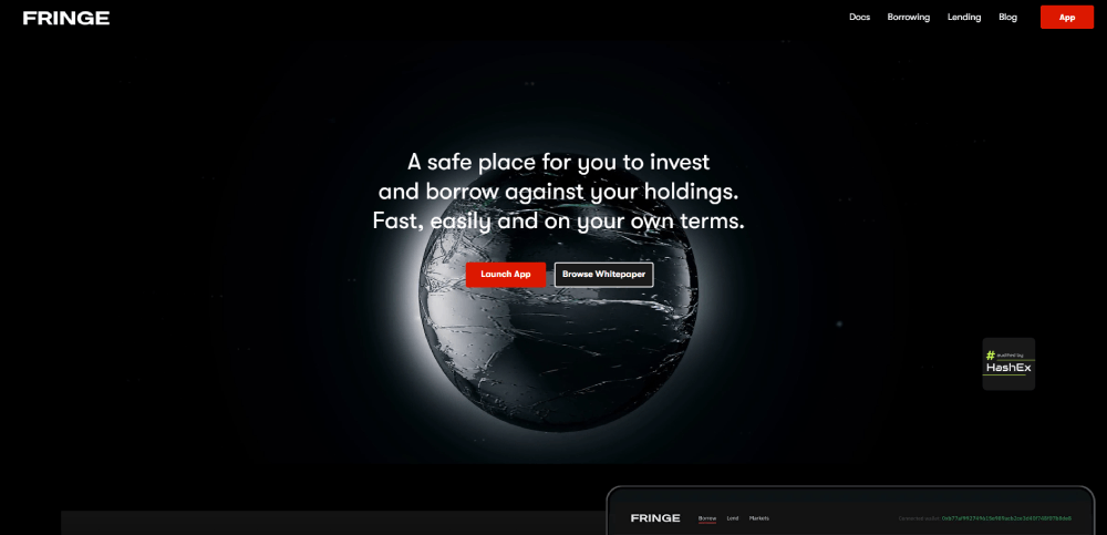
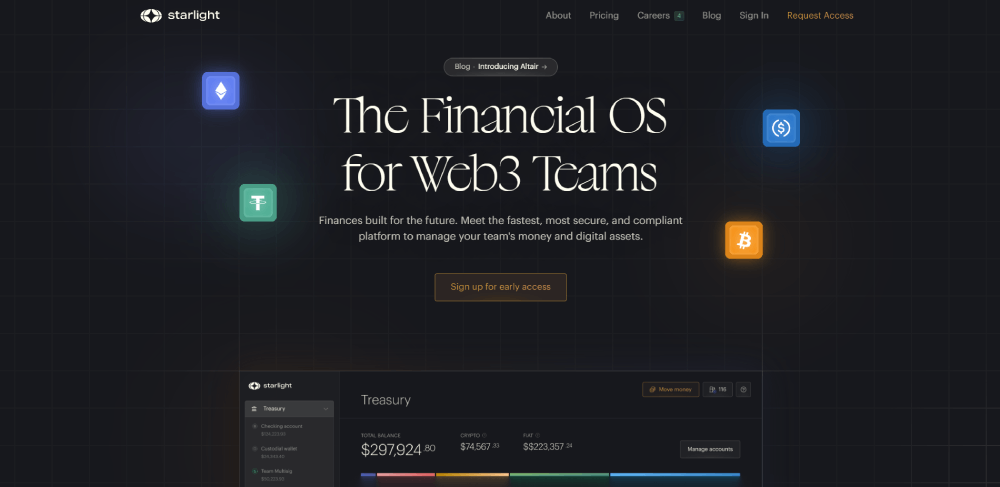
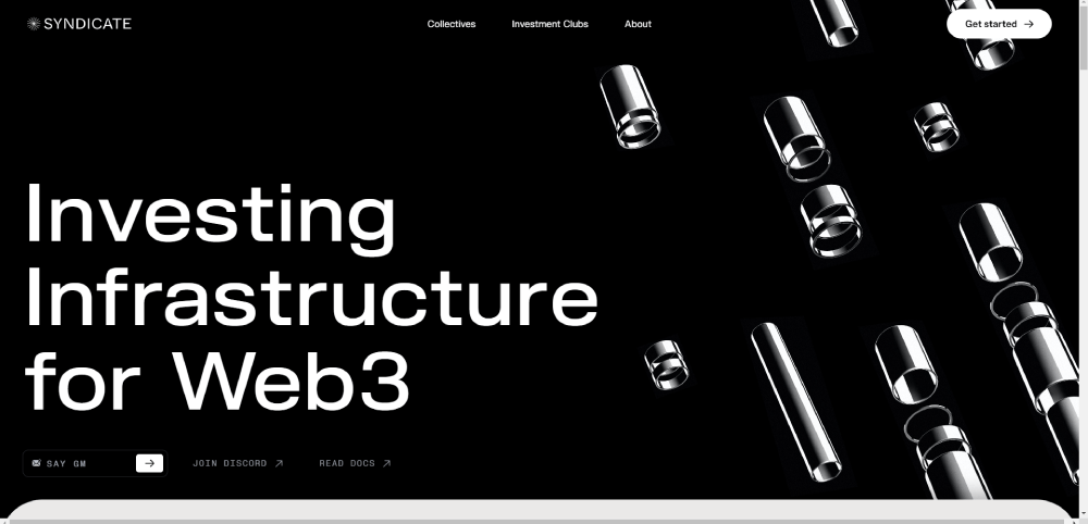
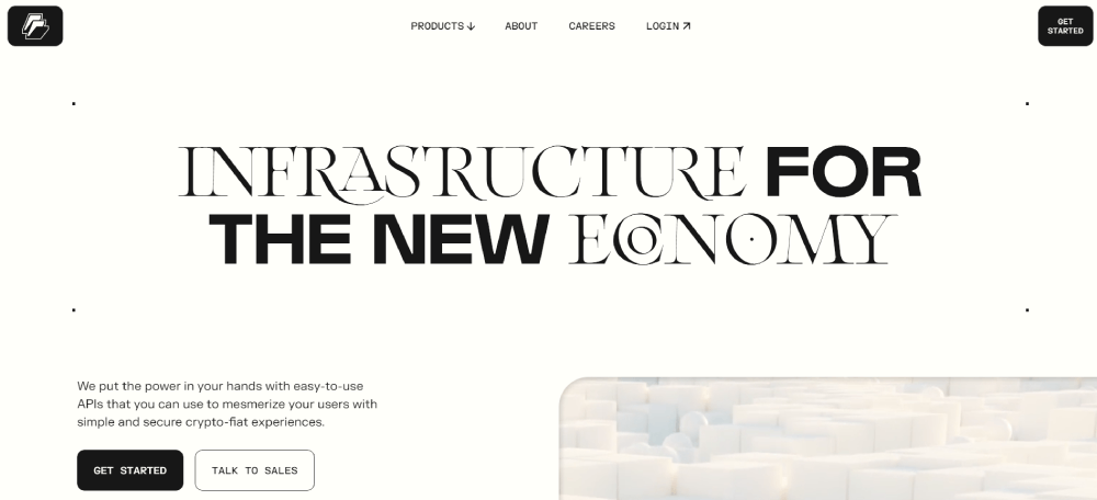
Crypto and Web3: Dark backgrounds with neon accents (purple, teal, electric blue). Active trading environment, technical credibility.
Premium wealth management: Champagne gold, cream, and charcoal. Reward, refinement, and long-term value. Gold accents on CTAs, not large gold backgrounds, which feel cheap rather than luxurious.
Green and red are reserved for financial data signals in every category. Using red for a button or green for a header in a finance UI creates immediate cognitive conflict for users who associate those colors with loss and gain.
Typography Standards for Financial Interfaces
Sans-serif typefaces dominate finance web design. Inter, Helvetica Neue, and custom grotesque fonts appear across 90%+ of top-performing financial websites. Serif is rare and tends to appear only in premium wealth management or institutional contexts where it signals heritage.
4 typography rules that apply across financial website categories:
- Body text minimum: 16px for financial copy, 14px bold minimum for data labels
- Line height: 1.5 or higher for paragraph text, tighter for data tables
- Font weight variation: at least 3 weights in the type system (regular, medium, bold)
- Monospace or tabular figures for all numerical data to maintain column alignment
Financial data tables need tabular numeral sets, not proportional ones. Proportional figures cause columns to shift width based on digit combinations. That is a small technical detail that separates production-quality financial UI from amateur implementations. See how typography works in web design for a deeper look at the mechanics behind these decisions.
What Layout Patterns Appear Across Top Finance Website Designs?
Finance sites that convert well share 5 layout decisions regardless of their category. These are not trends. They are structural requirements that emerged from user behavior in high-stakes transaction environments.
Poor design or content drives away 38% of visitors (TechKV, 2024). In finance, where the average visitor is already cautious about where they put their money, layout errors cost more than in any other industry.
Above-the-Fold Priorities by Finance Site Type
What belongs in the first viewport depends entirely on what the site sells.
Banking sites: Account login CTA, persistent and prominent. Secondary CTA for new account opening.
Investment platforms: Product value proposition with a dashboard preview or social proof number. Self-serve signup CTA.
Fintech tools: Single acquisition action (get started, calculate now, open account). No competing CTAs in the hero.
Insurance sites: Quote start CTA with a step count indicator visible ("Get a quote in 4 steps").
Recurring Structural Patterns in Financial UI
Card-based layouts appear across banking dashboards, investment platform overviews, and personal finance tools. Cards work because they separate data units without requiring users to parse visual weight differences between table rows and column headers.
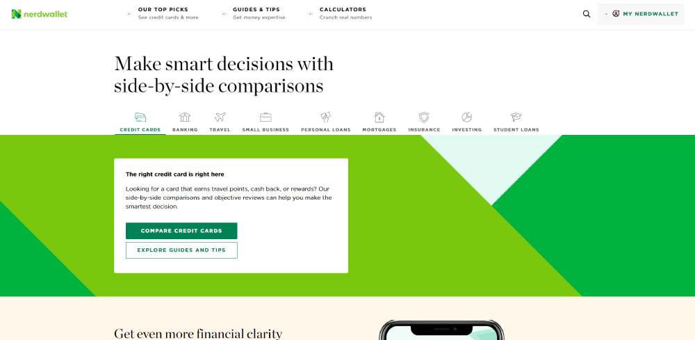
Progressive disclosure is the pattern that separates well-designed financial sites from overwhelming ones. Complex product information, regulatory disclosures, and fee schedules are hidden behind tabs, accordions, or modals rather than stacked on a single page. NerdWallet applies this pattern well, hiding detailed product comparison data behind expandable rows on landing pages rather than surfacing it all at once.
Footer design in finance carries more regulatory weight than in any other industry. License numbers, regulatory body references, FINRA/FCA disclosures, social links, and a full sitemap are standard. A finance site footer that skips these elements signals compliance gaps to users who know what to look for. A well-structured website footer is particularly relevant in regulated industries where disclosure placement affects both trust and legal standing.
How Do Finance Websites Handle Mobile Design?
Mobile banking users worldwide surpassed 2.5 billion in 2024, with projections pointing toward 3.6 billion by 2029 (Statista via TechBullion, 2026). That growth rate is outpacing overall internet user growth.
Mobile sessions in financial services are short and task-specific, typically under three minutes (TechBullion, 2026). Finance website mobile optimization has to accommodate that behavior pattern, not fight it.
Mobile Navigation and Touch Design Standards
73.1% of web designers say non-responsive design is the top driver of visitor abandonment (GoodFirms, 2025). In finance, where 33% of customers have stopped using a mobile banking app due to poor UX and 34% have switched providers over bad digital experiences, that number is a business risk, not just a design metric (Adria Business & Technology, 2024).
Touch target minimums for financial mobile interfaces:
- 44px minimum tap area for all CTAs and form inputs
- 8px minimum spacing between adjacent interactive elements
- Bottom navigation bar preferred over hamburger menus for primary actions
Biometric Authentication and Mobile-First Patterns
Biometric authentication will secure over 2.5 billion banking transactions monthly by 2026, up from approximately 1.7 billion in 2023 (Juniper Research). The design implication is that "sign in" flows on financial mobile sites need to support Face ID and fingerprint as primary inputs, not secondary options.
Monzo, Revolut, and Cash App carry mobile-app design language directly into their responsive web presence. The component structure, spacing system, and interaction patterns on their websites match the apps. That continuity reduces cognitive friction for users who move between the app and the browser version.
For teams who want to see how responsive website design applies across different financial product categories, the structural principles remain consistent: task-first navigation, minimal scroll depth to key actions, and biometric-ready authentication flows.
What Accessibility Standards Apply to Finance Website Design?
WCAG 2.1 AA is the baseline standard for publicly accessible financial services in the US and EU. It is not optional. In April 2024, the Department of Justice updated Title II of the ADA, mandating WCAG 2.1 AA compliance for digital content from state and local governments, with compliance deadlines set for 2026 and 2027 (DeveloperUX, 2025).
Over 4,000 ADA digital accessibility lawsuits were filed in federal and state courts in 2024 alone (UsableNet via Saul Ewing LLP, 2024). Financial institutions, because they operate consumer-facing websites with high transaction volume, are consistently in the target range.
Common Accessibility Failures on Finance Sites
Color contrast is the single most common accessibility violation on the web, affecting 83.6% of all websites according to WebAIM's 2024 Million analysis.
In finance, that failure creates 3 specific problems:
- Data tables with insufficient contrast between row values and headers
- Form fields using placeholder text (light gray on white) that disappears on input
- PDF disclosures that fail screen reader parsing due to missing text layers
WCAG 2.1 AA requires a minimum contrast ratio of 4.5:1 for normal text and 3:1 for large text (18px or 14px bold). Most financial data tables fail this threshold when using medium gray on white for secondary row data.
Screen Reader Optimization for Financial Data
Charts, graphs, and interactive calculators are the three financial UI elements most likely to break screen reader compatibility. SVG charts without ARIA labels, JavaScript-rendered calculators without keyboard navigation support, and dynamic price feeds without live region announcements all create access barriers for users relying on assistive technology.
Tools used to audit finance site accessibility include Axe, WAVE, and Lighthouse accessibility scoring. Running all three catches different issue categories. Axe covers ARIA and semantic HTML violations. WAVE identifies contrast failures. Lighthouse scoring gives a composite that can be tracked across design iterations. These tools also integrate with Figma via plugins like Stark, which catches violations before a design reaches development. See examples of what accessible websites actually look like in practice for design reference across industries.
What Tools and Platforms Are Used to Build Finance Websites?
The technical stack behind a finance website is not just a development decision. It directly shapes what design patterns are possible, how quickly compliance updates can be pushed, and how the site performs under high concurrent user load.
React.js and Next.js are the top 2 frontend technologies for fintech applications, used for their interactive UI capabilities, real-time data update support, and performance optimization (Binmile, 2025). Most high-traffic financial websites running today use one of these two frameworks.
Frontend Frameworks and Design Tools
Next.js is the dominant choice for financial marketing sites and product landing pages. Server-side rendering improves Core Web Vitals scores, which matters for financial services where page speed directly affects conversion. Finance dashboard templates built on Next.js with Tailwind CSS now cover most standard financial UI patterns out of the box (TailAdmin, 2026).
Figma is the standard design tool across fintech teams. Component libraries like Material UI and Ant Design have finance-specific component sets covering data tables, form validation states, and dashboard layouts. Most financial institutions building custom design systems start in Figma and export to React via design tokens.
| Layer | Common Tools | Finance-Specific Use |
|---|---|---|
| Design | Figma, Stark plugin | Component libraries, accessibility audits |
| Frontend | React, Next.js | Real-time data rendering, SSR for Core Web Vitals |
| Component system | Material UI, Ant Design | Data tables, form states, dashboard layouts |
| CMS | Contentful, Sanity | Regulated content management, audit trails |
CMS and Compliance Considerations
Headless CMS platforms like Contentful and Sanity handle compliance-specific requirements that monolithic CMS tools struggle with. Data residency controls, content audit trails, and role-based publishing permissions are built into these platforms at the architecture level, not added via plugins.
No-code and low-code platforms have a ceiling in regulated finance. Webflow and Squarespace work for marketing pages and advisor landing pages. They cannot handle the audit trail requirements, custom authentication flows, or real-time data integrations that core financial product pages need.
Teams starting a financial website project can reduce build time significantly by starting with a solid template foundation and adapting it rather than building from scratch. The available finance WordPress themes cover institutional banking aesthetics, investment platform layouts, and personal finance tool structures. Pairing a strong template base with a proper frontend framework for dynamic data features is the practical approach most mid-size fintech teams use today. The same logic applies to broader web design decisions, where understanding the core principles of web design helps teams make stack and template decisions that hold up under real user traffic.
FAQ on Finance Website Design
What makes a good finance website design?
A good finance website design combines trust signals, clear visual hierarchy, and fast load times.
Security badges, regulatory disclosures, and readable data layouts work together to convert cautious visitors into active users.
What colors work best for financial websites?
Navy blue dominates traditional banking. Green signals growth in investment platforms. Pastels reduce anxiety for personal finance tools.
Dark backgrounds with neon accents are standard in crypto. Red is reserved strictly for alerts and negative data, never for branding.
How important is mobile design for finance websites?
Critical. Mobile banking users surpassed 2.5 billion in 2024.
Over 70% of fintech traffic is phone-based. Sites that ignore mobile-first design lose users before the first CTA is seen.
What is the best font for a finance website?
Sans-serif typefaces like Inter and Helvetica Neue are the standard. They score higher on readability at small sizes.
Use tabular numeral sets for data tables so columns stay aligned regardless of digit combinations.
Do finance websites need WCAG compliance?
Yes. WCAG 2.1 AA is the legal baseline in the US and EU. Over 4,000 ADA digital accessibility lawsuits were filed in 2024.
Color contrast failures are the most common violation, affecting 83.6% of websites (WebAIM, 2024).
What layout patterns appear on the best finance websites?
Card-based UI, sticky navigation with a persistent login CTA, and progressive disclosure for complex product data.
Above-the-fold structure varies by category: banking sites prioritize account access, fintech sites lead with a single conversion action.
What platform is best for building a finance website?
React and Next.js lead for dynamic financial data rendering. Figma with Material UI or Ant Design handles the component system.
Headless CMS platforms like Contentful manage compliance-sensitive content with audit trails that monolithic CMS tools cannot match.
How do fintech websites differ from traditional bank websites?
Fintech sites move faster on visual identity and take more design risks. Traditional banking sites prioritize institutional credibility over brand differentiation.
The biggest structural gap is onboarding flow length: fintech averages 4-7 steps, traditional banking often runs 12-18.
What trust signals should a financial services website include?
Three categories matter most: security indicators (SSL badges, padlock icons), social proof with specific customer numbers, and visible regulatory disclosures.
Adding a single trust badge has been documented to increase conversions by 42% (Nestify, 2024).
How do investment platforms handle complex data in their website design?
Progressive disclosure is the standard pattern. Complex product data sits behind tabs, accordions, or modals rather than stacking on one page.
Dashboard previews shown to logged-out visitors convert browsers into sign-ups by making the product tangible before commitment.
Conclusion
This conclusion is for an article presenting finance website design examples across banking, fintech, investment platforms, insurance, crypto, B2B tools, and personal finance dashboards.
The pattern is consistent across all of them: design drives trust, and trust drives conversion.
Color scheme, typography, mobile optimization, and WCAG compliance are not separate concerns. They work as one system.
Robo-advisor platforms reduce financial anxiety through pastel palettes. Digital banks use app UI previews as homepage social proof. B2B finance sites lead with specific ROI numbers, not feature lists.
Every category has its own visual language. Learning to read it is how you build financial services web design that actually performs.


