Exquisite Barbershop Website Design Examples You Can Find Online
July 3, 2025
Kindergarten Website Design Examples That Look Good
July 6, 2025Your salon's website books appointments while you sleep. Or it doesn't, and you're losing clients to competitors with better hair salon website design.
Most salon owners know they need an online presence. Fewer know what actually converts visitors into booked chairs.
This collection of hair salon website design examples breaks down what works. You'll see real sites using platforms like Squarespace, WordPress, and Wix with booking systems from Fresha, Vagaro, and Square Appointments.
We cover design features, platform comparisons, cost breakdowns, and the specific elements that make service pages convert.
Whether you're building from scratch or redesigning an outdated site, these examples show exactly how successful salons present their brand online.
What is Hair Salon Website Design
Hair salon website design is the process of creating a digital presence for beauty businesses that offer hairstyling, coloring, and treatment services.
A well-built salon site combines online booking functionality, service menus, stylist portfolios, and client galleries into one cohesive platform.
The goal? Convert browsers into booked appointments.
How Does a Hair Salon Website Differ from Other Business Websites
Salon sites live and die by visual proof. Before and after photos, stylist work samples, and client transformations matter more than written descriptions.
Unlike B2C websites selling products, hair salons sell expertise and trust, so the design needs to showcase real results.
What Makes a Hair Salon Website Effective
Three things: fast appointment scheduling through platforms like Fresha or Vagaro, a clear service menu with pricing, and a portfolio that proves skill.
Mobile responsiveness is non-negotiable since most clients book from their phones.
Hair Salon Website Design Examples
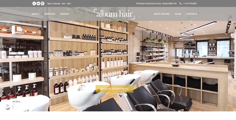
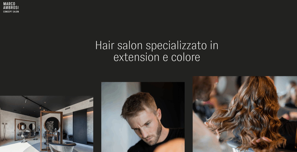
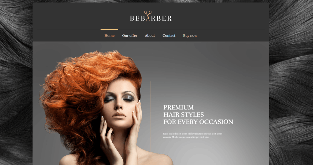
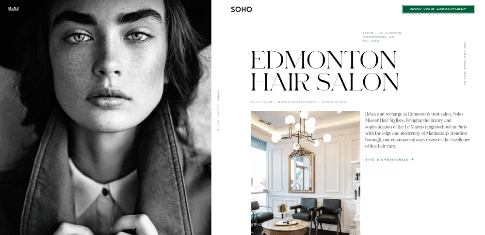
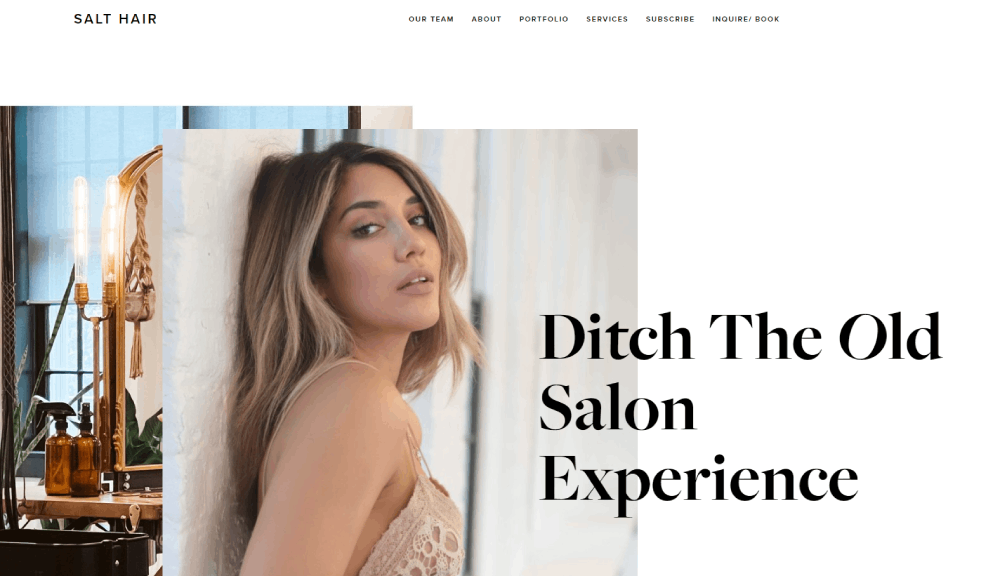
Album Hair
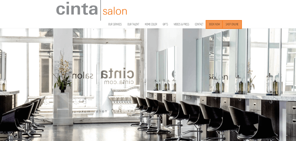
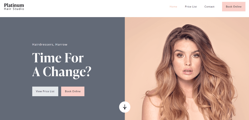
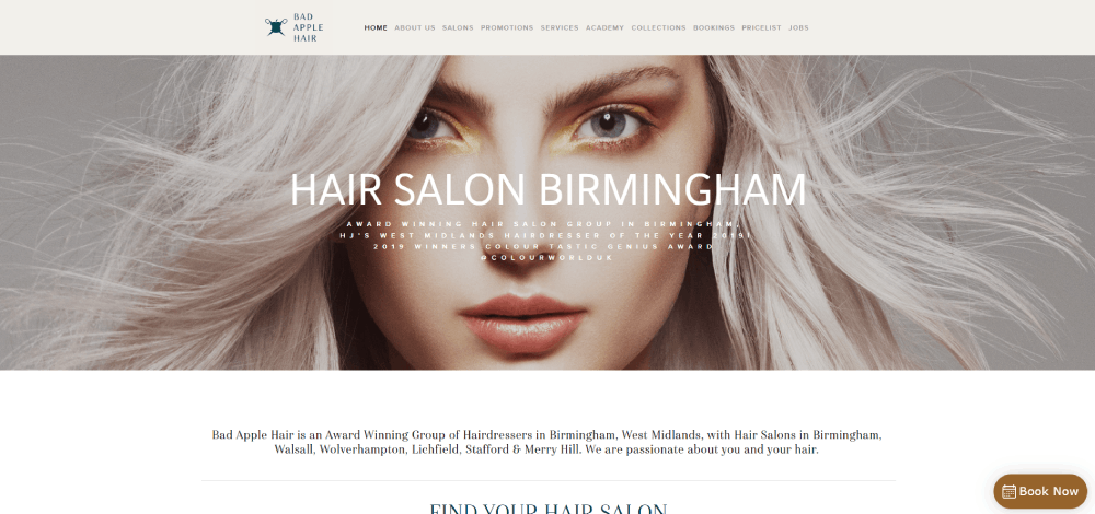
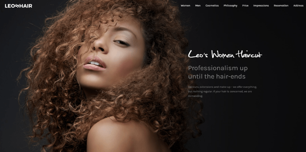
Being one of the top hair salon websites, Forza Kappers offers usability and great content. Its modern look will surely inspire those who want to create their own hair salon website. They've done a great job adding hero images to the header. Thus, the website has an elegant and unique touch.
Hair Salon Website Design Features
The features you include determine whether visitors book or bounce.
Focus on functionality first, aesthetics second.
What Booking System Features Should a Hair Salon Website Include
Real-time availability display, service duration estimates, and stylist selection are baseline requirements.
Top platforms for salon appointment scheduling:
- Fresha - free for basic features, commission on new clients
- Vagaro - $25-85/month, includes marketing tools
- Square Appointments - free for individuals, paid for teams
- Acuity Scheduling - $16-49/month, strong customization
- Booksy - $29.99/month, built for beauty industry
What Visual Elements Work Best for Hair Salon Websites
High-resolution before and after photos outperform stock images every time.
A strong hero section featuring real client transformations builds immediate trust.
Key visual components:
- Portfolio gallery with filtering by service type
- Stylist headshots with brief bios
- Salon interior photography
- Client review screenshots from Google or Yelp
What Navigation Structure Works for Hair Salon Websites
Keep the main menu under seven items. Services, Pricing, Stylists, Gallery, Book Now, Contact.
The Book Now button needs to appear in the header on every page, not buried in a website menu dropdown.
Hair Salon Website Design by Platform
Your platform choice affects cost, flexibility, and maintenance requirements.
Each option works, but they serve different skill levels and budgets.
Hair Salon Website Design on Squarespace
Best templates for salons: Bedford, Brine, York. Built-in scheduling through Acuity (owned by Squarespace) simplifies setup.
Monthly cost runs $16-49 depending on features needed.
Hair Salon Website Design on WordPress
More flexibility but steeper learning curve. Themes like flavor and flavor starter work well for beauty businesses.
Pair with booking plugins (Amelia, Bookly) or embed third-party schedulers. Hosting adds $5-30/month through providers like Bluehost or GoDaddy.
Hair Salon Website Design on Wix
Drag-and-drop builder with salon-specific templates. Wix Bookings handles appointments natively at no extra charge on Business plans.
Plans range from $17-35/month for business features.
Hair Salon Website Design Cost
Budget depends on whether you build it yourself or hire a professional.
Both paths lead to functional sites, just different timelines and results.
How Much Does a Custom Hair Salon Website Cost
Freelance designers charge $1,500-5,000 for a complete salon website. Agencies typically start at $5,000 and go up to $15,000+ for custom builds.
Factors that increase cost:
- Custom booking system integration
- E-commerce for product sales
- Multiple location support
- Custom photography included
- Ongoing maintenance contracts
How Much Does a DIY Hair Salon Website Cost
Platform subscription: $16-49/month. Domain registration: $12-20/year. Premium template (optional): $50-200 one-time.
Total first-year cost for DIY: roughly $250-700.
Trade-off is your time. Expect 20-40 hours to build something that looks professional without design experience.
Hair Salon Website Design Elements by Service Type
Different services need different page structures.
Color work demands visual proof. Cuts need style variety. Treatments require explanation.
Hair Coloring Service Pages
Before and after galleries are mandatory here. Organize by technique: balayage, highlights, color correction, vivid colors.
Include processing time estimates and maintenance requirements for each color service, similar to how popular beauty websites structure their content.
Hair Styling Service Pages
Showcase range through categorized galleries: bridal updos, blowouts, special events, editorial work.
Link styling pages to your wedding photographer partners if you offer bridal services. Cross-promotion works.
Hair Treatment Service Pages
Treatments like keratin, bond repair, and scalp therapies need explanation since clients often don't understand what they're booking.
List specific product brands you use (Olaplex, K18, Kerastase) to build credibility with informed clients.
How to Choose a Hair Salon Website Design
Wrong choices here cost time and money to fix later.
Ask the right questions before you start building.
What Questions Should Salon Owners Ask Before Designing a Website
Critical questions to answer first:
- What's your primary goal: bookings, brand awareness, or product sales?
- Which booking system does your salon already use?
- Do you need multi-location support?
- Who will update content after launch?
- What's your monthly budget for hosting and tools?
Your answers determine platform choice. Heavy booking focus? Wix or Squarespace. Product sales priority? Shopify or WooCommerce on WordPress.
What Mistakes Do Hair Salons Make with Website Design
These errors kill conversions:
- Booking button buried below the fold or hidden in navigation
- Stock photos instead of real client work
- Missing service prices (clients assume expensive and leave)
- No mobile optimization when 70%+ of traffic comes from phones
- Outdated stylist information after team changes
- Slow loading galleries that take 5+ seconds
Avoid bad design patterns by testing your site on mobile before launch. Check Google Analytics monthly to spot drop-off points.
Hair Salon Website Design Inspiration by Style
Your brand personality should guide aesthetic choices.
Luxury salons need different visuals than budget-friendly chains.
Minimalist Hair Salon Website Designs
Neutral palettes, simple navigation, focus on photography over graphics. Works best for high-end positioning where the work speaks for itself.
Check minimalist website examples for layout inspiration.
Bold and Colorful Hair Salon Website Designs
Vibrant gradients and playful fonts signal creativity. Great for salons specializing in fashion colors, creative cuts, or younger clientele.
Browse colorful websites to see how brands use saturation effectively without overwhelming visitors.
Luxury Hair Salon Website Designs
Dark backgrounds, gold or metallic accents, serif fonts. A luxury color palette sets premium expectations before clients see pricing.
Pair with good typography choices to reinforce the upscale positioning.
Hair Salon Website Design Tools and Resources
The right tools speed up the build process.
Most are free or low-cost for basic needs.
Design Tools for Salon Websites
Canva handles social graphics and basic image editing. Adobe XD and Figma work for wireframing if you're planning layouts before building.
For photo editing, Lightroom presets keep your gallery images consistent across the site.
Analytics and Optimization Tools
Google Analytics tracks visitor behavior and booking conversions. Hotjar shows where users click and scroll.
Monitor your Google Business Profile insights alongside website data to see the full client journey from search to appointment.
Content Resources for Salon Websites
Stock photo alternatives for salons: Unsplash, Pexels (search "hair salon" or "hairstylist"). Better option: hire a local photographer for one session.
Mailchimp integrates with most platforms for email marketing to past clients. Build a list from day one.
Hair Salon Website Design Checklist
Use this before launch to catch common oversights.
Technical Requirements
- SSL certificate installed (https:// in URL)
- Mobile responsive on iOS and Android
- Page load under 3 seconds
- Booking system tested with real appointment
- Contact form sends to correct email
- Google Maps embed shows accurate location
Content Requirements
- All services listed with descriptions and prices
- Stylist bios with photos and specialties
- Minimum 10 portfolio images per major service
- Business hours displayed on homepage and contact page
- Phone number clickable on mobile
- Social media links functional
SEO Requirements
- Page titles include city name and "hair salon"
- Meta descriptions written for each page
- Images compressed and include alt text
- Google Business Profile linked and verified
- Schema markup for local business added
Run through this website checklist quarterly to maintain quality as you update content.
FAQ on Hair Salon Website Design
What platform is best for building a hair salon website?
Squarespace and Wix work best for DIY builds with built-in booking tools. WordPress offers more flexibility but requires plugins for appointment scheduling. Your technical comfort level and budget determine the right choice.
How much does a hair salon website cost to build?
DIY builds run $250-700 annually including hosting and domain. Custom designs from freelancers cost $1,500-5,000. Agency builds start at $5,000 and increase based on features like e-commerce integration and multi-location support.
What features must a hair salon website include?
Online booking system, service menu with pricing, stylist bios, before and after gallery, contact information, and mobile responsive design. These six elements convert visitors into appointments. Everything else is optional.
Which booking system works best for salon websites?
Fresha offers free basic features. Vagaro includes marketing tools for $25-85 monthly. Square Appointments works free for solo stylists. Booksy and Acuity Scheduling provide strong customization for growing teams.
Do I need a professional designer for my salon website?
Not necessarily. Modern platforms like Wix and Squarespace offer salon-specific templates that look polished without coding knowledge. Hire a designer only if you need custom features or lack time for DIY.
How many pages should a hair salon website have?
Minimum five pages: Home, Services, About/Stylists, Gallery, and Contact. Larger salons add separate pages for each service category, individual stylist profiles, blog content, and membership information.
What images should I include on my salon website?
Before and after transformations, stylist headshots, salon interior photos, and client gallery work samples. Skip generic stock photos. Real images of your actual work build trust faster than polished but fake alternatives.
How do I make my salon website mobile-friendly?
Choose a responsive website template that automatically adjusts to screen sizes. Test booking forms on phones. Keep buttons large enough for thumbs. Most salon clients browse and book from mobile devices.
What colors work best for hair salon website designs?
Neutral backgrounds let hair photos stand out. Black and white signal luxury. Soft pastels suit feminine brands. Bold colors work for creative salons. Match your physical salon's brand identity for consistency.
How can I improve my salon website's visibility on Google?
Claim your Google Business Profile. Add your city name to page titles. Write unique service descriptions. Collect Google reviews. Compress images for faster loading. Update content quarterly to signal an active business.
Conclusion
These hair salon website design examples prove that effective salon sites share common traits: clear booking paths, authentic imagery, and mobile-first layouts.
Your platform choice matters less than execution. Wix, Squarespace, or WordPress all work when paired with tools like Booksy or Acuity Scheduling.
Focus on what converts. A strong call to action button, visible pricing, and genuine stylist portfolios outperform flashy animations every time.
Start with the basics: mobile responsive design, fast loading galleries, and seamless appointment scheduling. Track results through Google Analytics and refine based on data.
Your website is your 24/7 receptionist. Build it to book chairs, not just look pretty.
The salons winning online prioritize function alongside aesthetics. Now you have the blueprint to do the same.

