The Best Woodworking Website Design Examples
August 4, 2025
The best parallax scrolling website templates you can use
August 7, 2025A poorly designed jewelry website costs you sales every single day. Buyers abandon carts, skip past blurry product photos, and bounce when checkout feels sketchy.
The best jewelry website design examples solve these problems through high-resolution imagery, trust signals, and frictionless shopping experiences.
This guide breaks down 15 online jewelry stores from brands like Tiffany & Co., Blue Nile, and Mejuri. You will see what makes their product pages convert, how they handle mobile browsing, and which Shopify or Magento features drive results.
Whether you sell engagement rings, fashion accessories, or handmade pieces, these e-commerce examples show exactly what works in the fine jewelry market today.
What is Jewelry Website Design
Jewelry website design is a specialized branch of e-commerce web development focused on presenting fine jewelry, engagement rings, and accessories through digital storefronts.
The design combines high-resolution product photography, trust signals like GIA certifications, and conversion-focused layouts built for the luxury goods market.
Unlike standard online stores, jewelry e-commerce sites must handle complex product variations. Ring sizes, metal types, gemstone options, and custom engraving all need clear presentation.
Platforms like Shopify, Magento, and BigCommerce power most jewelry retail websites today. Each offers different strengths for catalog management and checkout customization.
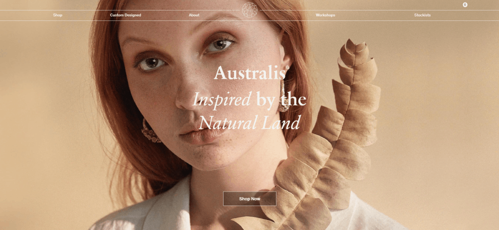
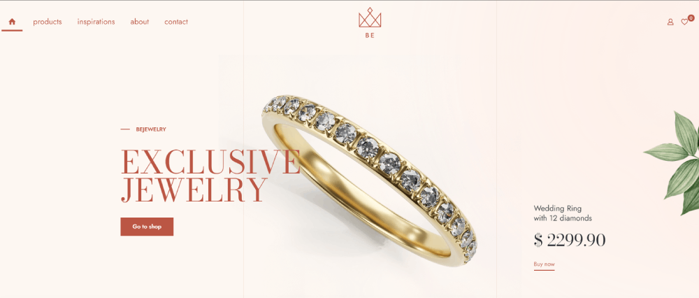
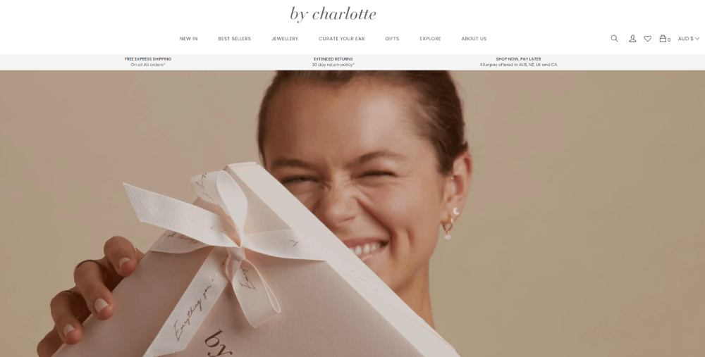
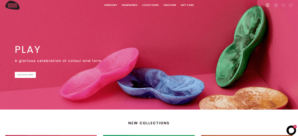
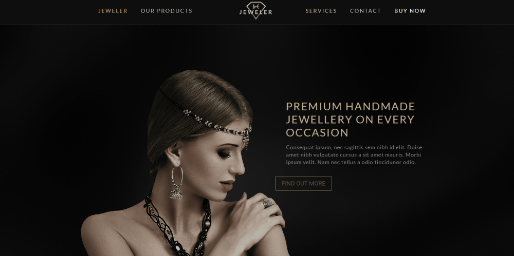
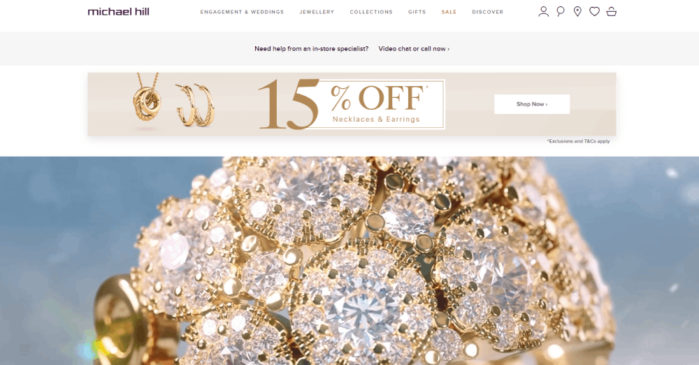
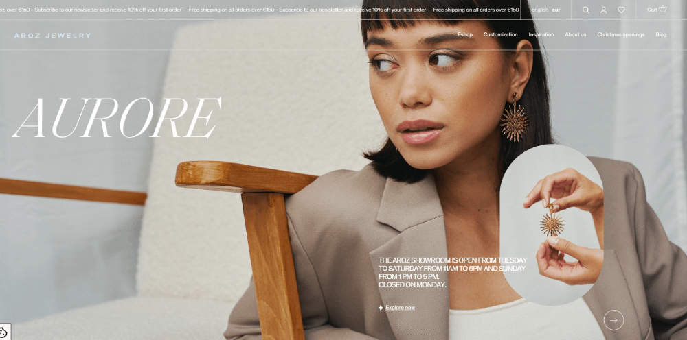
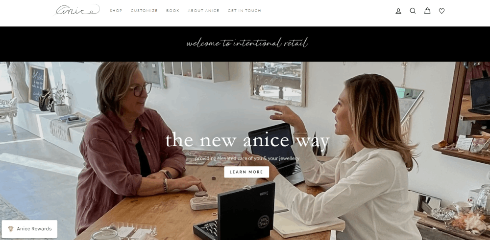
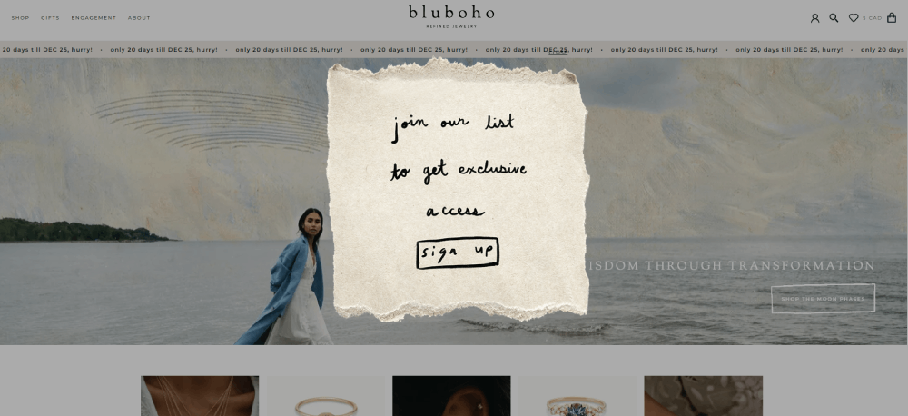
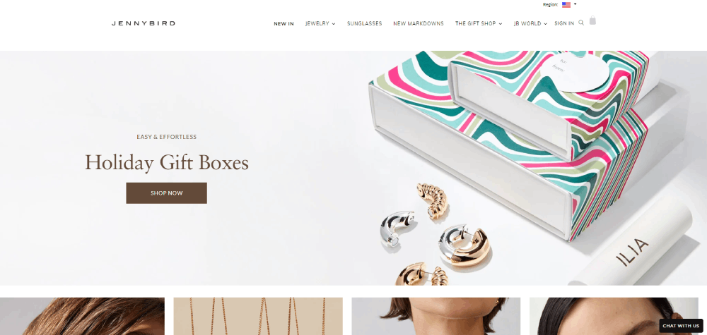
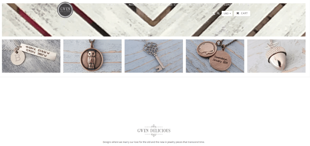
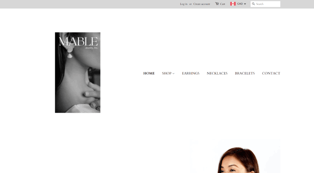
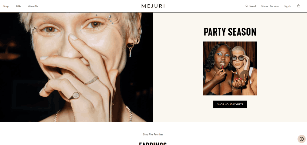
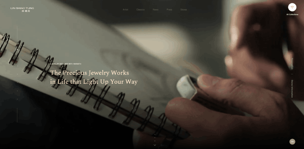
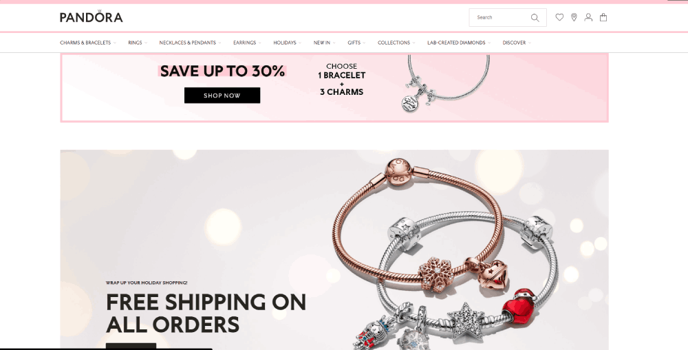
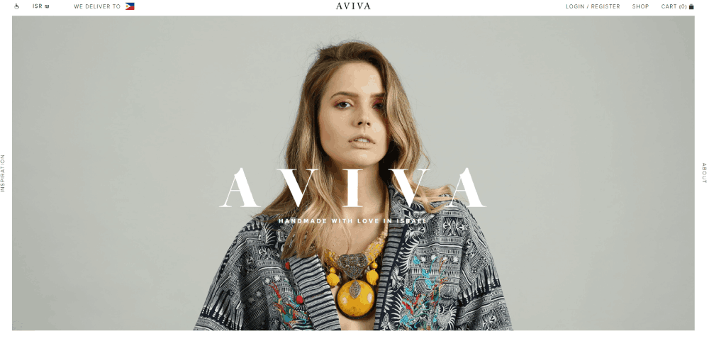
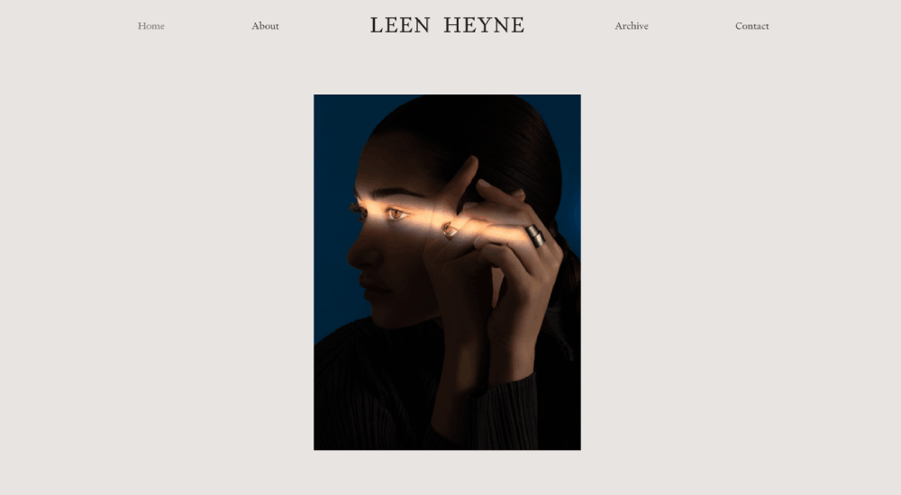
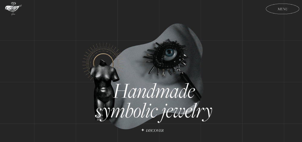
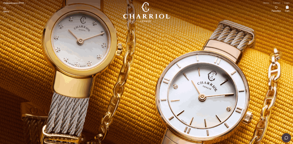
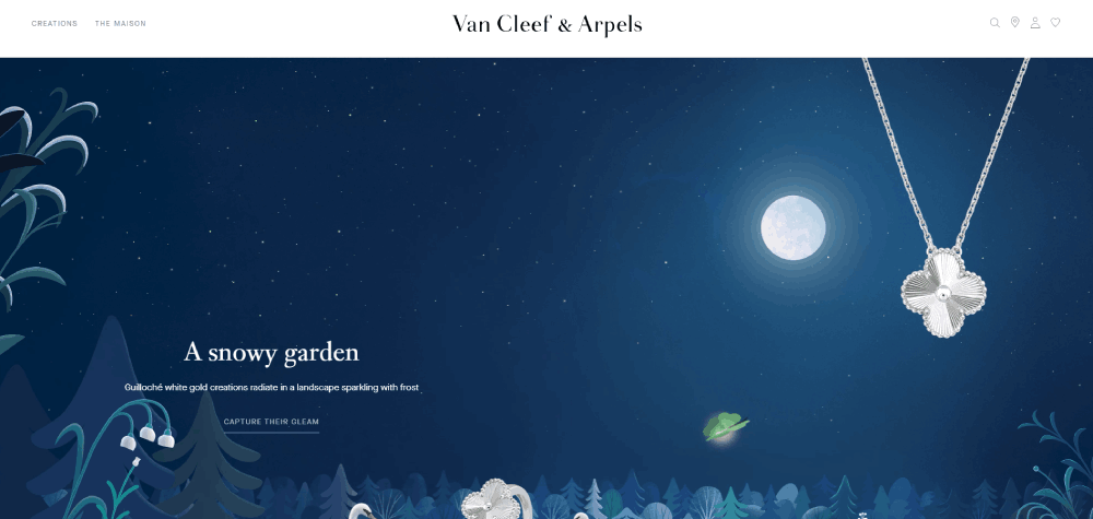
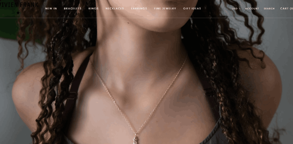
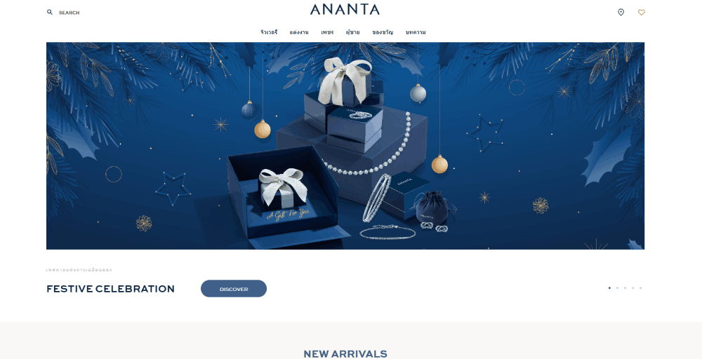
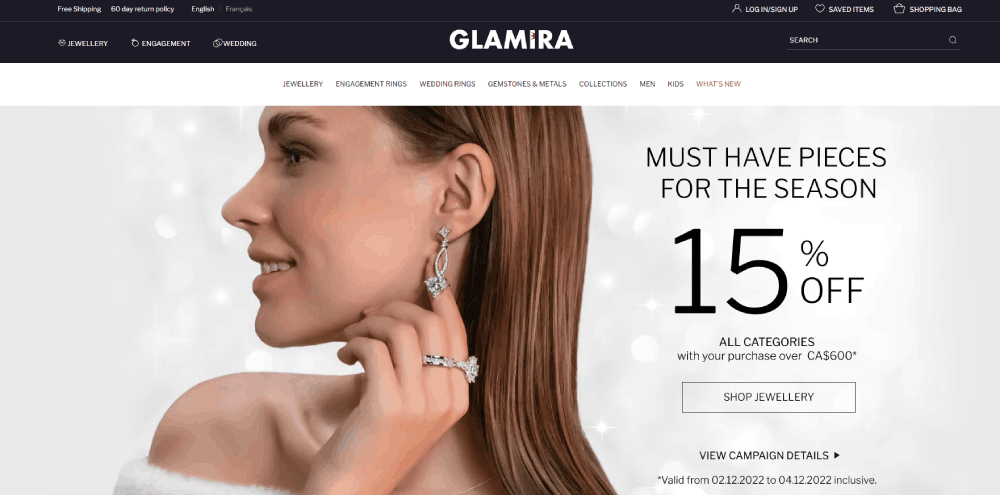
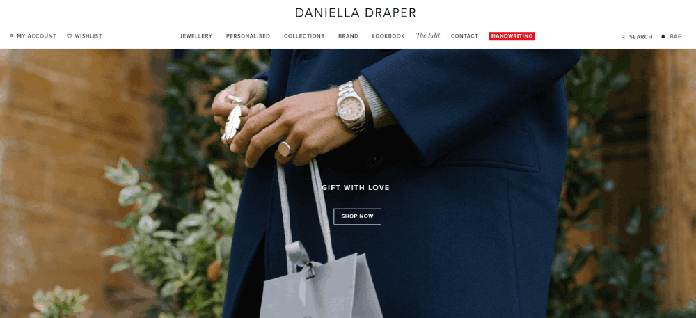
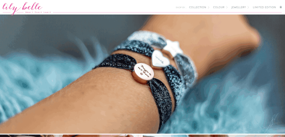
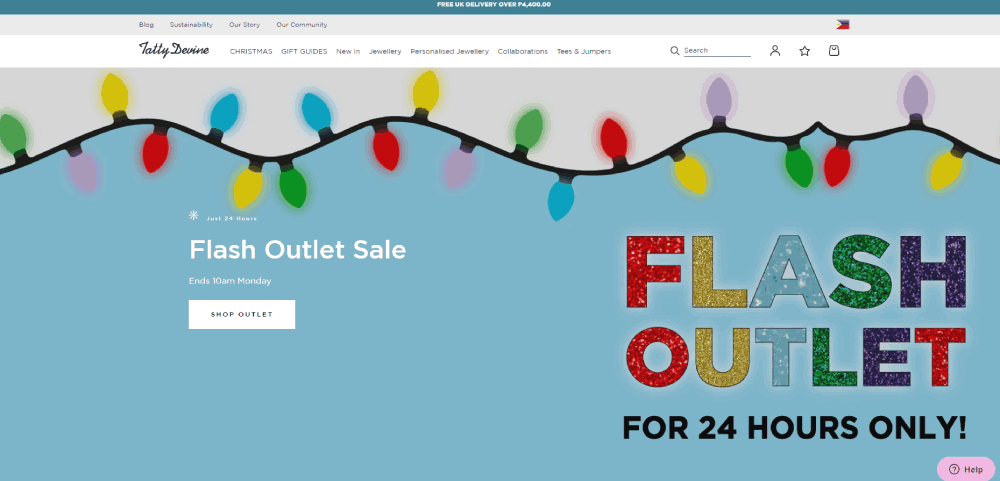
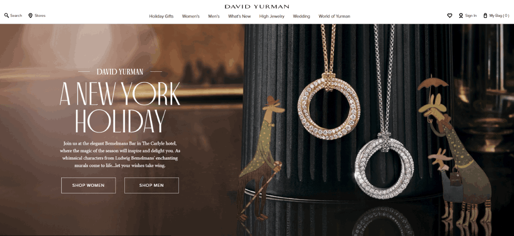
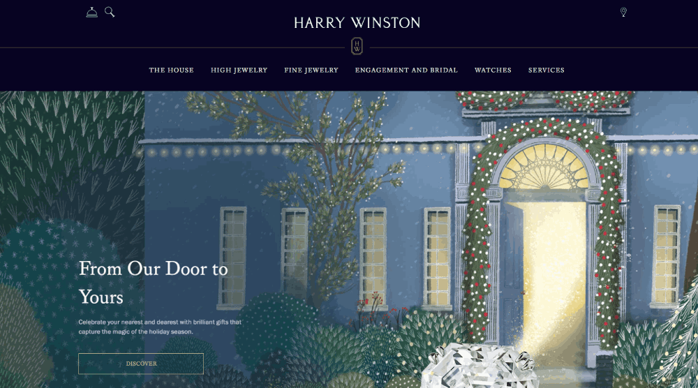
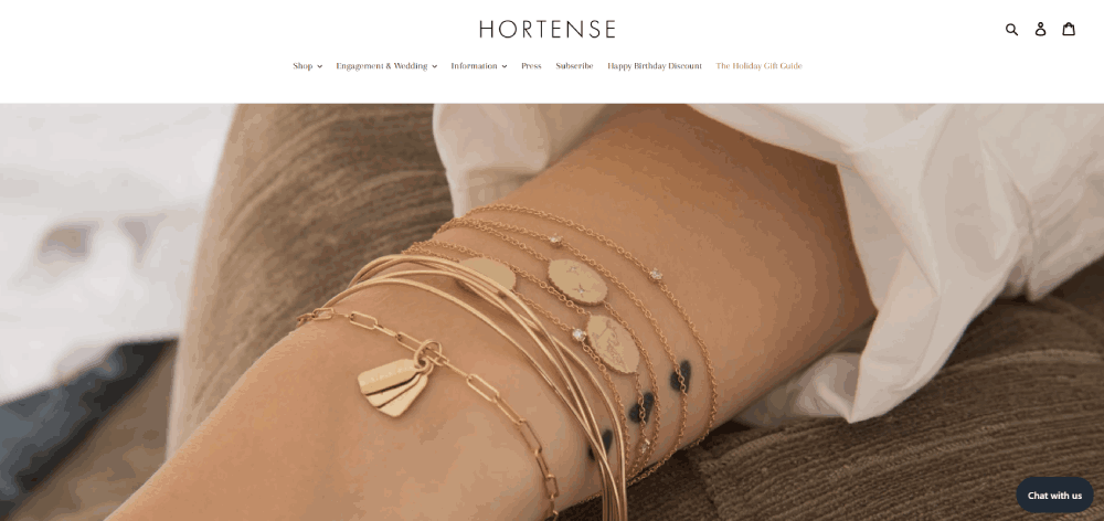
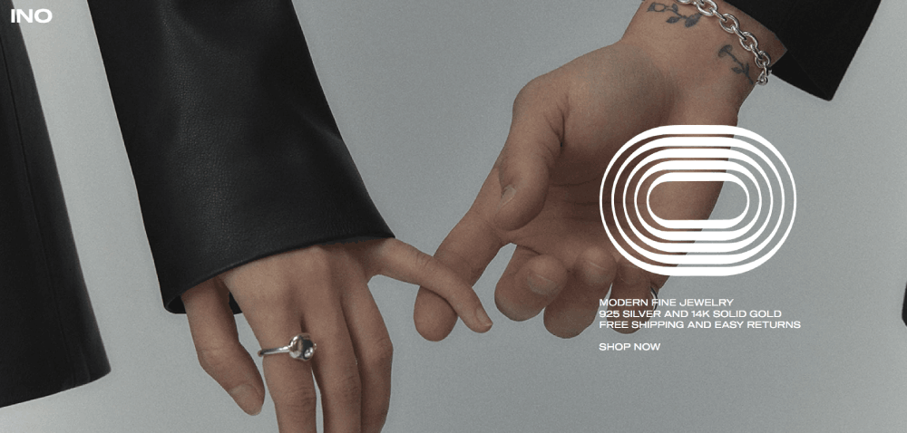
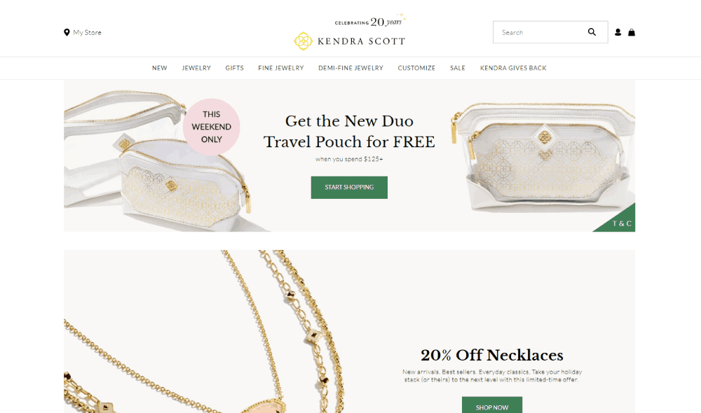
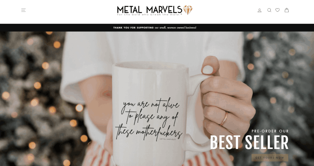
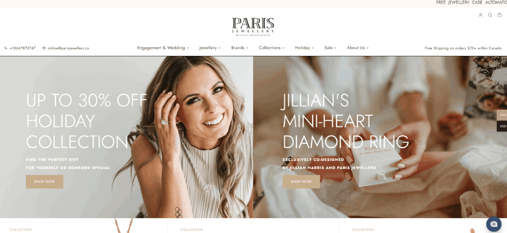
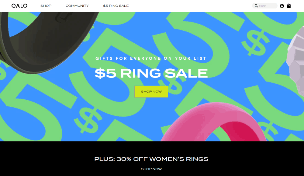
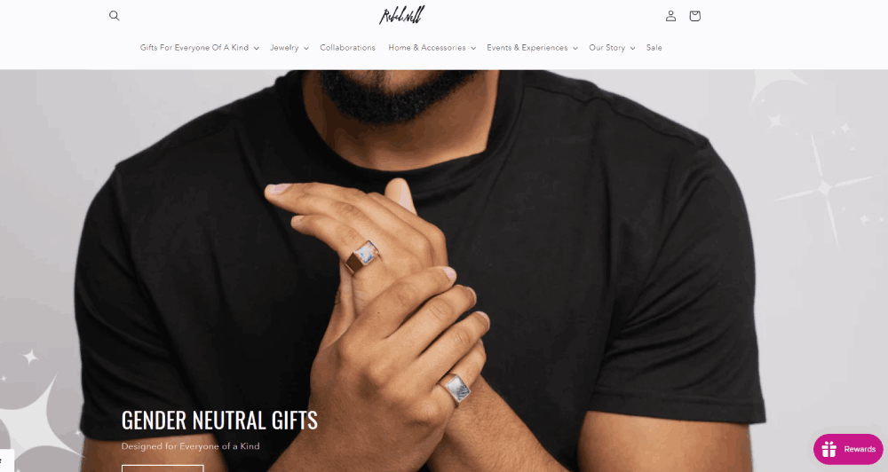
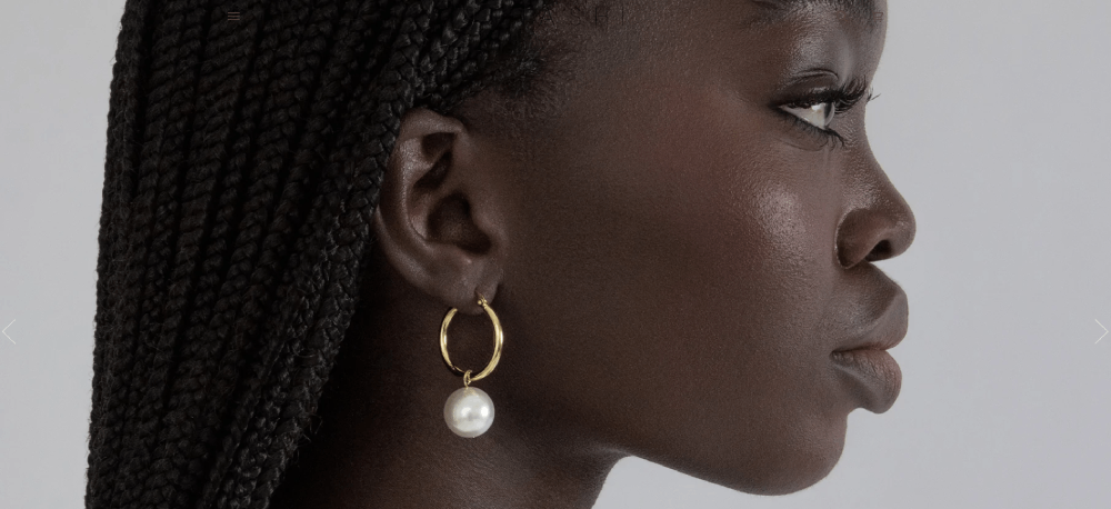
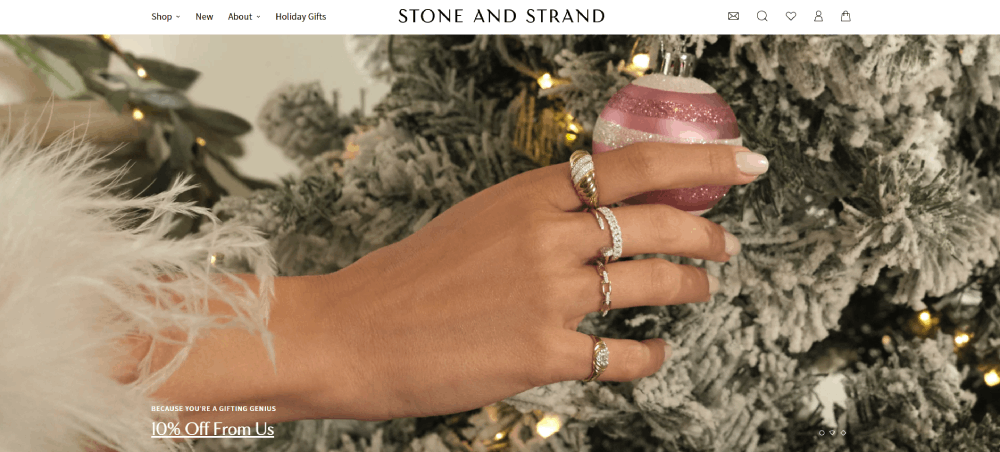
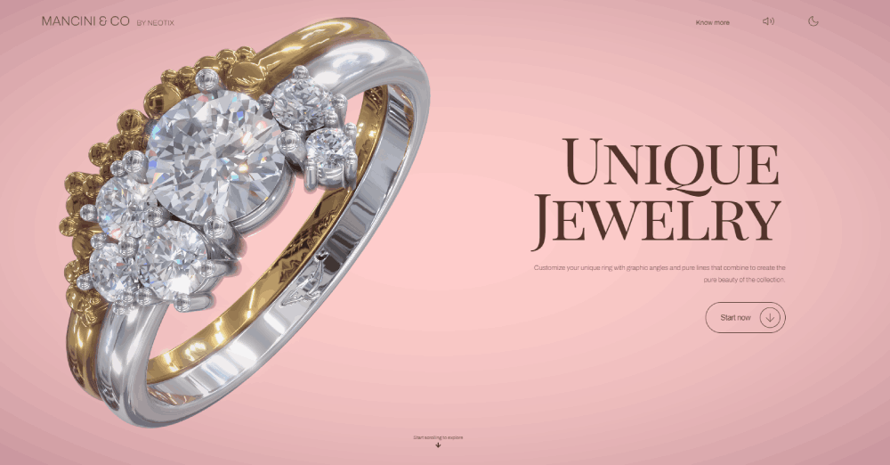
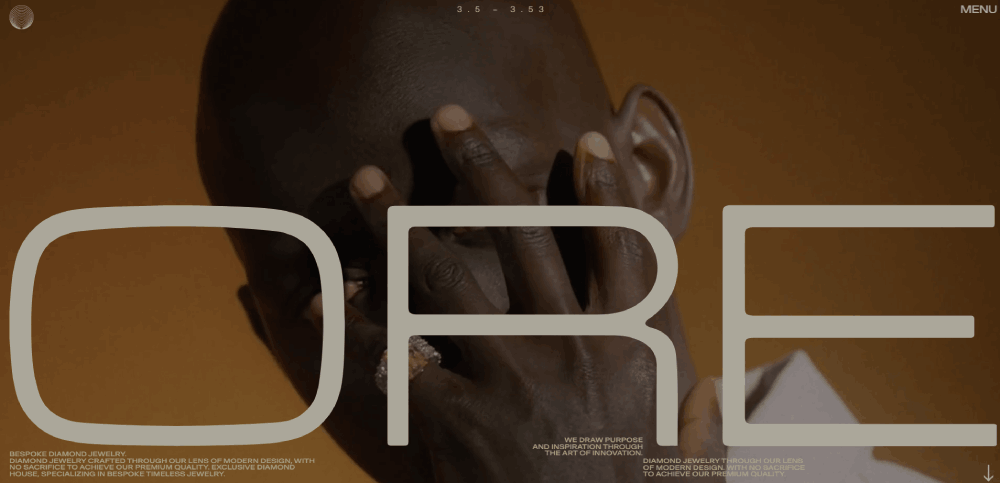
Jewelry Website Design Examples
Abby Seymour
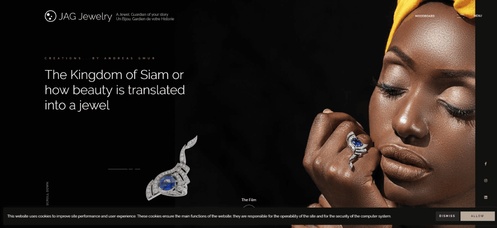
JAG Jewelry
How Does Jewelry Website Design Differ from Standard E-commerce Design
Standard e-commerce focuses on volume and quick purchases. Jewelry demands a different approach entirely.
Buyers spend weeks researching before purchasing an engagement ring or fine jewelry piece. Your site needs to support that longer decision cycle with detailed information and multiple touchpoints.
What Visual Elements Do Jewelry Websites Require
360-degree product views, macro photography showing gemstone clarity, and lifestyle imagery showing pieces worn. Video demonstrations have become standard for items over $500.
The hero section needs to immediately communicate brand positioning, whether luxury, artisan, or accessible fashion jewelry.
Which Trust Signals Matter for Jewelry Buyers
GIA certification badges, secure checkout icons, and clear return policies displayed prominently. A well-designed testimonial page showing verified purchases builds confidence for high-value transactions.
Payment options like Affirm or Klarna reduce friction for expensive purchases.
What Page Speed Standards Apply to Image-Heavy Jewelry Sites
Google PageSpeed Insights scores above 70 on mobile remain the target, even with dozens of high-resolution images per page.
Lazy loading, WebP image formats, and CDN delivery keep load times under 3 seconds. Slower sites see 40% higher bounce rates on product pages.
What Criteria Define a Well-Designed Jewelry Website
The best elegant websites in the jewelry space share common traits: clear navigation, trust-building elements, and frictionless checkout flows.
But criteria shift based on whether you sell $50 fashion pieces or $50,000 diamond rings.
How Does Product Photography Impact Jewelry Sales
Product photography accounts for up to 75% of purchase decisions in jewelry e-commerce. Buyers cannot touch or try on items, so images must do the heavy lifting.
Multiple angles, zoom functionality showing metal texture, and color-accurate representation are non-negotiable.
What Navigation Structure Works Best for Jewelry Collections
Category-based navigation by jewelry type (rings, necklaces, bracelets) combined with attribute filters (metal, gemstone, price range). Check website navigation examples from brands like Blue Nile and Mejuri for proven patterns.
Search autocomplete suggesting specific products speeds up discovery.
Which Checkout Features Reduce Cart Abandonment for High-Value Items
Guest checkout options, multiple payment methods including PayPal and Stripe, and transparent shipping costs shown early. Progress indicators and form design optimized for speed matter here.
Ring sizer requests and free shipping thresholds push hesitant buyers toward completion.
How Do Mobile Layouts Affect Jewelry Browsing Behavior
Over 65% of jewelry browsing happens on mobile devices. Mobile first design ensures touch-friendly image galleries and thumb-reachable add-to-cart buttons.
Sticky product information and simplified filtering prevent frustration on smaller screens.
What Design Styles Perform Best for Different Jewelry Categories
A bridal jewelry website needs different design treatment than a fashion accessories shop. Category dictates expectations.
Which Layout Works for Engagement Ring Websites
Clean backgrounds, diamond education sections, and ring builder tools. James Allen and Blue Nile set the standard. Include sizing guides, setting comparisons, and financing information prominently.
What Design Approach Suits Fashion Jewelry Brands
Lifestyle imagery, trend-driven collections, and fast checkout flows. Think Instagram-ready visuals and impulse purchase optimization. Fashion websites in the jewelry space need frequent content updates to stay relevant.
How Should Custom Jewelry Makers Structure Their Sites
Portfolio-first layouts showing past commissions, clear process explanations, and consultation booking. Trust comes from showcasing craftsmanship rather than inventory depth. A strong portfolio section becomes the primary sales tool.
What Design Elements Work for Vintage Jewelry Sellers
Authenticity documentation, era categorization, and detailed provenance information. Photogra
FAQ on Jewelry Website Design
What platform works best for jewelry e-commerce websites?
Shopify dominates the jewelry market for small to mid-sized brands due to easy product variant management. Magento suits larger catalogs with complex filtering needs. BigCommerce and WooCommerce offer alternatives depending on technical resources and customization requirements.
How much does a professional jewelry website cost?
Basic Shopify jewelry stores start around $5,000 to $15,000. Custom builds with advanced features like 360-degree photography and virtual try-on run $50,000 to $200,000. Ongoing costs include hosting, payment processing through Stripe or PayPal, and photography updates.
What photography standards do jewelry websites require?
Multiple angles per product, macro shots showing gemstone clarity, and lifestyle imagery. White or neutral backgrounds work for product pages. Video demonstrations increase conversions for items over $500. Consistent lighting prevents color accuracy issues.
Which trust signals increase jewelry website conversions?
GIA certification badges, secure checkout icons, and verified customer reviews matter most. Clear return policies, warranty information, and physical address display build confidence. Payment security logos from PayPal, Stripe, and Affirm reduce checkout abandonment.
How should jewelry websites organize product categories?
Primary navigation by jewelry type: rings, necklaces, bracelets, earrings. Secondary filters for metal type, gemstone, price range, and occasion. Blue Nile and Brilliant Earth demonstrate effective website menu structures for complex jewelry catalogs.
Do jewelry websites need mobile-responsive design?
Over 65% of jewelry browsing happens on mobile devices. Touch-friendly image galleries, simplified checkout flows, and thumb-reachable buttons are mandatory. Responsive websites that adapt to screen size directly impact bounce rates and sales.
What payment options should jewelry stores offer?
Credit cards through Stripe, PayPal for buyer protection, and buy-now-pay-later services like Affirm or Klarna. Financing options reduce friction for engagement rings and fine jewelry purchases. Multiple payment methods decrease cart abandonment significantly.
How do jewelry brands build visual consistency online?
Consistent photography style, cohesive color theory application, and unified typography across pages. Brands like Mejuri and Catbird maintain recognizable aesthetics through careful art direction. Templates ensure new products match existing catalog presentation.
What homepage elements do successful jewelry sites include?
Hero imagery showcasing signature collections, featured product carousels, and social proof sections. Navigation to major categories, trust badges, and email capture for marketing. Seasonal promotions and new arrivals keep returning visitors engaged with fresh content.
Which design mistakes hurt jewelry website performance?
Slow loading from unoptimized images, confusing navigation, and hidden shipping costs. Poor mobile experience, lack of zoom functionality, and missing size guides frustrate buyers. Review bad design examples to understand what patterns to avoid completely.
Conclusion
These jewelry website design examples share common traits: high-quality product imagery, clear navigation structures, and trust signals that reduce purchase anxiety.
Brands like James Allen and Brilliant Earth prove that technology investments pay off. Virtual try-on tools and 360-degree diamond views directly increase conversion rates.
Smaller brands like Catbird show that personality beats budget. A cohesive visual identity and authentic storytelling compete against larger retailers.
Start with the fundamentals. Optimize your product page layouts, implement secure checkout processes, and display GIA certifications prominently.
Use a website checklist to audit your current jewelry store against these examples.
Whether you build on BigCommerce, WooCommerce, or a custom platform, the principles remain the same. Put your jewelry first, make buying easy, and earn trust at every step.

