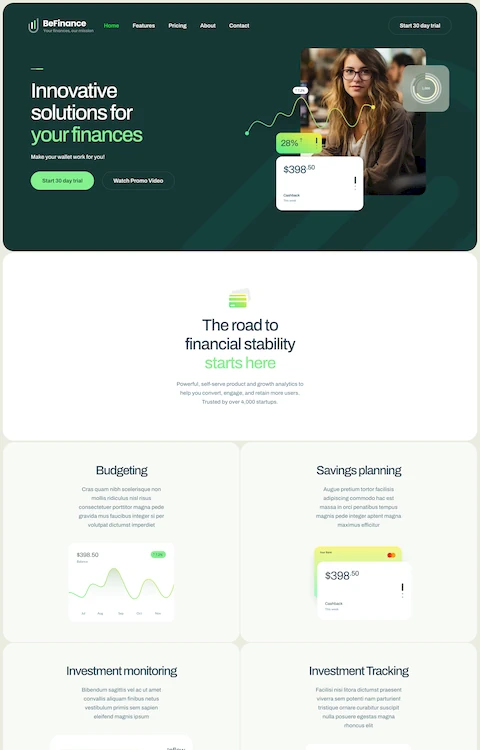
Great Pet Care Website Design Examples
July 2, 2025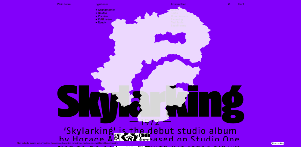
Graphic Designers’ Portfolio Websites That Look Amazing
July 3, 2025Your next landscaping client is searching online right now. Without a strong website, they'll hire your competitor instead.
The best landscaping website design examples share common patterns: striking project galleries, clear service pages, and quote request forms that actually convert.
This guide breaks down what works for lawn care companies, hardscape contractors, and garden designers building their online presence.
You'll see real portfolio layouts, learn which platforms suit different business sizes, and understand the technical features that turn visitors into leads.
Whether you're building a new site on WordPress or redesigning an existing one, these examples provide a clear roadmap for outdoor service businesses.
What is Landscaping Website Design
Landscaping website design is the process of creating digital platforms for lawn care companies, garden designers, and outdoor service businesses.
These sites showcase project portfolios, service offerings, and contact methods for residential and commercial clients.
A well-built landscape contractor website combines visual galleries with lead generation forms and service area maps.
The goal is simple: turn visitors into quote requests.
Landscaping Website Design Examples
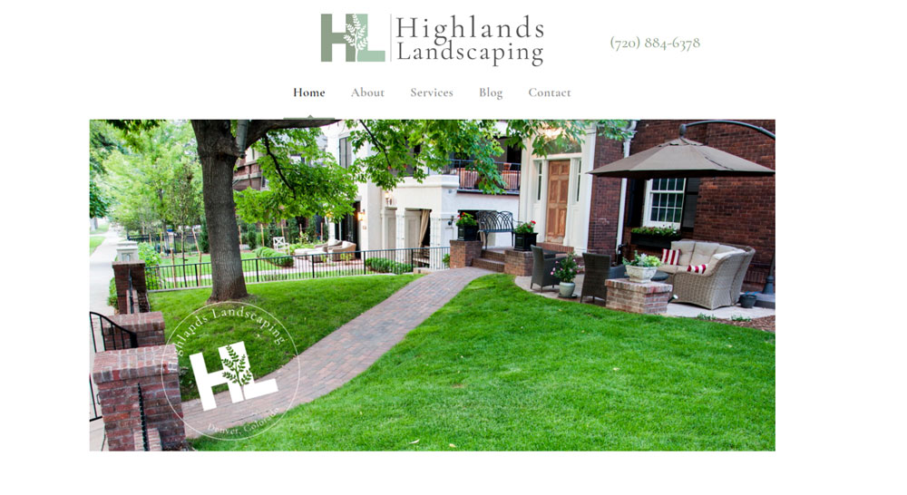
Highlands Landscaping
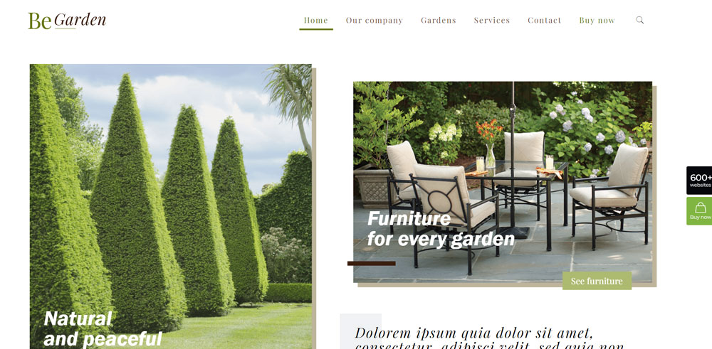
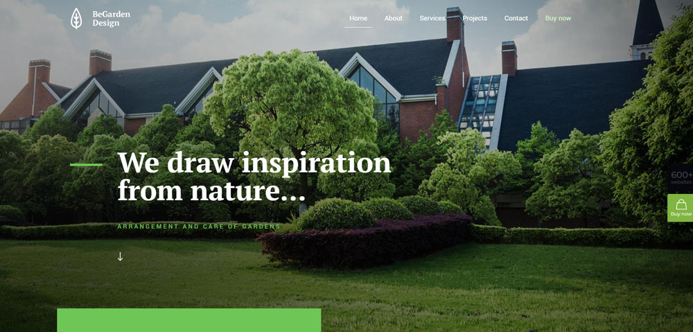
Be Garden
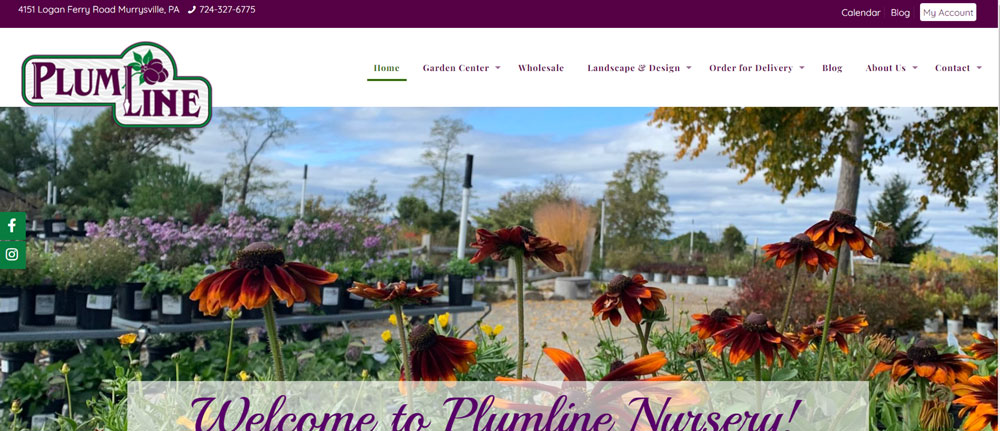
Plumline Nursery
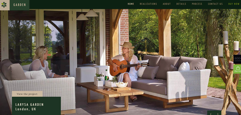
Be Garden 2
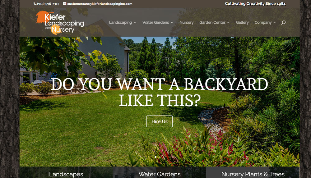
Kiefer Landscaping and Nursery
Be Garden 3
Exotic Gardens Landscaping
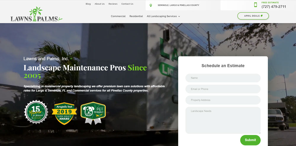
Lawns & Palms
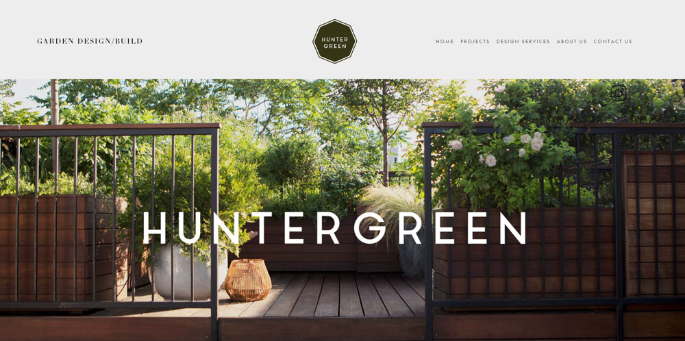
Huntergreen
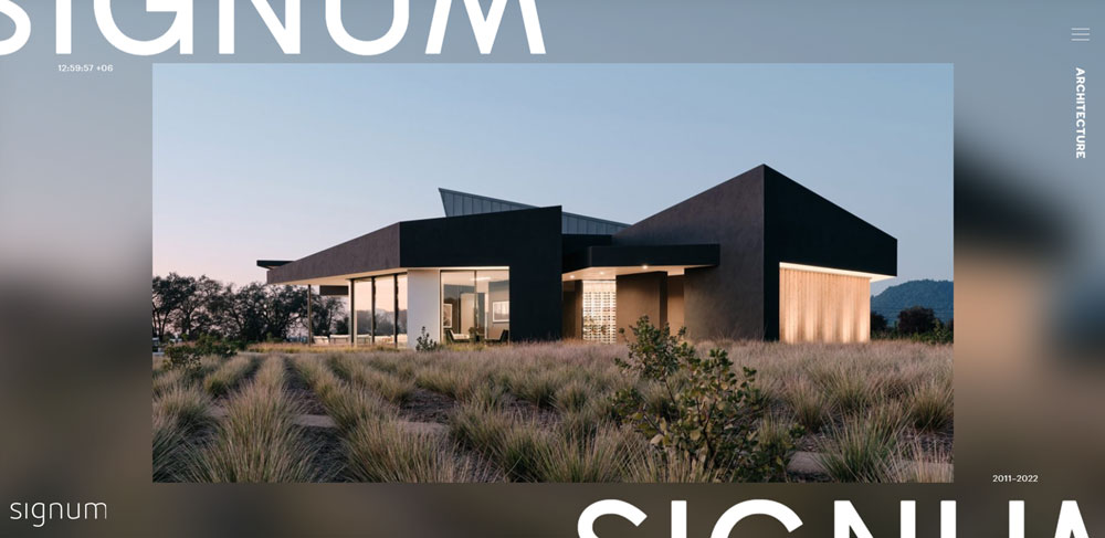
Signum Architecture
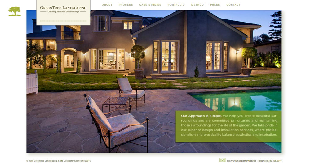
Green Tree Landscaping
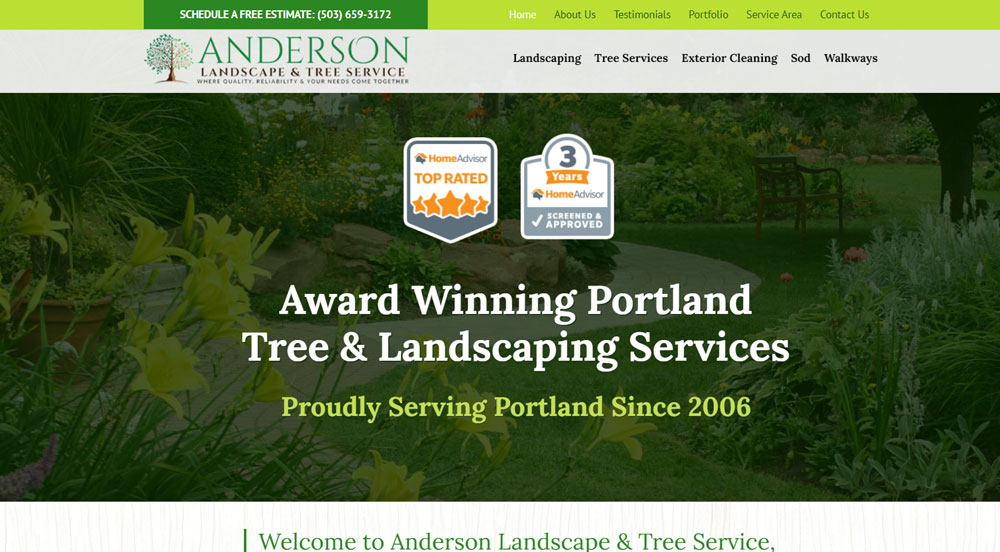
Anderson Landscape Maintenance
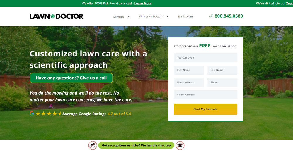
Lawn Doctor
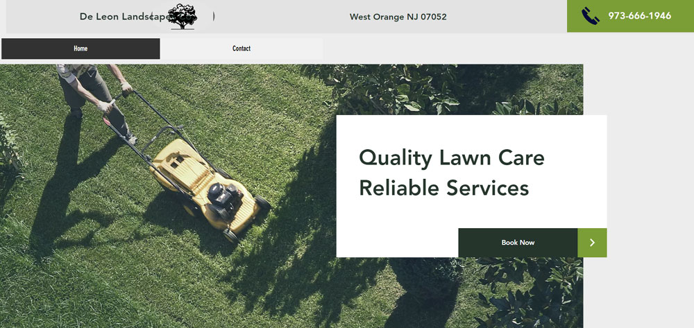
De Leon Landscapes Co.
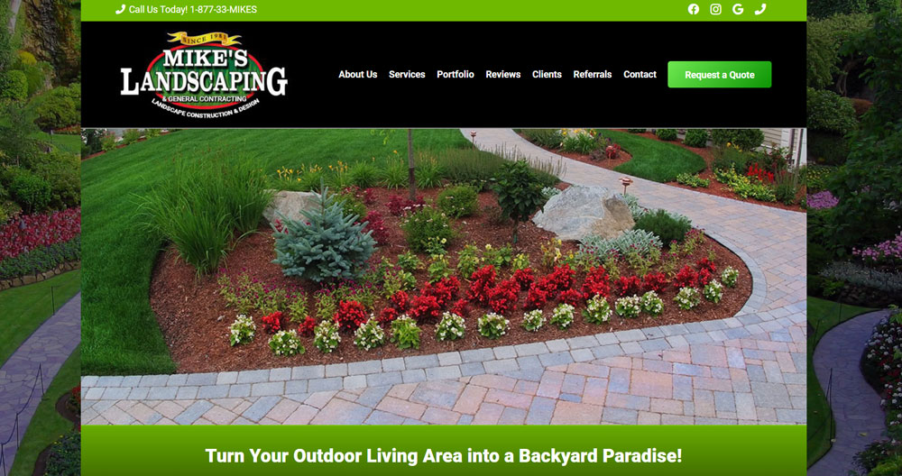
Mike’s Landscaping
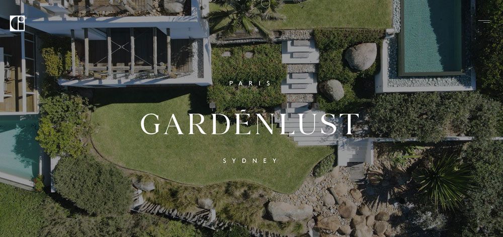
Gardenlust
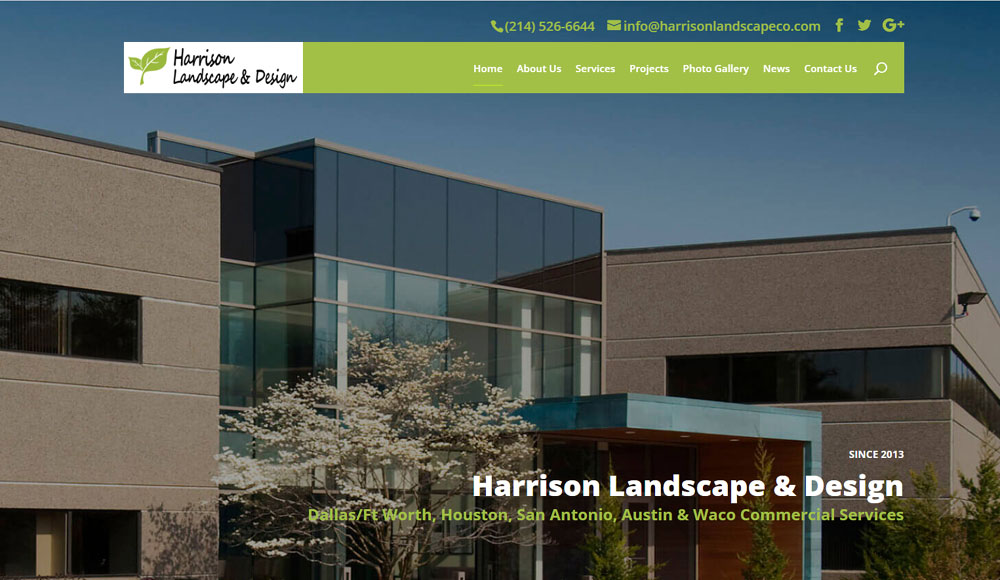
Harrison Landscape Co
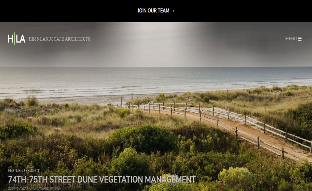
Hess Landscape Architects
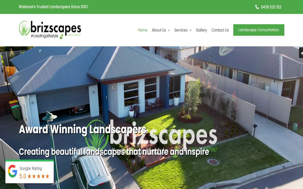
Brizscapes
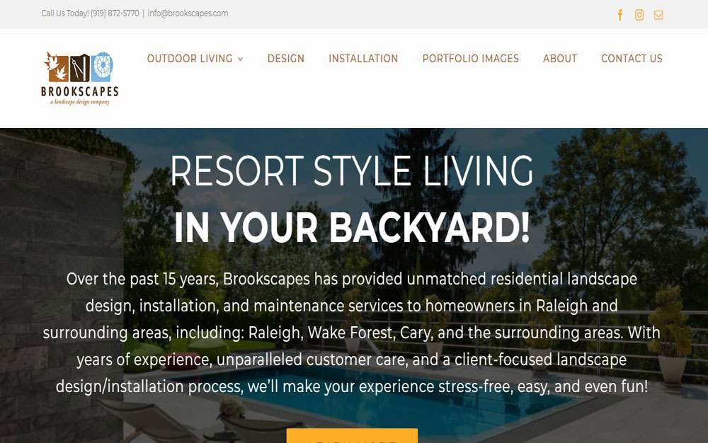
Brookscapes
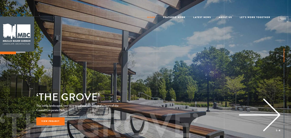
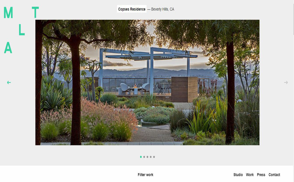
Melillo + Bauer Associates
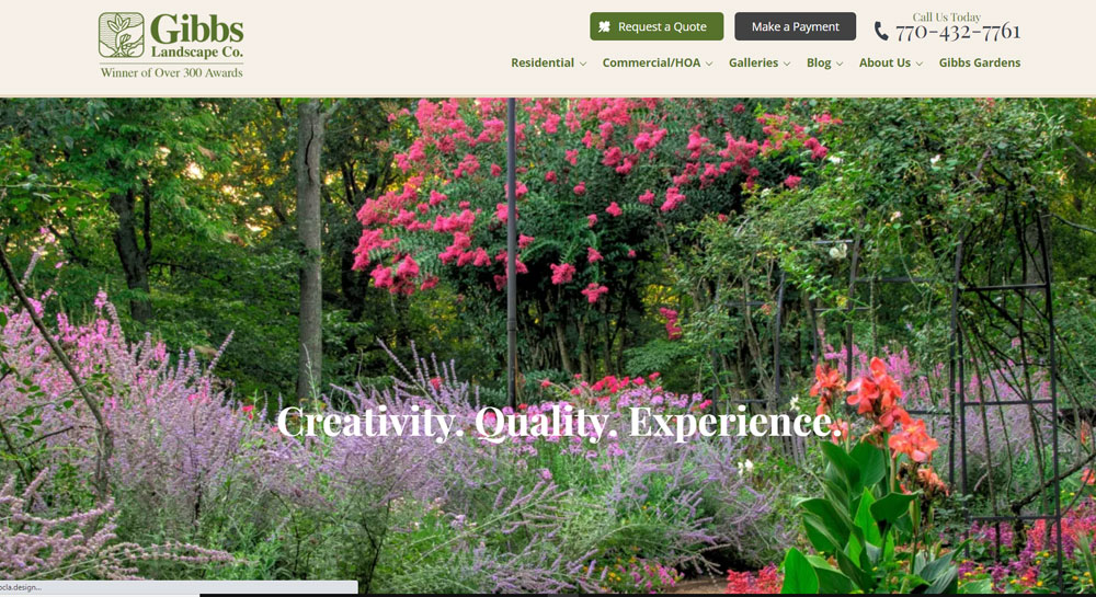
Gibbs Landscape
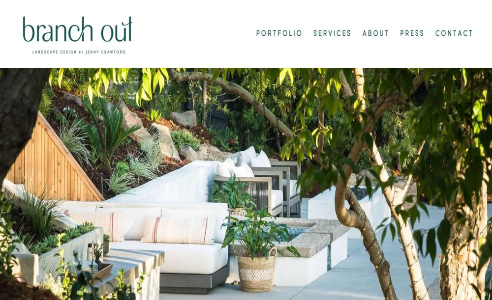
Branch Out Landscapes
Mark Tessier
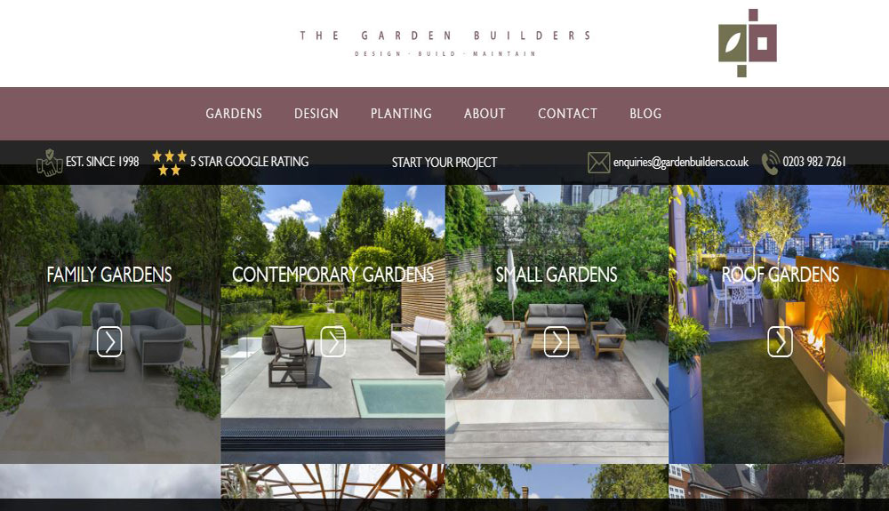
Garden Builders
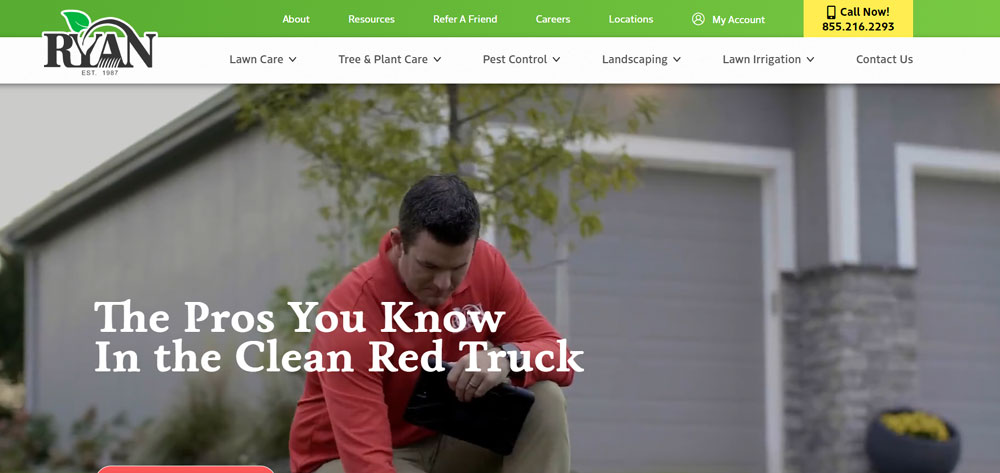
Ryan Lawn
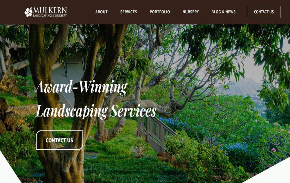
Mulkern
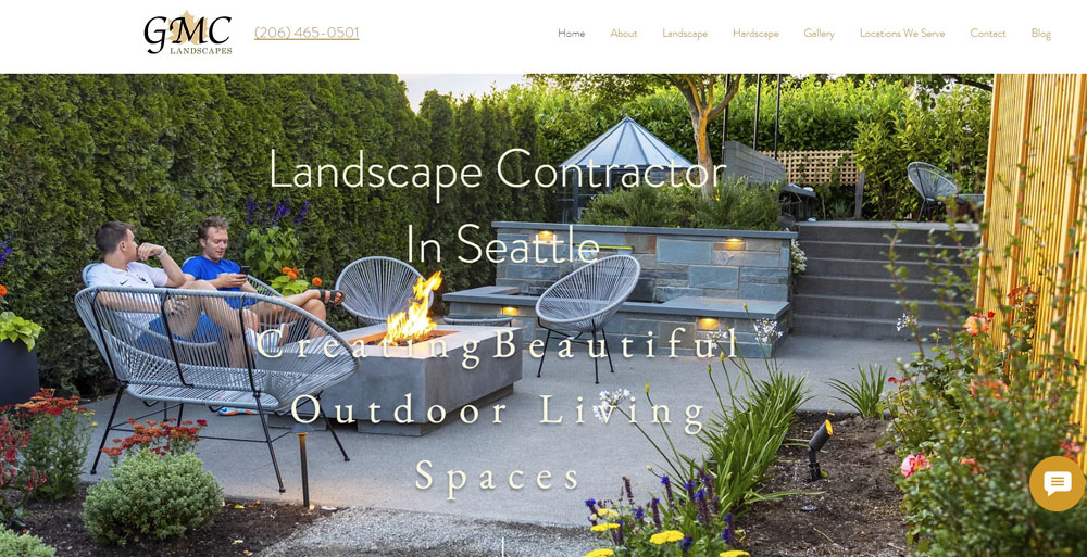
GMC Landscapes
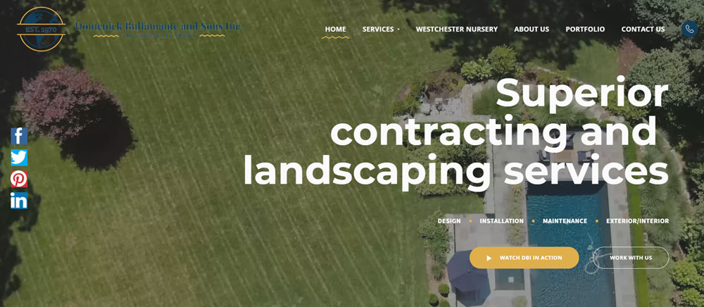
Domenick Bulfamante & Sons Inc
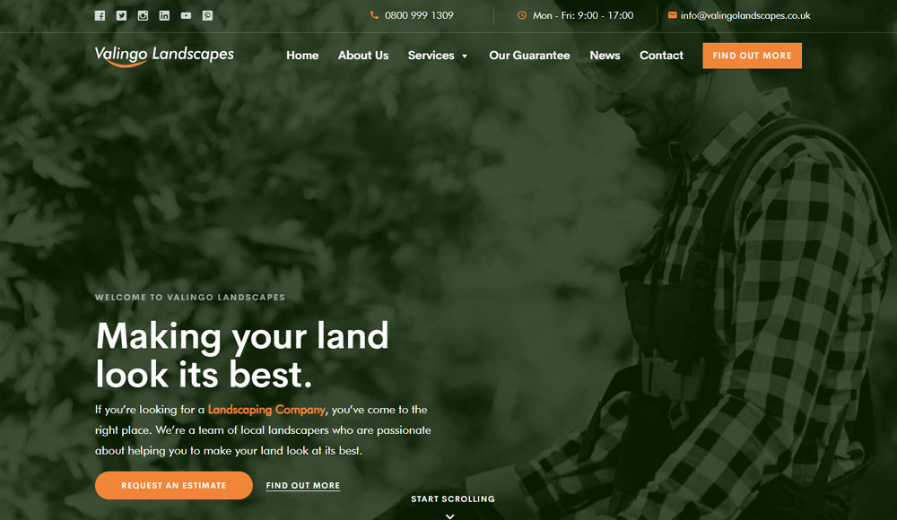
Valingo Landscapes
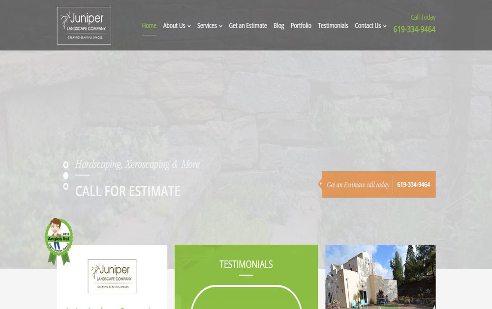
Juniper Landscape Company
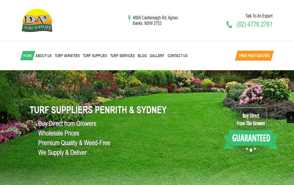
D&V Turf Supplies
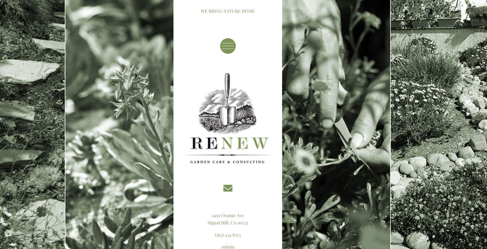
RENEW LANDSCAPE
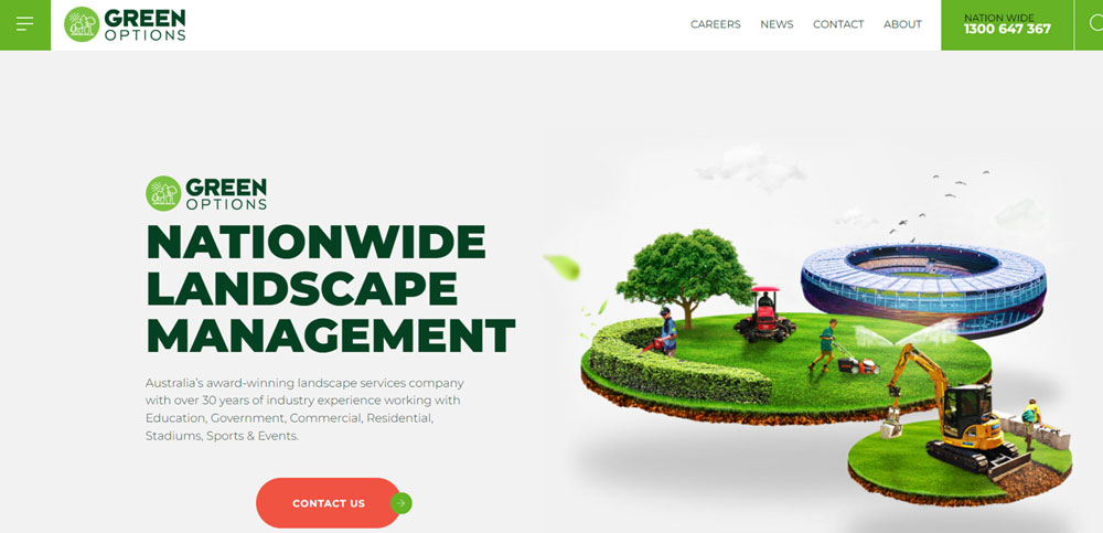
Green Options
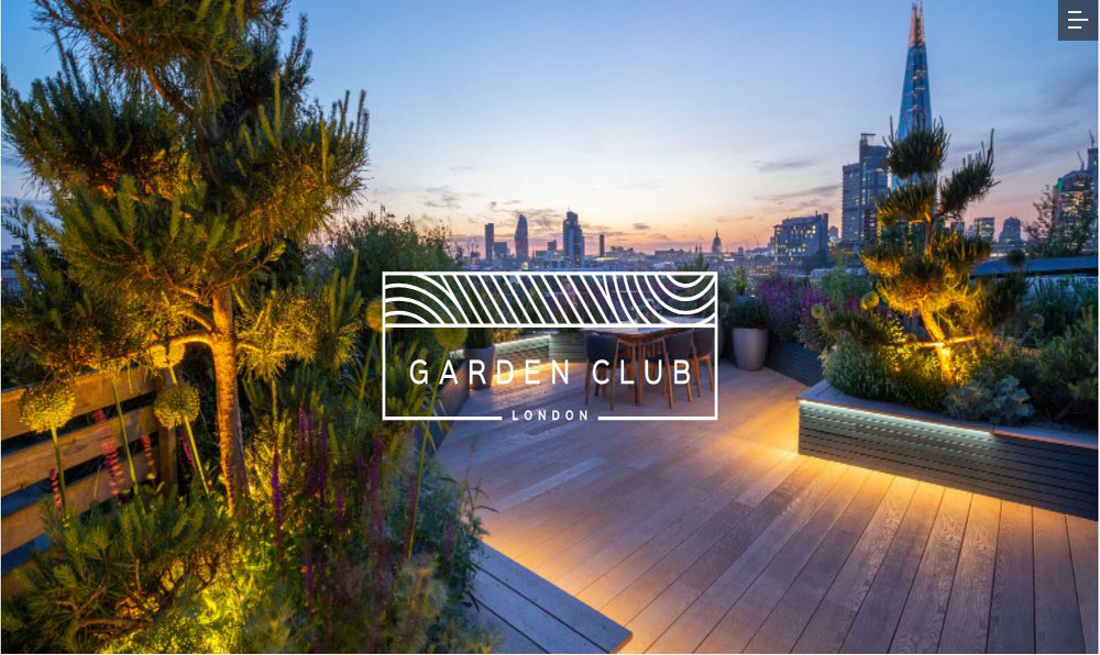
Garden Club London
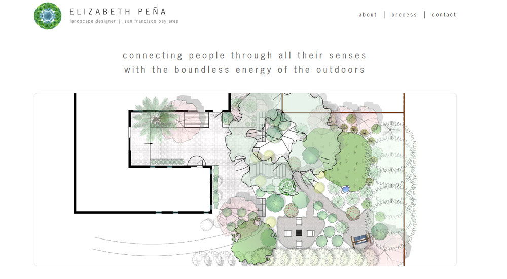
Elizabeth Peña
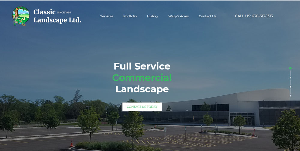
Classic Landscape LTD
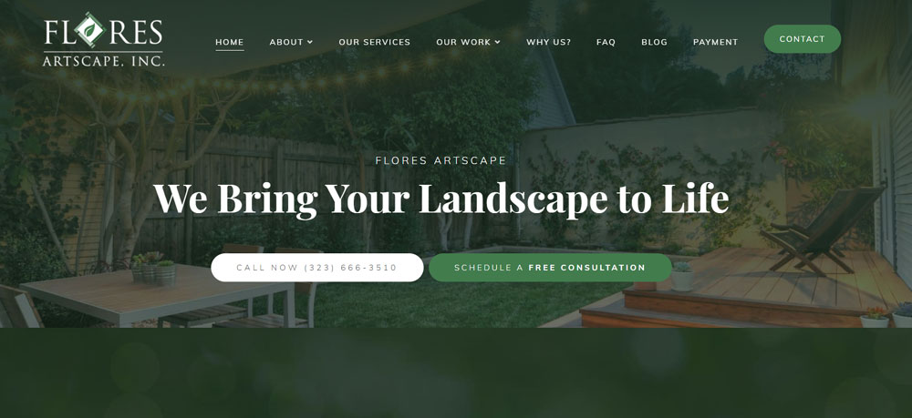
Flores Artscape
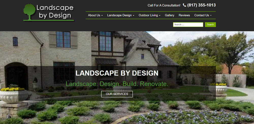
Landscape By Design
OneAbode
Why Do Landscaping Companies Need Professional Websites
Homeowners search online before hiring any outdoor service provider. Without a site, you lose leads to competitors who have one.
A professional website builds trust before the first phone call. It shows your work, lists your services, and proves you run a legitimate operation.
Here's what a landscaping website actually does for your business:
- Displays before and after photos of completed hardscape and softscape projects
- Captures leads through free estimate forms
- Shows your service area with location maps
- Lists specific services like irrigation installation, lawn maintenance, and patio construction
- Builds credibility with customer testimonials
TruGreen and BrightView Holdings both use their websites as primary lead generation tools. Smaller companies compete by having better local SEO and more targeted service pages.
Best Landscaping Website Design Examples
These landscape contractor websites demonstrate effective design patterns for outdoor service businesses.
Each example highlights different approaches to portfolio display, service presentation, and lead capture.
Greenscape Pro Website
Full-width project gallery on the homepage. Service pages organized by residential lawn care, commercial grounds keeping, and seasonal cleanup.
The quote request form sits in a sticky sidebar. Mobile responsive with tap-to-call functionality.
Summit Hardscapes Website
Dark background with high-contrast project photography. Specializes in retaining wall construction, patio installation, and outdoor lighting.
Each project page includes materials used, square footage, and completion timeline. This level of detail builds trust with homeowners planning larger investments.
Valley Irrigation Solutions Website
Technical focus with diagrams of sprinkler system layouts and drainage solutions. Hunter Industries and Rain Bird product integrations featured throughout.
The hero section uses a video background showing installation work. Service area map covers three counties.
Maple Leaf Garden Design Website
Soft green color palette with botanical photography. Portfolio organized by garden style: English cottage, Japanese zen, native plantings.
Blog section covers seasonal planting guides and xeriscaping tips for drought-prone regions.
Urban Edge Landscaping Website
Targets commercial property managers and HOA boards. Case studies replace traditional galleries, showing maintenance contracts and property transformations over multiple years.
Pricing transparency with service tier breakdowns. B2B websites like this one prioritize information density over visual flash.
Stonecraft Outdoor Living Website
Luxury positioning with elegant website aesthetics. Projects feature outdoor kitchens, fire pits, and pool landscaping.
Photography dominates every page. Minimal text, maximum visual impact. The call to action buttons use "Schedule a Design Consultation" instead of generic "Contact Us" language.
Four Seasons Lawn Care Website
Service-focused layout with separate landing pages for spring cleanup, summer maintenance, fall leaf removal, and snow removal.
Online booking system integrates with their scheduling software. Recurring service packages displayed with monthly pricing.
Native Roots Landscape Architecture Website
Portfolio showcases sustainable landscape design projects. Certifications from the National Association of Landscape Professionals displayed prominently.
Project pages include plant lists, water usage calculations, and environmental impact statements. Appeals to eco-conscious residential clients.
Premier Property Grounds Website
Multi-location commercial landscaping company. Each branch has a dedicated landing page with local team photos and regional project galleries.
The site handles fleet information, equipment lists, and insurance documentation for property management companies conducting vendor due diligence.
Backyard Bliss Designs Website
Clean website layout targeting suburban homeowners. Before and after sliders on every project page.
Service packages named for easy understanding: "Curb Appeal Boost," "Complete Backyard Transformation," "Weekly Maintenance Plan." Free estimate form design captures project type, budget range, and preferred timeline.
What Design Elements Make Landscaping Websites Effective
Certain design patterns consistently perform well for outdoor service businesses. These elements affect both user experience and conversion rates.
How Do Color Schemes Affect Landscaping Website Conversions
Green dominates this industry for obvious reasons. Earth tones (brown, tan, terracotta) work as secondary colors.
Avoid neon or overly saturated palettes. They clash with natural project photography.
What Typography Works Best for Outdoor Service Businesses
Sans-serif fonts for body text. Something readable on mobile screens where most local searches happen.
Headers can use more distinctive typefaces, but legibility matters more than style. Check how websites with good typography balance personality with readability.
How Should Landscaping Portfolios Be Displayed
Grid galleries with category filters work best. Let visitors sort by project type: patios, lawns, gardens, hardscapes, outdoor lighting.
Each project needs multiple photos, not just one hero shot. Include progress photos when possible.
What Makes a Landscaping Homepage Effective
Strong project imagery above the fold. Clear service categories. Visible phone number and quote request button.
Skip the generic stock photos of grass. Use your actual work. Homeowners can spot fake portfolio images instantly.
How Do Visitors Navigate Landscaping Websites
Navigation structure directly impacts whether visitors find what they need or bounce to a competitor.
What Pages Should a Landscaping Website Include
Core pages: Home, Services, Portfolio, About, Contact. Add service area pages for local SEO targeting specific cities or neighborhoods.
Blog optional but useful for seasonal content that captures search traffic year-round.
How Should Service Pages Be Structured for Lawn Care Companies
One page per major service category. Lawn maintenance, hardscaping, irrigation, and seasonal services each deserve dedicated pages.
Include pricing guidance (ranges are fine), process explanations, and relevant project examples on each service page.
Where Should Contact Forms Be Placed on Landscaping Sites
Homepage (above fold or in a sticky element), dedicated contact page, and bottom of every service page.
Multiple touchpoints matter. Someone ready to request a quote should never have to search for the form.
What Technical Features Do Top Landscaping Websites Use
The best landscape contractor websites go beyond static pages. They include functional elements that capture leads and streamline customer communication.
How Do Quote Request Forms Convert Landscaping Leads
Effective forms ask for project type, property size, budget range, and preferred contact method. Too many fields kill conversions; too few waste your time on unqualified leads.
Conditional logic helps. Someone selecting "irrigation installation" sees different follow-up questions than someone choosing "weekly lawn maintenance."
What Gallery Formats Display Landscape Projects Best
Filterable grid galleries outperform simple slideshows. Visitors want to see projects similar to theirs, whether that's patio installation, flower bed design, or commercial grounds keeping.
Before and after comparisons work extremely well for this industry. Side-by-side sliders or toggle views show transformation clearly.
How Do Booking Systems Work on Landscaping Websites
Recurring service businesses benefit from online scheduling integration. Clients book lawn maintenance, seasonal cleanup, or consultation appointments directly.
Tools like Jobber, Service Autopilot, and LMN connect scheduling to invoicing and route optimization. Worth the investment for companies handling 50+ weekly appointments.
How Do Landscaping Websites Perform on Mobile Devices
Over 60% of local service searches happen on smartphones. A responsive website isn't optional.
Critical mobile elements for lawn care websites:
- Tap-to-call phone numbers
- Thumb-friendly navigation menus
- Fast-loading project images (compressed, properly sized)
- Forms that work without zooming
- Location-aware service area detection
Test your site on actual phones. Google PageSpeed Insights flags mobile issues, but real-world testing catches problems the tools miss.
A mobile first design approach builds for small screens initially, then scales up for desktop. This prevents the common mistake of cramming desktop layouts into mobile views.
What Platform Options Exist for Landscaping Website Design
Platform choice affects cost, maintenance requirements, and design flexibility. Each option suits different business sizes and technical comfort levels.
How Does WordPress Work for Landscaping Businesses
WordPress powers roughly 40% of all websites. Themes like flavor layouts specifically for service businesses with portfolio galleries, testimonial page sections, and quote request forms built in.
Plugins extend functionality: Yoast SEO for search optimization, Elementor or Divi Theme for visual editing, WPForms for lead capture. Requires hosting and periodic updates.
What Squarespace Templates Suit Landscaping Companies
Squarespace offers polished templates with minimal setup. Good for smaller operations wanting a simple website without technical headaches.
Limited customization compared to WordPress. Monthly fees include hosting. Works well for garden designers and landscape architects showcasing visual portfolios.
How Do Custom-Built Landscaping Websites Compare to Templates
Custom builds from web design agencies cost more but deliver unique functionality. Multi-location companies, franchise operations, and businesses needing complex integrations benefit most.
Template sites work fine for most local landscaping companies. Save custom development budget for businesses generating $500K+ annually.
How Much Does Landscaping Website Design Cost
Pricing varies dramatically based on complexity, platform, and who builds it. Understanding cost factors prevents overpaying or underinvesting.
What Factors Affect Landscaping Website Pricing
Key cost drivers:
- Number of pages (5-page site vs. 30-page site)
- Custom design vs. template modification
- Photography (professional shoot vs. existing images)
- Integrations (booking systems, CRM connections, payment processing)
- Ongoing maintenance and hosting
- SEO setup and content writing
A basic DIY Wix or Squarespace site runs $200-500 annually. Professional template customization costs $2,000-5,000 one-time.
What Is the Average Cost Range for Different Website Types
DIY template sites: $150-600/year (platform fees, domain, basic plugins)
Freelancer-built WordPress sites: $1,500-4,000 one-time plus $50-150/month hosting and maintenance
Agency-designed custom sites: $5,000-15,000+ depending on scope
Budget landscaping companies start with templates and upgrade later. Established businesses with strong revenue invest in custom builds that support growth.
Common Landscaping Website Design Mistakes
Avoid these errors that hurt conversions and frustrate potential customers.
Stock photos instead of real work. Homeowners recognize generic grass images. Your actual projects build trust; stock photos destroy it.
Missing or buried contact information. Phone number belongs in the header and footer. Every page needs a path to contact.
Slow-loading galleries. Unoptimized images tank mobile performance. Compress photos, use lazy loading, implement proper image sizing.
No service area clarity. Visitors need to know immediately if you serve their location. Service area maps or city lists prevent wasted inquiries.
Generic service descriptions. "We provide quality landscaping services" says nothing. Specific services with pricing guidance convert better.
Ignoring local SEO. Service area pages targeting specific cities and neighborhoods capture local search traffic. A single "Services" page misses geographic opportunities.
Outdated project photos. Portfolios showing work from 2015 suggest you haven't completed anything recent. Rotate in new projects quarterly.
No mobile optimization. Pinch-to-zoom forms and tiny tap targets lose mobile visitors. Test on actual devices, not just browser simulators.
Sites with good UX avoid these patterns. Review competitor sites through customer eyes to spot similar issues on your own.
Similar industries face comparable challenges. Construction websites, roofing websites, and plumber websites all require portfolio-heavy designs with strong local targeting.
Related service businesses can draw inspiration from house cleaning websites for recurring service models or handyman websites for multi-service presentation approaches.
FAQ on Landscaping Website Design
What makes a landscaping website effective?
Effective landscaping websites combine high-quality project galleries, clear service descriptions, and visible contact forms. Mobile responsiveness matters since most local searches happen on phones. Fast load times and service area clarity convert visitors into quote requests.
Which platform works best for lawn care websites?
WordPress offers the most flexibility with themes and plugins like Yoast SEO and Elementor. Squarespace and Wix work for smaller operations wanting simpler setups. Choose based on your technical comfort level and customization needs.
How much does a landscaping website cost?
DIY template sites cost $200-600 annually. Freelancer-built WordPress sites range from $1,500-4,000 one-time. Agency custom builds start at $5,000 and climb based on integrations, page count, and photography requirements.
What pages should a landscape contractor website include?
Core pages include Home, Services, Portfolio, About, and Contact. Add dedicated pages for each major service like irrigation installation, hardscaping, and lawn maintenance. Service area pages targeting specific cities boost local SEO performance.
How do I display landscaping projects on my website?
Use filterable grid galleries organized by project type: patios, gardens, outdoor lighting, lawn care. Include before and after photos with sliders. Each project page benefits from multiple angles, materials used, and completion timelines.
Should landscaping websites have online booking?
Online booking benefits recurring service businesses handling lawn maintenance and seasonal cleanup. Tools like Jobber and Service Autopilot integrate scheduling with invoicing. One-time project companies focus better on quote request forms instead.
What colors work best for outdoor service websites?
Green dominates as the primary color for obvious reasons. Earth tones like brown, tan, and terracotta serve as strong secondary options. Avoid neon or overly saturated palettes that clash with natural project photography.
How do I get more leads from my landscaping website?
Place quote request forms on every service page, not just the contact page. Use clear call to action buttons with specific language like "Get Free Estimate." Add tap-to-call phone numbers for mobile visitors.
Do landscaping companies need blog content?
Blogs capture seasonal search traffic for topics like spring lawn prep, fall cleanup tips, and drought-resistant planting. They support local SEO and demonstrate expertise. Update quarterly minimum to maintain relevance with search engines.
What mistakes hurt landscaping website conversions?
Stock photos instead of real work kill trust instantly. Buried contact information frustrates visitors. Slow-loading galleries lose mobile users. Missing service area details waste time on unqualified leads. Outdated portfolios suggest inactive businesses.
Conclusion
These landscaping website design examples demonstrate what separates high-converting sites from digital brochures that collect dust.
The patterns are consistent: strong before and after photos, mobile responsive layouts, and lead generation forms placed where visitors actually look.
Whether you choose Squarespace for simplicity or build on Elementor for flexibility, the platform matters less than execution.
Focus on showcasing real irrigation projects, residential lawn transformations, and commercial property work. Skip the stock photos entirely.
Add service area pages targeting your specific cities. Include customer testimonials near your quote forms. Test everything on actual mobile devices.
Your website works 24/7. Make it your best salesperson by applying these design principles to your own grounds keeping or tree service business today.

