


Examples of Lead Generation Landing Pages That Work
May 23, 2025
Inspiring Examples of Video Landing Pages That Convert
May 27, 2025In the cluttered digital landscape, less truly becomes more. Minimalist landing pages cut through the noise by focusing on what truly matters: conversion. These stripped-down interfaces leverage strategic simplicity and whitespace optimization to guide visitors toward clear calls to action without distraction.
Why does this approach work so well? When designed with conversion-focused principles, minimalist website designs eliminate visual clutter that competes for attention. They prioritize content hierarchy and essential elements only, allowing your value proposition to shine through unobstructed.
The best simple websites achieve remarkable results through purposeful design choices. By optimizing white space and employing negative space usage strategically, they create breathing room that actually improves user engagement and reduces bounce rates.
This collection showcases exceptional examples of minimalist landing pages that balance aesthetic appeal with functional minimalism. You'll discover how top brands leverage clean web design and streamlined interfaces to create friction-free signup experiences that convert visitors into customers.
Examples Of Minimalist Landing Pages
Notion
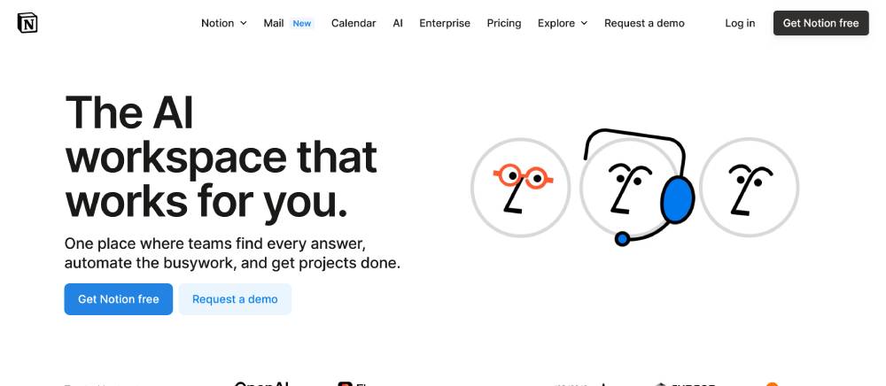
Minimalist black and white interface with thoughtful spacing. Typography relies on a clean sans-serif with varied weights for hierarchy. Block-based layout showcases the product's flexibility. Subtle hover states indicate interactive elements. Mobile version maintains the desktop's elegant simplicity while adapting to smaller screens.
Stripe
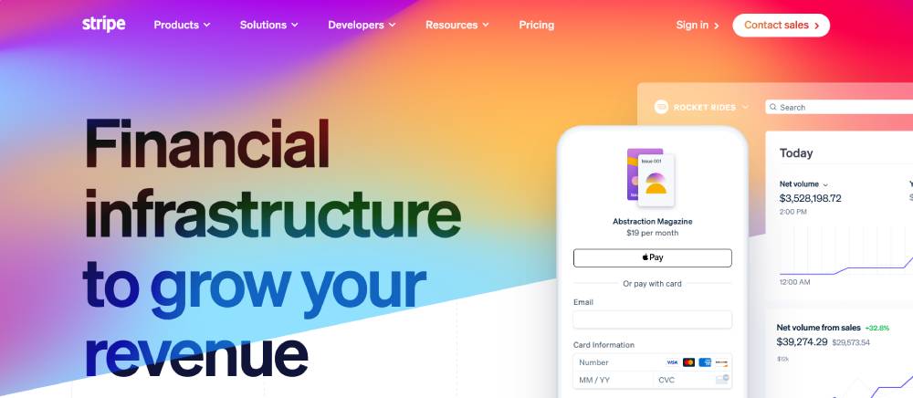
Dynamic gradient backgrounds with smooth color transitions. Code snippets appear directly in the interface demonstrating implementation ease. Navigation stays minimal despite complex offerings. Animated elements respond to cursor movement. Device mockups show the product in real contexts.
Square
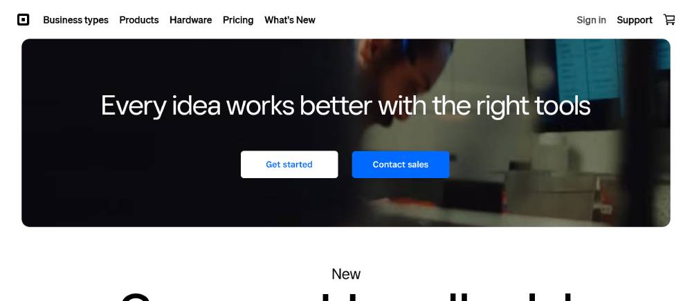
Grid-based layout with consistent white space rhythm. Product photography takes center stage on the homepage. The design uses sharp corners and defined edges throughout. Color palette stays restrained with strategic red accents. Mobile version reflows content without losing visual identity.
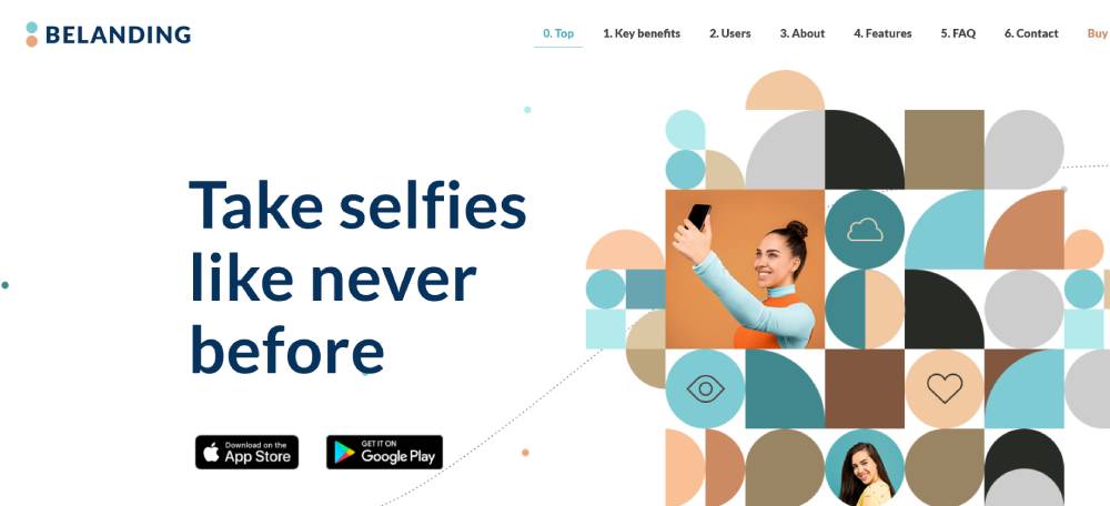
Be Landing 3
Figma
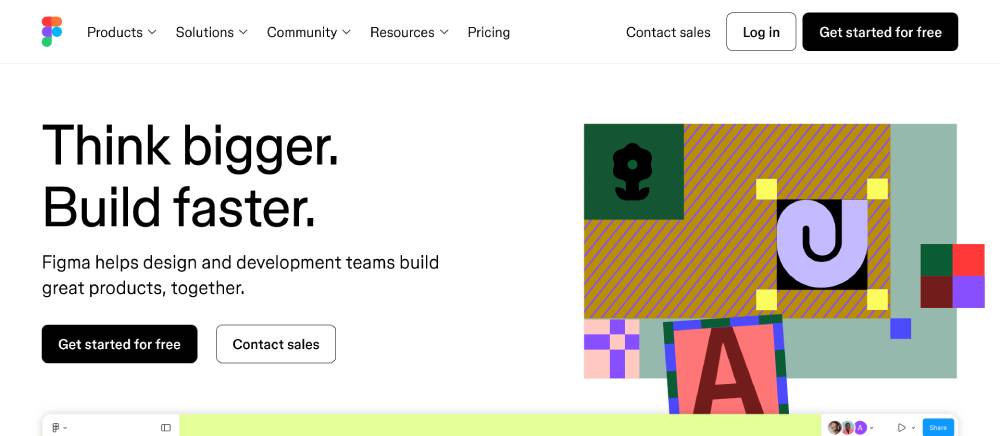
Interface echoes the product's own design tool aesthetics. Cursor demonstrations show collaborative features in action. Purple brand accents appear at key interaction points. Homepage features actual design components rather than stock images. Navigation simplifies complex features into clear categories.
Loom
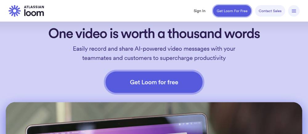
Video thumbnails display prominently throughout the layout. Orange circular elements reinforce the recording button metaphor. Typography maintains excellent readability with generous spacing. The homepage leads with a functional demo. Mobile design prioritizes video playback experience.
Linear
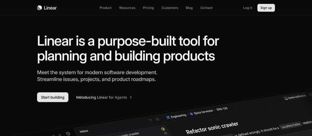
Dark mode default creates a developer-friendly aesthetic. Minimal animations highlight state changes effectively. Typography uses monospace elements for technical credibility. Interface demonstrates actual product interactions. Horizontal scrolling sections break the traditional vertical flow.
Bear App
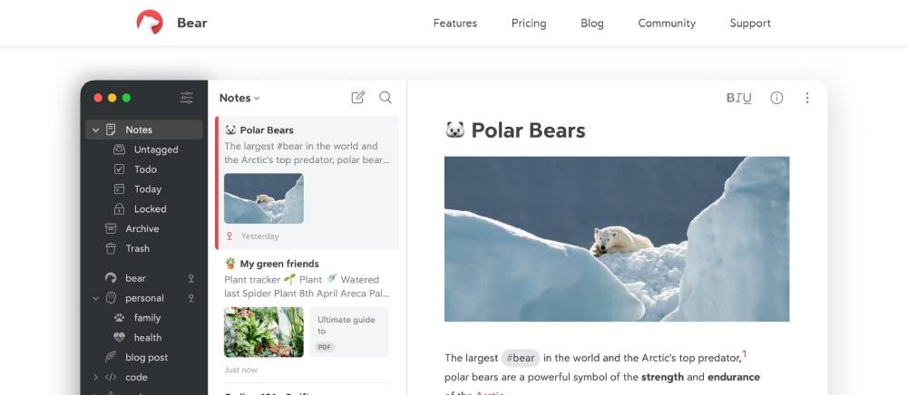
Warm color accents against neutral backgrounds. Actual note examples show the app's capabilities directly. Device frames present the interface in context. Typography showcases the writing-focused nature of the app. Navigation stays extremely minimal to emphasize content creation.
Superhuman

Premium, minimal aesthetic with subtle dark/light contrasts. Limited color palette signals focus and efficiency. Product screenshots appear at perfect scroll moments. Typography uses a distinctive serif for headlines. Exclusivity elements built into signup process design.
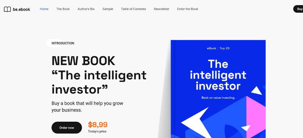
Be Ebook 3
Everlane
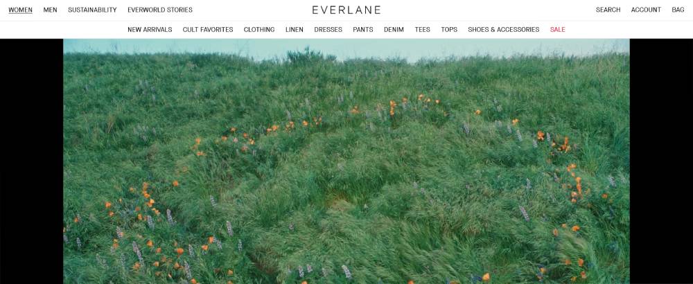
Product photography dominates with minimal interface elements. Typography maintains clothing label aesthetics. White space creates breathing room around fashion items. Navigation consolidates categories without overwhelming options. Mobile experience prioritizes quick product browsing.
Gumroad
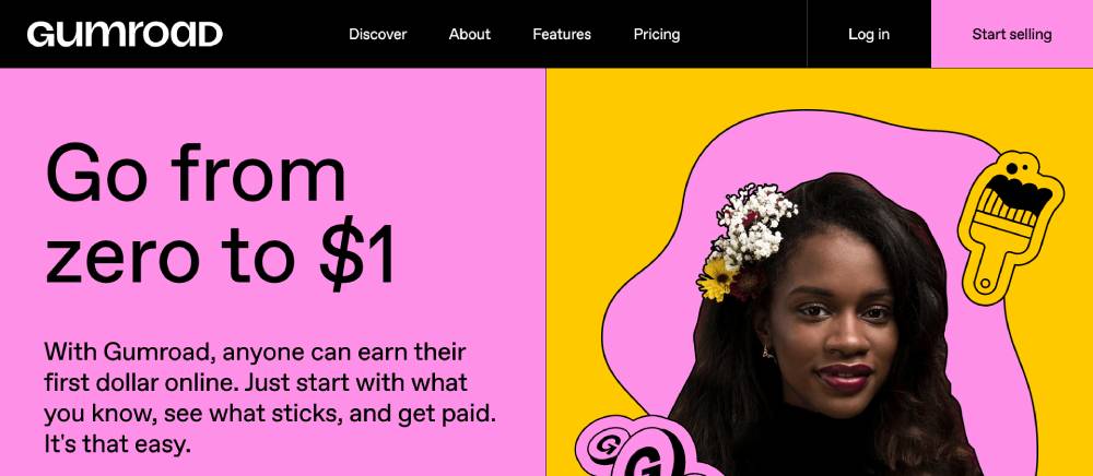
Creator-focused design with example products featured prominently. Purple brand color used strategically for calls to action. Layout demonstrates both buyer and seller experiences. Typography stays readable for extended content. Mobile view optimizes for discovery browsing.
Typeform
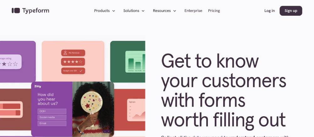
Interactive elements demonstrate the question flow experience. Rounded corners create a friendly, approachable feel. Bold typography with high contrast for readability. Color blocks separate functional areas clearly. Homepage includes working examples of form interactions.
Clearbit
Data visualization elements integrated into the design. Blue gradient creates a trustworthy, technical feel. Dashboard previews show actual platform functionality. Card-based layout organizes complex features cleanly. Typography balances professional and accessible qualities.
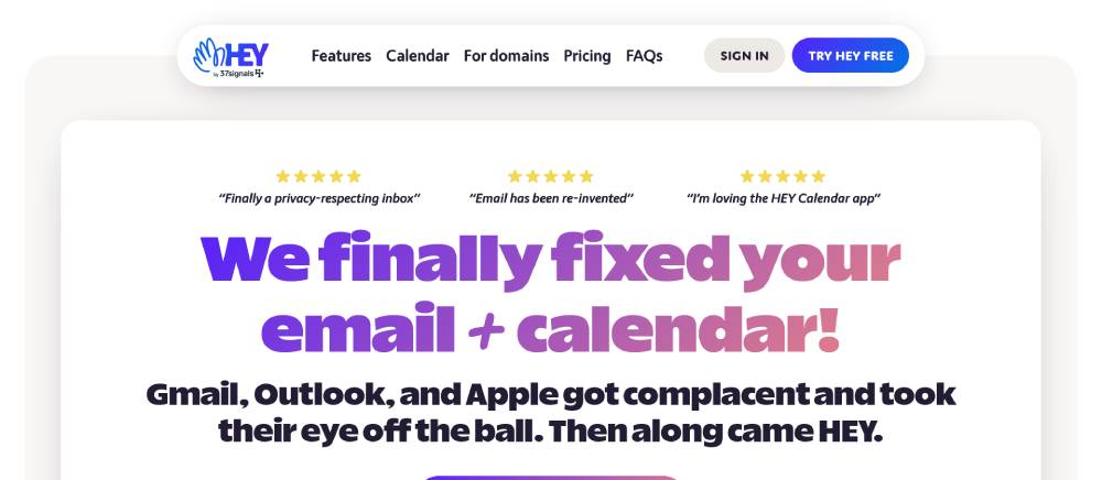
Hey
Playful illustrations with distinctive red accents. Large, bold typography creates confident statements. Email interface previews show unique screening features. The homepage tells a story through scrolling. Navigation focuses entirely on the product rather than company sections.
Be Landing 2
Pitch
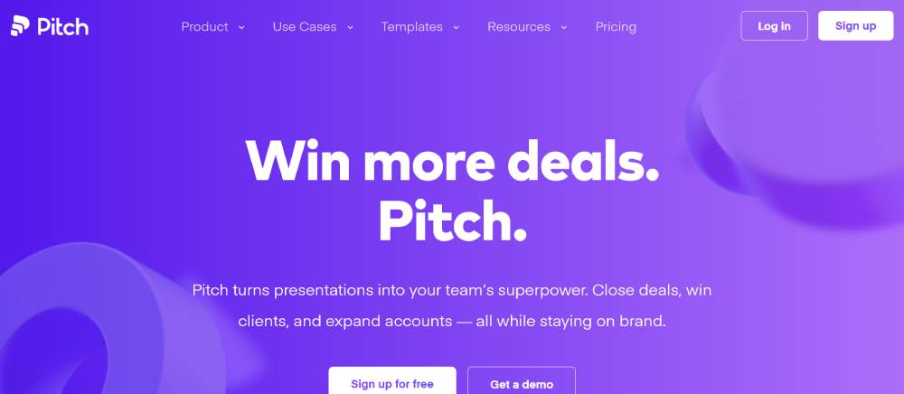
Presentation slides appear directly in the interface. Blue color scheme with carefully selected accent colors. Animation demonstrates slide transitions seamlessly. Layout accommodates both creation and presentation modes. Mobile design prioritizes viewing experience over editing.
FAQ on Minimalist Landing Pages
What makes a landing page minimalist?
A minimalist landing page employs clean web design principles, focusing on essential elements only. It uses ample white space, streamlined interfaces, and reduced visual clutter to highlight a single call to action button. The design prioritizes content hierarchy and functional minimalism over decorative elements.
How do minimalist landing pages improve conversion rates?
Minimalist pages boost conversions through distraction-free interfaces that guide visitor attention directly to the hero section and CTA. By eliminating unnecessary elements, they create a friction-free signup experience. This conversion-focused design approach reduces cognitive load, making decision-making easier for potential customers.
What elements should I include in a minimalist landing page?
Focus on including only conversion-essential components: a compelling value proposition, strategic website navigation, a prominent CTA, minimal but effective visual elements, and above-the-fold content that communicates benefits immediately. Form design should be simple with minimal fields.
What are some examples of successful minimalist landing pages?
Shopify landing page and Dropbox homepage demonstrate excellence in minimalist design. Both use flat design elements, clear typography focus, and negative space usage effectively. Companies like Stripe and Mailbox app showcase how purposeful design with single-column layouts drives user action through visual weight distribution.
How important is typography in minimalist landing page design?
Typography is critical in minimalist designs. Websites with good typography use font hierarchy to create structure without visual clutter. Clean, readable fonts enhance the user experience while maintaining the stripped-down aesthetic. Font choices should reflect brand personality while ensuring readability across devices.
Should minimalist landing pages use images?
Yes, but selectively. Images should serve a purpose—demonstrating products, reinforcing messages, or creating emotional connections. Websites with illustrations can maintain minimalism when graphics are simple, purposeful, and aligned with the overall aesthetic without competing with conversion goals.
How do I balance simplicity with providing enough information?
Employ progressive disclosure techniques and strategic content hierarchy. Start with essential information above the fold, then reveal deeper details as users scroll. Modern website design balances minimalism with information depth through thoughtful website layout that guides the user journey.
What color schemes work best for minimalist landing pages?
Limited color scheme palettes work best—typically 1-3 colors plus neutrals. Many successful minimalist pages use monochromatic schemes or subtle color accents against white backgrounds. The limited palette enhances visual weight distribution and helps important elements stand out.
Are minimalist landing pages effective for all industries?
While particularly effective for tech, SaaS websites, and product websites, minimalist design principles can adapt to most industries. The key is maintaining essential brand elements while simplifying the interface. Even complex offerings can benefit from streamlined presentation focused on core value propositions.
How do I ensure my minimalist landing page is mobile-friendly?
Embrace mobile first design principles and create responsive websites that adapt seamlessly across devices. Prioritize page load optimization, touch-friendly elements, and maintain visual hierarchy on smaller screens. Test rigorously on multiple devices to ensure consistent experience.
Conclusion
The examples minimalist landing pages we've explored demonstrate why this approach has become so prevalent in today's web design principles. By embracing purposeful simplicity, these pages achieve what cluttered designs cannot: immediate impact and efficient conversion.
What makes these examples work isn't just their clean aesthetic—it's their laser focus on user journey optimization through:
- Strategic visual hierarchy that guides attention naturally
- Thoughtful use of negative space to improve comprehension
- Responsive design principles that ensure cross-device excellence
- User-friendly website architecture that reduces cognitive load
When creating your own minimalist landing page, remember that success comes from thoughtful reduction rather than arbitrary elimination. The creative websites we admire most understand this balance, proving that sometimes the most effective digital first impression comes from what you choose to leave out.
If you enjoyed reading this article about minimalist landing page, you should read these as well:


