Top Notch Musician Websites That Look Amazing
parallax background

Top Notch Musician Websites That Look Amazing

What is Toolset and how to use it on a WordPress Site
July 31, 2020
Cool Looking Personal Trainer Websites To Inspire You
September 16, 2020
What is Toolset and how to use it on a WordPress Site
July 31, 2020
Cool Looking Personal Trainer Websites To Inspire You
September 16, 2020
 

Musicians usually want to impress on and off stage, and their websites often remind us why some bands or singers are so popular. They don’t hesitate to advertise their activity through well-designed web pages with interesting and much useful information.

These are some common factors noticeable in the majority of musicians’ website:

  • Photos of the band
  • Discography, along with purchase links and free samples
  • Tour Dates & tickets
  • Blog section

Although they may follow a pattern, generally musicians’ websites are quite fascinating, so we compiled the most interesting ones, to reveal a harmonious combination of artistry and pragmatism, creativity and professionalism.

Awesome musician websites

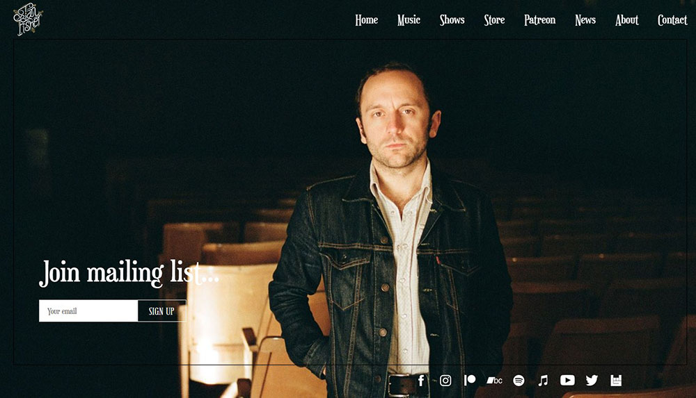
Ian Fisher


The funky almost gothic style is constructed from various elements, including, the white text on the dark background, the writing font, and the minimalistic theme. The photo with the songwriter in a serious and enigmatic pose welcomes you to the page and begins his story.

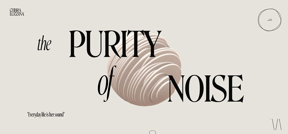
Chiara Luzzana


Chiara transforms sound into harmonious music. She specializes in Sound Branding and Music Composition. Her website is an excellent portfolio for her impressive international reputation as an audio artist.

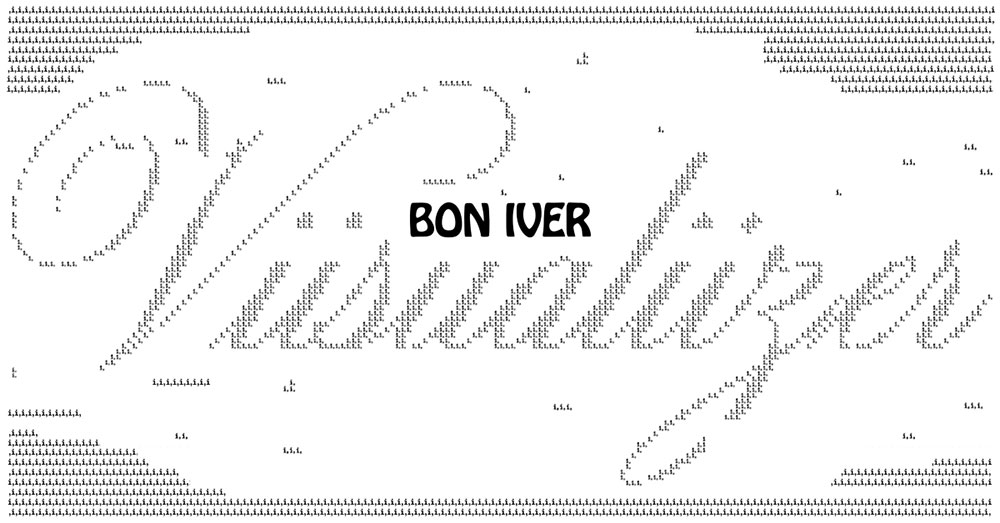
Bon Iver Viisualiizer


This page represents the success of Bon Iver’s last album – “i,i”. With every “i” on the screen, the album is being played in another part of the world. There are many statistics to inform the visitor about the album’s worldwide achievements.

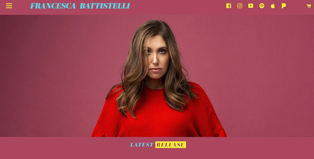
Francesca Battistelli


Francesca promotes her music and her entire activity through this simple but interesting landing page.

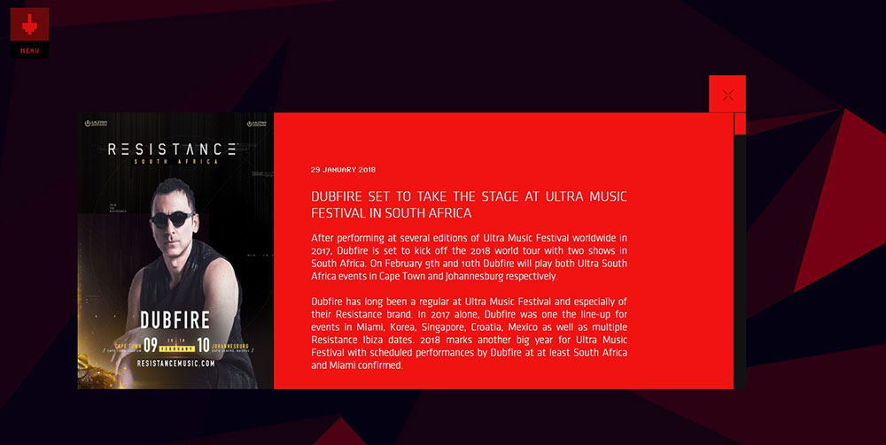
Dubfire


Dubfire reinvented himself after his recent success and people are very enthusiastic about the changes. His new website demonstrates the electro-techno style he pursues at the moment. Bright colors and dynamism make the visitor want to read and follow all the posts.

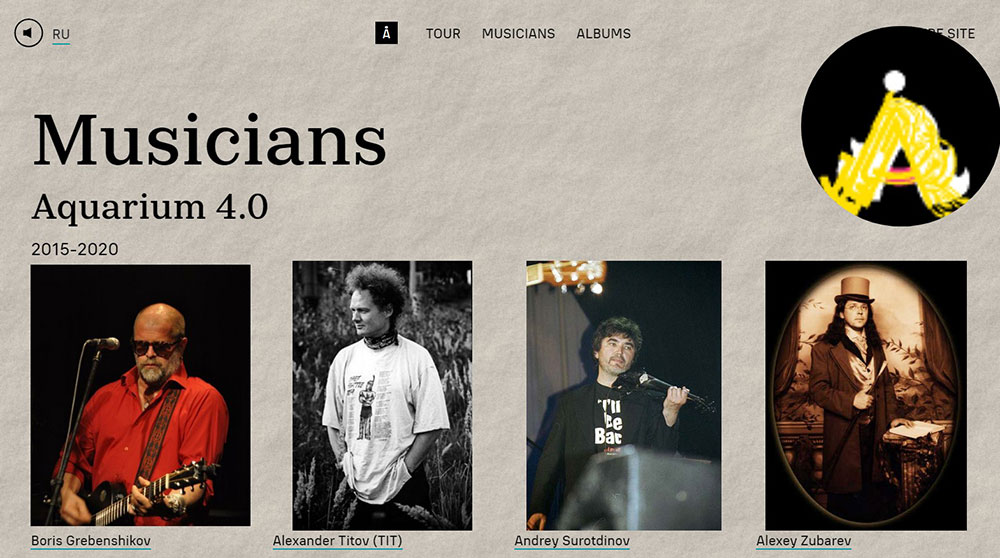
Aquarium rock band


Turn up your speaker and scroll down to travel through this virtual world that Aquarium has prepared for their visitors. Bright visuals and Russian lyrics make a perfect combination for those wishing to become acquainted with Russian rock.

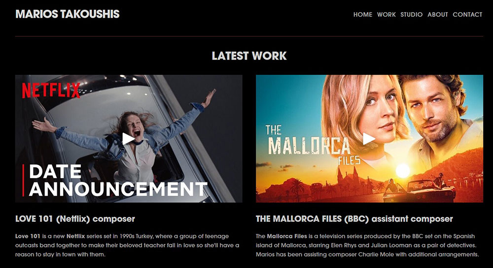
Marios Takoushis


This film, TV composer, and music producer presents his latest project in an organized and attractive way.

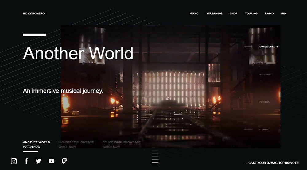
Nicky Romero - Redefine


Nicky Romero has redesigned his virtual image and built an impressive and electrifying new website.

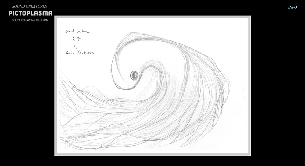
Sound Creatures, by Is-Real


This project merges imagination with the senses, proving that together they are impressive yet unpredictable. The website contains the visual representation of a soundtrack, from the artist’s point of view.

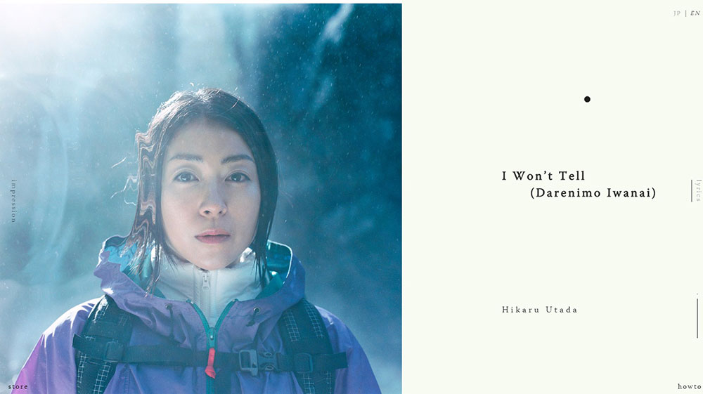
Hikaru Utada“I Won't Tell”


Hikaru Utada has built an entirely new website to promote his song – “I Won’t Tell”, an innovative venture.


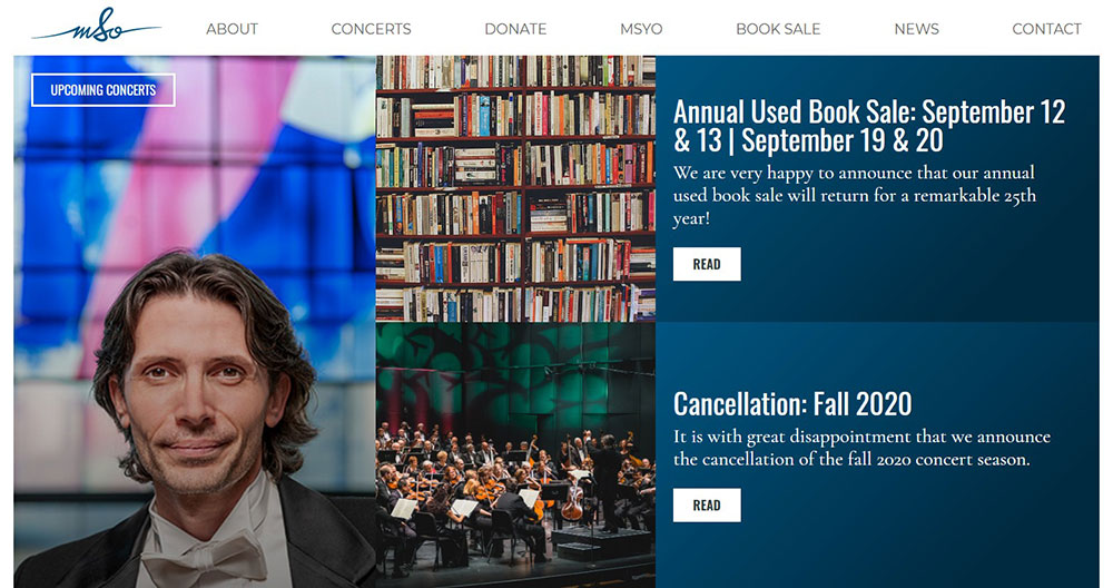
The website of Mississauga Symphony Orchestra greets you with the latest news of their doings. Unfortunately, at the moment, they announced the cancellation of the 2020 fall season. However, you can enjoy the symphony atmosphere by listening to some “...music from the maestro”.

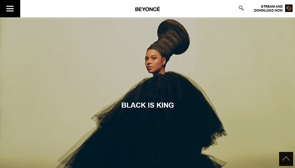
Beyonce


With a great team behind her, of course Beyonce would have a wonderful website.

Chris Cornell


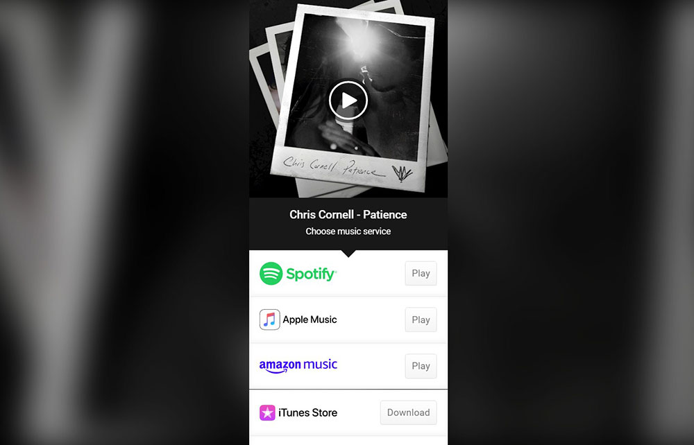
Chris Cornell makes sure you have all the essential information about him, thus his landing page includes a link to his music on Youtube, social media profiles, and personal artistic photos.

John Blek & The Rats


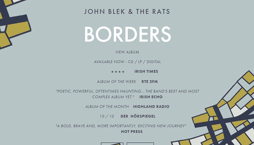
With a touch of old school style, this website flows and builds the story of the band, and when you’ve finished absorbing it, you can leave a comment in the dedicated section at the bottom.

Poppa


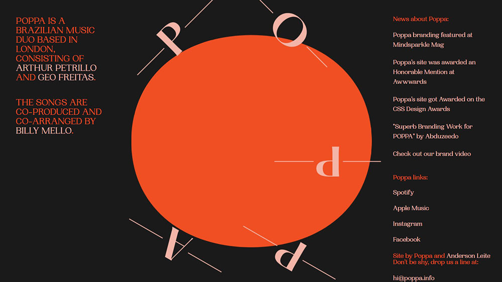
Originating from Brazil, Arthur Petrillo and Geo Freitas merge their voices, bringing this project alive. The website is enhanced by animation of the letters when hovering.

Jamie Drake


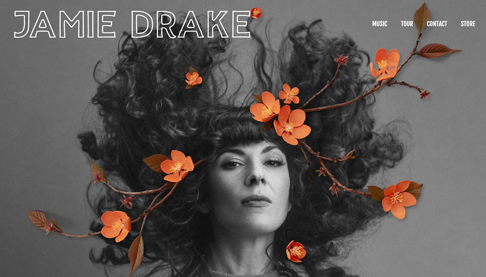
Jamie Drake’s website offers instant recognition of her artistry. For example, the way the orange flowers match her trousers from the next photo proves her special attention to detail.

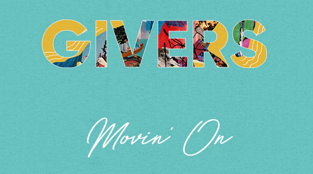
Givers


This page is simple and minimalist, offering aesthetically pleasing elements on a single colored background.

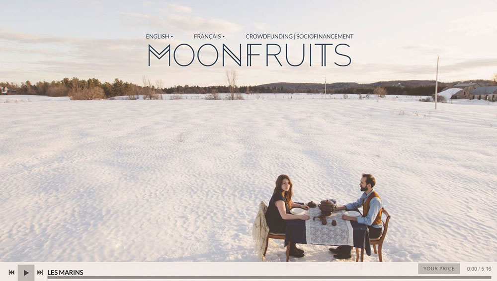
Moonfruits


The welcoming picture from Moonfruits’ website is memorable, encouraging further exploration of their story. The navigation is simple and captivating. You can easily find plenty t of information regarding Moonfruits’ tour, new releases, and music videos. They also have a corresponding page in French.

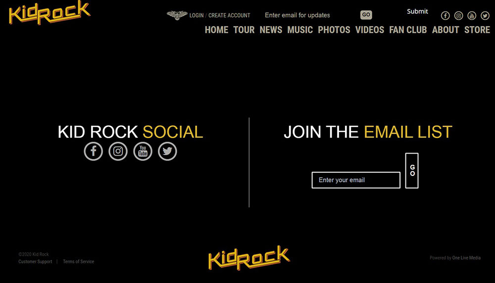
Kid Rock


This classy, accessible website is reminiscent of the classic era of American rock and is suitable for promotions of any kind.

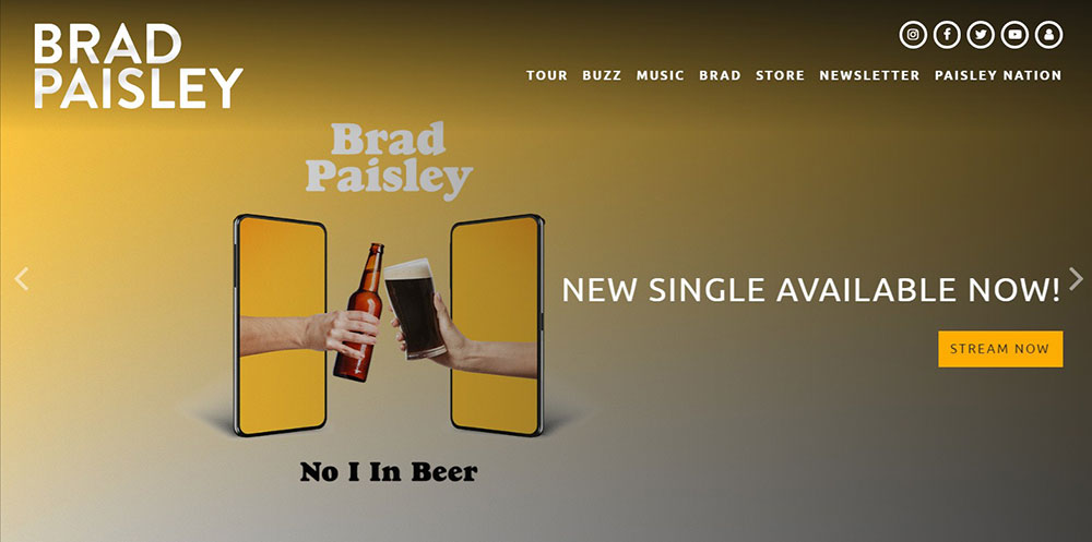
Brad Paisley


Brad Paisley’s website has a clear menu, cool background and visuals, with an easy-to-follow tour timeline.

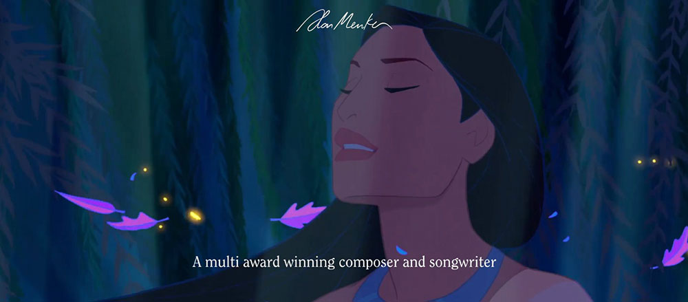
Alan Menken


Alan Menken is a multi-award-winning composer, and appropriately his website allows us a satisfying glimpse into the artist’s inner world.

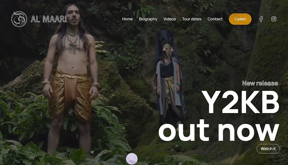
Al Maari


Al Maari entices visitors with a dark mysterious indie image on a black background, which then rolls into a series of eclectic and startling images and videos. You can click the Listen button to hear his music.

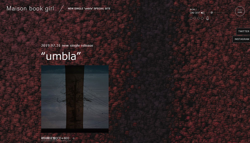
Maison book girl new release


Maison book girl or Bukuga is a musical group from Japan and their website informs their fans about the latest releases of singles and music videos.

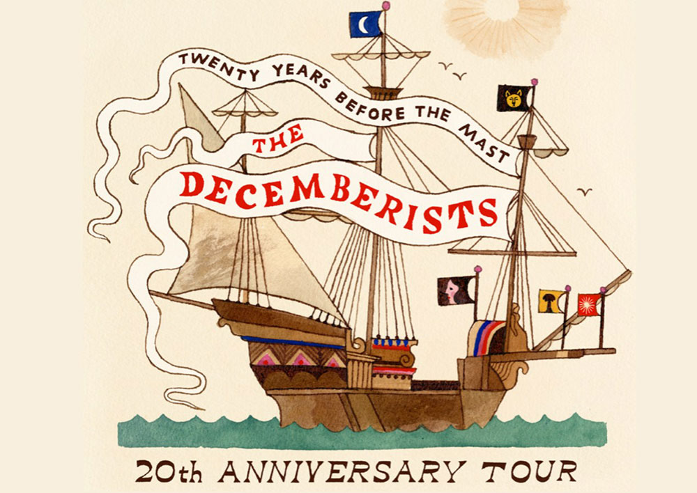
The Decemberists


With two versions of the website (a short and a long one), the Decemberists meet the expectations of all types of viewers.

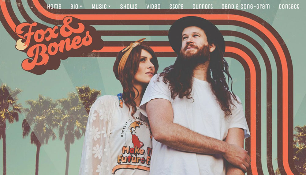
Fox and Bones


These musicians use the metaphor of the foxes in building their story. It says that “a group of foxes is a rare and lovely sight, beautiful to behold”. They represented this uniqueness throughout the entire website.

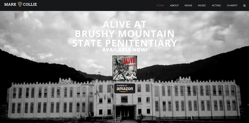
Mark Collie


The website enables smooth scrolling through group photos, achievements, and schedules. The contrast between the black background and the rest of the elements ensures harmony.

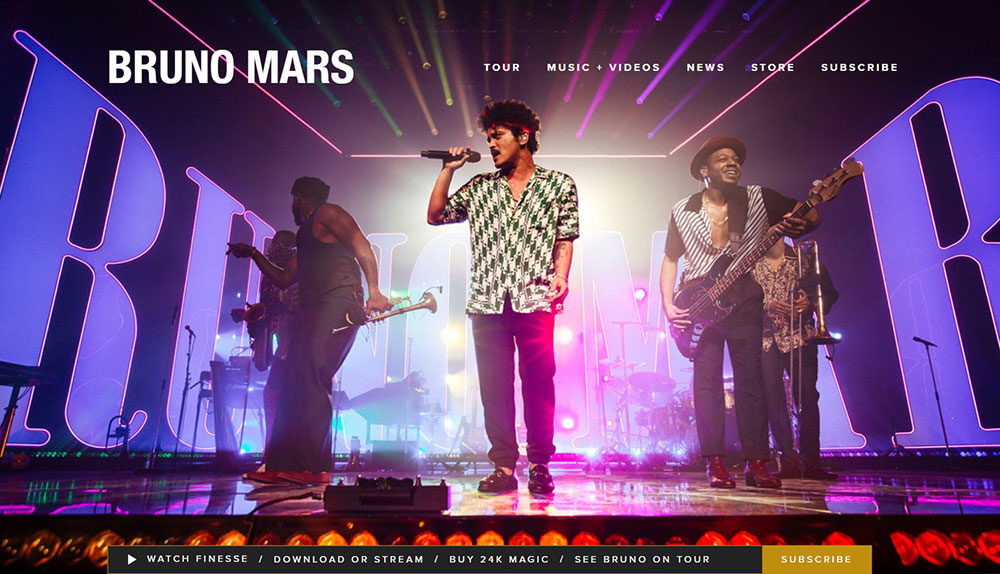
Bruno Mars


The website is standard, featuring an exciting image of the artist and his band performing live. Bruno Mars does not require an introduction, but all relevant information is of course available.

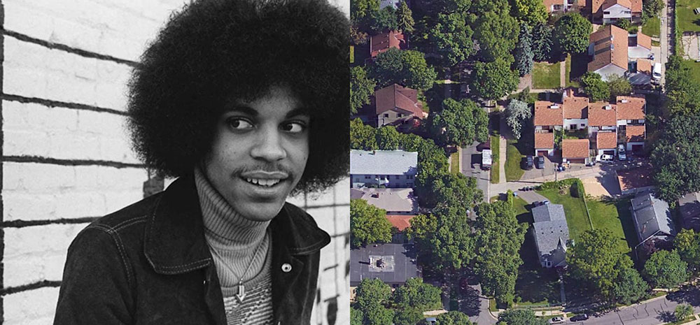
Becoming Prince


Prince’s website is designed to help the visitor understand his background and story through an interactive image of birthplace – Minneapolis.

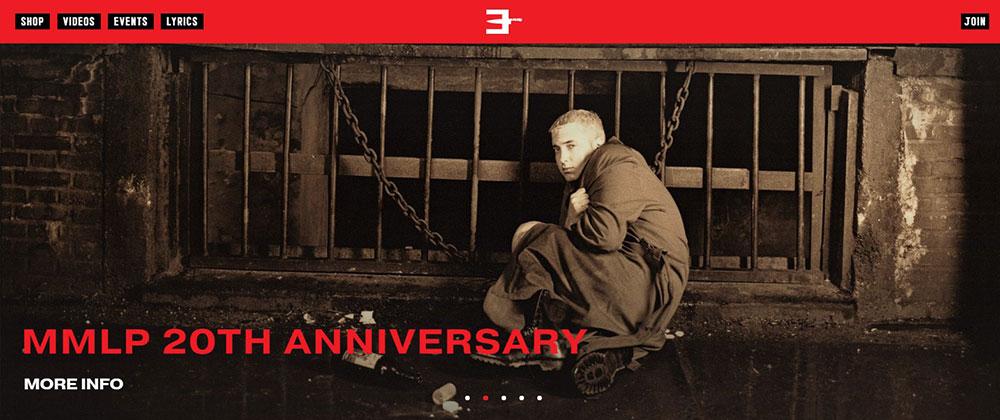
Eminem


This Eminem website celebrates the 10th anniversary of his album Recovery. It is somewhat minimalist, but effective.

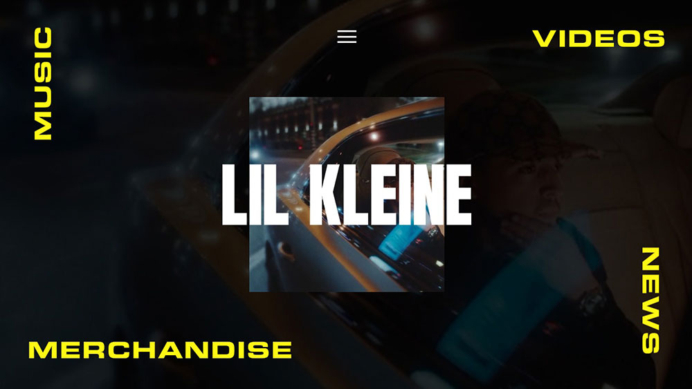
Lil Kleine


This website features a black background, with yellow accents, and the artist’s name emblazoned in the center.

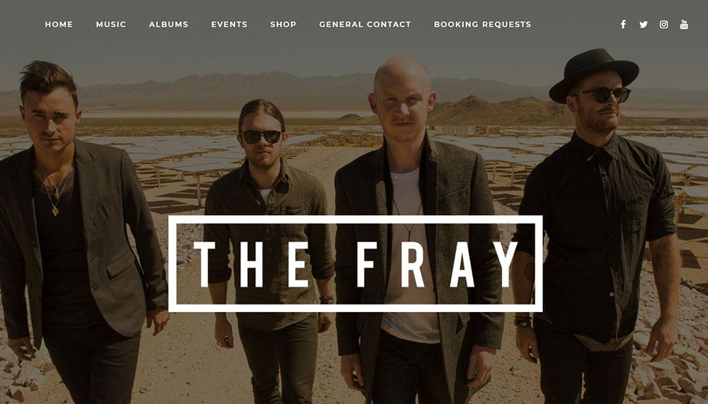
The Fray


The Fray’s website is classic, featuring a photo of the band, their discography and plenty of other information available via scrolling.

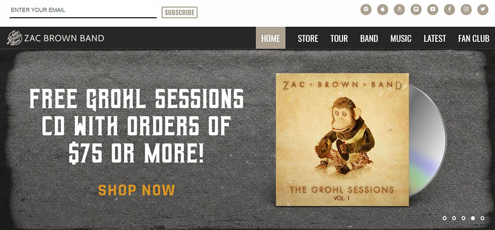
Zac Brown Band


This website offers the unusual feature of joining the fan club and enjoying discussion topics and the perks of being a real fan.

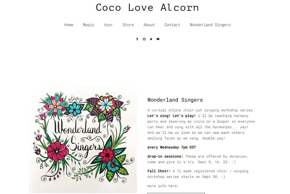
Coco Love Alcorn


This website is bright and colorful, with animations and abstract visuals used to promote new releases, which is a very creative design.

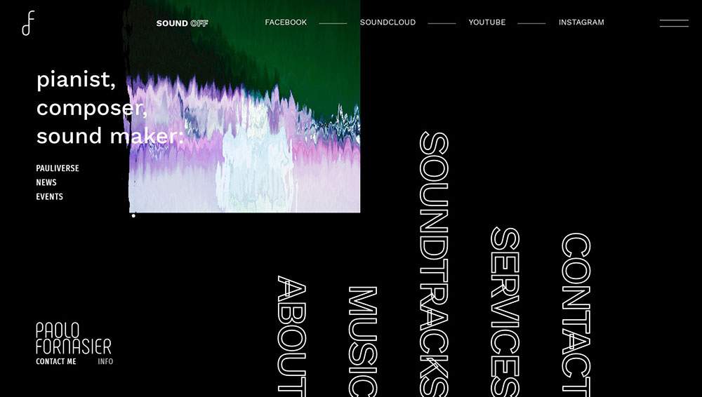
Paolo Fornasier


An amazing website that makes the viewer feel like he’s the actual artist. You can hover over the text and play the piano.

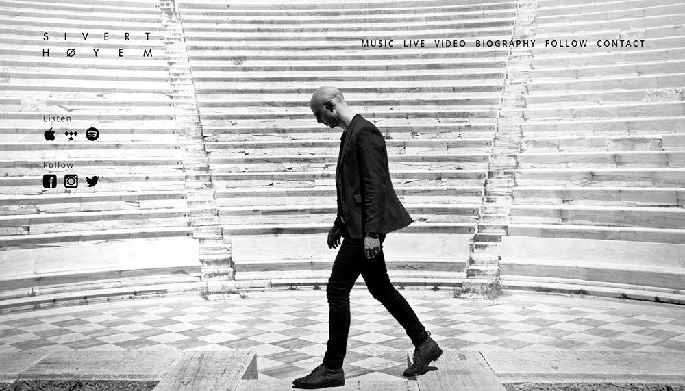
Sivert Høyem


The website unfolds to reveal a black and white image of the artist in profile, set against an amphitheatre. The ambience is mysterious and intriguing.

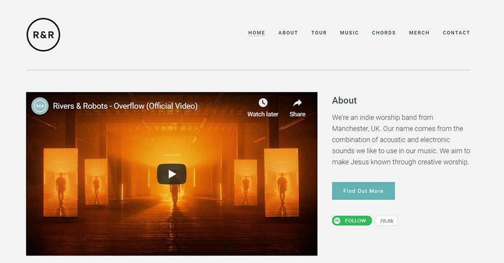
Rivers & Robots


This band’s acoustic and electronic music is aimed at directing creative worship to Jesus. The loading page colors are in warm autumn tones with an interesting entry video.

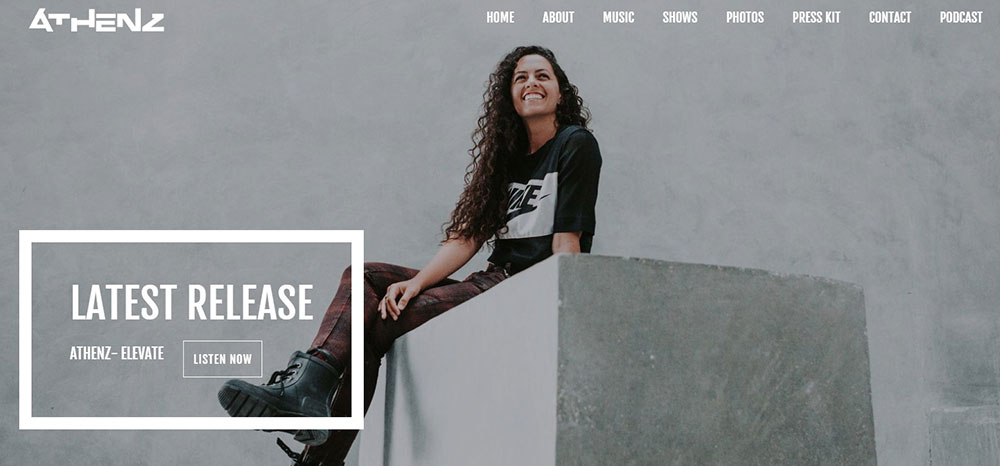
Athenz


Smooth transitions and cool contrast offer a short but memorable website visit. The harmony of the aesthetic is maintained by using very small text in the top-right corner.

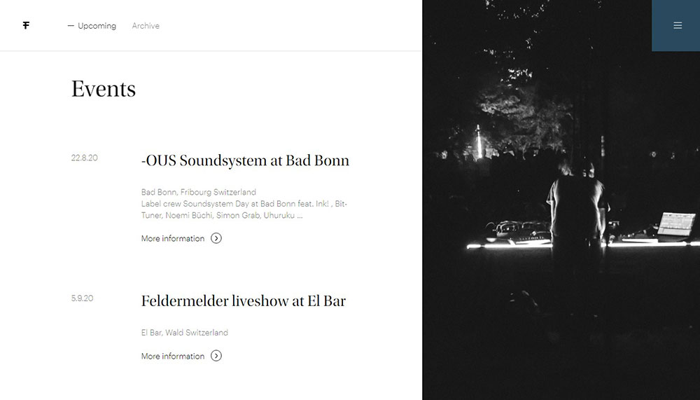
Feldermelder


This website is extraordinary in its concept. The stark black and white image is enhanced with a background of what appears to be sand through an aperture, creating intriguing designs across the screen. Feldermelder’s music accompanies the visuals.

Ending thoughts on these musician websites

There are many musicians’ websites listed, with a wide variety of styles, images, concepts and ideas from which you can choose to best represent your music and artistic sense. If you require help when building your first website, especially at the beginning of the process, Be Theme can assist with all the problems you might encounter. We have more than 500 pre-built website options, so check our website to find what you’re looking for.

If you enjoyed reading this article on top notch musician websites, you should check out this one about accessible websites examples.

We also wrote about a few related subjects like cool looking personal trainer websites, great looking spa websites, best corporate websites, the best looking tourism websites, hotel website design, product landing page, the most impressive luxury websites and impressive animated websites.

Albert Ślusarczyk
Albert Ślusarczyk
As the co-creator of Be Theme, I am a strong believer in designing with care and patience. I pour my energy, time & knowledge into perfecting the theme for our 260,000+ customers.
Siteground Hosting