Impressive Looking Charity Website Design Examples
January 5, 2026
Great Plastic Surgery Website Design Examples
January 6, 2026Your website is working against you if visitors leave before booking.
The best wellness website design examples share common traits: calming visuals, clear service pages, and booking systems that actually convert. Whether you run a yoga studio, massage therapy practice, or holistic coaching business, your site needs to reflect the peaceful experience clients expect.
This guide breaks down what works in wellness web design right now.
You'll see real examples from spas, mental health practices, and fitness brands. We cover color psychology, typography choices, booking integrations with tools like Acuity Scheduling and Mindbody, plus the mistakes that kill conversions.
Time to build a site that books clients while you sleep.
What is Wellness Website Design
Wellness website design is the practice of building digital platforms for health, fitness, spa, meditation, and holistic service businesses.
These sites combine calming visual elements with intuitive booking systems and trust-building components.
The goal is simple: convert visitors into paying clients while reflecting the peaceful nature of wellness services.
Unlike standard business sites, wellness platforms need to evoke relaxation before a visitor even reads a single word.
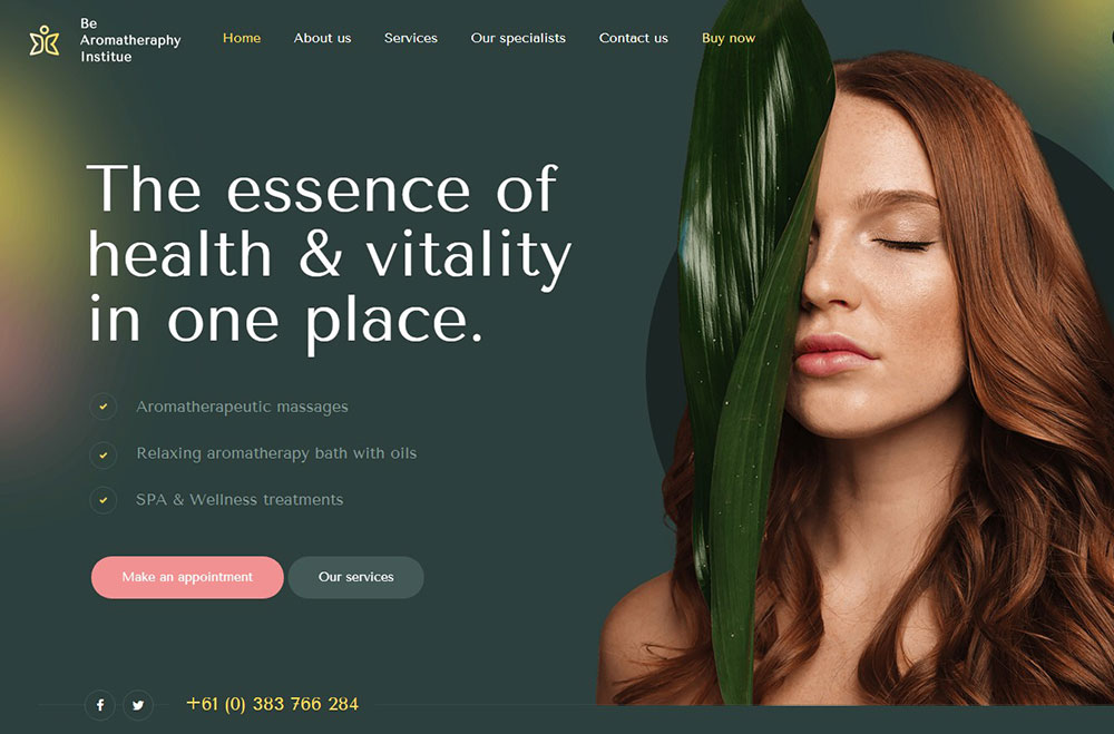
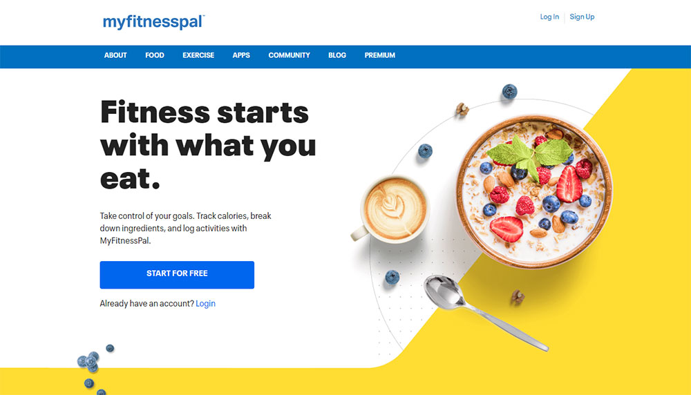
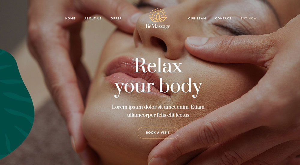
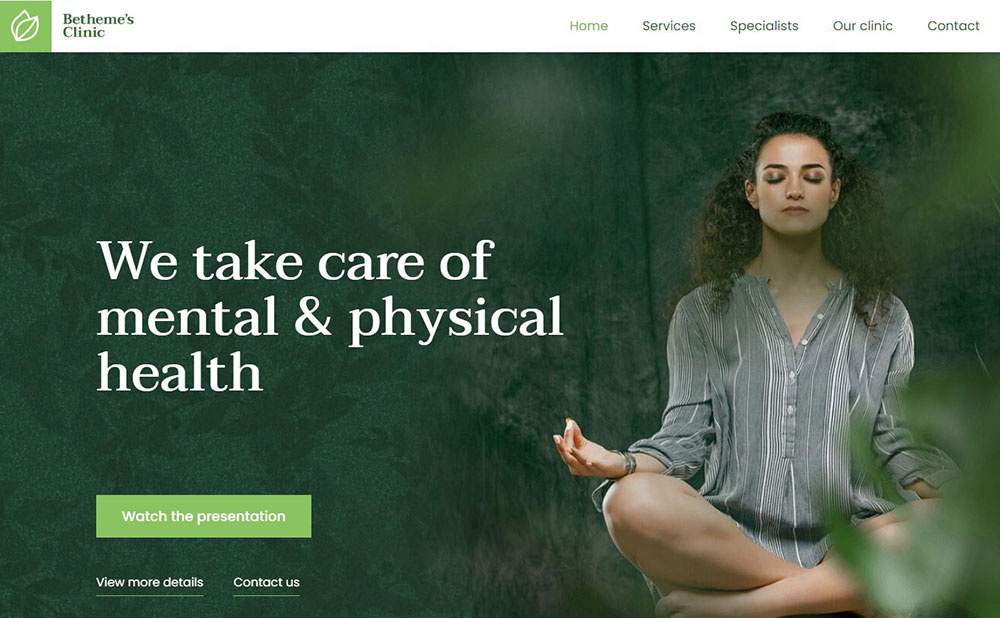
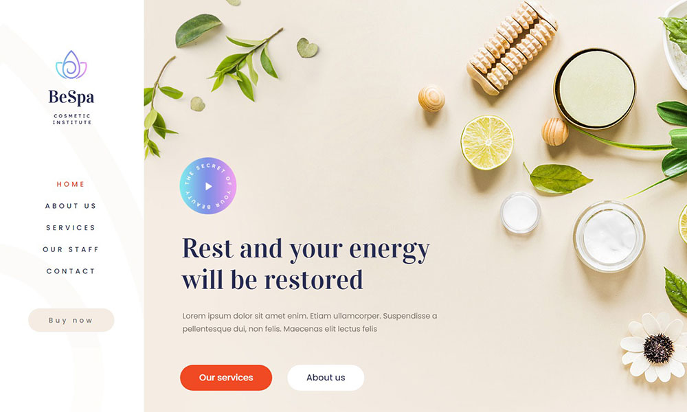
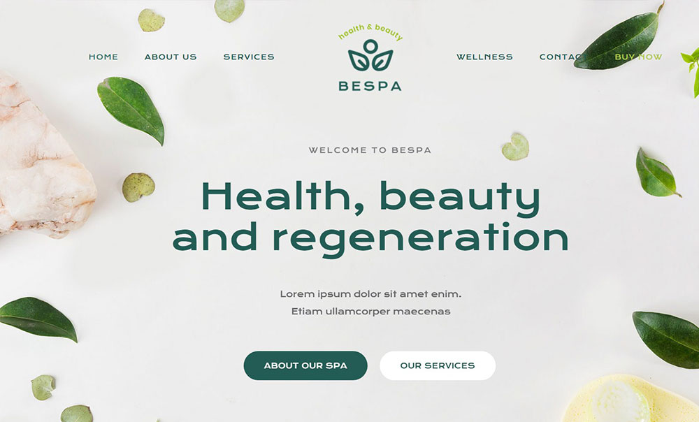
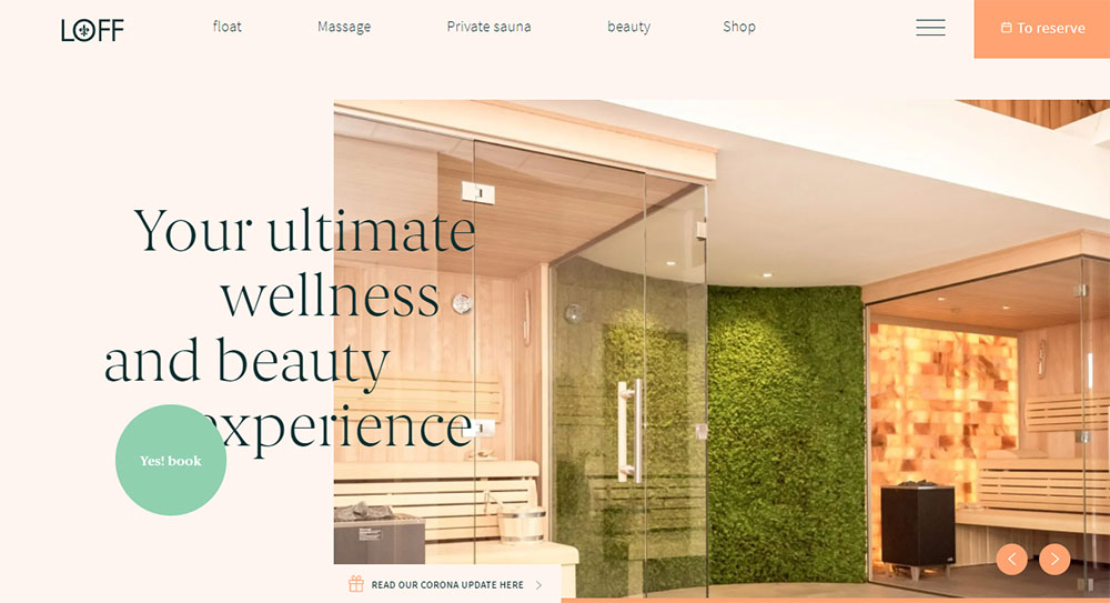
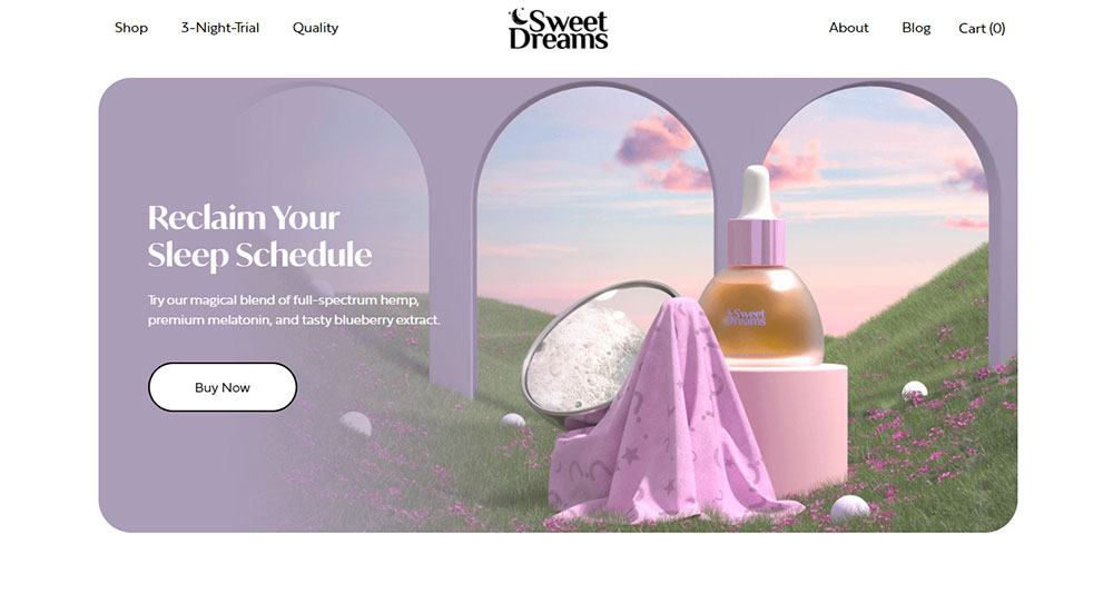
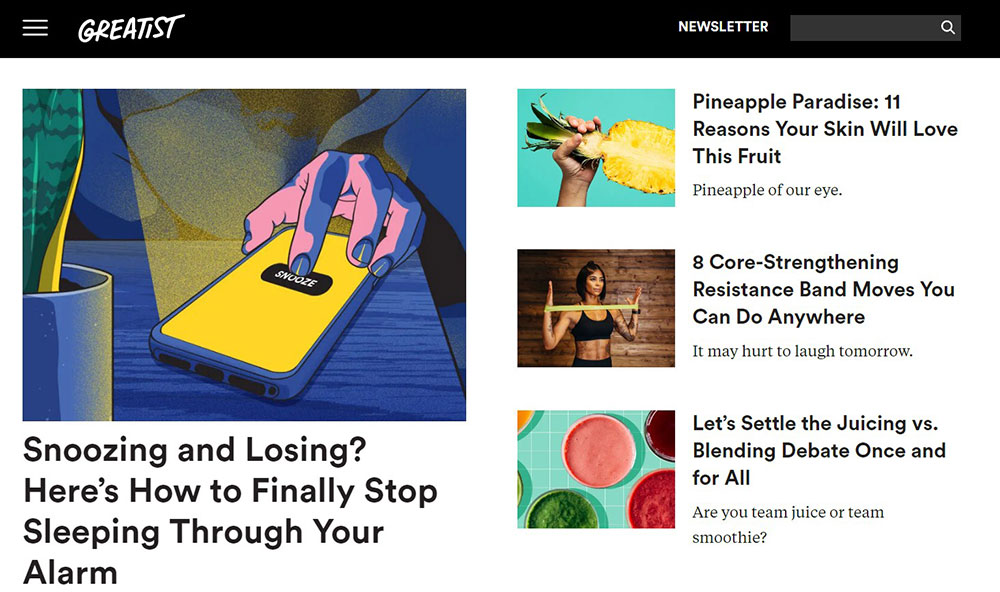
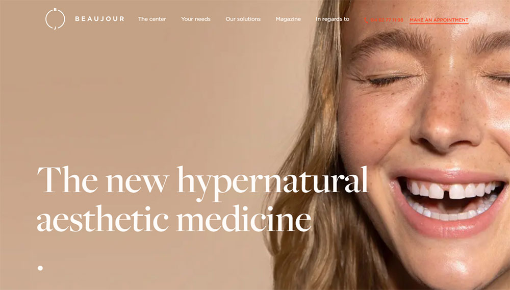
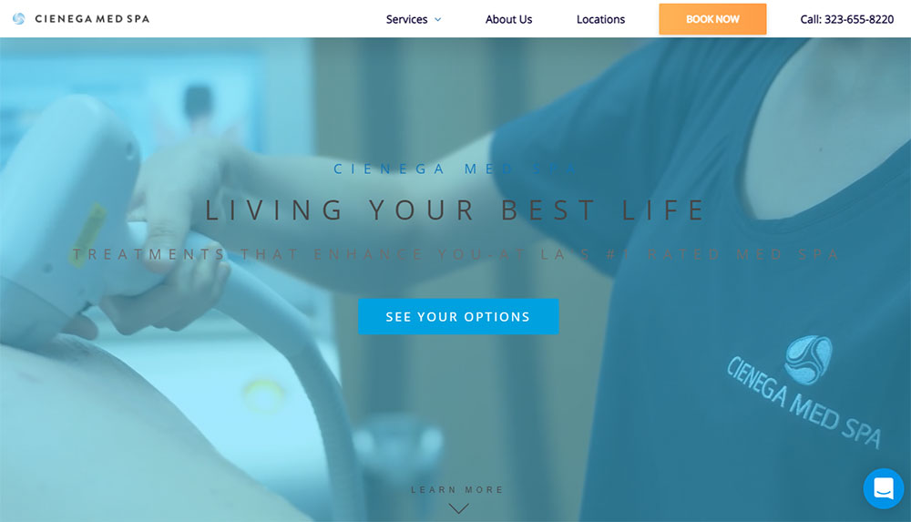
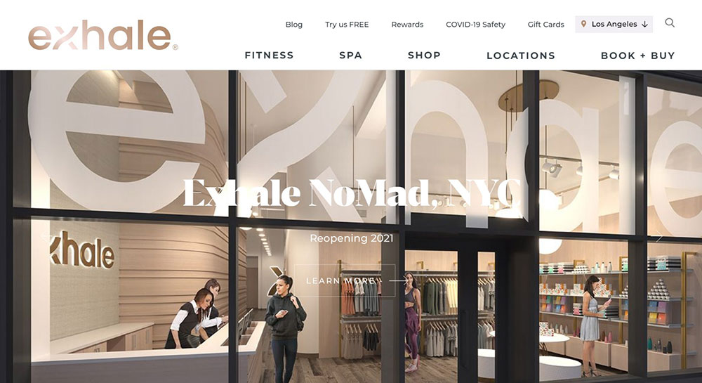
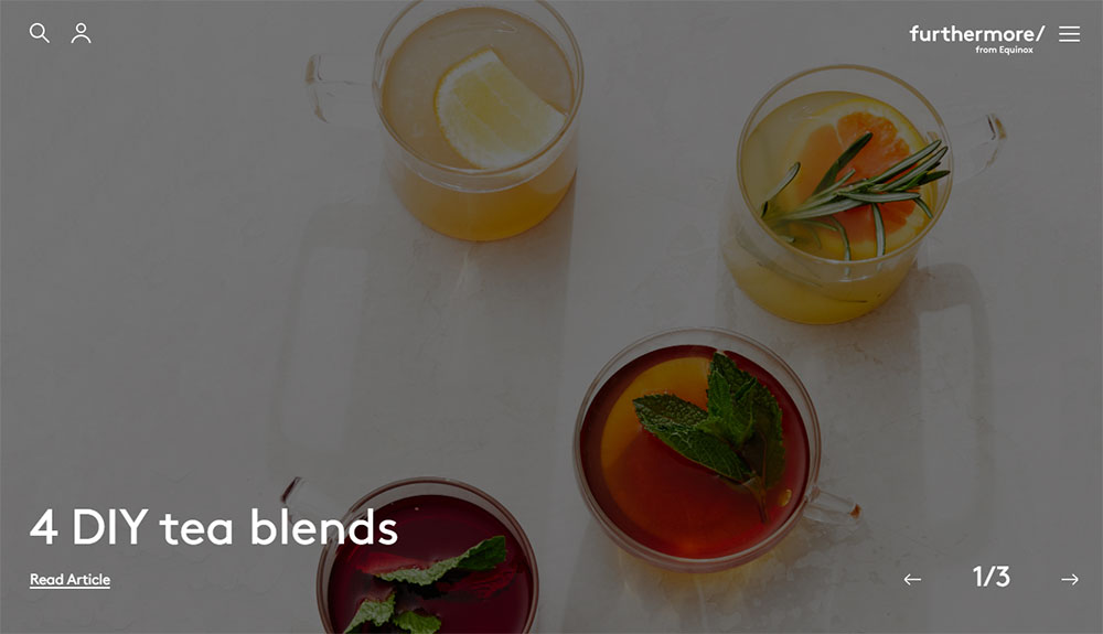
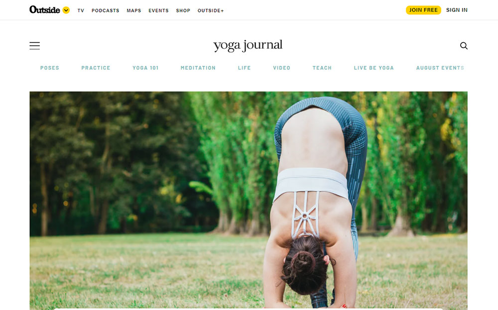
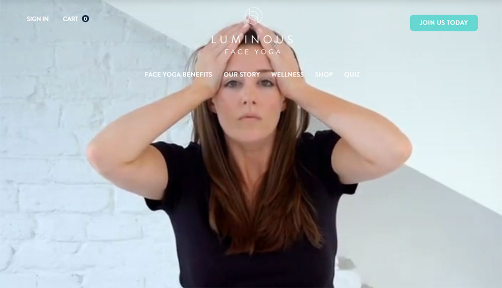
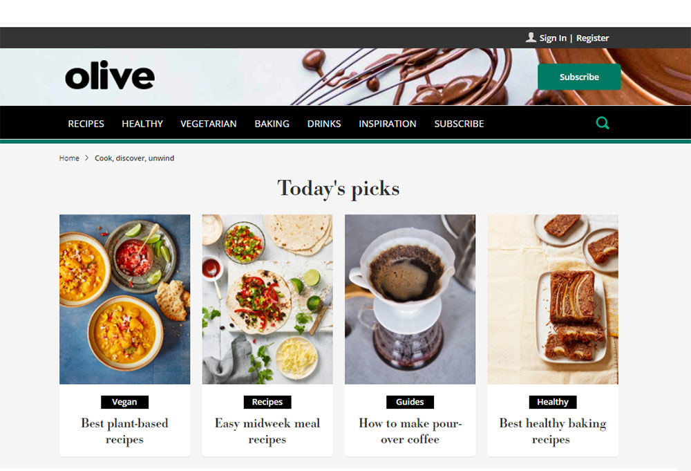
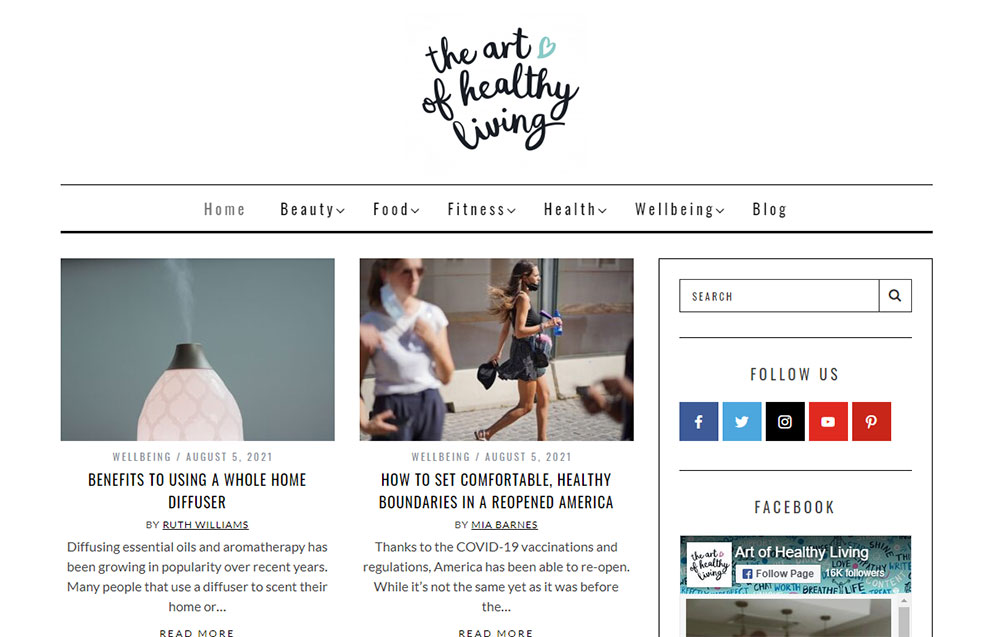
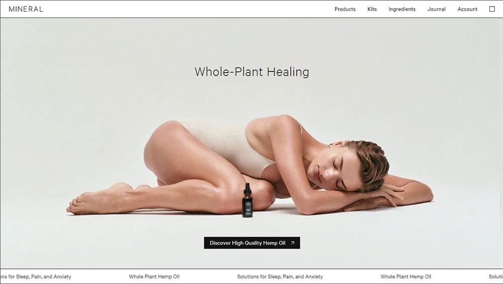
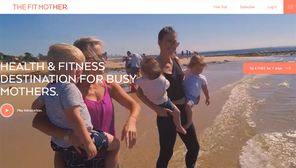
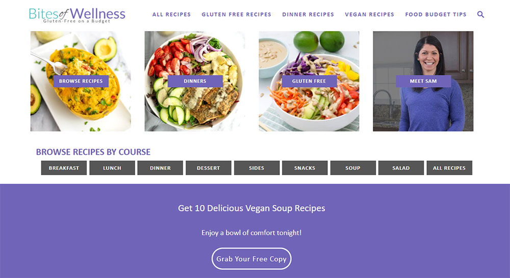
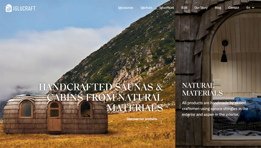
Health and Wellness Website Design Examples
Wellory
What Makes a Good Wellness Website
How Does Color Psychology Affect Wellness Websites
Colors trigger emotional responses. A calm color palette with soft greens, blues, and neutral tones signals relaxation instantly.
Bright reds and harsh oranges work against you here. Stick to muted, nature-inspired hues that mirror the experience clients will have in person.
What Typography Works Best for Health and Wellness Sites
Clean sans-serif fonts like Lato, Open Sans, or Montserrat dominate the wellness space. Pair them with elegant serif headers for contrast.
Avoid decorative or overly stylized typefaces. Readability matters more than creativity when someone is searching for a therapist or yoga instructor.
Why Does Page Speed Matter for Wellness Businesses
Google PageSpeed scores directly affect rankings and user experience. A site that loads in under 3 seconds keeps visitors engaged.
Compress images, use lazy loading, and choose reliable hosting. Slow sites kill conversions faster than poor design.
How Should Navigation Be Structured on Wellness Sites
Keep menus simple: Home, Services, About, Book Now, Contact. That covers 90% of visitor needs.
Check out these website navigation examples for reference. Drop-down menus work for larger practices with multiple service categories.
Types of Wellness Websites
What Are Spa and Massage Therapy Website Designs
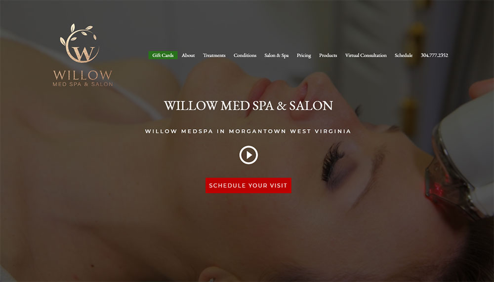
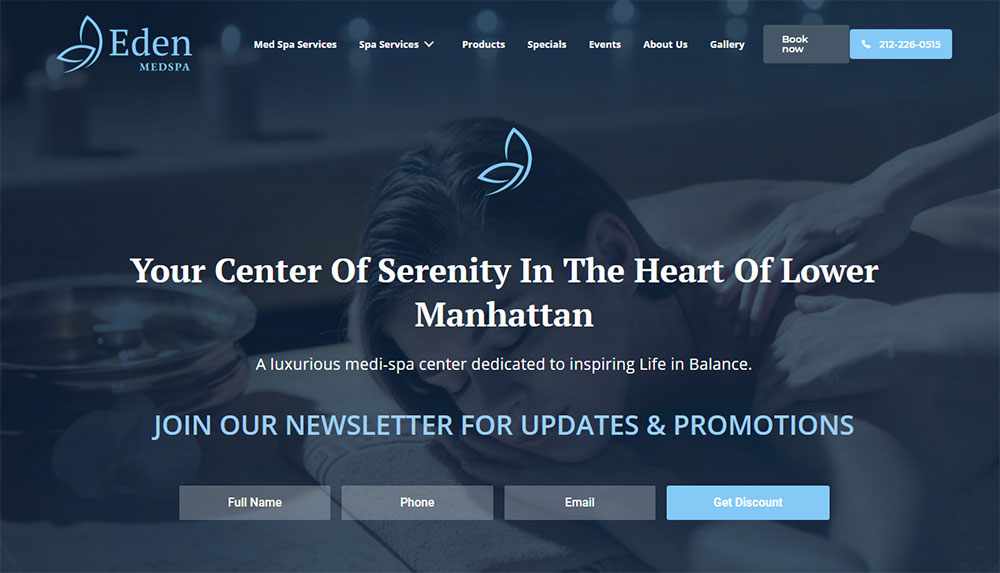
Spa websites prioritize atmosphere. High-quality imagery of treatment rooms, products, and serene environments does the heavy lifting.
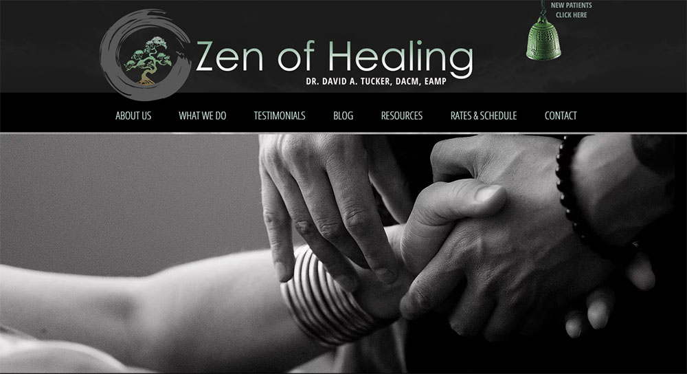
Massage therapist websites focus on credentials, service menus, and easy appointment booking through tools like Acuity Scheduling or Jane App.
How Do Yoga Studio Websites Differ From Fitness Websites
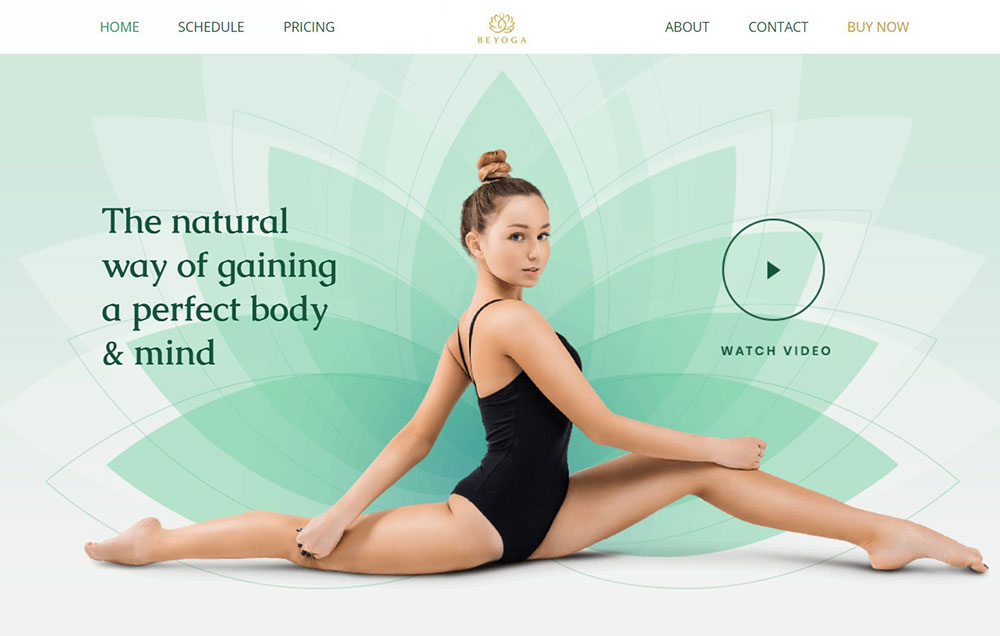
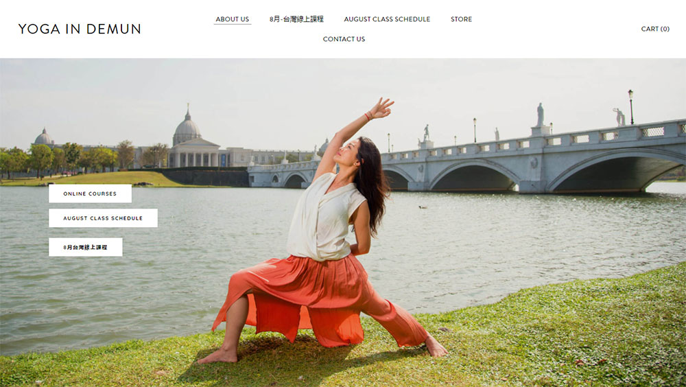
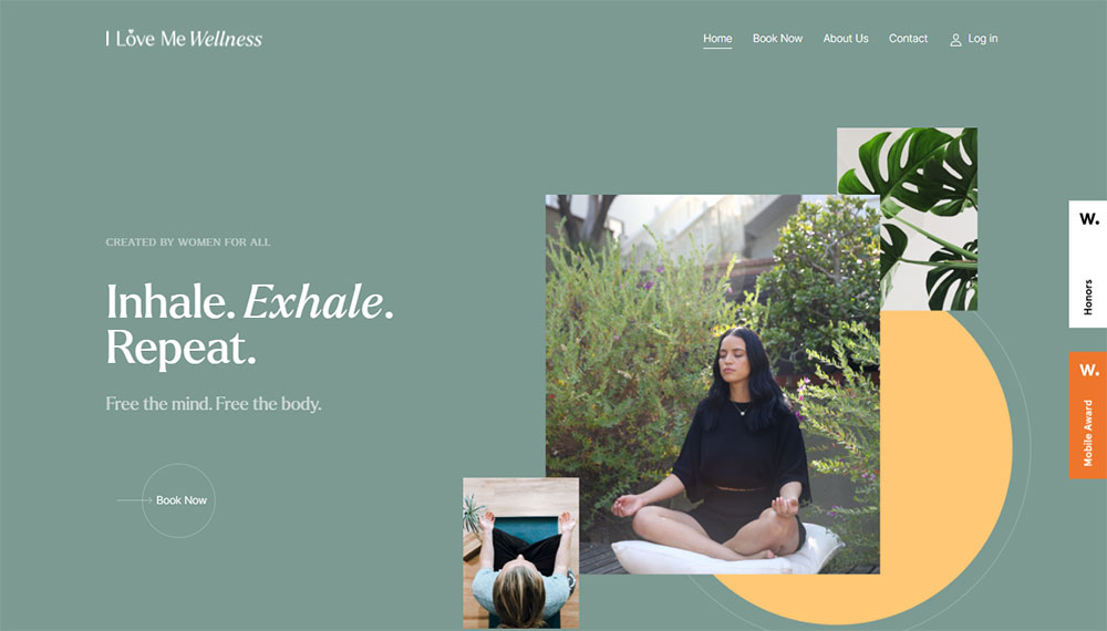
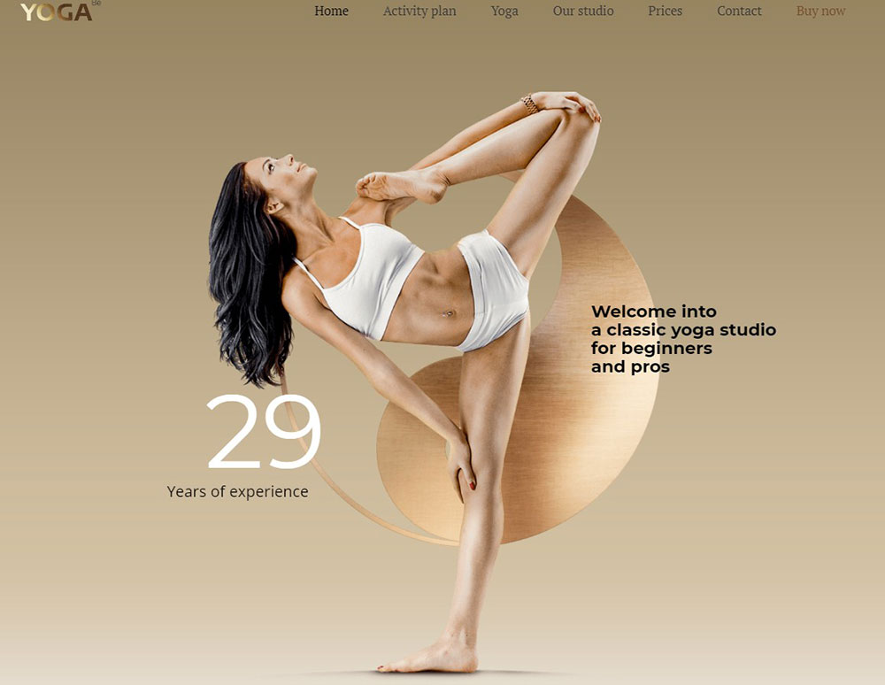
Yoga websites lean spiritual and meditative. Earth tones, flowing layouts, class schedules integrated with Mindbody.
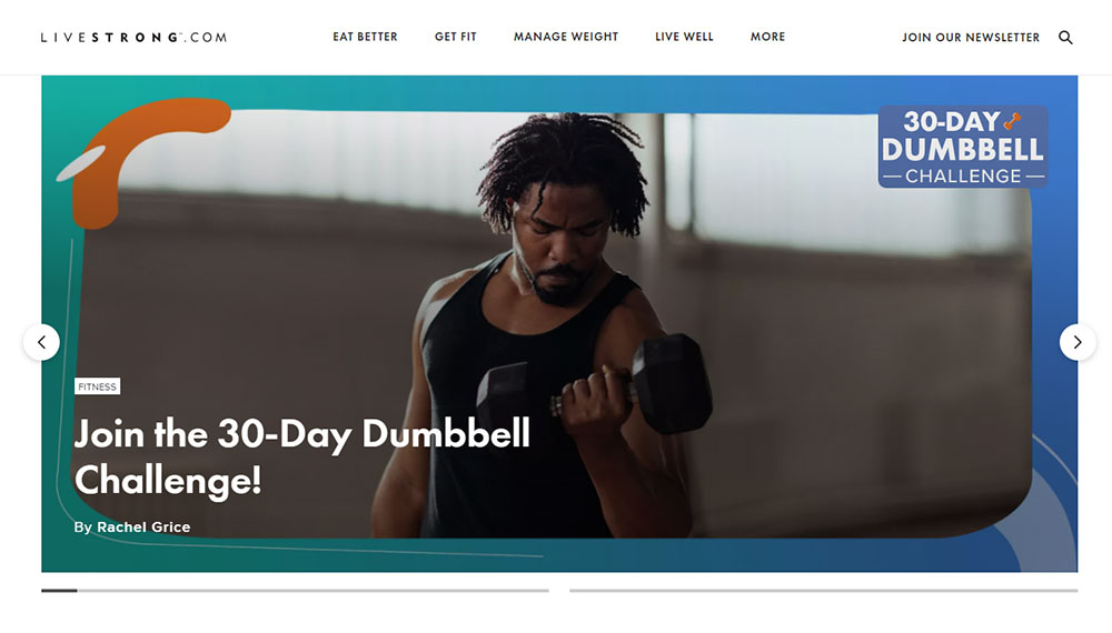
Fitness websites and gym websites push energy and results. Bold fonts, action shots, membership pricing front and center.
What Makes Mental Health Practice Websites Unique
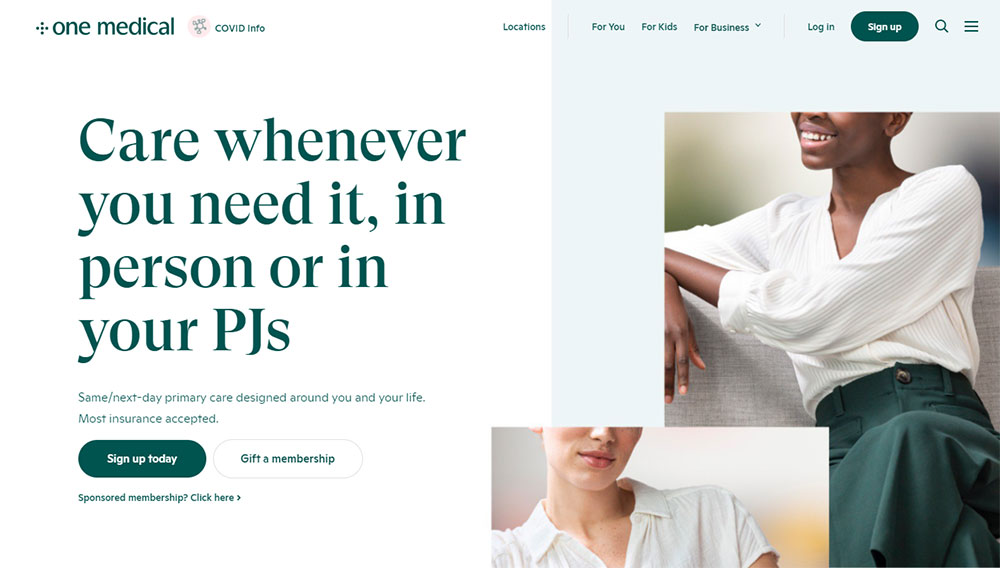
Mental health websites require extra sensitivity. HIPAA compliance, secure client portals, and calming imagery without being clinical.
The best therapist websites build trust through professional photos, credentials, and clear explanations of therapy approaches.
How Are Nutrition and Holistic Coach Websites Structured
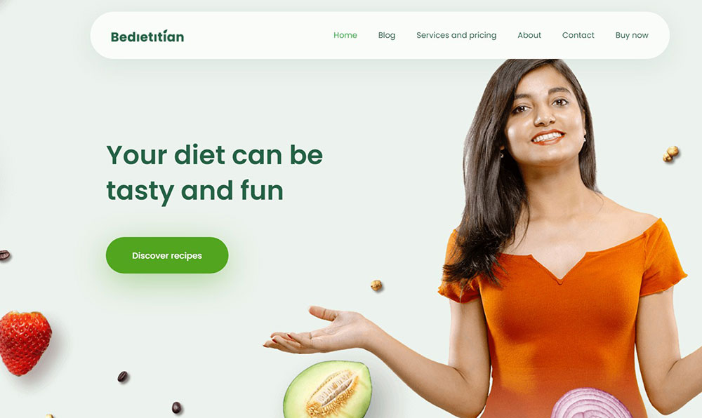
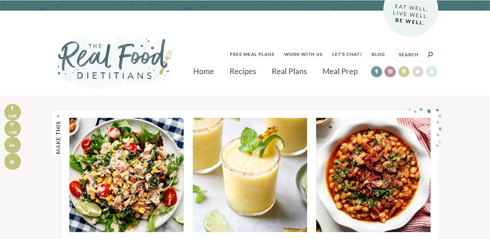
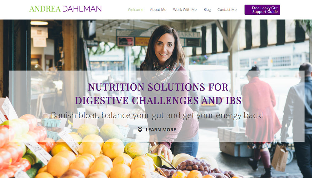
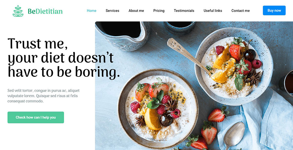
Dietitian websites showcase expertise through blog content, meal plans, and client transformations.
Coaching websites lean heavily on testimonials, free resources, and discovery call bookings. Calendly integration is standard.
What Defines Wellness E-commerce Website Design
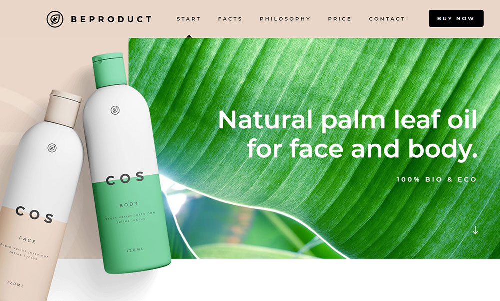
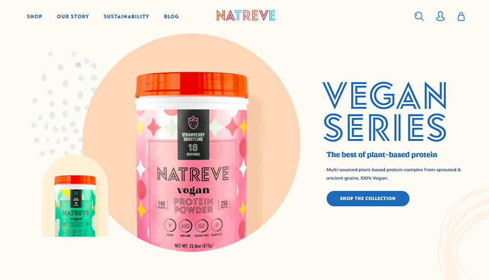
Selling supplements, skincare, or wellness products requires Shopify or WooCommerce. Product photography must be clean and consistent.
Trust badges, ingredient transparency, and customer reviews drive conversions. Brands like Thrive Market and Goop set the standard here.
Design Components of Wellness Websites
What Hero Section Layouts Work for Wellness Brands
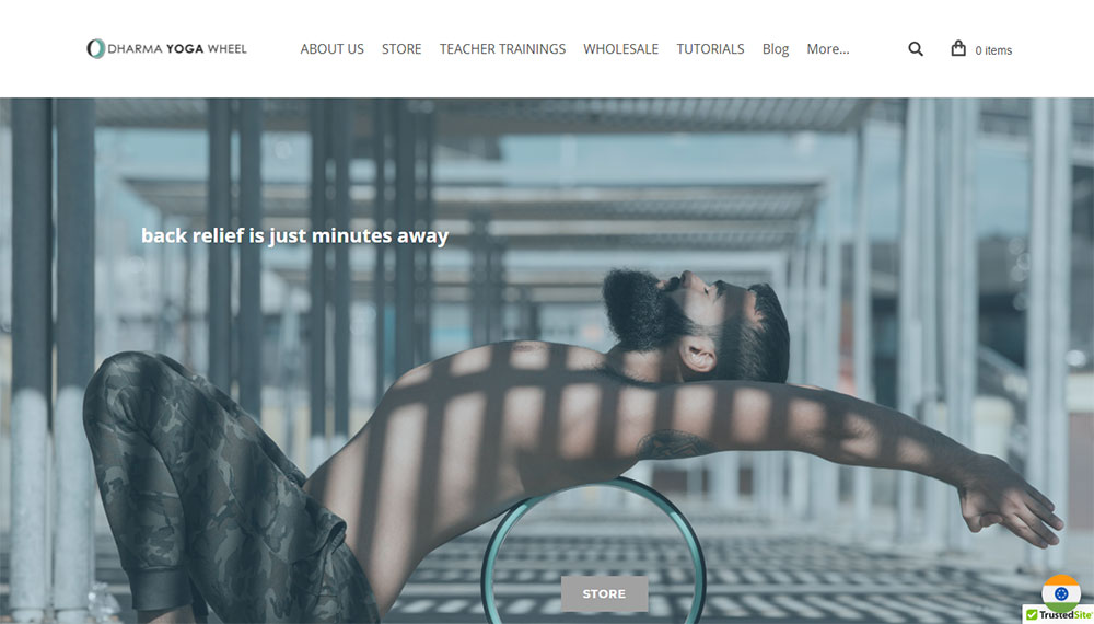
The hero section sets the tone immediately. Full-width images of peaceful environments work better than stock photos of smiling people.
Include a clear headline, brief tagline, and one primary CTA. "Book Your Session" beats "Learn More" every time.
How Should Service Pages Be Designed
Each service deserves its own page. Include duration, pricing, what to expect, and booking options.
Use white space generously. Walls of text scare visitors away from booking.
What Booking System Integrations Perform Best
Acuity Scheduling and Calendly work great for solo practitioners. Mindbody handles class-based businesses like yoga studios.
Jane App dominates healthcare websites and therapy practices due to its HIPAA compliance and insurance billing features.
How Do Testimonials and Social Proof Increase Conversions
Client testimonials reduce hesitation. A dedicated testimonial page plus scattered quotes throughout the site builds trust at multiple touchpoints.
Video testimonials outperform text. Google reviews and before/after photos add credibility for results-based services.
What Blog and Resource Sections Should Include
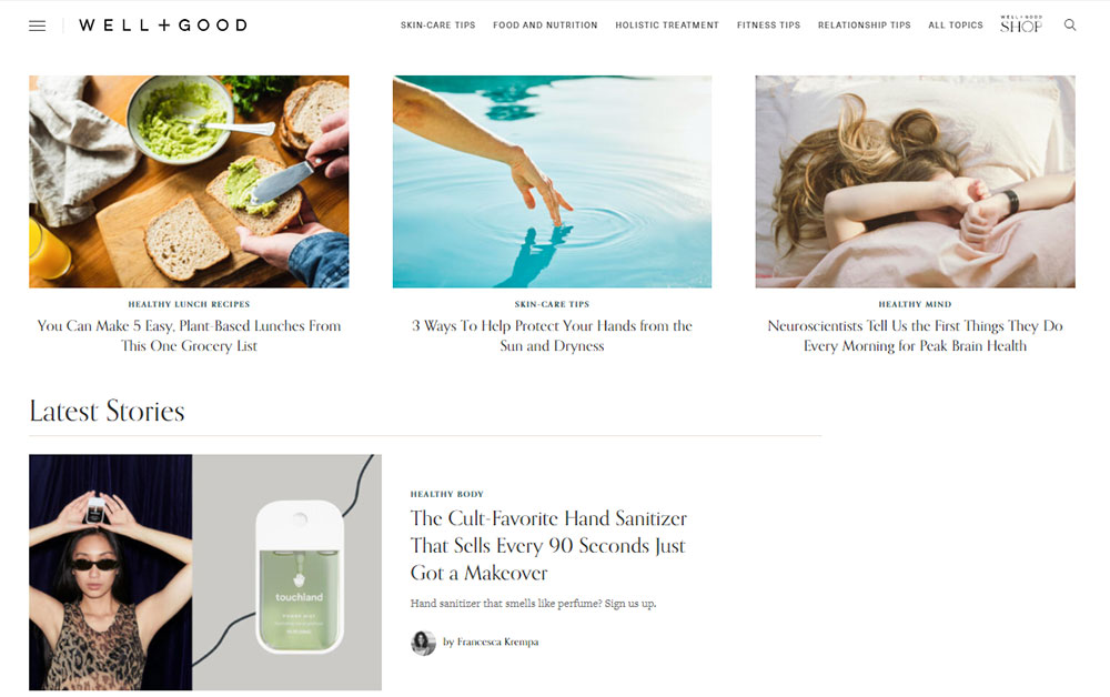
A wellness blog design needs clear categories: nutrition, mindfulness, fitness tips, mental health resources.
Offer free downloadable guides or webinars. This captures email addresses and positions you as an authority. Mind Body Green and WellnessMama built entire brands on this approach.
How to Create a Wellness Website
What Steps Should You Follow to Plan Your Site
Start with your website checklist: define target audience, list core services, gather testimonials, and outline content needs.
Sketch your sitemap before touching any design tool. Most wellness sites need 5-8 pages maximum.
How Do You Choose Colors and Fonts for a Wellness Brand
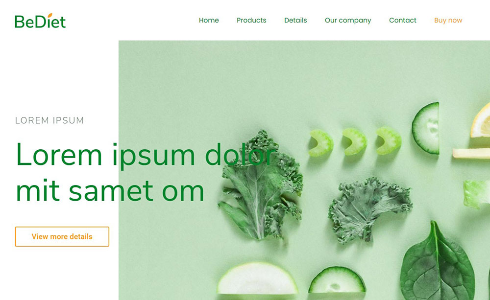
Study color theory basics. Green color palettes signal health and growth; blues convey trust and calm.
Pick two fonts maximum: one for headings, one for body text. Adobe Fonts and Google Fonts offer free options like Playfair Display paired with Source Sans Pro.
What Pages Does Every Wellness Website Need
Core pages for any wellness business:
- Homepage with clear value proposition and primary CTA
- Services with detailed descriptions and pricing
- About featuring credentials, story, and professional photos
- Contact with form design that captures essential info only
- Booking integrated with Acuity, Calendly, or Mindbody
Optional: Blog, Resources, FAQ, pricing page if services have tiered options.
How Do You Optimize for Mobile Users
Over 60% of wellness searches happen on phones. Mobile first design is mandatory, not optional.
Test booking flows on mobile devices. Tap targets need adequate spacing; forms should use appropriate keyboard types for phone numbers and emails.
Common Mistakes in Wellness Website Design
What Layout Errors Reduce Conversions
Cluttered homepages with too many CTAs confuse visitors. Multiple competing buttons, auto-playing videos, and pop-ups on entry all hurt conversions.
Study sites with good UX principles. One primary action per page. Clear visual hierarchy guiding eyes toward booking.
How Does Slow Loading Affect User Trust
Pages loading over 3 seconds lose 53% of mobile visitors. Core Web Vitals directly impact both rankings and user perception of professionalism.
Compress images through TinyPNG or ShortPixel. Use WebP format. Avoid heavy sliders and unnecessary animations that tank performance scores.
What Content Gaps Hurt Wellness Websites
Missing credentials and certifications raise red flags. No photos of actual practitioners or facilities suggest something to hide.
Vague service descriptions without pricing force visitors to call or email. Most will bounce to competitors who show rates upfront. Transparency wins trust in health and wellness spaces.
Avoid these bad design patterns: stock photos of random people, broken booking links, outdated blog posts from years ago, and contact forms that never get responses.
FAQ on Wellness Website Design Examples
What makes a wellness website design effective?
Effective wellness websites combine calming color palettes, clear navigation, and seamless booking integration. They prioritize user friendly website principles with fast load times and mobile responsiveness. Trust signals like testimonials and credentials convert browsers into clients.
Which platform is best for building a wellness website?
Squarespace works great for solo practitioners wanting polished templates. Wix offers easier customization. WordPress handles complex membership sites. Shopify suits wellness e-commerce brands selling supplements or skincare products.
How much does a wellness website cost to build?
DIY platforms like Squarespace run $16-50 monthly. Custom WordPress or Webflow sites from agencies cost $3,000-15,000. Add $20-50 monthly for booking tools like Acuity Scheduling or Jane App.
What colors work best for health and wellness websites?
Soft greens, muted blues, warm neutrals, and earth tones dominate wellness design. These colors signal relaxation and trust. Avoid harsh reds or neon shades that create anxiety rather than calm.
Should wellness websites include online booking?
Yes. Online booking through Mindbody, Acuity, or Calendly is expected now. Sites without booking lose clients to competitors. Integration reduces phone calls and lets visitors schedule appointments at midnight if they want.
What pages does a wellness website need?
Minimum five pages: Homepage, Services, About, Contact, and Booking. Optional additions include a blog for SEO, personal trainer websites often add client transformations, and therapists need secure client portals.
How do I make my wellness website look professional?
Use professional website design principles: consistent fonts, quality photography, and adequate white space. Remove stock photos of random smiling people. Show your actual space, team, and credentials prominently.
What booking system integrates best with wellness sites?
Acuity Scheduling and Calendly suit individual practitioners. Mindbody handles class-based businesses like yoga studios. Jane App works best for healthcare providers needing HIPAA compliance and insurance billing features.
How important is mobile optimization for wellness websites?
Critical. Over 60% of wellness searches happen on smartphones. Responsive websites that adapt to any screen size rank higher on Google and convert more mobile visitors into bookings.
Can I build a wellness website without coding skills?
Absolutely. Squarespace, Wix, and Showit require zero coding. Drag-and-drop builders handle most wellness site needs. Webflow offers more control but has a steeper learning curve for clean websites with custom animations.
Conclusion
These wellness website design examples prove that success comes from combining aesthetics with functionality. A beautiful site means nothing if visitors cannot book appointments easily.
Focus on mobile responsive design first. Integrate scheduling tools like Calendly or Jane App. Build trust through client testimonials and visible credentials.
Platforms like Squarespace and Webflow make professional results accessible without coding knowledge. Use Figma or Dribbble for inspiration before building.
Check your Core Web Vitals regularly. Speed and ADA accessibility affect both rankings and user experience.
Your wellness brand identity deserves a website that converts. Start with one page, test your booking flow, and expand from there. The best health and wellness websites evolve over time based on real visitor behavior.


