


Top Examples of B2B Landing Pages That Drive Results
June 17, 2025
Creative Examples of Interactive Landing Pages to Inspire You
June 21, 2025Agency websites often struggle to convert visitors into clients despite heavy traffic. The difference between successful agencies and those fighting for leads lies in their landing page strategy.
Professional service providers need pages that immediately communicate value and build trust. Whether you run a digital marketing agency or focus on creative services, your landing page determines client acquisition success.
This guide presents examples of agency landing pages that convert browsers into buyers. You'll discover proven layouts, compelling copy structures, and conversion optimization techniques used by top-performing agencies.
We'll analyze high-converting designs across different agency types, examine call to action button placement strategies, and break down elements that drive lead generation. From SaaS landing pages to creative landing pages, you'll see exactly what works in today's competitive market.
Examples Of Agency Landing Pages
Basic/Dept
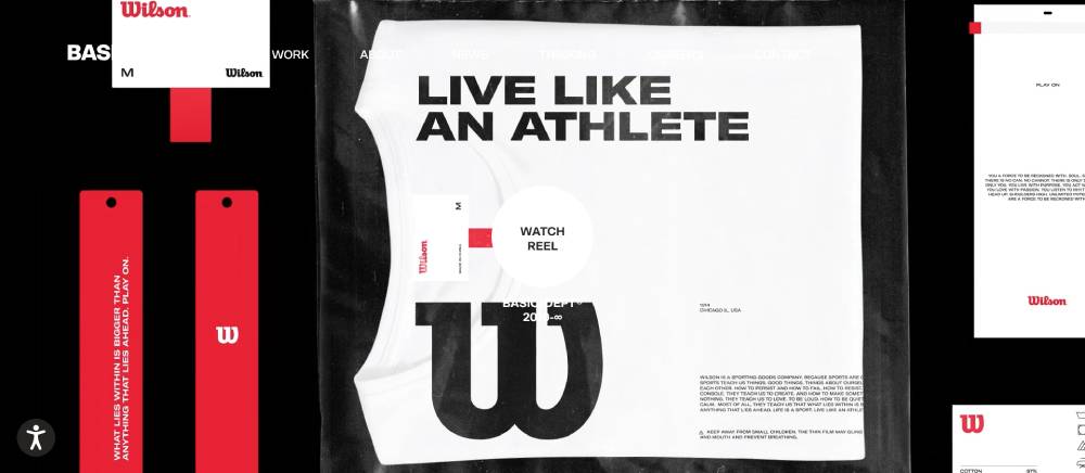
Clean typography choices dominate the homepage experience. White space creates breathing room between content blocks. Navigation stays minimal with clear hierarchy structures.
Interactive elements respond smoothly to user actions. The grid system organizes information without feeling rigid. Color palette remains restrained yet purposeful throughout different sections.
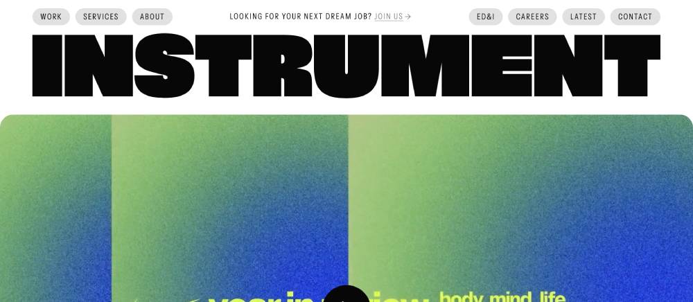
Instrument
Bold visual statements capture attention immediately. Typography mixing creates interesting contrast patterns. Case study presentations follow consistent layout principles.
Background animations add movement without overwhelming content. Project thumbnails maintain uniform sizing across the portfolio grid. Interactive hover states provide clear feedback to users.
Active Theory
WebGL animations create immersive browsing experiences. Loading sequences keep users engaged during transitions. Particle effects respond to mouse movements naturally.
Typography choices support the experimental aesthetic approach. Navigation elements fade in and out contextually. Color gradients shift based on scroll position throughout the page.
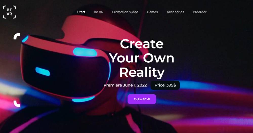
Be VR
Resn
Portfolio pieces showcase technical capabilities effectively. Video backgrounds loop without audio distractions. Interactive demos let visitors experience the work directly.
Layout structures adapt to different screen sizes fluidly. Typography hierarchy guides users through complex information. Subtle animations add polish without slowing performance.
Locomotive
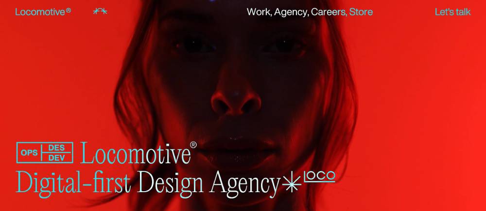
Scroll-triggered animations reveal content progressively. Typography treatments create visual interest without sacrificing readability. Image galleries display work samples clearly.
Navigation systems stay accessible across all device types. Color schemes complement the minimalist design approach. Interactive elements provide immediate visual feedback to user actions.
Humaan
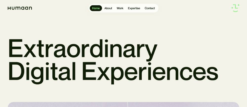
Geometric shapes create visual rhythm throughout the interface. Typography choices reflect contemporary design trends. Portfolio sections organize projects by category effectively.
Hover animations add personality to static elements. Loading states communicate progress clearly to visitors. Color transitions happen smoothly between different page sections.
Hello Monday
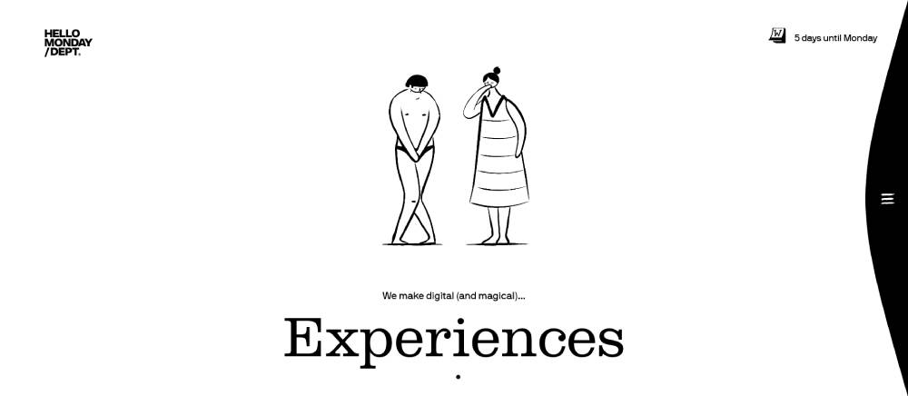
Playful interactions surprise users without hindering usability. Typography mixing balances personality with professional presentation. Case studies include detailed process documentation.
Animation timing feels natural and purposeful throughout. Grid systems maintain consistency while allowing creative flexibility. Color choices support brand identity across all touchpoints.
Dogstudio
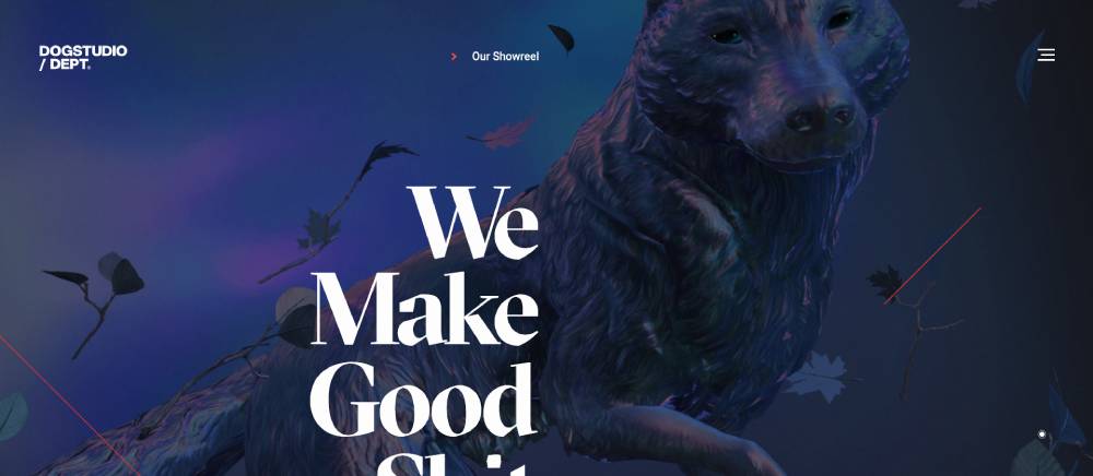
Video content plays automatically with subtle audio cues. Typography selections support multilingual content requirements. Portfolio filtering works instantly without page reloads.
Interactive timelines showcase project development stages. Navigation stays persistent during scroll interactions. Color palettes shift to match individual project branding.
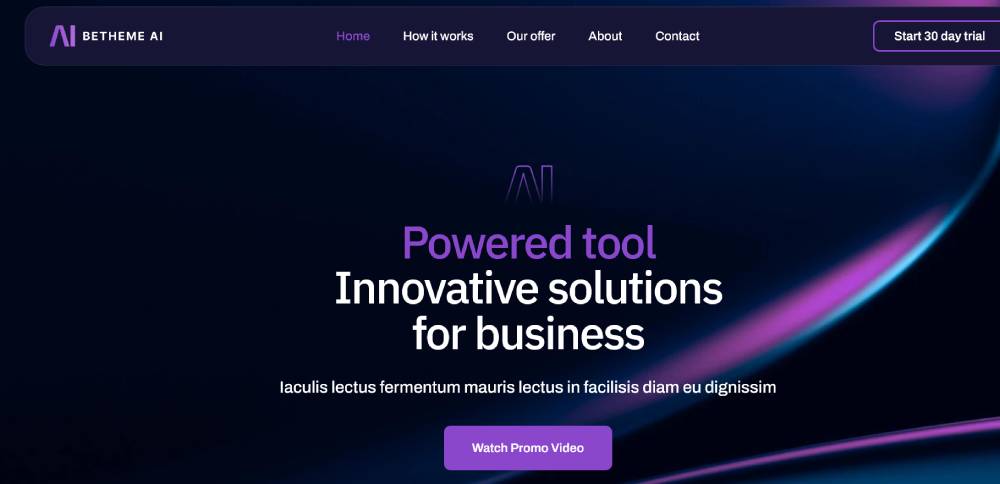
Be AI 3
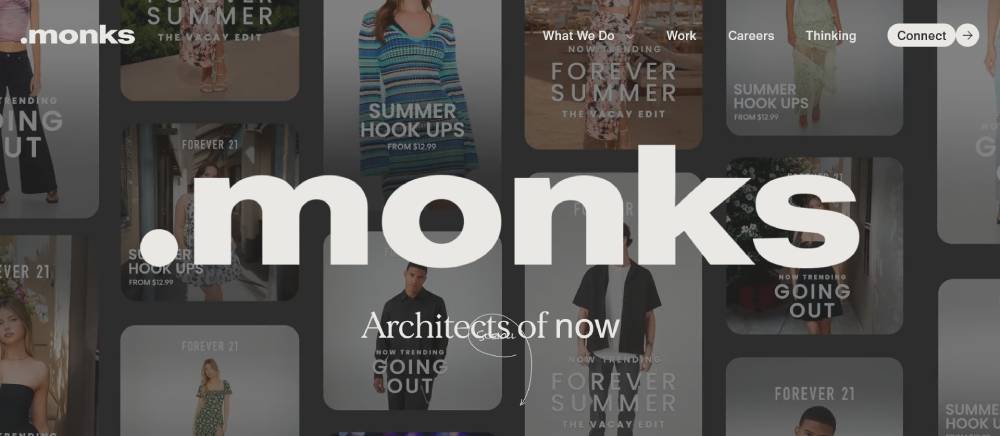
MediaMonks
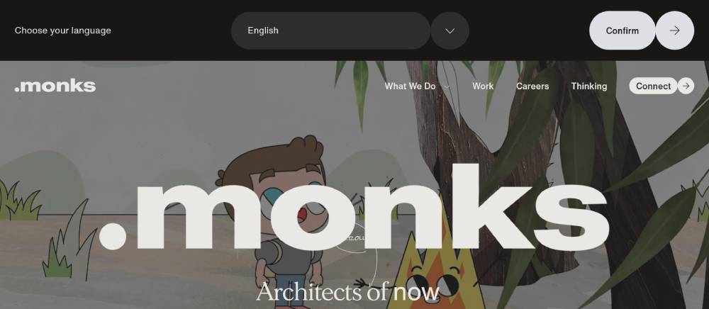
Complex animations load quickly across different devices. Typography hierarchy organizes dense information effectively. Client logos display prominently without overwhelming content.
Interactive case studies include behind-the-scenes details. Navigation adapts to content length dynamically. Color systems maintain consistency across global office pages.
BKWLD
Cursor interactions create engaging micro-experiences. Typography choices support long-form content reading. Portfolio pieces include detailed project specifications.
Background patterns add texture without competing with text. Navigation elements respond to user preferences immediately. Color choices create clear distinction between content types.
Cuberto
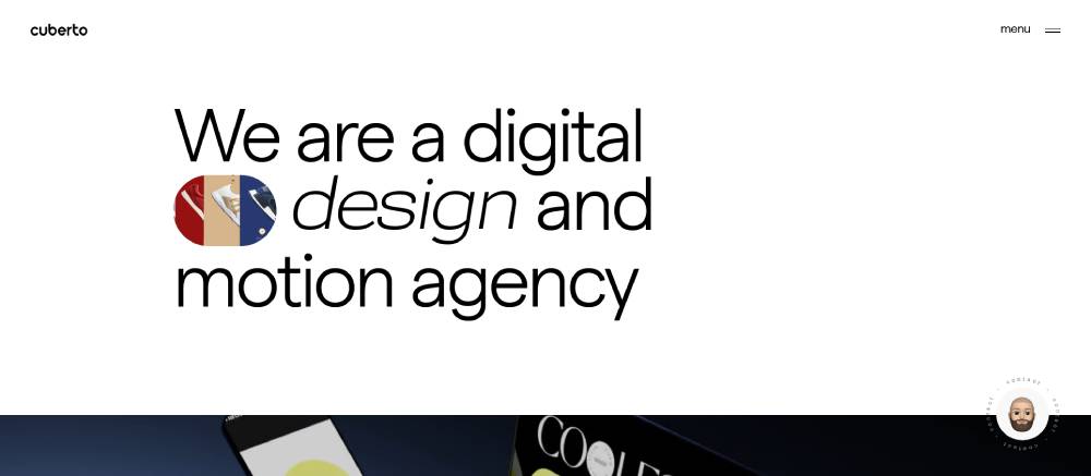
Smooth scrolling animations connect different sections naturally. Typography treatments balance creativity with functional requirements. Interactive demos showcase development capabilities directly.
Particle systems respond to device orientation changes. Navigation stays accessible during animation sequences. Color gradients create depth without requiring heavy graphics.
Jam3
Immersive experiences blur the line between website and application. Typography selections support experimental layout approaches. Portfolio organization highlights diverse project types.
Interactive elements respond to touch and mouse inputs differently. Loading animations maintain engagement during content transitions. Color systems adapt to ambient device settings.
R/GA
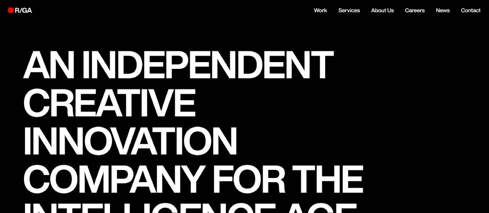
Data visualizations present complex information clearly. Typography hierarchy supports multiple content formats. Global navigation adapts to regional content requirements.
Interactive timelines showcase company history effectively. Video content integrates smoothly with text elements. Color coding helps users navigate different service offerings.
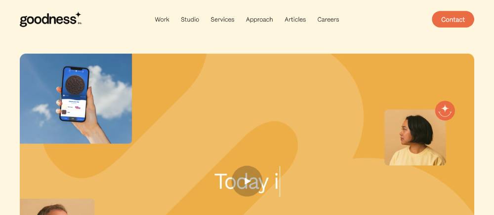
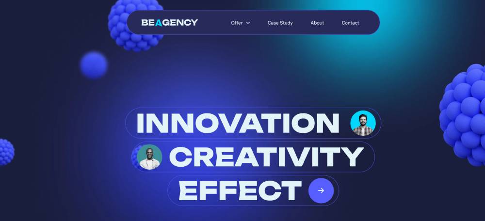
Be Agency 9
AREA 17
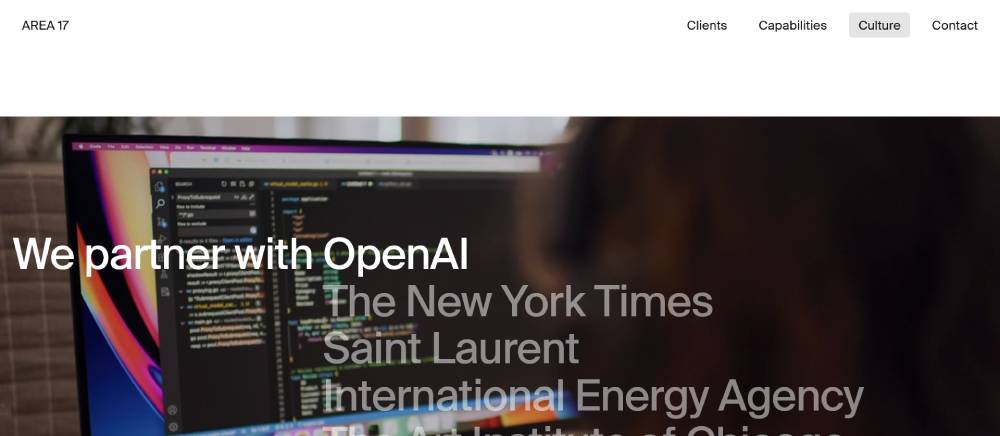
Editorial layouts translate digital content beautifully. Typography choices reflect print design sensibilities. Portfolio presentations include detailed technical specifications.
Navigation systems accommodate extensive content archives. Interactive elements maintain accessibility standards consistently. Color palettes support long reading sessions comfortably.
Your Majesty
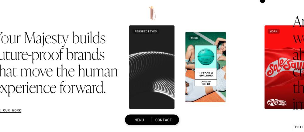
Cursor-following animations create personalized interactions. Typography mixing reflects contemporary cultural references. Case studies document creative process thoroughly.
Interactive portfolios allow users to filter by interest. Navigation elements adapt to scroll direction dynamically. Color choices create emotional connections with different projects.
Wondersauce
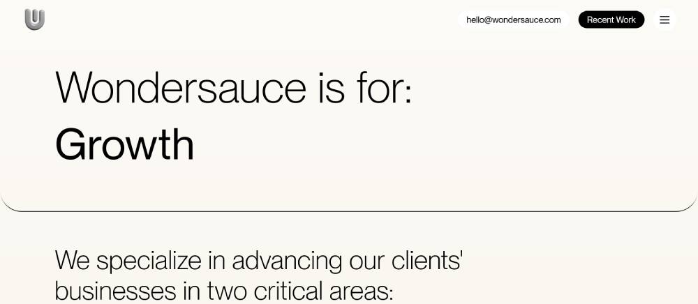
Playful animations maintain professional credibility balance. Typography treatments support diverse client work presentation. Interactive elements respond to user behavior patterns.
Portfolio organization makes finding relevant work easy. Navigation stays consistent across different content types. Color systems reflect agency personality without overwhelming content.
Red Antler
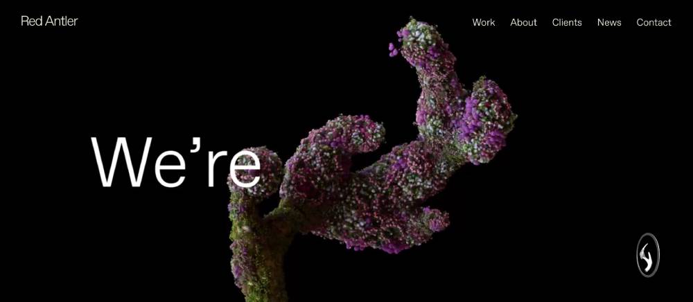
Brand identity elements integrate into interface design naturally. Typography choices support strategic messaging clearly. Case studies include quantifiable results prominently.
Interactive brand stories unfold through scroll interactions. Navigation adapts to content complexity smoothly. Color applications demonstrate brand development expertise directly.
Barrel
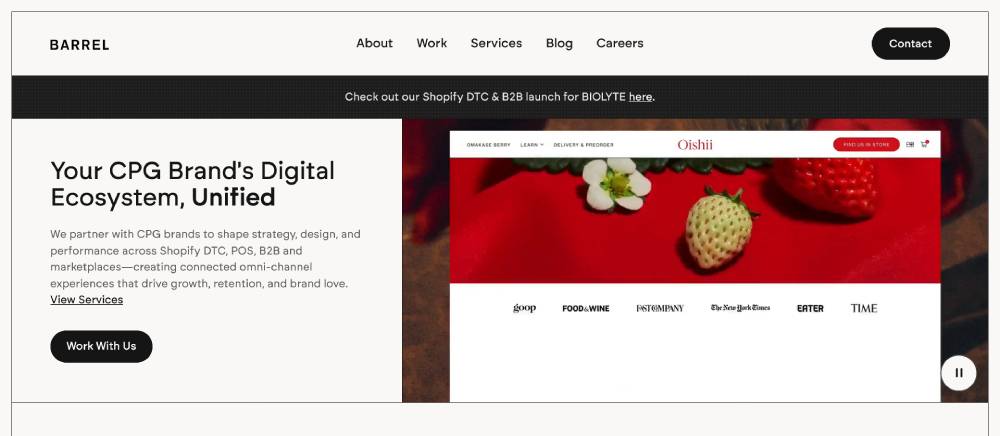
Clean interfaces let portfolio work speak loudly. Typography selections support technical content presentation. Interactive demos showcase development capabilities effectively.
Navigation systems prioritize user experience consistently. Loading states provide clear progress feedback. Color choices complement client work without competing visually.
Studio Mega
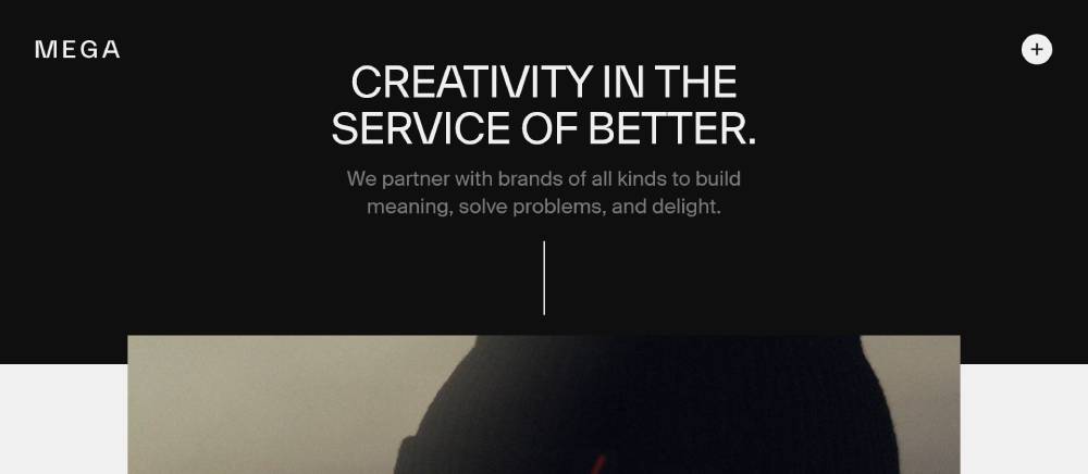
Experimental layouts push conventional boundaries carefully. Typography treatments create unique reading experiences. Portfolio pieces include detailed creative rationale.
Interactive elements surprise users while maintaining functionality. Navigation adapts to unconventional content structures. Color experiments support creative positioning clearly.
Work & Co
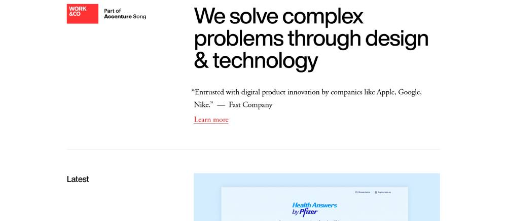
Corporate aesthetics balance creativity with business requirements. Typography hierarchy organizes complex service offerings. Case studies include client testimonials prominently.
Interactive presentations demonstrate strategic thinking clearly. Navigation systems accommodate global team structures. Color applications support professional brand positioning consistently.
FAQ on Agency Landing Pages
What makes agency landing pages different from regular websites?
Agency landing pages focus on single conversion goals with targeted messaging for specific services. Unlike business website designs, they eliminate distractions and guide visitors toward one action. Professional agencies use strategic form design and compelling value propositions to maximize lead generation.
How do I optimize conversion rates on agency pages?
Focus on clear value propositions, social proof elements, and streamlined user experience. Test different hero section layouts, testimonials, and contact forms. Successful marketing websites use A/B testing to identify highest-converting elements and continuously improve performance metrics.
What essential elements should every agency landing page include?
Include compelling headlines, client testimonials, service descriptions, and prominent contact forms. Add trust signals like certifications and case studies. Effective agency websites showcase portfolio pieces and clear pricing information to build credibility with potential clients.
How long should agency landing page copy be?
Keep copy concise but comprehensive enough to address visitor concerns. Most high-converting pages use 300-800 words focused on benefits over features. Professional websites balance detailed service descriptions with scannable formatting and strategic white space usage.
Should agency pages use video backgrounds or static images?
Video backgrounds can increase engagement when used strategically, but static images often load faster and perform better on mobile. Consider your target audience and page speed requirements. Many modern landing pages use high-quality photography with subtle animations for optimal user experience.
What color schemes work best for agency landing pages?
Choose colors that reflect your brand personality and industry expectations. Technology websites often use blues and grays, while creative agencies prefer bold, vibrant palettes. Test different color scheme combinations to see what resonates with your specific audience.
How do I make my agency page mobile-friendly?
Implement responsive design principles with touch-friendly buttons and readable fonts. Optimize images for faster loading and ensure forms work seamlessly on smartphones. Responsive websites adapt layouts automatically and prioritize mobile user experience in today's mobile-first environment.
What mistakes should I avoid on agency landing pages?
Avoid cluttered layouts, unclear messaging, and multiple competing calls-to-action. Don't hide contact information or use complex navigation menus. Learn from bad design examples and focus on simplicity, clarity, and user-focused content that addresses specific client needs.
How do I showcase agency credibility effectively?
Display client logos, case studies, and specific results achieved for previous clients. Include team photos and professional certifications. Branding agency websites often feature detailed about sections and awards to establish trust and demonstrate expertise in their field.
What tools help create high-converting agency pages?
Use platforms like WordPress, Webflow, or specialized landing page builders. Tools like HubSpot and Unbounce offer conversion-focused templates. Consider web design tools that provide analytics integration and A/B testing capabilities to optimize performance and track visitor behavior effectively.
Conclusion
These examples of agency landing pages demonstrate how strategic design drives client acquisition and business growth. Successful agencies combine compelling messaging with user-friendly interfaces that convert visitors into qualified leads.
Key elements include:
- Strong value propositions that address client pain points
- Strategic testimonial page placement for social proof
- Optimized pricing page layouts that reduce friction
- Mobile-responsive designs that work across all devices
Whether you're building startup landing pages or established consulting websites, focus on conversion optimization over visual complexity. Test different layouts, analyze user behavior, and continuously refine your approach.
Remember that effective website navigation and clear calls-to-action separate high-performing agencies from competitors. Implement these proven strategies to transform your online presence into a powerful lead generation machine.
If you enjoyed reading this article on the agency landing pages, you should check out this one about accessible websites examples.
We also wrote about a few related subjects like the best looking tourism websites, hotel website design, product landing page, great looking spa websites, cool looking personal trainer websites, top notch musician websites, the most impressive luxury websites and impressive animated websites.


