

Top Industrial Website Templates That Convert Visitors
January 26, 2026
Catering Website Design Examples You Want To See
January 28, 2026Schools compete for enrollment before families ever step on campus. Your website is where that competition gets decided.
A poorly structured site with slow load times and buried information sends prospective parents straight to competitors. Meanwhile, schools with clean navigation, mobile-first design, and accessible content pull more inquiry forms and campus tour requests.
This breakdown covers what separates functional school websites from broken ones. You'll see school website design examples across different institution types, platform comparisons that matter for budget planning, and the specific design decisions that affect both search rankings and parent trust.
No theory. Just what works in based on performance data and accessibility standards that actually get enforced.
What Is School Website Design
School website design is the process of planning, structuring, and building a website specifically for an educational institution, including elementary schools, high schools, private academies, and public school districts.
It covers layout, website navigation, content organization, and visual identity tailored to serve students, parents, teachers, and administrators.
Unlike general web development, school web design prioritizes parent communication portals, admissions workflows, event calendars, and staff directories alongside standard usability.
A K-12 website has to work for a parent checking bus schedules at 6 AM on their phone and a prospective family browsing campus photos on a desktop during lunch. Two completely different use cases, same homepage.
That dual purpose is what separates educational websites from most other site categories.
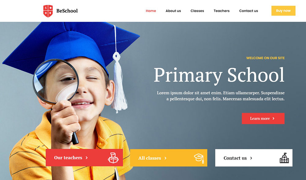
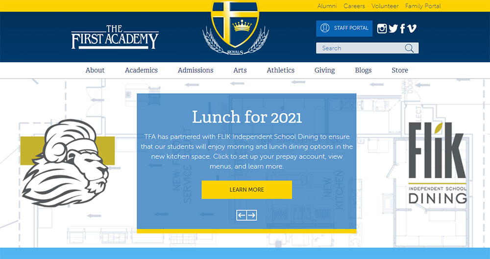
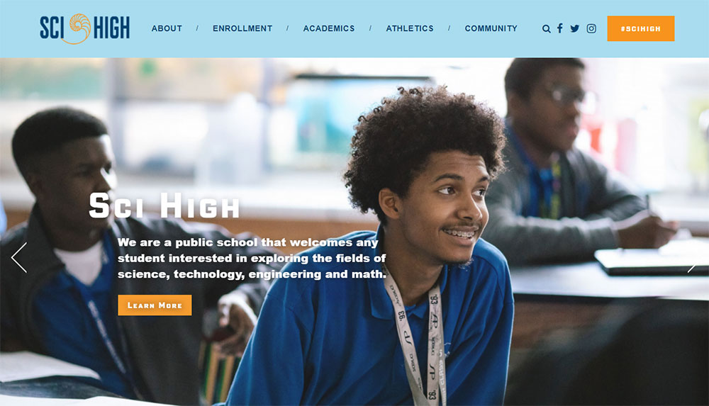
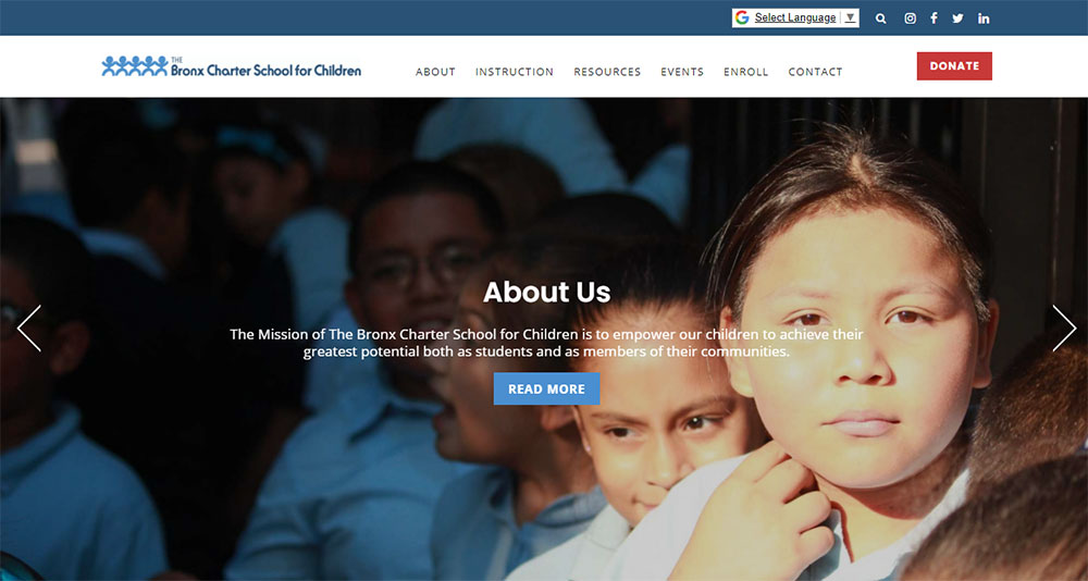
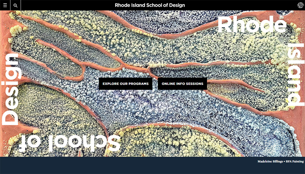
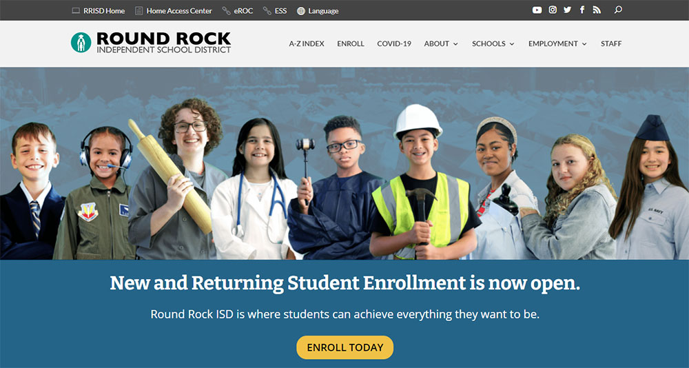
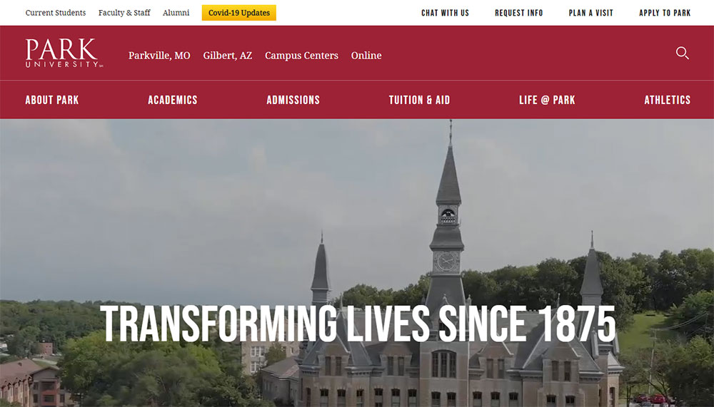
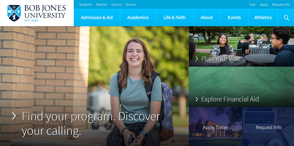
School Website Design Examples
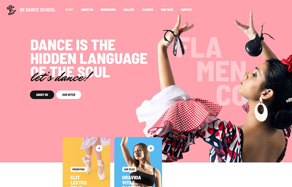
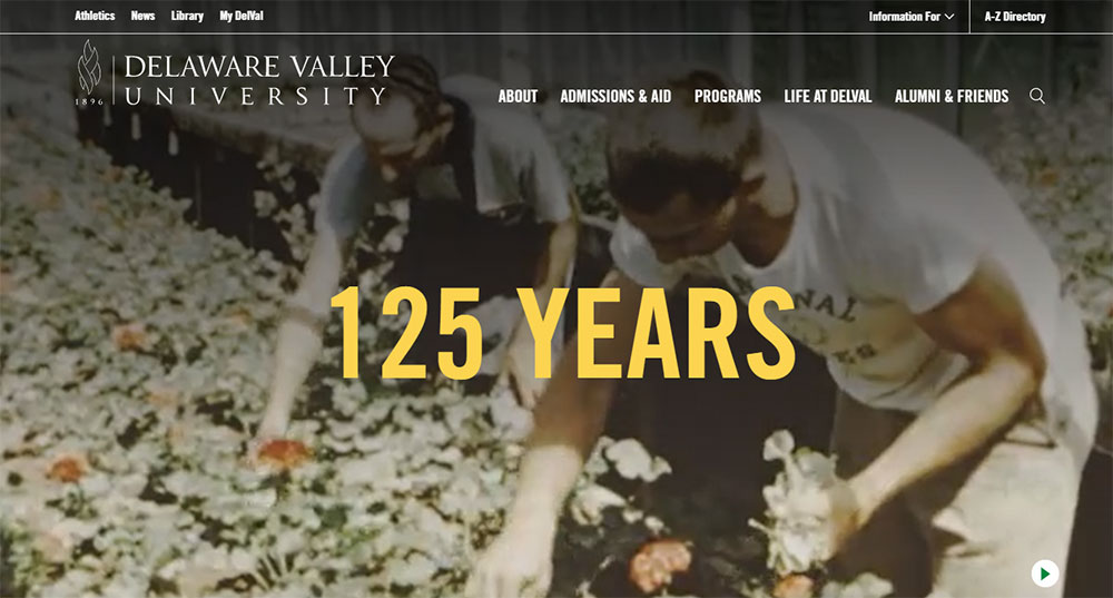
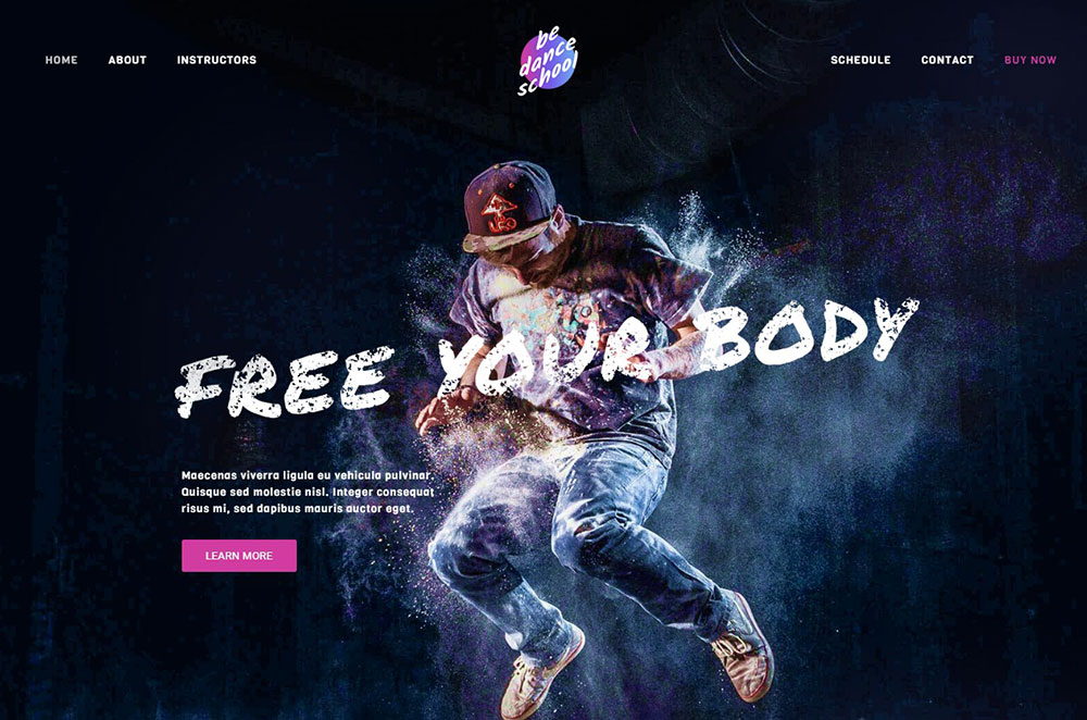
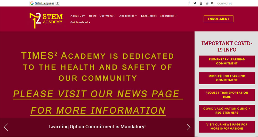
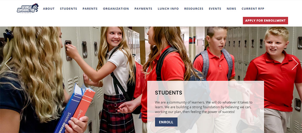
The First Academy


Why Does School Website Design Matter for Student Enrollment and Parent Trust
A school's website is typically the first interaction a prospective family has with the institution. Stanford's Web Credibility Research found that 75% of users judge an organization's credibility based on its website design alone.
For schools, that judgment directly affects enrollment numbers.
A 2023 survey by Finalsite showed that 87% of families visit a school's website before scheduling a campus tour. If the site loads slowly, looks outdated, or buries admissions information three clicks deep, those families bounce.
Schools with well-structured, mobile-first sites report 34% more inquiry form submissions compared to those running legacy designs, according to data from SchoolMessenger's 2024 engagement report.
Bounce rate on education websites averages around 55%. Schools that redesigned with clear visual hierarchy and fast page loads brought that number below 40%.
Trust signals matter here more than in most industries. Accreditation badges, parent testimonials, teacher credentials, and verifiable contact information all contribute to whether a visitor stays or leaves.
Look, if a parent can't find the phone number for the front office within 5 seconds, something is broken.
What Are the Core Elements of an Effective School Website
Every school website shares a set of baseline components that determine whether it functions well or frustrates its visitors. These elements go beyond aesthetics. They directly affect how quickly parents find information, how prospective families perceive the institution, and whether search engines can properly index the content.
How Does Navigation Structure Affect Usability on School Websites
A school site typically needs to serve 4+ distinct audience groups through a single website menu: current parents, prospective families, students, and staff. Role-based navigation with segmented top-level menus (like "For Parents," "For Students," "Admissions") reduces average task completion time by 40%, based on Blackbaud's UX benchmarks.
The staff directory should be accessible within one click from any page. Accessible websites following WCAG 2.1 AA standards require full keyboard navigation, proper ARIA labels, and a logical heading hierarchy across all pages.
What Role Does Visual Hierarchy Play in School Website Layouts
Typography choices set the tone immediately. Most high-performing school sites pair a clean sans-serif for headings (Open Sans, Poppins, or Lato at 32-40px) with a readable body font at 16-18px.
White space between content blocks should be at least 48px. Cramming news feeds, event widgets, and photo galleries into the same viewport without breathing room is one of the fastest ways to make a school homepage feel chaotic.
CTA buttons for admissions pages perform best at 44px minimum height with high-contrast color schemes that meet a 4.5:1 contrast ratio.
How Do Admissions Pages Convert Visitors Into Applicants
The admissions page is the single highest-value page on any school website. Form design matters here more than anywhere else on the site.
Keep inquiry forms to 5-7 fields maximum. Every additional field beyond that drops conversion rates by roughly 11%, according to HubSpot's 2024 form analytics data.
Trust signals directly on the admissions page (accreditation logos from NAIS or regional bodies, a short parent testimonial page snippet, and a clear "What Happens Next" section) reduce form abandonment. Education websites that include these elements see conversion rates between 8-12%, compared to 3-5% for pages without them.
Page load speed on admissions pages should be under 2.5 seconds for Largest Contentful Paint. Prospective parents clicking through from a Google Ad or social post will not wait around.
What Accessibility Standards Should School Websites Follow
Public schools in the United States must comply with Section 508 of the Rehabilitation Act and Title II of the ADA. Private schools receiving federal funding fall under similar requirements.
At minimum, school websites need:
- Alt text on every image, including campus photos and staff headshots
- Captions or transcripts for all video content
- Color contrast ratios of 4.5:1 for normal text, 3:1 for large text
- Full keyboard navigability without mouse dependency
- Screen reader compatibility tested with NVDA or VoiceOver
- Skip navigation links on every page
Running a Lighthouse audit through Google Chrome DevTools gives a quick accessibility score. Anything below 90 needs immediate attention.
The U.S. Department of Education has increased enforcement of web accessibility complaints against school districts since 2022. This is not optional anymore. It is a legal baseline.
How Should a School Website Homepage Be Structured
The homepage carries more weight than any other page. It is the router for every audience segment hitting the site.
Above the fold, a strong hero section with a single clear message and one primary call to action button (typically "Schedule a Tour" or "Apply Now") outperforms carousels and sliders. Carousels have an average click-through rate below 1% past the first slide, per a Nielsen Norman Group study. Most schools still use them anyway.
Below the hero, structure content in this order:
- Quick links bar (4-6 items: lunch menu, calendar, parent portal, directions, contact)
- Brief value proposition block (2-3 sentences about the school, not a full history)
- News or announcements feed (3 most recent items, not 10)
- Upcoming events widget pulling from the integrated school calendar
- Social proof section (awards, accreditation badges, enrollment stats)
- A website footer with contact info, address, Google Maps embed, and links to social media
Every element above should render within the first two scrolls on desktop and three on mobile. If a parent has to scroll through a full-screen video, a mission statement, a principal's letter, and a photo gallery before finding the lunch menu link, the UX is working against them.
The header should stay fixed on scroll with the school logo, main navigation, and a search bar. Search functionality is not a nice-to-have on school sites. Parents use it constantly to find specific forms, policies, and staff contacts.
Took me a while to accept that homepages should not try to tell the school's entire story. They should get people where they need to go. Fast.
What Platform Options Exist for Building School Websites
The platform you pick determines what you can build, what you can break, and how much it costs to fix. Not every school needs a custom-coded site, and not every school can get away with Wix.
Finalsite is purpose-built for K-12 and independent schools. It includes admissions management, event calendars, and parent notification tools out of the box. Pricing starts around $4,000-$8,000 per year depending on school size. Best fit for private and independent schools with budget.
Blackbaud integrates with fundraising, student information systems, and enrollment management. Heavy on features, heavy on cost. Typically $6,000+ annually. Public and private schools with existing Blackbaud infrastructure benefit most.
WordPress with Elementor or a dedicated education theme (Flavor: flavor.developer) runs between $500-$3,000 for initial setup, plus hosting and maintenance. Most flexible option. Also the most likely to break if nobody maintains it. Roughly 40% of school websites globally run on WordPress, based on BuiltWith data from late 2024.
Squarespace works for small private schools or preschools that need something clean and fast without technical overhead. Limited on integrations with student information systems and LMS platforms like Canvas or Schoology.
SchoolMessenger focuses on communication (alerts, mass notifications, app-based messaging) with a basic website builder attached. Functional, not pretty.
A quick comparison:
- Budget under $1,000/year: WordPress with a premium theme, or Squarespace
- Budget $3,000-$8,000/year: Finalsite, SchoolMessenger, or a managed WordPress build
- Budget $8,000+/year: Blackbaud, custom development, or Finalsite with full integrations
Whichever platform you choose, make sure it supports ClassLink or Clever SSO if your district uses either. Single sign-on compatibility is a dealbreaker for schools running Google Workspace for Education alongside a separate parent portal.
How Do Mobile-First Design Principles Apply to School Websites
Over 63% of traffic to school websites comes from mobile devices, according to Finalsite's 2024 analytics benchmark across 3,000+ school sites. Parents check grades, read announcements, and fill out forms from their phones. Usually while waiting in the pickup line.
Building responsive websites for schools means more than scaling down the desktop version. It means designing for thumbs first.
Touch targets need to be at least 44x44 pixels. That includes menu links, form fields, and buttons. Anything smaller and parents with average-sized thumbs will tap the wrong link, especially on screens under 390px wide.
Hamburger menus are standard on mobile school sites, but the menu itself needs to be shallow. Two levels deep, maximum. If a parent has to tap through "Academics" then "Departments" then "Science" then "AP Chemistry" just to find a teacher's email, the information architecture is too nested.
Click-to-call buttons for the front office should appear on every mobile page. Sticky footer bars with "Call," "Directions," and "Apply" work well for admissions-focused schools.
Modern website designs compress images to WebP format, lazy load below-the-fold content, and serve different image sizes based on viewport width. A school homepage hero image that loads at 2.4MB on mobile is a problem. Target under 200KB per image at mobile breakpoints.
What Common School Website Design Mistakes Reduce Engagement
I see the same issues on school websites over and over again. Some of them are easy fixes. Others require a full rethink of how the site is organized.
Outdated event calendars. Nothing signals neglect faster than a calendar showing last semester's events. If the school can't commit to updating it weekly, remove it from the homepage entirely and link to a Google Calendar embed instead.
PDF-heavy content. Posting the student handbook, lunch menu, and supply list as PDFs instead of native HTML pages kills mobile usability and search indexing. Google can crawl PDFs, but the user experience is terrible on a phone screen.
Missing search functionality. Parents search for specific things: "snow day policy," "bus routes," "Mrs. Johnson email." Without a search bar, they leave and call the office. That costs the school staff time.
Uncompressed images. A gallery of 50 photos from the spring concert, each at 3MB, loaded all at once. Page load times spike past 8 seconds. Use lazy loading and compress every image before upload.
Cluttered homepages. Trying to surface every piece of information on the homepage results in a page that communicates nothing. This is a case of bad design fundamentals, not a content problem.
Broken links. Staff pages linking to retired teacher profiles, resource pages pointing to moved documents. Run a crawl with Screaming Frog or a free broken link checker quarterly at minimum.
No mobile testing. Checking the site on one iPhone model is not mobile testing. Test across at least 3 screen sizes (small Android, mid-range iPhone, tablet) and 2 browsers (Chrome and Safari cover 85%+ of mobile traffic).
How Do Top School Websites Handle Content for Different User Groups
A school website serves at least four distinct audiences: current parents, prospective families, students, and staff. Each group arrives with different goals, and each needs a clear path from the homepage to the information they came for.
Segmented navigation is the most direct solution. A top bar or tabbed interface with "Current Families," "Prospective Families," "Students," and "Staff" filters the experience immediately. Finalsite and Blackbaud both support audience-based navigation natively.
Role-based parent portals with login access handle the more sensitive content: grades, attendance records, tuition payments, and medical forms. These sit behind authentication through platforms like PowerSchool, ClassLink, or Clever and should not be indexed by search engines.
Prospective family content needs its own section entirely, not buried inside the current parent navigation. Admissions pages, virtual tour videos, tuition information, and inquiry forms should live under a dedicated "Admissions" or "Enroll" menu item visible from every page.
Staff resources (intranet links, professional development schedules, HR documents) belong behind a login or on a separate subdomain. Mixing staff-only content with public-facing pages confuses both visitors and search engine crawlers.
The best user friendly websites in education treat each audience like a separate product. Same brand, different journeys.
What Color Palettes and Typography Choices Work Best for School Websites
School branding almost always starts with institutional colors, usually pulled from a logo designed decades ago. The trick is translating those colors into a web palette that actually works on screens.
A school whose brand colors are navy and gold cannot just slap #000080 and #FFD700 on every element. Gold text on white backgrounds fails WCAG contrast requirements. Navy on dark gray is unreadable. You need tints, shades, and neutral companions.
A functional school website color theory setup typically includes:
- Primary color: The dominant brand color, used for headers, buttons, and active navigation states
- Secondary color: A complementary accent for hover states, tags, and secondary CTAs
- Neutral palette: White (#FFFFFF), off-white (#F5F5F5), light gray (#E0E0E0), dark gray (#333333) for backgrounds, text, and borders
- Alert color: A distinct red or orange reserved exclusively for urgent notices and deadlines
For typography, schools that pair a geometric sans-serif heading font (Poppins, Montserrat, or Inter) with a humanist body font (Source Sans Pro, Nunito, or Lato) consistently score well in readability testing.
Body text at 16px minimum. Line height at 1.5 to 1.6. Paragraph width capped at 70-75 characters per line. These are not preferences. They are baseline readability standards backed by research from the Baymard Institute.
Schools targeting younger audiences (elementary, kindergarten) lean toward rounded typefaces and warmer palettes. High schools and universities tend toward sharper geometry and cooler tones. Montessori and Waldorf schools almost universally use earthy greens, warm beiges, and organic shapes that reflect their educational philosophy.
How Does Page Speed Impact School Website Performance and Search Visibility
Core Web Vitals directly affect how Google ranks school websites. A slow site does not just frustrate parents. It gets pushed down in search results, which means fewer prospective families find the school through organic search.
The three metrics that matter:
- Largest Contentful Paint (LCP): Should be under 2.5 seconds. This measures how fast the main content loads. On school sites, the hero image or homepage banner is usually the LCP element.
- Interaction to Next Paint (INP): Should be under 200 milliseconds. Measures responsiveness when a user clicks or taps. Slow INP often comes from heavy JavaScript on event calendar widgets or embedded Google Maps.
- Cumulative Layout Shift (CLS): Should be under 0.1. Measures visual stability. Ads, late-loading images without defined dimensions, and dynamic content injection cause layout shifts.
Run every school website page through Google PageSpeed Insights and the Lighthouse audit tool in Chrome DevTools. Focus on mobile scores first since that is where most traffic comes from.
Common speed fixes for school sites:
- Convert all images to WebP format and serve responsive sizes via srcset
- Lazy load images and iframes below the fold
- Use a CDN (Cloudflare's free tier handles most school traffic volumes)
- Defer non-critical JavaScript, especially third-party widgets
- Preload the LCP image and critical CSS
- Set explicit width and height on all images and embeds to prevent CLS
The average education website scores 47 on mobile PageSpeed, based on a 2024 HTTPArchive crawl of .edu and school-related domains. That is well below the 90+ threshold Google considers "good."
Schools running WordPress with five unoptimized plugins, a bloated theme, and shared hosting at $8/month are the worst offenders. Switching to managed WordPress hosting (Cloudways, Kinsta, or WP Engine) and trimming plugins to under 10 active typically pushes mobile scores above 70 without touching the front-end code.
Speed is not a bonus feature. It is the foundation that everything else (search rankings, user experience, conversion rates) sits on top of.
FAQ on School Website Design Examples
What makes a good school website design?
A good school website design has clear navigation, fast page load speed, mobile responsiveness, and organized content for parents, students, and staff. Accessibility compliance with WCAG 2.1 AA standards, strong visual hierarchy, and a working search bar are baseline requirements.
What platform is best for building a school website?
WordPress offers the most flexibility for schools on a budget. Finalsite and Blackbaud are purpose-built for K-12 institutions with built-in admissions tools, event calendars, and parent portals. Squarespace works for small private schools needing a simple setup.
How much does a school website redesign cost?
Costs range from $500 to $30,000+ depending on platform and scope. A WordPress build with a premium theme runs $1,000-$3,000. Finalsite or Blackbaud subscriptions cost $4,000-$10,000 annually. Custom development for large districts exceeds $15,000.
What pages should every school website include?
Every school website needs a homepage, admissions page, staff directory, event calendar, contact page, and parent portal login. Additional pages for academics, athletics, school news, lunch menus, and transportation round out the core structure.
How do school websites handle accessibility requirements?
Public schools in the United States must meet Section 508 and ADA standards. This includes alt text on images, keyboard navigation, screen reader compatibility, proper color contrast ratios, and video captions. Lighthouse audits in Chrome DevTools measure compliance.
What are the best school website design examples to follow?
Top school website design examples share common traits: clean layouts, mobile-first design, fast Core Web Vitals scores, segmented navigation for different audiences, and strong brand identity. Independent, public, and charter schools each approach these differently based on budget.
How important is mobile responsiveness for school websites?
Over 63% of school website traffic comes from mobile devices. Parents check grades, read alerts, and submit forms from their phones. A responsive school website with 44px touch targets and shallow menu depth is not optional anymore.
What CMS features should a school website have?
A school website CMS needs event calendar integration, parent notification tools, LMS compatibility with Canvas or Schoology, SSO support through ClassLink or Clever, form builders for admissions, and role-based content permissions for staff editors.
How can a school website improve enrollment numbers?
Schools with well-designed admissions pages, clear calls to action, fast page speed, and visible trust signals like accreditation badges from NAIS report 34% more inquiry submissions. Keeping inquiry forms to 5-7 fields maximizes conversion rates.
What color schemes work best for school websites?
Start with institutional brand colors, then build a web-ready palette with tints, shades, and neutrals. Pair a primary brand color with off-white backgrounds and dark gray text. Every color combination must pass WCAG contrast ratios of 4.5:1 minimum.
Conclusion
These school website design examples show that great education sites share a few non-negotiable traits: fast load times, accessible layouts, and content structured for multiple audience groups.
Platform choice matters less than execution. A WordPress site with solid information architecture will outperform a $10,000 Finalsite build with poor content organization every time.
Focus on Core Web Vitals scores, WCAG compliance, and segmented navigation before worrying about aesthetics. Parents and prospective families care about finding information quickly, not parallax effects.
Test on mobile first. Run Lighthouse audits quarterly. Keep inquiry forms short and admissions content within two clicks of the homepage.
A school's digital presence is now its front door. The schools that treat their website like a product, not an afterthought, are the ones filling seats.


