Clean and Calming Psychologist Website Design Examples
July 15, 2025
Sleek and Modern Examples of Automotive Website Templates
July 17, 2025Your cafe could have the best espresso in town. None of that matters if your website looks like it was built in 2009.
First impressions happen online now. Customers check your cafe website before they ever walk through the door.
This collection of cafe website design examples shows what actually works. Real coffee shops, real results.
You'll see how top brands like Blue Bottle Coffee and Intelligentsia handle everything from menu display to online ordering.
We cover color palettes, typography choices, platform options, and pricing. Plus the mistakes that drive customers to your competitors instead.
What is Cafe Website Design
Cafe website design is the process of creating a digital presence for coffee shops, espresso bars, and similar establishments that reflects brand identity while providing menu information, location details, and online ordering capabilities.
The goal is simple: get people through the door or placing orders online.
A well-built coffee shop website does more than look pretty. It communicates atmosphere, showcases food photography, and makes essential information instantly accessible.
Most visitors land on a cafe homepage with specific intent. They want hours, the menu, or directions. Everything else is secondary.
Platforms like Squarespace, WordPress, and Wix dominate this space. Each offers templates designed specifically for hospitality businesses.
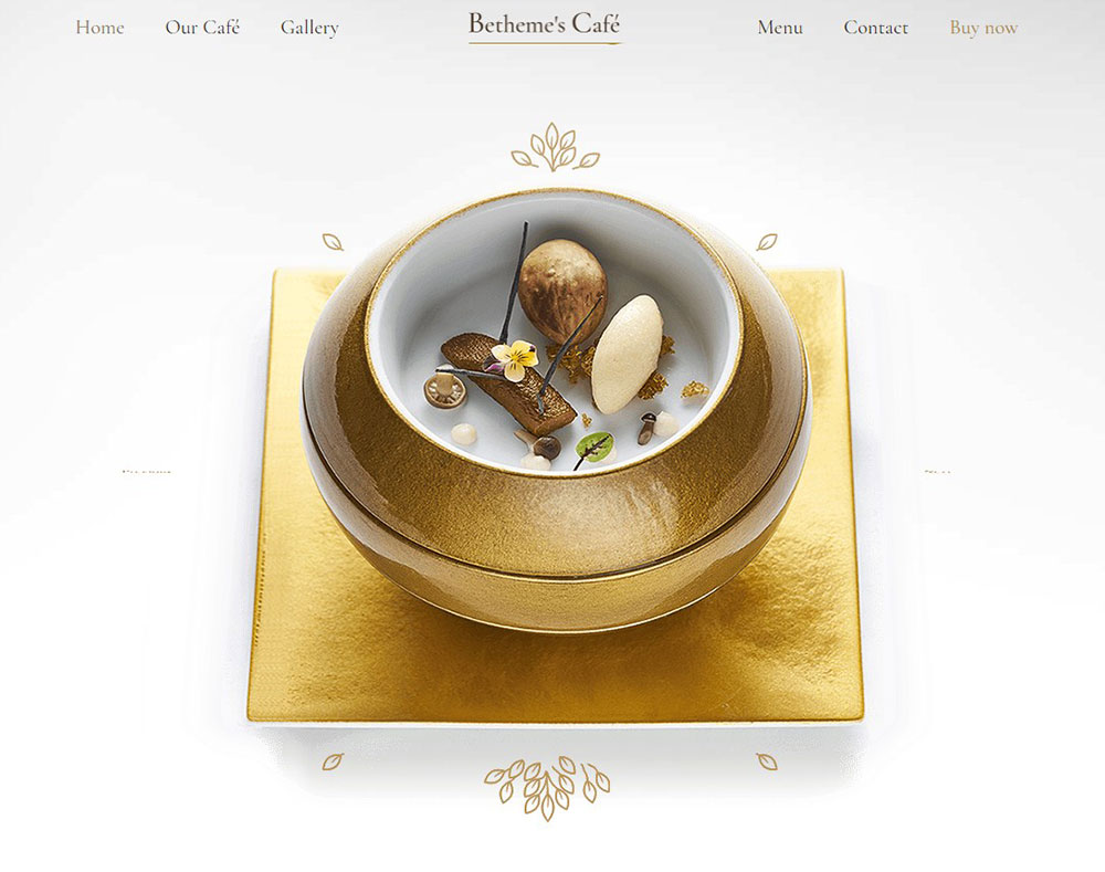
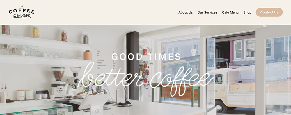
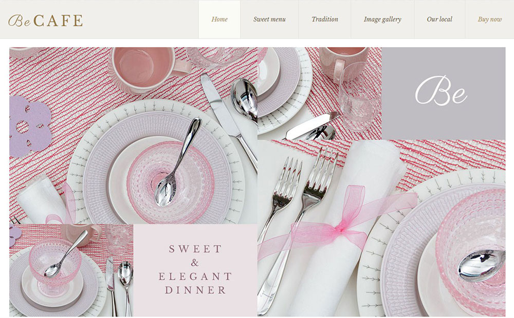
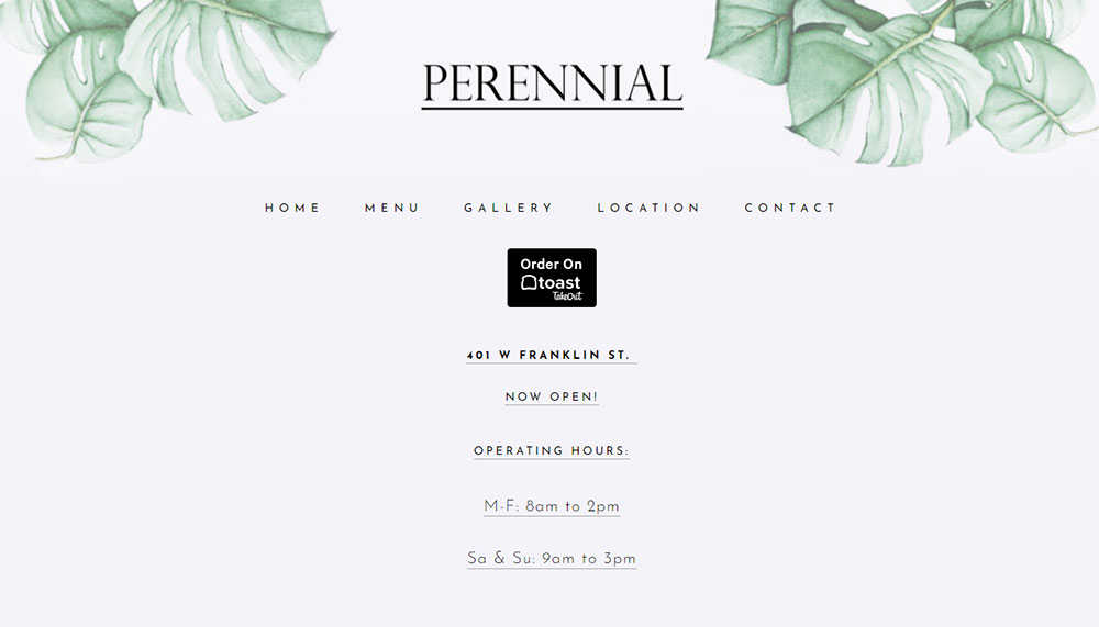
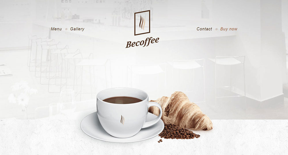
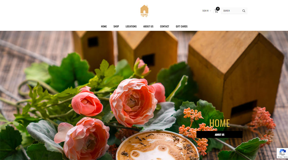
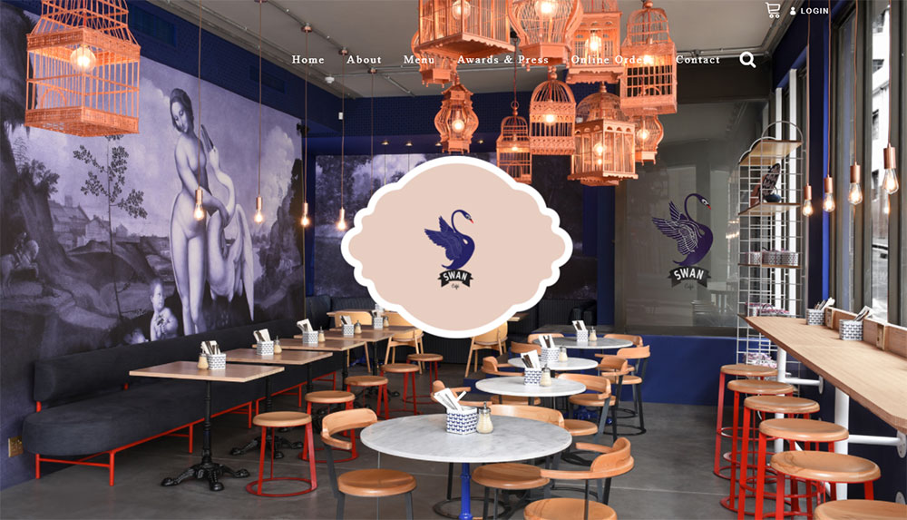
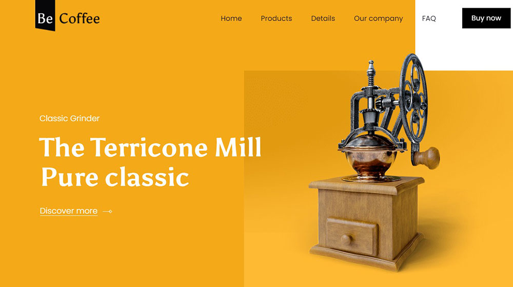
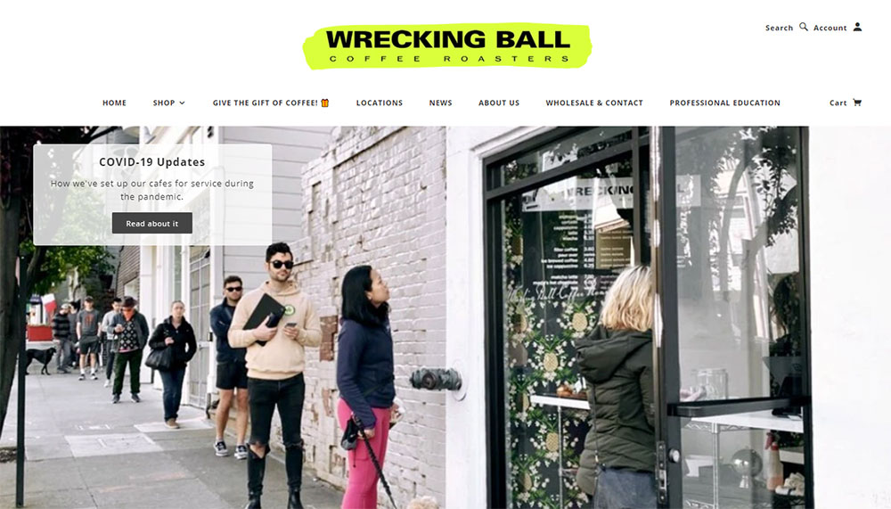
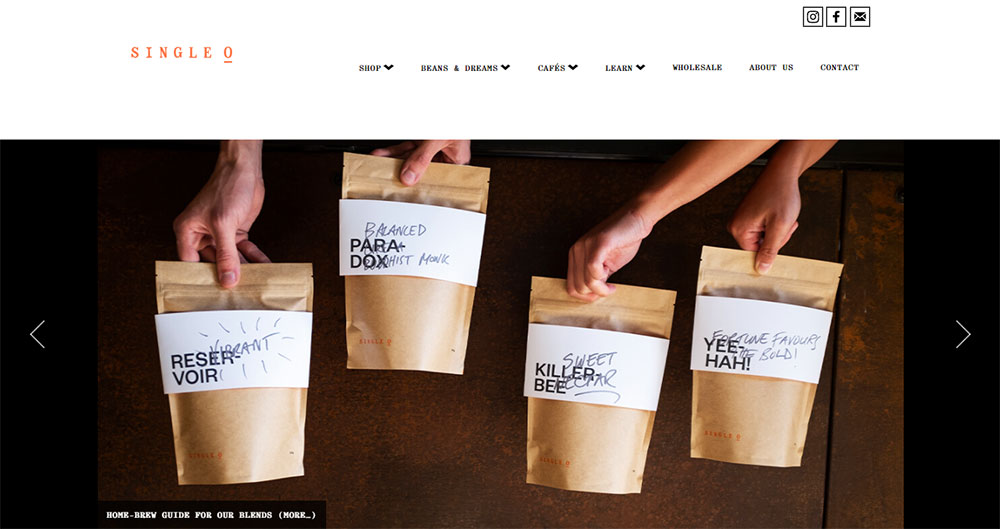
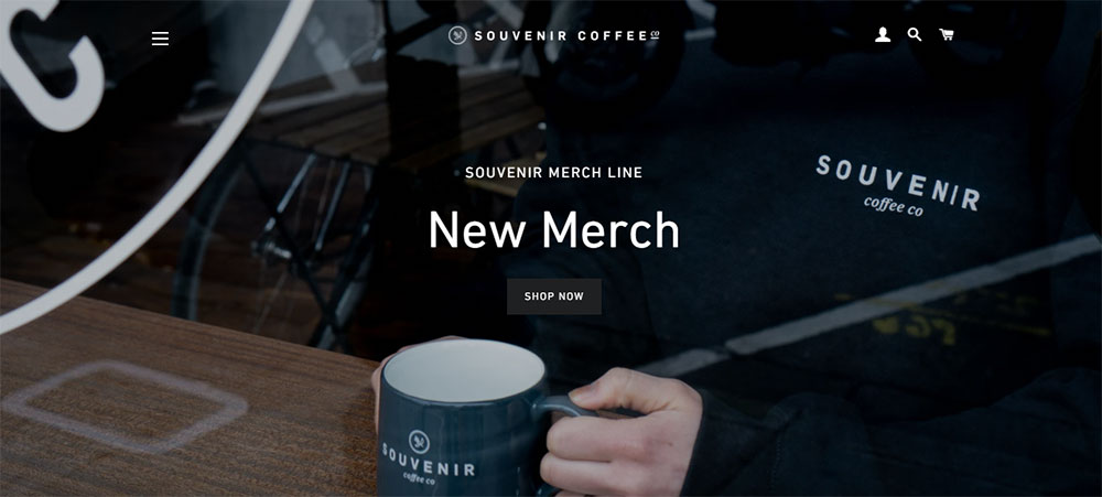
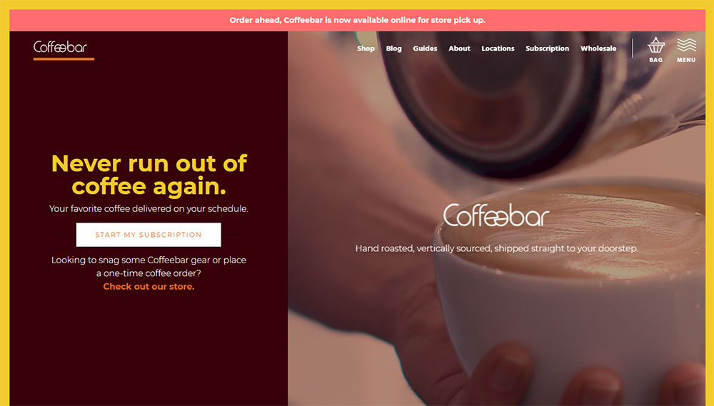
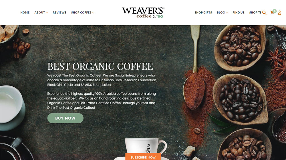
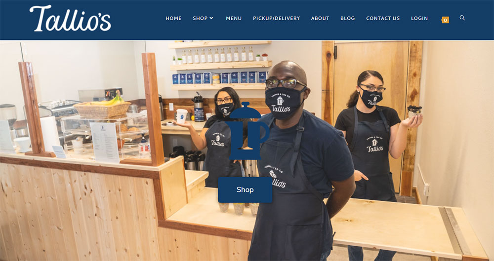
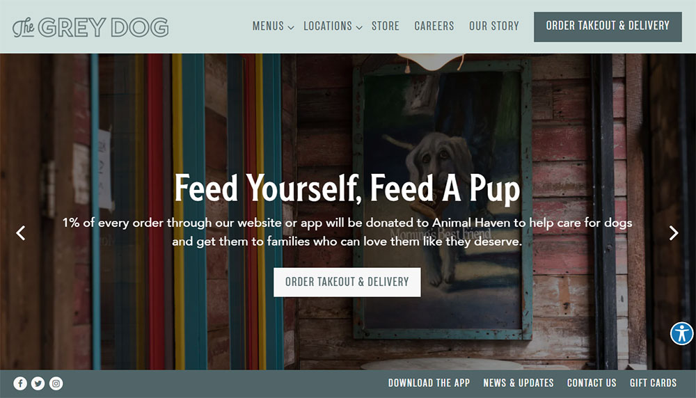
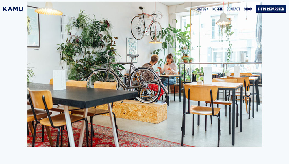
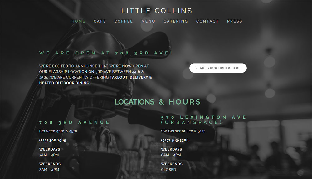
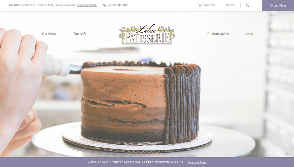
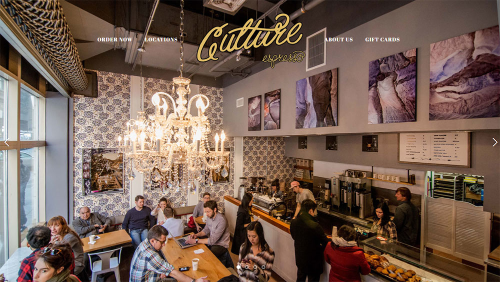
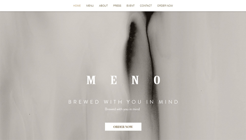
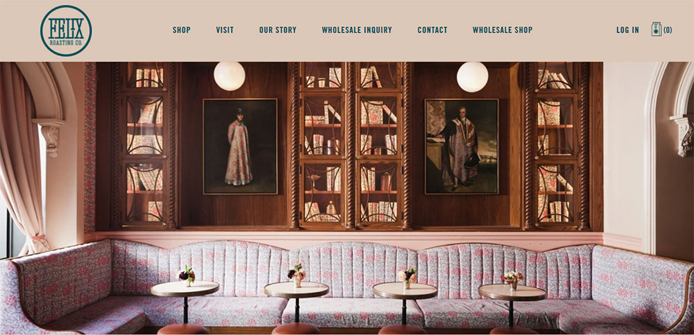
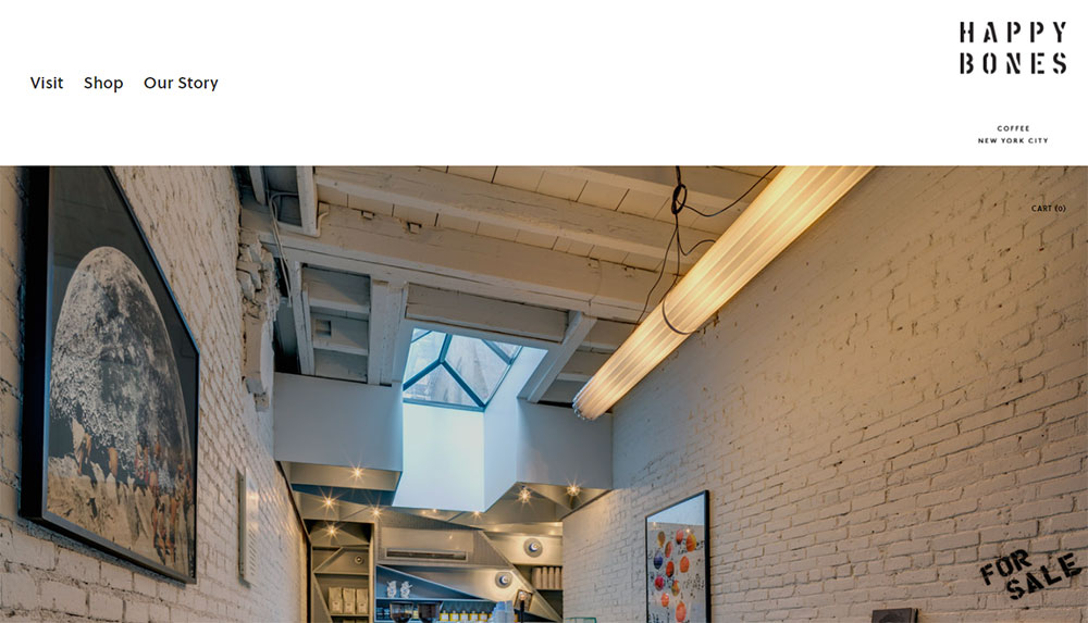
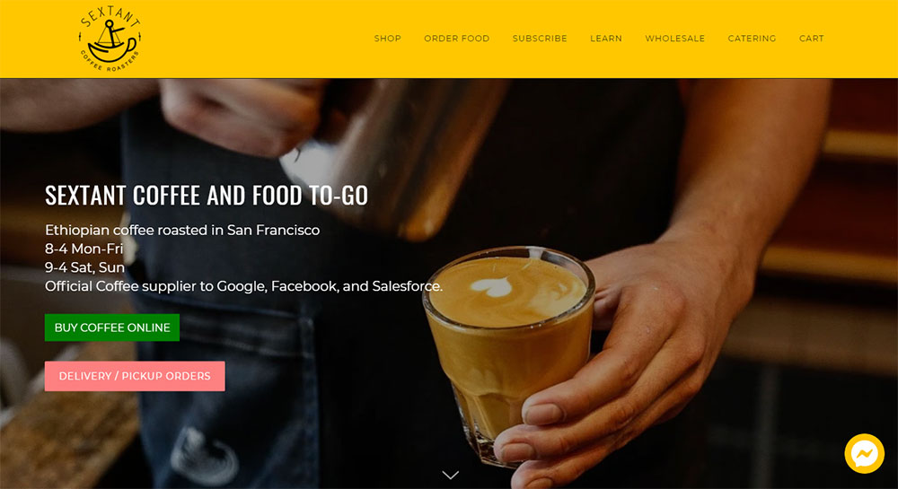
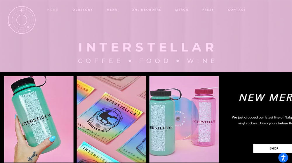
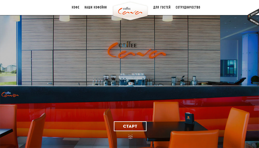
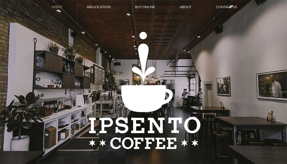
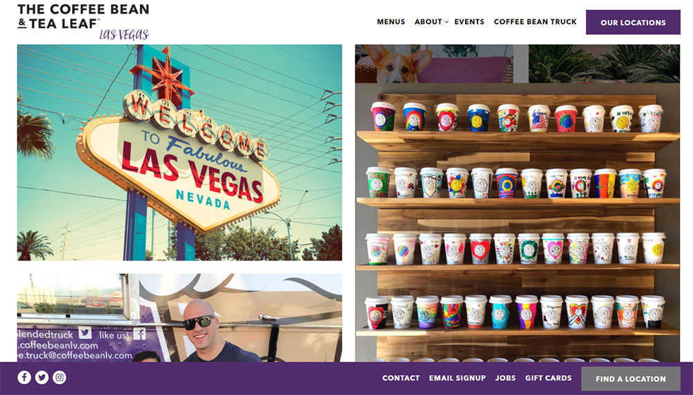
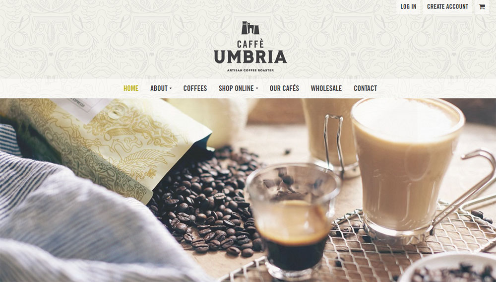
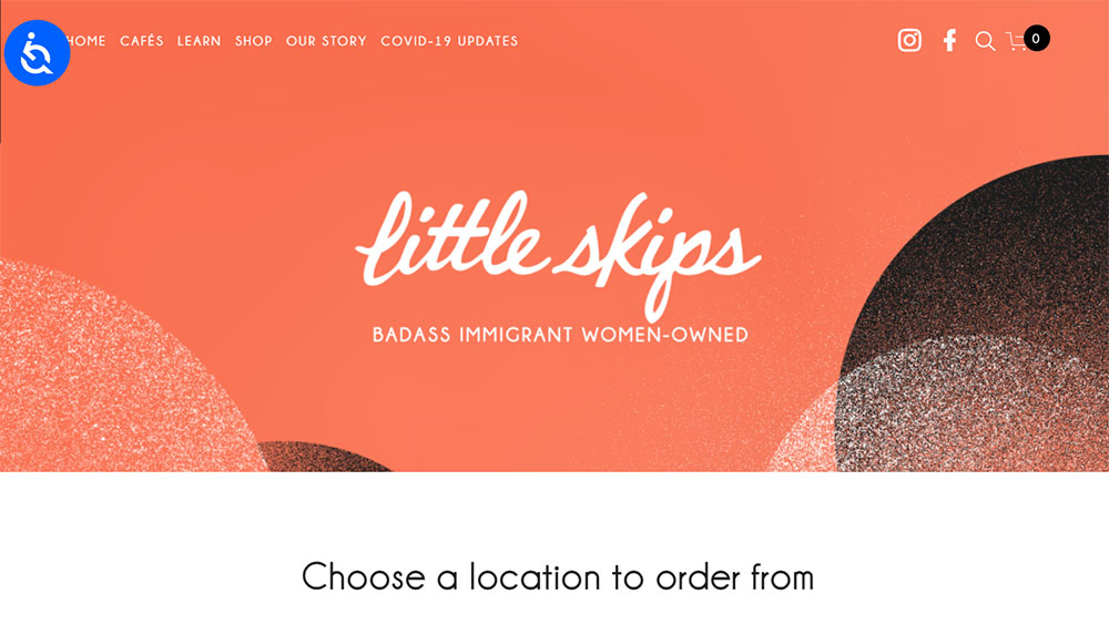
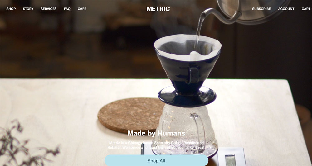
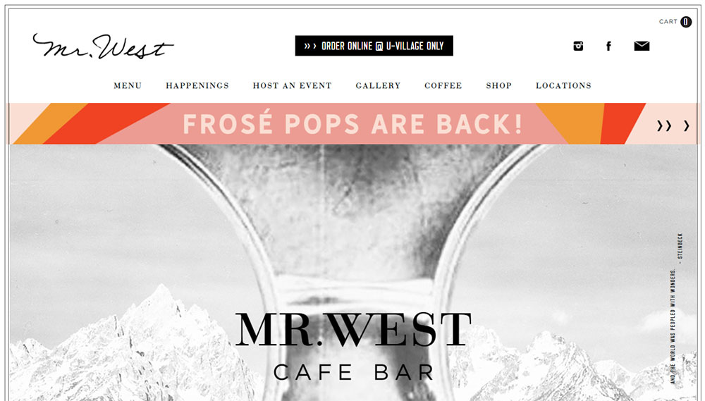
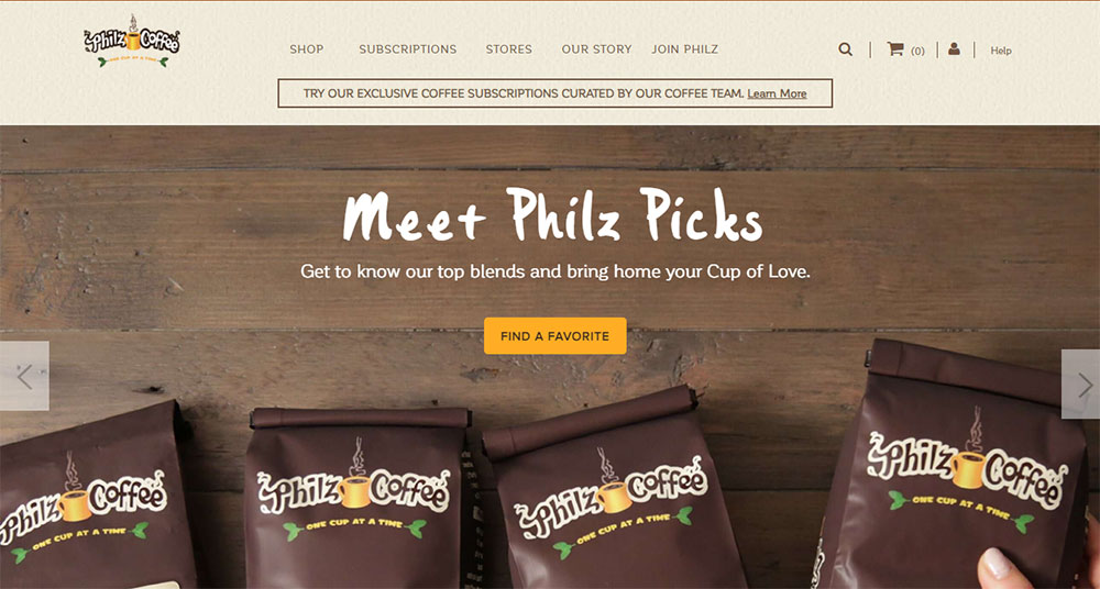
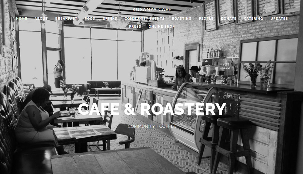
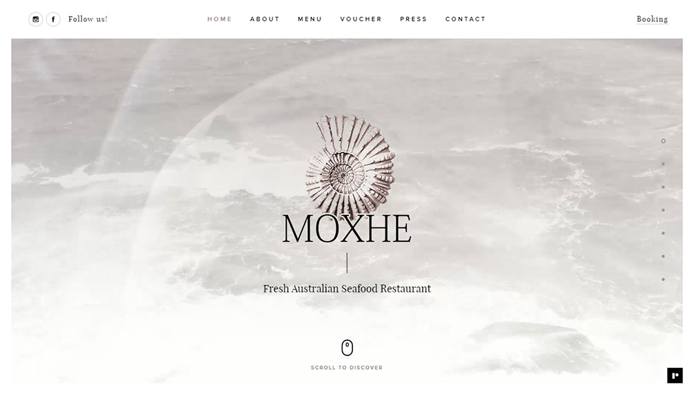
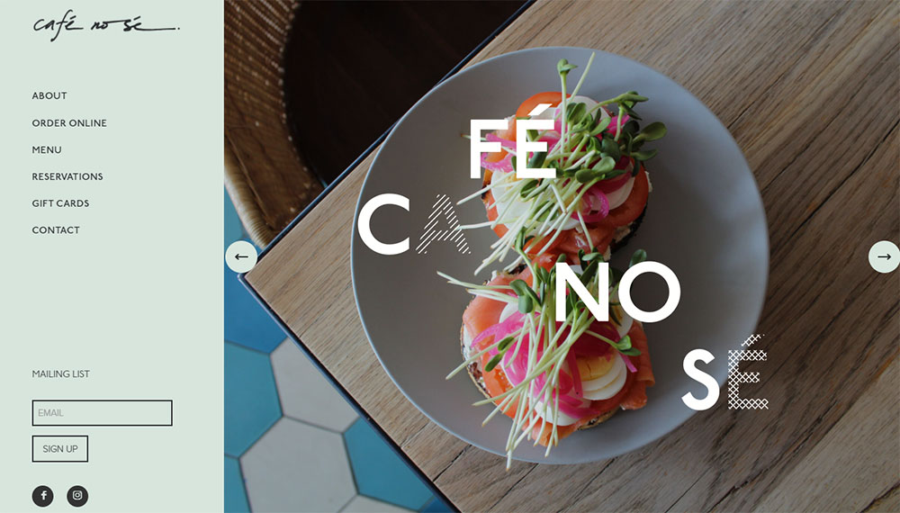
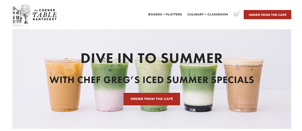
Cafe Website Design Examples
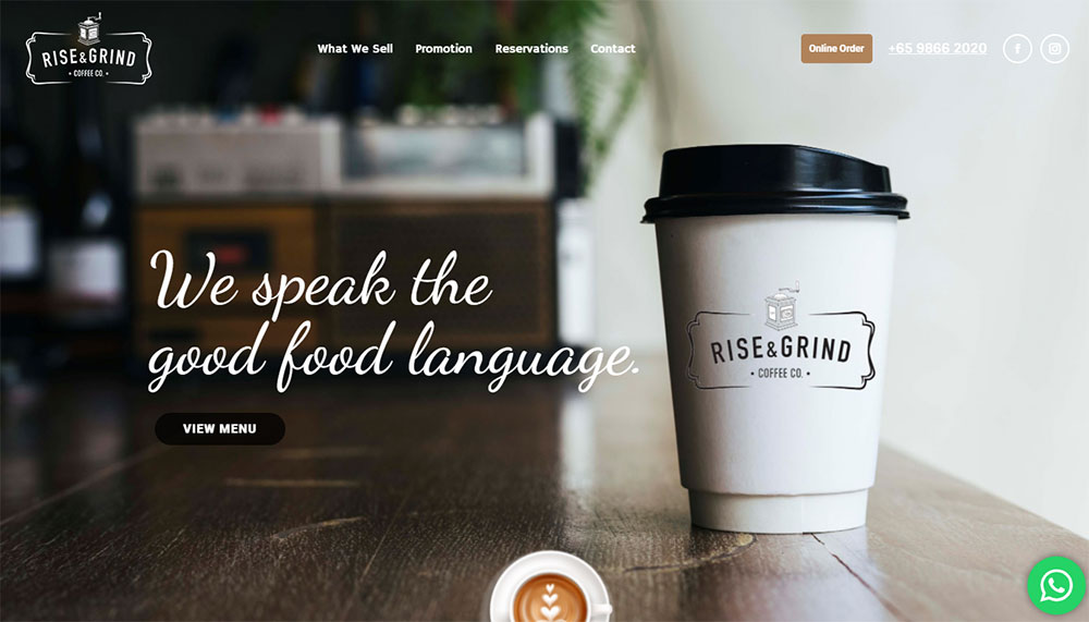
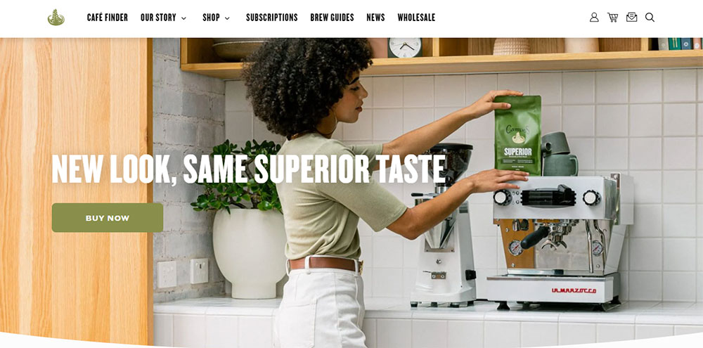
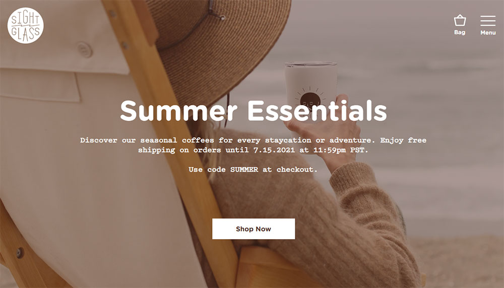
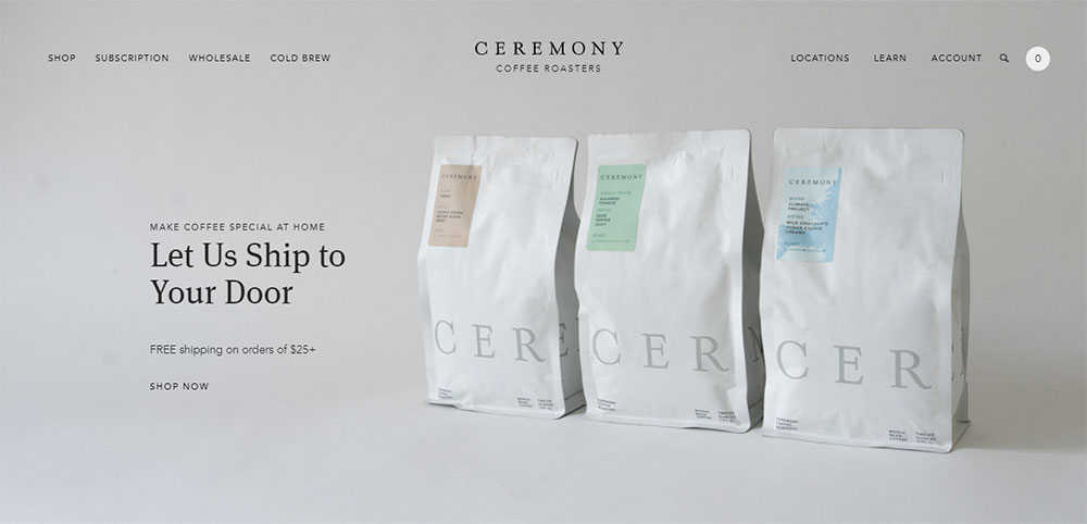
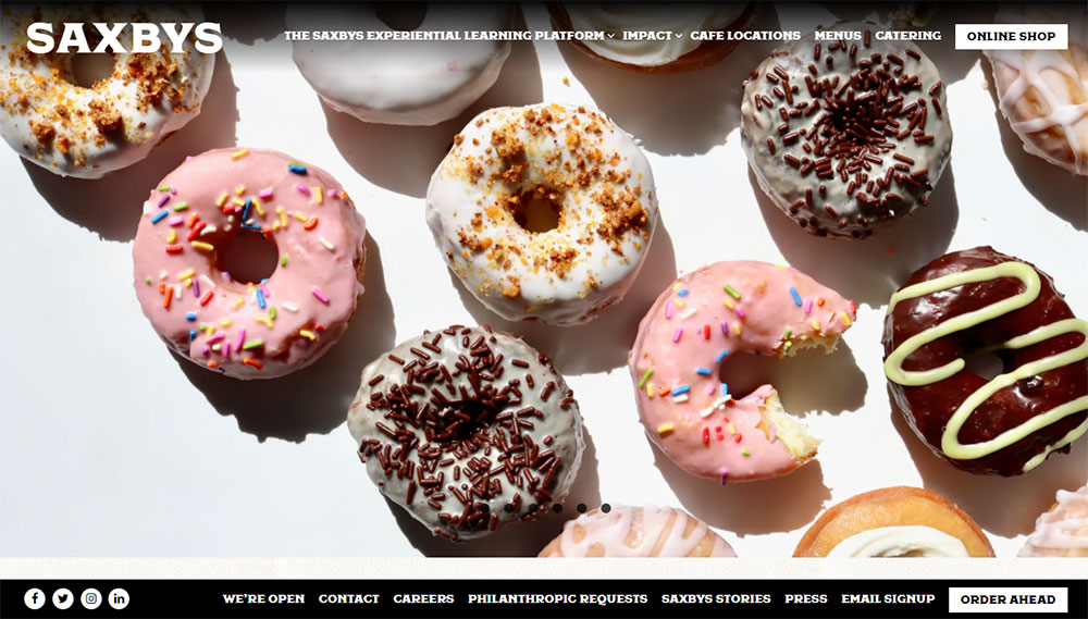
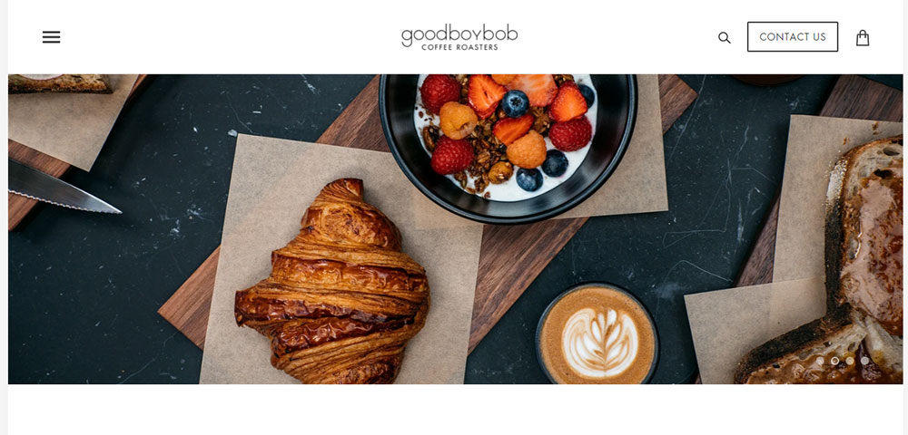
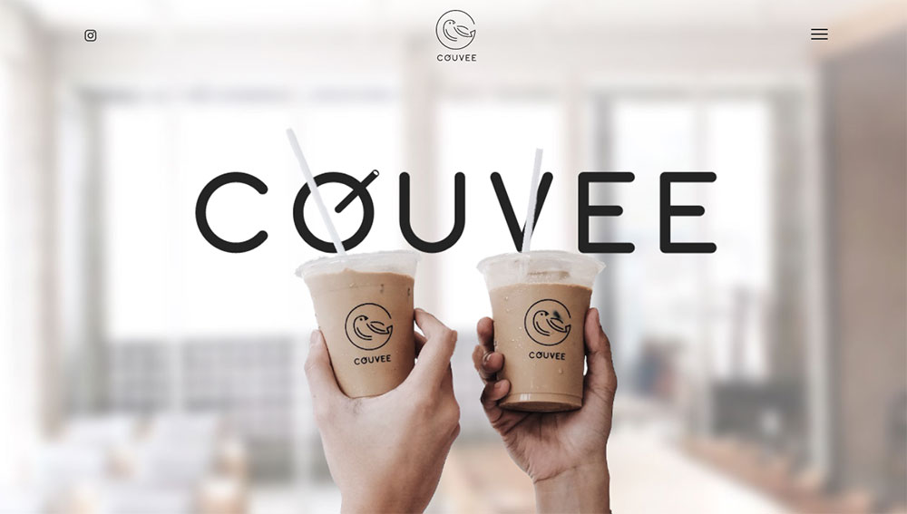
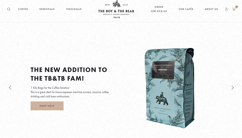
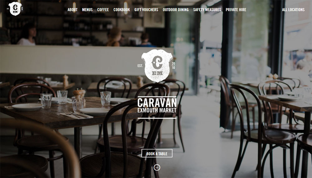
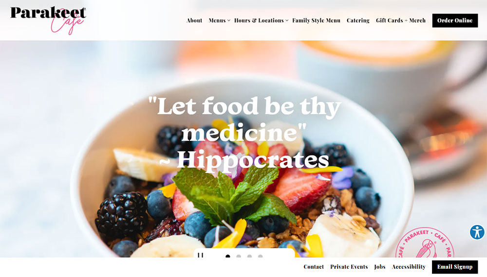
Coffee & Chocolate
How Does a Cafe Website Differ from Other Restaurant Websites
Cafes operate differently than full-service restaurants, and their websites reflect that.
Restaurant sites focus heavily on reservation systems and extensive menus. Cafe sites prioritize quick visits, grab-and-go orders, and atmosphere.
The vibe matters more here. A bistro or patisserie website sells an experience as much as it sells coffee and pastries.
Compare this to food websites for larger restaurants. Those need table management, private dining inquiries, and complex menu hierarchies.
Cafe digital presence stays leaner. Fewer pages, faster load times, stronger visual impact.
Similar patterns appear in bakery websites and ice cream websites, which share the same quick-service DNA.
What Design Elements Define Successful Cafe Websites
Four elements separate forgettable cafe sites from ones that actually drive foot traffic: color, type, photography, and navigation.
Color Palettes Used in Cafe Websites
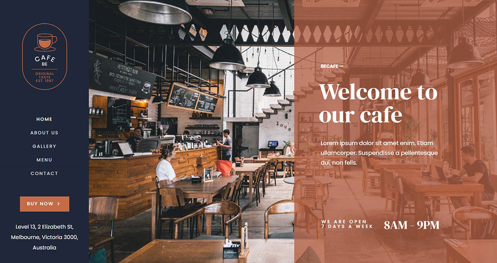
Warm earth tones dominate. Browns, creams, terracotta, and muted greens signal comfort and quality.
Understanding color theory helps here. Darker roasts pair with deeper palettes; light roast specialty shops lean brighter.
A solid color scheme creates instant brand recognition across web and physical space.
Typography Choices for Cafe Branding
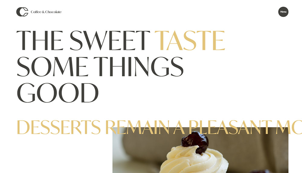
Script fonts for logos, clean sans-serifs for menus. That combination appears constantly.
Good typography makes menus scannable at a glance. Customers decide what to order before they reach the counter.
Study websites with good typography in the hospitality space for proven combinations.
Photography Styles in Cafe Web Design
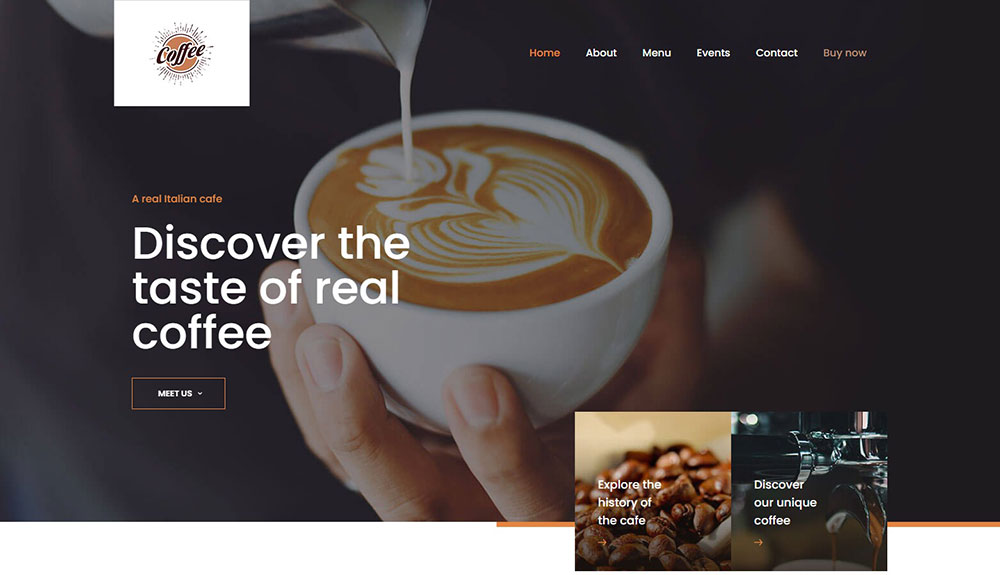
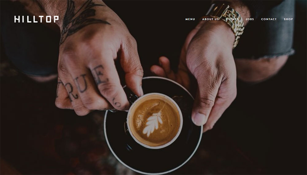
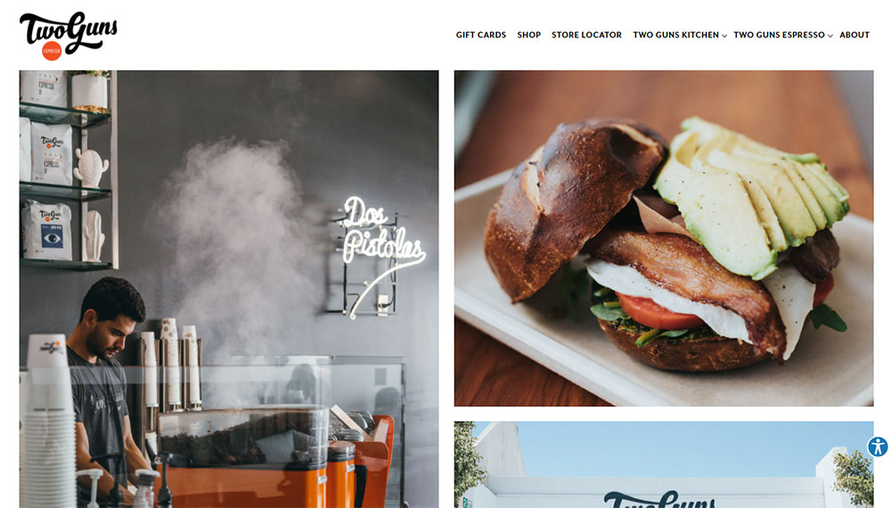
Lifestyle shots outperform product-only images. Show hands holding cups, steam rising, customers laughing.
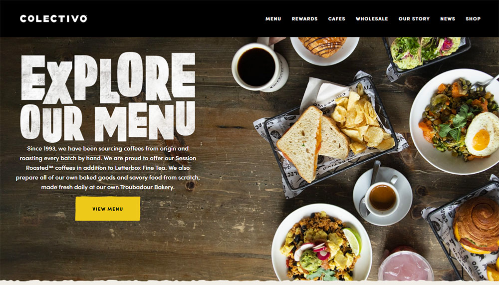
Food photography quality directly impacts perceived quality of the actual product. Blurry phone shots kill credibility.
Natural lighting, shallow depth of field, and consistent editing create cohesive gallery pages.
Navigation Patterns for Cafe Sites
Three to five menu items maximum. Menu, About, Location, Order, Contact.
Check website navigation examples from successful coffee brands. They all share this simplicity.
Mobile-friendly sticky headers work best. Customers browse on phones while walking to your location.
Best Cafe Website Design Examples
These real-world examples demonstrate effective approaches across different cafe types and brand positions.
Blue Bottle Coffee
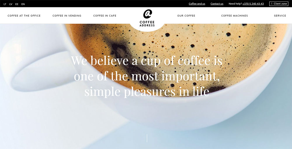
Clean, minimalist website approach. Massive product photography with minimal text.
The hero section rotates seasonal offerings. Subscription model gets prominent placement.
Intelligentsia Coffee
Educational focus sets them apart. Origin stories, brewing guides, roaster profiles.
Navigation splits between shopping and learning. Works for specialty coffee audiences who research before buying.
Stumptown Coffee Roasters
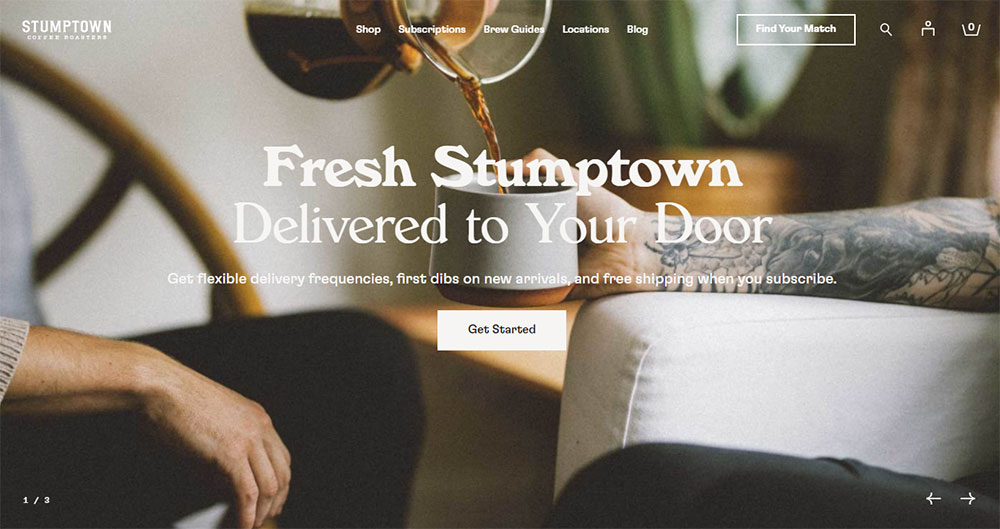
Bold typography, vintage-inspired aesthetic. Location pages include neighborhood context.
E-commerce integration feels natural, not forced. Wholesale inquiry forms are easy to find.
Counter Culture Coffee
Training and education front and center. B2B and B2C audiences served from one homepage.
Subscription options dominate the call to action buttons.
Verve Coffee Roasters
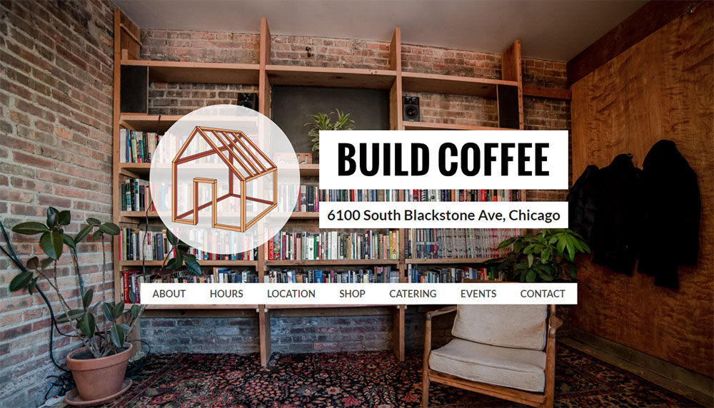
California lifestyle photography throughout. Location pages show actual cafe interiors.
Mobile experience mirrors desktop perfectly. Responsive design done right.
What Features Do Cafe Websites Include
Beyond aesthetics, cafe sites need functional components that serve customer needs and business operations.
Online Menu Display Options
PDF menus are outdated. HTML menus with clear categories, prices, and dietary tags perform better.
Update seasonally without calling a developer. Content management through WordPress or Squarespace makes this simple.
Reservation and Booking Systems
Most cafes skip this entirely. First-come seating fits the casual model.
Exceptions: brunch spots and tea rooms with limited capacity. OpenTable or built-in form design handles these cases.
Location Maps and Contact Information
Google Maps embeds are standard. Include parking notes, transit directions, and accessibility info.
Business hours need prominence. Nothing frustrates customers more than arriving at a closed door.
Social Media Integration Methods
Instagram feeds embedded on homepages show current activity. Pinterest boards work for aesthetic-focused brands.
Keep social links in the footer. They matter, but not more than your core pages.
Online Ordering Capabilities
Toast POS and Square POS integrations handle most needs. Third-party delivery through DoorDash and Uber Eats requires separate setup.
Direct ordering saves commission fees. Make that option more visible than aggregator links.
How to Choose a Website Platform for a Cafe
Platform choice depends on budget, technical skill, and growth plans. No single answer fits every coffee shop.
Squarespace for Cafe Websites
Best for design-focused owners who want beautiful websites without coding. Templates built specifically for restaurants and cafes.
Monthly cost: $16-49. Includes hosting, SSL, and basic e-commerce.
Limitations: less flexibility for custom features; third-party integrations sometimes clunky.
WordPress for Cafe Websites
Powers 40% of the web for good reason. Unlimited customization through themes and plugins.
Starter cost: $100-500 for theme, hosting, and basic setup. Ongoing maintenance required.
Elementor and similar page builders make visual editing possible. Check web design tools for current options.
Wix for Cafe Websites
Drag-and-drop simplicity. Good for owners who update content themselves.
Restaurant-specific features include website menu builders and online ordering integration.
Monthly cost: $17-35. Less scalable than WordPress for multi-location operations.
Custom Development Options
Makes sense for cafe chains or brands with complex needs. Webflow sits between templates and full custom.
Budget: $5,000-50,000+ depending on features. Hire agencies with hospitality portfolio experience.
Overkill for single-location independent cafes.
What Design Mistakes Do Cafe Websites Make
These errors appear constantly. Avoid them and you're already ahead of most competitors.
Slow-loading images. Uncompressed food photography kills mobile performance. Compress everything under 200KB.
Hidden contact information. Phone number and address belong in the header or footer on every page. Not buried three clicks deep.
Outdated menus. Nothing worse than showing up for a seasonal item that disappeared six months ago. Update quarterly at minimum.
Missing business hours. Include holiday schedules. Specify if hours differ by location.
Poor mobile experience. Over 60% of cafe searches happen on phones. Test every page on actual devices.
Auto-playing music or video. Startles users; drains data. Just don't.
No clear call to action. Every page needs direction. Order online, visit us, view menu, sign up.
Study examples of bad design to recognize patterns. Then look at sites with good UX for contrast.
How Much Does a Cafe Website Cost
Costs vary wildly based on approach and ambition. Here's the realistic breakdown.
DIY Template Route
- Platform subscription: $150-600/year
- Domain name: $12-20/year
- Stock photography: $0-200
- Your time: 10-40 hours
Total: $200-800 for a functional site you build yourself.
Freelancer or Small Agency
- Design and development: $1,500-5,000
- Professional photography: $500-2,000
- Copywriting: $300-800
- Ongoing maintenance: $50-200/month
Total: $2,500-8,000 for a polished, professional website.
Full Agency Build
- Strategy and branding: $2,000-10,000
- Custom design and development: $5,000-25,000
- Content creation: $1,000-5,000
- SEO setup: $500-2,000
Total: $10,000-40,000+ for enterprise-level cafe chains or flagship locations.
Most independent cafes land in the $2,000-5,000 range. That gets you custom design, professional photos, and a site that actually converts visitors.
Use a website checklist before launch to catch issues early. Review web design principles to evaluate agency proposals.
Cheaper isn't always better. A $500 site that looks amateur costs more in lost customers than a $3,000 site that builds trust.
FAQ on Cafe Website Design
What platform is best for building a cafe website?
Squarespace works best for design-focused owners wanting quick setup. WordPress offers more flexibility for custom features. Wix suits beginners who update content themselves. Budget and technical comfort determine the right choice.
How much does a cafe website cost to build?
DIY template sites cost $200-800. Freelancer builds run $2,500-8,000 including photography. Full agency projects reach $10,000-40,000 for cafe chains. Most independent coffee shops spend $2,000-5,000 for professional results.
What pages should a cafe website include?
Five core pages: Homepage, Menu, About, Location, and Contact. Add an online ordering page if you offer takeout. A blog or events page works for cafes hosting community activities.
How important is mobile responsiveness for cafe websites?
Critical. Over 60% of cafe searches happen on phones. Customers check menus and hours while walking. A mobile first design approach ensures your site works perfectly on every device.
What colors work best for coffee shop website design?
Warm earth tones dominate: browns, creams, terracotta, muted greens. These colors signal comfort and quality. Darker palettes suit traditional roasters; brighter schemes work for specialty and third-wave coffee brands.
Should a cafe website have online ordering?
Yes, if you offer takeout or delivery. Toast POS and Square integrate directly with most platforms. Direct ordering saves commission fees compared to DoorDash or Uber Eats aggregator links.
What makes cafe websites different from restaurant websites?
Cafes prioritize quick visits and atmosphere over reservations. Fewer pages, faster load times, stronger visual impact. Full-service restaurant sites need table management and complex menu hierarchies that cafes skip entirely.
How often should a cafe update its website?
Update menus seasonally at minimum. Refresh photography annually. Check business hours before holidays. Review the entire site quarterly for outdated information, broken links, and slow-loading images.
Do cafe websites need professional photography?
Strongly recommended. Quality food photography directly impacts perceived product quality. Budget $500-2,000 for a professional shoot. Lifestyle shots showing customers and atmosphere outperform product-only images.
What are the biggest cafe website design mistakes?
Hidden contact information, outdated menus, slow-loading images, and poor mobile experience top the list. Auto-playing media and missing business hours also frustrate visitors. Test your site on actual phones before launch.
Conclusion
These cafe website design examples prove one thing: your digital presence shapes customer perception before they taste a single drop of coffee.
The best coffee shop websites share common traits. Strong brand identity, responsive layout, clear business hours display, and frictionless user experience.
Pick a website builder platform that matches your skill level. Squarespace for simplicity, WordPress for flexibility, Wix for quick updates.
Invest in quality food photography. It pays for itself.
Start with the fundamentals: homepage design, mobile friendly layout, and accurate location information with Google Maps integration.
Your artisan cafe deserves a website that reflects the care you put into every cup. Build it right, and customers will find you.

