How to Fix the “ERR_SSL_VERSION_OR_CIPHER_MISMATCH” Error
July 5, 2019
An Awesome List of Trippy Websites You Should Check Out
November 26, 2019Autumn took some time to come this year. However, now that the cold is back, the best way to relax is with a cup of coffee. Coffee has had a lot of popularity in our history, and now we can find a coffee shop almost on any street.
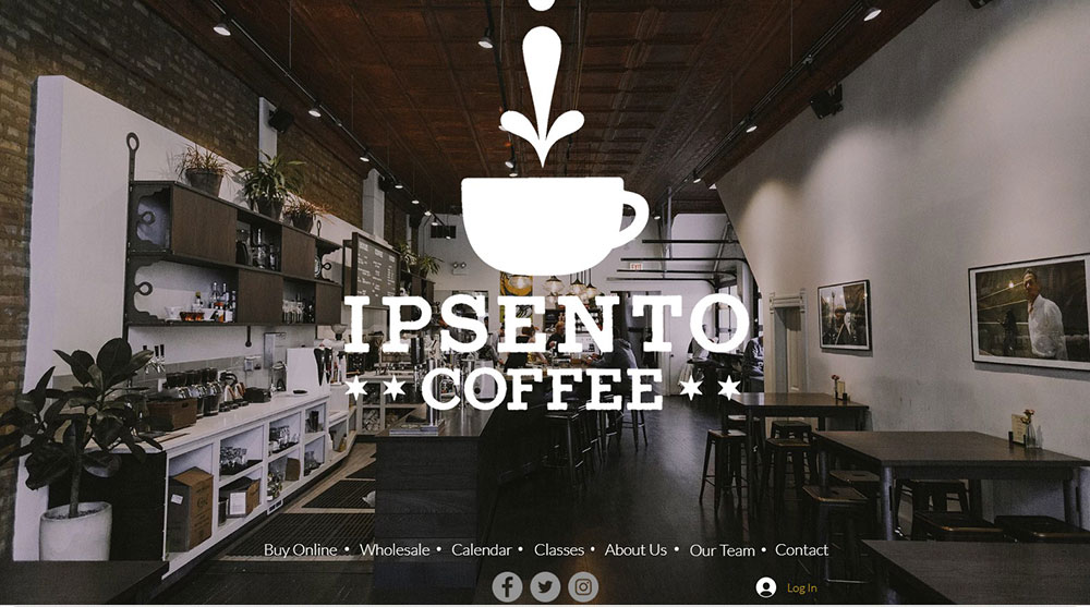
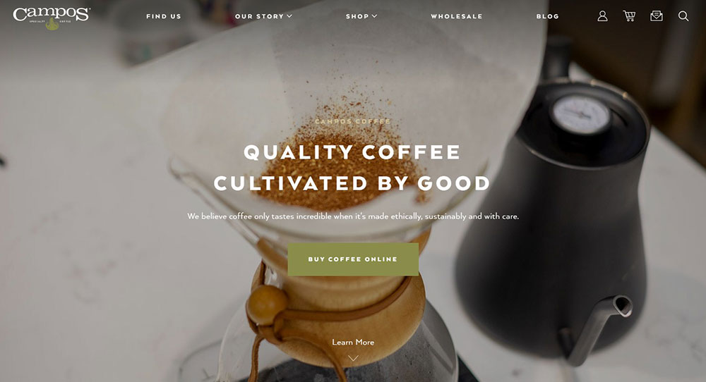
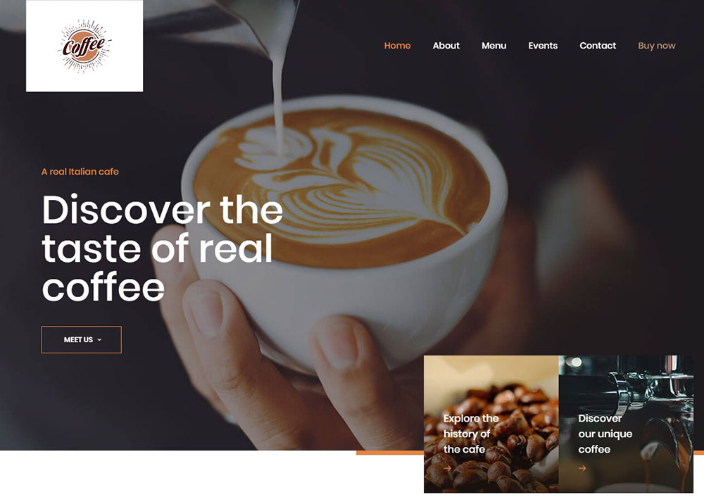
One of the best ways to check which are the ones you should visit is through coffee websites. What you’ll notice is that most of them are done in a minimalist style and show only the essential information coupled with well-chosen, appealing imagery.
If you’re designing a coffee website and need some inspiration, we can help you out. Check out the following coffee websites that are sure to energize you. Also, drink a coffee while you are doing it!
Ingenious Coffee Websites
The coffee industry is quite a huge one! The online presence of coffee shops and brands is significant, and it is quite diverse. Across the board, you can find everything from simple layouts with unique typography to complex grid layouts that are packed with visuals.
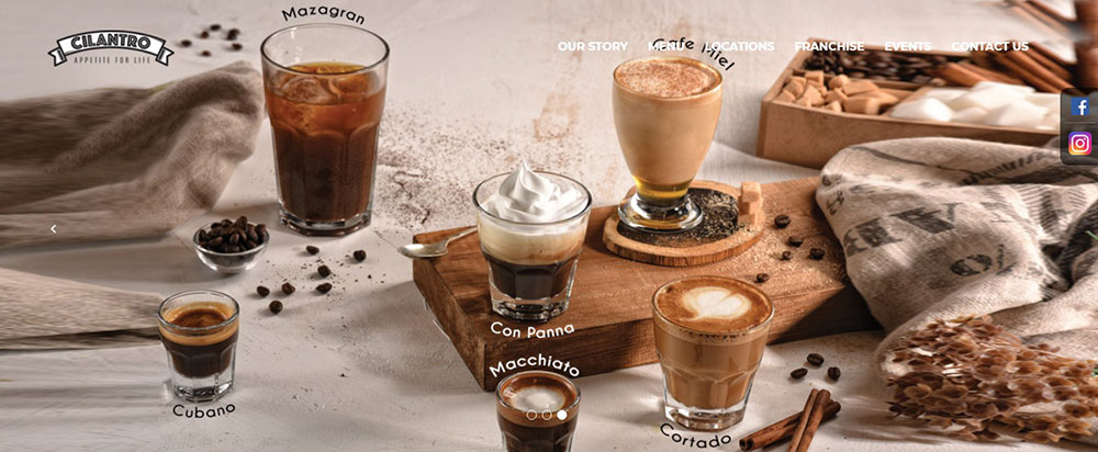
If you are wondering how coffee websites normally look and what they have in common, the answer is simple. They show their passion for coffee. Usually, visuals are the main focus together with creative typography that emphasizes the unique characteristics of the coffee on sale.
In this article, we’re going to take a closer look at coffee websites to see their features and attraction points.
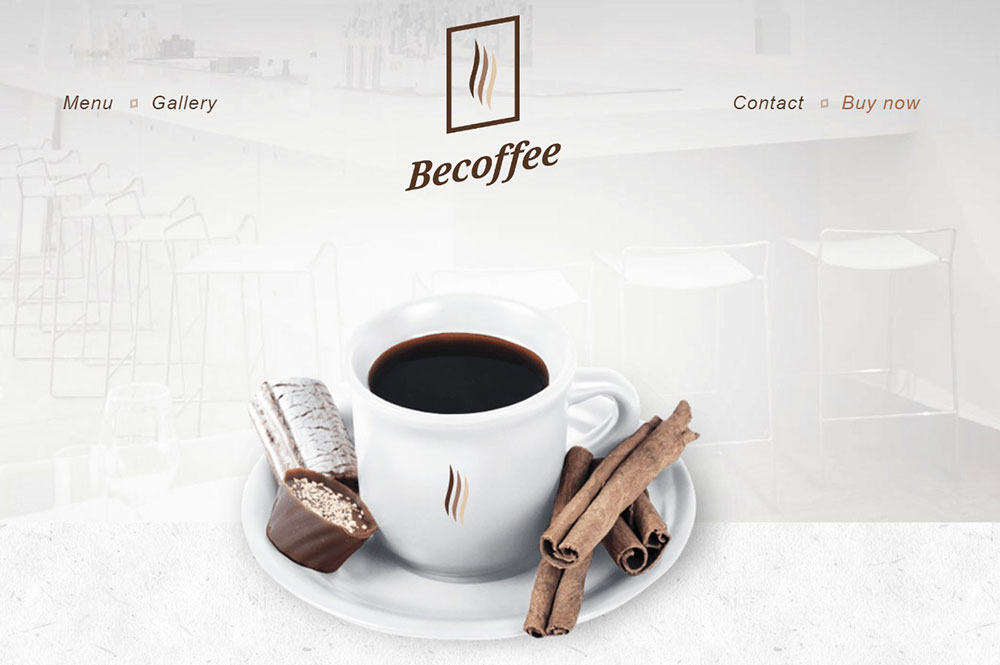
But before we do that, we need to consider how we would personally imagine coffee websites. Probably the first thing that we would think about is that the site should include coffee beans, coffee machines, and so on. Natural, earthy colors should also be present that blend in with cups and otherimagery that is commonly associated with coffee.
Another important aspect of coffee websites is the way the descriptions are used. As each one more or less sells a different kind of coffee, the way words are put around them is essential. Besides that, necessary information like source of beans and roasting methods are also needed. Adding details about aroma, finish, acidity, and so on might help as well.
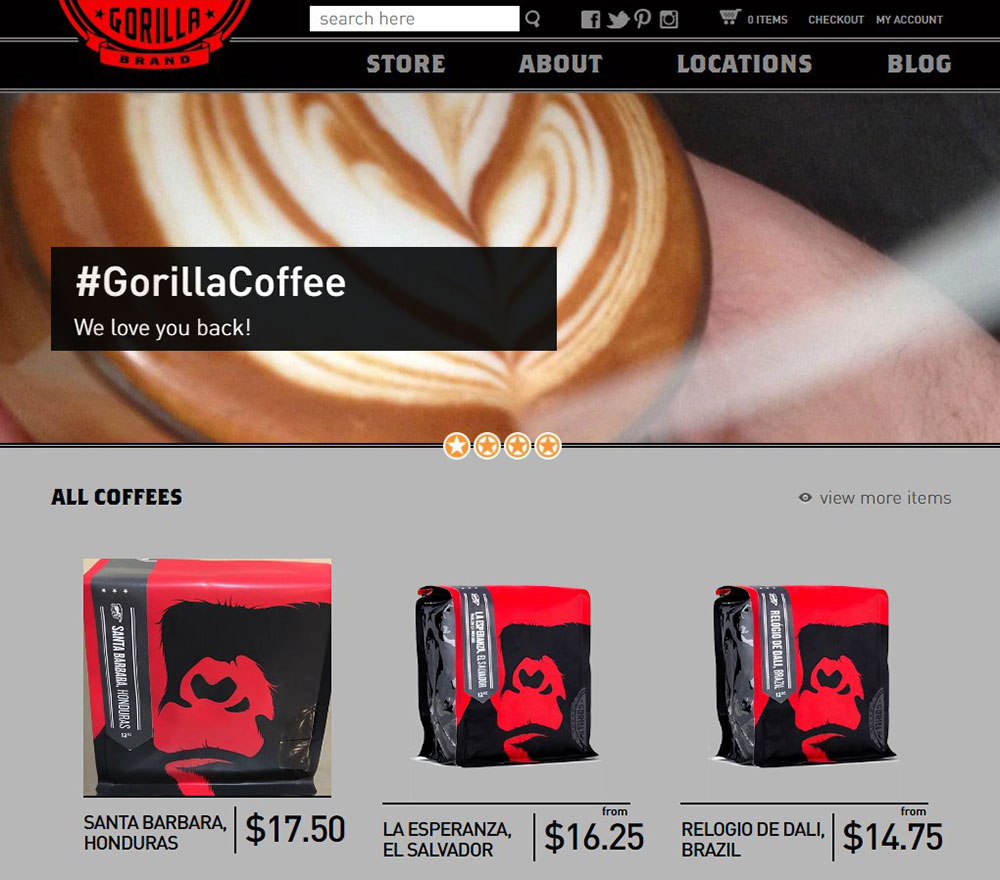
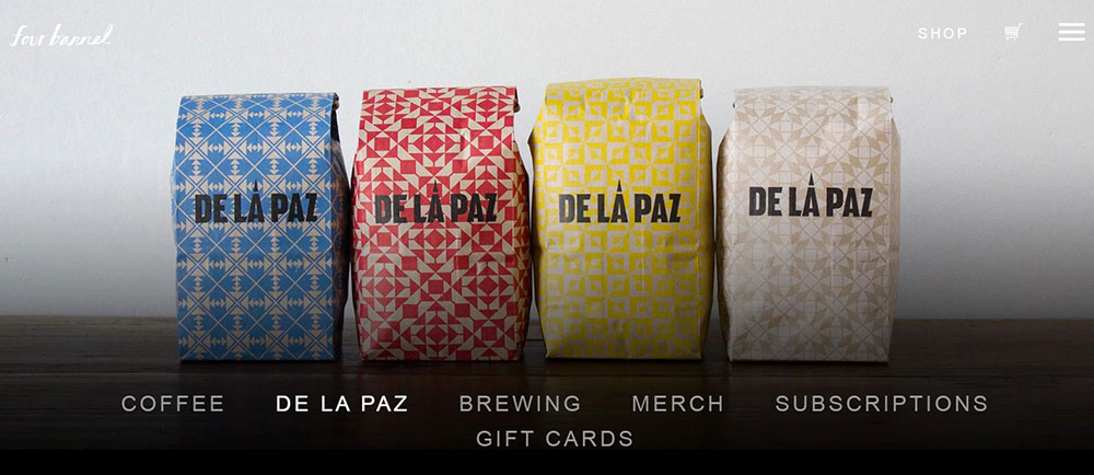
Showing pictures with the packaging of the coffee or with the actual shop is essential. By doing so, you make sure that possible clients will take the shop as an option in their minds. This should be done quite often, especially on social channels.
A good idea here is that a couple of times per month, specific pictures are taken to showcase the vibe and setting of the coffee house or brewery in action. When people see other people enjoying the atmosphere in a coffee shop, they will associate it with an excellent place to go.
Examples of coffee websites that will wow you
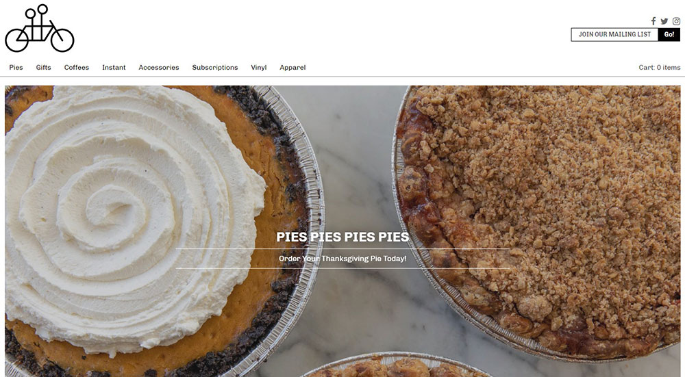
Here are some new coffee websites that we think you should check out. We love their visuals and the typography that they use.
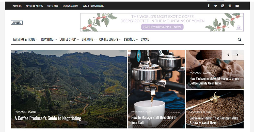
Perfect Daily Grind
In coffee websites, colors play an essential role. This one features two primary colors that are being used. It is quite difficult not to admire the bold and busy appearance of the homepage. It gets your attention quite fast, and the secret is in using the right colors.
Together with a dark-toned pallet and some solid shapes, the urban style is being exposed. Coffee websites can do a great job of showing users that coffee can be enjoyed in a relaxed way, even if you are in a busy city.
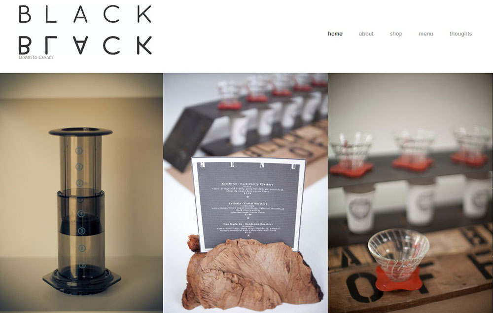
Black Black Coffee
To promote black coffee (no milk, no cream), coffee websites need to be done accordingly for this kind of product. This website has beautiful graphics that make the space look hipster and modern. Notice the emphasis on minimalist web design, which goes with the minimalism of black coffee.
This coffee website belongs to a roaster in Souderton, PA. We can see the use of custom branded images that create a personalized and professional look. And when you go to their Instagram page, for example, you’ll see how a coffee shop does social media the right way.
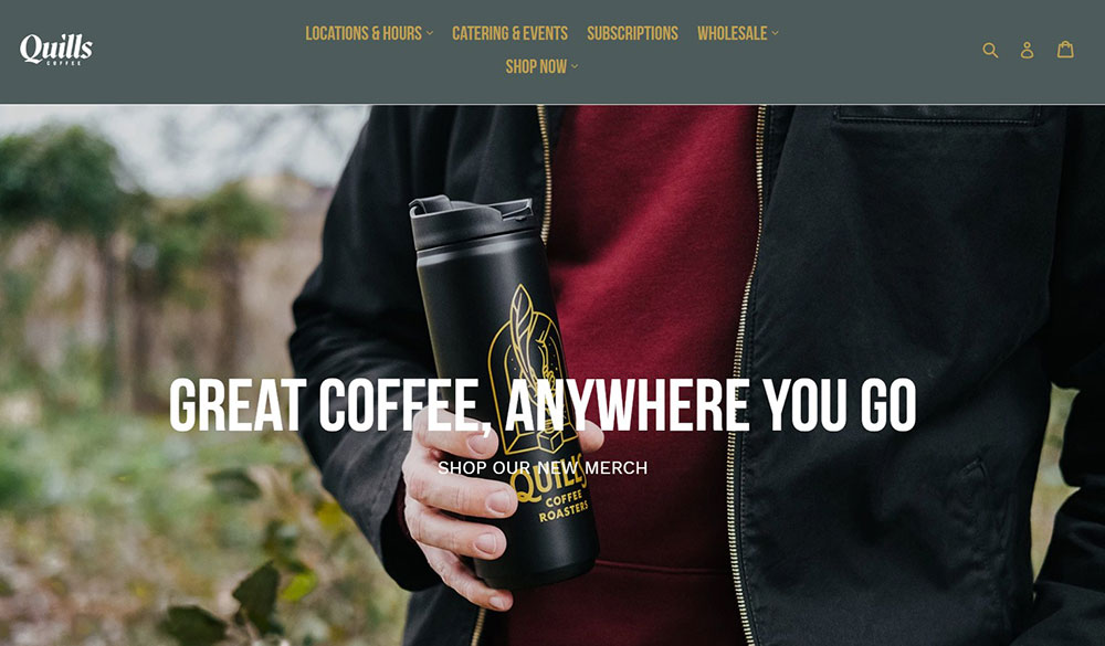
QuillsCoffee
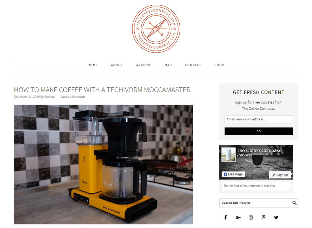
This coffee blog is run by a team of craft coffee connoisseurs whose mission it is to find the best coffee shops around. Even though it’s not a coffee shop website, and they’re not selling any products, you will get a good idea of a minimalist coffee site design with all the right basic elements.
Dunkin’ Donuts Coffee
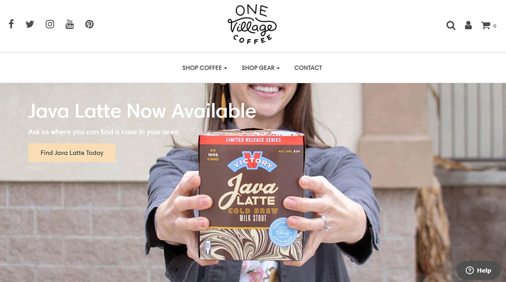
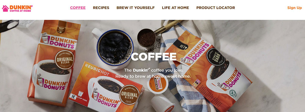
No matter what your website is about, if you do a bright and breezy web page, it is going to be very appealing. Colors that don't seem to go well with coffee-themed sites can indeed work with some careful designing. Coffee websites like this one are an excellent example of how you can achieve that.
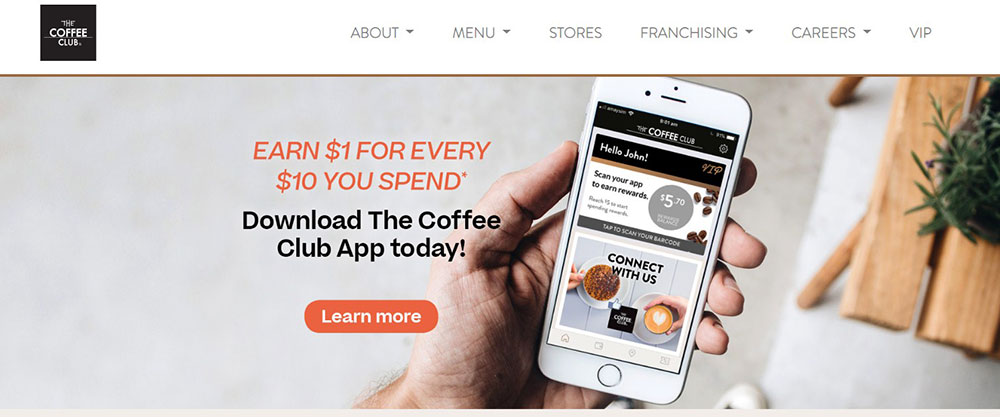
CoffeeClub
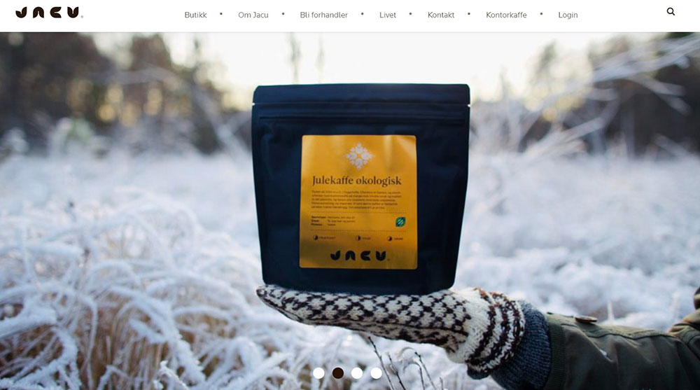
Jacuis a Norwegian coffee roastery that will show you how to design your coffee site so well, it doesn’t even matter if you understand the language or not. With its great use of images, visitors know exactly what they’re about.
Wrapping up these inspirational coffee websites
Coffee websites will become more and more popular (and more and more well-designed) as this industry grows. To be able to compete on a level playing field with other coffee sites, yours will need to have all the right elements in all the right places.
It can be quite a challenge to do that, especially if it is your first time building a coffee website. Hopefully, with this list of awesome coffee websites, your job will be that much easier.
If you enjoyed reading this article on coffee websites, you should check out this one about best startup websites.
We also wrote about a few related subjects like list of trippy websites best interactive websites, time wasting websites to avoid burnout, the best political campaign websites, best restaurant websites, best agency websites, the coolest black websites, the best relaxing websites and the best weird websites.

