Veterinarian Website Design Examples That Look Great
September 13, 2025
Coaching Website Design Examples That Attract Clients
September 17, 2025Your website loses patients before they ever call.
77% of people research healthcare providers online before booking an appointment. That first impression happens in seconds, and outdated medical practice websites send potential patients straight to competitors.
The best doctor website design examples combine clinical credibility with patient-focused user experience. They build trust, simplify appointment scheduling, and convert visitors into loyal patients.
This guide breaks down what separates high-performing physician websites from forgettable ones. You'll see real healthcare web design inspiration across specialties, learn the technical requirements for HIPAA compliance, and understand which design elements actually drive patient acquisition.
What is Doctor Website Design
Doctor website design is the process of creating digital platforms that communicate medical expertise, build patient trust, and facilitate healthcare interactions.
Professional physician websites combine clinical credibility with patient-focused navigation.
The design serves three primary functions: patient acquisition, online appointment scheduling, and medical information delivery.
Unlike generic business sites, medical practice websites require HIPAA compliance, accessibility standards, and trust-building elements that reassure patients before their first visit.
Why Doctor Website Design Matters for Medical Practices
Patient trust begins before the first appointment.
A 2024 PatientPop study found 77% of patients research healthcare providers online before booking. Your website acts as the digital front door to your practice.
Poor design choices cost practices money. Slow load times, confusing website navigation, and missing contact information drive potential patients to competitors.
Medical websites with clear call to action buttons convert 3x more visitors into booked appointments.
Doctor Website Design Examples
Boka Boka
Be Dentist 4
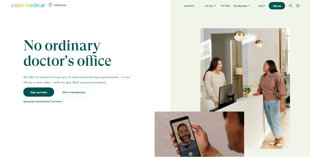
One Medical
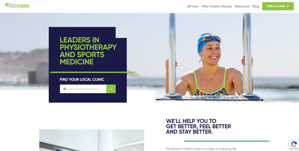
Lifecare
Be Pscychologist 3
Skin Clinics
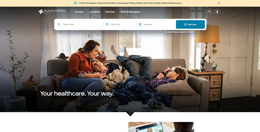
Baylor Scott And White
Be Psychologist 2
25th - Save a Child’s Heart
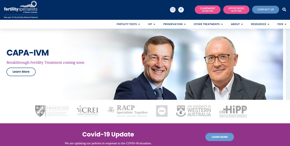
Fertility Specialists of WA
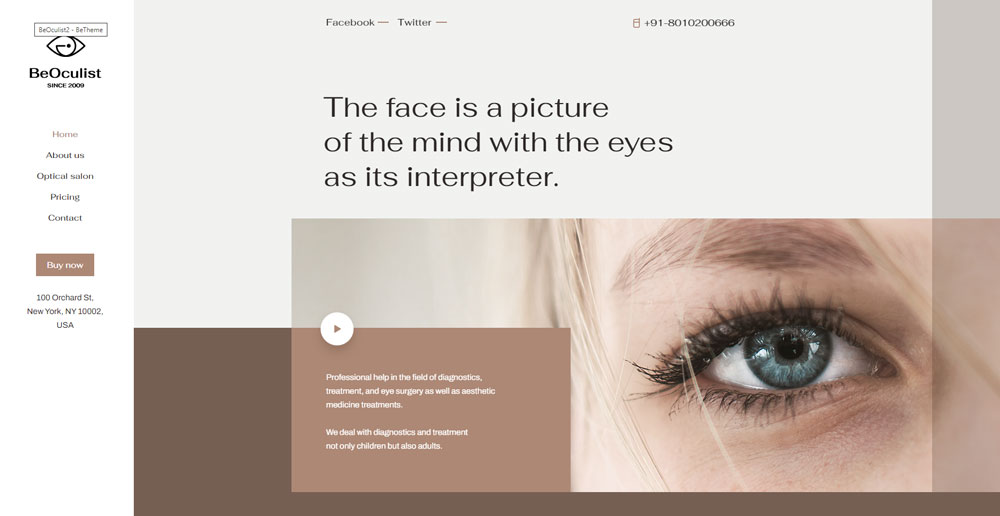
Be Oculist 2
Adventist HealthCare
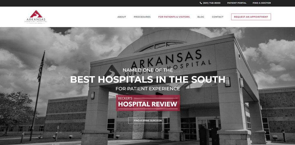
Arkansas Surgical Hospital
Be Dentist 3
Zocdoc
Alto
Be Healthy
Mississauga Foot Clinic
TrueCare
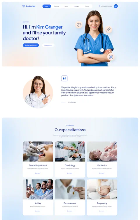
Be Clinic 2
UT Southwestern Medical Center
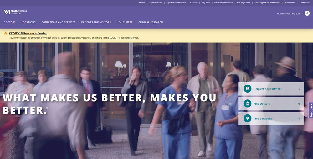
Northwestern Medicine
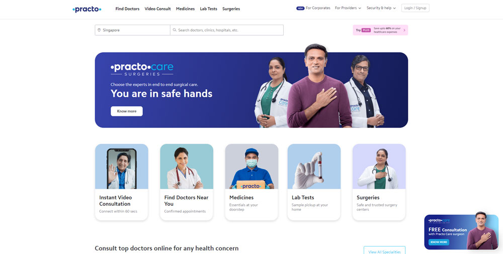
Practo
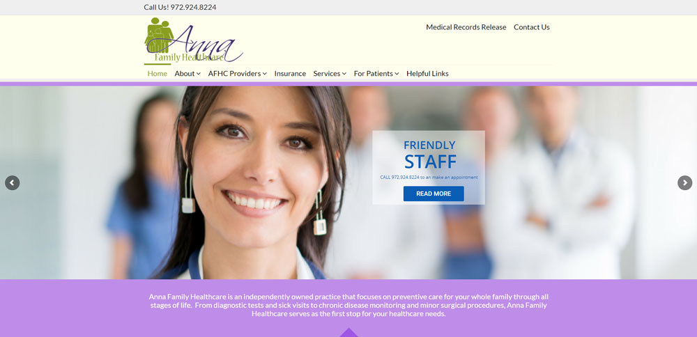
Anna Family Healthcare
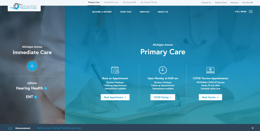
Michigan Avenue Primary Care
Gritman Medical Center
Blue Water Dental
Doctor Croteau / Plastic Surgeon
This is a nice-looking doctor website featuring the work of a plastic surgeon in Quebec.
Institute of Dermatologists
Qazi Cosmetic Clinic
Olathe Health
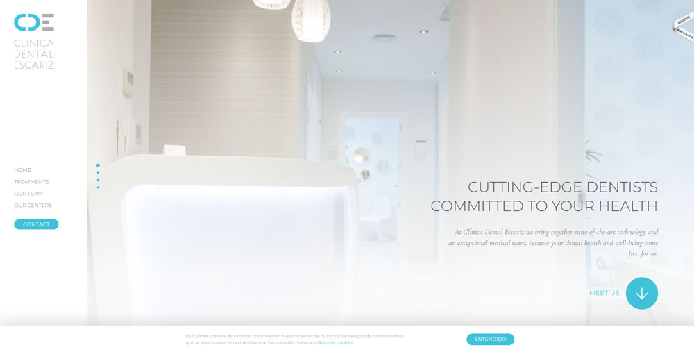
Clinica Dental Escariz
Rush
Italian Doctors
Die Ordi
THE Downtown Sports Clinics
New York Group for Plastic Surgery
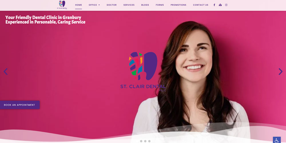
St. Clair Dental
Mercy Health
Weston Davis Equine Surgery
Pinnacle Health Care
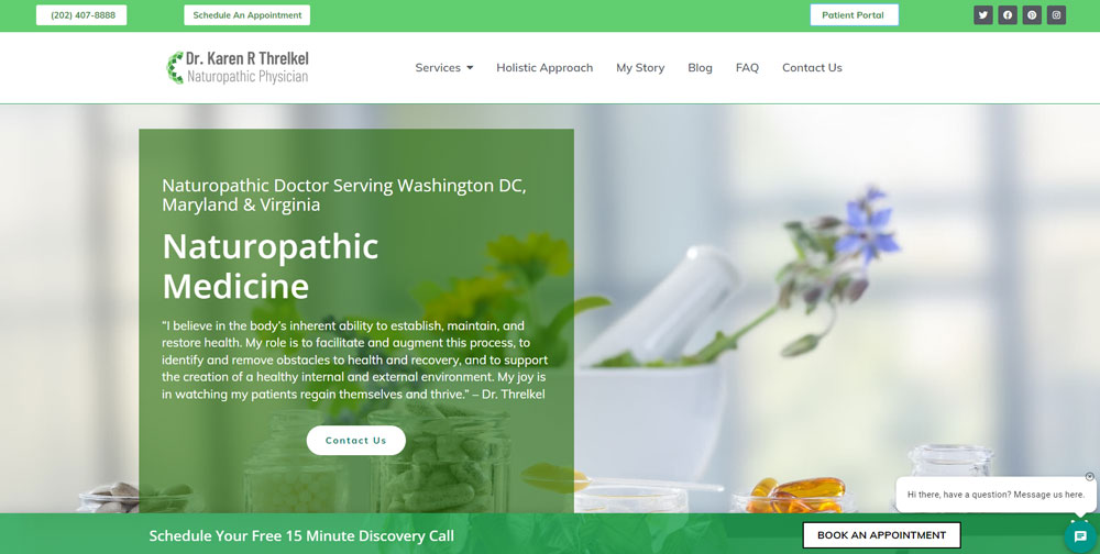
Karen Threlkel
Doctor Romeu | Psicologos BCN
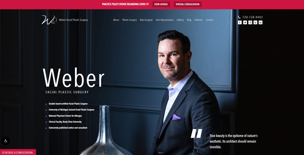
Weber Facial Plastic Surgery
Nudge Psychology
Comprehensive Healthcare Medical
Slowpokes
OCOS Oralchirurgisches Centrum Osnabrück
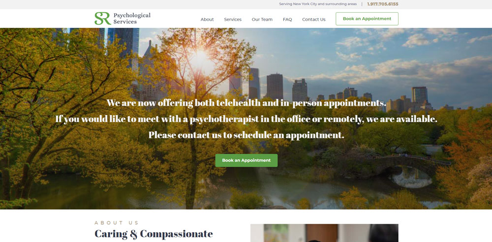
SR Psychological Services
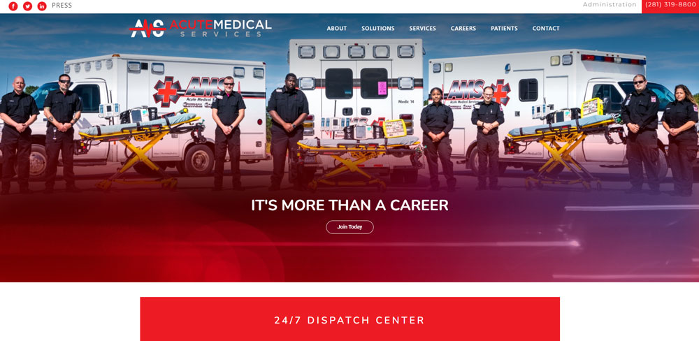
Acute Medical Services
Integrated Podiatry Clinic
Types of Doctor Website Designs
Medical practices require different website approaches based on specialty, patient demographics, and practice size.
Single Practitioner Websites
Solo physician websites focus on personal branding and direct patient relationships. The doctor's credentials, philosophy, and approachability take center stage.
Multi-Physician Practice Websites
Group practice sites require provider directories, specialty filtering, and departmental organization. Patients need to find the right doctor quickly.
Clear website menu structures help visitors navigate between departments, locations, and individual physician profiles.
Specialist Medical Websites
Dermatologists need before/after galleries. Cardiologists need heart health resources. Orthopedic surgeons need procedure animations.
Each specialty demands unique design elements. A plastic surgery website looks nothing like a family medicine site.
Telemedicine-Focused Websites
Virtual care platforms prioritize video consultation booking, secure messaging integration, and HIPAA-compliant patient portals.
These sites borrow design patterns from SaaS websites while maintaining medical credibility.
Core Design Elements for Doctor Websites
Every effective medical website shares common structural components that build trust and drive conversions.
Header and Navigation Components
Medical website headers require clear hierarchy.
Logo placement, phone number visibility, and appointment buttons compete for attention. The most effective doctor websites place appointment scheduling above the fold.
Research from WebMD shows 63% of patients want online booking options visible immediately.
Hero Section Requirements
First impressions happen in 0.05 seconds.
Doctor website hero sections need professional imagery, practice value proposition, and immediate call-to-action.
Stock photos of smiling doctors underperform authentic team photography. Real faces build real trust.
Provider Profile Pages
Patients research individual physicians before booking.
Each doctor page needs:
- Professional headshot
- Board certifications and credentials
- Specialty focus areas
- Education and training history
- Patient reviews and ratings
Think of these pages as digital portfolio pieces that showcase each physician's expertise.
Service Pages
Medical service pages require clear descriptions without excessive jargon.
Include procedure information, expected outcomes, recovery timelines, and insurance details. Patients want to know what happens before they call.
Patient Portal Integration
Secure login areas for medical records access, lab results, and prescription refills reduce administrative calls by 40%.
Patient portals built with good UX principles keep patients engaged between visits.
Contact and Location Information
Google found that 46% of searches have local intent.
Medical practices need address, phone, hours, and embedded maps on every page. Not just the contact page.
Mobile users expect click-to-call functionality and one-tap directions.
Design Considerations by Medical Specialty
Different medical fields demand different design approaches. A pediatrician's site shouldn't look like an oncologist's.
Primary Care Website Design
Family medicine sites emphasize accessibility and comprehensive care.
Design focus: appointment ease, insurance acceptance lists, and full-service offerings. These sites work best with warm color schemes that feel welcoming.
Dental Practice Website Design
The best dentist websites feature smile galleries, treatment visualizations, and financing options prominently.
Before/after photography drives conversions more than any other element.
Cosmetic Surgery Website Design
High-quality imagery is non-negotiable.
Surgeon credentials, procedure galleries, and consultation booking dominate effective cosmetic sites. Many borrow visual approaches from luxury websites to position procedures as premium services.
Pediatric Practice Website Design
Children's healthcare websites need friendly aesthetics, parent-focused content, and vaccination scheduling tools.
Bright colors work here. Playful illustrations reduce anxiety for both kids and parents.
Mental Health Practice Website Design
Therapy and psychiatry websites prioritize confidentiality messaging, calming aesthetics, and easy intake processes.
The best therapist websites use calm color palettes and minimalistic design to reduce visitor anxiety.
No flashy animations. No aggressive popups. Just quiet professionalism.
Technical Requirements for Medical Websites
Healthcare websites face stricter technical requirements than most industries.
HIPAA Compliance Considerations
Any website handling patient information requires encryption, secure form design, and compliant hosting.
Contact forms that collect health information need SSL certificates and proper data handling protocols. Non-compliance risks fines up to $50,000 per violation.
Mobile Responsiveness
58% of healthcare searches happen on mobile devices.
Medical sites must function perfectly on smartphones. Responsive design isn't optional; it's required.
Test every page on multiple devices before launch.
Page Speed Optimization
Google penalizes slow websites. Medical sites should load in under 3 seconds on mobile connections.
Compress images, minimize code, enable caching. Every second of delay reduces conversions by 7%.
Accessibility Standards
ADA compliance protects practices from lawsuits and serves patients with disabilities.
WCAG 2.1 guidelines apply to all medical websites. Accessible websites include alt text, keyboard navigation, and screen reader compatibility.
Accessibility isn't charity. It's good business and legal protection.
Patient Trust Signals in Doctor Website Design
Patients make decisions based on perceived credibility. Your website must prove expertise before they'll book.
Credentials and Certifications Display
Board certifications, hospital affiliations, and medical society memberships build instant credibility.
Display these prominently on provider pages and the homepage. Logos work better than text lists.
Patient Reviews Integration
Third-party review platforms like Google, Healthgrades, and Vitals provide social proof more effectively than self-hosted testimonials.
A well-designed testimonial page showcases verified patient experiences. Embed real reviews; don't fabricate quotes.
Before/After Galleries
For procedural specialties, documented results demonstrate competence better than written claims.
Dermatology, plastic surgery, and dental sites need extensive photo galleries. Consistent lighting and angles matter.
Awards and Recognition
Regional and national healthcare awards deserve prominent placement.
"Top Doctor" badges, hospital excellence awards, and specialty recognitions validate your expertise. Place them in the website footer or dedicated recognition section.
Common Doctor Website Design Mistakes
Most medical websites fail for predictable reasons. Avoid these errors.
Outdated Photography
Stock photos from 2010 destroy credibility instantly.
Patients notice dated hairstyles, old equipment, and generic imagery. Invest in professional photography every 2-3 years.
Missing Mobile Optimization
Pinch-to-zoom requirements drive patients away.
Sites that aren't mobile first lose 58% of potential visitors. Test on actual phones, not just browser simulators.
Hidden Contact Information
Phone numbers buried in footers cost appointments.
Every page needs visible contact options. Sticky headers with phone numbers convert better than clean designs that hide essential information.
Excessive Medical Jargon
Patients search in plain language.
"Heart attack symptoms" beats "myocardial infarction presentation." Write content at an 8th-grade reading level. Use clear typography that enhances readability.
Slow Page Load Times
Every second of delay reduces conversions by 7%.
Uncompressed images, bloated plugins, and cheap hosting kill performance. Bad design choices compound into terrible user experience.
How to Choose a Doctor Website Design Approach
Budget, timeline, and technical requirements determine your best path forward.
Budget Considerations
Template-based solutions start at $500. Custom medical websites range from $5,000 to $50,000+.
The difference shows in unique branding, custom patient portal integration, and ongoing support. Professional website design pays for itself through increased patient acquisition.
Timeline Expectations
Template modifications take 2-4 weeks. Custom builds require 3-6 months.
Factor in content creation, photography sessions, and compliance reviews. Rushing launches leads to embarrassing mistakes.
Ongoing Maintenance Requirements
Medical websites need regular updates for security, content freshness, and regulatory compliance.
Budget $100-500 monthly for maintenance. A complete website redesign every 3-5 years keeps your practice competitive.
Visual Design Trends for Medical Websites
Healthcare design evolves alongside broader web trends while maintaining professional standards.
Clean and Minimal Layouts
Minimalist website design dominates modern healthcare.
Generous white space improves readability and creates a sense of clinical cleanliness. Cluttered layouts feel chaotic and unprofessional.
Color Psychology in Healthcare
Blue conveys trust and competence. Green suggests health and growth. White signals cleanliness.
Avoid aggressive reds and oranges on medical sites. Blue websites dominate healthcare for good reason.
Photography Standards
Authentic team photos outperform stock imagery 10 to 1.
Show real staff, real facilities, real patients (with consent). Staged diversity shots feel fake and erode trust.
Modern Interface Elements
Subtle animations, smooth scrolling, and interactive elements engage visitors without overwhelming them.
Medical sites can learn from modern website design trends while maintaining appropriate restraint. No need for parallax scrolling on every page.
Comparing Doctor Website Platforms
Platform choice affects cost, flexibility, and long-term maintenance.
WordPress for Medical Practices
WordPress powers 43% of all websites. Flexible, affordable, widely supported.
Thousands of healthcare themes available. Requires ongoing security updates and plugin management.
Squarespace and Wix Options
Drag-and-drop builders offer speed and simplicity.
Limited customization compared to WordPress. Good for solo practitioners; insufficient for large practices needing custom patient portal integration.
Custom Development
Full control over design, functionality, and integrations.
Highest cost but best results for practices with complex needs. Essential for multi-location healthcare systems and specialty clinics requiring unique features.
Healthcare-Specific Platforms
PatientPop, Tebra, and similar platforms bundle website design with practice management.
Convenient but limiting. Templates look similar across practices; switching platforms means starting over.
Measuring Doctor Website Performance
Data reveals what works and what needs improvement.
Key Metrics to Track
- Appointment booking conversion rate
- Phone call clicks from website
- Page load speed scores
- Mobile vs desktop traffic split
- Bounce rate by page type
- Time on provider profile pages
Google Analytics Setup
Track goal completions for appointment requests, contact form submissions, and phone clicks.
Google Search Console reveals which medical queries drive traffic. Both tools are free and essential.
Conversion Optimization
Test different website layouts, button colors, and form lengths.
Small changes yield measurable results. A/B testing appointment buttons alone can increase bookings 20-30%.
Patient Journey Analysis
Map how visitors move through your site before booking.
Most patients visit 3-5 pages: homepage, provider profile, services, reviews, contact. Optimize these paths for user-friendly navigation.
FAQ on Doctor Website Design
How much does a doctor website design cost?
Template-based medical websites cost $500-2,000. Custom physician website design ranges from $5,000-50,000+ depending on features like patient portal integration, online appointment scheduling, and HIPAA-compliant forms.
What pages should a medical practice website include?
Every healthcare website needs a homepage, provider profiles, services pages, patient portal access, contact information, and location details. Specialty practices benefit from before/after galleries and patient testimonial sections featuring verified reviews.
How do I make my doctor website HIPAA compliant?
Use SSL encryption, secure hosting, and compliant contact forms. Any page collecting patient health information requires proper data handling protocols. Work with healthcare-specialized web developers familiar with HIPAA requirements.
What colors work best for medical websites?
Blue conveys trust and professionalism. Green suggests health and wellness. White signals cleanliness. Avoid aggressive reds or oranges. Pediatric practices can use brighter, friendlier palettes than specialty clinics.
How long does it take to build a doctor website?
Template modifications take 2-4 weeks. Custom medical website development requires 3-6 months including content creation, professional photography, compliance reviews, and patient portal integration testing.
Should my medical website have online appointment booking?
Yes. 63% of patients prefer online scheduling over phone calls. Integrated booking systems reduce administrative workload, decrease no-shows through automated reminders, and convert more website visitors into booked appointments.
What makes a good doctor bio page?
Effective physician profiles include professional headshots, board certifications, specialty focus areas, education history, and patient reviews. Personal touches like hobbies or philosophy statements humanize providers and build patient connection.
How important is mobile optimization for medical websites?
Critical. 58% of healthcare searches happen on mobile devices. Sites without responsive design lose over half their potential patients. Test all pages on actual smartphones before launch.
How often should I update my medical practice website?
Review content quarterly. Update provider information immediately when staff changes occur. Plan a complete redesign every 3-5 years. Regular security updates and plugin maintenance should happen monthly.
Can I use stock photos on my doctor website?
Authentic photography outperforms stock images significantly. Patients recognize generic healthcare photos and trust decreases. Invest in professional photography of your actual team, facilities, and equipment every 2-3 years.
Conclusion
These doctor website design examples prove that effective medical websites balance clinical professionalism with genuine patient connection.
The best physician sites share common traits: fast load times, mobile-responsive layouts, clear provider profiles, and frictionless appointment booking.
Your healthcare web presence directly impacts patient acquisition. Every design choice, from color palette to navigation structure, either builds trust or erodes it.
Start with the fundamentals. Prioritize WCAG accessibility compliance, secure HIPAA-compliant forms, and authentic team photography over flashy animations.
Test relentlessly on mobile devices. Track conversion metrics through Google Analytics. Update content quarterly.
A well-designed medical practice website pays for itself through increased bookings, reduced phone calls, and stronger patient relationships. Your digital front door deserves the same care you give your patients.

