

Websites with a Purple Color Palette to Inspire You
August 23, 2025Stunning Writer Website Design Examples to Copy
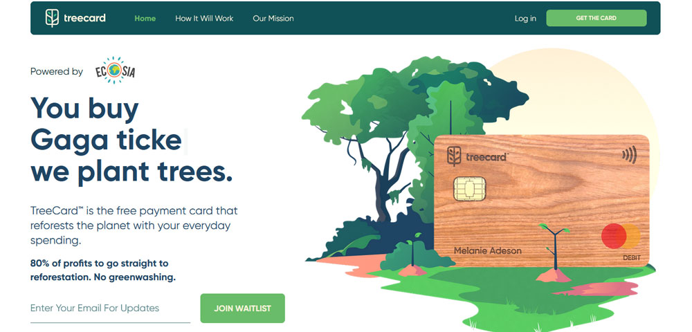
September 4, 2025Green converts. Brands like Spotify, Robinhood, and Whole Foods Market built billion-dollar identities around it.
But picking the wrong shade tanks trust and readability fast.
This collection of website design examples using a green color palette breaks down what actually works across industries.
You'll see specific hex codes, real brand implementations, and the psychology behind each green variation.
We cover dark forest tones for finance, mint shades for tech, emerald for luxury, and everything between.
No generic inspiration dumps. Just actionable examples you can reference when building your next modern website.
What is Green Website Design
Green website design is a visual approach where green serves as the primary or dominant hue in a site's color scheme.
Designers select shades ranging from deep forest tones to soft mint variations based on brand goals and target audience.
You'll find green color palettes across health, finance, sustainability, technology, and food sectors.
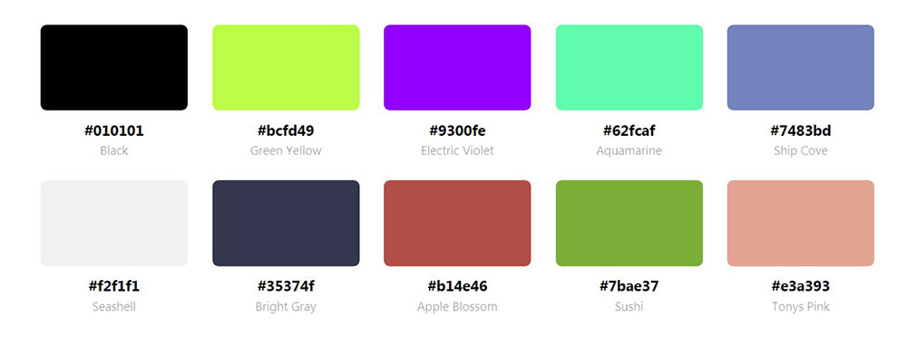
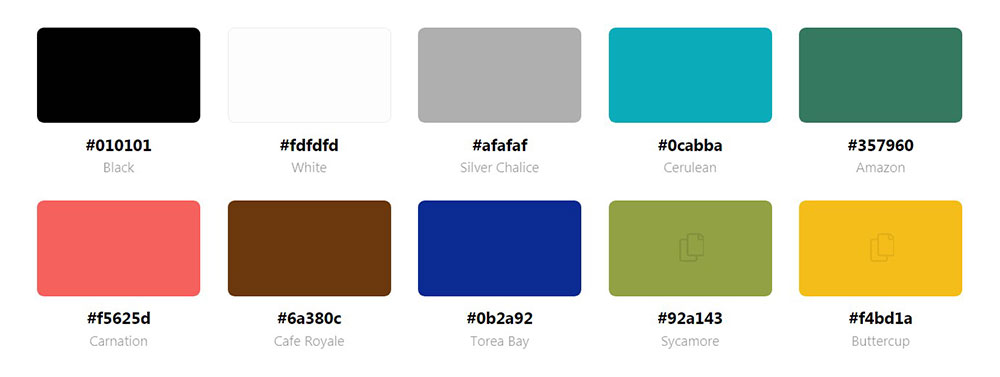
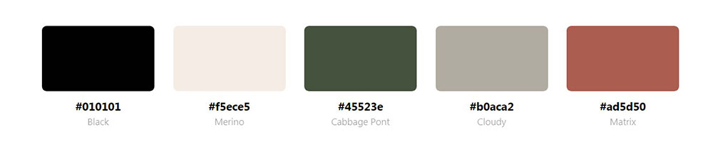
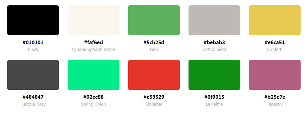
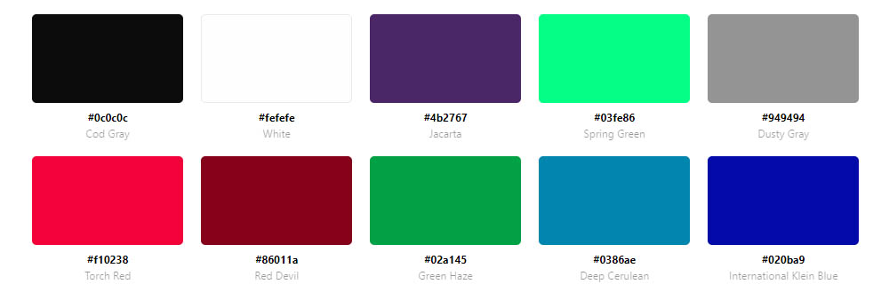
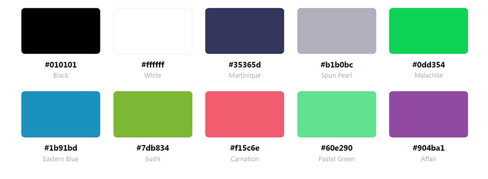
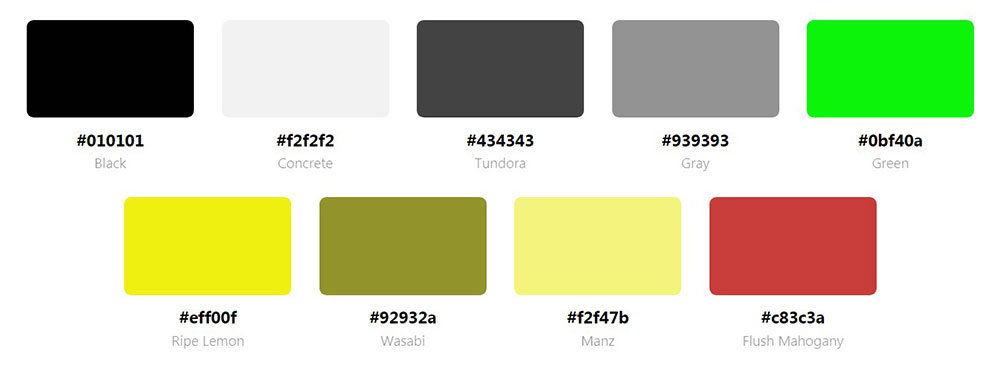
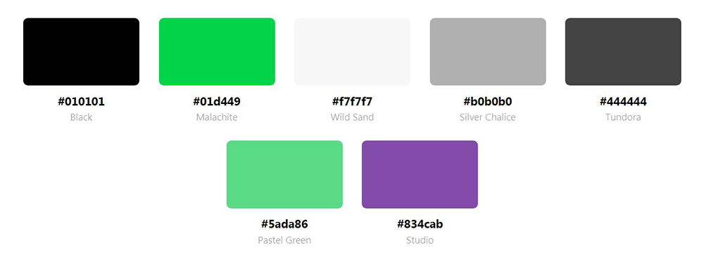
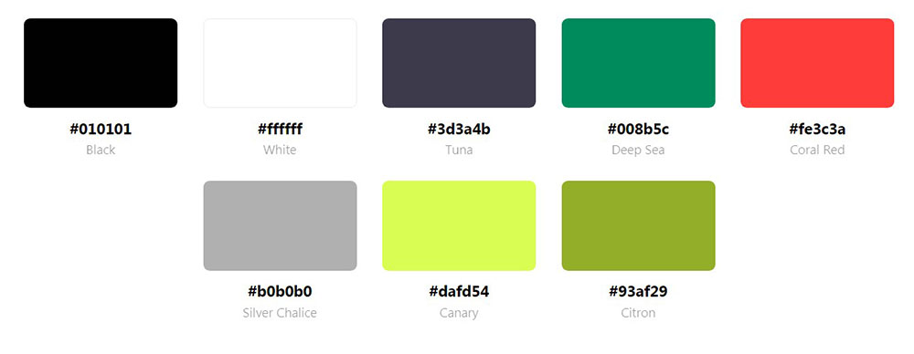
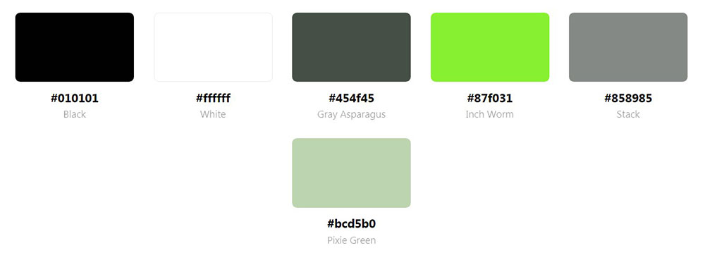
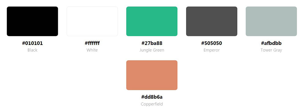
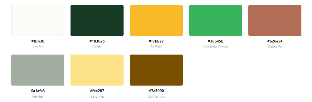
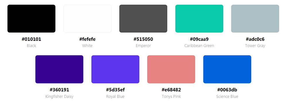
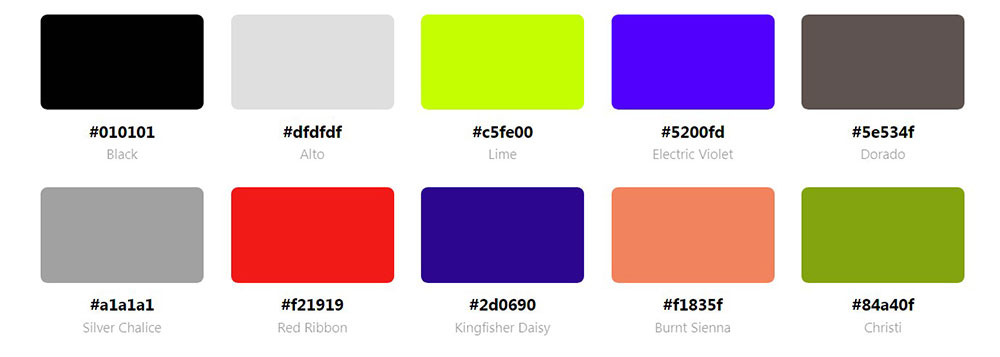
The hex codes vary wildly. #228B22 for forest green. #98FF98 for mint. #50C878 for emerald.
Each shade carries different psychological weight and works better in specific contexts.
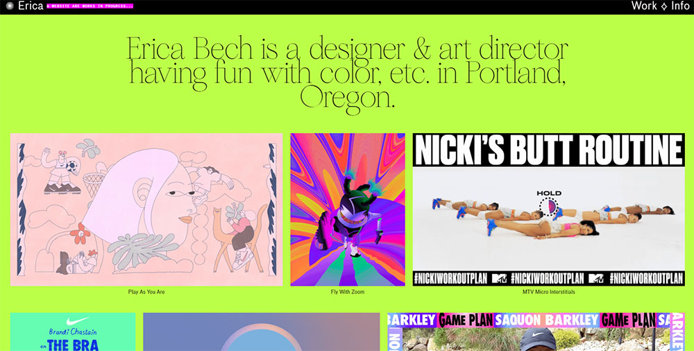
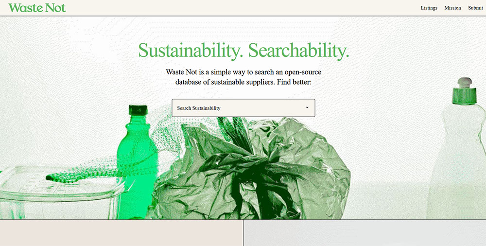
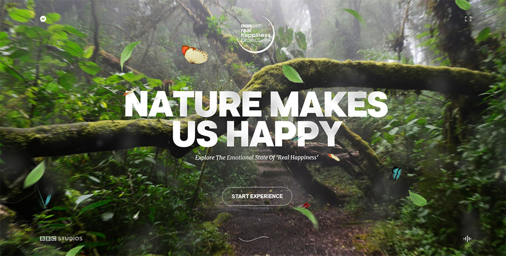
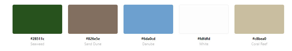
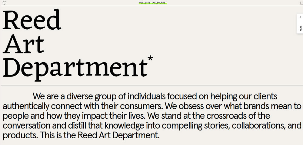
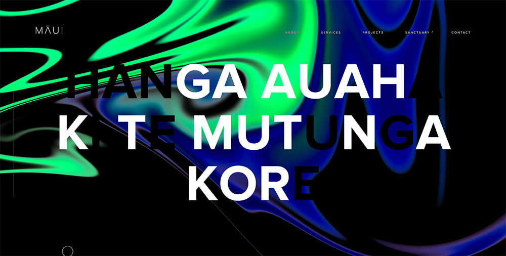
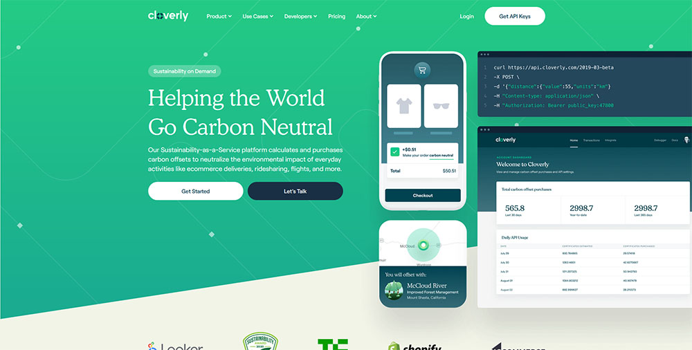
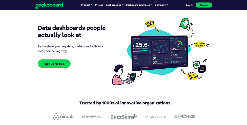
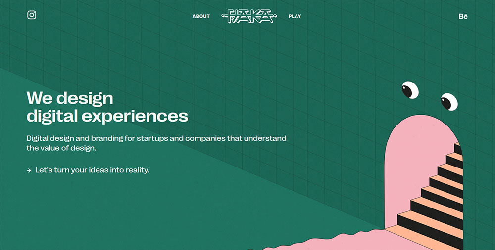
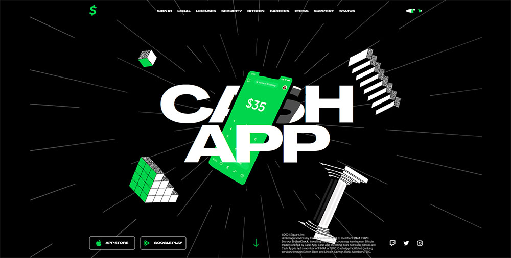
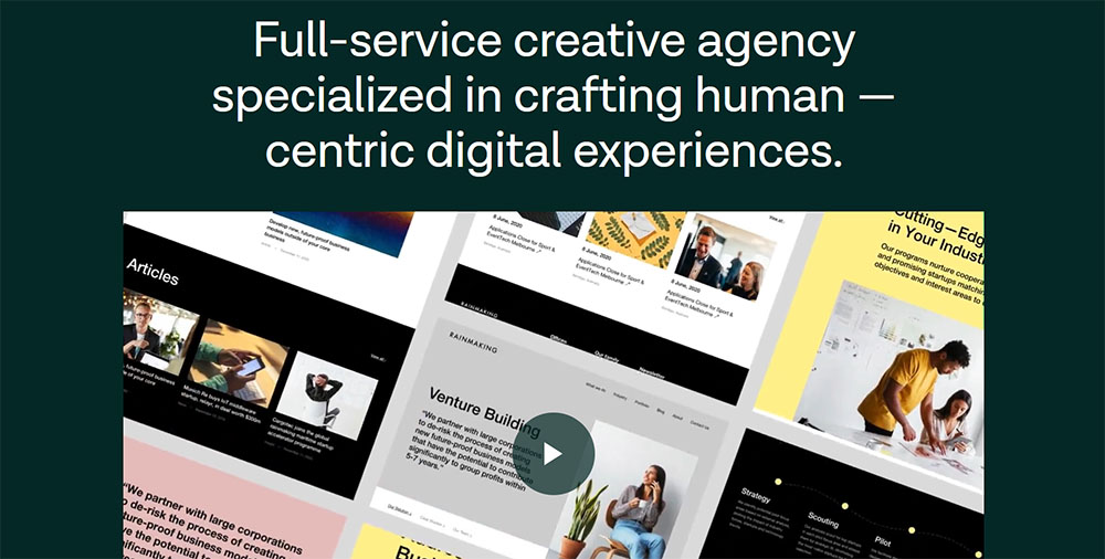
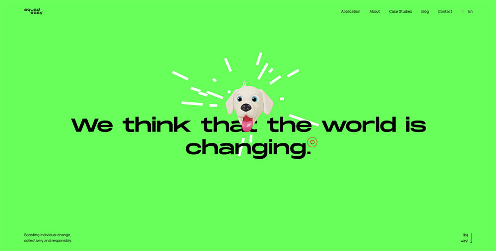
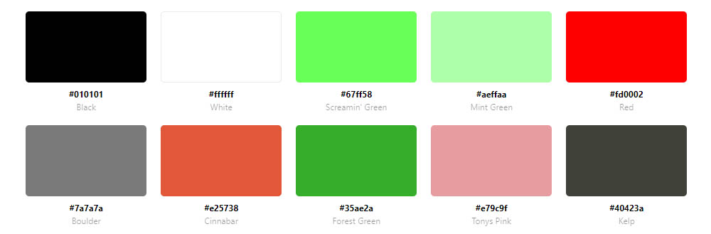
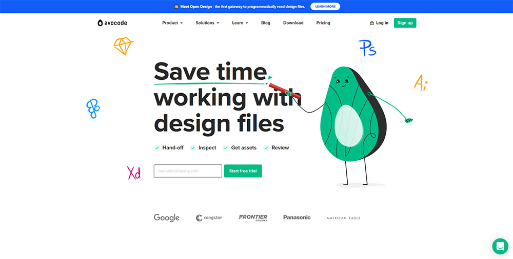
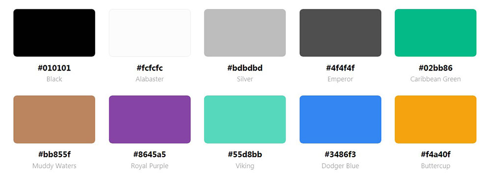
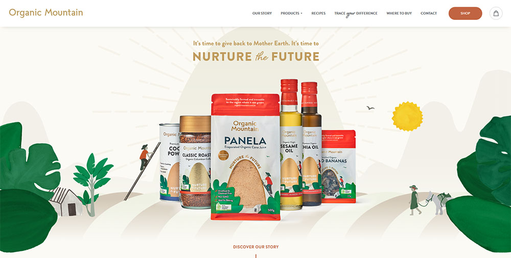
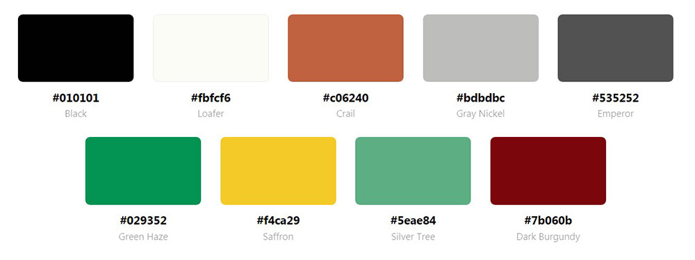
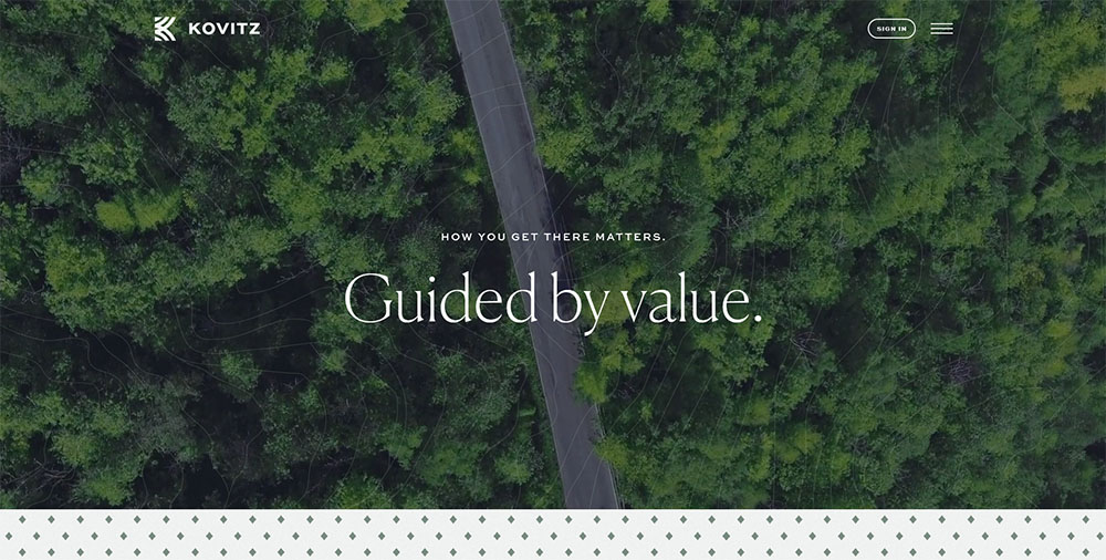
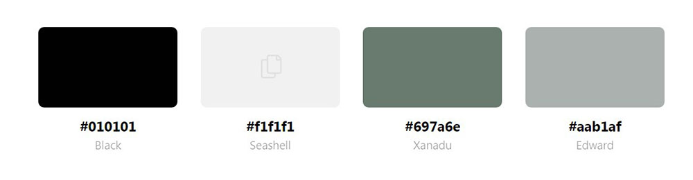
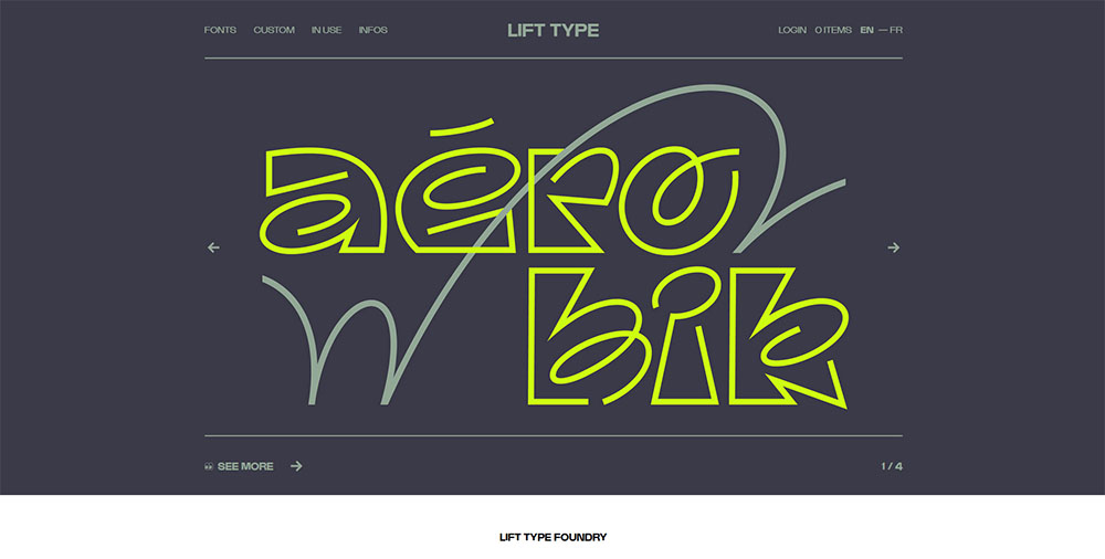
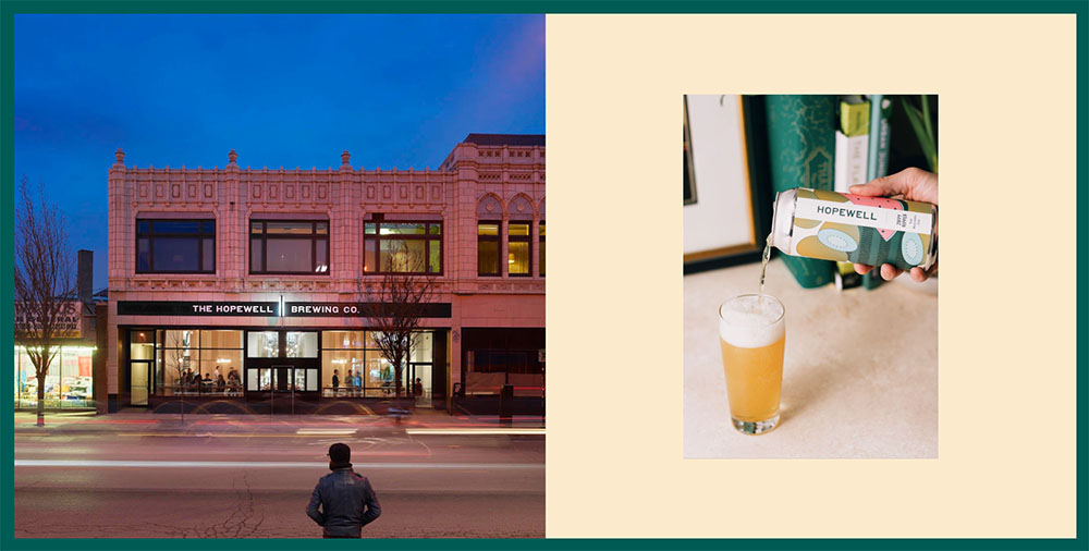
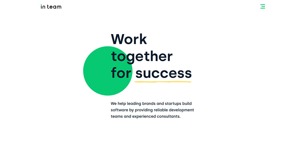
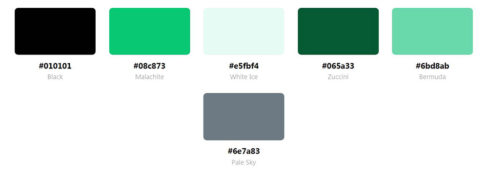
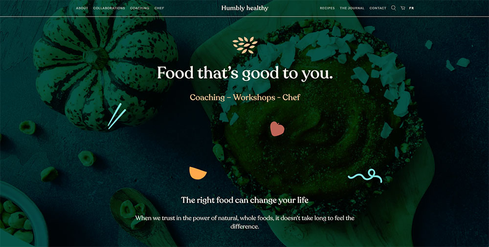
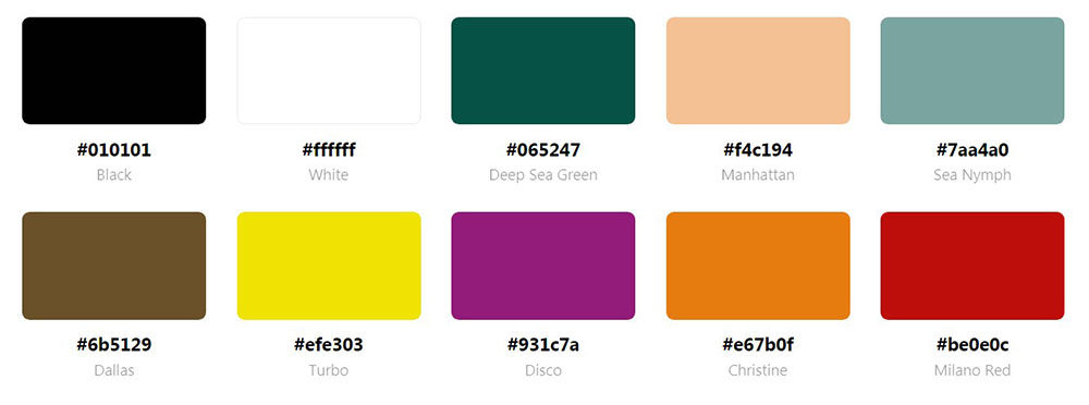
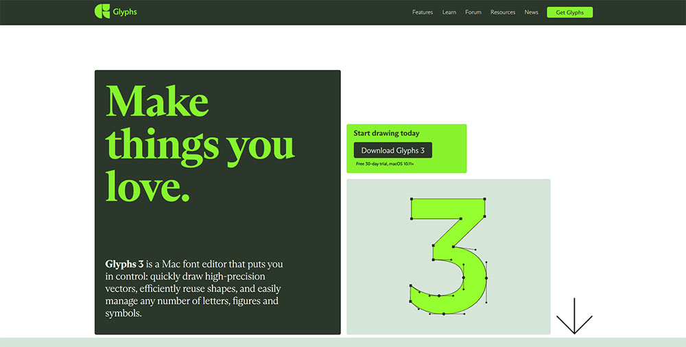
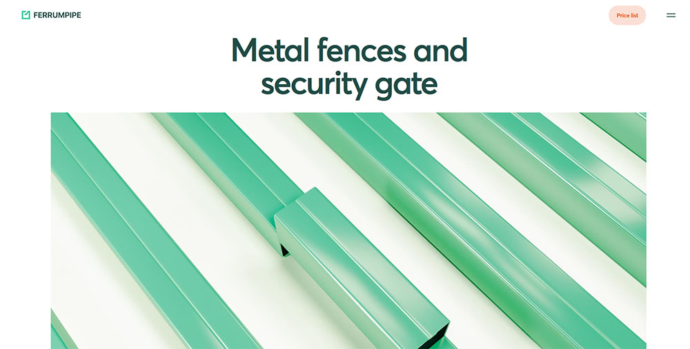
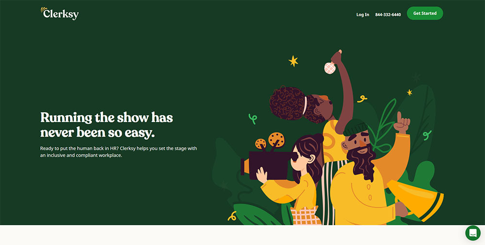
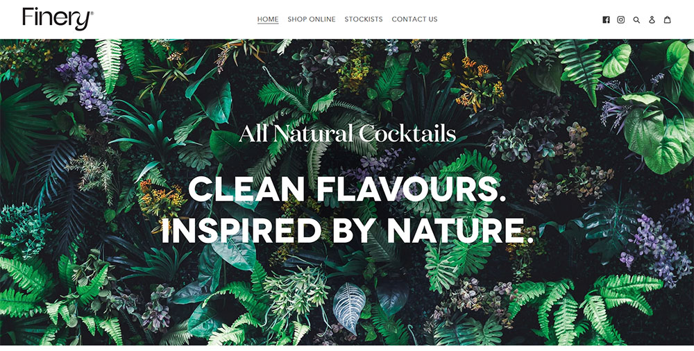
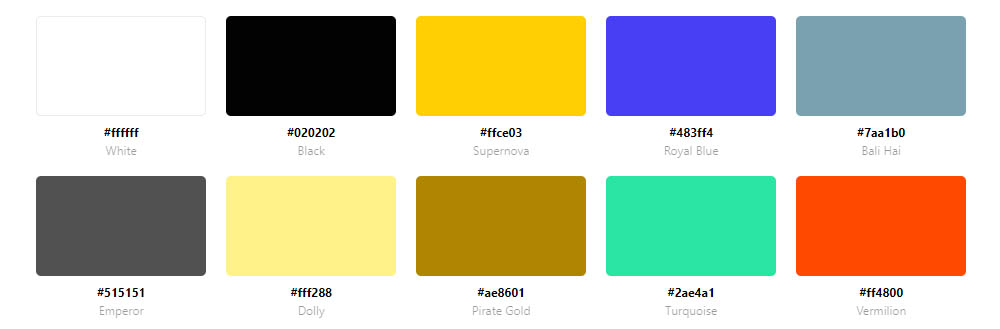
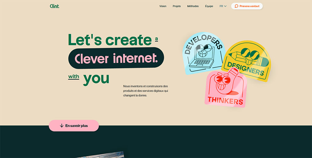
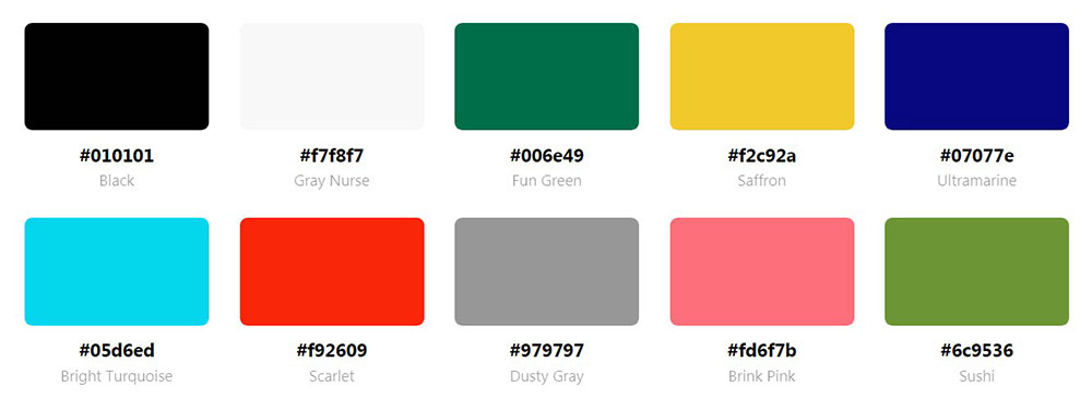
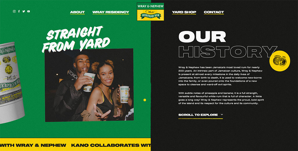
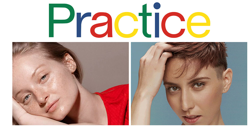
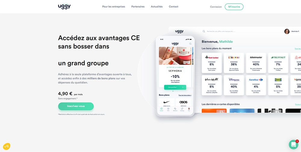
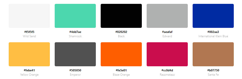
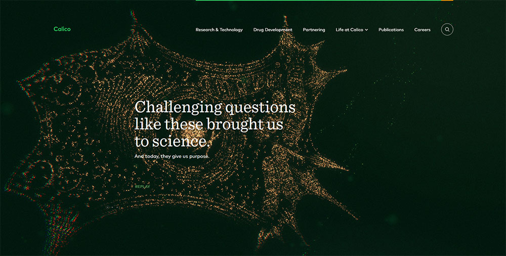
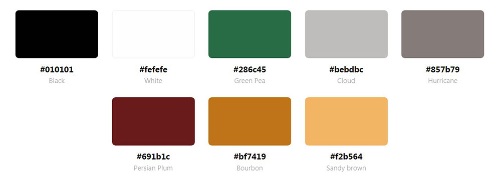
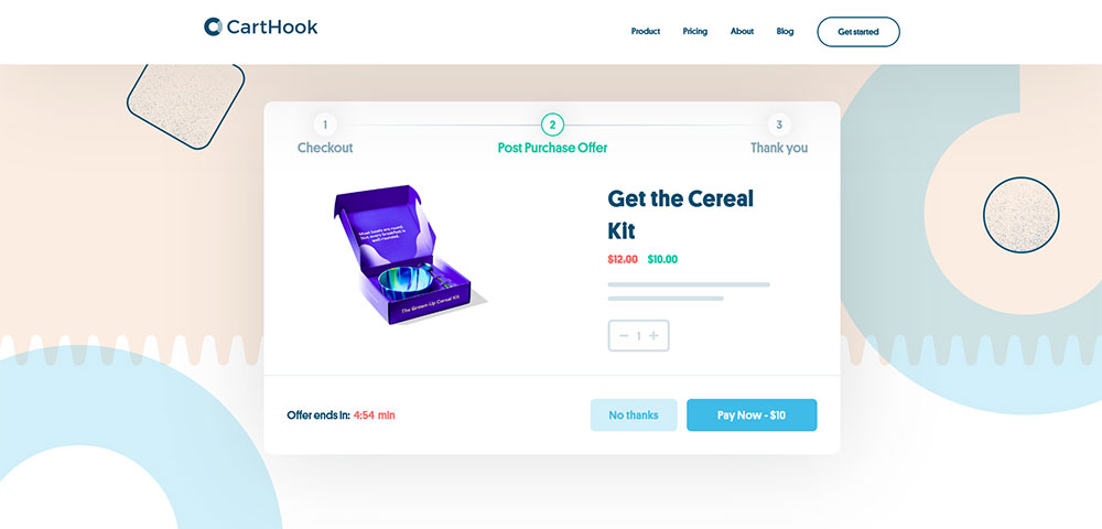
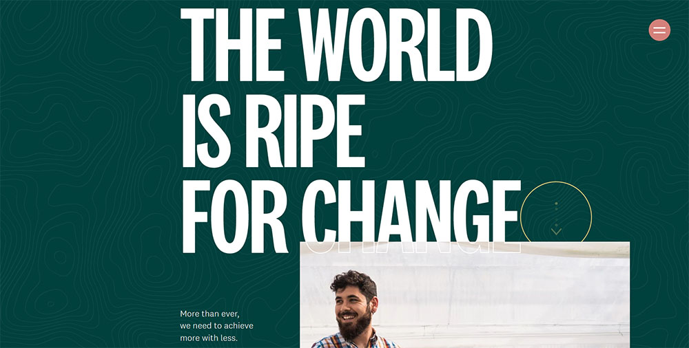
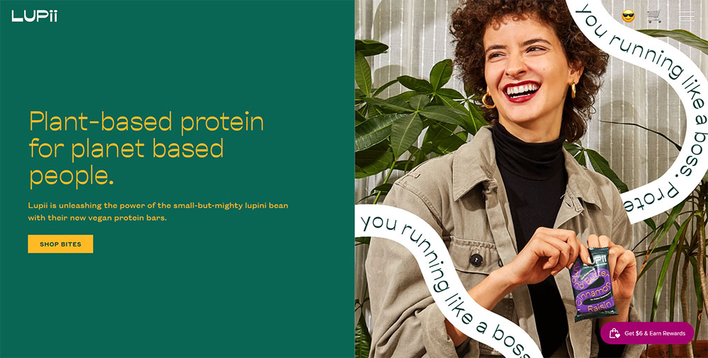
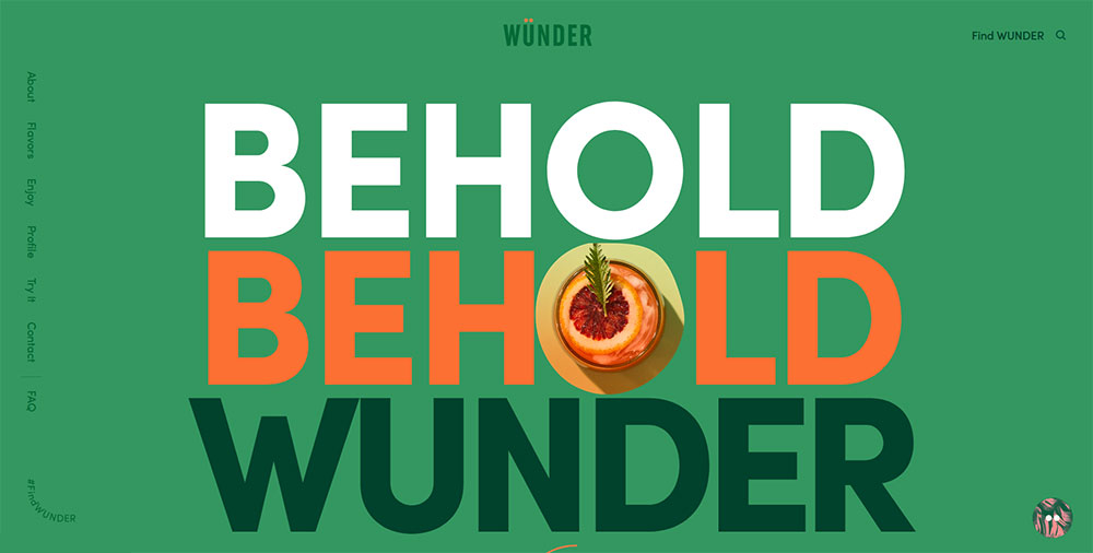
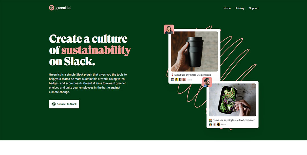
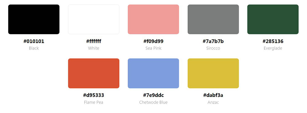
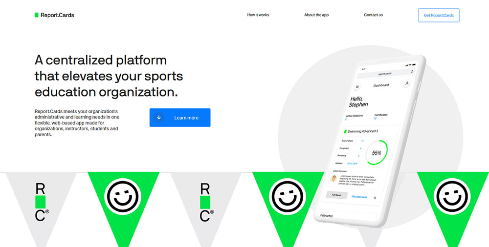
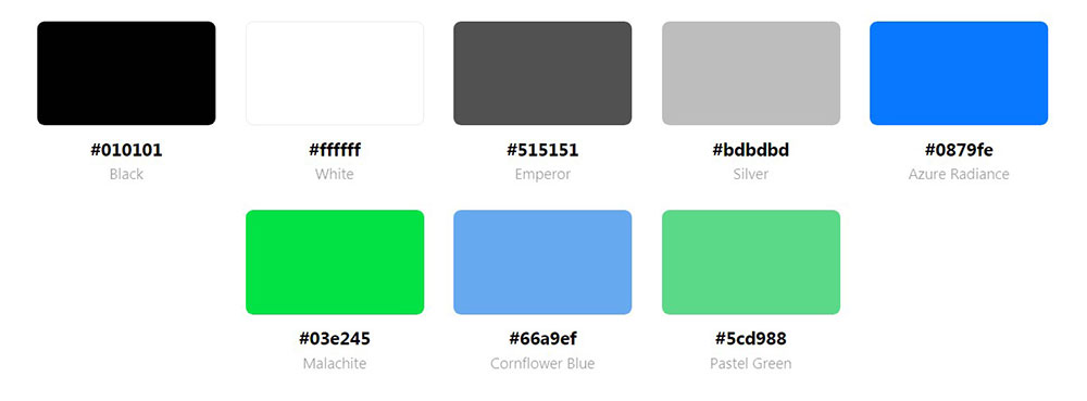
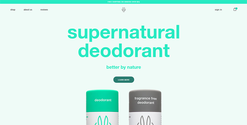
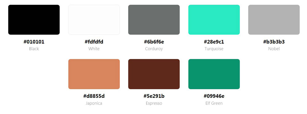
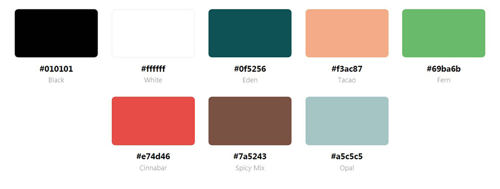
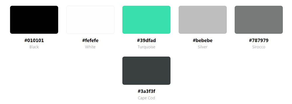
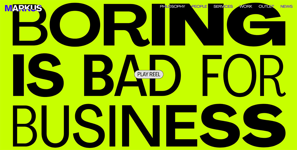
Websites with a Green Color Palette
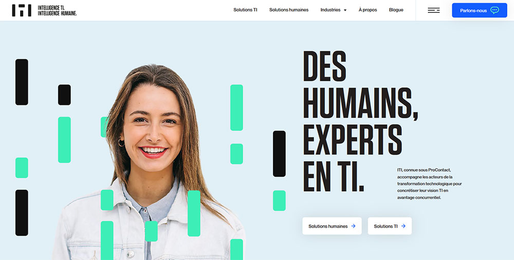
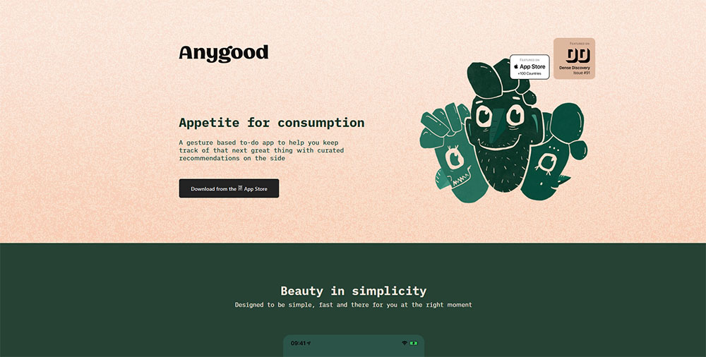
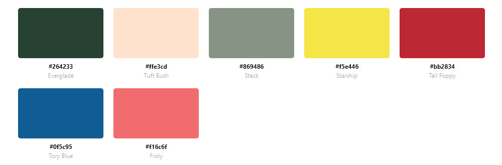
Erica Bech


How Does Green Affect Website User Experience
Green triggers associations with growth, safety, and balance in most Western cultures.
Research from the Pantone Color Institute links green tones to reduced eye strain during extended screen time.
Sites using green as their primary color report higher trust scores in user surveys, particularly in finance and wellness sectors.
Readability improves when designers pair dark green text (#006400) with light backgrounds.
Contrast ratios matter here. WCAG 2.1 accessibility standards require a minimum 4.5:1 ratio for body text.
Green call to action buttons convert well against white or light gray backgrounds because they pop without feeling aggressive.
Which Green Shades Work Best for Professional Websites
The right green depends on your industry, audience age, and brand positioning.
Here's what actually works based on real-world implementations.
Dark Green Website Designs
Dark green (#013220, #004d00) signals luxury, tradition, and financial stability; bank websites and law firms use it constantly.
Pairs best with gold accents, cream backgrounds, and serif typography.
Light Green Website Designs
Light green (#90EE90, #98FB98) feels fresh, approachable, and young.
Works for healthcare, organic products, and startups targeting millennials; avoid it for premium or luxury positioning.
Mint Green Website Designs
Mint (#3EB489, #AAF0D1) reads as modern and clean without feeling clinical.
SaaS websites and technology companies favor this shade for dashboards and product interfaces.
Emerald Green Website Designs
Emerald (#50C878, #046307) balances sophistication with energy.
Popular among eco-brands, jewelry sites, and luxury brands wanting to avoid the typical black-and-gold approach.
What Makes a Green Website Design Successful
Color alone doesn't make a site work. Structure and contrast do the heavy lifting.
Color Contrast Ratios
Run every green-text combination through WebAIM's contrast checker before launch.
Green on green fails accessibility tests almost every time.
Typography Pairing
Sans-serif fonts (Inter, Open Sans) work with lighter greens; serif fonts (Playfair Display, Merriweather) pair better with darker, more traditional shades.
White Space Usage
Green needs breathing room. Cramped layouts make green feel overwhelming rather than calming.
Follow white space best practices: 20-30% of your layout should remain empty.
Accent Color Combinations
Safe pairings that consistently perform:
- Green + white + charcoal gray
- Green + cream + gold
- Green + navy + white
- Green + coral (use sparingly)
Understanding basic color theory helps you avoid combinations that clash or create visual tension.
Which Industries Use Green Website Designs Most Effectively
Some industries have made green their default. Others use it as a differentiator.
Health and Wellness Green Websites
Sage and mint dominate this space; brands like Calm and Headspace built their visual identity around soft greens.
Mental health websites lean toward muted tones that feel therapeutic rather than clinical.
Finance and Banking Green Websites
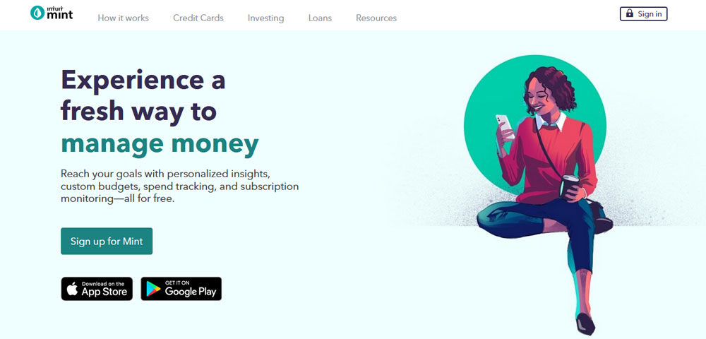
TD Bank, Robinhood, and Mint all use green as their primary brand color.
The connection to money is obvious but effective; fintech websites increasingly adopt teal and emerald variations.
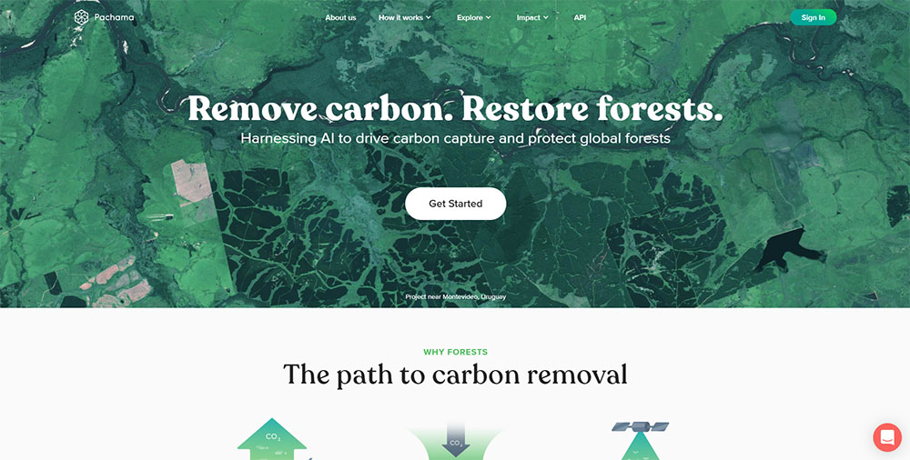
Sustainability and Eco-Brand Green Websites
Expected choice, tricky execution. Too much green feels preachy.
Successful eco-brands like Patagonia use green sparingly as an accent, not a background flood.
Food and Beverage Green Websites
Whole Foods Market, Starbucks, and countless organic food brands rely on green to signal freshness.
Works for health-focused products; avoid for indulgent categories like desserts or alcohol.
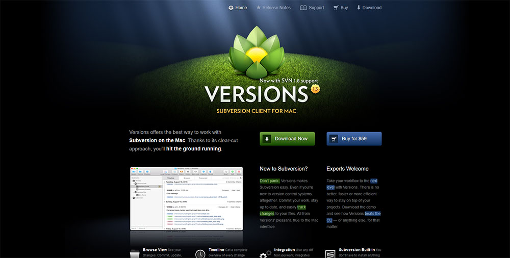
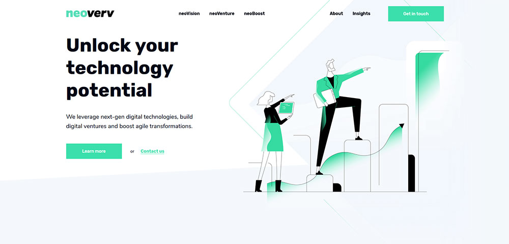
Technology and SaaS Green Websites
Spotify's green became iconic. Android uses green as its signature color.
Tech brands pick green to stand apart from the sea of blue competitors; it signals innovation without the coldness of pure white or black.
How to Combine Green with Other Colors in Web Design
Green plays well with neutrals and struggles with competing warm tones.
These combinations have proven track records across thousands of live sites.
Green and White Combinations
The safest pairing. White backgrounds let green elements breathe and maintain clean visual hierarchy.
Use ratios of 70% white, 20% green, 10% accent color for balanced layouts.
Green and Black Combinations
High contrast, high impact. Works for dark themed websites targeting younger demographics.
Emerald (#50C878) on black backgrounds creates a premium tech aesthetic; forest green feels too muted.
Green and Gold Combinations
Classic luxury pairing used by elegant brands and financial institutions.
Dark green (#013220) with gold (#FFD700) accents signals tradition and wealth without feeling dated.
Green and Blue Combinations
Tricky because both are cool tones competing for attention.
Teal (#008080) bridges this gap effectively; avoid placing pure green next to pure blue in navigation or buttons.
What Typography Pairs Best with Green Website Designs
Font choice either amplifies or undermines your green palette's intended mood.
Sans-Serif Fonts for Modern Green Sites
Inter, Poppins, and Open Sans pair with mint and light green shades for tech and startup aesthetics.
These fonts keep the overall feel contemporary and approachable.
Serif Fonts for Traditional Green Sites
Playfair Display, Merriweather, and Lora work with dark green palettes on finance and legal sites.
The combination reads as established and trustworthy.
Display Fonts for Creative Green Sites
Bebas Neue, Oswald, and custom typefaces suit creative brands using bold green statements.
Check typography-focused sites for pairing inspiration before committing.
How to Choose the Right Green for Your Website
Wrong green choice tanks conversions and brand perception. Here's a decision framework that works.
Match Green to Industry Expectations
- Finance: Dark green (#004d00), hunter green (#355E3B)
- Health: Sage (#9DC183), seafoam (#71EEB8)
- Tech: Mint (#3EB489), teal (#008080)
- Luxury: Emerald (#50C878), forest (#228B22)
- Food: Lime (#32CD32), leaf green (#4CBB17)
Consider Your Target Audience Age
Younger audiences (18-34) respond to vibrant greens like lime and mint; older demographics prefer muted sage and forest tones.
Test with actual users from your target segment before finalizing.
Test Green Against Your Existing Brand Assets
Pull your logo, product photos, and marketing materials into Figma or Adobe Color.
Green must complement what already exists, not clash with established brand elements.
Validate with Accessibility Tools
Run your chosen green through Stark, axe DevTools, or WAVE before launch.
Green fails accessibility more often than designers expect, especially in text applications.
A/B Test Before Full Commitment
Tools like Google Optimize or VWO let you test green variations against your current palette.
Data beats opinion. Let conversion rates decide which shade wins.
FAQ on Website Design Using A Green Color Palette
What is the best green hex code for websites?
No single best code exists. Dark green (#004d00) works for finance and legal sites. Mint (#3EB489) suits tech and SaaS brands. Emerald (#50C878) balances luxury with energy. Test your chosen shade against WCAG 2.1 contrast requirements before launch.
Which industries use green website designs most often?
Finance, healthcare, sustainability, food, and technology lead green adoption. Brands like TD Bank, Whole Foods Market, and Spotify built recognition around green palettes. The color signals trust, growth, and environmental awareness across these sectors.
Does green improve website conversion rates?
Green buttons consistently outperform red and orange in A/B tests for finance and health sectors. Context matters though. Run tests with tools like Google Optimize using your actual audience before assuming green will boost your specific conversions.
What colors pair well with green in web design?
White, black, gold, and navy pair reliably with green. Avoid placing green next to red (Christmas effect) or bright orange (visual clash). Use Adobe Color or Coolors to generate balanced palettes with proper contrast ratios.
Is green accessible for colorblind users?
Green alone fails for red-green colorblind users (8% of men). Never use green as the only indicator for success states or required actions. Combine green with icons, text labels, or patterns. Test with Stark or axe DevTools.
What fonts work best with green color schemes?
Sans-serif fonts like Inter and Poppins complement modern mint and teal palettes. Serif fonts like Playfair Display pair with traditional dark greens. Match font personality to your green shade's mood for cohesive layout design.
How much green should a website use?
Follow the 60-30-10 rule. Use 60% neutral base (white, gray), 30% green as secondary, 10% accent color. Award-winning sites from Awwwards rarely exceed 40% green coverage. Restraint creates impact; saturation overwhelms visitors.
Can green work for dark mode websites?
Absolutely. Emerald and mint pop against dark backgrounds without causing eye strain. Spotify's dark interface proves green thrives in low-light contexts. Adjust saturation slightly brighter than light mode versions to maintain readability.
What green shades feel luxurious versus budget?
Dark forest green (#013220) and emerald signal premium positioning. Lime green and bright chartreuse read as budget or playful. Pair luxury greens with gold accents and serif typography. Pair budget greens with bold sans-serif fonts.
Where can I find green website design inspiration?
Dribbble, Behance, and Awwwards feature curated green designs filtered by color. Check website inspiration galleries for categorized examples. Screenshot sites you like into Figma boards organized by shade and industry.
Conclusion
These website design examples using a green color palette prove one thing: shade selection determines success.
Forest green builds trust for banking interfaces. Mint keeps tech dashboards feeling fresh. Emerald bridges luxury and accessibility.
Before launching, validate your hex codes through Adobe Color for harmony and WCAG tools for contrast compliance.
Study how Awwwards winners balance green saturation with negative space. Screenshot what resonates into Figma boards.
Test variations with real users from your target demographic.
Green isn't just a color choice. It's a core design element that shapes brand perception, readability scores, and conversion rates.
Pick the right shade. Apply proper contrast ratios. Let the results speak.


