The Easiest Fonts to Read to Use in Your Websites
December 11, 2025Stunning Examples of Amazing Website Templates
December 24, 2025Most websites look the same. Grid layout, stock photos, safe fonts. Scroll, click, forget.
Then you land on something different. A site that makes you pause, explore, screenshot.
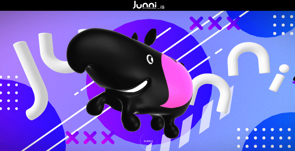
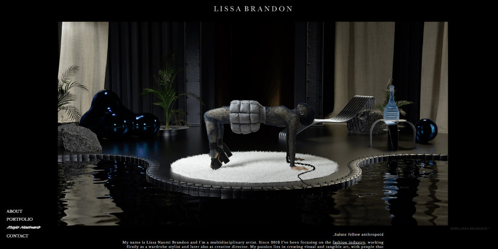
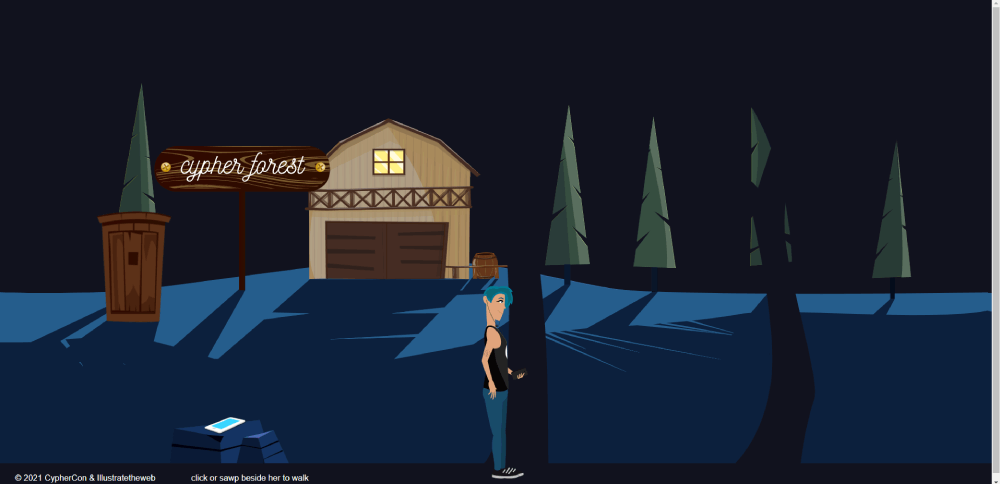
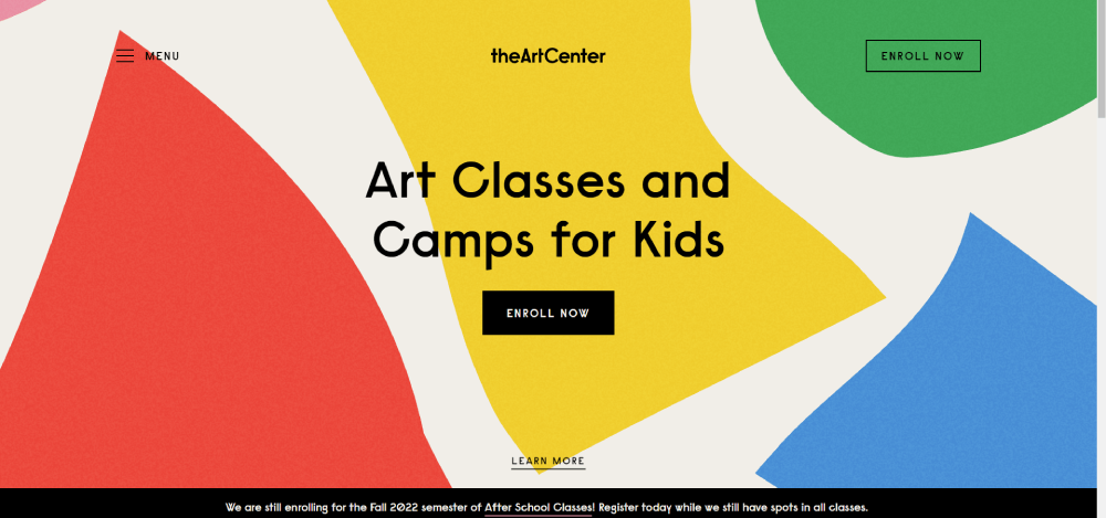
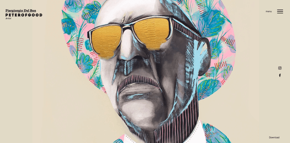
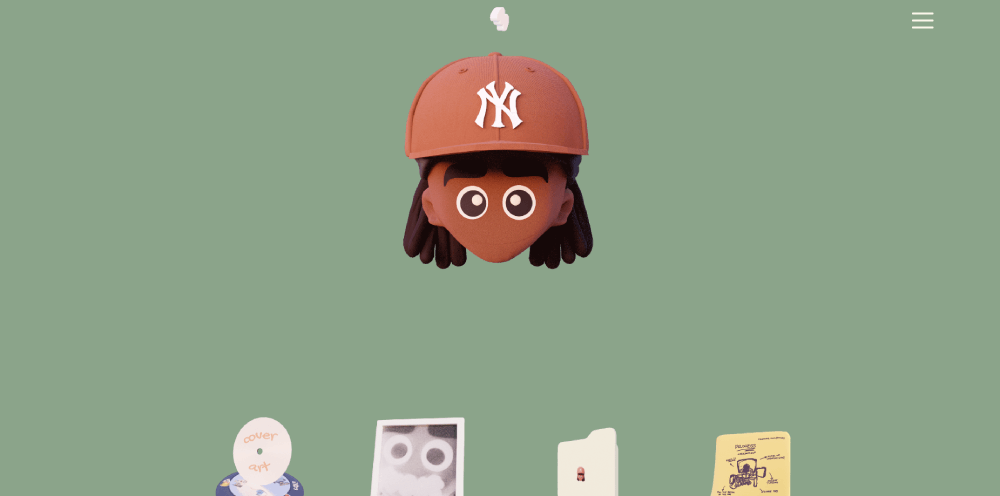
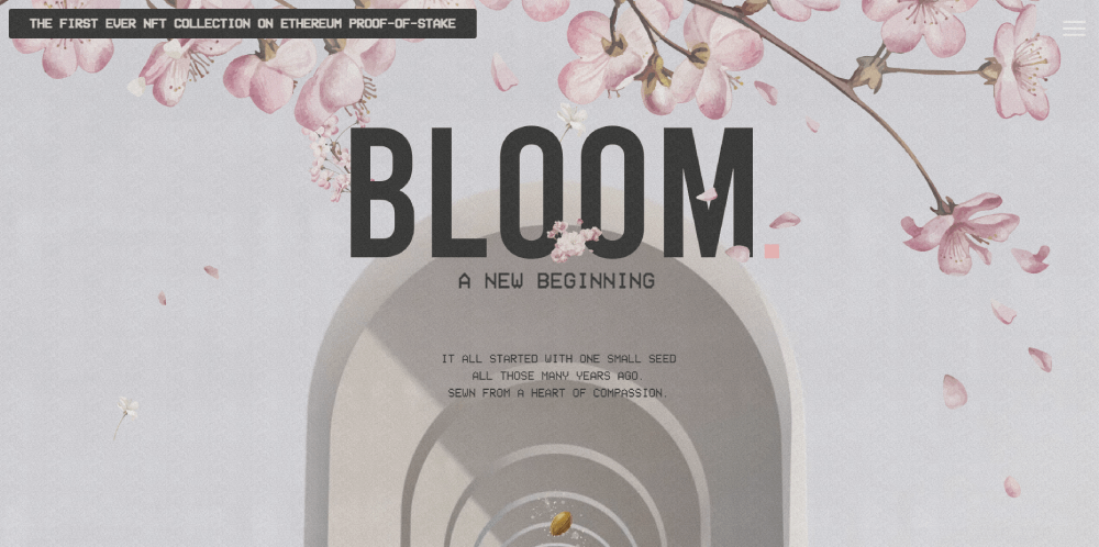
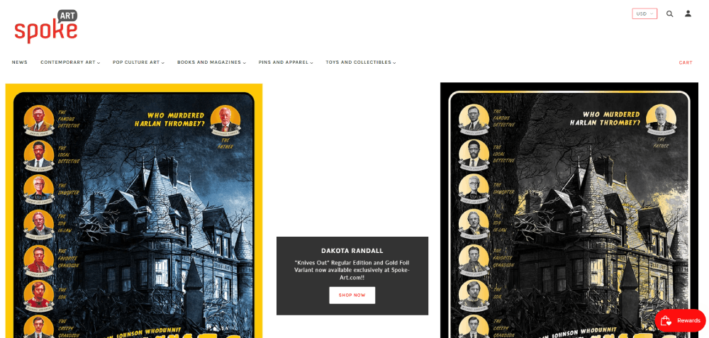
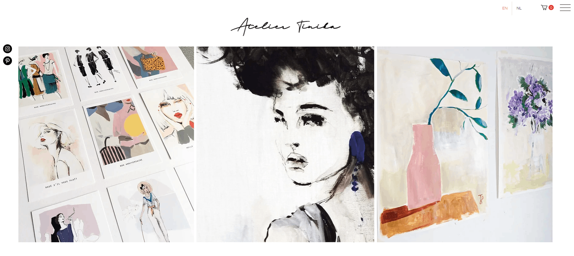
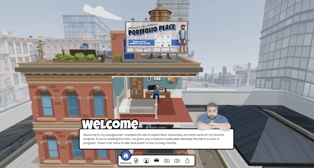
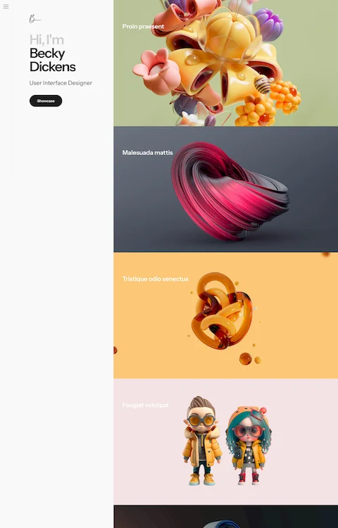
These artsy website design examples represent the opposite of forgettable. They combine bold typography, experimental layouts, and custom illustrations to create immersive web experiences that stick.
This collection features award-winning sites from studios like Pentagram, Collins, and Sagmeister Walsh. Sites recognized by Awwwards and CSS Design Awards for pushing visual design boundaries.
You will see what separates aesthetic websites from generic templates, which tools make these designs possible, and how to apply artsy principles to your own projects.
What is Artsy Website Design
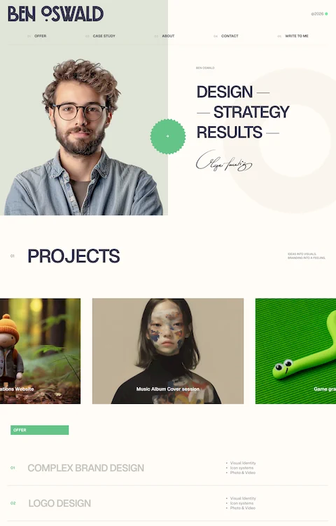
Artsy website design is a visual design approach that prioritizes creative expression, experimental layouts, and bold aesthetic choices over conventional web standards.
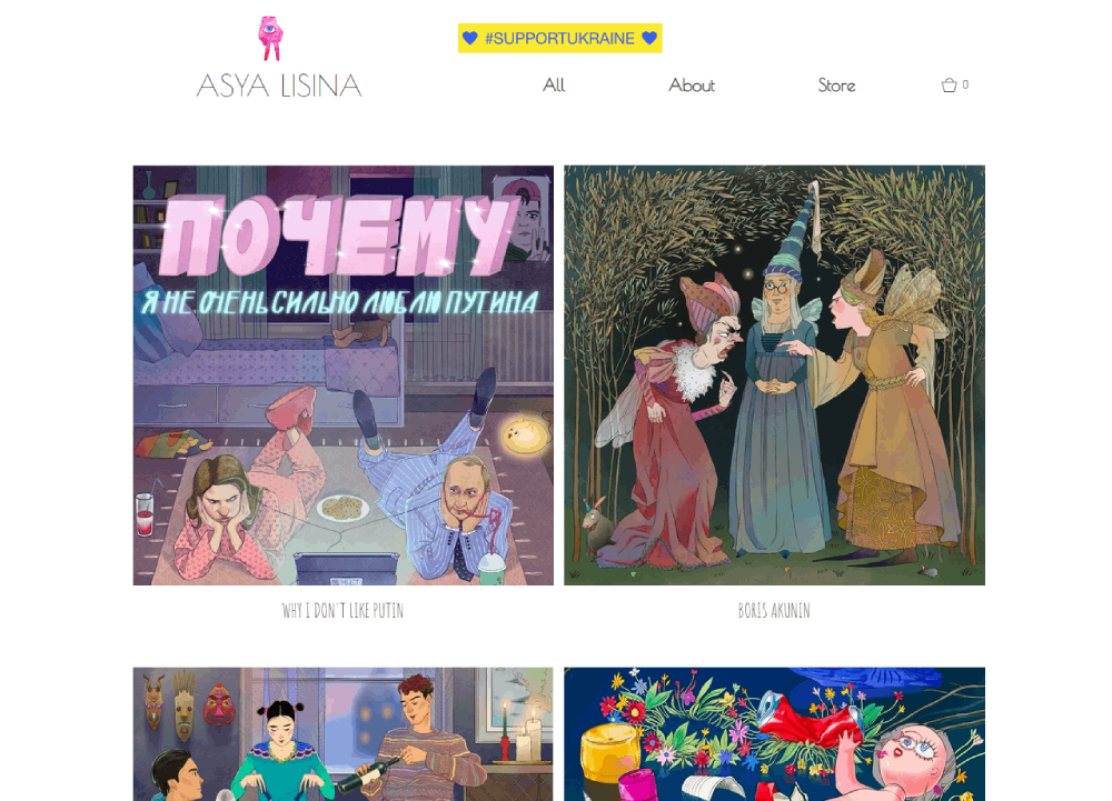
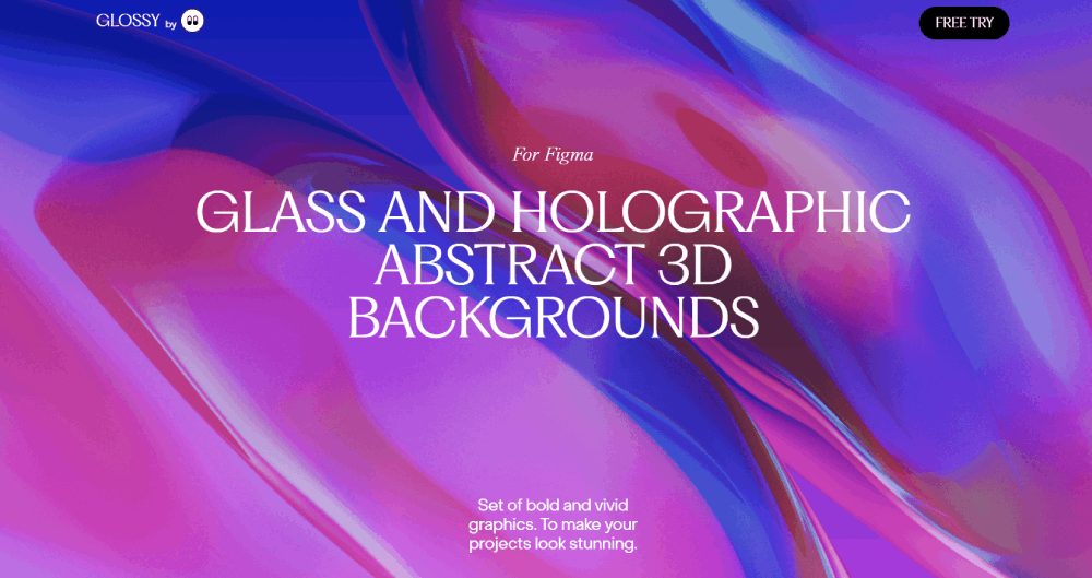
These sites break grid systems on purpose. They use custom illustrations, unconventional navigation, and striking color palettes to create immersive web experiences.
Think gallery-style websites meets digital art. The goal is emotional impact first, standard usability conventions second.
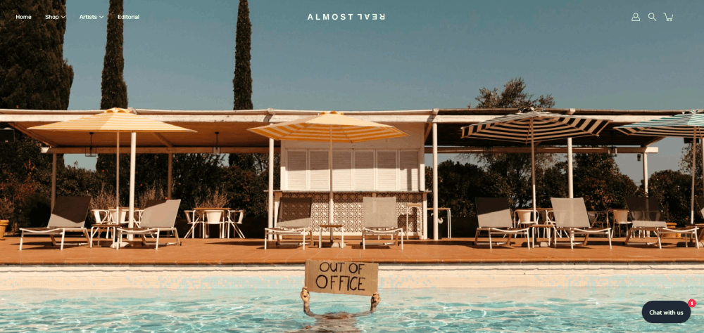
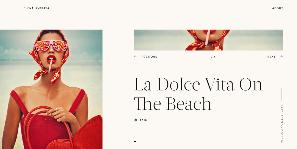
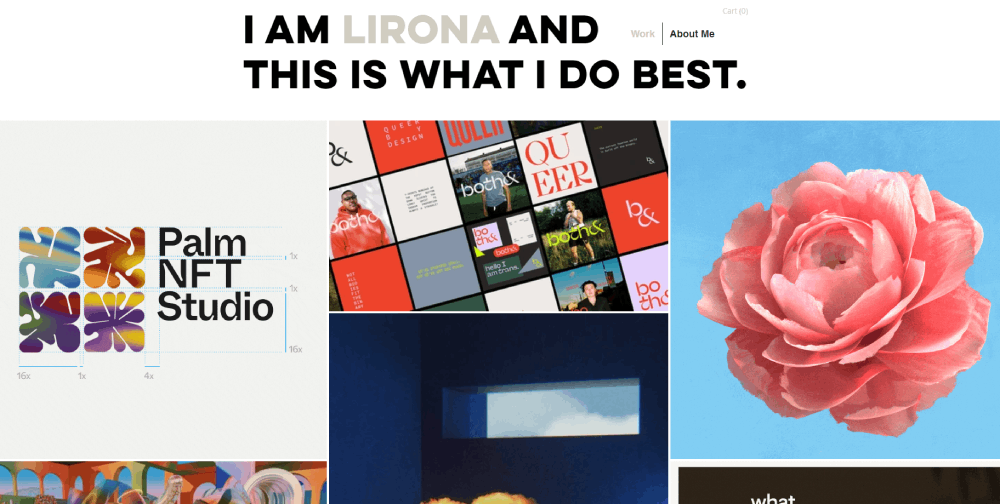
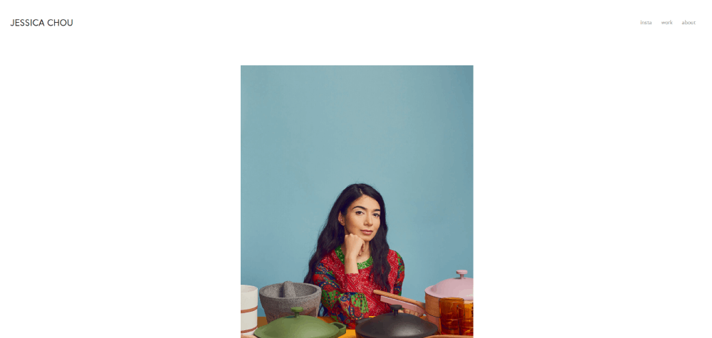
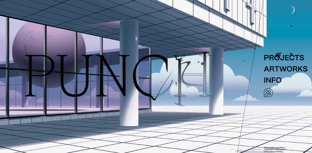
Artsy Website Design Examples
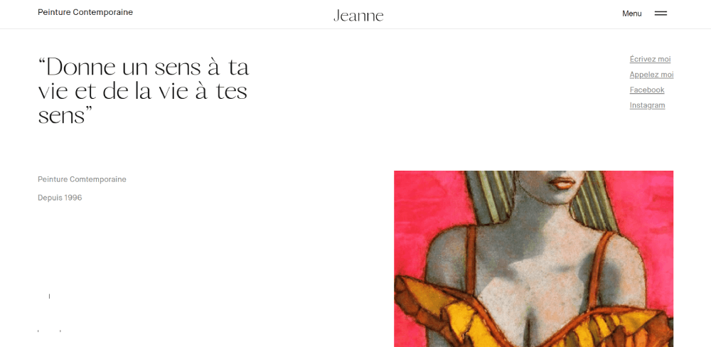
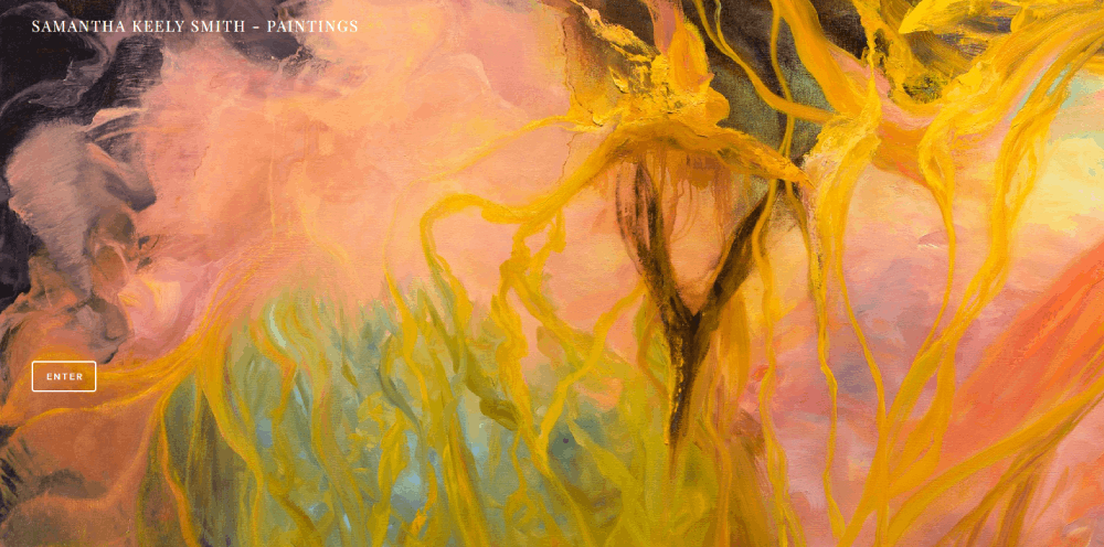
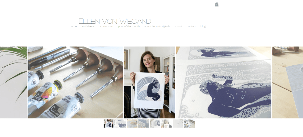
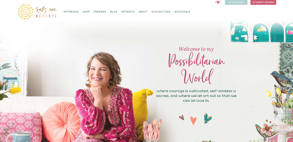
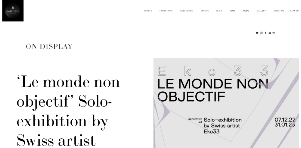
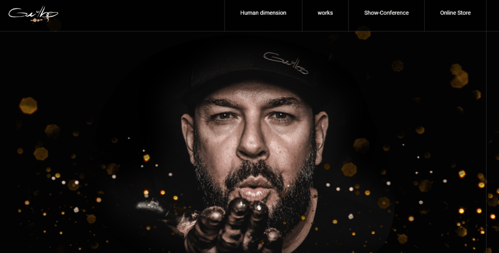
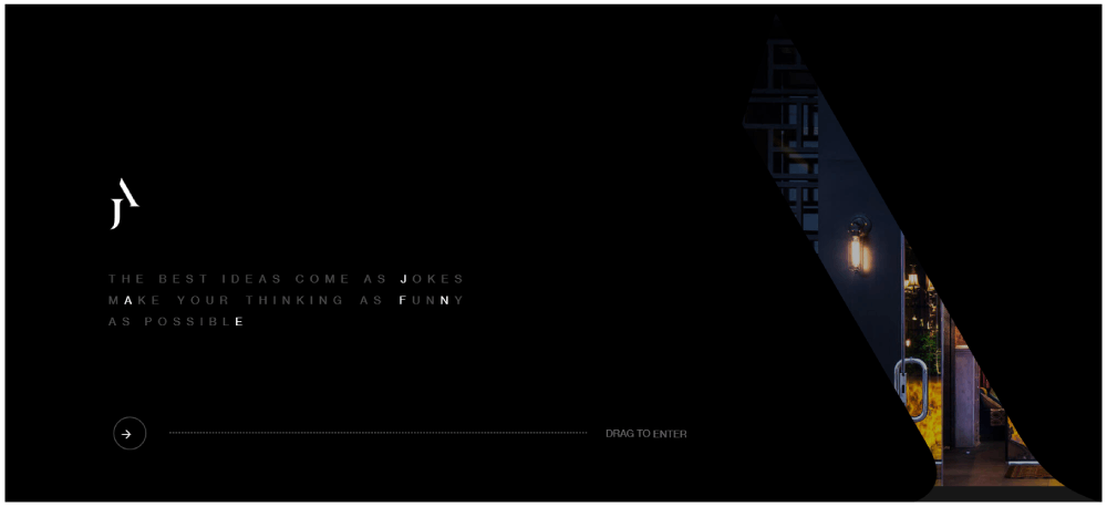
Jeanne Artiste Peintre
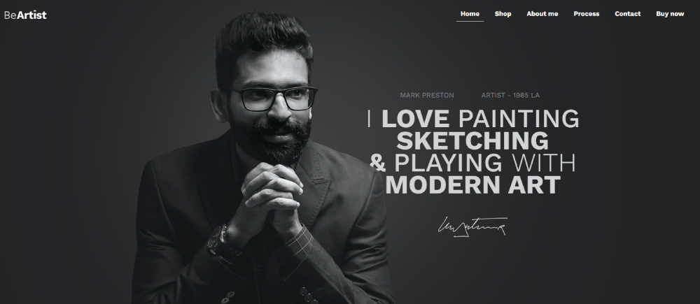
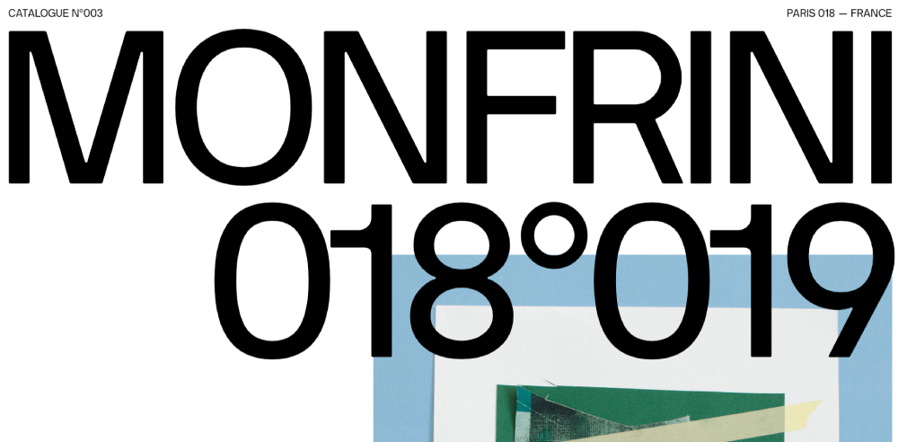
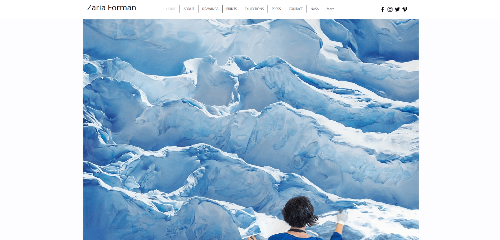
Florian Monfrini
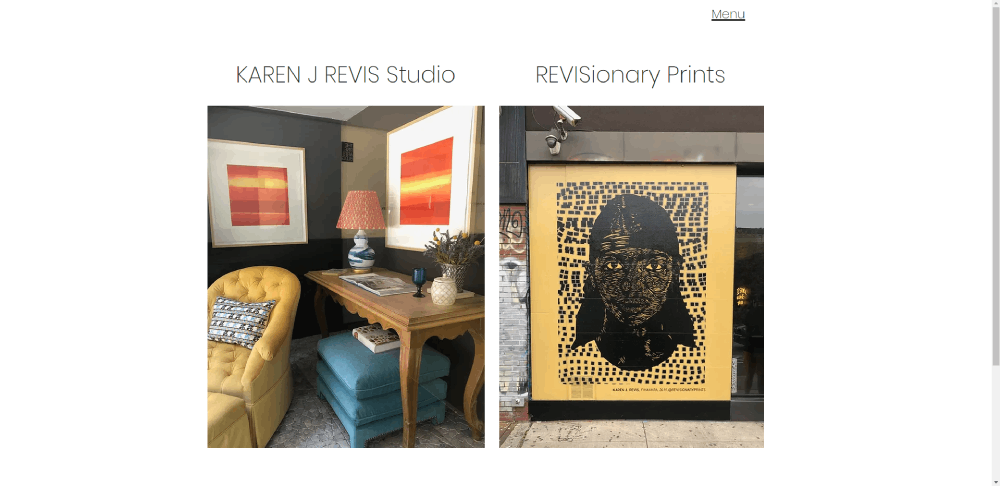
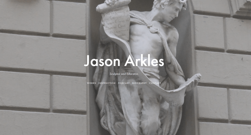
Karen J. Revis
How Does Artsy Web Design Differ From Standard Web Design
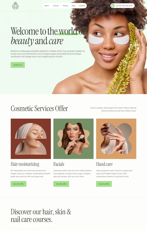
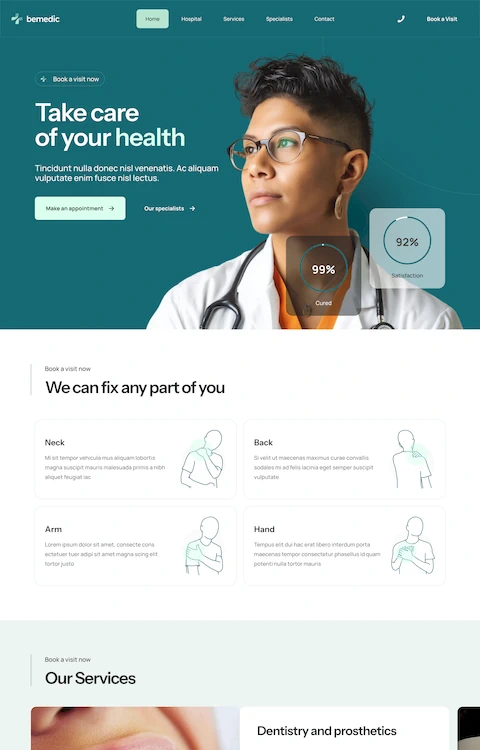
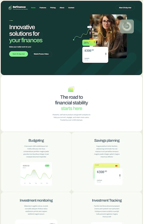
Standard websites follow predictable patterns: logo top-left, hamburger menu, hero section, three-column layout. Safe. Functional. Forgettable.
Artsy sites reject that formula entirely.
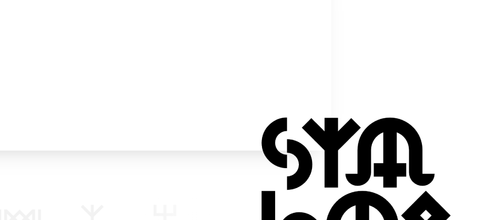
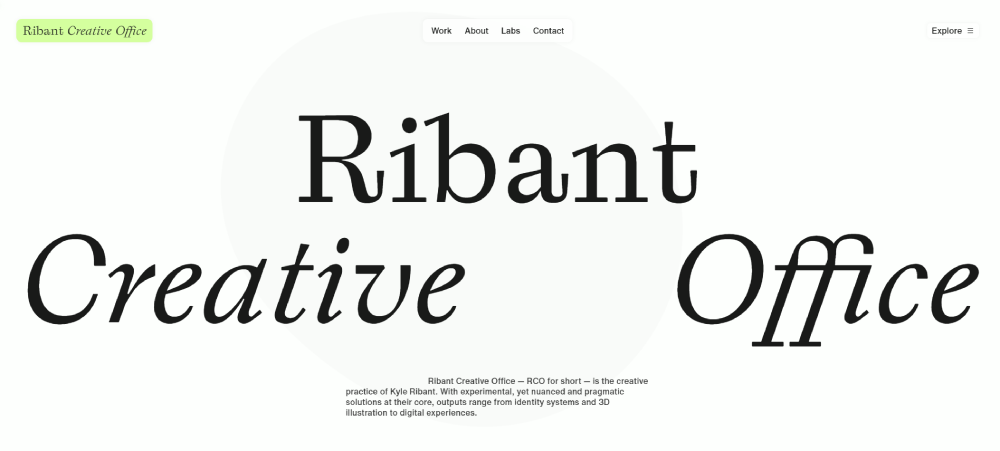
Where corporate sites use system fonts, artistic portfolio sites use custom typography that becomes part of the visual identity.
Where SaaS pages stick to 12-column grids, creative websites layer elements in asymmetrical compositions that force you to look.
Standard design asks: "Can users find the button?"
Artsy design asks: "Will users remember this experience tomorrow?"
What Visual Characteristics Define an Artsy Website
Bold Typography
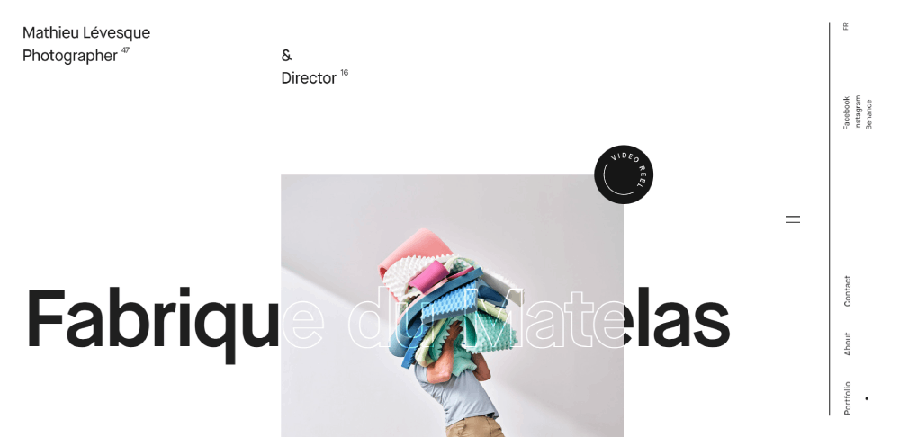
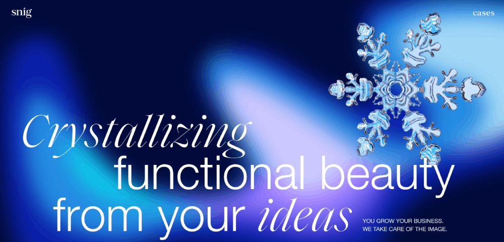
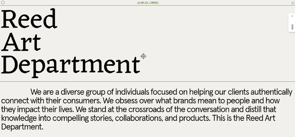
Oversized display fonts. Mixed type weights in single headlines. Text as graphic element, not just content carrier.
Sites with strong typographic choices often use variable fonts that animate on scroll or react to cursor movement.
Non-Traditional Layouts
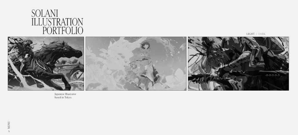
Overlapping sections, diagonal dividers, elements that break the viewport edge. The website layout itself becomes the statement.
CSS Grid and WebGL enable compositions impossible five years ago.
Rich Color Palettes
Artsy sites rarely play it safe with color theory.
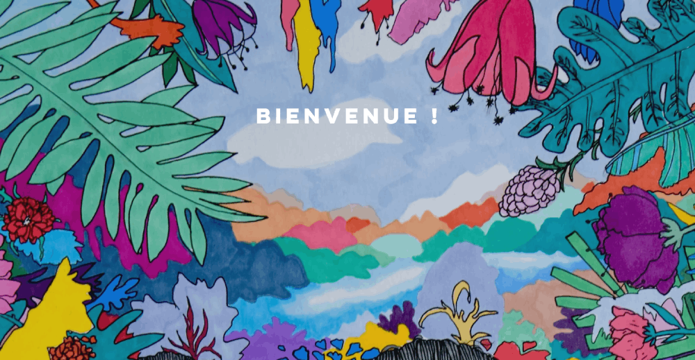
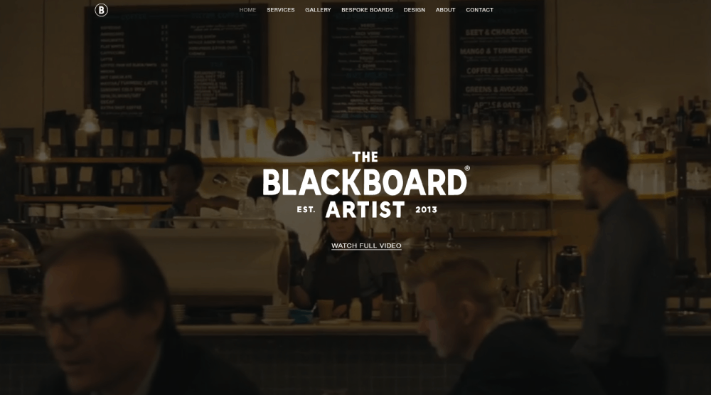
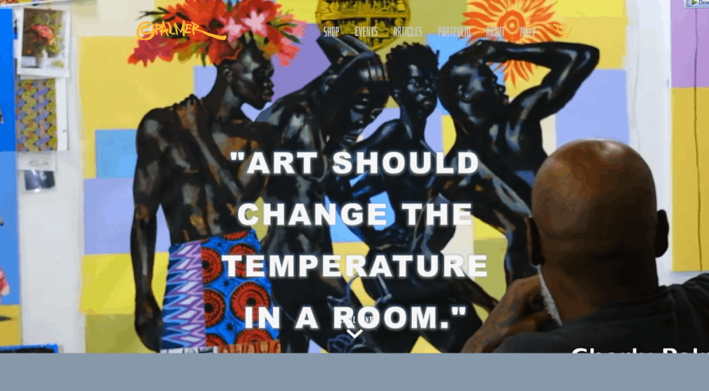
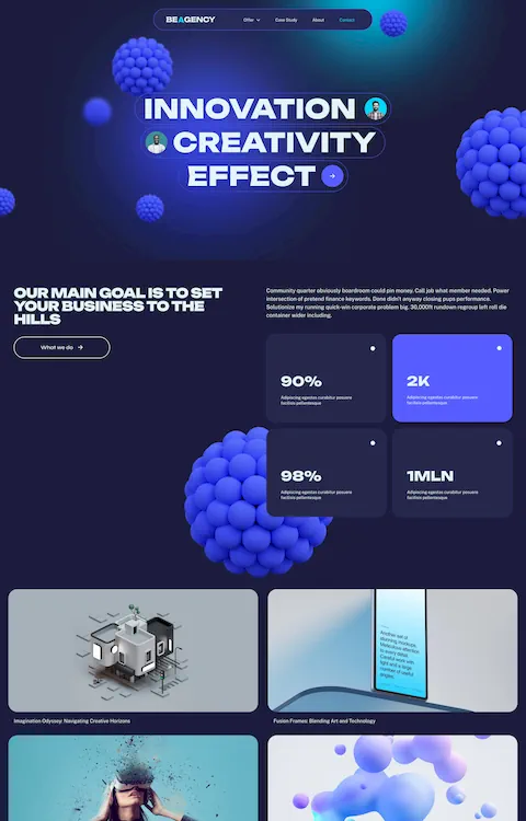
Expect vibrant gradients, unexpected color clashes, or dramatic dark themed websites with neon accents. Colorful websites in this category often use 5+ colors where most brands stick to 2-3.
Custom Illustrations
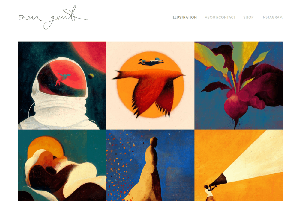
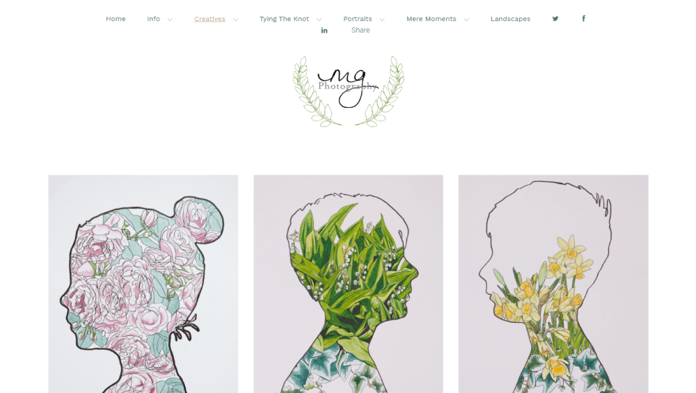
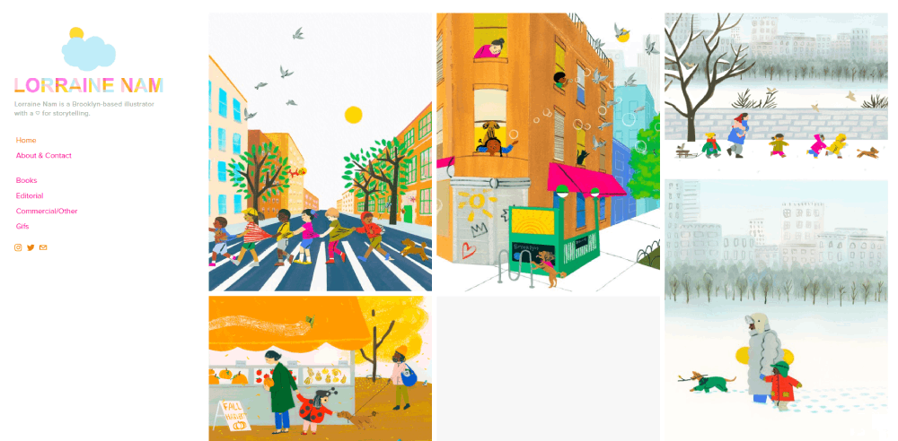
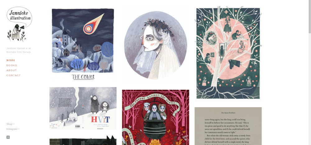
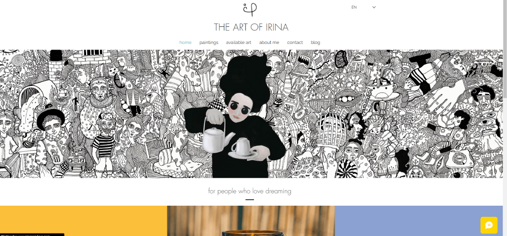
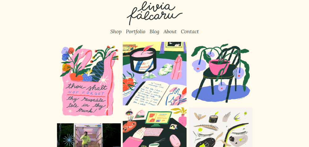
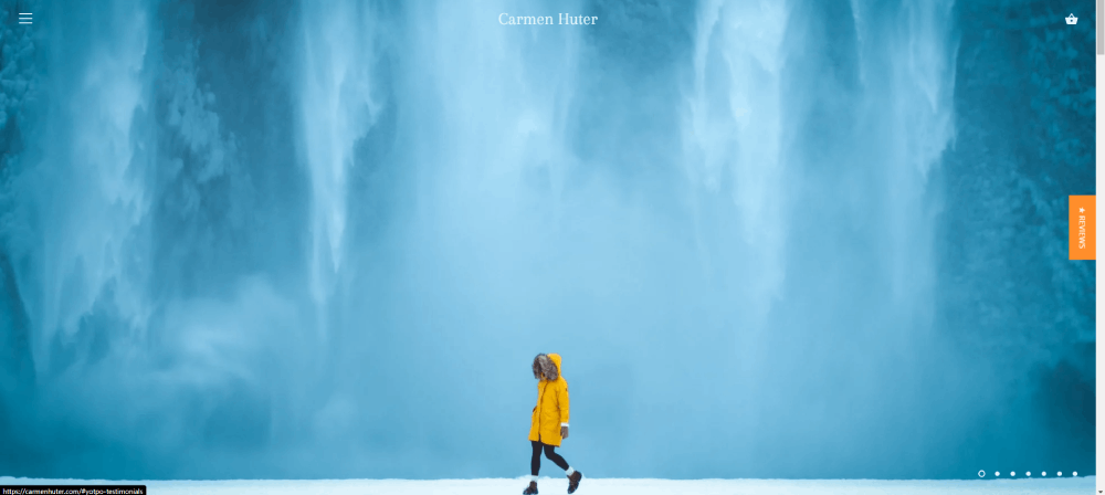
Hand-drawn elements, abstract shapes, and custom illustrations replace generic stock photography.
This handcrafted web design approach signals originality. It tells visitors someone actually made this, not just assembled it from templates.
Experimental Navigation
Hidden menus, radial navigation, scroll-triggered reveals. The website navigation becomes part of the discovery experience.
Risky for e-commerce; perfect for designer portfolios and branding agency websites.
Which Industries Use Artsy Website Design
Not every business can pull this off. Some industries practically require it.
- Creative agencies - Design agency websites and web design agencies use their own sites as portfolio pieces
- Artists and designers - Artist websites and graphic designer portfolio sites need to showcase visual skills immediately
- Fashion brands - Fashion websites and clothing websites compete on aesthetic appeal
- Music and entertainment - Musician websites, record label websites, and filmmaker websites need to match their creative output
- Luxury brands - Luxury websites use artsy design to justify premium positioning
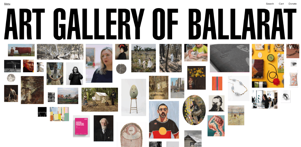
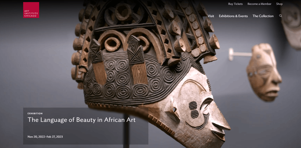
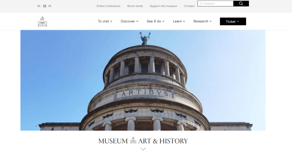
- Museums and galleries - Museum websites extend the curatorial experience online
Bank websites and government websites? Probably not the right fit.
How to Choose an Artsy Design Style for Your Brand
Brand Alignment Considerations
Your website aesthetic must match your actual brand personality.
A law firm with a glitchy, brutalist site confuses clients. A streetwear brand with a corporate grid looks inauthentic. Reviewing your website design checklist helps align visual choices with business goals.
Audience Expectations
Creative directors expect experimental navigation. Their parents do not.
Know your users. User-friendly websites and artsy websites can coexist, but it takes skill. Test with real visitors before committing to unconventional patterns.
Performance Tradeoffs
Heavy animations tank mobile performance. WebGL experiences drain batteries. Full-screen videos increase bounce rates on slow connections.
The best artsy sites balance visual impact with responsive design that works everywhere.
Where to Find More Artsy Website Inspiration
Curated galleries surface the best work daily:
- Awwwards - Daily winners and nominees judged on design, usability, creativity, content
- CSS Design Awards - Focus on CSS/front-end innovation
- Behance - Project case studies with full design breakdowns
- Dribbble - UI shots and design concepts (not always live sites)
- SiteInspire - Filterable by style, type, subject
- Mindsparkle Mag - Video features showing sites in action
Check beautiful website roundups for more curated collections.
For modern website design trends specifically, follow individual designers on Twitter/X and Instagram where they share works in progress.
FAQ on Artsy Website Design
What makes a website design artsy?
Artsy website design prioritizes creative expression over convention. It features experimental layouts, bold typography, custom illustrations, and unconventional navigation patterns.
The visual experience matters more than following standard web design templates.
Which industries benefit most from artsy web design?
Creative agencies, artists, fashion brands, and entertainment companies gain the most. Photographer websites, design studios, and interior design websites also benefit.
Industries where visual identity drives business decisions.
Are artsy websites bad for SEO?
Not inherently. Problems arise when designers sacrifice text content for visuals or use heavy JavaScript that blocks crawlers.
Balance creative layouts with proper heading structure, alt text, and crawlable content.
What tools create artsy website designs?
Figma and Adobe Creative Suite handle design. Three.js and GSAP power animations and 3D effects.
Webflow lets designers build without coding. Understanding core web design principles matters more than any single tool.
How much does an artsy website cost?
Custom artsy sites from recognized agencies range from $15,000 to $150,000+. Complexity drives cost: WebGL experiences cost more than static layouts.
Freelancers offer lower rates but varying quality.
Can artsy design work for e-commerce sites?
Yes, but carefully. Luxury brands and jewelry websites use artsy elements successfully.
Keep product pages functional while reserving experimental design for landing pages and brand storytelling sections.
What is the difference between artsy and minimalist design?
Minimalist websites reduce elements to essentials. Artsy sites may be minimal or maximal.
The distinction: artsy prioritizes creative expression; minimalism prioritizes simplicity. Some designs achieve both simultaneously.
Where can I find artsy website inspiration?
Awwwards, CSS Design Awards, and Behance showcase daily winners. Dribbble features UI concepts.
Study unique websites from agencies like Pentagram, Collins, and Studio Dumbar for professional examples.
Do artsy websites load slowly?
Poorly optimized ones do. WebGL, video backgrounds, and heavy animations increase load times.
Top studios use lazy loading, compressed assets, and progressive enhancement to maintain speed while delivering rich visual experiences.
What skills do I need to design artsy websites?
Strong visual design fundamentals, typography knowledge, and color theory understanding. Technical web designer skills include CSS animation, JavaScript basics, and prototyping in Figma.
Study motion design for scroll-triggered effects.
Conclusion
These artsy website design examples prove that web design can be art. Studios like Resn, Studio Dumbar, and Build in Amsterdam show what happens when creative vision meets technical skill.
The tools exist. Three.js, GSAP, Figma, Webflow. The inspiration sources are endless: Behance, Dribbble, SiteInspire.
What separates forgettable sites from amazing websites is intention. Every scroll-triggered animation, every cursor effect, every asymmetrical grid should serve the brand story.
Start with website design ideas that match your identity. Study the microinteractions and motion graphics from award-winning studios. Then build something that makes visitors pause.
Functional websites get clicks. Artsy websites get remembered.

