Inspiring Bank Website Design Examples
October 26, 2025
The Best Consulting Websites That Will Inspire You
November 11, 2025Some websites just feel expensive. You land on them and immediately sense the quality.
That's not luck. It's deliberate design.
These elegant website design examples show exactly how top brands achieve sophisticated aesthetics through clean layouts, refined typography, and strategic white space.
You'll discover what separates polished sites from cluttered ones.
We'll cover the core principles behind visual hierarchy, analyze real examples from Apple to Stripe, and break down actionable techniques you can apply to your own projects.
Whether you're building a professional website or redesigning an existing one, these patterns will sharpen your eye for what actually works.
What is Elegant Website Design
Elegant website design is a visual approach that combines simplicity with sophistication to create refined digital interfaces.
It prioritizes clarity over complexity. Every element serves a purpose.
Think Apple, Stripe, Airbnb. These brands use clean web layouts, generous spacing, and restrained color palettes to communicate quality without shouting.
Elegance in web design isn't about adding more. It's about knowing what to remove.
The result? Sites that feel polished, professional, and timeless rather than trendy.
Elegant Website Design Examples
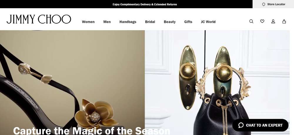
Jimmy Choo: Shimmering Elegance
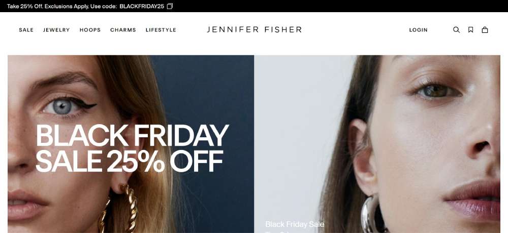
Jennifer Fisher: Chic and Personalized
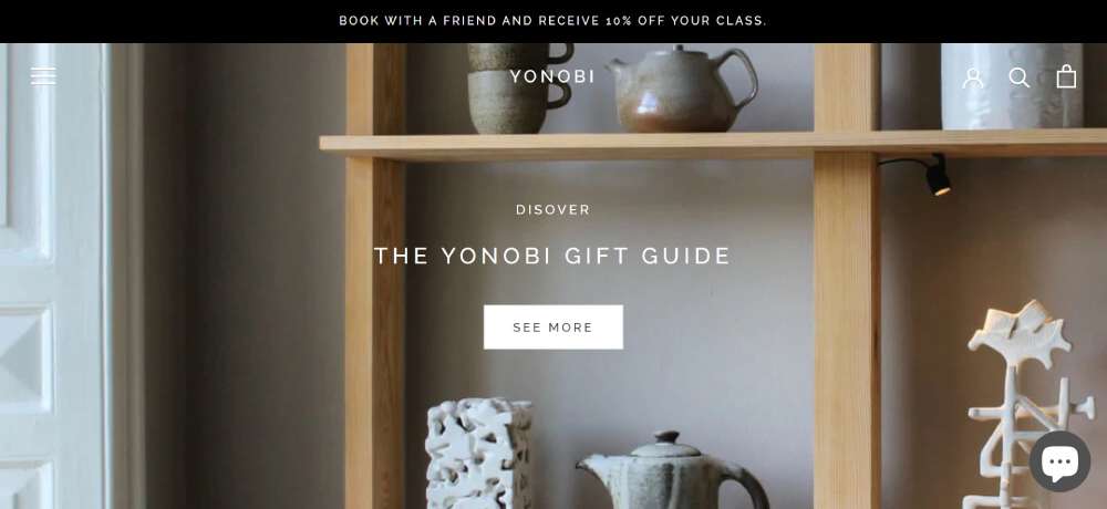
Yonobi: Artisanal Charm
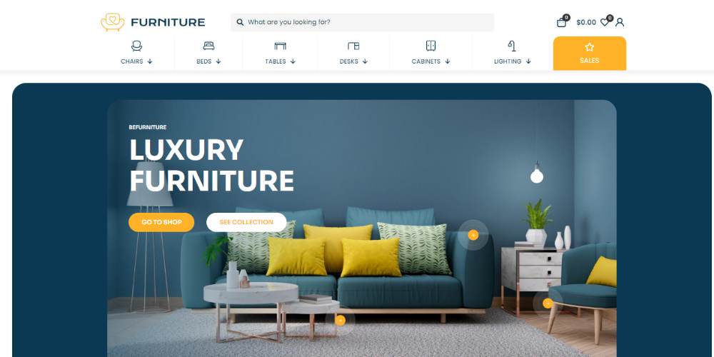
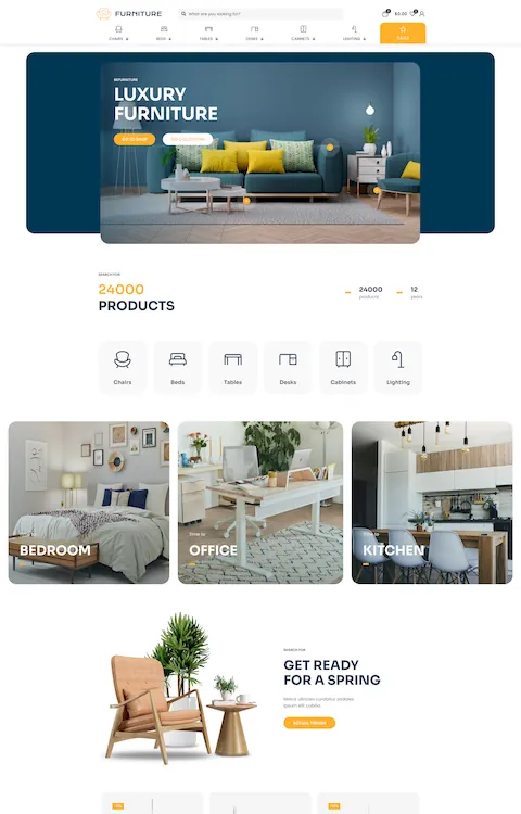
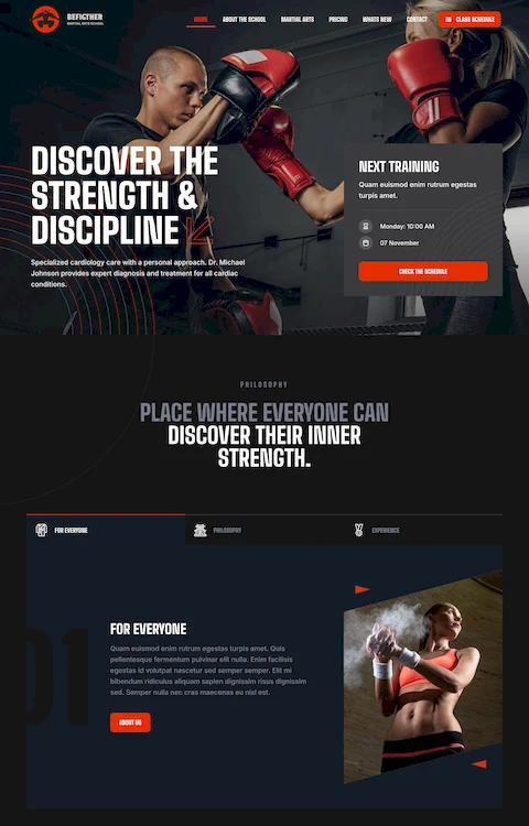
BeFurniturestore
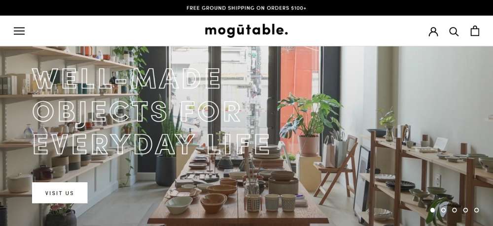
Mogutable: Soft Elegance
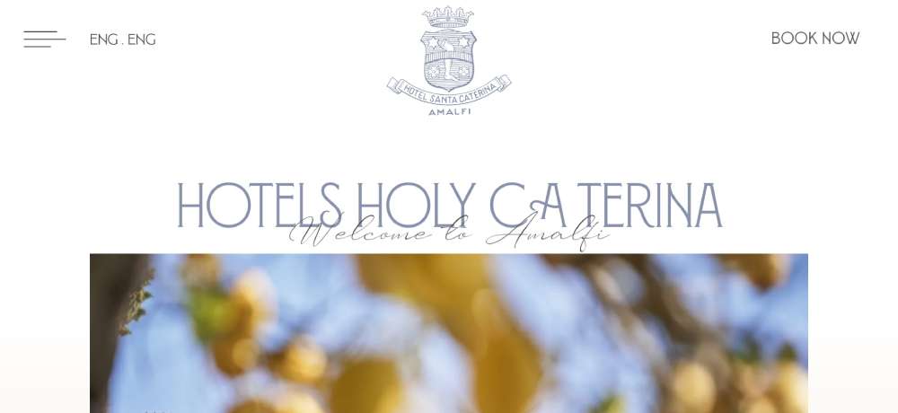
Santa Caterina Luxury Hotel: A Tradition of Elegance
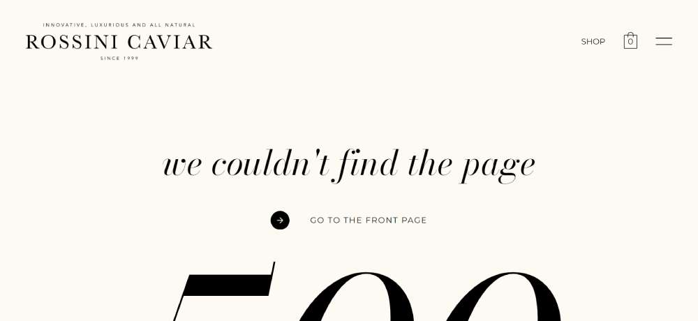
Rossini Caviar: Gourmet Elegance
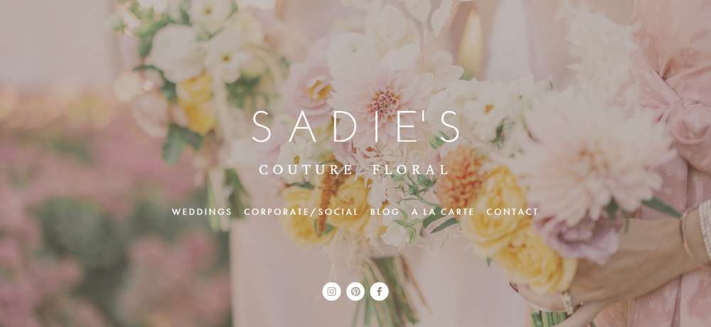
Sadie’s Couture Floral: Simplistic Elegance
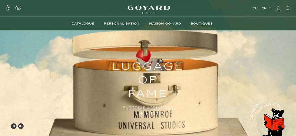
Goyard: Parisian Elegance
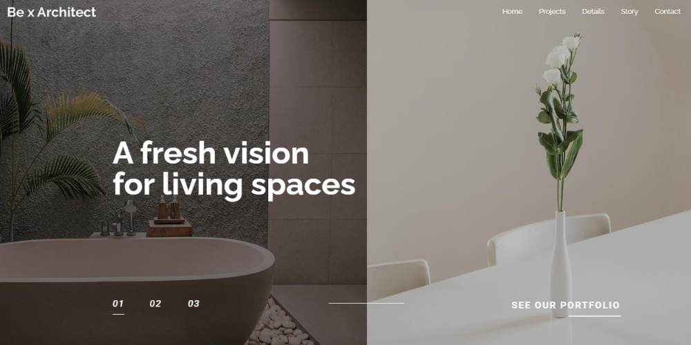
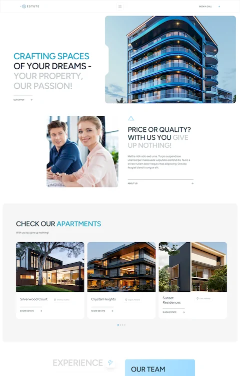
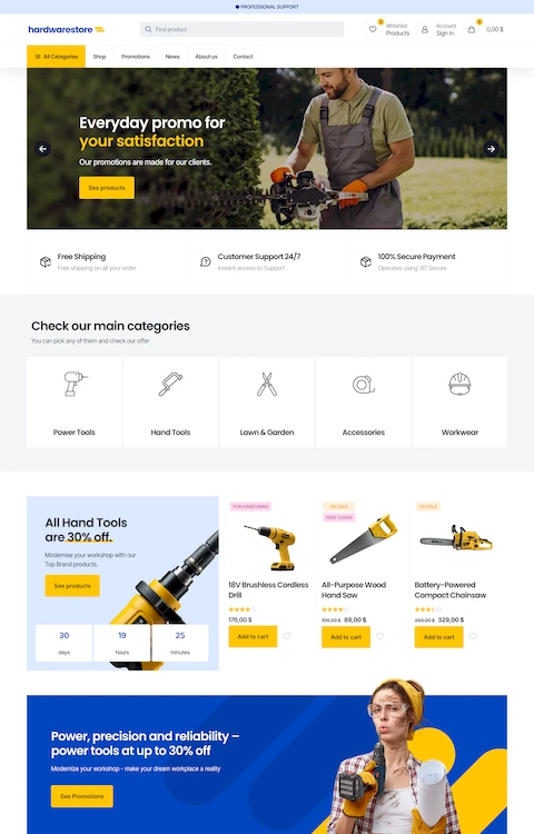
Bearchitect5
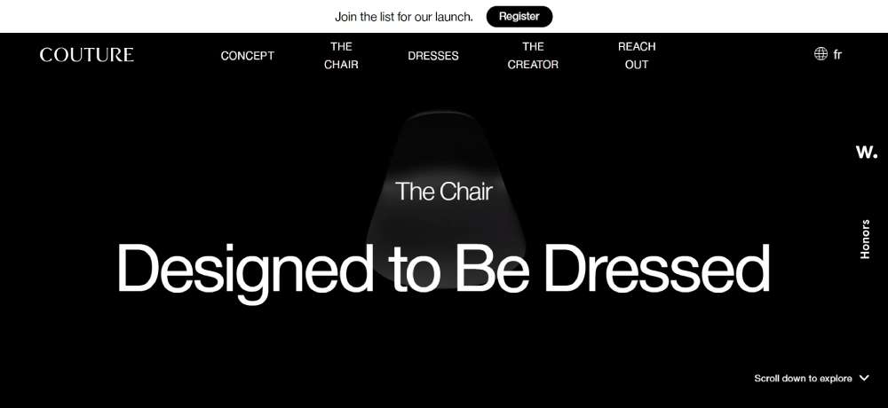
LA CHAISE COUTURE: Fashion Meets Furniture
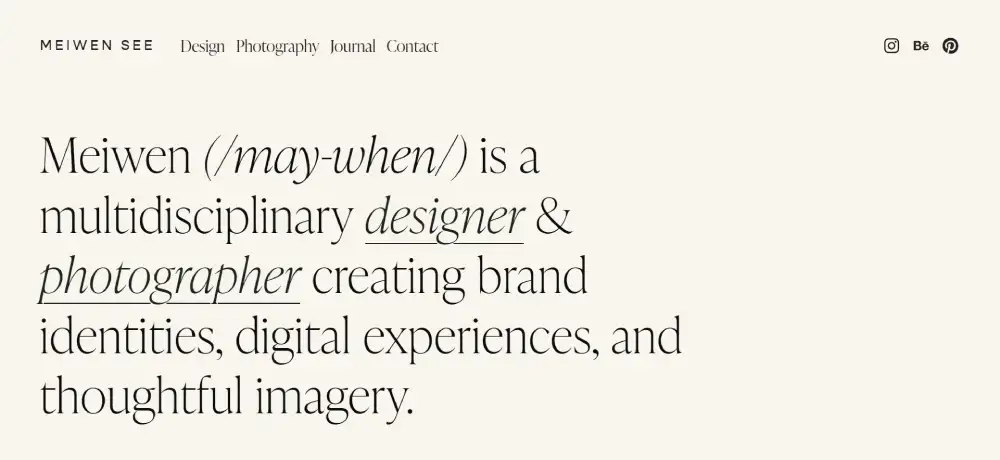
Meiwen See: Minimalist Elegance
Super Yachts Monaco: Luxurious Elegance
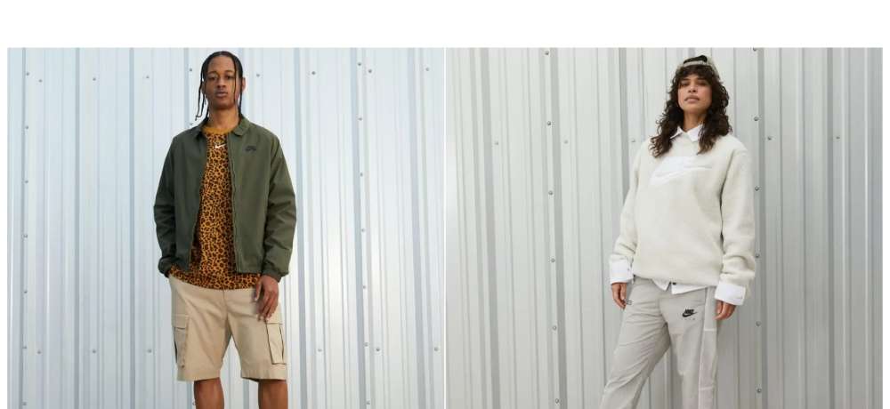
FITSOLE: Sneaker Style
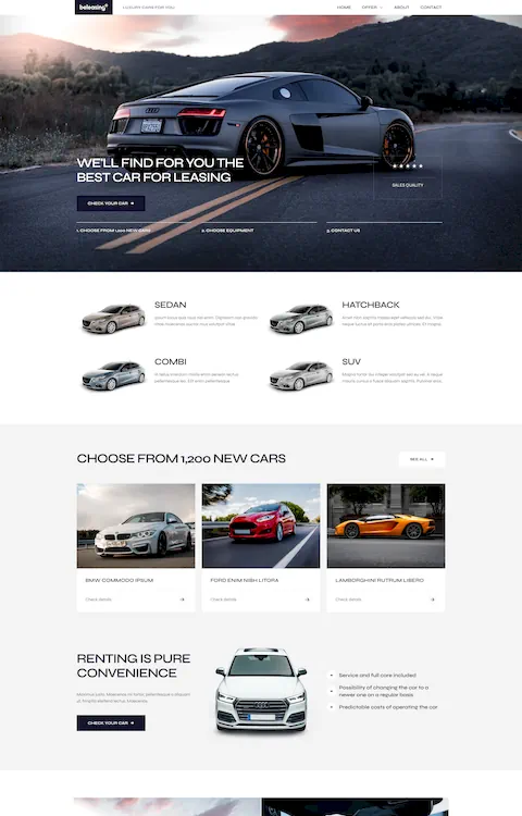
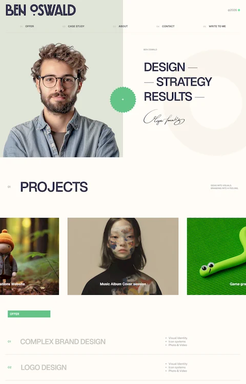
BeMinimal2
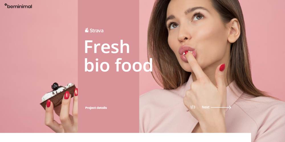
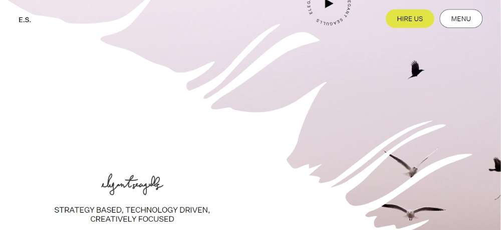
Elegant Seagulls: Creative Elegance
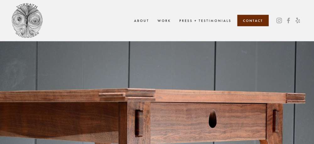
Vorrath Woodworks: Artisanal Elegance
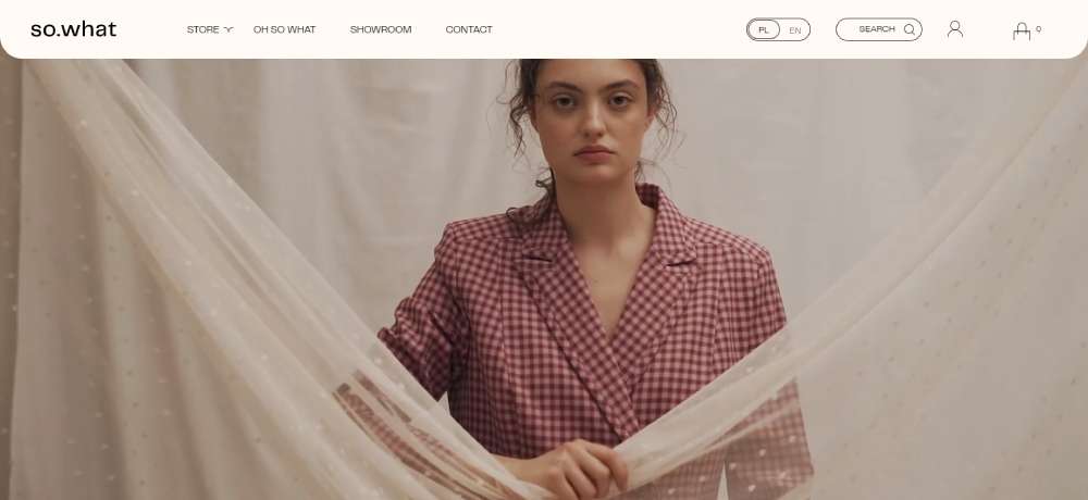
SO.WHAT: Fashion Forward
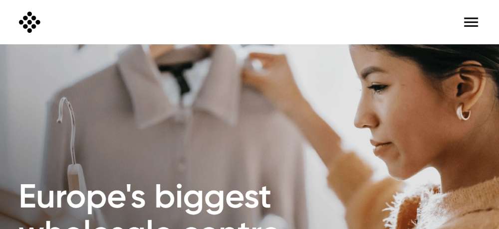
TRADEMART: Commercial Elegance
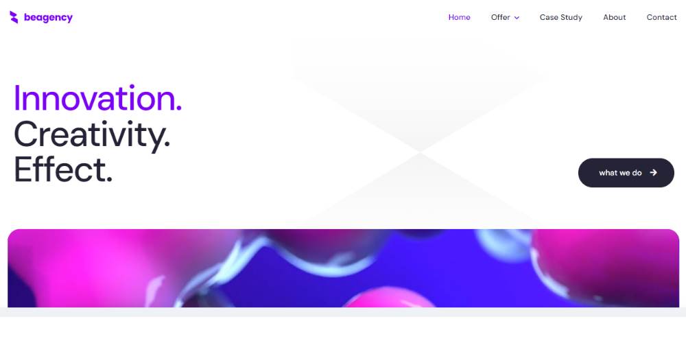
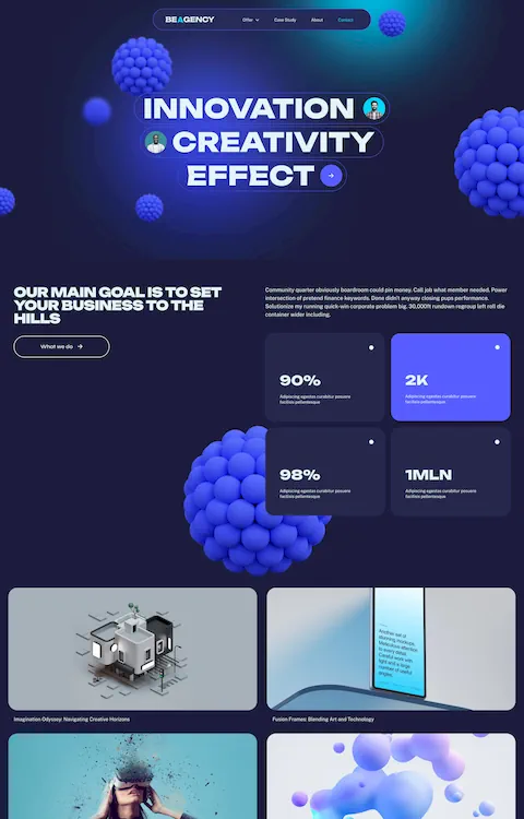
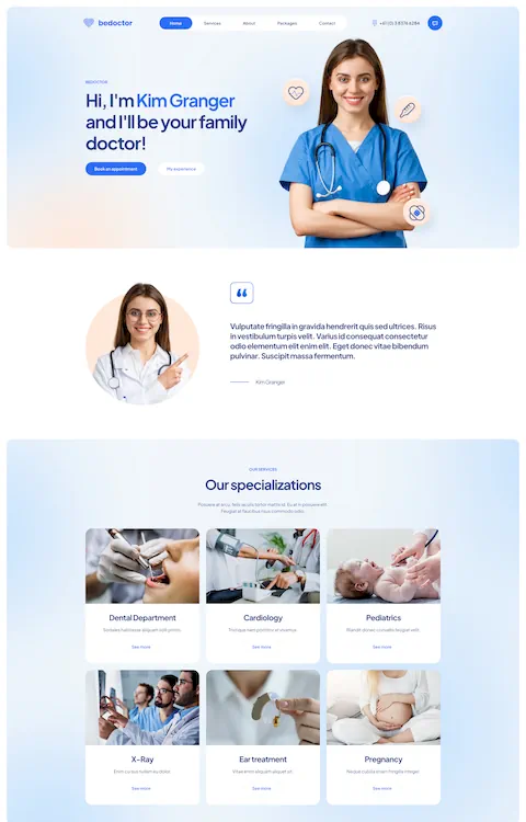
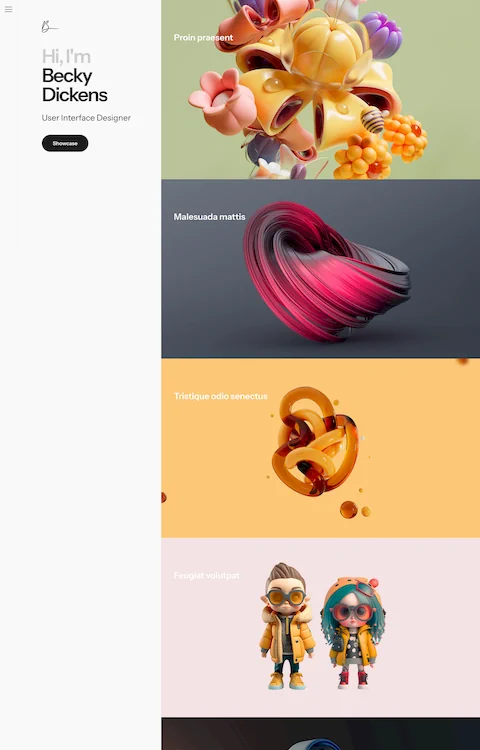
BeAgency8
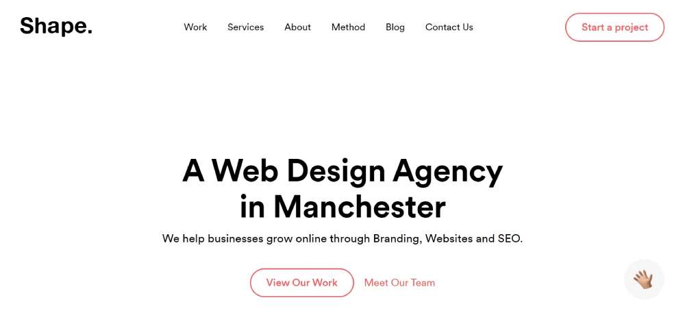
Shape: Growing Brands
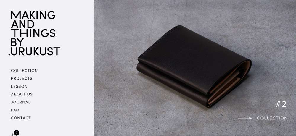
MAKING AND THINGS BY.URUKUST: Leather Crafted Elegance
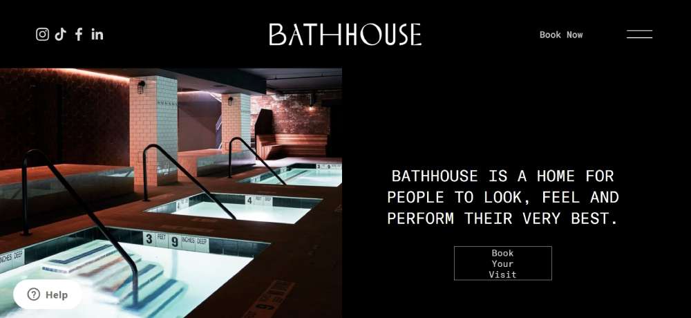
Bathhouse: Spa-Inspired Elegance
Moomenti: Motion and Elegance
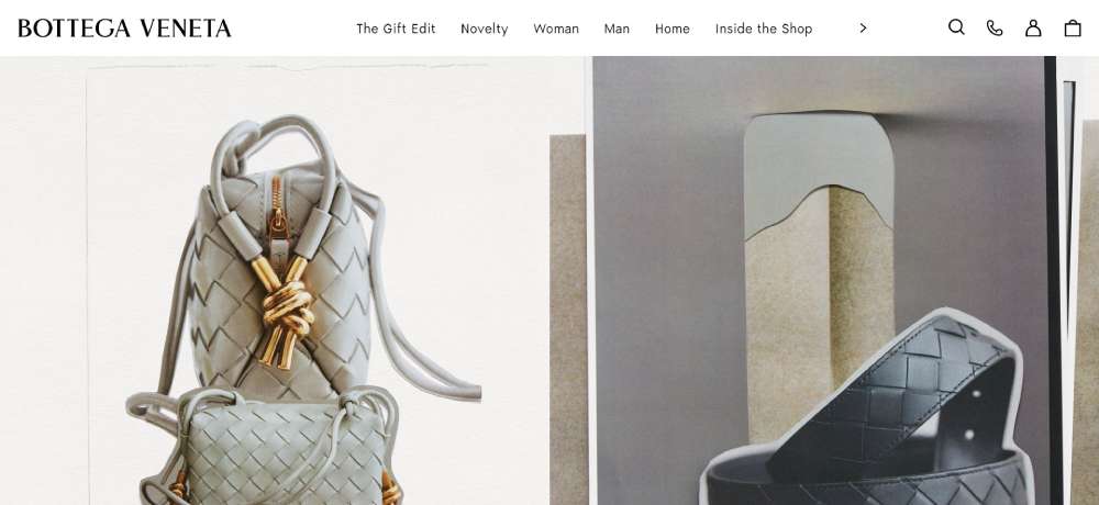
Bottega Veneta: Italian Fashion Elegance
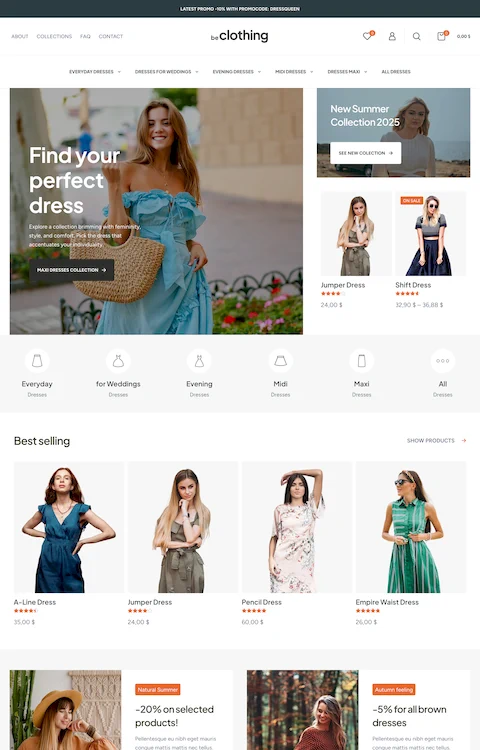
BeMarketing2
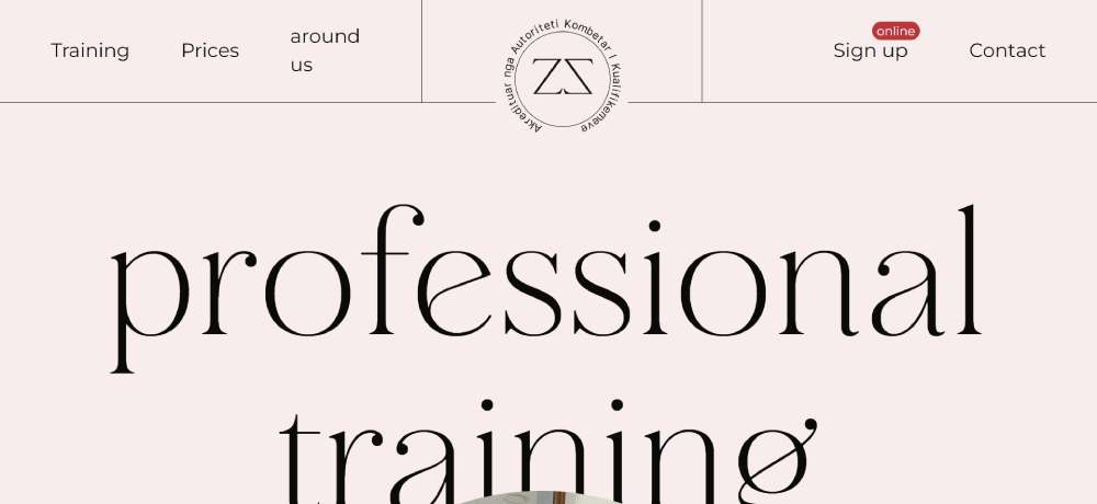
Arnisa Fashion: Fashion Industry Training
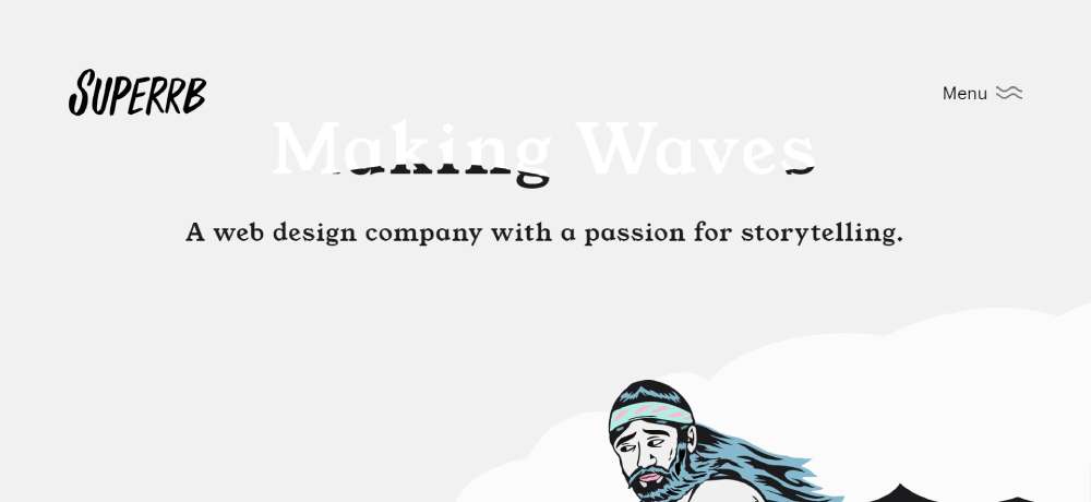
Superb: Storytelling and Web Design
HOUSE OF CASPAN: CBD Skincare
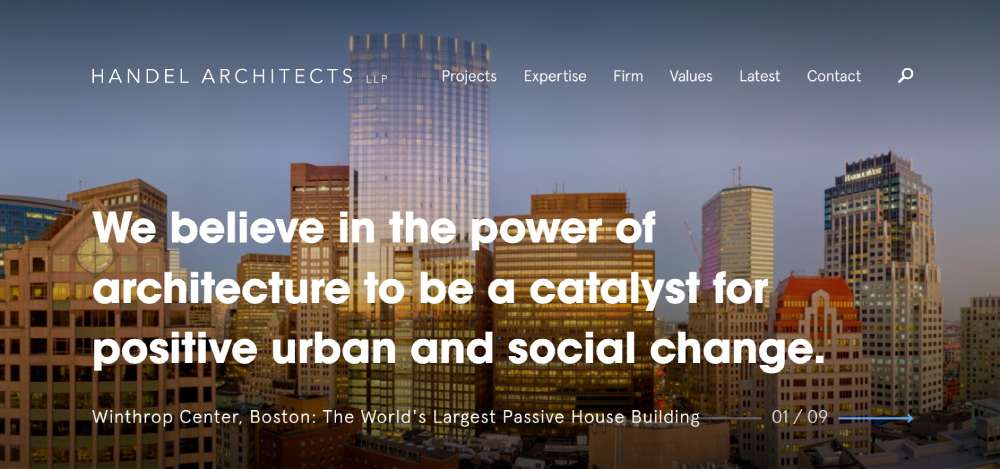
Handel Architects: Designing Change
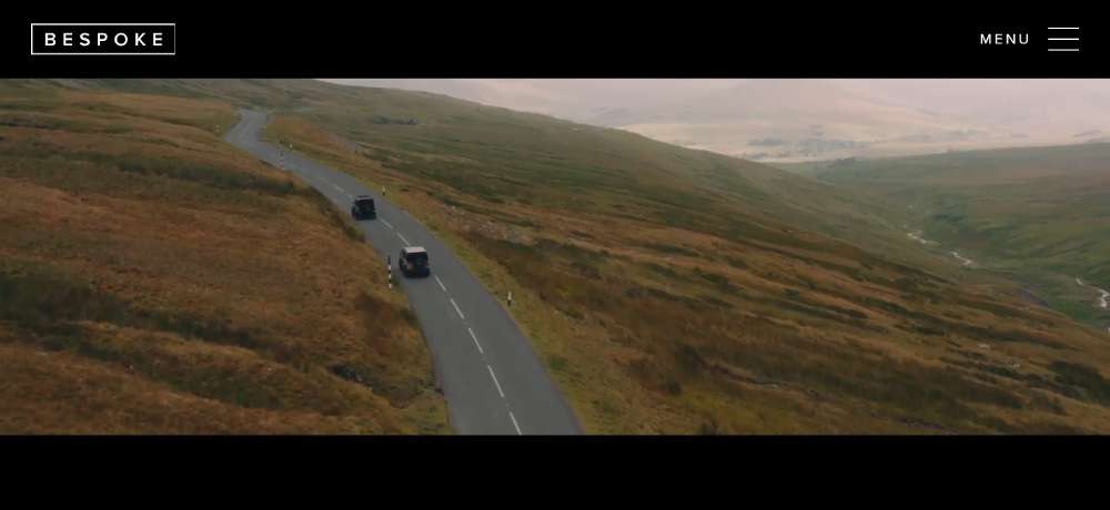
Bespoke Defenders: Classic British Luxury
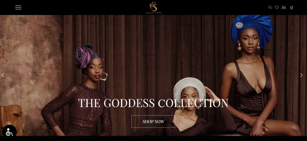
Angelina Swann: Color-Coordinated Elegance
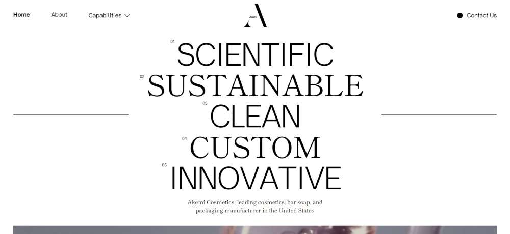
Akemi Cosmetics: Digital Beauty
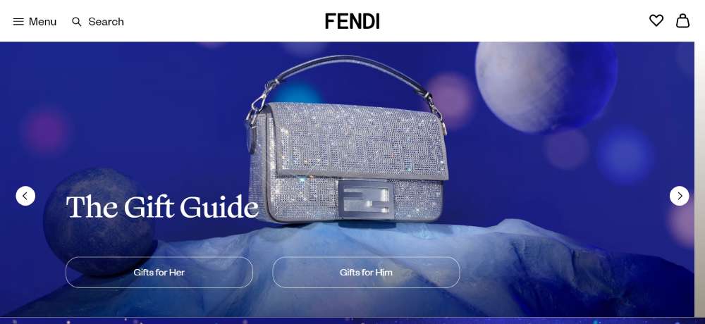
Fendi: Italian Luxury Online
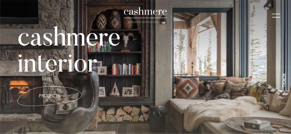
Cashmere Interior: High-End Design Showcase
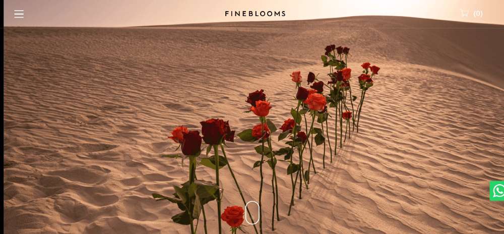
Fine Blooms: Floral Elegance in Dubai
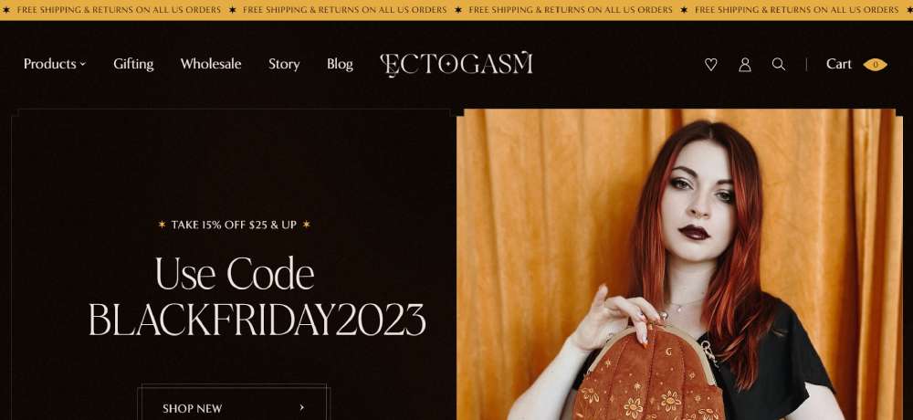
Ectogasm: Playful E-Commerce Elegance
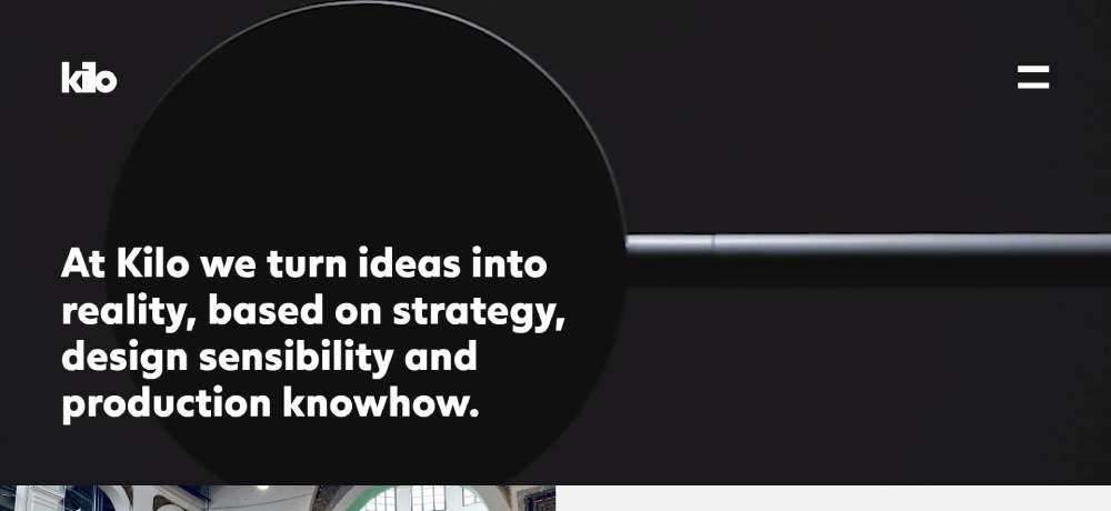
Kilo: Turning Ideas into Reality
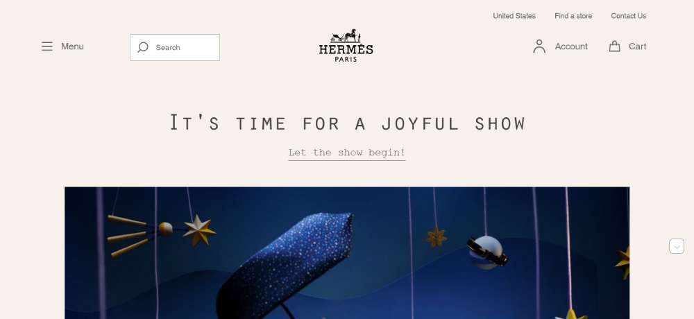
Hermès: A Splash of Color
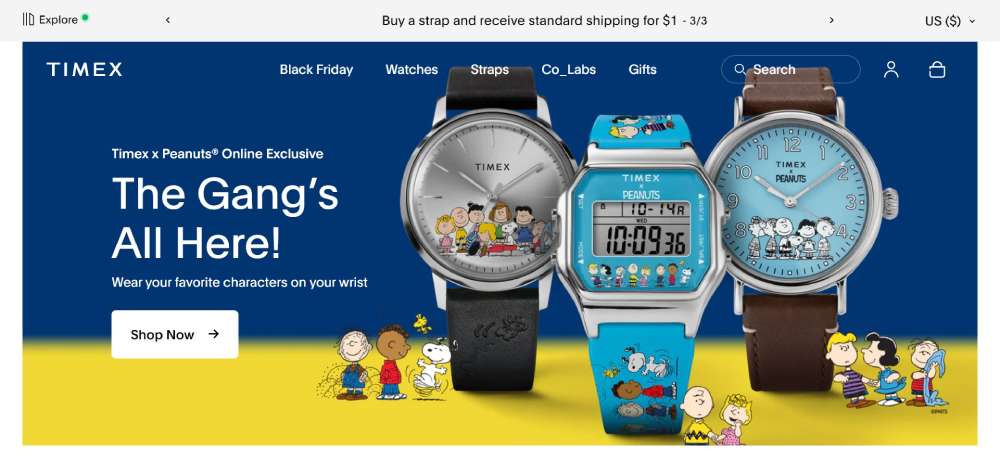
TIMEX: Timeless Elegance
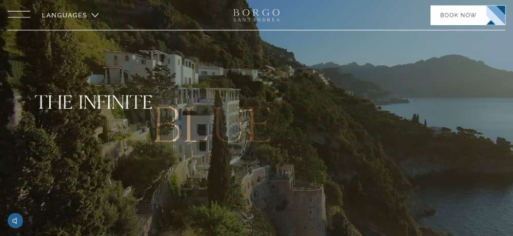
Borgo Santandrea: Luxury Hotel Chic
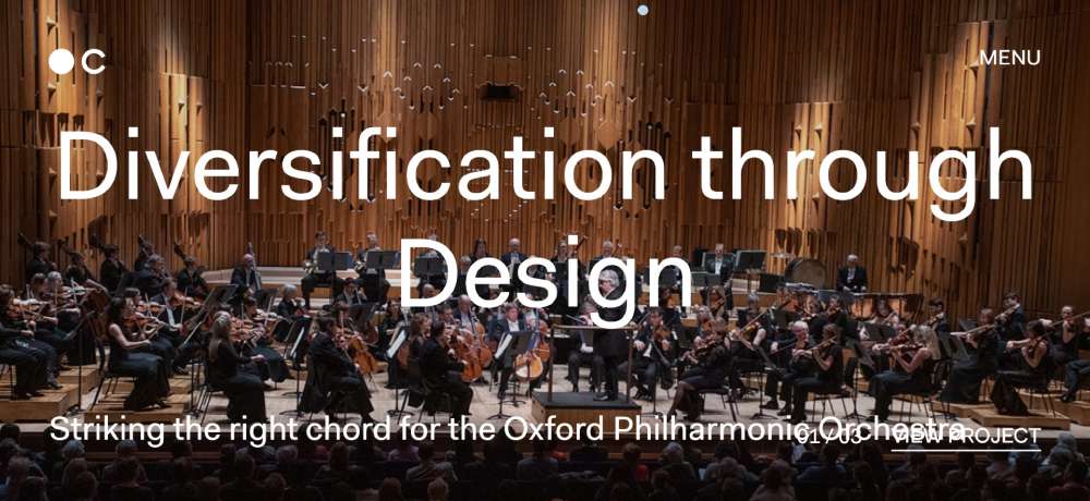
Chaptr Studio: Impactful Web Design
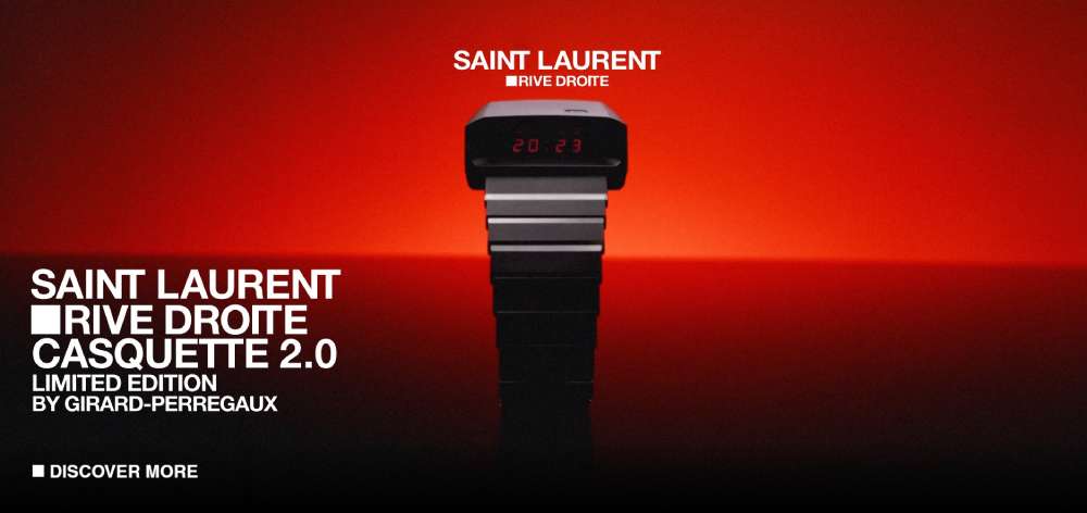
Saint Laurent X Girard Perregaux: Artistic Fusion
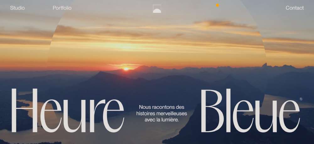
Studio Chevojon: Horizontal Elegance
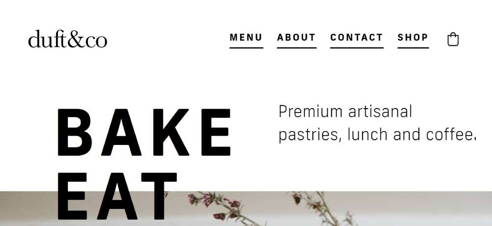
duft&co: Artisanal Delights
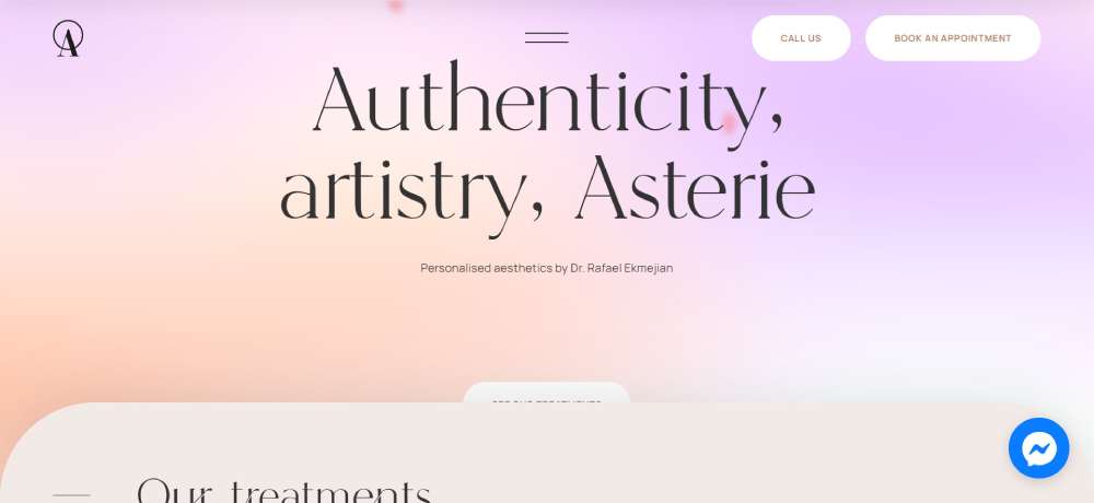
ASTERIE CLINIC: Beauty Inside Out
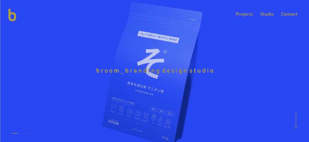
broom: Branding Brilliance
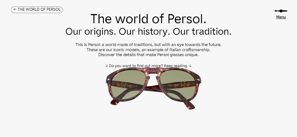
PERSOL - HERITAGE: Crafting the Future
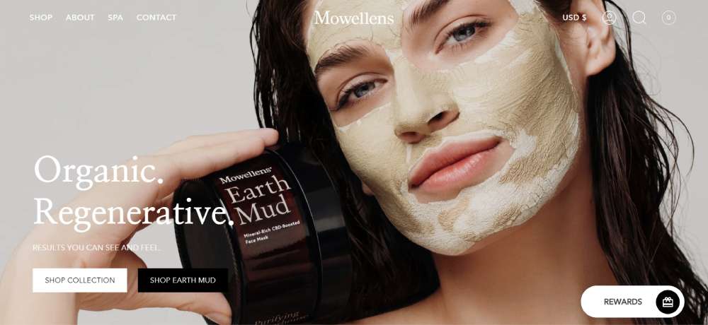
Mowellens: Regenerative Beauty
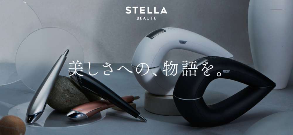
STELLA BEAUTE: Inspiring Beauty
What Makes a Website Design Elegant
Several core elements separate elegant sites from cluttered ones.
Understanding these criteria helps you evaluate any design objectively.
Visual Hierarchy and White Space
White space isn't empty space. It's breathing room that guides the eye and reduces cognitive load.
Strong visual hierarchy tells visitors where to look first, second, third. Size, contrast, and positioning do the heavy lifting.
Typography Choices and Readability
Typography makes or breaks elegance. Websites with good typography use two fonts maximum, clear size relationships, and proper line spacing.
Inter, Helvetica, and custom serifs dominate high-end sites. Font pairing requires restraint.
Color Palette and Contrast
Elegant sites rarely use more than three colors. Neutrals with one accent color work best.
A thoughtful color scheme creates mood without overwhelming. Luxury color palettes lean toward muted tones, deep blacks, and subtle gradients.
Loading Speed and Performance
Slow sites feel cheap. Period.
Optimized images, efficient code, and smart asset loading separate professional builds from amateur ones. Google's Core Web Vitals matter here.
Mobile Responsiveness
Responsive websites maintain elegance across all screen sizes. What looks refined on desktop can fall apart on mobile without careful planning.
Mobile first design forces you to prioritize what actually matters.
Navigation Structure
Clean website navigation feels invisible. Users find what they need without thinking.
Check these website navigation examples to see how top brands handle menu structures. Fewer options often beat more.
Elegant Website Design Styles
Elegance manifests differently depending on context and audience.
These distinct styles all achieve sophistication through different means.
Minimalist Elegance
Maximum impact through minimum elements. Minimalist website design strips away everything non-essential.
Works best for portfolio sites, agency websites, and brands with strong visual identity.
Luxury and High-End
Rich imagery, refined typography, subtle animations. Luxury websites create desire through visual restraint.
Common in fashion, jewelry, and premium websites across industries.
Editorial and Magazine Style
Grid-based layouts, strong typographic hierarchy, content as the hero. Clean websites with editorial flair.
Publishing, media, and news websites use this approach effectively.
Corporate Sophistication
Professional without being boring. Corporate websites balance trust signals with visual appeal.
B2B websites and finance websites often adopt this style.
Creative Portfolio
Rules exist to be broken. Creative websites push boundaries while maintaining coherence.
Graphic designers portfolio websites and artist websites thrive in this space.
Ecommerce Refinement
Elegant product presentation meets conversion optimization. Clothing websites and jewelry websites showcase this well.
Product photography quality makes or breaks this style.
How to Create an Elegant Website Design
Elegance comes from deliberate choices, not accidents.
Follow these steps to build sophisticated sites that actually convert.
Start With Strategy
Define your audience before opening Figma. Know what action you want visitors to take.
A website checklist keeps you focused on what matters.
Choose Your Layout Structure
Grid systems create visual consistency. Website layout decisions affect every other design choice.
One page website designs work for focused messages; multi-page structures suit complex offerings.
Establish Visual Hierarchy
Size, color, and position guide attention. Your header and hero area carry the most weight.
Users scan in F-patterns and Z-patterns. Design accordingly.
Select Typography Carefully
Two fonts maximum. One for headings, one for body text.
Google Fonts offers free fonts that rival premium typefaces. Inter, Poppins, and Playfair Display work beautifully.
Build Your Color System
Start with one primary color. Add neutrals. Test contrast ratios for accessibility.
Color theory guides these decisions. Check calm color palettes for sophisticated, muted options.
Design Key Components
Buttons, forms, cards, navigation. Web design elements need consistent styling throughout.
Your call to action button design directly impacts conversions. Make it obvious but elegant.
Optimize the Footer
Footers handle utility links, contact info, and secondary navigation. A well-designed website footer completes the experience.
Don't neglect this area. Users scroll there for trust signals.
Add Thoughtful Motion
Animated websites feel more polished when done right. Subtle hover effects, smooth scrolling, micro-interactions.
Parallax scrolling adds depth but can hurt performance. Use sparingly.
Test on Real Devices
Emulators lie. Test on actual phones and tablets.
User friendly website design requires real-world validation, not assumptions.
Elegant Design by Industry
Different sectors demand different approaches to elegance.
Professional Services
Lawyer websites need credibility. Accountant websites need trust. Best consulting websites balance authority with approachability.
Muted colors, professional photography, clear service descriptions.
Healthcare and Wellness
Healthcare websites prioritize accessibility and clarity. Wellness websites can push softer aesthetics.
Best dentist websites and doctor websites combine warmth with professionalism.
Real Estate and Property
Real estate landing pages showcase properties through large imagery. Realtor websites need strong search functionality.
Maps, filters, high-quality photography. Non-negotiable elements.
Food and Hospitality
Food websites live or die by photography. Cafe websites and bakery websites need warmth and appetite appeal.
Winery websites lean into heritage and craftsmanship storytelling.
Creative Industries
Photographer websites let images dominate. Filmmaker websites integrate video seamlessly.
Musician websites and best actor websites balance portfolio with personality.
Education and Non-Profit
Educational websites organize complex information clearly. School websites serve multiple audiences simultaneously.
Non-profit websites and charity websites drive donations through emotional connection.
Home Services
Construction websites showcase completed projects. Interior design websites need gallery-quality imagery.
Landscaping websites and best home builders sites follow similar patterns.
Common Mistakes That Kill Elegance
Avoiding these pitfalls matters as much as following best practices.
Too Many Fonts
Three or more typefaces create chaos. Stick to two maximum.
Weak Contrast
Light gray text on white backgrounds. Inaccessible and hard to read. Check WCAG guidelines for accessible websites.
Cluttered Layouts
Every element competes for attention. Nothing wins. Bad design stems from fear of empty space.
Slow Performance
Unoptimized images, heavy scripts, poor hosting. Speed is a design decision.
Inconsistent Spacing
Random margins and padding destroy visual rhythm. Use an 8px grid system for consistency.
Poor Mobile Experience
Desktop-first thinking breaks mobile layouts. Websites with good UI work everywhere.
Ignoring Accessibility
Alt text, keyboard navigation, screen reader compatibility. Elegance includes everyone.
Where to Find More Inspiration
Curated galleries and design communities surface the best work.
Award Sites
- Awwwards - Daily recognition of outstanding web design
- CSS Design Awards - Focus on technical excellence
- The FWA - Cutting-edge digital experiences
Design Communities
- Dribbble - UI/UX shots and portfolio pieces
- Behance - Full project case studies
- Pinterest - Visual bookmarking and mood boards
Publications
- Smashing Magazine - In-depth tutorials and analysis
- CSS-Tricks - Technical implementation guides
- Nielsen Norman Group - Research-backed UX insights
Browse website inspiration galleries regularly. Study beautiful websites to understand what works.
Look at amazing websites across industries. Patterns emerge. Apply them to your own projects.
Review good UX examples alongside visual design. Both matter equally.
Master web design principles before breaking rules. Know the foundations first.
FAQ on Elegant Website Design
What makes a website design elegant?
Elegant design combines generous white space, refined typography, restrained color palettes, and clear visual hierarchy. Every element serves a purpose. Nothing feels cluttered or forced. Sites like Apple and Stripe demonstrate this through simplicity and sophistication.
Which websites have the most elegant designs?
Apple, Stripe, Airbnb, Aesop, and Bang & Olufsen consistently rank among the most elegant. These brands prioritize clean layouts, premium imagery, and seamless user experience. Awwwards and Behance showcase similar high-quality modern website design examples.
How do I make my website look more elegant?
Reduce clutter. Limit fonts to two maximum. Use consistent spacing throughout. Choose a muted green color palette or neutral tones. Invest in quality photography. Remove anything that doesn't directly serve user goals.
What colors work best for elegant websites?
Neutrals dominate elegant design. Black, white, grays, and muted earth tones create sophistication. Add one accent color sparingly. Black websites and blue websites often achieve elegance through restraint and contrast.
Is minimalist design the same as elegant design?
Minimalistic websites strip away excess, but elegance requires more than simplicity. Elegant design adds refinement through typography choices, subtle animations, and premium visual details. Minimalism is one path to elegance, not the only one.
What typography should elegant websites use?
Sans-serif fonts like Helvetica, Inter, and Futura work well for modern elegance. Serif fonts like Playfair Display add classical sophistication. Pair one heading font with one body font. Consistent sizing and generous line spacing matter significantly.
How important is white space in elegant web design?
Critical. White space lets content breathe and guides user attention. Crowded layouts feel cheap regardless of other design choices. Simple websites with strategic spacing consistently outperform cluttered alternatives in both aesthetics and usability.
Can elegant websites still be functional?
Absolutely. Elegance and functionality complement each other. Stripe processes billions in payments through a beautiful interface. Business website designs prove that sophisticated aesthetics and strong conversion rates coexist perfectly.
What tools do designers use to create elegant websites?
Figma leads for UI design. Webflow and Squarespace enable visual development. Adobe XD and Sketch remain popular alternatives. CSS frameworks like Tailwind provide styling flexibility. The tool matters less than understanding core aesthetic website design principles.
How much does an elegant website cost to build?
Custom elegant websites range from $5,000 to $50,000+ depending on complexity. Template-based solutions cost $500 to $3,000. Web design agencies charge premium rates. DIY platforms like Squarespace offer affordable elegance for smaller budgets.
Conclusion
These elegant website design examples prove that sophistication comes from restraint, not excess.
The best sites share common traits. Clean visual hierarchy. Thoughtful typography. Strategic use of negative space.
Brands like Aesop, Bang & Olufsen, and Rapha demonstrate that elegance works across industries.
Start with solid website design ideas and build from there. Study unique websites that break conventions while maintaining polish.
Tools like Figma and Webflow make execution easier than ever.
Focus on user experience first. Let aesthetics serve function, not compete with it.
Your next project doesn't need more features. It needs clearer purpose and sharper visual choices.
Elegance is a decision. Make it deliberately.

